Tuesday, June 30th, 2009

Lightroom: More Adjustment Brush techniques


You just gotta love the Adjustment brush in Lightroom 2. It makes Lightroom a great tool for quick fixes and, honestly, I’ve used Photoshop a lot less since I started using Lightroom. I love the combination, Lightroom is fast and so smart and Photoshop is there for when I need specialist effects. So, on to today’s post…

In an earlier post I talked about using the Adjustment Brush in Lightroom 2 at a simple level – sort of Adjustment Brush 101. In this post I’ll show you some advanced features of the adjustment brush which help you make multiple adjustments to the image at one time and to do so more easily. Consider this Adjustment Brush 102.
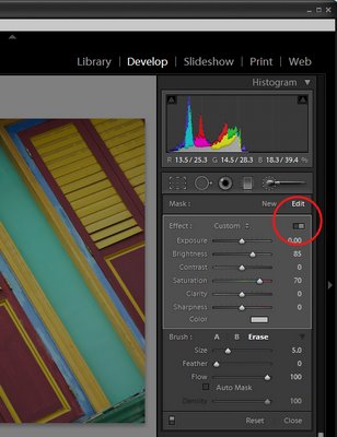

In the Develop module, when you have the Adjustment Brush selected there is a switch that you can click to switch between Button and Slider mode. In button mode you can adjust one of the Exposure Brightness, Contrast, Saturation, Clarity and Sharpness settings at a time. In Slider mode, you can adjust any one or more of these options.


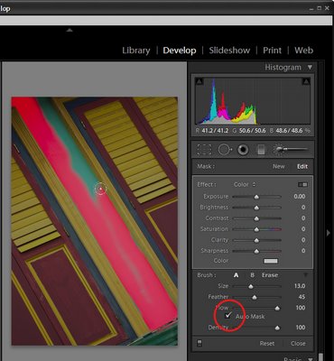
In the Brush area of the panel you will see an AutoMask option. When this is enabled, you can paint around the inside edge of an area and the AutoMask feature will mask the area ensuring your brushstrokes don’t go over the edge. This works best on areas where the edge is distinct and recognizable. When you paint, make sure you have the main part of the paint brush inside the area you want to effect.

To toggle between AutoMask being on or off as you paint, hold the Control key as you paint (Command on the Mac).
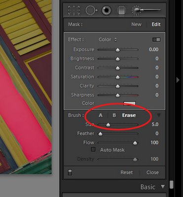

In the Brush area you will see two brushes, A and B. You can switch between the two by clicking on the A or B indicator. Each brush has its own Size, Feather, Flow and Density settings, and AutoMask can be enabled for either or both of the brushes. Having two brushes lets you configure each differently and switch easily between the two.

Each brush can be switched into the third brush mode – Erase mode by holding the Alt key (Option on the Mac) as you paint with either brush.
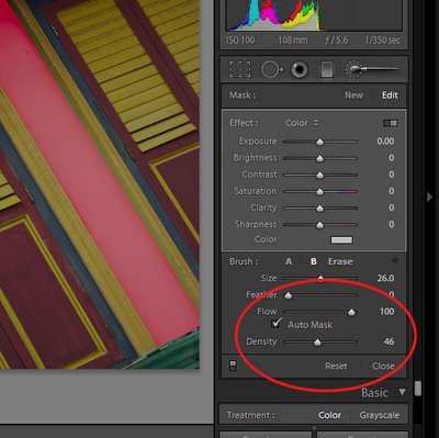

Setting the brush size defines the area of the brush and it is the central circle which you see when you are painting. The Feather amount adds an additional softness to the brush which is shown by the second outer circle. A hard brush has a Feather of 0 and it shows as a single circle.

Flow specifies the flow for the brush which can be set to less than 100 so you can build up an effect gradually by painting over an area multiple times. The Density slider adjusts the opacity and controls the maximum opacity of the brush strokes. So, if you have Flow set to a low value and Density to 50, the maximum opacity that the brush can reach regardless of how many times you paint over an area is 50.
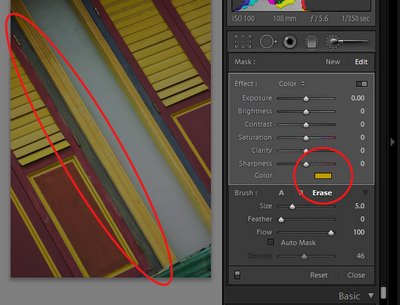

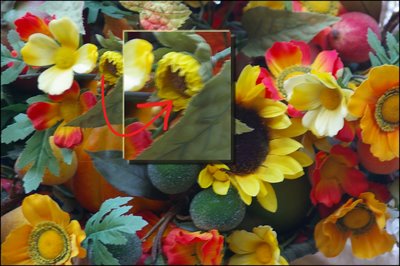
In the Effect area is a Color option which allows you to paint over an image with a color of your choice. To do this, select the color to use and then paint over the area to apply it to. You can use this to colorize a black and white image or, as I’ve done here, paint over a dark blue area with yellow to make it dark green.

Tip: Interested in learning more about Lightroom? Check out my post on understanding Clarity, Vibrance and Saturation in Lightroom 2.

Helen Bradley

Monday, June 29th, 2009

Flash files in PowerPoint 2007 Presentations

It’s easy to add Flash movies to your PowerPoint presentations and to configure them to play. Here’s how:


Step 1
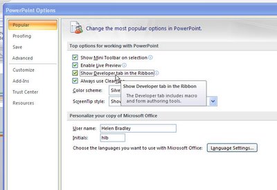
Start by loading the Developer tab which provides access to the objects that you need to do this. Click the Office button, choose PowerPoint Options > Popular group and enable the ‘Show Developer tab in the Ribbon’ checkbox.

Step 2
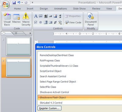
Switch to the slide that will be used to play the Flash video. Select the Developer tab on the Ribbon, click the More Controls button and locate and select the Shockwave Flash Object entry in the list. Click Ok and drag a shape onto your slide.

Step 3
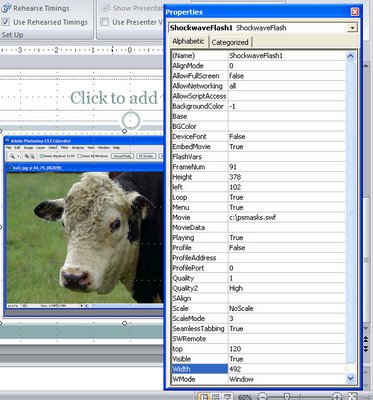
Right click the shape and choose Properties. Set the Playing property to True, the Embed Movie property to True and set the Movie property to the full filename and path of the Shockwave movie file. Click Ok. You must run the presentation to preview the movie file.

Helen Bradley

Sunday, June 28th, 2009

Take your photography up a notch


Owning a digital camera isn’t a panacea for taking bad photos. In fact, all too often, having a digital camera means you take many more bad photos – you just don’t pay to have them printed. Take a quick look through the photos you’ve taken recently and see how many great photos you’ve taken compared with how many you’re disappointed with.

If you’re erring on the side of having too many photos in the not so good category, then read on! This month I have some great tips for taking much better photos and they’re simple solutions that don’t need special tools or expensive cameras. In fact they’re techniques that are guaranteed to take anyone’s photography up a notch.

Cut the clutter
When your photos are marred by untidy backgrounds and general clutter, there are two simple solutions. One is to move closer. Most people shoot from way too far away from their subjects so it’s inevitable that there will be other extraneous detail in the shot. You can tell if you’re standing too far away if you look at the photos you take and identify how much of the surface area of the photo the subjects take up. If it’s less than 50% you’re not getting close enough.

Next time you’re about to take a photo, take one good big step towards your subject and check the LCD screen. Mentally calculate how much of the photo area is covered by the subject, if it’s not at least half, then take another step and check again. At the same time, ensure that the scenery behind your subject is attractive. If not, move yourself or the subject until you have a more attractive background (or move in closer still), and then take your shot.


Getting in close to this carousel turns the shot from ho-hum into wonderful.

No more blur
Blur in photos is great when you want it and disastrous when you don’t. When you want a sharp, clear photo and all you’re getting is blur, there are some things to check. One is that you’re not too close to your subject. Your camera’s manual will tell you the ideal range at which the camera can focus – if you’re closer than recommended then your photos will be blurry. The solution is to move further away from your subject so the lens can focus or switch to macro mode. Macro mode is indicated by a small flower icon and it is used for close up photography. Again, check your camera’s manual to see just how close you can be to your subject in macro mode – you will find this is usually a minimum of around 5cm. When using macro mode, zoom out (not in) as the camera generally won’t focus in macro mode if you’re using the zoom at the same time.

If the blur cannot be attributed to being too close, it might be caused by camera movement. When taking a shot, hold the camera in both hands and brace yourself. Take a breath, push the shutter release half way down to allow the camera to focus on the subject. Then push the shutter release the remainder of the way down to take the shot before breathing out again. Taking and holding a breath will avoid a lot of camera movement and pressing the shutter release half down gives the camera’s auto-focus mechanism time to focus correctly before you take the shot.


The camera moved a little as this shot was taken resulting in a slight blur.

When your subject is moving, taking a sharp picture is more difficult than when it is stationary. In this situation, switch the camera to sports mode so the shot will be captured faster and so there is less chance of the movement causing a blurry shot. It will also help if you adjust your placement so the movement is occurring towards you and not across the path of the shot. Of course, in some situations this is not possible, for example, standing in front of horses racing around a track is generally not possible, however it will give a clearer shot!

Too much light or too little
When your photos are repeatedly too light or too dark, adjusting the camera’s exposure may help. To do this, check your camera’s manual to see if it has an exposure compensation option. Generally you can adjust the exposure up or down by approximately 2 stops – these are marked -2, -1, 0, 1 and 2 on a scale. Zero is the value that is used by default and, to get a darker image, set the value towards the negative, generally around minus one third to minus half a stop is sufficient. On the other hand if your shots are too dark, adjust the setting to a positive value of around one third or one half. Exposure compensation settings are often lost when you turn off your camera so you should check it each time just in case.


If you’re shooting in bright daylight, and particularly if you are shooting portraits or a person standing in front of a scene, use the forced or fill flash setting on your camera. This forces the flash to fire in circumstances that it would generally not be required. The flash will light the person’s face and give a much nicer portrait shot and the background will still be captured just fine too.

Helen Bradley

Saturday, June 27th, 2009

Photoshop Elements: Spot sharpening with a faux layer mask

One of the features on the wish list of most advanced Photoshop Elements users is Layer Masks. It is one of the key features that separates Photoshop Elements from Photoshop – but it doesn’t have to be that way. It is possible to create faux layer masks in Photoshop Elements if you know how – and today, I am going to show you how.

One of benefits of this approach to creating faux layer masks in Elements is that it uses features built into Elements and it doesn’t rely on a third party plug-in so it works with most versions of Photoshop Elements.

A bit of background
While Photoshop Elements doesn’t support layer masks for regular layers, it does provide them for all its adjustment layers. This faux layer mask solution takes advantage of this by forcing an adjustment layer’s layer mask to behave like a layer mask on a regular layer just as it does in Photoshop. The trick is to apply an adjustment layer to the image which does nothing to the image at all – so you get the benefit of the layer mask but without forcing any unwanted change on the image. Once you’ve done this you have a layer mask you can borrow.

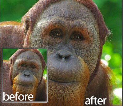
In this step by step example, I’ll show you how to use the mask to paint some additional sharpening onto an image. What I’ll do is oversharpen an image – well beyond the level of sharpening which the image should have and then I’ll remove the sharpening with the mask and paint is back over selected parts of the image – again using the mask.

While this technique is shown using Photoshop Elements you can use the same technique in Photoshop – only in Photoshop you won’t need to use the fake mask as you can add a layer mask to the oversharpened layer itself.


Step 1
Finish editing your photo. If you have multiple layers, create a flattened version of image by selecting the topmost layer and press Ctrl + Alt + Shift + E (Command + Option + Shift + E on the Mac). This creates a new composite layer without flattening the layers.

Duplicate this layer by right-clicking it and choose Duplicate Layer. You should now have two identical image layers at the top of the layer stack.


Step 2
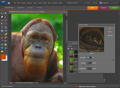
Select the topmost layer and choose Enhance > Unsharp Mask and apply excessive sharpening to the image. What you want is an extremely oversharpened image. You don’t want halos, just very heavy sharpening. In this example, I’ve used a radius of 2, a threshold of 0 and the full amount of 500. Click Ok.


Step 3
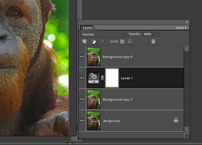
Add an adjustment layer by choosing Layer > New Adjustment Layer and choose either Levels or Brightness/Contrast or Hue/Saturation – you need an adjustment layer that doesn’t do anything to the image if you don’t alter its settings. Click Ok and don’t make any changes to the adjustment layer settings. Drag the adjustment layer so it sits between the two image layers.


Step 4
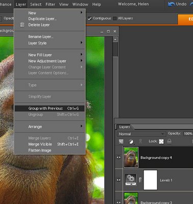
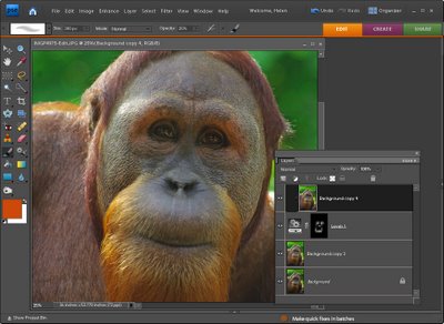
To create the fake layer mask, select the topmost oversharpened layer and choose Layer > Group with Previous. This attaches the oversharpened layer to the adjustment layer below limiting the effect of this layer to the area that is white in the adjustment layer mask – right now that is all the top layer.


Step 5
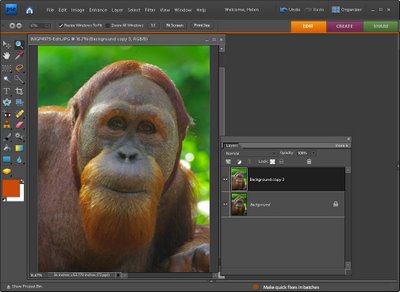
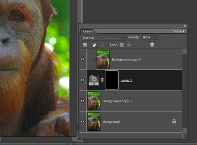
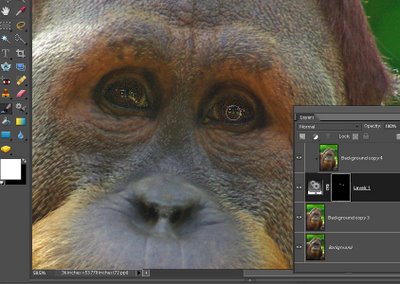
Click on the adjustment layer and click on the layer mask thumbnail which is the white box on the right side of the layer in the Layers palette. You should see a double border around it indicating that it’s selected. Fill this mask using the paint bucket tool with black. The entire oversharpening effect is immediately removed from the image.


Step 6
Select the brush tool and select a soft round brush. Adjust the opacity to around 25 percent and select white as the foreground color. With the layer mask thumbnail still selected, paint over the areas of the image that you want to apply additional sharpening to. In my case, I wanted to oversharpen the eyes on the orangutan.


Step 7
As you paint, the sharpening effect will built up – if you paint somewhere by mistake, set black as the foreground color and paint out the mistake. This is how a mask works – you paint with black to remove the effect on this layer (in our case you paint in black to remove the sharpening effect form the layer above because the two layers are grouped together) and you paint with white to reveal the effect.

When you are done, you can flatten the image or save it as a layered PSD file.

In future whenever you need to use a layer mask in Photoshop Elements, simply apply an adjustment layer to the image, drag it under the layer it should control and group the layers together.

Learn more: If you’re interested in learning more about sharpening, check out my very popular post on Understanding the basics about Sharpening.

Helen Bradley

Friday, June 26th, 2009

Wrap text over an image in Publisher


Wrapping text around and over an image works differently in Microsoft Publisher to the way it works in Microsoft Word, and confusingly so. It is not possible to wrap text around an image in Publisher in such a way as to have your text actually overlap the image. You can do it in Word but not in Publisher – Go figure!

In Microsoft Word you can use the edit wrap points feature on an image to wrap text over an image so the text appears over the image. If you try to make Publisher work like Word and try to wrap text using the Edit Wrap Points feature, portions of the image will be cropped away when you move the wrap points inside the image. Frankly the process is stupid and it really shouldn’t work this way, particularly in a DTP program.

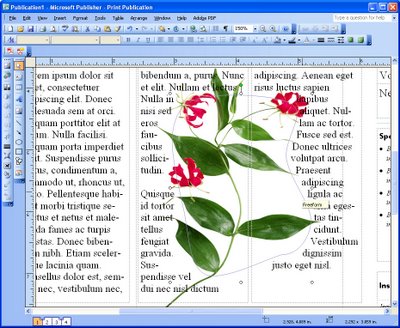
There is, however, a workaround for this limitation in Microsoft Publisher. So, if you need to wrap text across an image, insert your image into your publication and insert a freeform shape over the top of it. This shape should be the shape that you want the text to wrap along.

Then configure the shape’s wrapping option so that the text wraps tightly around it. Configure the image so that text doesn’t wrap it at all – so use an option like None. Then position the image so it appears under the text, set the fill for the text box to No Fill so you can see through it to the image underneath. Set the Fill and Line Color for the freeform shape to No Fill and No Line.

Note that text wrapping can be controlled this way in print publications but it does not work with web publications because of the limitations of HTML code.

Helen Bradley

Thursday, June 25th, 2009

Automatic thank you for following software for Twitter


I got an automatic thank you from someone I followed on Twitter the other day and it felt neat and personal. I thought it would be a good idea to do this for my new followers too.

So, I headed over to http://twitterdmer.com and did the deed. You simply sign up with your twitter ID and password and select one of the custom thank yous or create your own.

I made my own with a link to my blog since most folks who follow me are interested in Photoshop and Photography so I want them to be able to easily find my blog too.

Click Enable and you’re done. It takes around 30 seconds and it’s personal and very cool!

Helen Bradley

Thursday, June 25th, 2009

When to use your camera’s flash and when not to

Depending on how you use it, your camera’s flash might be your best tool for lighting a shot or the fastest way to ruin one. It’s all in how you use it, and when.

In this post I’ll show you how to tame your camera’s flash to ensure it works for you and not against you.

Configure the flash
The first step for using the flash on your camera is to knowing how to configure it so you can, in an instant, turn it on or off as required. If you’re unsure, check your camera’s manual to see the flash options you have, how to identify what the current flash setting is and how to change it.

This is vital even if you only ever shoot out of doors in full sun – that is, surprising as it might seem – one time you should use your flash and it’s one time your camera won’t default to using it. So, you need to know how to force the flash to fire.

When you are checking for flash options you’re sure to find that your camera has a redeye reduction flash option. This makes the flash fire twice, one low strength flash and one full strength flash. The first flash shrinks the pupil size of your subject so that you’re less likely to get a redeye effect in your photo.


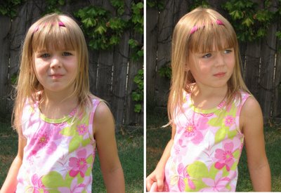
The image on the right was shot with a fill flash to light the young girl’s face – it is a better photo than the one on the left.

Unfortunately your subject often misinterprets the purpose of the first flash and thinks the photo has been taken so they move away and you lose the shot.

It is often a better solution to disable the redeye reduction flash and use your photo editing software to remove redeye later on. You can reduce the redeye effect other ways too, one easy option is to increase the room lighting – the lighter the surrounds are, the less likely you are to get a redeye effect.

Some cameras also have a flash intensity setting so you can set the fill flash to flash but not at full power so you don’t blow out your subject’s skin but you still get a nice light.

How far can you flash?
If you’ve tried using a flash at a night time sporting event or concert you’ll know it is pretty ineffectual. The range of your camera’s flash is around 3 yards/metres so unless you’re very close to your subject it will be of no use at all.

In this situation, turn off the flash and set the camera to night mode. Brace the camera using a tripod or on something steady and take the photo – without the flash. It might take a second to capture the shot but the result will be much better.


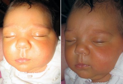
Using the flash too close to this small baby has washed out her face, turning the flash off gives a better result.

Should you use your flash on a sunny day – YES!
When you first start taking photos you’ll think that the last place you need to use a flash is in full sun. Long time photographers, however, know that full sun is misleading and someone standing in full sun in front of a landscape, streetscape or beach won’t be correctly lit unless you stand close enough to them and use the flash to light their features. The flash won’t have any effect on the background but it will improve how your subject looks – one hundred percent.

Check your camera’s manual – some cameras have a special daytime fill flash which you should use for this situation and, if not, just use the regular flash.

Too much flash
With many point and shoot cameras the flash has a tendency to be too strong and it will wash out your subject. You have a couple of choices in this situation, either move further away from your subject so the flash has lost some of its power by the time it reaches them or diffuse the flash.

To diffuse the light, place something in front of the flash to reduce the light – a small piece of wax paper taped over the flash is one option or you can hold a small piece of shiny white cardboard underneath the flash angled upwards to bounce the light upwards – this will create a more diffused lighting effect.


This little girl was photographed in a shady place with no harsh shadows and she was relaxed cuddling a favourite toy.

Knowing when to use the flash, how to work when you can’t use it and when it’s best turned off will help you take your photography skills up a notch. You’ll be able to take great beach shots, you’ll get photos of your favourite bands at their concerts and your friends across the dinner table.

Helen Bradley

Wednesday, June 24th, 2009

Publisher: Keep lines neat


If you look at just about any magazine you’ll see that the lines of text line up along the bottom of the page. Even if there are images in some columns and not in others, everything lines up very neatly along the bottom of the page.

Publisher 2003 included a new feature which has been carried forward into Publisher 2007 and which lets you create baseline guides so you too can get professional looking results with your text.

In Publisher, these baselines let you position text so that the baseline of the text in one column of text lines up with the baseline of the text in the columns adjacent to it.

To configure the baseline guides for a series of columns, choose Arrange > Layout Guides > Baseline Guides and set the spacing and offset for your baseline. While you can create both horizontal and vertical baselines, horizontal baselines are those you’re most likely to use.

To get the best results, the Spacing setting which controls the spacing between lines of text aligned to the guides should be the same or larger than the line spacing between your lines of text. So, for example, if you are using 12 point text set the baseline to 14 points or more (typically line spacing is set to 2 points more than font point size).

Then, when you have created your text, select it and choose Format > Paragraph > Indents and Spacing tab and, under the Line Spacing options, select the Align text to baseline guides checkbox. This will re-align the selected text so that it lines up with the baseline guides throughout your paragraph.

Helen Bradley

Tuesday, June 23rd, 2009

10 Ways to Create, Copy, Blend, Merge and Save Photoshop Layers


Layers are a key tool to working successfully in Photoshop. Here are my 10 best tips for working with them:

1 Create a layer in Photoshop
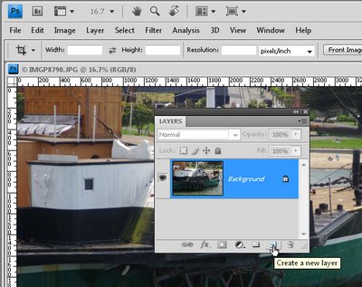
To create a new layer in Photoshop, choose Layer > New > Layer or, better still, click the Create a New Layer at the foot of the Layer palette.

2 Display the Layer Palette in Photoshop
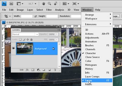
Ok, let’s go back a step first. If you can’t see the layer palette choose Window > Layers and it will show on the screen. Pressing F7 does the same thing.

3 Save Photoshop layers
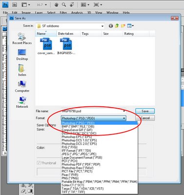
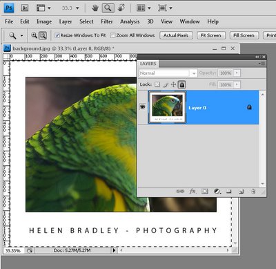
Layers are saved in Photoshop when you save the Photoshop file in a format that supports layers. The simplest format to use is the PSD format. Choose File > Save As and choose PSD from the Save As Type dropdown list.

4 Merge layers in PS
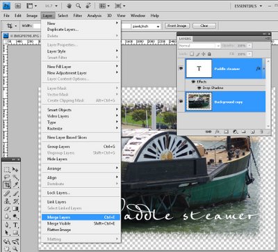
When you have multiple layers in a Photoshop imager you can merge them to flatten the file in a number of ways. You can save the image using a file type that does not save layers such as JPG. You could also use Layer > Flatten Image to flatten the image to a single layer or you can select all the layers by Control + Clicking on them (Command + Click on the Mac) and then choose Layer > Merge Layers to merge them all to a single layer but retain the layer opacity. In this case, you should save your image as a PNG or PSD file or some other format that saves transparency if you want to keep this.

5 Blend layers
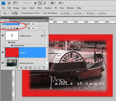
You can blend one layer into the layer below by using the blend modes in the layer palette. Select a blend mode from the blend mode dropdown list to change the way the layer interacts with those below. Some blend modes work when the two layers are the same and some don’t. They also work if you have two different layers.

6 Rotate a layer
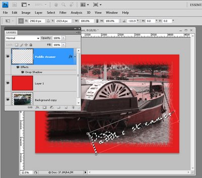
You can rotate a layer inside a Photoshop image by Ctrl + Clicking on the layer thumbnail to select the layer itself (use Command + click on the Mac). Choose Edit > Transform > and choose Rotate 180, Rotate 90 CW or Rotate 90 CCW to rotate in a fixed rotation. Alternatively, select Edit > Free Transform and you can rotate the layer by dragging on it. When you’re done, press Enter to confirm the rotation. To turn off the marching ants, press Ctrl + D or choose Select > Deselect.

7 Unlock a layer
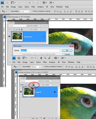
To unlock a layer (provided it is not the background layer) select the layer and click the Lock all Icon in the layers palette – if the layer is locked, this unlocks it.

To unlock the background layer, double-click the layer and press Ok to turn it into a regular layer which unlocks it automatically.

8 Copy a layer
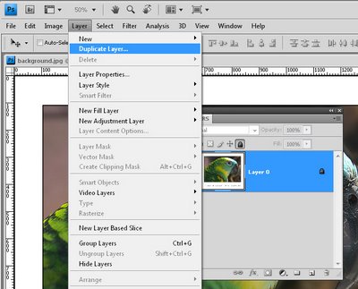
To copy a layer in Photoshop, select the layer and choose Layer > Duplicate Layer and press Ok. Alternatively, working in the layer palette drag and drop the layer onto the Create New Layer icon to create a copy of it.

9 Select a layer
To select a layer in Photoshop, hold the Ctrl key on a PC (Command on the Mac), and click on the layer thumbnail in the layer palette. This selects the layer. You will see the marching ants around the layer.

10 Flatten layers and still keep them
I call this my “have your cake and eat it too” tip. To flatten all the layers in an image to one layer but still keep all the layers intact, click on the topmost layer in the Layer stack and press Control + Alt + Shift + E on the PC or Command + Option + Shift + E on the Mac.

Helen Bradley

Monday, June 22nd, 2009

Capture great cell phone photos

You’ll probably never win a major photographic award with a photo snapped from your cell phone. But that doesn’t mean you can’t get some wonderful photos if you work within its limitations. Most cell phones lack most of the features of even an entry level point and shoot digital camera but, when you know what it can do (and what it can’t), you can capture some fun and dare we say it, artistic photos.

Let’s start with the limitations of your cell phone. First of all it probably doesn’t have a flash and, if it does, it’s range will be so small that it will be next to useless. So, taking shots in poor light or at night is seldom an option unless your cell phone has a night mode or unless you can light your subject some other way. If your cell phone has a night shooting mode, use this and hold the phone very steady to shoot in the low light as the shot will take longer to capture and any movement will ruin it. On the other hand, the cell phone probably won’t do so well in extremely bright sunlight either without some help. If your cell phone takes photos that are blown out in sunlight, see if you can adjust the exposure levels so the photos are darker and less blown out. If not, move around your subject to find the best place to shoot from – often moving around so the sun falls in a different place will be the difference between a well exposed shot and an average quality one.


As you probably won’t have a zoom on your cell phone, you need to get up close – that means moving closer to the subject so it fills the viewfinder and then some. If you’re used to having a lot of room around your subject’s face, move closer so that their face totally fills the viewfinder. Don’t worry if you cut off a person’s ear or part of their head as you do this, the photo will be all the better for doing so. If your cell phone shoots landscape mode photos, turn it on the side to shoot portrait or vice versa – the difference can have an impact on how much you fit into your shot.

Shooting right
When shooting with your cell phone, hold it steady – like any other camera the shot won’t be in focus if you move. Forget taking a photo holding the cell phone with one hand out from your body, instead, hold it close to you and, where possible, with both hands or brace it against a fence, wall or tree. Just before you shoot, take a deep breath and hold it as you take the shot, then breathe out.
© Matthew Ludgate, istockphoto.com

When looking for things to capture, concentrate on fun and whimsical subjects and think of your photos as being a be a visual diary of your life. You can snap informational subjects like bus timetables and train routes, restaurant menus or a picture of the wine label of a bottle you like and want to buy again. Instead of sticky notes, capture a picture of the note so you have the information with you. Most cameras let you use an image as the wallpaper for the phone and you can use anything for this – fun to look at or practical to use – it’s your choice.

When photographing small things that are close to the ground like pets and children, get in close – bend your knees, kneel or sit at the same level to capture the shot. The results will be more compelling when you do.

Many sites are popping up with tools and features to help you download your camera photos and do something with them. For example, Yahoo Flickr has a tool you can use to email photos direct from your camera phone. Sites like this overcome the problem with many phones of having to organise to be near a computer to download your images.

Always edit your photos where possible on your computer rather than using your phone’s tools simply because the tools available on your computer are far more sophisticated than those on your phone. Some programs like the new Microsoft Digital Image Suite 2006 have special fixing tools for camera phone photos – this removes any colour cast and noise and adds some sharpening to make the image clearer.

If your phone offers a choice of quality for capturing your images, it’s best, where possible, to choose the highest quality. Although you may not notice a difference in quality when viewing the photo on your phone, you will notice it if you’re viewing it on a computer screen or if you capture a really nice shot that you want to print.


If you’re interested in just what shots people are taking with their camera phones, visit this Flickr cell phone stream and check out the gallery there. You’ll find a range of subjects and you just might be inspired to try some of them yourself.

Helen Bradley

Page 1 of 3123