Wednesday, November 28th, 2012

5 Techniques for taking better photos

These 5 techniques can help you improve your photography today

Here are 5 techniques you can put to work today to help take better photos:

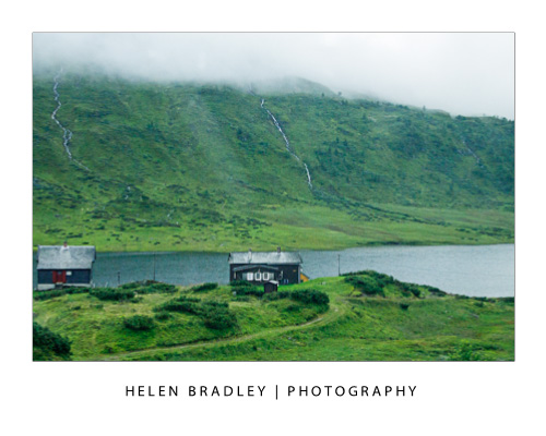
Tip 1 – Capture Moving objects

When shooting a moving object, capture it as it comes towards because as your camera can focus more easily this way.

If an object is travelling across your field of vision, follow the movement with the camera as you capture the shot. The object will be in focus and the remainder of the background will be pleasantly blurry. Or do it in reverse and focus on the background and let the subject move across the image.

In this photo I opted to keep the background in focus and the vehicles in motion:

 Tip 2 – Create a frame

When shooting an object in the distance, frame it using an object in the foreground such as an overhanging tree or an arched window. The frame will invite the viewer to look into the image.

Tip 3 – Focus and shift

To focus on an object off centre in your photo, point to the object and press the shutter release halfway down to focus on the object. Move the camera to reframe the scene and continue to depress the shutter and take the photograph.

In this image I focused on the boat on the right then reframed the image before capturing the shot.

Tip 4 – Reflections

Look for interesting items to reflect your subject in. Faces can be reflected in a car’s rear vision mirror and buildings can be reflected in a puddle on the footpath. Images of objects reflected in shiny surfaces often result in more compelling images than would be the case if you simply photographed the original object.

 Tip 5 – Get down low

When photographing pets and children get down to their level so you capture the child or animal face on rather than photographing the top of their head. If shooting from above, get a lot higher and get your subject to look up as you take the shot.


Helen Bradley

Tuesday, October 30th, 2012

7 Camera Settings for Capturing Better Photos

Whether you are using a Point and Shoot or a DSLR camera here are seven camera settings that will help you capture better photos:

Tip 1 – Adjust for light

Most digital cameras, in particular SLRs, let you select ISO film equivalencies. Choose 100 – 200 sensitivity for photographing in bright light conditions and use 400 – 800 when there is less light.  In very poor light you can capture at 3200 – 6400 or higher but you will find that, as a result, there will be more film grain visible in the final image a a result.

To capture an image like this at night you should have an ISO setting of at least 800 -1600 or higher and a tripod to steady the camera.

Tip 2 – Choose your mode

Most cameras, in particular point and shoot cameras have settings for portrait, landscape, night shooting, sports, etc. Choose the correct mode for the type of conditions and the camera will automatically configure the ideal settings to ensure the best shots in the available light conditions.

For an image like this choose Landscape mode so it is all in focus.

Tip 3 – Depth of field

Use your camera’s Aperture Priority setting and set the aperture to a small f stop such as 2.8 to capture photographs with an interesting depth of field. Focus the camera on the object to appear in focus and, when you do, objects in front and behind this object will appear pleasingly out of focus.

Here I focused on the girl in front with a very small f stop and she is in focus – the girl facing us is not.

Tip 4 – Axe the digital zoom

Of the two types of digital camera zoom, which you will find in both point and shoot cameras and camera phones only Optical Zoom is a true zoom . If your camera offers digital zoom it is best to disable it or avoid using it. Digital zoom merely increases the size of the image captured and crops away the area not required. Optical zoom actually zooms into the scene to capture it at full size.


Tip 5 – Adjust exposure

Avoid over or under exposed photos using your camera’s exposure compensation settings. These can usually be adjusted to somewhere between -2 to +2EV. To lighten a shot use + values and to darken one, use – values.

Here is the same Boston building captured at -2, 0 and +2 exposure – the one on the right is the better exposed shot.

Tip 6 – Set the correct White balance

Different light sources throw different color casts onto your photos. For instance, inside lighting such as florescent and tungsten globes will throw blue/green or orange tints onto your image. When shooting indoors without a flash, set the white balance mode to match the light source, to remove any undesirable color cast.

This camera is set to an ISO of 80 (suitable for a very bright day) and AWB – Auto White Balance – this  means the camera will adjust the white balance – not good for indoor shooting but should be fine out of doors in full sun.


The image on the left was shot in tungsten light with no white balance adjustment. The one on the right was shot in the same position but with white balance set to tungsten light – the color is much improved.


Tip 7 – Set the Flash

Use your flash when capturing portraits on a very bright day. While it may seem counter productive, the flash will light your subject’s face and avoid the deep shadows that the overhead sun will cast on their face.

On the left the little girl is captured with no flash and over head sun. On the right I fired the flash and her face and clothes are more evenly lit.


Helen Bradley

Monday, October 29th, 2012

Lightroom – Faux Orton Effect

Learn how to create a Faux Orton Effect in Lightroom, which produces intriguing photos using glowy colors and contrasting details. I also demonstrate how to save the effect as a preset to reuse over and over again.


Transcript:

Hello, I’m Helen Bradley. Welcome to this video tutorial. In this tutorial I’m going to show you how to create the Orton effect or a faux Orton effect on an image in Lightroom.

I have an example of the Orton effect that we’re going to create here in Lightroom. This is the original image and this is the image with the Orton effect applied to it. What I’ve done is I’ve softened the image and then tried to boost the blacks a little bit. You can’t get a true Orton effect in Lightroom because you can’t apply layers in an image. So what I’m trying to do is to bring in some of the characteristics of an Orton effect, a slightly lighter more glowy sort of image with some sharp blacks in it and a sort of hazy look to it. So let’s see how we might do this.

With this image open in Lightroom, first of all I’m going to the Develop module and I’m going to upgrade this one because it’s been worked on in earlier version of Lightroom. So I’m just going to upgrade it to the new process version. And I’m happy with that so let’s just go back to the image that we’re working on. I’m going to make a virtual copy so we can see how far we’ve come. And we’re going to be working on this virtual copy.

Now the first thing I’m going to do is just adjust this image. I’m not so much worried about the histogram as I am about getting some things out of this image that I want to get out of it. But I’m going to turn off the highlight clipping because I’ve got that turned on here. You can see highlight clipping is showing here. So I want to hide this for now. Let’s turn off the histogram and let’s just adjust the image a little bit. I’m just going to set my black point. You can see I’ve got the Alt or Option key held and I’m just trying to darken this to get some blacks in the image. It needed quite a bit of darkness in the image. And let’s go up with the whites right now.

Okay, so once I’ve got the image adjusted reasonably well to get a little bit of contrast and I’m starting to see some blacks let’s start going for this Orton effect. And one of the things we’re going to do is to reduce clarity. So we’re going to bring the clarity right down on this image. I do want quite a bit of vibrance because I want a quite a bit of color. And now let’s go and add some more reduced clarity. I’m going to click the graduated filter. Now this allows me to apply a graduated filter to the image. And it needs to be anchored to a side of the image. So I want it anchored to the top so I’m just going to drag down here to create it. And because it has saturation set to minus one hundred what we’re seeing is that we’re seeing no saturation in this images at all. So that’s convincing us that this is the graduated filter. Of course I do want saturation in that image so I’m going to take it back to normal but I am going to reduce clarity. And that’s adding some more of that softening effect to this image. And I’ll click Done.

Now I can boost that even more by adding a second graduated filter to do exactly the same thing. So again, clicking on Graduated Filter, making sure I select New. This time I’m going to drag up. It doesn’t matter whether I go up or down but I just want two filters on this image. So I want to add the effect. So here’s the second filter. Again, the default on this one is for saturation to be minus one hundred. I just want to take that back to normal. And what I want to do is kill the clarity. And I can also kill the sharpness by taking that down a bit too. I might increase the exposure a little bit more in the way of highlights. And I can go to this one as well, click on this and again, bring down the sharpness on this layer, just tweak that a little bit and maybe add a little bit of exposure and highlights on that one, maybe even some shadows until I get the effect that I’m looking for. And I’ll click Done.

At this point I may want to come back and re-adjust my blacks on the whole of the image. You can see that the blacks have been affected by that adjustment and I don’t have nearly as much black as I had before. So let’s go in and adjust the blacks. Having done that I’ve brought way more black in I think than I want. So let’s just go and bring up the highlights a bit on the basic image underneath all those adjustments, and again, kick up the shadows a little bit.

So there’s the basic Orton effect applied to the image and having done that I could just go onto the next image. But I could also make this a preset that I can use in future. In the Develop module I can go up to presets here and I can click the plus symbol. So here we are New Orton because I think I have an old one, okay, and I’m going to select which options I want in there. I do want graduated filters. I didn’t use split toning. I did use color. I did use process version and calibration. I didn’t use any post-crop vignetting or grain. I didn’t use any lens correction or noise reduction here. I did use some color. I didn’t use any sharpening so I’m going to that out. I didn’t use any tone curve adjustment. But I did adjust clarity and I did adjust these settings. I didn’t adjust white balance. So now that I’ve made a selection of everything that I want added to this particular develop preset, I’m just going to click to create it.

Now this is a new Orton preset. And of course it’s been applied to this image by default. But let’s go and get another image shot in similar circumstances to this and let’s go and apply it to this image. And all I do is to click New Orton, and it is than applied to this image. The process version is applied and all of the settings that we included including the two graduated filters here and here. The reason why I used a graduated filter and not adjustment brush is that adjustment brush cannot be included in a develop preset whereas the graduated filter can. And now I’ve got a new Orton preset that I can use with any of my images. All I do is click on the image and then click on this new Orton preset and it’s automatically applied to the images.

Now if I don’t like it I can Ctrl Z to undo it. In the case of this image that I had already applied it to I kind of like it, but I think the saturation is too much. So I can use that as a starting point for working with this image. And I can then adjust the sliders because all you’re doing by creating a preset in Lightroom is actually recording what the sliders are set at. So you can use that as a starting point and then adjust the sliders as you like from there.

So there’s how to create a faux Orton preset in Lightroom to apply to your images. I’m Helen Bradley. Thank you for joining me for this video tutorial. If you liked the tutorial please like the video here on YouTube. Think about subscribing to my YouTube channel so that you get updates whenever we launch videos which at the moment is a couple of times a week.

Helen Bradley

Wednesday, October 24th, 2012

5 Quick Tips to Improve your Photography Today!

If you want to add a quick boost to your photos, follow these five tips to take better photos today… and everyday!

Tip 1 – Get close to your subject

The single simplest way to improve your photographs is to move physically closer to what you are photographing. If you can’t get physically closer then zoom in close using your camera’s zoom.

This image was captured from the verandah of a house in the tropics so it was possible to walk up very close to the clump of bananas on the palm.


Tip 2 – Capture Close ups with Macro

When shooting an object close up, set your camera to its Macro setting which is indicated by a small flower – you can set it using either a setting on the camera itself or from inside its menus. Zoom all the way back out (macro and zoom don’t mix) and check that the camera is able to focus on what you’re shooting – if not, move further back a little and try again. Most cameras can capture shots using macro mode as close as a few inches from the object.

This flower was captured with a macro setting – one side benefit of this is that the background is thrown out of focus showing an attractive shallow depth of field.

Tip 3 – Follow the Rule of thirds

The rule of thirds is a tool for creating a dynamic composition for your image. To apply it, draw an imaginary tic-tack-toe board over the scene you see in the  camera’s LCD screen or the viewfinder before you take the shot. Position the subject of the image along a horizontal a vertical line or at the  intersection of the lines. This ensures, for example, that the  horizon appears across the top or bottom third of an image and never right in the middle.

In this image the out of focus wall in the foreground is along the bottom line of the imaginary tic-tac-toe board.

Tip 4 – Capture from an Unusual Angle

Look for different angles to shoot from. Take a portrait  from a vantage point high above the person and look for different angles when photographing classic buildings so you  capture photographs that aren’t the same as everyone else’s.

In this image the camera was positioned under the flower and facing the sky and the translucency of the flower shows beautifully.

Tip 5 – Respect the “no flash” zone

The effective radius of your camera’s flash is around 9-12 feet so it won’t work in a sporting stadium at night. Instead use a long exposure time and mount the camera to a tripod.

In the image below the short radius of the flash has lit the statue which is close to the camera. A long exposure has captured the light on the structure behind. Read this post to discover how setting a curtain flash lets you combine both flash and long exposures.


Helen Bradley

Saturday, October 20th, 2012

How to shoot from a (fast) train


Ok, I’ve struggled with taking good shots on trains for a while now. The biggest problem is that by the time I know I have bad results it’s just impossible to go back and try to fix the problem.

Recently,  on a trip between Bergen and Oslo in Norway I nailed the shoot and ended up deleting only one third of my shots. There’s no way you won’t mess up a lot of your shots when shooting from a train or fast moving car, but with these tips you can make the percentage that are keepers so much higher.

First of all you have a choice between noise and blur. You need to bite the bullet on this – you can get sharp images but you might have a bit of noise. Personally, I actually like some noise and I think it’s fine. But, if you can’t live with some noise it might be as well to pack your camera away and just enjoy the trip.

Second you need a small aperture so you get a lot of the image in focus. I shoot at 7.1 or 8 which is pretty small so it  requires a corresponding high ISO to compensate. So, I dial up the ISO to 1600 and sometimes 3200. That is very sensitive but it means I can capture at speeds like 1/2000 of a second or even much faster than that – and that freezes the motion.

Third, you need to use manual focus. Unless you have a stupid fast focus on your camera it will get caught trying to focus and refocus and you won’t ever get a shot as the train moves. The autofocus will  be confused by things going fast close like trees, tall grass and power poles. If you manually focus you can work faster and ignore distractions. I have to say, I practically NEVER shoot manual so in shooting manual in this situation I’m doing this because there really isn’t any alternative to doing so.

Fourthly, the grass is always greener on the other side of the train. You will always think your side of the train has nothing interesting and it is all on the other side. This probably isn’t the case so don’t keep running back and forth  across the train. Instead, focus on what is on your side of the vehicle, learn to anticipate what you might see so you can react to it instantly when you see it.

Fifthly, I like to sit facing backwards so things move away from me and in a window seat of course. YMMV on this.

Once you are set up, find a direction to shoot that minimizes the reflections from the train window and inside lighting and start shooting. Accept the fact that trees and poles will mess up a lot of shots but if you take more than the usual number of pictures you will get a good number of good shots. Also accept that you will miss more than you capture depending on the situation. On my trip across Norway trees, power poles, tall grass and numerous tunnels played havoc with my shooting but the skies were wonderful and I did nail some really great shots and i felt way more in control of the shooting than ever before.

So, next time you are. on a fast train traversing a continent, set your camera up and enjoy the shooting experience.

Helen Bradley

Tuesday, September 18th, 2012

Photoshop Sunburst Tutorial

Learn how to use Distort filters to create a cool sunburst in Photoshop.

Check out all our tutorials on our YouTube channel.

Complete transcript of this video:

Hello, I’m Helen Bradley. Welcome to this video tutorial. In this tutorial I’m going to show you how to create a quick and easy sunburst in Photoshop. To create my sunburst I’m going to start with a new image. I’m going to make mine 3,000 x 3,000 pixels in size so it’s a reasonable size. I’ve yellow selected as my foreground color. I’m just selecting the Rectangular Marquee Tool and just selecting about half of this image and filling it with the foreground column by pressing Alt Backspace on the PC, Option Delete on the Mac. I’m going to do Select Inverse so that I have the other half of the image selected. Again, I’ll select white as my foreground color and fill it with that color and then Ctrl or Command D to deselect the selection. So all I have right now is an image where half of it is yellow and half of it is white and it’s all on one layer. To distort it I’m going to start with the Filter Distort Wave, and that’s the first part of my sunburst. I’ll select Square as the type. And now I’m going to set the Wavelength. And you’ll find that the larger you set the Wavelength you get more of these stripes. Don’t worry that they don’t extend yet. What you’re worried about at this stage is the number of them. So I want about that number of stripes. Now I’m going to increase the Amplitude until I get stripes all across my image. So all I’m doing is square, equal values or nearly equal values for Wavelength and then adjusting the Amplitude until I get what I want in this little diagram here in this little preview window. And then I’m just going to click Ok. Before I leave here I’m just going to make sure that I Crop this because what I want is the exact same starting point and ending point. So here I’m starting on an orange stripe and I’m going to end over here on a white stripe. I’m just going to make sure that I have a pretty good crop here because that will make my wraparound work well in the next step. And the next step is to use the Filters again. We’ll choose Filter, and again this Distort option, but we want Polar Coordinates. And all I do is select the Polar to Rectangular or Rectangular to Polar that gives me the effect. If you don’t remember which one to use just flick between the two because it’s going to be really obvious which one gives you your sunburst and which one doesn’t. And obviously Rectangular To Polar is what I want so I’ll just click Ok. And here is my sunburst shape. It really is as easy as that. And I have a silhouette because I love to use silhouettes with sunburst shapes. So let’s just drag and drop a silhouette layer into here and then we can size it to suit. Now you can do all sorts of things with your sunburst effects. We could grunge this. We could texturize it. We could do all sorts of things with it. But to create it is as simple as a layer that is half of one color, half of the other color. Then you’ll Filter Distort, Wave to create a series off stripes, then you’ll Crop it so that you get the beginning of a stripe on one side and the end of the corresponding stripe on the other side. So you get this seamless sort of sunburst effect and you don’t have one really large stripe and then use Filter Distort Polar Coordinates to rotate it around. So there you have a sunburst effect in Photoshop.

Helen Bradley

Thursday, August 30th, 2012

Illustrator – recolor spirals and shapes part3

Learn how to find pieces of shapes and to fill with gradients and solid colors. Covers using the Layers panel to isolate shapes within a larger shape.

See all our tutorials on YouTube.

Text from video:

Hello, I’m Helen Bradley. Welcome to this video tutorial. In this video I’m going to show you have to recolor spirals in Illustrator and we’re going to do it the easy way. Before we start this tutorial I want to show you what we’re going to end up with. I have a shape here that I have been creating in the last few video tutorials. And I’ve showed you how to turn an oval and a circle into a shape like this using Pucker and Bloat and then Transform. And in this video tutorial I’m going to show you how we can recolor this shape. It may not be easy to see unless I point it out but this basic shape actually has a gradient fill in it. It’s a yellow to orange gradient. But the center of each of these flowers is colored orange. And some of these petals have been individually colored with solid colors. And I’m going to show you how you can create not only this Gradient Fill effect but also isolate different areas in this shape to apply different effects to them. So let’s get started. And here I have the basic shape that we’re going to work on. The trick with working with a shape like this spiral here which hasn’t been expanded so right now if I affect the colors on this particular shape I’m going to affect the colors in the entire spiral. The trick is being able to isolate the component parts. We’re going to start by applying our gradient. So I’m going to select the foreground fill and click Gradient. I’m actually going to select one of the built in gradients and we’re going to use orange to yellow gradient. Now it’s not working particularly well. But that’s fine because I’m just going to hide that dialog and go back to the Gradient Tool because now I can drag over the shape to apply the gradient the way I want it to be. If I drag from the outside across the shape the inside of the spiral becomes red and the outside is yellow. If I go the other way the outside of the spiral is red and the inside is yellow. And I just need to pick exactly what I want this shape to be. And by dragging smaller gradients I can affect more of the shape with red and less with yellow or drag the other way to add more yellow and less red. So I’m just going to find a sort of good intermediate position and call that good. The next thing I want to do is to isolate the middle of the shape and then isolate some of these petals. The easiest way to do that is to go to Window and then Layers. Now you may find that the Layers palette is a little bit confusing but it’s actually going to help us a lot here. So this is our main layer and it contains a group and the group has lots of little bits in it. So I’m just going to click these fly out menus so that I can see exactly what’s in my shape. And the thing I’m interested in right now is this bit because it’s the bit in the middle of my flower. So if I click this icon here I’ve isolated just that middle shape. And now I can fill it with whatever I like. So I’m going to choose green because it’s going to be really obvious that it’s happening. And this color is changing throughout the entire shape. Now I can isolate individual bits of my shape so I can select for example this piece here. And this is going to be this object. So I could apply a solid fill to it. I could also apply a gradient fill if I wanted to but I just want to isolate a few of these petals and just change their colors. Let’s have a look at this one. This is two around the path and that’s a good area for me to affect. I’m going to make that blue. And let’s have a look and see which this one is. It’s again two more around and I’m going to make it red. And now that I’ve finished with my layers I can just hide it. And let’s just click outside the shape and this is what we came to do. You can see that we have our gradient fill across the flower. The center of the shape is green and some of these petals have been refilled with solid colors. In future if I want to affect this shape I’m now going to have to be a little bit more discreet. If I want to affect my gradient I can come back in here, target my shape, go back to Window and then Layers and this time I’m going to hide the pieces that I don’t want to affect. So I’m going to hide the blue and the red and the green pieces. Now I have selected only the objects that are filled with the gradient fill. And now I can go back and grab my Gradient Tool and try and build up a different gradient effect for the image. I could even change the entire gradient, change the colors in it. And then when I’m ready to go back I can just redisplay these other pieces so that they are now visible. But you can see that because they weren’t visible when we applied the gradient they’re not actually being affected by it. So there we have our recolored shape. I hope you’ve enjoyed this video tutorial. I’m Helen Bradley. Look out for more of my Illustrator tutorials on this YouTube channel.

Helen Bradley

Friday, August 24th, 2012

Illustrator make complex shapes from simple pieces part1

Learn how to turn an oval into a flower and then some cool tricks for doing things with it in Illustrator. Covers using the Rotate tool.

Check out all our video tutorials on YouTube.

The transcript from the video:

Hello, I’m Helen Bradley. Welcome to this video tutorial. Today I’m going to show you how to make cool shapes In Illustrator the easy way. Before we get started on this video making shapes let’s have a look at the sort of things that we’re going to do. The first thing I’m going to show you how to do is to create this shape really, really easy. And then having created this shape all I did was duplicate it to make these shapes. And all of this is done with just an ellipse and a circle. And you’re going to see how all of these can be done really, really easily. Let’s get started with a brand new document. Now I’m just using a letter size document, RGB color space. So I’ll click Ok. Let’s just size the document and create an oval. Now I’m going to fill this oval with a purple color, and I’m just going to extend the stroke to about 4 points. Now I’m going to click the move tool to just position it where I want it to be and then select the rotate tool. Now this tool allows me to rotate the shape. And what I’m going to do is set the center point, which at the moment is here in the middle of the shape, and I want it down here. So I’m going to position my cursor there and Alt Click. And this allows me to now rotate around this location here. I want 13 petals on my flower. So I’m going to type 360 divided by 13 and Illustrator will make the calculation for me as to how many degrees I need to rotate this to fit 13 in exactly around the circle. I’m going to click Preview, make sure that it rolls forward, which is exactly what it’s supposed to do, and then click Copy. And now I’m just going to press Ctrl or Command D another series of times and each time I press one of things shapes is created and rotated. And I do that until I have my 13 petals. Now I’m going to add a center to the flower. So I’m going back to the ellipse shape. I’m going to drag in here to create a flower center. Now I want my circle over the middle of my flower so I’m just holding down the Spacebar as I draw it to make sure it goes in correct position. If I hold Shift it’ll be constrained to a circle shape. I’m going to let go now and I’m going to fill this with orange. Ok, I now have my flower shape so I’m going to select it all with Ctrl or Command A, and I’m going to choose Object and then Group. And this will group this object together so now I can operate on it as a single shape. And this is my starter shape. This is the flower that we were going to create. I’m going to select it again and this time Alt or Option drag on it because I want a few more copies of this shape because I want to show you what the possibilities are for working with a shape like this. And the first one we’re going to focus on is this one here, so let’s just zoom into it. I going to select the shape and now I’m going to transform it. I’m going to use Effect Distort and Transform Pucker and Bloat. And what this allows me to do is to create interesting effects. You can see that all I started with was an ellipse and a circle and already I’ve got a shape like this because I have my Preview turned on and I have Pucker and Bloat selected. And I can drag across here and create all sorts of different effects with my shape. If I didn’t have a really thick stroke then I wouldn’t have quite such strong black lines, but you can just determine exactly what you want. And this Pucker and Bloat will give you all sorts of shapes. Just a few extra percent and you’ll get a different shape entirely. So I’m just going to look for a good shape there and when I’ve got it I’m just going to call that done. So there’s one of the sorts of shapes that we can create just using a starting point of an oval and a circle, create a flower and then use Pucker and Bloat to create a shape like this. Let’s have a look at this flower. And this time I’m going to choose Effect Distort and Transform and I’m going to select Twist because twist allows me to twist this shape. You can see that I’m getting those curly ends to my flower. And I can go more or less. So let’s try say 30 degrees and see what that gives us. And it gives us a less of a twist. And if we go to 90 let’s see what we get there. We get a much greater twist. So you can do all sorts of things with your basic flower shape with that twist tool. And finally let’s have a look at another one of these effects. I’m going to choose Effect Distort and Transform again, and this time I’m going to select Tweak because what tweak does is actually fracture this image. You can see that we’ve got a horizontal and vertical setting of 10 percent here. And look what happens when I preview this and then go and really, really tweak it. If I choose between relative and absolute you could see I’m getting a sort of almost graffiti style effect. And it’s all done without having any skills at all in creating shapes beyond an oval and a circle. And you can experiment here with these sorts of options that allow you to get different effects from this tweak tool. So there we have a different effect from our flower. It’s obviously something very, very different but we could use this for example as a background for something later on. If we want to use this you’ll see that whenever we select it we’ve actually got our basic flower shape. Here’s a basic flower shape. Here’s our basic shape. If we want to use it elsewhere in Illustrator we may want to convert this. So we would choose Object and then Expand Appearance. And now we’ve actually got the shapes selected not the original flower, Object, Expand Appearance. And now we’ve got something the vector paths are actually around the physical shape not what it had been before we worked with at, again Object, Expand Appearance. And that would allow us then to come in and do things with the shape itself. Let’s just go and grab an object here and you can see that we can then start rescaling this portion or we can work with it in some way. But we can do things with it because it is no longer a flower shape. And we can do things such as dragging on points and making it all sorts of things. So I’ve totally messed that up there, but you get the idea as to what Expand Appearance will give you in terms of turning this flower shape into a something that then could be taken further in Illustrator, for example a repeat pattern. I’m Helen Bradley. Thank you for joining me for this video. Look out for more of my Lightroom, Photoshop and Illustrator tutorials on my YouTube channel.

Helen Bradley

Friday, August 10th, 2012

Photoshop isolate an object part1

Learn how to use Photoshop to prepare an image for tracing and painting in Illustrator with Live Paint. Shows how to make a selection on an image, how to use the Refine selection tools to refine a selection then how to convert the selection to a mask. See how to paint on the mask to fine tune the selection. See how to touch up the image to remove white by painting over it and then how to flatten and save the image as a jpg file to take into Illustrator.

The full text from the video:

Hello, I’m Helen Bradley. Welcome to this video tutorial. This video tutorial is part of a series and it’s involving using Live Paint in Illustrator. But we’re going to start in Photoshop because what we’re going to do in Photoshop is to isolate the image and get it all ready to take to Illustrator where we can trace it and apply live Paint to it. In a minute we’re going to take the image of this bathing box into Illustrator and recolor it using live paint. But before we do there’s a fair bit of work that we can do on this image to prepare it in Photoshop. The first thing I’m going to solve is the fact that this image is crooked so I’m going to select the Ruler tool. And from experimentation I already know that this image is going to look better if I straighten it based on the horizontal lines in the image so I’m just going to select that horizontal line and click Straighten Layer. And the image is now straightened and I can just crop it to get rid of the worst of the excess. The next thing I’m going to do is to isolate this bathing box. And to do that I’m going to start with the quick Selection tool because it’s just a very easy tool to use. I’m just going to click and draw on the image. And you can see that it’s jumped a little bit and gone in places that I didn’t want it to go and it hasn’t gone in places that I do want it to go. So I’m just going to drag over the bits that I want to expand it into. And in the places that I don’t want it to be I’m just going to hold the Alt or Option key down to turn it into an eraser so that we’re erasing that area from our selection. That’s a pretty good selection so I’m going to sit with that right now and choose Select and then Refine Edge because this allows me to refine the edge. I’ve got a few problems down this edge here and this edge here and there’s a bit of an issue where the tree line was. So I’m going to have Photoshop have a better look at this image and I’m going to choose the Refine Radius tool. At the moment I’m viewing the selection against white but I could see it as a black and white image. I could see it on black. That’s not actually helping me a lot. I could see overlay or marching ants. But I’m pretty happy with on white. I’m just not totally happy with my selection so I’m going to paint over the areas that I think Photoshop needs to have a better look at. And it needs to have a better look at there although that wasn’t a particularly good result so I’m just going to Ctrl Z to undo that fix and see if I can do a better selection. I think there’s a bit of a fix needed there and a bit of a fix needed down this edge here as well. It wasn’t a very good line so we’ll just undo it and try again. And this is particularly useful when Photoshop hasn’t done the best of selections. You can get it to fine-tune that selection and see if it can do a little better job. I’m relatively happy with that but I’m going to see if contrast will help me. And it seems to firm up that edge a little bit so I’m going to apply some contrast and I could see if radius is going to help. Virtually what I’m looking for here is a pretty good selection that I don’t have to do much with in a minute. I’m going to output to a New Layer with Layer Mask because that will give me a bit of flexibility and I’ll just click Ok. This is now a new layer in the image. It has a layer mask on it. I can zoom into any areas that need some more fixing such as this corner here. I’m going to bring in my tools, select the letter D for default colors, select a brush, I’ve got a fairly hard edge brush, make sure I’m painting onto the mask itself and just paint out any of these areas that I think need fixing. If I want to paint in white I’ll just press the letter X to bring that color back in and press X again to remove the color. And I’m just going to tidy up a couple of little bits here. I want to paint with white. I’m going to click and then Shift Click to paint a line to bring in this roof a little bit better. I’ll just zoom out again and just check around the image to make sure that everything is looking pretty good. I’m still not convinced that this image is straight but we’ll worry about that in just a second. I’m going to add a new blank layer to this image and I’ll press Ctrl Alt Shift E, that’s Option Shift Command E on the Mac, and that will give me the isolated image on its own layer. Now I can straighten it again if I think it needs a bit of straightening. I’m still convinced this is crooked so let’s see if this fixes it. We’ll just straighten this layer. That looks a little better to me. And I’m just going to apply an adjustment to this layer. I’m going to use Levels because this image is extremely dark and it will behoove us to lighten it a little bit before we head to Illustrator. So I’m just going to fix it a little bit. What I am a little concerned about here is these white areas so let’s just click Ok and let’s zoom into those white areas. And I’m going to select these with the Quick Selection Tool or with the magic Wand. Actually I’m thinking Magic Wand will be better here so let’s get the magic wand. It’s got a tolerance of 30. I’m just going to click on that area, click on this line here, this bit here, and there’s another bit over here. I need to Shift Click on those because they’re not being added automatically. Let’s just add them automatically so we don’t have to keep holding the Shift key down. Now that I’ve got those all selected I’m going to enlarge the selection a little bit because it’s a little on the small side. I’ll choose Select Modify Expand and Expand it by just 2 pixels. Now I’m going to add a new layer to this image, go and grab my paintbrush, I’m going to Alt Click on some paint that I’m going to copy and now I’m just going to paint over these areas on a brand new layer. Now this is just flat paint going in but that doesn’t matter because that’s just going to fix this area for us. And now I can select a blend mode and I’m thinking that darker color will be a good one, that we’ll only use the green when it is in fact a darker color. And I can just drag down the opacity of this layer a little bit too because it was a lighter area of the image. But I don’t want it be pure white because I just don’t want white in my image when I get to Illustrator. So Ctrl D to deselect the selection. And let’s just zoom out again. And that’s my finished image and it’s ready now to head to Illustrator to actually do something about recoloring the image. This is the image that we started off with here and this is the one that we’ve ended up with here. So I’m going to save this, choose File, Save As and I’m going to save it as a JPG image. And then we’ll come back in a next video in Illustrator and do something with this image.

Go and see all of our video tutorials on our YouTube channel

Helen Bradley

Friday, July 27th, 2012

Fixing Animal Eyes in Lightroom

Learn how to add impact to your animal and bird images with this smart and easy Lightroom fix.

Come and see all our video tutorials on our YouTube channel.

Helen Bradley

Page 7 of 8« First45678