Monday, September 15th, 2008
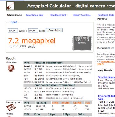
It’s a confusing question for new camera buyers. You think you want to print at 8 x 10 inches but just what do you need to do this? Well, as a rough rule of thumb, to print at 300 ppi you need 10 x 300 pixels in one direction and 8 x 300 in the other.
Ok, so you need an image around 3,000 x 2,400 but what is that in megapixels? Frankly this is about where my mind fogs over. It’s time to go search the web for someone who can do the math for me so I can go back to doing much more fun stuff like Photoshop layer masks 🙂
The site to go visit is the Megapixel Calculator here you simply type in the measurements you’re interested in and it will tell you how many megapixels you need (7.2 in case you were curious).
The site also has heaps of other information about a camera which shoots at that resolution including how many pictures you’d fit on various size cards, compressed file size values etc.. But don’t just take it from me, head over there and check out how useful it is.
Helen Bradley
Labels: calculating megapixels, camera buyer, ppi, print size
posted by Helen Bradley @ 4:40 pm0 Comments - links to this post
Monday, August 25th, 2008
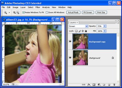
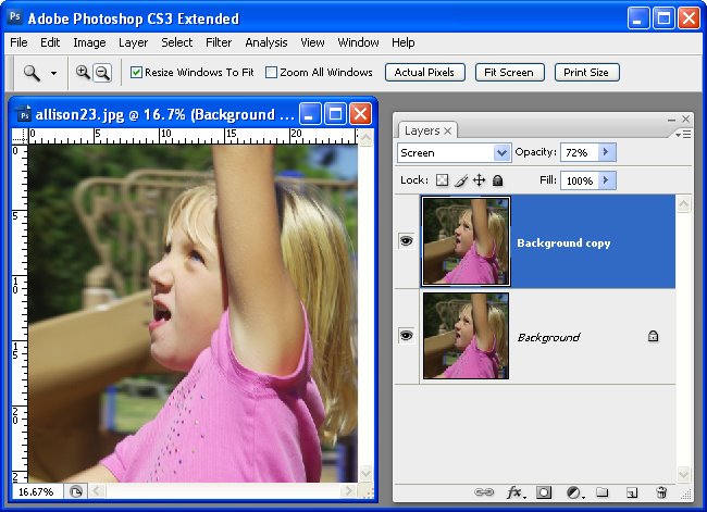
If you’re confused about the difference between the Lighten and Screen blend modes in Photoshop, here’s how they work:
The Lighten blend mode compares the pixels on the effected layers and selects the lightest to display.
The Screen blend mode multiples the pixel values on each layer and then takes the inverse so that the resulting image will always be lighter than the original.
So, use Screen mode on a duplicate of an image’s background layer to lighten the image – Lighten mode, in this situation, won’t have any effect on the image.
Helen Bradley
Labels: Lighten mode, lightening an image, Photoshop, Screen mode
posted by Helen Bradley @ 7:36 pm0 Comments - links to this post
Friday, July 18th, 2008
I love quick and dirty solutions and this one is just that. Got an image with a color cast that needs removing? Here’s a Photoshop solution worth looking at:
Open the image, choose Image > Adjustments > Color Match and click Neutralize. It’s a fix that neutralizes the image and, if it’s too much of a fix, drag the Fade slider to the right to get a balance between the original and the fixed version.
Simple huh?
Helen Bradley
Labels: color cast remove, Color match, Photoshop
posted by Helen Bradley @ 5:30 pm0 Comments - links to this post
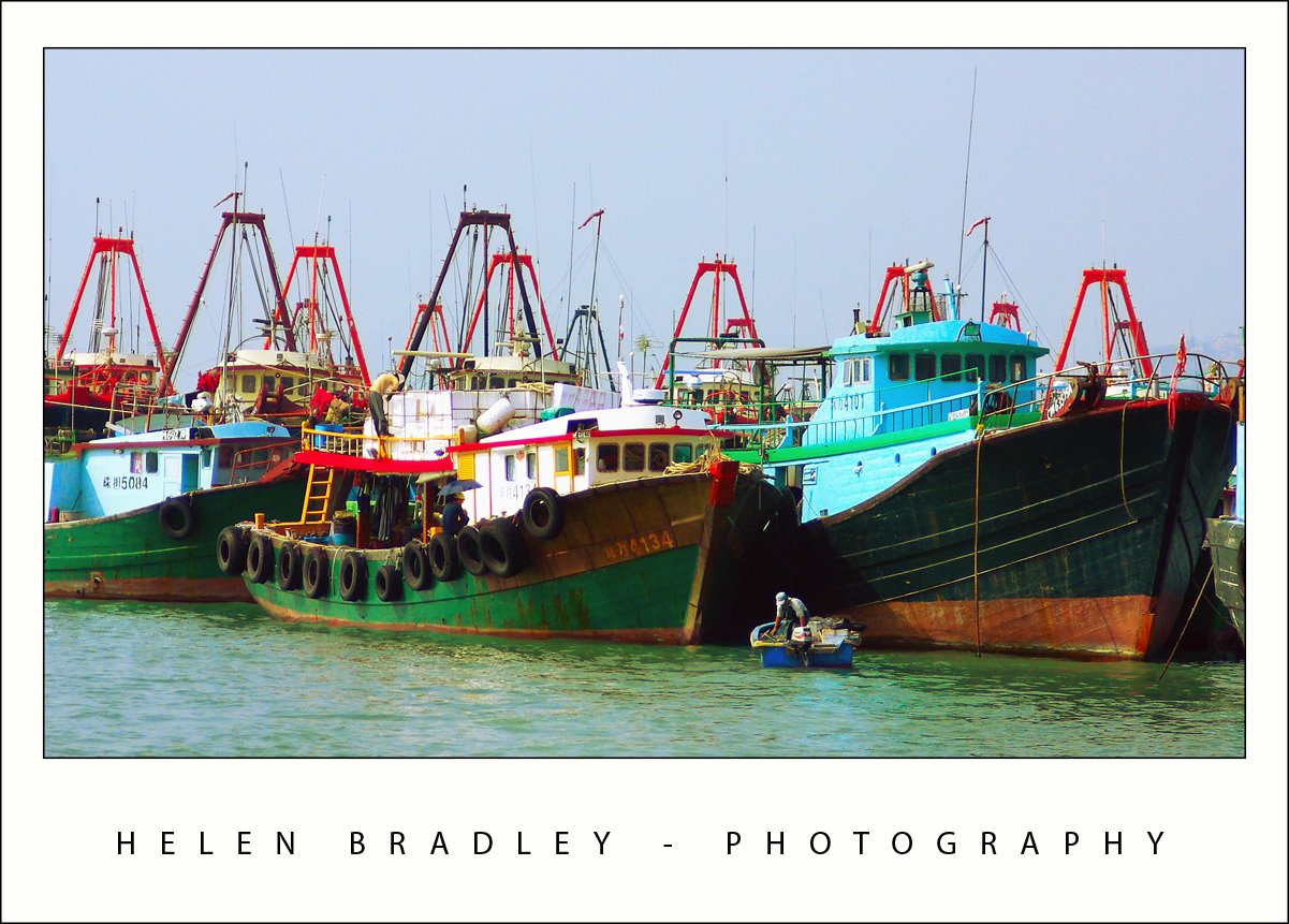
Friday, July 11th, 2008
Sometimes I really hate things I do. About a week ago I had high ideals about fixing my articles page and adding mini images to it. I slaved away in FrontPage for an hour or two and I had everything sorted out. I also added a new tutorial on creating planets, mini worlds – amazing circles – whatever you like to call them in Photoshop. Then I did something stupid. I uploaded it all but without really thinking about what I was doing. All I can assume is that I told FrontPage to synch the on and offline sites – result – it clobbered my blog – deleted everything including all my images.
Yikes. First thing I knew my Ad stats were down. I blamed Google for a day then went to see if the blog was live. Well that was a big No! Both of them totally gone. Luckily Blogger retains the text – what I lost was all the images. It has taken me a week to get this blog back up, the other one isn’t half done yet. I am seriously bummed.. what a big waste of time that was. But my articles page looks good [insert wry grin here]!
From here on in – I back up my blog images before I mess with the site. And, long term, I’m thinking about moving from FrontPage to Dreamweaver.. but first – Hey!- I have a blog to fix.
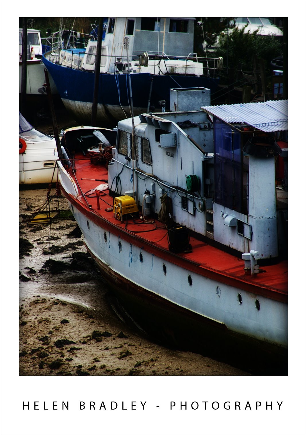
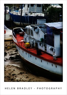
So, in the meantime, this lovely boat was high and dry in a creek near Brighton in the UK. Love the colours and the setting – this is one of my favourite images from the UK and it will be appearing in my new book next year.
Helen Bradley
Labels: amazing circles, blog, frontpage, nini world, Photoshop, planet
posted by Helen Bradley @ 3:42 am0 Comments - links to this post
Friday, May 16th, 2008
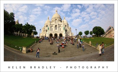
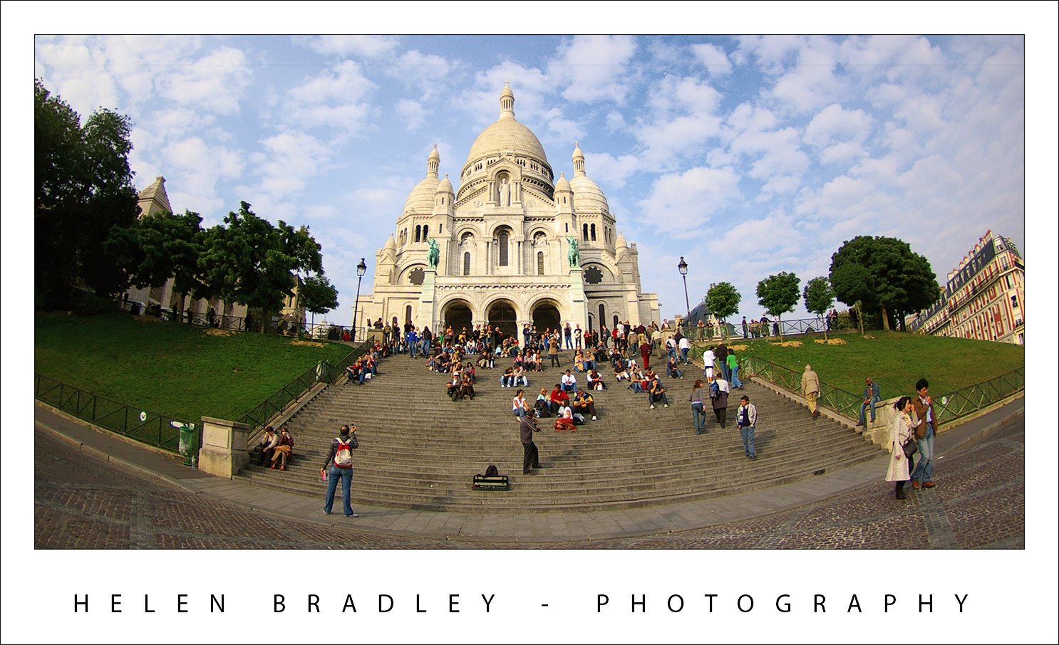
I’ll admit I fell in love with Sacre Coeur the day we visited it in Paris. While I could give the tourist trap parts of Montmartre a big miss, Sacre Coeur is magnificent. It stands tall over Paris and it’s such a beautiful building.
We were so lucky to be there on a day when cute little puff ball clouds dotted the sky. It was a scene that called out for my fish eye lens. I love this lens. It has such a wide angle that it sees so much – more than the human eye can in terms of angle, and it does funky things to buildings at the very edge of the image. With it you have so much creative potential that it’s worth lugging it around for 3 days and only using it a couple of times.
This image is here for Andrew Chow whom I met on a flight recently from Orlando to Los Angeles. We got talking – he was from Hong Kong originally so we had plenty to talk about and he was checking out some of my photos when I was organizing them. He really liked the ones of Montmartre.. so this is for you Andrew.. Enjoy!
Helen Bradley
Labels: fisheye lens., Montmartre, Paris, sacre coeur
posted by Helen Bradley @ 7:49 pm0 Comments - links to this post
Saturday, April 19th, 2008
I have never been to New Orleans, so this is a first. The mighty Mississippi has to be seen to be believed, it’s huge. I haven’t seen a river like that before – ever. You can hardly see from one side to the other and the river dwarfs the paddlesteamers and the container ships that plow their way up and down.
We spent a morning in the French Quarter, dubbed the “sliver by the river” and the “isle of denial” by locals as it remains less touched by the ravages of Katrina than other areas. We ate beignets at Cafe du Monde which is the quintessential New Orleans experience. Beignets are wonderful doughnut like square pastries piled high with powdered sugar which ends up everywhere – over your face, over the table and everywhere in between. Topped off with Cafe au lait, it’s not to be missed.
Fresh from California, where signage is in English and Spanish, here it is English, French and Spanish and it’s the deep south so it’s hot, marshy and humid but so very compelling in it’s own way.
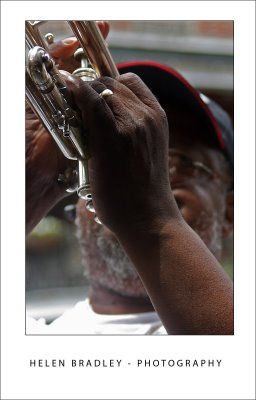
This guy was playing the trumpet raising money to rebuild his church. He was very funny and, to my delight, only too happy to let me capture some photos which I’ve promised to send him with an invitation for him to use them on his next album cover… who knows?
I had to work to get the exposure right, shooting from a covered area into a bright street was challenging and he was wearing that wonderful cap which added to the problems of lighting him without using a distracting fill flash. I had to use Curves to enhance the darks as the +2 exposure compensation muddied the blacks and blew out the highlights. The Photoshop Shadow/Highlight tool brought back enough detail in the highlights to give the images the richness I wanted to see.
Helen Bradley
Labels: curves, French Quarter, New Orleans, Shadow/Highlight
posted by Helen Bradley @ 4:21 pm0 Comments - links to this post
Wednesday, April 16th, 2008
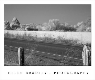
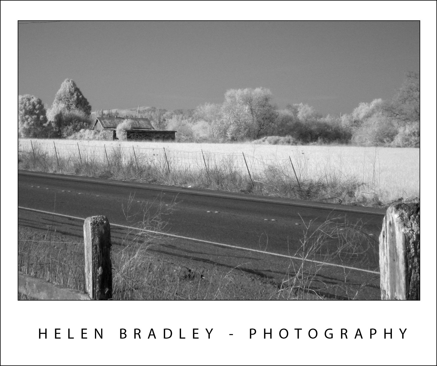
Everyone gets captivated by IR photography, right? The wonderful inverted black and whites are just too cool. Traditional IR photography is a pain in the bum. You have to put this filter over your camera lens to filter out visible light so you only get IR. Trouble is your digital camera is designed to capture visible light not IR, and digital cameras have a hot mirror filter to deliberately block IR. In all, it’s a recipe for frustration. You can’t see to check your focus or to compose your shot and you have to take really long exposures so you have to use a tripod. Forget about capturing a scene with things that move.
But, the news isn’t all bad. This image was shot with a brand new (albeit without any warranty remaining) Canon SD870 point and shoot. There is no warranty on this camera any more because 5 minutes after I bought it I shipped it to Lifepixel.com who pulled it apart and rebuilt it as an IR point and shoot. So, it captures IR, not visible light. And, because the camera is customised and only captures the light you’re wanting to capture, you can focus it, compose your shot in the viewfinder, adjust ISO and shoot moving objects – how amazing is that? I’ve only had a few minutes to test it so I took it down the road to shoot the hills and some farmland. I’m taking it to Mexico this week too.
Helen Bradley
Labels: Canon SD870, infrared conversion, infrared photography, IR
posted by Helen Bradley @ 3:39 pm0 Comments - links to this post
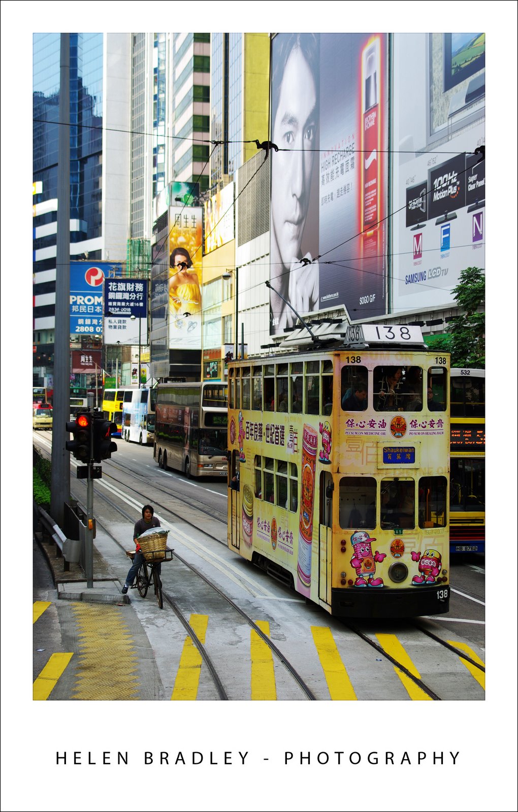
Tuesday, April 15th, 2008

One of the most wonderful things about Hong Kong is its cultural and social diversity. Along side this tram is a person on a push bike – with a basket full of things they are pedalling around town. It’s a sight you see a lot, high rise buildings, wealthy people contrasted with push bikes and mountains of laundry hanging off the sides of buildings. Gotta love this place, I certainly did.
This image needed more contrast and a bit of tweaking on the colour side to highlight its delicious pastels. My contrast fix of choice is now, officially Curves in Photoshop. But these aren’t your dad’s curves or your mums! They are curves on steroids – select the channels R,G and B and adjust each of them to get the best contrast in the image, just don’t look at colour – look at contrast. Then, when you’re done, you did apply your fix on an Adjustment layer didn’t you? Set the Adjustment Layer blend mode to Luminosity. Notice how the wonky colours disappear and your image’s contrast is adjusted perfectly? Luminosity blend mode applies the change to the image’s luminosity (lights and darks on a grey scale) and keeps it away from messing with colour – Like I said, not your mum and dad’s curves.. these are for real Photoshoppers!
Helen Bradley
Labels: blend modes, Hong Kong, luminosity., Photoshop, push bikes
posted by Helen Bradley @ 11:48 pm0 Comments - links to this post
Thursday, March 27th, 2008
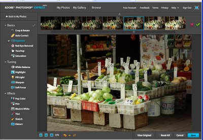
Ok, so it’s not the entire Photoshop program but it is edit to go Photoshop style and you can find it here – it’s called Photoshop Express and it’s the Beta release we’ve all been waiting for.
You register on the site then wait to get your email confirmed. Then login and upload your photos. There are heaps of great tools for adjusting your images. Of course, no layers or adjustment layers or any of the advanced stuff and you can whistle “Dixie” if you dream in LAB. However, these limitations aside there are plenty of good tools to use. These include Crop & Rotate, AutoCorrect as well as Fill Light, Sharpening and Soft Focus and even fun effects like Distort, Tint and Sketch.
The interface is dead easy to use – most options involve pointing and clicking at a display showing the effect applied at different levels, just like a linear version of the Photoshop Variations tool.
It’s well worth checking out and seeing that it’s so new, you get to snag a good URL for your gallery. But forget getting http://helenbradley.photoshop.com since I just grabbed that!
Helen Bradley
Labels: online editing, Photoshop, Photoshop Express
posted by Helen Bradley @ 5:36 pm0 Comments - links to this post
Friday, March 21st, 2008
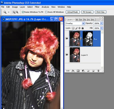
Luminosity (Luminance) masks are an interesting tool. Consider the situation where you need to apply a fix to an image but the lighter portions of the image are ok, it’s the darks that aren’t – or vice versa.
Start by duplicating the image layer and apply the fix to the top layer. Concentrate on the portion of the image that needs fixing, ignore the disaster that’s happening in the areas that don’t need fixing.
When you have the fix in place, it’s time for the fun stuff. Locate a channel which has the detail you want for your mask. You need a channel that is dark where you want the fix to be less and light where you want it more (or vice versa, as you can invert the mask). When you have your channel, Control + Click on the channel (Command + Click on the Mac) to load it as a mask. Now go back to the image and add a mask to the layer – it is automatically created as a luminosity mask based on the channel you used. So, your new mask is white where the channel is light and dark where the channel is dark. Of course, if you need it in reverse, add your mask, select it and press Control + I to invert it. Where the mask is lighter, the fix is more strongly applied and where the mask is darker, the fix is least strongly applied.
In the image above, shot in Harajuku, Tokyo on New Year’s Day, I’ve used a Luminosity mask based on the image’s own red channel to add some extra contrast and colour to the wonderful hat. I duplicated the image layer and applied a simple Overlay blend mode to that layer. Then I added the Luminosity mask to force the fix into the areas lightest in the red channel – ie where the reds in the image are located and less so in areas which weren’t red. (If this sounds wrong to you, remember that in RGB mode, the red channel is lightest where red is located and darker where it isn’t, ditto the green channel – it’s lighter where the green is and darker where it isn’t, etc..)
There’s also a handy shortcut you can use to make your masks if you know which channel to use. Use Control + Alt + 1 for the Red channel in a RGB image, Control + Alt + 2 for the Green and Control + Alt + 3 for the Blue. In LAB, the same shortcuts will get you the L, a and b channels respectively.
Helen Bradley
Labels: blend modes, Luminosity mask, Photoshop
posted by Helen Bradley @ 4:37 am0 Comments - links to this post
Tuesday, February 19th, 2008
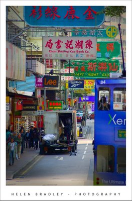
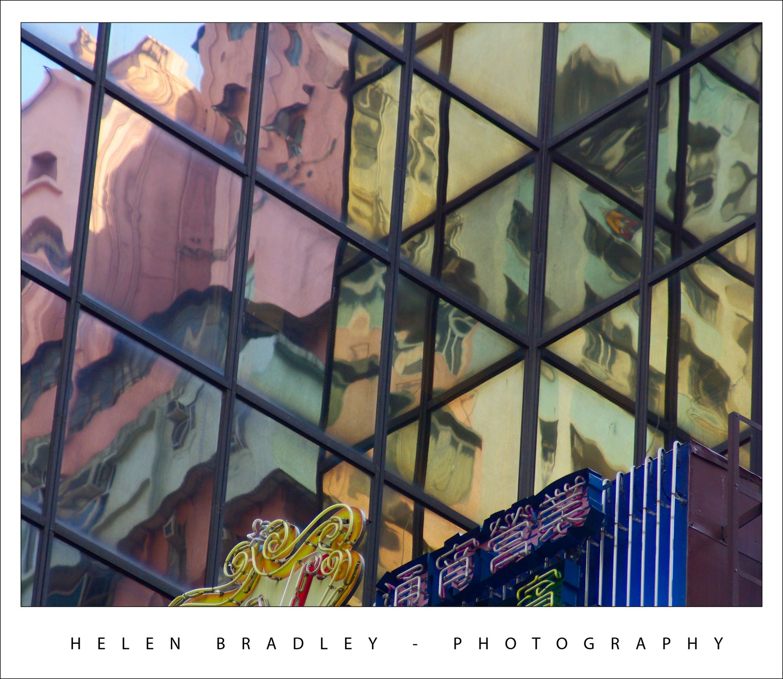
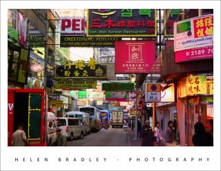
It’s hard to find a single phrase to define Hong Kong. You can be horrified by the pollution or captivated by its industry. You can long for the days of British rule or you can wonder at its cultural contrasts – a snippet of UK and a bucket load of eastern magic.
These narrow streets along Hong Kong Island were my favourite places. The trams are so beautiful, decked out as they are in advertising, each of them so different from the next and the street signs, brilliant and light by night, duller by day, an eclectic mix of Chinese characters and signs so familiar such as Lee jeans.
This image didn’t need much work. I just brought the colours out to lighten and brighten the signs then added a very subtle edge effect. This darkened vignette effect isn’t noticeable unless you look for it but it edges the photo, subtly keeping your eye in the middle where the action is by creating a slightly darker border around it.
To create a vignette frame effect, finish editing the photo and then add a new empty layer to the top of the Layer stack. Make a selection using the Rectangular marquee tool around the inside edge of the image. Invert the selection so you have just the edge selected and fill with a dark gray or a dark brown. Then deselect the selection and apply a really big blur to it – the Gaussian blur filter is the best choice here – you don’t want to see any edge left.
Now, adjust down the opacity of this top layer so that it blends with the image below. You want to be just able to see the effect darkening the edge of the photo when you look for it but not if you don’t – if that makes sense!
Helen Bradley
Labels: dark edge vignette effect, Hong Kong island., Photoshop
posted by Helen Bradley @ 7:09 pm0 Comments - links to this post
Thursday, January 24th, 2008
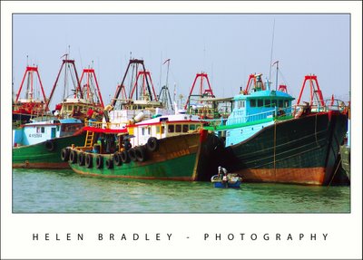
When I was in Hong Kong I went first to order chops at Man Wa Lane (Chop Alley) which is in the Sheung Wan area of Hong Kong. Chops are stamps with your name engraved on them in Chinese characters that you use to sign things. Because they are your name and your birth year symbol, they ideally are hand carved for you. I have wanted one for years and there’s no better place to get it than Chop Alley.
With a few hours to spare until I had to pick up the chops, I headed by ferry to the wonderful Cheung Chau island. There are no cars here – everyone bikes or walks and it’s just the most wonderful place. One side of the island is a fishing port and the other side is beach.
This photo is from the fishing port side. The atmosphere was horribly grey and polluted so the image was totally lacking in color as well as having a pretty ghastly color cast. First step is to remove the color cast. I use the “color by the numbers” approach of sampling white, neutral and black areas of the image and then adjusting curves until they are within the ball park of correct. Then, I took the image to LAB to boost the color using curves on the A and B channels. You can’t do so easily unless you remove the color cast first. The result is wonderful and one of a series of boat images I’m working on.
Helen Bradley
Labels: cheung chau, chop alley, Hong Kong, LAB, man wa lane
posted by Helen Bradley @ 5:07 pm0 Comments - links to this post
Sunday, January 20th, 2008

I’m not sure exactly what to say about this photo, it still takes my breath away every time I see it. It is so quintessentially Hong Kong.
Years ago they talked about taking out the trams, thankfully, reason prevailed and they didn’t. They are so unique and, in this photo, the tall tram, tall buildings and narrow roadway all work to give a wonderful perspective on this beautiful place.
Interestingly, the image can be cropped across the middle to give an equally beautiful and powerful image but, when it came to the crunch, I chose not to crop it. It’s this version that speaks to me, it’s what I saw and how I captured the scene, so here it is. Enjoy!.
Helen Bradley
Labels: cropping, Hong Kong island., trams
posted by Helen Bradley @ 5:36 pm0 Comments - links to this post
Tuesday, January 15th, 2008
Some of the best photo opportunities in Hong Kong happened around dusk as the lights began to cast their magic on the streets. The time frame is tight, you need to be there, camera in hand, and catch the mix of daylight and night light. But the rewards are definately there for the taking as shown here. This shot, to my recollection was taken in the Temple street night market area.
My new Pentax K10D digital SLR was my companion for this trip. It was its first outing so I was interested to see how it would perform. True to some reviews, as I captured mainly in JPEG format, the images lacked saturation. I did boost it in camera slightly uisng the saturation adjustment but I opted to stop short of boosting it too much in the camera and fix the images myself later on.
I did take advantage from time to time of the K10D’s push button RAW mode which lets you press a button on the case and take one RAW image. I did this when I had time to take two shots and when I had something I thought would lend itself to working with in Camera RAW.
However, and this is a big thing, in Photoshop CS3 you can open any JPEG image in Camera RAW and work with a subset of the Camera Raw functions on the image. This is a very powerful new tool and makes it easy to apply some fixes that would take more time in Photoshop – and, because you’re working in Camera RAW, the fixes aren’t saved to the image so they can be undone any time.
Curious? Open Photoshop CS3 Bridge, find your JPEG image and right click it. Instead of choosing Open, choose Open in Camera RAW and go play!
Helen Bradley
Labels: Camera Raw, Hong Kong island., jpeg., Pentax K10D, Photoshop CS3
posted by Helen Bradley @ 7:31 pm0 Comments - links to this post
Monday, January 14th, 2008

One of the things I found myself photographing in Hong Kong and in Tokyo was reflections. The images I caught of buildings reflected in other buildings are mini worlds that exist only for those who choose to see them.
Rreflections are a different reality. While the building doing the reflecting might not be visually interesting per se and the building being reflected might not be so great, the combination of the two is so wonderful and temporary.
Photographing them is as if life is rewarding you for using your eyes to see, not just look.
Helen Bradley
Labels: Hong Kong, Hong Kong island., reflections
posted by Helen Bradley @ 7:19 pm0 Comments - links to this post