Friday, March 27th, 2009

3 Step Photoshop Every Image Quick fix


Ok, so not technically Photoshop only – this tip works for any image software that supports layers, has layer blend modes and can do a gaussian blur. That includes Photoshop, Photoshop Elements and Paintshop Pro as well as lots of other great photoediting programs.

This is a very quick fix for boosting and image and giving it a really nice look.

Step 1
Start by duplicating the image layer by choosing Layer > Duplicate Layer.

Step 2
Add a Gaussian blur to the top layer by using Filter > Blur > Gaussian blur. You need to use enough radius to get a nice light blur on your image. For smaller images you need only a small value blur – say 2-4 and for larger images you will need a higher value. Click Ok when you’re done.

Step 3
Now set the Blend Mode for this blurred top layer to Soft Light or Overlay. You’ll get a nicer looking image and the colors will get a nice boost. Reduce the layer opacity a little if necessary.

This is a simple and effective fix and isn’t that the best type?

Helen Bradley

Thursday, March 26th, 2009

7 steps to throwing a Photo Party


Forget Photoshop for a day and put away your Digital SLR then grab a point and shoot, some photo paper and a lunchbox size printer and host a photo party that everyone will remember.

Make any occasion more memorable when you make it a photo party too. Instead of just taking photos, print them on the spot so everyone takes home a memory of the occasion. From weddings to birthdays and from retirements to anniversaries here is my 7 step approach to take any party to the next level.

1 Gather your tools
You will need one or two cameras – any digital camera will do and older ones are great because they take smaller images. If you have a newer camera, adjust the file size down to around 1200 x 800 in size and the quality to good (not superfine) as that is all you need to print a 6 x 4 photo quickly. Just remember to set these values back to normal after the party!

2 Grab a printer – lunch box size
To print the photos a small lunchbox photo printer is a great choice – it will print 6 x 4 and it can operate without needing to be connected to a computer. Simply pop the camera card or memory stick into the printer and start printing.

3 It is all in the planning
Test everything well before the party and get set up early on the day – you want to be able to enjoy the party not have to trouble shoot problems! I like to use one camera and two or more camera cards – in fact the piteously small cards you got with the camera are great for this job. Using it you can capture your first dozen or more photos, switch it out for a second (empty) card and get started printing.

4 Print and shoot
As the first photos are being printed, you can start capturing the next lot. Take one photo of each person or couple and don’t waste time editing or cropping photos – just set them up to print and get on with capturing more photos.

5 Share the wealth
Once you’ve finished printing them – hand out the photos to all the guests. I like to keep a laptop to one side to copy the images to so I can delete them from the cards and still have them as a permanent record in case anyone wants duplicates.

6 Fancy a part time job?
Affix pre-printed sticky labels with details of the date and occasion to the back of the photos. If you’ve had fun being chief photographer at the photo party, it’s a great sideline job so capitalize on the occasion and stick your details on the back of the photos too!

7 An album of Memories
For some parties like small weddings, showers, graduations, anniversaries, retirement parties and farewells I purchase a small album and add the printed photos to the album instead of giving them to the guests. Everyone then writes a message to the guest of honour beside their photo and the album is then given as a unique parting gift. If someone can’t make it to the party, have them send a note and a photo ahead of time so you can include it in the album.

Photo Party Check list
-Check everything works before party day
-Train a friend to use your printer and camera so they can help out
-Photograph everyone as they arrive
-Print contact sheets – they’re great for mini photos
-Have plenty of paper and ink on hand
-Delete bad photos in the camera so you don’t print them

Helen Bradley

Sunday, March 15th, 2009

Stupid Photoshop tricks #1 – hold your own photo

There are heaps of creative things you can do with your images in Photoshop and one I think totally rocks is a collage technique that turns your photo into a photo of itself. If you’re totally confused, check out the image – you’ll see a hand holding up what appears to be a Polaroid image in front of a scene – the Polaroid image itself shows part of the background scene and it’s all done in Photoshop – here’s how:


To create this image you will need a photo with an interesting subject. I’ve used a spring landscape.


You will also need a photo of your hand held as if you are holding a photo in it. Take the photo of your hand with your point and shoot camera held in one hand and your other hand stretched out in front of you. You may need to use macro mode to ensure that the hand is in focus and not the scene behind. The ideal setup for photographing your hand is with a road or carpark as the background – the contrast between your skin and the road will make it easy to select around your hand.

While you can create your own faux Polaroid image, there is a good one you can download from http://lured2stock.deviantart.com/art/Polaroid-3262470.

Open the photo of your hand, the landscape and the Polaroid image in Photoshop. Crop the hand to remove excess background.

Select around the edge of the Polaroid image and remove its excess background so you have only the image itself.

Drag the background layer from the Polaroid image and the hand image into the landscape image. Each element will appear on its own layer.


Drag the hand to the top of the layer stack and hide the other two layers. Use your favourite section tool to select around the hand and add a layer mask by clicking the Add Layer Mask icon at the foot of the Layer palette (use Alt + Add Layer Mask if you selected the background rather than the hand). Using a layer mask makes it easier later on to remove parts of the hand so the Polaroid will look like it is held in your hand.


To transform the Polaroid image so it is the correct size, Ctrl + click on its layer thumbnail and select the Move tool. Press Ctrl + T to select the free transform tool and then Ctrl + 0 (zero), to scale the image so that you can see its sizing handles. Drag the Polaroid into the approximate position it should appear in the image and size it to suit. It should appear partially covered by the hand.


Make a selection around the inside of the Polaroid image and delete it or add a mask to hide it. Select the background layer and hide the two top layers. Move the selection over the underlying image – choose Select > Transform Selection and resize it in proportion if desired.


Choose Edit > Copy to copy the selection onto the clipboard, then Edit > Paste to paste it into a new layer, size it to fit the hole in the layer above. Brighten this layer if desired. Select this layer and the Polaroid image by Shift + clicking on each of them and choose Layer > Link Layers. Rotate the Polaroid slightly.


Make the hand layer visible again. Select the brush and black paint, click on the layer mask for the hand layer and paint out portions of the hand that should be behind the Polaroid. Add a new layer below this layer and paint a small drop shadow along the edge of the fingers over the Polaroid.

Helen Bradley

Monday, March 9th, 2009

Photoshop – change the color of your house


You can change the color of anything using Photoshop. A friend of mine is about to paint her house but before her husband goes shopping for paint, she wants to know that the result will look good and that the house will blend nicely with its surroundings. It’s a job for a digital camera and some Photoshop know-how. Here’s how to recolor your house (or anything else) and save color combinations to review with someone else later on. I’ve used Photoshop CS3 but almost any version will do.

Open a photo of your house in Photoshop. I’ve used a bathing box for simplicity but the principles are the same for a house or, indeed, anything at all. You’ll need one extra copy of the background layer for each item you’ll recolor. For this image I’ve duplicated the background layer three times so I have a background layer, a layer for the house color, one for the door color and one for the trim and I’ve named them appropriately.

Start with the house layer and hide the others. Choose Layer, New Adjustment Layer and add a Hue/Saturation adjustment layer and drag the Saturation slider to -100 and click Ok. Add a second adjustment layer by choosing Layer, New Adjustment Layer, Levels and adjust the sliders until the area you’re focusing on looks like it could be painted with white paint. You want to retain the detail but lighten the area. Ignore everything else in the image for now. Click Ok when you’re done.

Now add a third adjustment layer using Layer, New Adjustment Layer, Hue/Saturation. Click the Colorize option and adjust the Hue, Saturation and Lightness sliders until you have the color that you want for the area you are working on. Again, ignore the effect on the rest of the image. Click Ok when you’re done.

Now, to limit the effect to the area you want painted in this color, select the adjustment layer just above the layer you’re working with and choose Layer, Create Clipping Mask. Repeat for the other two adjustment layers. You should see the adjustment layers indented in the Layers palette. Now, you can paint on the color. Select the layer you’re working on, in my case this will be the layer named house and hold Alt as you click on the Add Layer Mask button at the foot of the Layer palette. This creates a Reveal All layer mask so your photo should now be its original color.

Select white as your foreground color and paint over the areas you want to be coloured with the color you just selected. If you paint over something by mistake, switch to black foreground color and paint the original color back.


Step 1
For each area of color in the image, add the same three adjustment layers, one to remove the color, one to adjust the lightness and one to add color back. Create the adjustment layers as a clipping group with the appropriate layer. Finally, add a layer mask and paint the effect onto an area to recolor it.


Step 2
Because you will use adjustment layers for all the changes, you can alter the settings at any time if desired. Simply double click on the Adjustment layer thumbnail and the dialog will open so you can make changes to its settings and then click Ok to reapply it to the image.


Step 3
To save a color scheme, add a new layer at the top of the Layers palette, select it and press Control + Shift + Alt + E to create a new merged layer. Name this and turn its visibility off. Now change the colors to test a different look and save that version the same way.

Helen Bradley

Thursday, March 5th, 2009

Photoshop: Color that packs a punch


I like to see lovely saturated color in my photos but sometimes the color I capture just doesn’t do justice to the subject and it isn’t what I remember the scene looked like. Boosting the color can turn a lackluster image into one that totally rocks. So, if you find that the color in your photos is lacking, here’s what I do to make it better. The process is ridiculously simple, it requires no selections to be made, and it can be recorded as a simple action. It’s my kind of fix – quick, easy and very powerful.

A word about LAB
The fix uses the LAB color space. This is not an often used color space and it isn’t available in most other programs so you won’t be able to mimic this effect in, for example, Photoshop Elements. However, LAB has been around in Photoshop for years.

In the RGB color space you work with the red, green and blue channels and in CMYK you work with cyan, magenta, yellow and black channels. In LAB you have three channels; L, a and b. The L channel is the lightness channel and, if you adjust it you adjust only the lightness in the image and you don’t change any of the color in the image. This sets Lab apart from RGB and CMYK as color and lightness are separate in LAB where they aren’t in the other modes.

In Lab the two color channels are a and b. The a channel contains color information for the green and magenta in the image. The b channel manages the blue and yellow colors in the image. If you were to look at these channels they would look very light because they contain only color information and no lightness data.

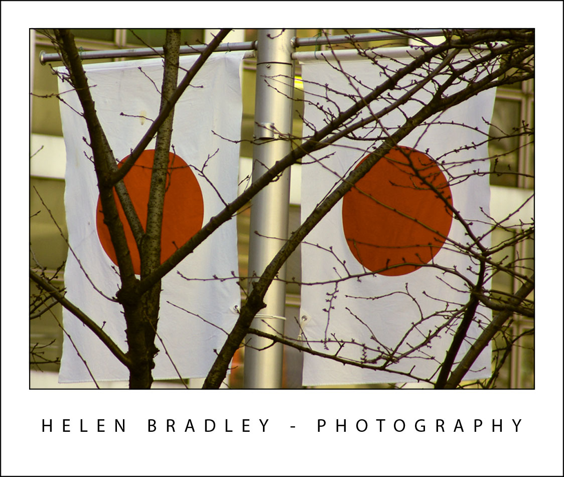
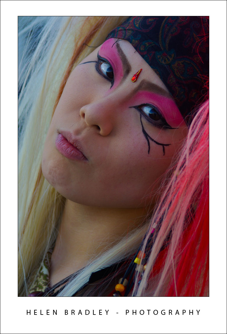
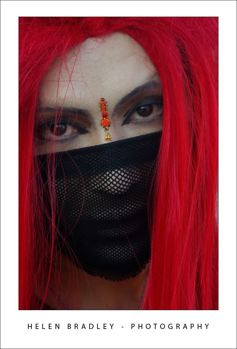
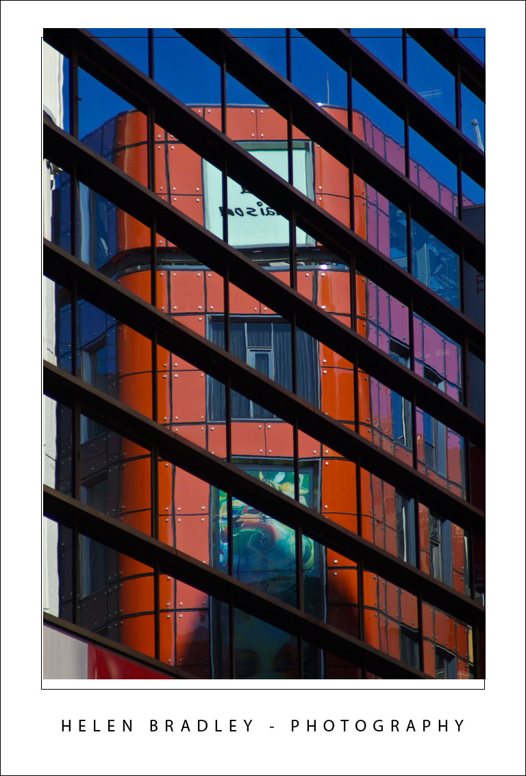
By separating lightness from color as LAB does you can make adjustments that would be difficult or time consuming to do in any other color space. However, that said, I think this fix works best on animals, landscapes and streetscapes – but not on close ups of people. On people it tends to destroy the natural skin tones.

How to fix in Lab
To see this LAB fix at work pick an image that has color in it but which you think could use a color boost.
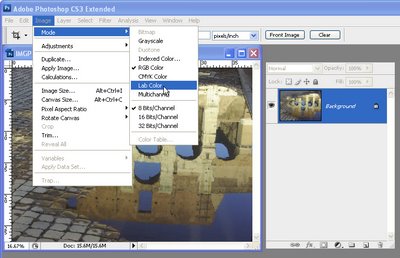
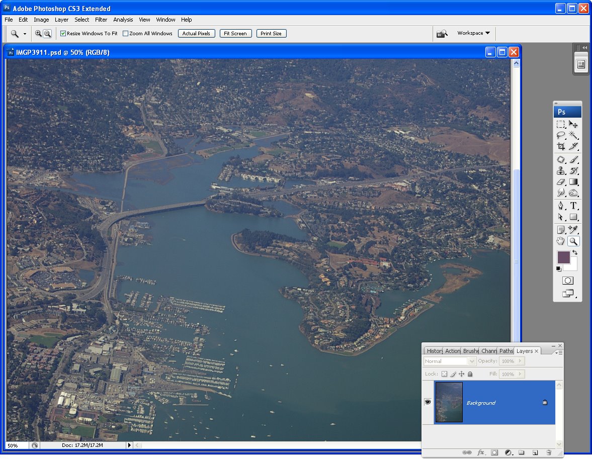
Step 1
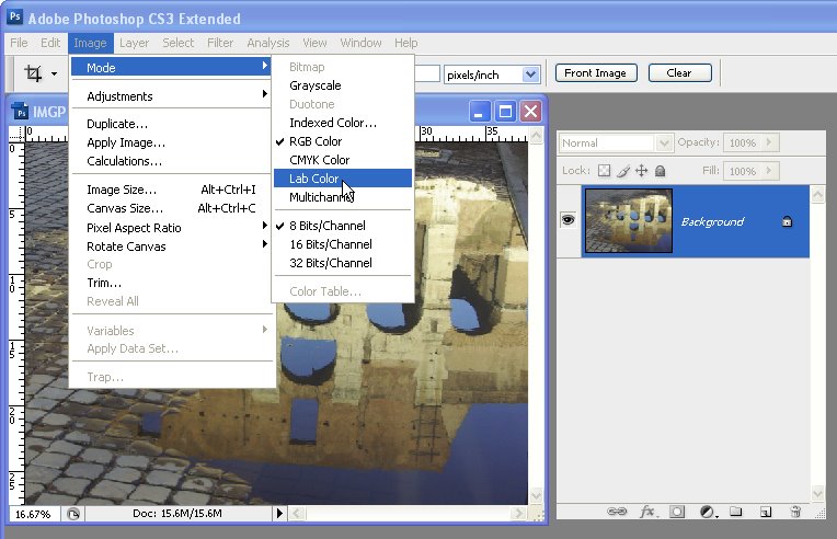
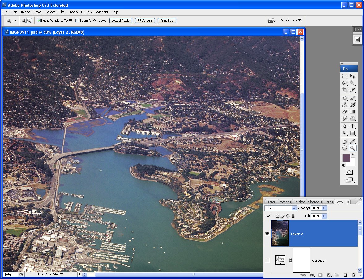
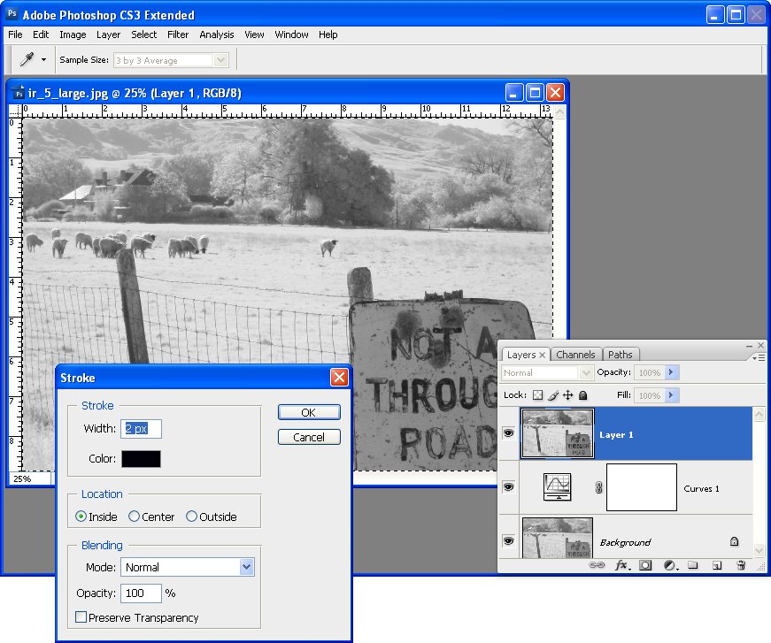
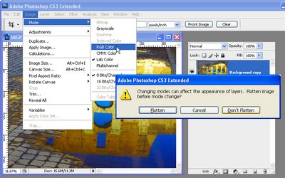
With the flattened image open in Photoshop, choose Image > Mode > LAB Color. If you’re working on a flattened image you won’t see anything except LAB/8 appearing in the title bar of the image.
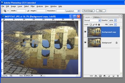
Step 2
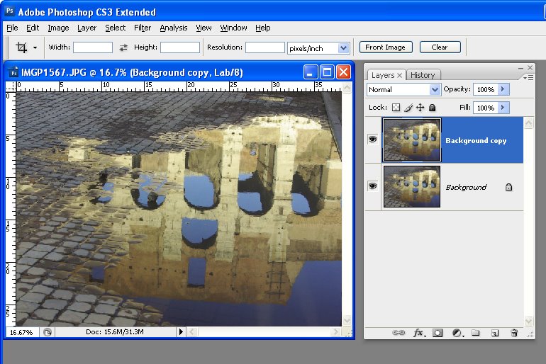
Duplicate the background layer of the image by right clicking it and choose Duplicate Layer. You’ll make your adjustments on this duplicate of the background layer so that you can blend them into the background layer later on.
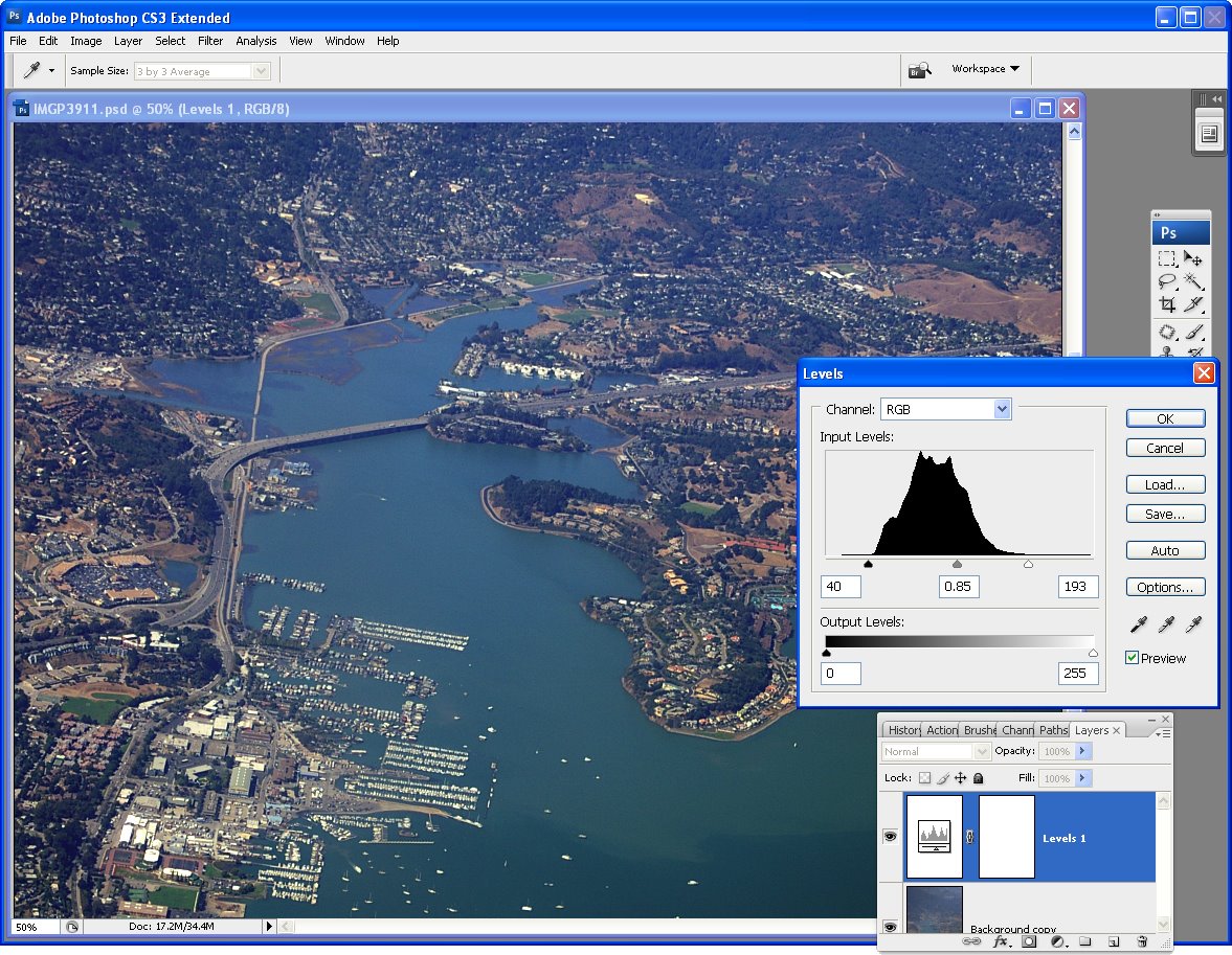
Step 3
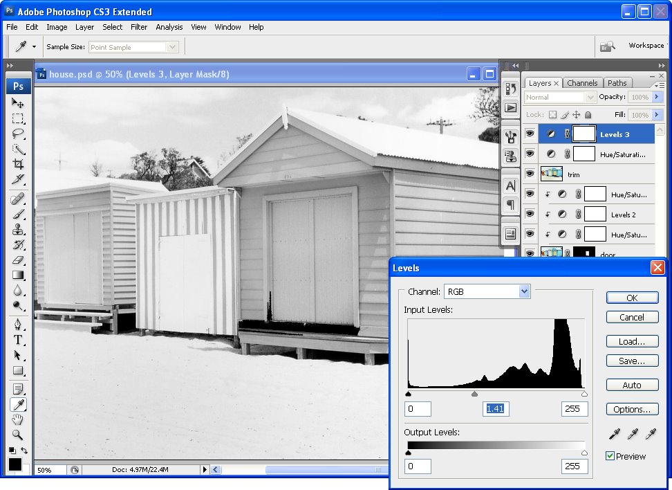
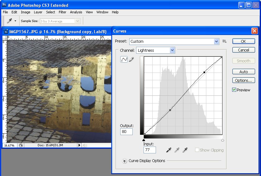
Choose Image > Adjustments > Curves to apply the curves adjustment to the duplicate background layer. Don’t use an adjustment layer as you’ll only have to flatten it on returning to RGB anyway.

In the curves dialog, the L channel is visible on the screen. This channel that contains only lightness and darkness values so that you can drag on the curve to adjust this if desired.
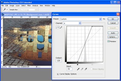
Step 4
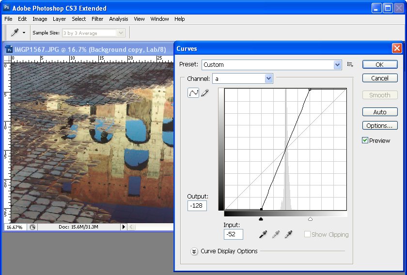
Select the a channel – this is the magenta/green channel. In a standard Photoshop setup green is on the left and magenta is on the right. Drag the bottom edge of the curve inwards 2-3 squares. Then drag the top edge of the curve inwards the same number of squares. It doesn’t matter how many squares you drag but you must drag the same number on either end so the curve line crosses the middle of the grid – this stops you from inadvertently inducing a color cast into the image.
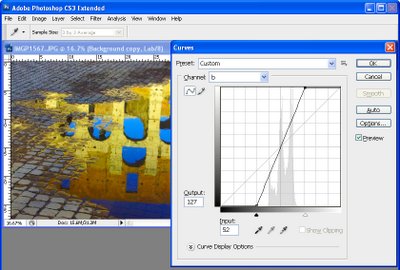
Step 5
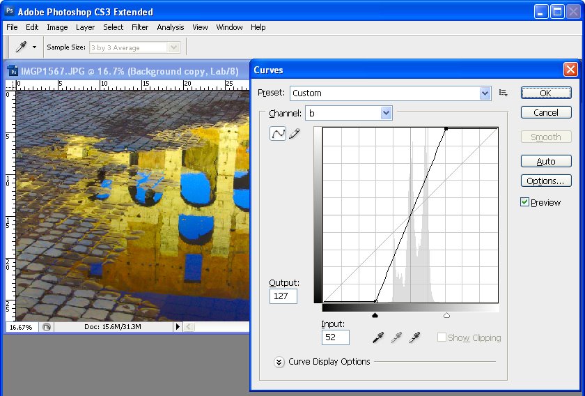
When you’ve adjusted the a curve, repeat the process with the b curve. At this point the image is probably looking very scary indeed. However, you need to make the adjustment strong enough that you get too much color rather than too little at this stage. Click Ok to apply the curve to the top image layer.

Step 6
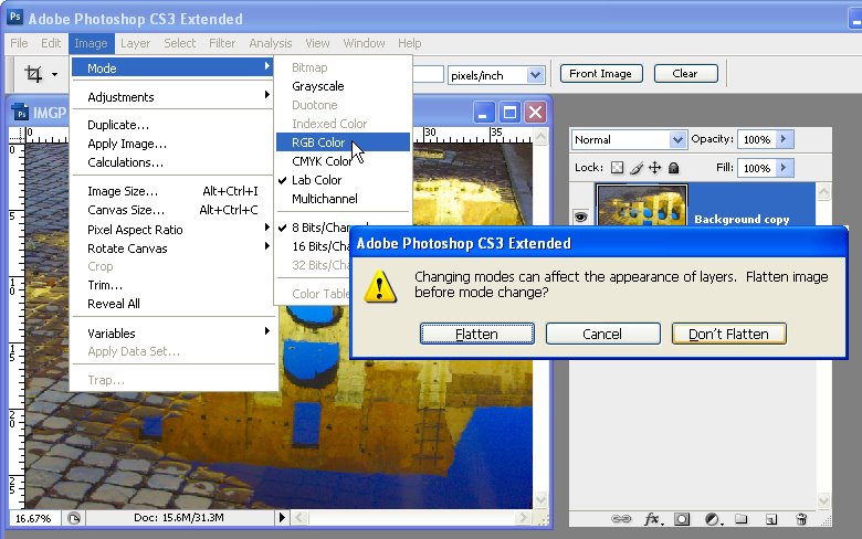
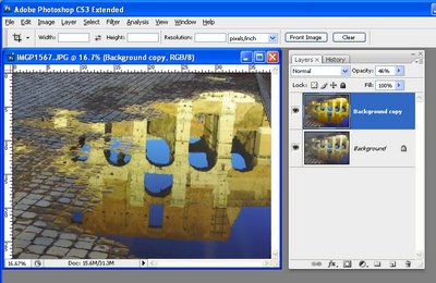
To return to RGB mode choose Image > Mode > RGB Color. When prompted, select the Don’t Flatten option. This is critical because you want both layers intact back in RGB mode.

Step 7
Now drag the Opacity slider for the top layer back to 0 so you see the original image and slowly walk the slider back up until you get the amount of color you want in your image. When you’re done, save the result.

Once you’ve done this a couple of times, you’ll appreciate how much of a boost in color you can get and how fast you can do it. Record the fix as an action and you can do it in one click and then just adjust the opacity to suit.

In some cases altering the blend mode of the top layer can yield pleasing results. The blend modes in the Overlay, Soft Light, Hard Light, Vivid Light, Linear Light and Pin Light grouping in the Blend Mode list give the best results. You can also duplicate the top layer and apply different blend modes to each copy to bring out different areas of the image.

So, if you want to produce eye-wateringly beautiful color in your photos, chances are that a Lab color fix like this is just what you need.

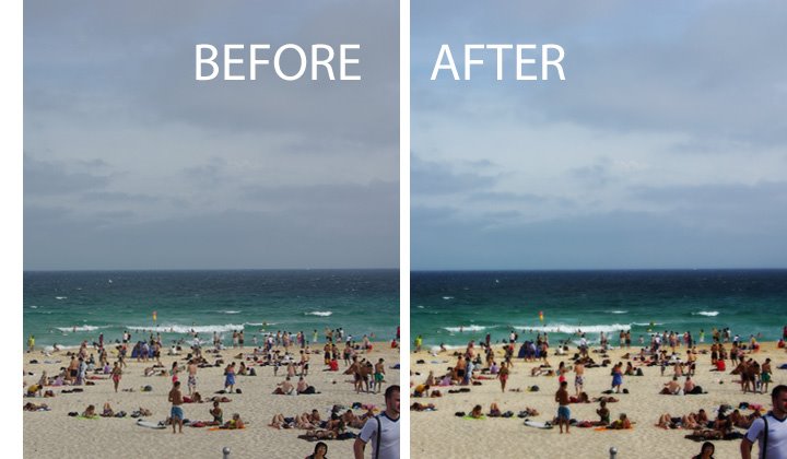
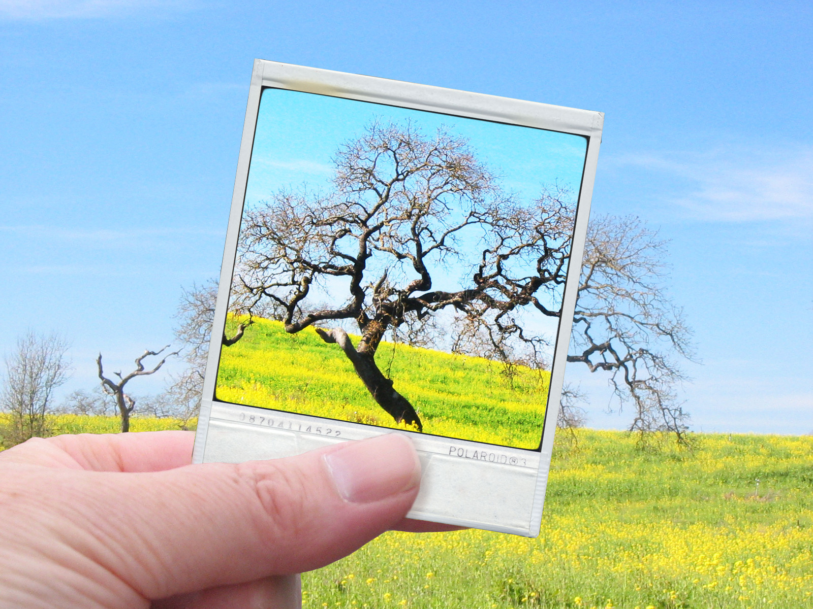
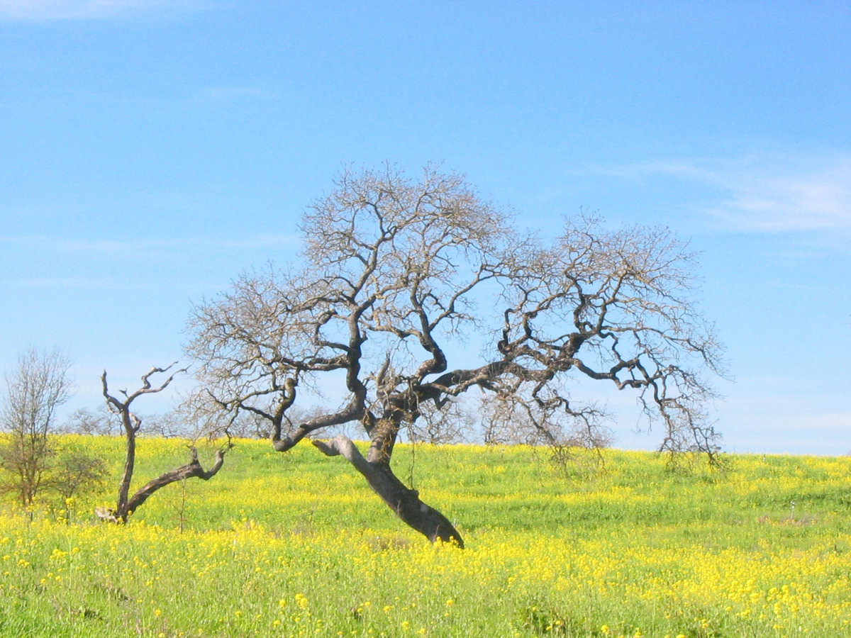
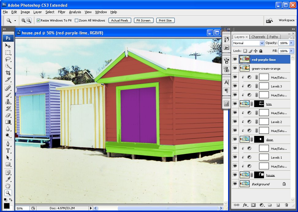
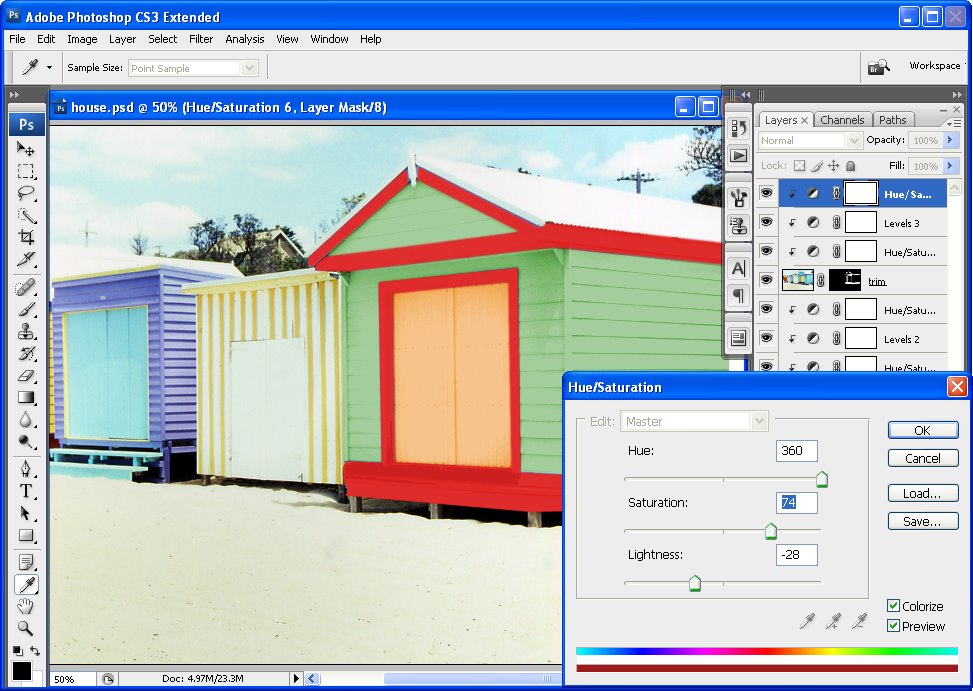
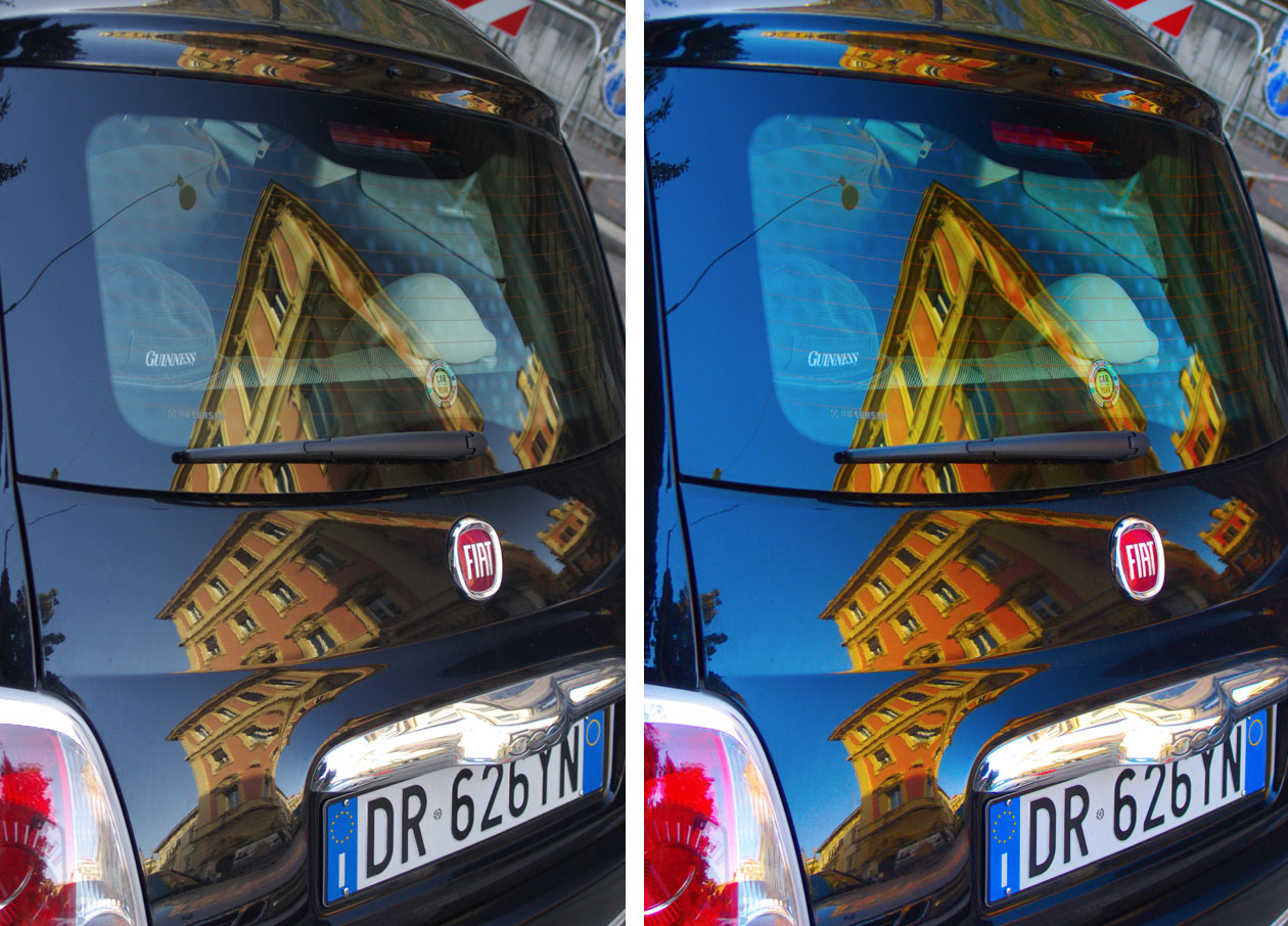
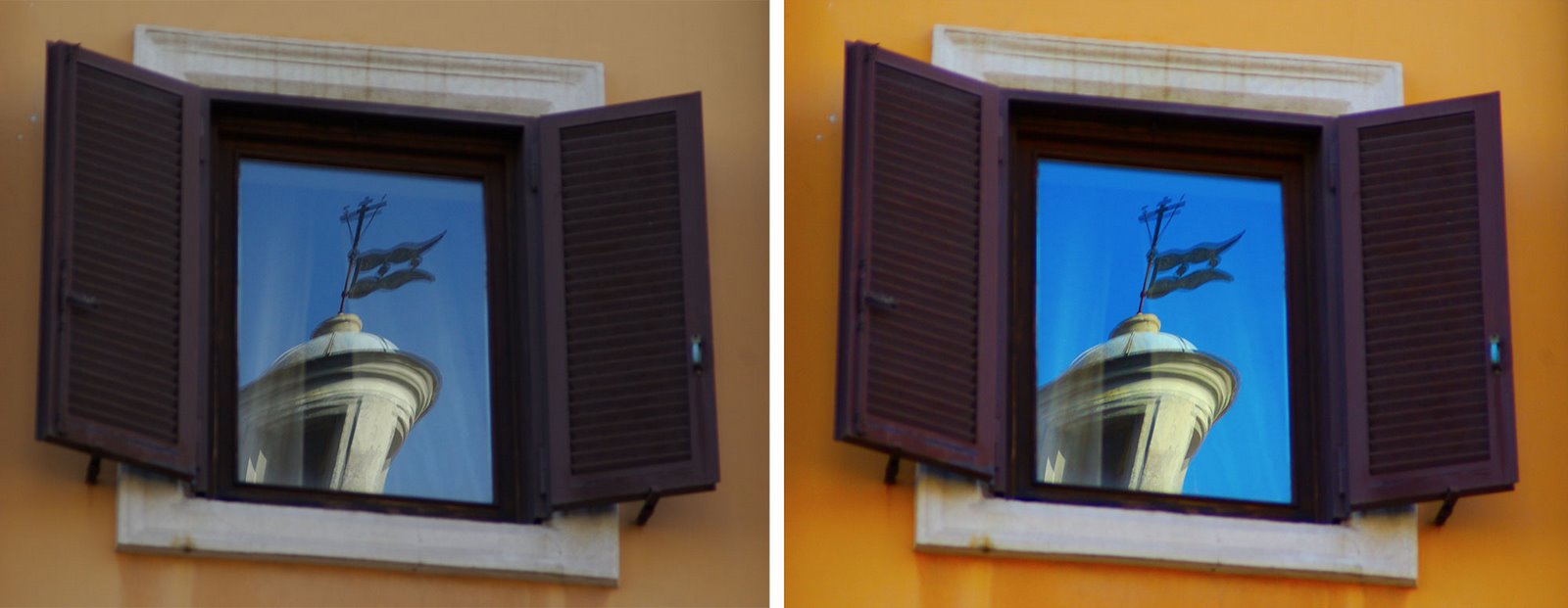
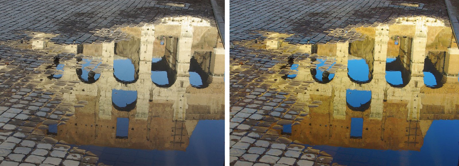
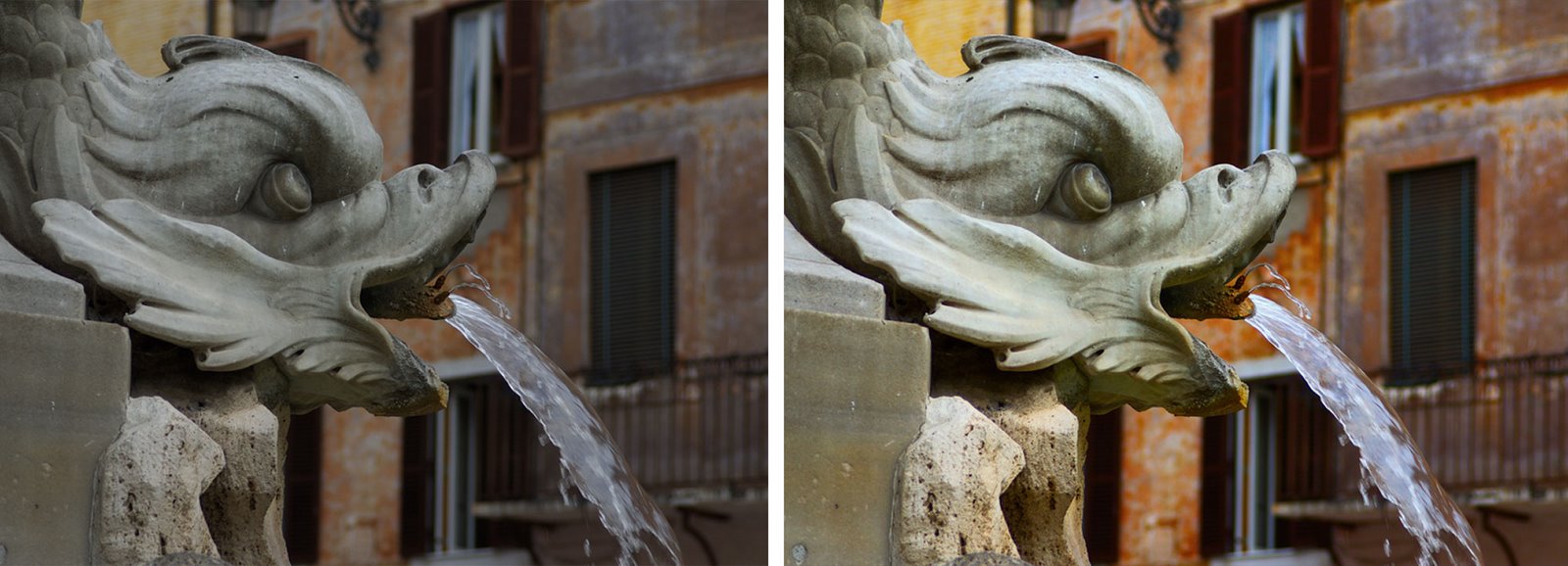
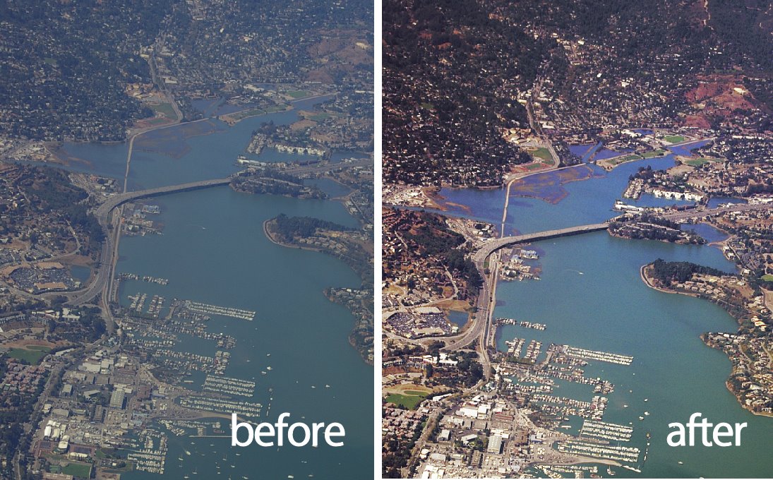
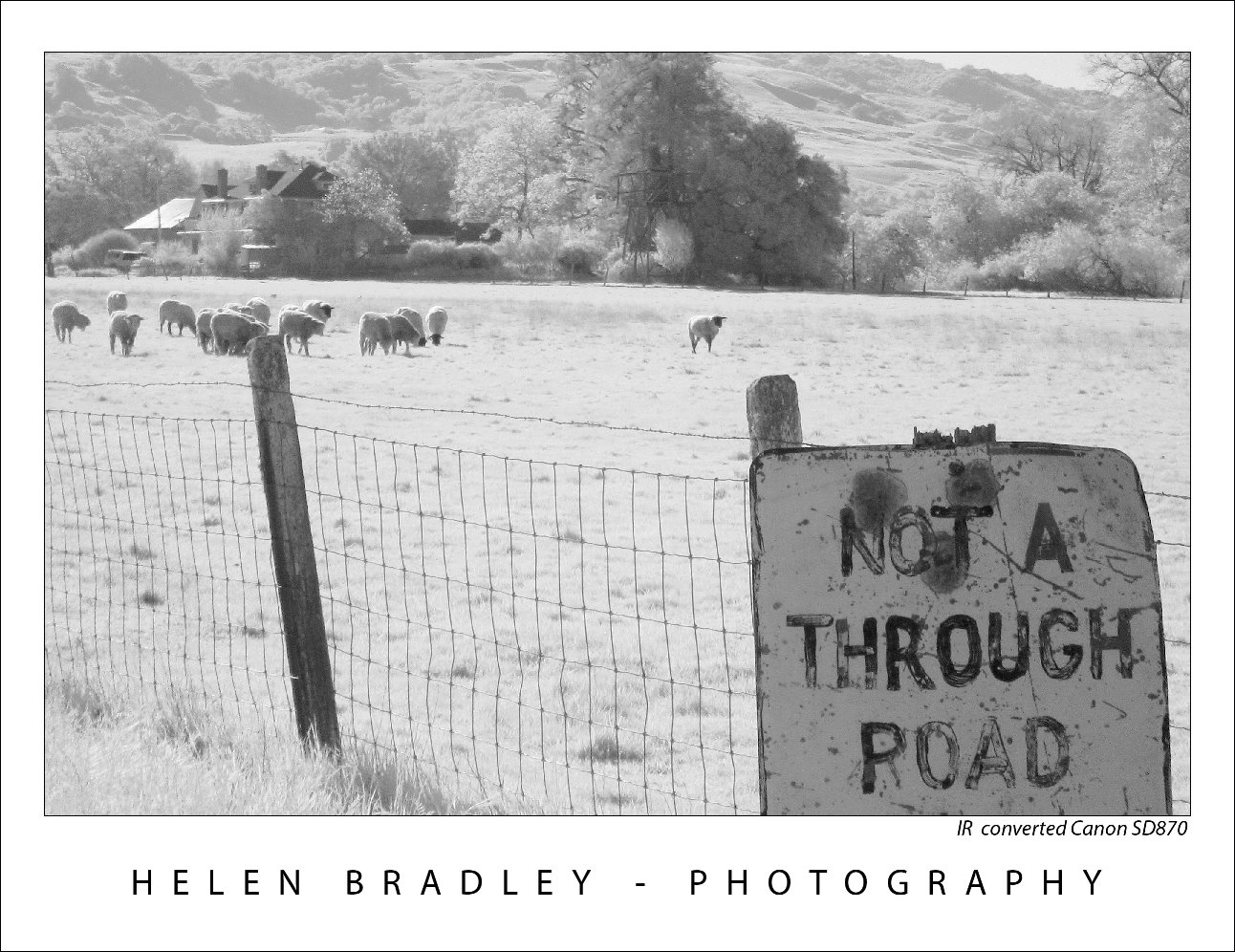
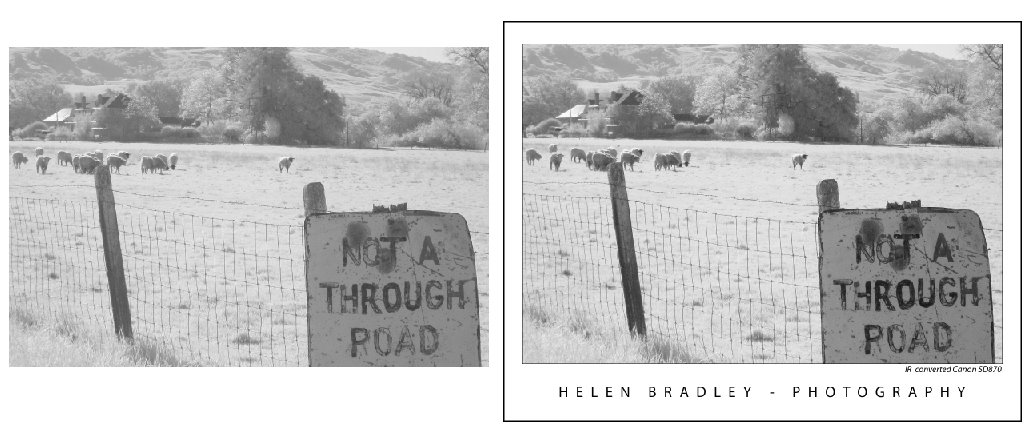
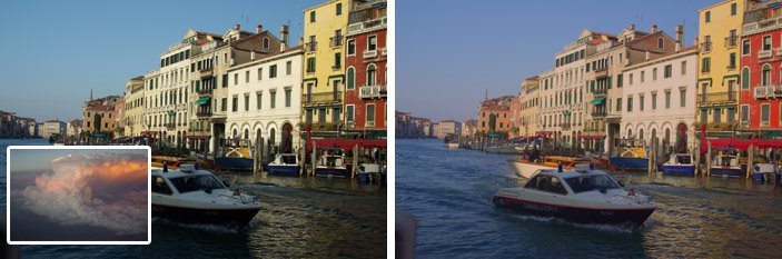
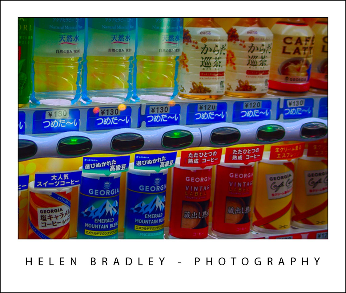
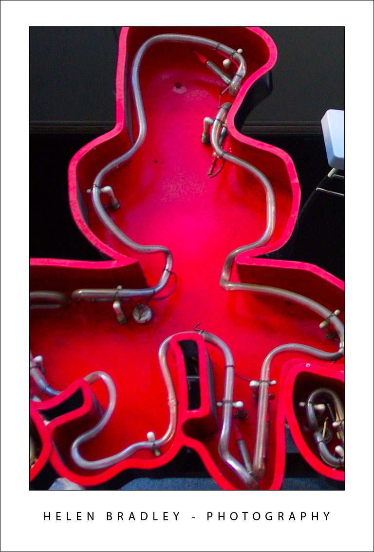
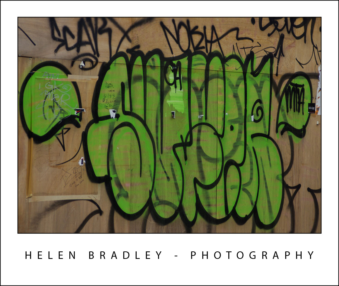
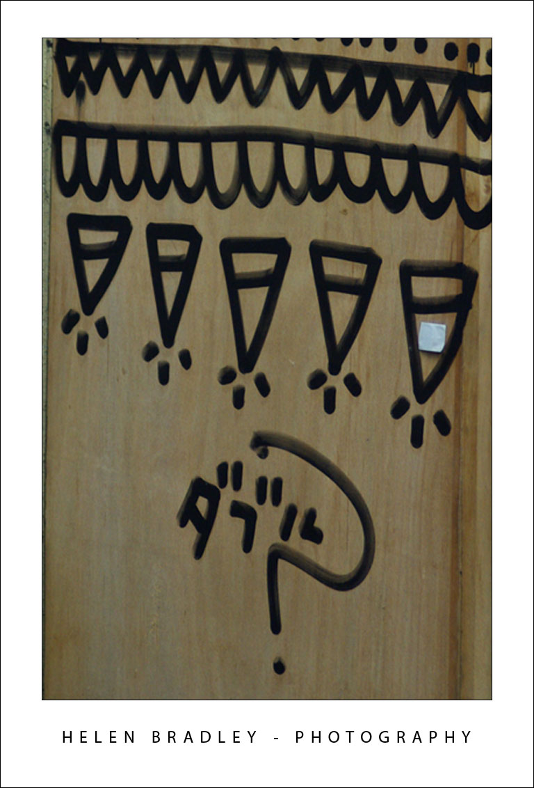
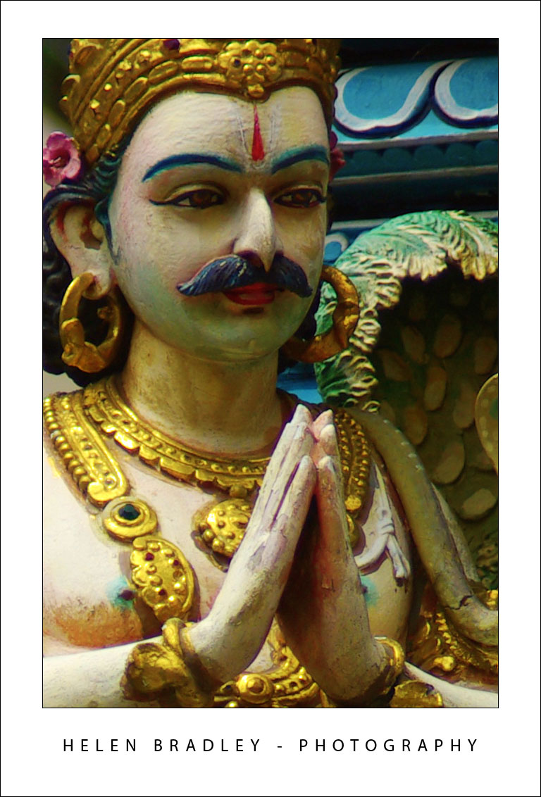
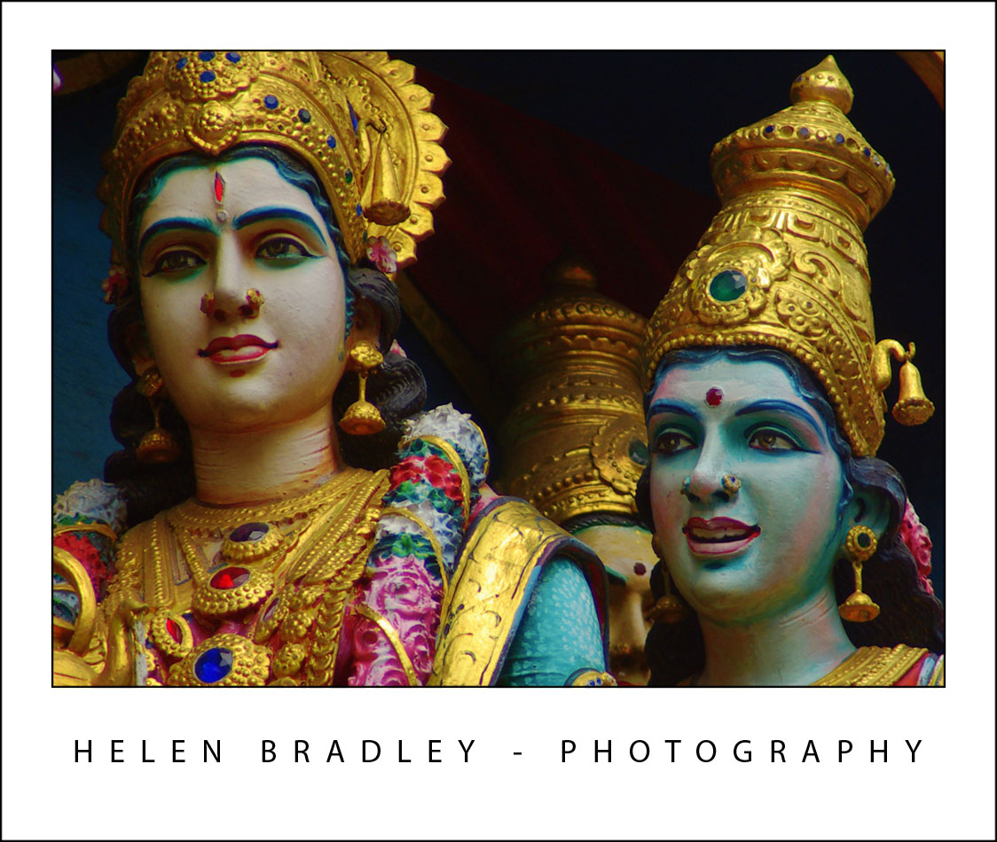
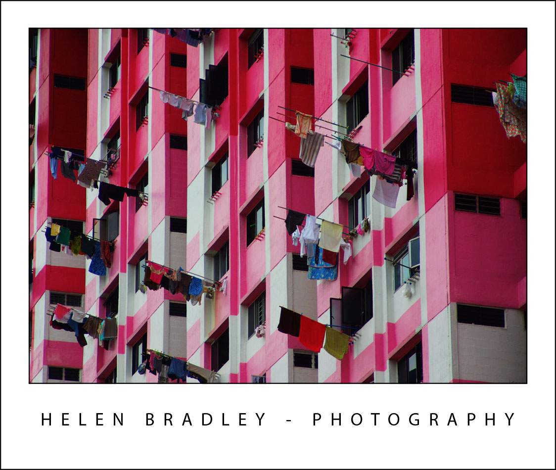
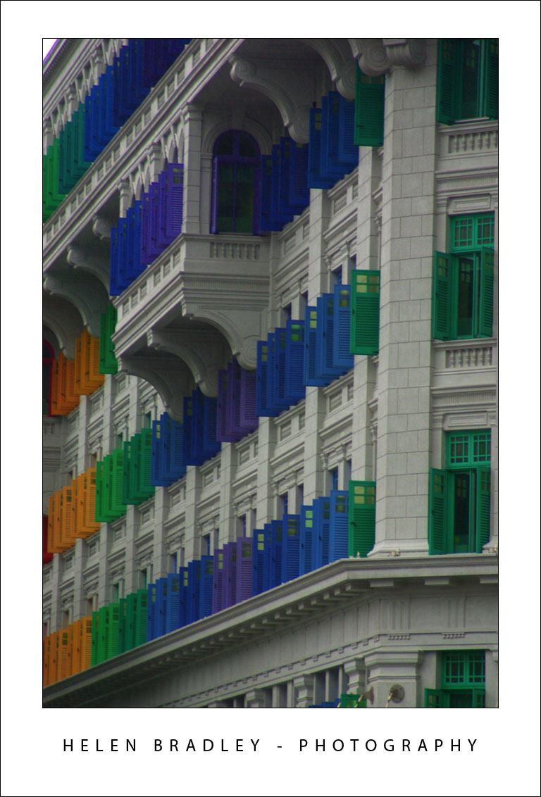
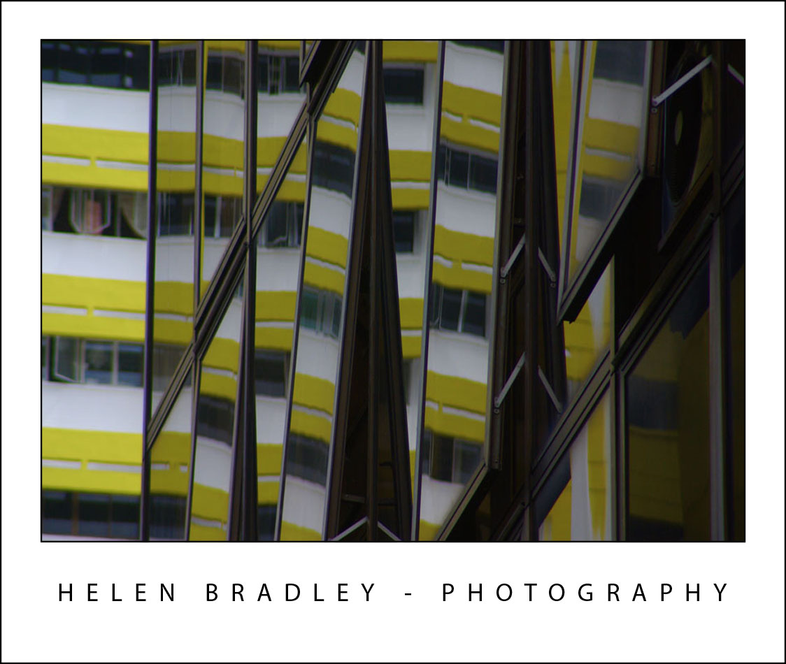
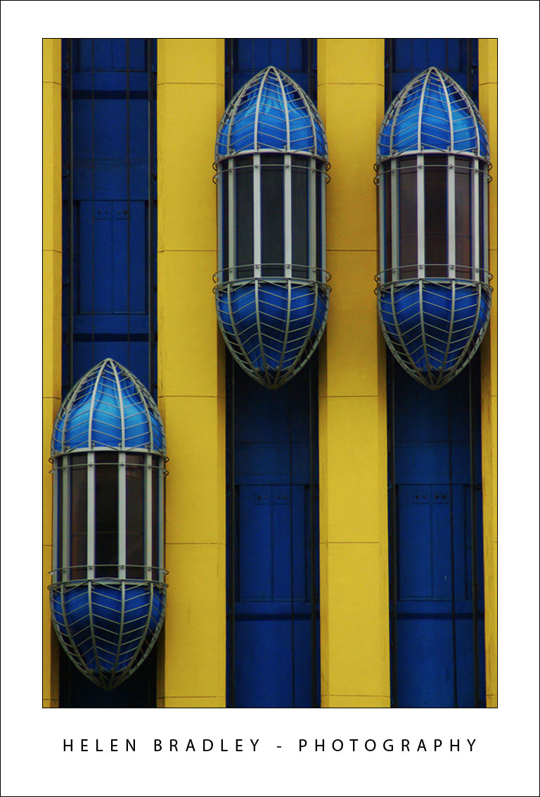
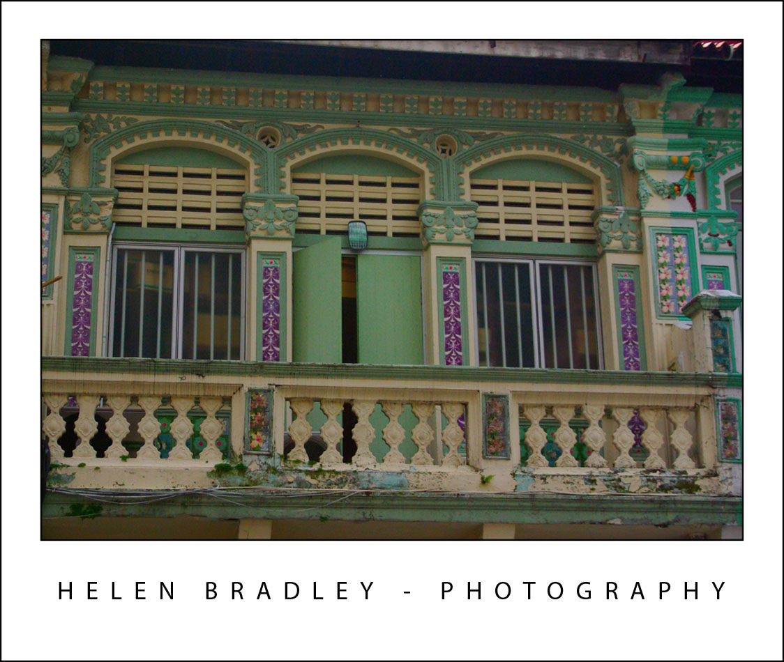
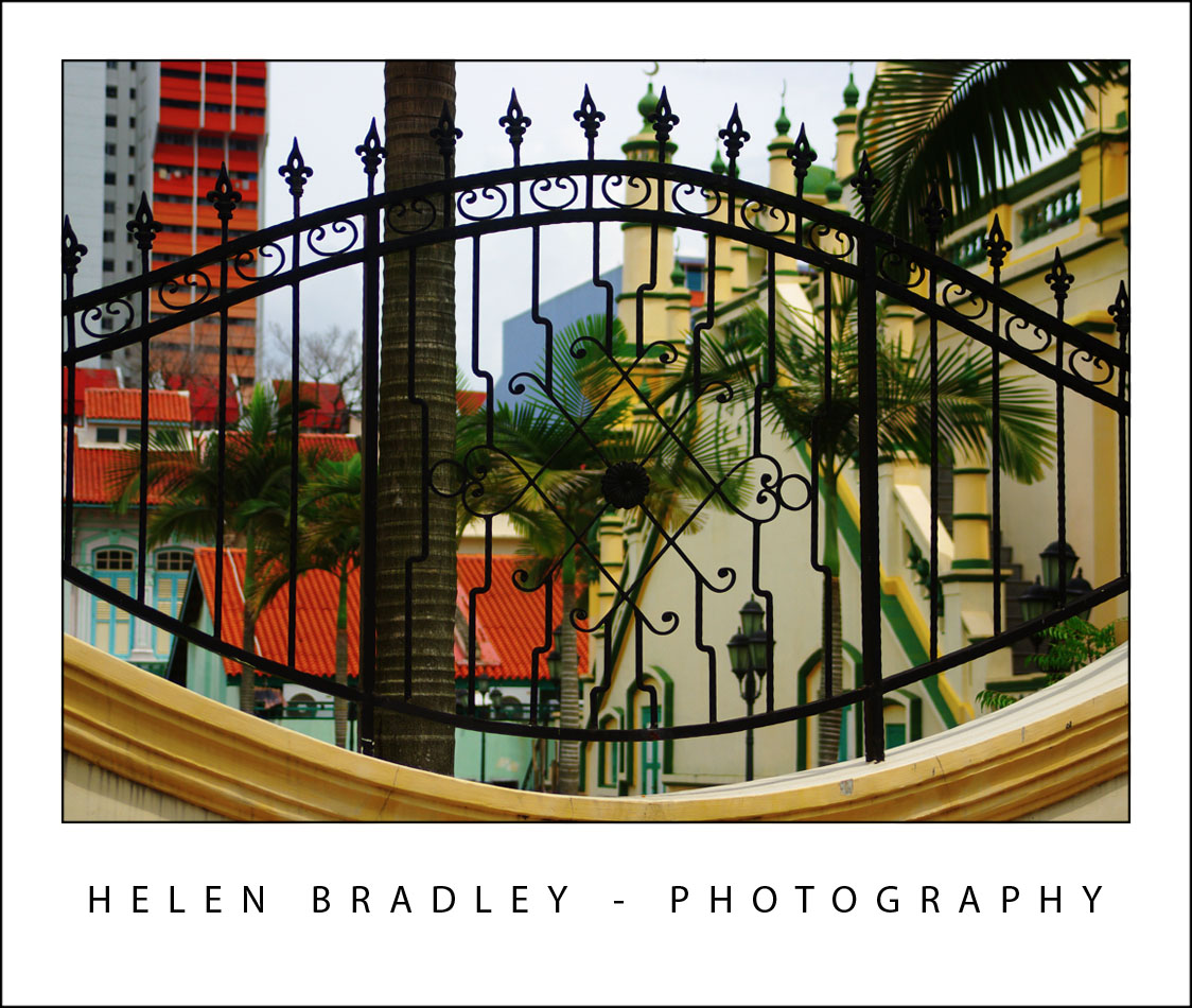
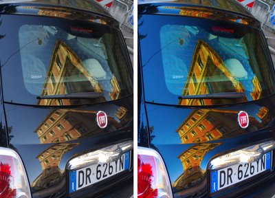
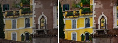
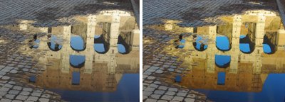
The images below show the original image on the left and the LAB color fix applied to it in the image on the right. No adjustments other than working LAB and blending the resulting layers have been used on the right hand versions.


Post Script: To learn more about LAB color mode and the fixes that you can perform using it, look no further than Dan Margulis’ book— Photoshop LAB Color: The Canyon Conundrum and Other Adventures in the Most Powerful Colorspace – it’s practically the definitive book on Lab by the master of Lab himself.

I contibute to the Post Production blog at Digital Photography School and this post first appeared there.

Helen Bradley

Wednesday, March 4th, 2009

Sharpening in Lightroom 2

Sharpening is the last step in editing an image. If you’re working in Lightroom then you have a very sophisticated Sharpening tool at your disposal. It’s hard to determine what the coolest part of the process is – the Detail and Masking sliders or the fact that sharpening is applied to only the image luminosity so it doesn’t mess up the image colors.

To sharpen in Lightroom, open the Develop module and the Detail panel to show the sharpening tools. A good starting point for most images is to set the Amount to 100, set the Radius to 1.0 and the Detail to around 25. As an aside, it’s nice to see that Lightroom is realistic about the appropriate radius to use and it limits you to a value between 0 and 3 which takes some of the guess work away from determining what value you should use.

Now you have a starting point, adjust the Detail and Amount sliders to see how they affect the sharpening. To see the before and after, press the backslash (\) key. The Detail slider is unique to Lightroom – it doesn’t appear in Photoshop. What it does is to remove halos around the sharpened edges. Low values for Detail reduce halos and higher values allow them.

The Masking slider is a way cool tool. It lets you remove the sharpening from texture areas of the image and areas that you typically would not want to be oversharpened such as skin tones. To use it, drag the Masking slider to around 75 and compare the results. You should see less sharpening in areas that don’t typically need it the larger the Masking value. To see what the mask looks like, hold the Alt key (Option on the Mac) as you drag on the slider and you’ll see a grayscale mask in place of your image. The white areas of the mask are the areas that will be sharpened – they are the edges in the image – and the black areas are those that will not be sharpened or which will be sharpened with less intensity.

The mask gives you a lot of control over how the sharpening is applied to the image and it prompts the question “why isn’t this in Photoshop too?”

Helen Bradley

Wednesday, February 25th, 2009

Photoshop: Fixing photos shot from airplanes

One of the cool things about getting a window seat in an airplane is that you get a unique opportunity to photograph things from a high vantage point. On the flipside, when you get them home you often find photos taken from the air look washed out and the colour is poor. Luckily there is not much that Photoshop can’t recover provided the photographs are in focus. So if you scored a window seat lately and if you have images that fix, I’ll show you the Photoshop tools you need to fix them.

Understand the problems
Most airplane photos look washed out and they don’t have the richness of colour that you might expect them to have. The first step in fixing them is to boost the tonal range in the image using a levels adjustment – a by product of this is that the colour gets a boost.

Step 1
Start by making a duplicate of the background layer so that you’re working on a copy in case you need to refer to it later on. To do this, right click the background layer in the layers palette and choose Duplicate Layer.

Step 2
Select the background layer and choose Layer > New Adjustment Layer > Levels and click Ok. The Levels histogram tells you a lot about the state of your image. In most cases you’ll lack white whites and black blacks and most of the image content will be around the middle of the image. Drag the right and left sliders below the chart so that there are below the points where the chart data begins. This should give the image an immediate boost in contrast and some boost in colour too. Adjust the midtone slider if desired to fix the midtones in the image and click Ok to confirm your settings.

Step 3
Colour fixes: Often the image will contain too much blue and you can adjust this using a Curves adjustment. Choose Layer > New Adjustment Layer > Curves and click Ok to display the curves dialog. Click the Channel list and choose the Red channel. Drag up on the middle of the Red channel line to add some red to the image. Repeat with the Green channel adjusting it as required – drag down on the middle to remove green and up to add it. Finish with the Blue channel.

If you’re unsure which way to go with the adjustment, give the line a good pull in one direction or the other to see what happens, back off the adjustment to get something less intense. Different places on the curve line will give you different effects so experiment either side of the midline. Click Ok when you are done.

Step 4
Fixing uneven contrast: Photographs shot from high up are generally display better tonality in the areas closer to you and poor tonality in areas farther away. To fix this add another layer by choosing Layer > New Layer and click Ok. Fill this layer with a gradient by selecting the Gradient tool and select the Black to White gradient. Choose the Linear option and drag the gradient to fill the layer. You want black at the top of the layer and white at the bottom – if you get it wrong, drag in another direction till you get it right. Don’t worry that your photo has disappeared in the process!

From the Blend modes dropdown list choose Color Burn. This will darken the image considerably particularly in the areas where the black colour appears. Adjust the layer Opacity in the layer palette until you get an acceptable result.

Step 5
Final touches: To finish the colour fixing, boost the saturation using Layer > New Adjustment Layer > Hue/Saturation and increase the Saturation a little. If the image needs a little lightening and if you’re using Photoshop CS3 or CS4, use a Brightness/Contrast adjustment layer. If you’re using Photoshop CS2 or earlier, use a Curves adjustment and this time drag the composite RGB curve upwards to lighten the image. The Brightness/Contrast tool in earlier versions of Photoshop is to be avoided at all costs as it damages good pixels in the image – the new tool that first appeared in Photoshop CS3 is much different and much better.

step 6
Sharpening: The final step is to apply some sharpening to the image. To do this, you need a single image layer so press Ctrl + Alt + Shift + E to create a composite layer. Select this layer and use Filter > Sharpen > Unsharp Mask to sharpen the image. Set the Radius to between 0.5 and 1 and set the threshold to under 10. Adjust the Amount until you get a good sharpening of the image.

Helen Bradley

Wednesday, February 25th, 2009

Update to Photoshop CS4

Adobe has advised that it has released an update to Photoshop CS4. The Photoshop 11.0.1 update addresses key issues reported by customers that may impact performance. The update also includes the ability to correctly recognize 3D textures edited by plug-ins; improved quality of Auto-Blend Layers (Stack Images); and fixes for issues that can be caused by corrupt fonts or when pasting formatted text.

The Photoshop 11.0.1 update is available as a free download for existing Photoshop CS4 customers at http://www.adobe.com/downloads/updates/ or through the Adobe updater via the application itself.

Helen Bradley

Sunday, February 22nd, 2009

Show Off! Frame your photos in Photoshop

When you’re displaying your photos on a blog or a website you’ll want them to look as good as they would if you had them framed on the wall. Here is a Photoshop technique for adding a frame, complete with your name and photo details, to a photo.

To see what we are aiming for, compare the two images below. The photo on the left is unadorned and the one on the right has been framed using the process outlined in this step by step. This frame gives the photograph a very smart and professional look.

Here’s how to achieve this:


Step 1
Once you have finished editing your photograph in Photoshop, click the topmost layer of the image and press Ctrl + Alt + Shift + E (Command + Option + Shift + E on the Mac), to create a new layer containing a merged version of the image.

Click this new top layer and choose Select > All and then Edit > Stroke. Set the Width to 2 pixels, the Color to black and select Inside and click OK. This adds a keyline around the image and makes sure that any white areas in the photograph do not bleed into the frame. Adjust the stroke width to match your image size – larger images can handle a wider stroke whereas small images may need only a 1 pixel stroke. Choose Select > Deselect or press Control + D (Command + D on the Mac).


Step 2
Enlarge the Photoshop image window by dragging on one corner. You want to see some of the gray edge around the photo. Set the background color to the desired frame color. Click the Crop tool, select the entire photo and let go the mouse button.


Step 3
Hold the Alt key (Option on the Mac) and drag on the left or right side of the crop marquee outwards into the gray area of the image. What you’re doing is marking the amount of space that you want for a frame around the left and right areas of the image.

Repeat using the Alt key (Option on the Mac), on the top or bottom border to create a matching amount of space above and below the image. Now, without holding down any other keys, drag the bottom border downwards to create a larger space at the bottom of the image.

Double click on the crop selection and this extra area you have marked out will be added to your photograph. If your image had a background layer the color is added to the background. If your background layer had been previously converted to a regular layer, the extra area will be transparent. If the area is transparent, add a new layer by choosing Layer > New > Layer and fill it with white or your chosen frame color by choosing Edit > Fill and choose the color to use from the Use list. Drag this layer underneath your topmost photo layer.


Step 4
Select the topmost layer, choose Select > All and then Edit > Stroke and add another 2 pixel black stroke on the Inside of the selection. Choose Select > Deselect or press Control + D (Command + D on the Mac).


Step 5
Click the Horizontal Type tool and select a relatively plain font such as Myriad Pro, black color and type your name below the photo. For example, I use “Helen Bradley – Photography”. To widen the spacing between the font characters so they fit better across the screen, select the text and press Alt + Right Arrow (Option + Right Arrow on the Mac). To center the text below the image, select the text and the image layer and choose Layer > Align > Horizontal Centers.

If desired, add the photo title and date captured on the right hand side underneath the photograph in the same font face but a smaller font size. This time, don’t stretch the characters apart and use an Italic font if desired. Align the last character in the title with the edge of the image.

Step 6
You’re now ready to save a version of this image as a JPEG file for web display.

Tip
Choose a ‘frame’ color that works for your images, you can use an off white color rather than white or reverse the colors and use white keylines and type, and a black frame. Whatever choice you make, it will ensure your photos are readily identifiable if you consistently use the same design for all your images.


Tip
If you are preparing a series of images to display on the web, you can create a frame shape with the keylines and type already in place on the frame layer and with a cutout area for the photograph to appear in. Save the frame image as a PSD or layered TIFF file ready for use. Open the frame and your finished photo. Flatten your photo image to a new layer using Control + Alt + Shift + E (Command + Option + Shift + E on the Mac) and drag this new layer underneath the “hole” that you have cut out of the frame image and size the image to suit. Save the framed version and repeat as required. When you have a lot of images to process and if you’re prepared to loose a little of the image edges for the sake of speeding up your workflow, you will find that adding an image to a frame is quicker than creating the frame for each image separately.

I blog for the online Digital Photography School and this post first appeared here Digital-photography-school.com.

Helen Bradley

Wednesday, February 4th, 2009

Photoshop: Extracting Lines from a photo


Here is a link to my latest post on the Digital Photography School blog. It is also a technique I used in my Photoshop presentation for CHA designers recently as it is a really cool way to get lines out of an image. I love step 4 – in the previous step everything goes to white. In step 4 the Gaussian blur brings out the lines like magic!

Enjoy!

Helen Bradley

Monday, January 12th, 2009

Free Photoshop Brushes

Yup, I am a certified brush junkie and I just love free downloadable Photoshop brushes. However, I’m also a designer so I need to know what I can use for my designs and what I can only use for personal projects.

So.. I created this web page with a list of my favorite brushes. You get to see pictures of the brush sets, you get some detail about the set and the all important licence information. Click any of the links or the images themselves to go direct to the web site to download the brushes you like.

It’s all too easy and, best of all, I’ll be updating the page regularly so you’ll always find something new in the list and I’ll be adding links to my own custom brush sets so you can download them too.

If you have a favorite brush set you think I should include in the list, send me an email to helen(at)helenbradley.com, tell me about the set and give me the download link. If I like it, I’ll add it to the list and credit you for finding it.

You can also get regular updates on my favorite brushes by following me on Twitter. I post a new set nearly every other day.

Helen Bradley

Thursday, January 8th, 2009

Turn daylight into sunset


The Photoshop Color Match tool lets you borrow the color from one image and use it to recolor another one. So, for example, if you have an image shot in daylight that you want to make look more like a photo taken at sunset, Color Match can do all the work for you.

Open the two images in Photoshop – the image to change and an image shot at sunset which contains good sunset colors. It doesn’t matter what the sunset image looks like – it doesn’t have to be in focus or nicely shot – all you need is good sunset colors.

Click on the image to convert to a sunset image and choose Image > Adjustments > Match Color. From the Source dropdown list select the image that you will be borrowing the colors from. This automatically recolors your photo to match the sunset image’s colors more closely.

You probably won’t get a perfect result just from doing this so now adjust the Color Intensity, Luminance and Fade sliders until you get a result that you like. The Color Intensity slider adjusts the color saturation, the Luminance slider lets you adjust the brightness of the effect, and the Fade slider fades the effect to blends it back into the original image.

In some circumstances choosing the Neutralize checkbox may also give good results.

Click Ok when you are done.

Helen Bradley

Wednesday, December 31st, 2008

Akemashite omedeto gozaimasu


Happy New Year!

This year marks my second year in Tokyo for New Years. This time I’m lucky enough to be staying at the Park Hyatt Hotel in Shinjuku. Featured in Lost in Translation it is as beautiful and wonderful as shown in the movie.

Here are a batch of my photos. Starting out with a couple snapped at Harajuku yesterday. It’s the home of Cosplay – costume play and such a fun place to hang out.

Reflections abound in this city of skyscrapers:


These drink machines are everywhere and sell some very interesting and colourful drinks:


Love this inside neon sign – some things look very different when lit up:


This time I’m finding a lot more graffiti around. Some angry, some artistic and some colourful:


I think this is a old bowling alley sign, the alley is long gone but the sign is still there…


Very strange indeed. There was a whole wall dotted with these signs. Not sure what these guys did but I imagine it wasn’t good!

Helen Bradley

Thursday, December 11th, 2008

Singapore – East meets West


Singapore is totally amazing and in places totally unexpected. There is colour everywhere – in the temples and in the regular buildings too. The Hindu temples are so beautiful that they simply take your breath away.

The heat is ubiquitous and the humidity ensures you never feel dry! It is monsoon season so yesterday we had a huge thunderstorm – lightening and thunder and inches of torrential rain. It’s so well designed that everything drains instantly so it’s just left wet and steamy afterwards.

I walked to Little India and took a cruise on the river. Just spent time acquainting myself with the layout of the city and got a hint of its magic.

Here are some images and the stories they tell. First up, details from one of the Hindu temples:

The buildings are so colourful and what would a day in Asia be without laundry!

Elevators at the W hotel:

Shophouses on the river and window detail:

Muslim temple detail:

Gotta love neon – the Singaporeans do!

Detail from a city building – looks like snowflakes:

Helen Bradley

Thursday, December 11th, 2008

Adding Keywords to multiple images in Lightroom


Let’s preface this blog entry by stating that what follows makes no sense at all.

I ran into some inconsistent Lightroom behaviour when trying to add keywords to images. The scenario was this: I needed to add the same keyword to a number of photos all at once. While you can do this as you import the images, sometimes you’ll be importing images which shouldn’t all have the same keywords so doing it in Lightroom later on makes more sense.

Problem is that you have to be in the right view to do it – choose the wrong one and you can waste a lot of time and have precious little to show for it. Please Adobe – make this simpler and more intuitive because right now it’s darn right frustrating and it really makes no sense at all.

Until Adobe fixes the problem, here’s the low down on adding the same keywords to multiple images in Lightroom. First select the Library and then choose Grid View, if you don’t this things will fail, miserably. Choose View > Grid or click the Grid View button.

Now select the images to add the keywords to – click on one and Shift + Click on the last, for example. Type the keywords in the box which says “Click here to add keywords” and press Enter.

You can also copy keywords from one image and then paste them into others by copying the keywords then select the images to paste into (making sure you are in Grid view – it doesn’t work otherwise) and then paste the keywords into the “Click here to add keywords” box – use Control + V to do this.

If you try this and it fails you’re not in Grid view. Heaven help me – there’s no reason I can see why you should have to go into Grid View to do it but you do.. so now you know.

Helen Bradley