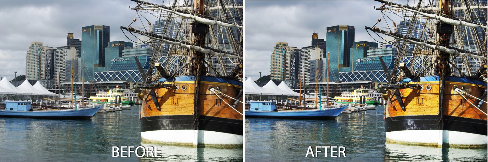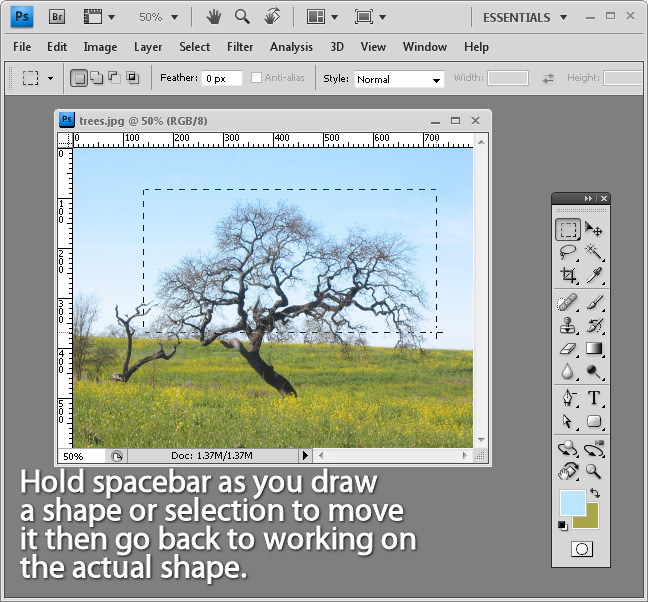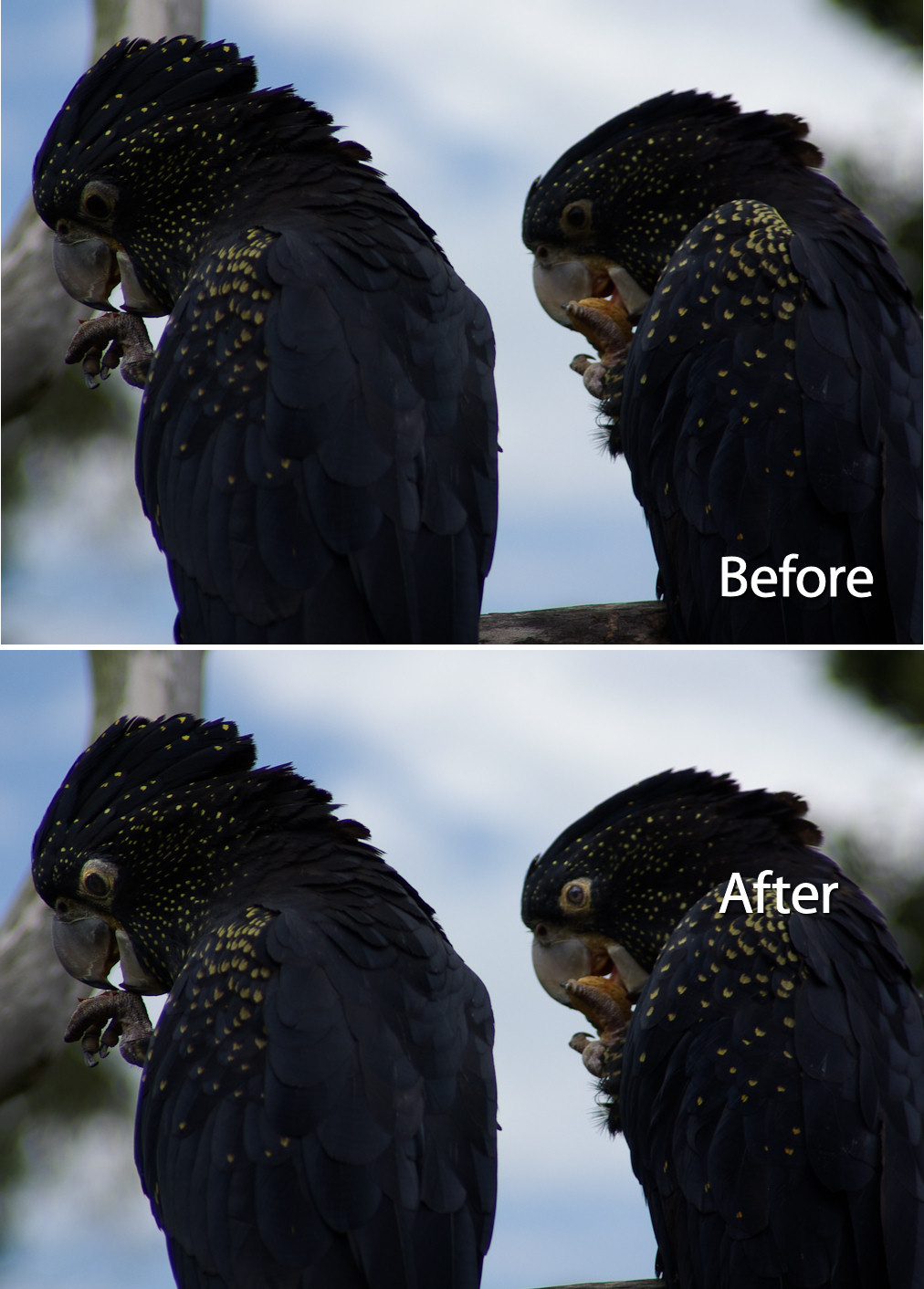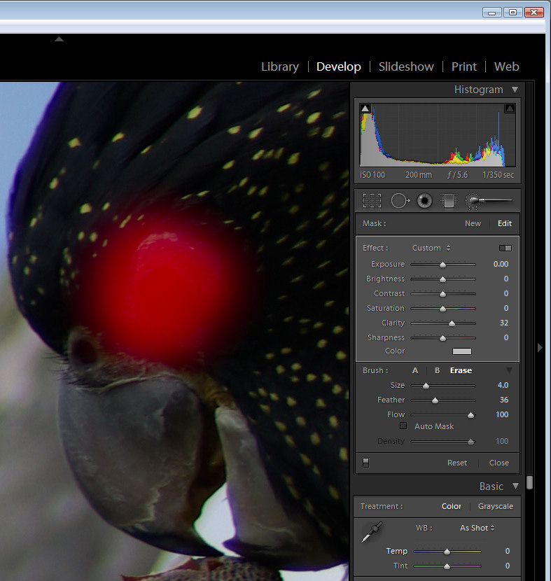
Sometimes in post production you will want to change the colors of an object in your photos. Photoshop has a number of tools that you can use to change the color in an image, and in this post I’ll show you some of these which you can use without having to make a selection on the image.
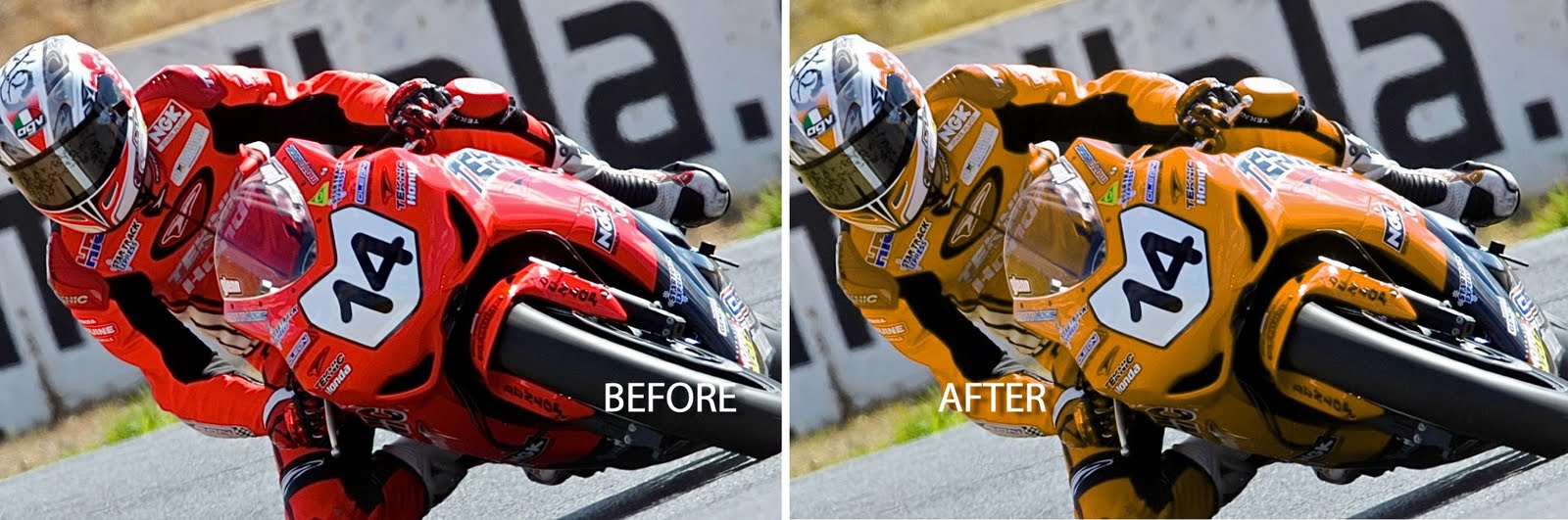
Before I begin, a word about the photographs I’m using. They were shot by Jacinta Oaten, a 15 year old Australian sports photographer with a promising career ahead of her as you can see. Jacinta kindly let me browse her photo collection to select some images to use for this post – thanks Jacinta!
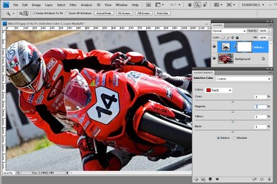
Color Replacement Tool
On the Photoshop toolbar sharing a position with the Brush tool is the Color Replacement tool. For this tool you’ll need to select the color that you want to paint with and then click and paint over the image.

The tool reads the color immediately under the cursor as you start painting and looks for similar colors to paint over. This allows you to paint somewhat outside the lines and still replace only the color that you want to replace.
Using the Tool Options you can set the Tolerance to so, for example, if you are recoloring an area that is a fairly solid color, you can use a low tolerance to isolate the color. On the other hand if you’re recoloring an area where there is quite a bit of variety in the color because of shadows or texture, for example, you can increase the tolerance to recolor a wider range of colors similar to those under the cursor.
As you paint, you can let go the mouse button and click again somewhere else to change the sampled color so you can replace a different shade of that color, for example.
This tool is handy for detailed work as it allows you to resample and paint a number of times so that you can get in around certain areas avoiding other areas if you don’t want to paint over them.
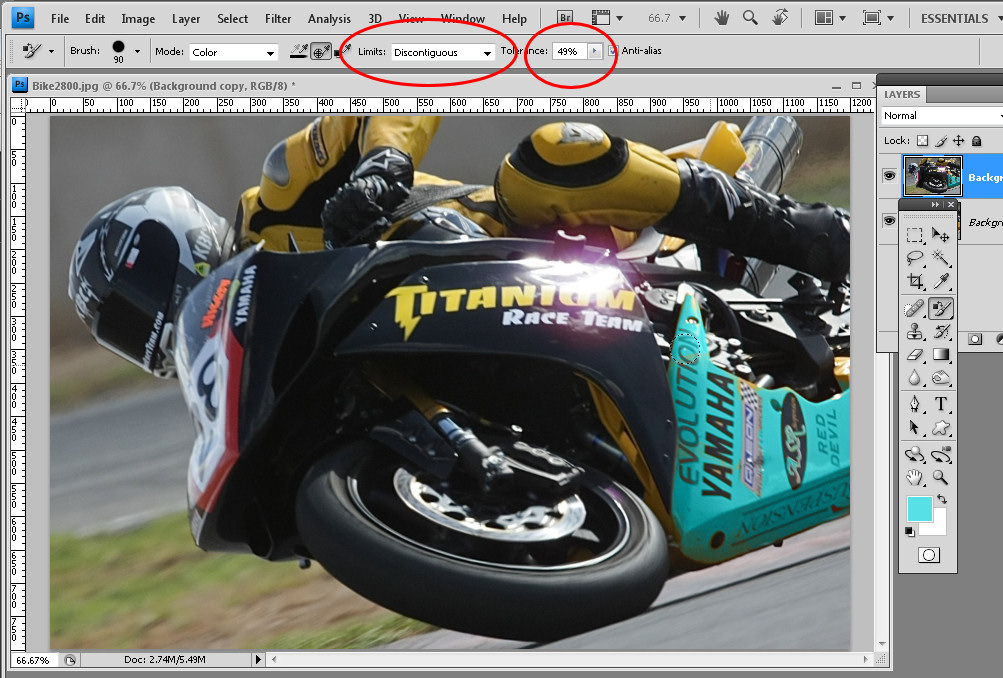
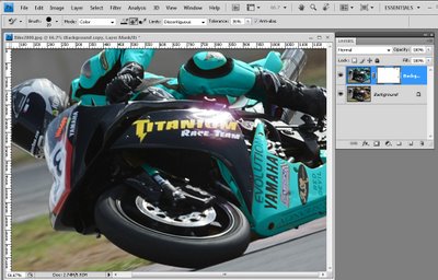
The options with this tool include the Limits option which allows you to specify whether only areas of color contiguous to those under the sampling point of the brush are altered or if all matching areas under the brush are painted over. The Find Edges option attempts to preserve edge detail as you paint. Here I used Discontiguous to ensure the yellow inside the advertiser’s names on the bike was changed too.
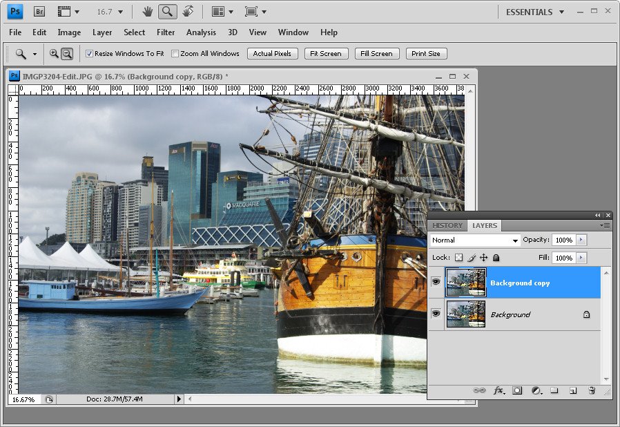
The Color Replacement Tool must be used on a layer that has colored pixels in it so it’s best to duplicate the background layer and work on the duplicate layer. Then, if you make a mistake you can mask out the changes that you’ve made to the duplicate later to recover detail from the image layer underneath.
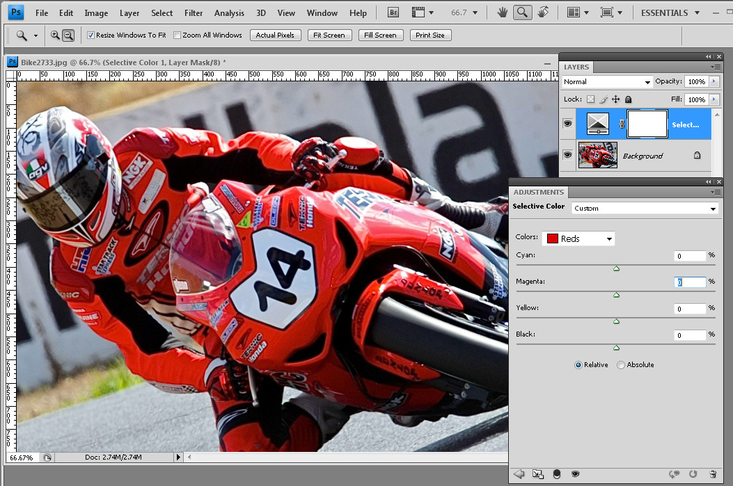
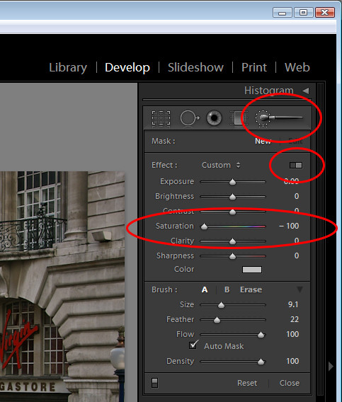
Selective Color
The Selective Color tool lets you adjust the colors in the image by selecting which colors to adjust and then adding more or less of another color to them. To use it, select Layer > New Adjustment Layer > Selective Color. Using it as an adjustment layer fix lets you later remove the recoloring from any part of the image by painting on the adjustment layer mask.
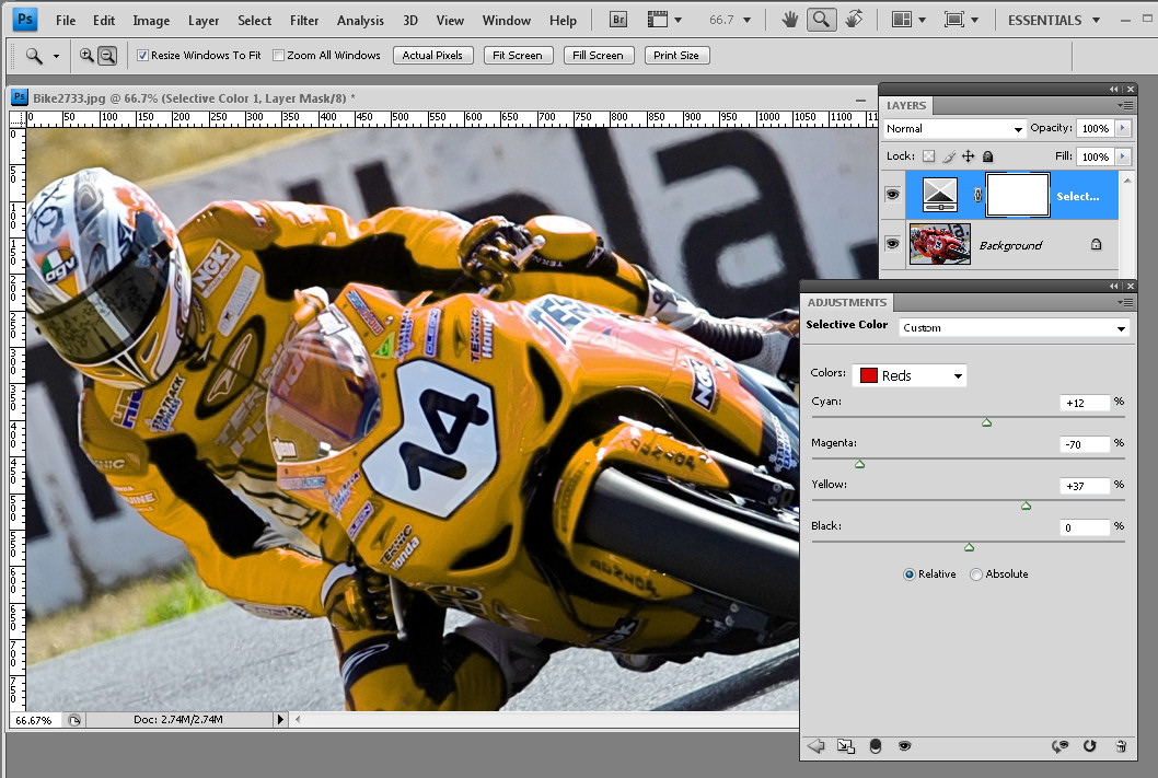
In the dialog you can select the color to alter from the Colors dropdown list. In this image I wanted to change the Reds so they are selected.
The color sliders below this show Cyan, Magenta, Yellow and Black. It helps to understand these colors and their opposites; Cyan is opposite Red, Magenta is opposite Green and Yellow is opposite Blue.
So, for example, if you drag the magenta slider to the right, you will add magenta to the image but if you drag it to the left, you will add green – its opposite. The other sliders work in the same way.

This tool works well when you have an image such as this one where most of the color that you want to change (the reds) only appear in the area that you want to change and not elsewhere in the image. To change the color, drag the sliders to add more of the colors you want to add and to remove the opposite color.

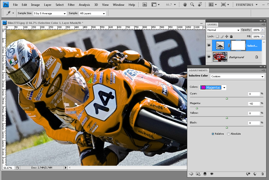
Sometimes multiple colors contribute the color to the image so here I’ve knocked out some of the pink tones in the bike windscreen by adjusting the Magenta color too.
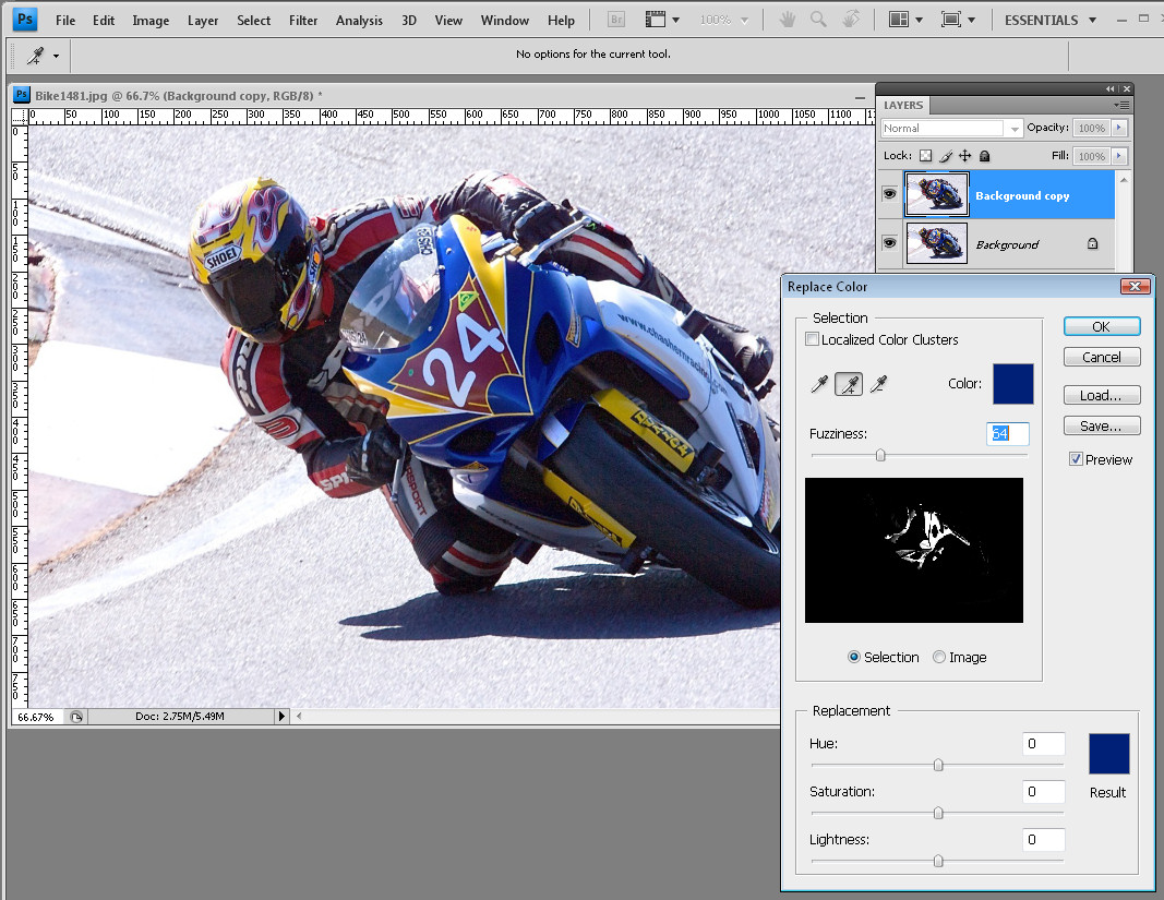
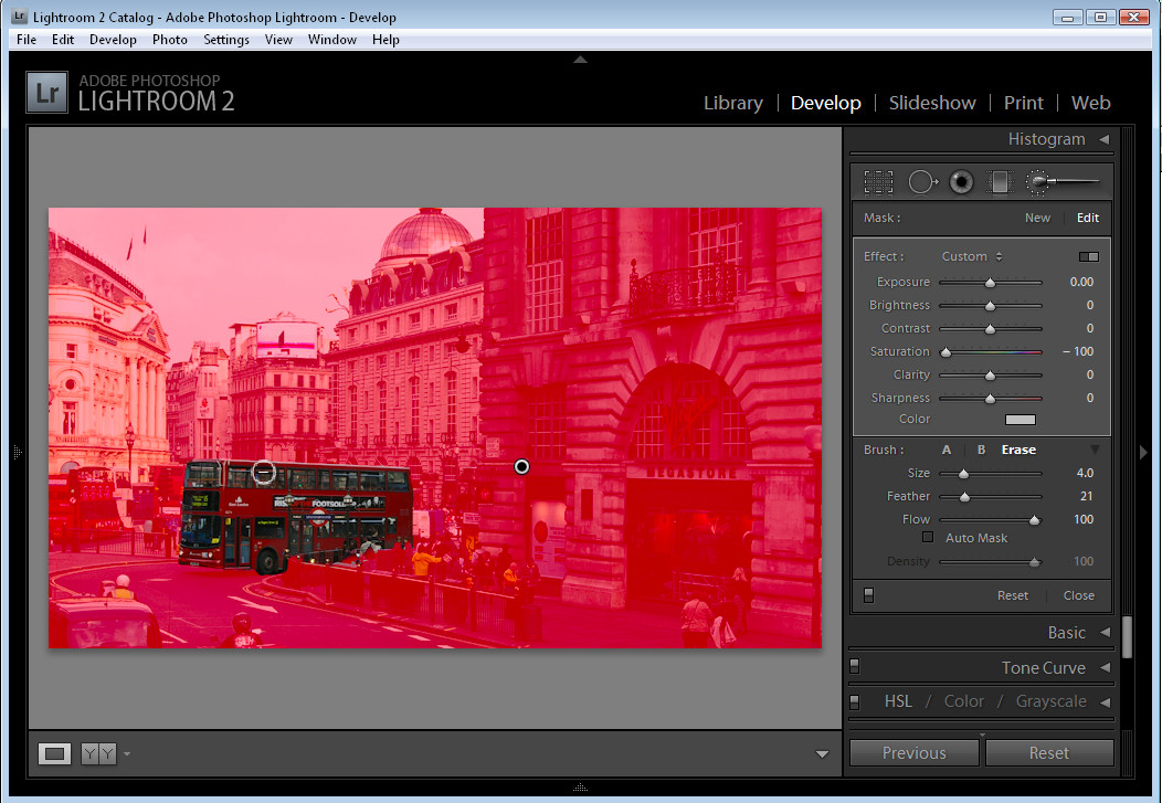
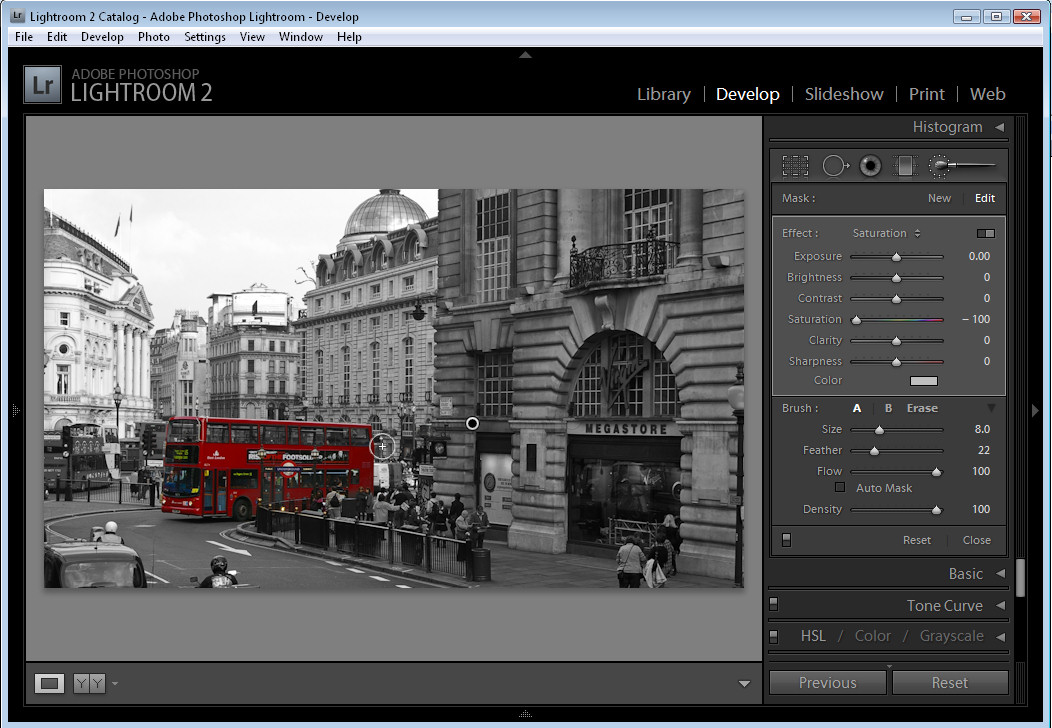
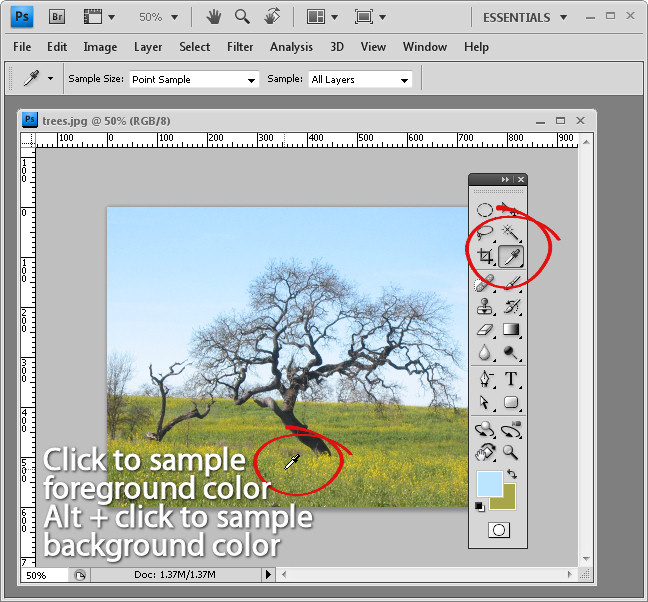
Replace Color
Another tool that you can use to change color is the Replace Color tool. To see this tool at work, select Image > Adjustments > Replace Color. This tool must be applied as an adjustment and cannot be used as an adjustment layer so, again, apply it to a duplicate of the background layer.
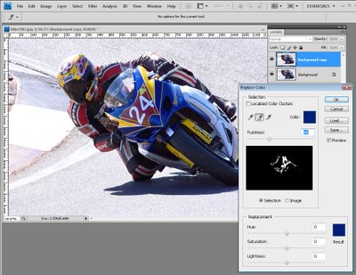
With this tool you click on an area in the image that you want to change the color of. Click the Add to Sample eyedropper and then click to select more of the color to change.
You’ll need to click on all the colors in the image that represent the color that you need to alter. You can test the result by dragging on the Hue slider at the foot of the dialog to see if the selection is accurate and that the color change is affecting the area you want to affect.
The Fuzziness slider lets you add more or less adjacent pixels to the fix – use it to obtain a smoother change from one color to the next. When you’re done, click Ok. Use the Saturation and Lightness sliders to tweak the effect.
The Localized Color Clusters checkbox can help refine the color selection so it’s worth testing to see if it makes a difference. Here it isolated the selected colors and removed a problem that I had with the number and the silver metal of the bike being recolored where it shouldn’t have been.
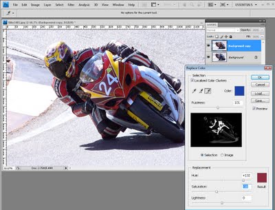
When you apply this fix to a duplicate of the original image layer you can add a layer mask to the top layer and use it to mask out any areas that are affected by the recoloring which should not be affected.
Choosing the right tool for the job
There are just some of the tools you can use to recolor an image. You will find one may work better than another depending on the image you are working on so experiment to see what works best for you.
Helen Bradley


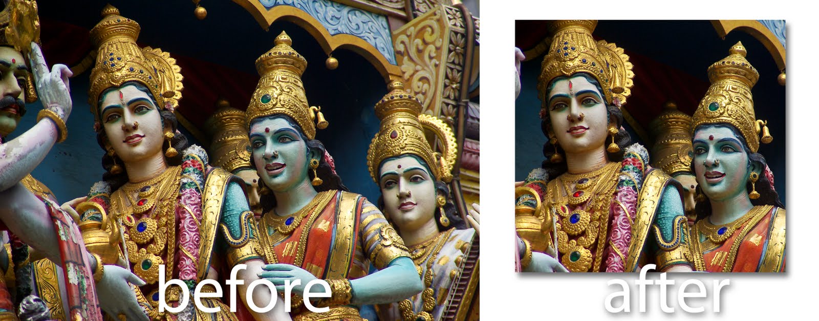
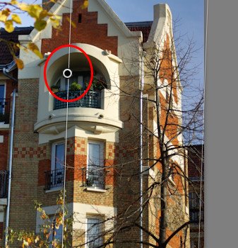
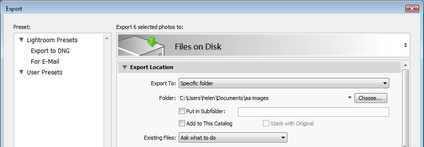
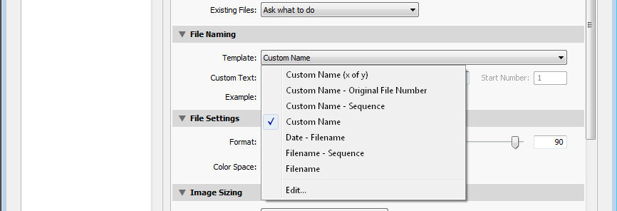
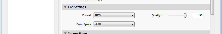
 This fun Photoshop technique lets you showcase your photos on a computer screen or billboard and it uses the vanishing point filter to distort and crop the image.
 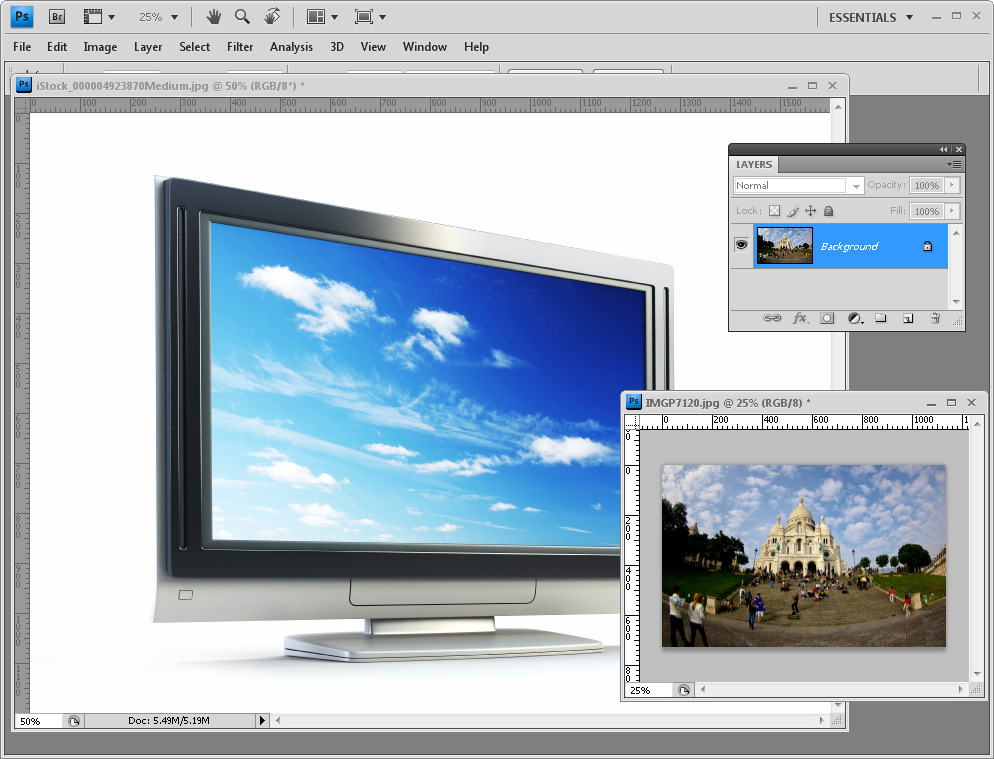 Step 1
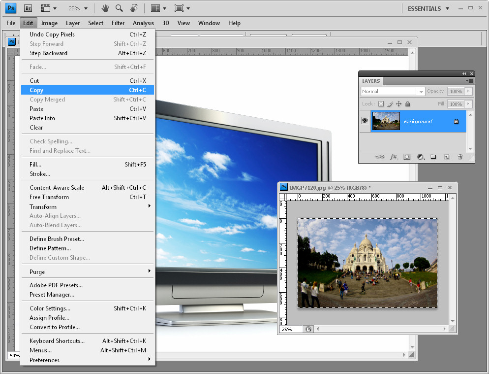 Step 2
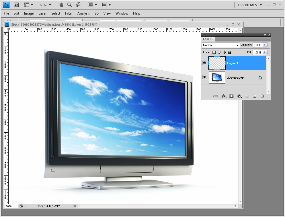 Step 3
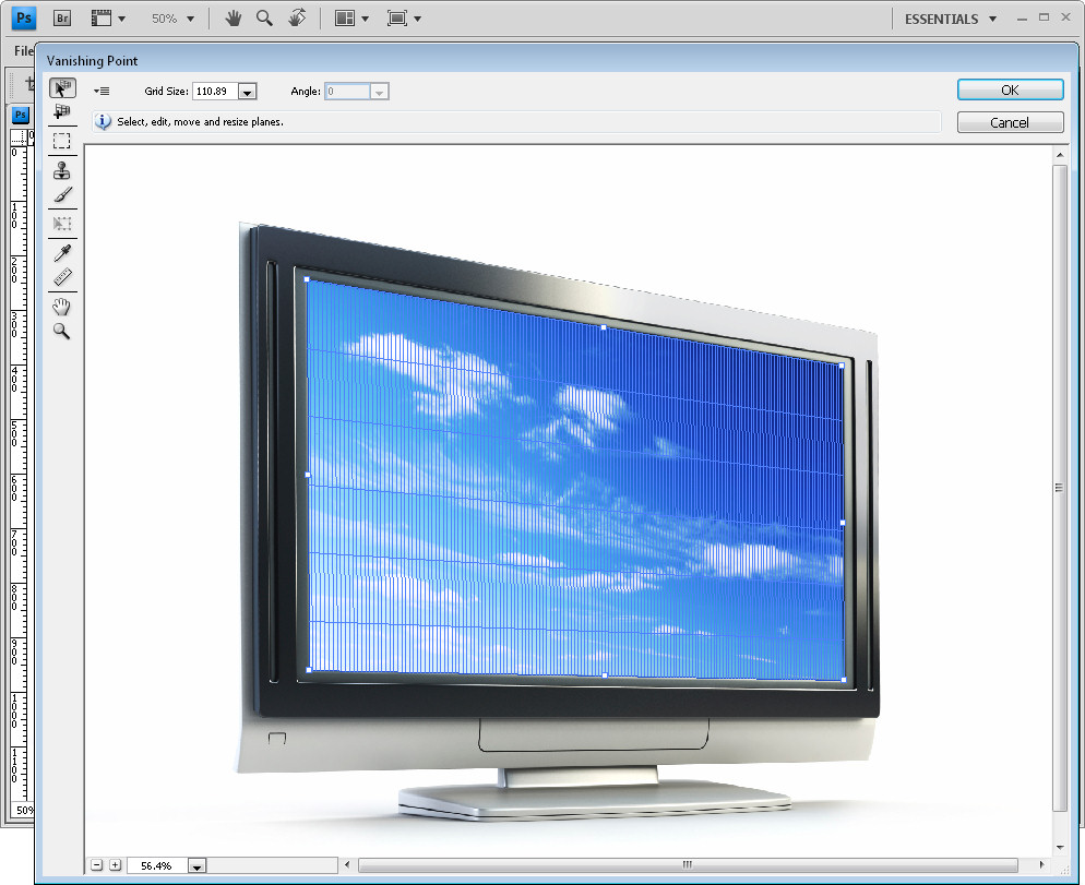 Step 4
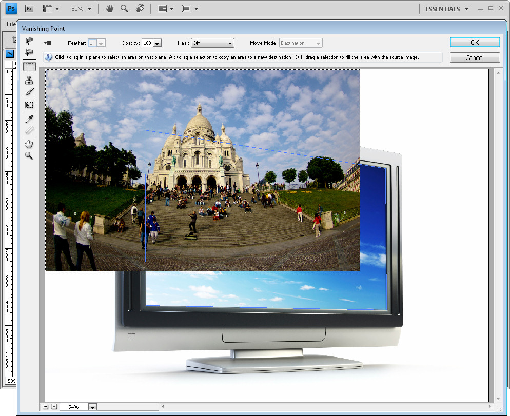 Step 5
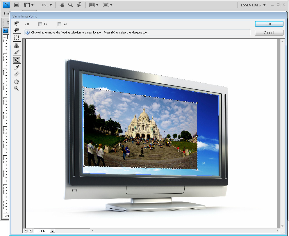 Step 6
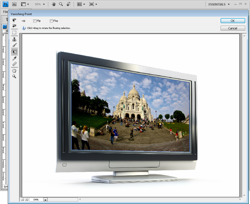 Step 7
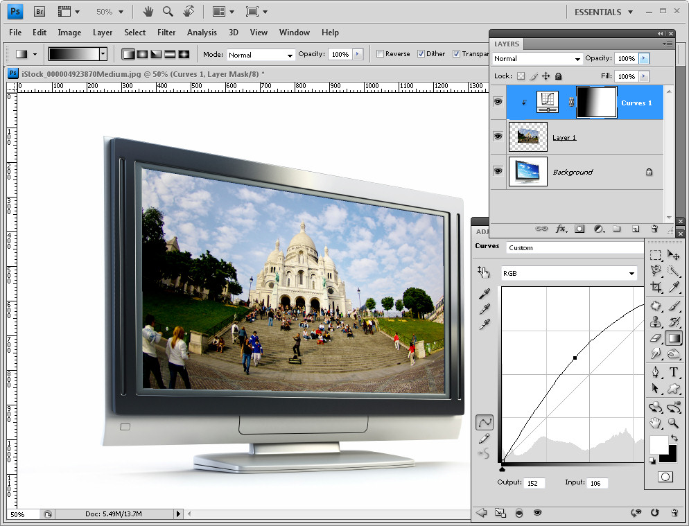 Step 8
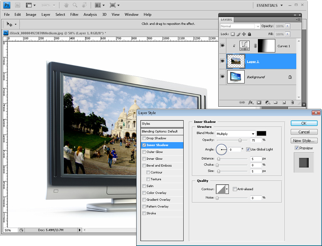 Step 9