Thursday, March 11th, 2010

Photoshop – Copy and Invert Masks

Photoshop copy and invert a mask

This is totally cool. I was playing around in Photoshop the other night and needed to duplicate a mask and then invert it. I remember that you can copy a mask using two fingers and the mouse button so that means it’s some combination of the Control, Alt and Shift keys – that’s all you really need to remember – the rest is experimentation.

Well, I did the two finger drag using Shift and Alt and this must be a keystroke combination I haven’t used before because lo and behold! it not only copies the mask but it inverts it too!

So, to copy a mask, drag it using Control + Alt (Command + Option on the Mac). To copy and invert the mask, Shift + Alt (Shift + Option on the Mac).

Helen Bradley

Wednesday, March 3rd, 2010

Photoshop – Cut Text from an Image

This is a cool effect that you see quite a lot in advertising and elsewhere. It involves cutting some text out of an image so you see an image in the text shape.
Step 1
To begin, open an image to use and then use the Type tool to type some text over the top of it. Make sure that the type is very large and that it covers a lot of the image so choose a thick font.
Step 2
You can adjust the Tracking and Font size of the text in the Character palette to ensure that the text is large and so that you do not have excessive spaces between characters.Step 3
Double-click on the background layer of the image and click Ok to convert it to a regular layer. Drag the image layer on top of the text layer in the layer palette.Step 4
With the image layer selected, choose Layer > Create Clipping Mask to clip the image to the shape of the text on the layer underneath. Step 5
To add some extra dimension to the effect, duplicate the image layer by selecting it and choose Layer > Duplicate Layer and click Ok.

Drag this layer containing a second copy of the image to the bottom of the layer stack. Select the text layer again and add layer style such as a Inner Glow or a Drop Shadow to finish the effect.

Photoshop, Photoshop Creative, clipping mask, text effect

Helen Bradley

Wednesday, February 24th, 2010

Spotting Images in Photoshop

By Helen Bradley

Many of the images that you take particularly cityscapes, like most portraits, can do with some spot fixing. I’ve been traveling through Europe a lot lately and because it’s considered almost de rigeur to smoke there, many of the photos that I have are littered with cigarette butts and assorted garbage.

And although you may not realize it, even small cigarette butts will detract from an image. A few minutes spent cleaning up an image can result in it having a way more polished look. Here are my top techniques for cleaning up litter and unsightly blemishes.

A word of advice before you begin: make a duplicate of the original image and work on this. Then you have the original image to look back at and see just how much improved the image is after the spot fixing is complete.

Step 1
Spot Healing Brush
For simple spot fixes the Spot Healing Brush cannot be beaten. It doesn’t require you to make a selection of a source area to use for the fix so you can get to work fixing the image straight away.

Ensure your brush is large enough to cover the problem area but not any bigger – the idea is to spot fix just the problem area and to leave as much of the original image intact around it. Zoom in close to where the flaws are and paint over each flaw one at a time.

The Hand tool is useful here as you can press and hold the spacebar as you drag on the image to reposition and when you let go the mouse and spacebar the Spot Healing Brush will be still selected.

It can take five minutes or more to spot a really bad image, but the overall result will be significantly improved.

When you’re using the Spot Healing Brush tool, make sure that you have the Proximity Match option enabled, not Create Textures. Proximity match gives a better result with most spotting tasks.
Step 2
Patch Tool
For larger jobs where, for example, the Spot Healing Brush won’t fix the problem because it’s too close to something with different texture or it’s such a large problem that it really needs a bigger solution, use the Patch Tool or the Clone Tool.

With the Patch Tool you make a selection around the area that is the problem, making sure that the Source option on the toolbar is selected. Now drag the marquee away to find an area to use as the fix. Sometimes you may need to apply this fix a couple of times, and you may need to clone around the edges of the area later on to improve the overall appearance and to add some texture back into the image.
Step 3
Clone tool
To use the Clone Tool, select the tool, locate an area of the image that you want to clone from – this is your source image area – and Alt + Click (Option + Click on the Mac) on that area to sample it. Then start painting on the image – typically this works best if you click repeatedly rather than painting as painting tends to introduce repeated patterns into the fix which scream “Look! I tried to fix this in Photoshop!”

In Photoshop CS4, the Clone Tool has a preview so you can line things up neatly making it a very handy tool for fixing elements where there are lines or other things that need to be matched up in the fix.

You can also use the Clone Tool to add some texture back into areas that the patch tool has removed texture from even after the fix has been applied.

Step 4
Healing Brush
The Healing Brush tool works similarly to the clone tool, but it has a healing ability built in so it’s a handy tool to use too.

With the Healing Brush tool you need to again Alt + Click (Option + Click on the Mac), to sample the area of the image to use as the fix, and then click over the area that needs fixing.

The healing aspect of this brush blends the solution over the problem so you could, for example, have quite a dark solution area in your brush, but when you paint over a lighter area to fix it, the fix will lighten as it is blended in.

In the example above we couldn’t use the Healing Brush to fix the water running out from under these plants as it would tend to want to blend in and darken the area being fixed when we need it to be lighter. In the case of the water, the clone tool is the best option because it lets us paint over the water area with lighter pixels without trying to blend in the result which would simply darken it again.
Step 5
Take a good look
Once you’ve fixed the obvious problems take a good look at your image at 100% and see if there are things that are distracting to your eye that you may want to fix. These will generally be things that are lighter, brighter or in sharp focus as they are things our eyes are attracted to. If these are ugly and not really central to the image itself, then get rid of it. I removed some of the tree labels at this point.

To finish the image I added some color to the sky, adding some saturation and a curves adjustment and then cropped in a little closer.

Helen Bradley

Saturday, February 20th, 2010

Lightroom: What is it and When Should You Consider it?

by Helen Bradley
There have been questions posted as comments recently asking about the role of Lightroom in a photographer’s workflow. Many posters who are not currently using Lightroom aren’t sure whether Lightroom it is an alternative to Photoshop or where it fits if you have Photoshop too. I thought it was a good time to look at where Lightroom fits in the Adobe line up and to explain why Lightroom isn’t a Photoshop alternative.

Lightroom was developed from the ground up as a tool for photographers and one which would provide a logical workflow for processing a lot of images in an effective and efficient way. Photographers have special needs for handling images from photo shoots and these aren’t necessarily reflected in how Photoshop is designed.

When you handle a lot of images in Photoshop you download them and preview them in Bridge. If they require fixing or printing, you take them via Camera RAW (if they are Raw files) to Photoshop. In Lightroom most of your workflow takes place inside Lightroom – Lightroom contains the organizing tools of Bridge and the processing tools of Camera RAW so, if it is an alternative to anything it is better seen as an alternative to Bridge and Camera RAW rather than to Photoshop itself.

In Lightroom you import only those images you want to use and manage inside Lightroom. If an image isn’t in the Lightroom catalog then Lightroom cannot see it. This is in contrast to Bridge which shows you the entire contents of folders on your hard drive. In Lightroom you can build preview images as you import them or later on and these are also stored in the catalog – this makes it quicker for you to view and work on your images in contrast to using Bridge. Lightroom’s Library module also contains tools for managing images such as adding keywords, sorting and cataloging them.
The Lightroom Develop module is the equivalent of Photoshop Camera RAW and it contains tools for applying image wide fixes. You can use these on any image that Lightroom can import and this includes Camera RAW images, JPEGs and Tifs. Lightroom also has a few tools which let you fix limited areas of an image, such as the Clone, Heal, Graduated Filter and Adjustment Brush. However it is here that the differences between Photoshop and Lightroom are most apparent – there are lots of things that Lightroom cannot do that Photoshop can. Photoshop is a pixel editor so it can be used to affect images all the way down to pixel level – Lightroom isn’t. Photoshop supports layers and layer masks, Lightroom does not. Photoshop can merge panoramas, HDR sequences and align and blend layers – none of these features appear in Lightroom. In Photoshop Extended you can work with video and 3D – again these aren’t features of Lightroom.
Other modules
The remaining modules in Lightroom are SlideShow, Print and Web which are tools for displaying images either as slideshows, web pages or assembling them for printing. Some of the same things can be done using the combination of Bridge and Photoshop but this is where Lightroom tops Photoshop. The Lightroom tools work better because your images are already there, organized, open and ready to work with and the tools are very fast.

Where does Lightroom fit?
So, if you are asking yourself if Lightroom is an alternative to Photoshop, the answer is No! It is, however, a possible alternative to using Bridge and Camera RAW although there may still be times if you are using Photoshop and Lightroom that you may still opt to use Bridge rather than Lightroom. For example, Lightroom can’t handle the wide array of file types that Bridge can and sometimes you won’t want to import images into Lightroom – for example if you use stock images you may not want them mixed up with your own photos. In this case you may choose to access them from Bridge rather than going to the trouble of importing them into Lightroom.

Most people who use Lightroom report significant savings in the amount of time they spend processing their images. This makes sense as all your images, once they are imported into Lightroom are immediately available and you can edit them without opening them and changes are saved inside the Lightroom catalog and not to the file itself (unless you change the default behavior). Most people who use Lightroom also report that they use Photoshop less than they did before because many of the fixes they might have performed in Photoshop can now be managed in Lightroom. Since I made the commitment to Lightroom, this is my experience – much less time spent working on images overall and much less time spent in Photoshop.

There are many people who can benefit from using Lightroom to manage their digital photo workflow and there are many who will not. If you work with lots of images, if you need to apply the same fix to multiple images, if you need to get your images from the camera and out to your client in a very short time – then Lightroom totally rocks.

On the other hand if you create composites or spend most of your post production time on a handful of images perfecting them by editing them and crafting them into your vision, then Lightroom may not offer any significant advantages. Remember too, that any program will take time to learn and Lightroom doesn’t always follow the Photoshop style of doing things so there is a learning curve you’ll need to commit to before you will feel at home in Lightroom.

So, there’s my take on Lightroom and Photoshop. Now it is over to you. What has your experience been – do you use Photoshop less now you have Lightroom? Did you try Lightroom and not continue? We’d love to hear

Helen Bradley

Tuesday, February 16th, 2010

Lightroom 3 Print Improvements

By Helen Bradley
With Lightroom 3 Beta having just been released, the first thing that most people will do – as I did – is to look and see if the features that you’ve always wanted in the program have been added.

One of the areas that Lightroom 2 fell a little short on in my book was the Print module. I wanted to be able to print with a colored background without having to import a background to use as a Identity Plate to achieve the effect and I wanted to be able to assemble a single printed sheet incorporating multiple images but I didn’t want them to have to always be the same size.

Ok, so the good news is I am a very happy gal! Both these problems are fixed in the new Lightroom 3 Beta. In fact, the new print module in Lightroom 3 Beta totally rocks.

Over the next few weeks I plan to post on some of the new features in the Lightroom 3 Beta but today I just want to show off the new Custom Picture Package tool.

Get the beta!
If you haven’t used Lightroom before or if you are interested in looking at the new Lightroom 3 Beta, visit http://labs.adobe.com to download the free Lightroom 3 Beta. As always you should never trust vital stuff and day to day work to a beta version of any software – it’s there to work with and experiment with but you can’t expect it to be 100% reliable.

Ok, technical stuff out of the way, let’s get into the Print module in Lightroom 3 Beta.

Step 1
Start with a selection of images – this can be a folder of images or a collection. Click the Print module and select Custom Package. Click the Page Size button and select your printer and page size – even if you will print to a JPEG file you still need to do this – Ok, so it’s not perfect!.
Step 2
Get ready for the most exciting change to Lightroom in my book at least. Grab an image from the filmstrip and drag and drop it onto the grid. Keep the grid visible for now as it makes it easier to line everything up.

When you drag and drop the image in position, you can resize it as desired.

Step 3
If you want the container to match the image aspect ratio click the Lock to Photo Aspect Ratio checkbox. If not, deselect it and you can size the image to any dimension you like – so you can create a portrait shape image from a Landscape one, for example.
Step 4
You can now drag and drop a second image into the display and size it to any dimension.

If your image is larger than the container, hold the Control key (Command on the Mac) and drag the image inside the container to find the best position for it.

Step 5
Continue and add the images that you want into your display.

If you prefer to use fixed size containers, you can click to add specific size containers using the options in the left hand panel. You can then drag images from the filmstrip to fill them.
Step 6
To change the background color, select the Page Background Color option and choose a color to use. If you choose anything other than solid black, you’ll still see the grid lines on the screen but these won’t print and you can turn them off if they’re in the way.
Step 7
Click the Identity Plate and you can add your own identity plate as you could with other versions.

When you’re done, from the Print To options, select to print to a printer or to a JPEG File and you can then print by clicking the Print/Print to File button.
Step 8
Before you leave the module, click the + symbol to the right of the Template Browser entry on the left panel and type a name for your template so it is saved and you can reuse it again in future.

While it’s still not perfect, the Print module in Lightroom now has support for features that were not achievable with Lightroom 2 without complex workarounds and which will be appreciated by avid Lightroom users everywhere.

Helen Bradley

Saturday, February 13th, 2010

Master Repeating Patterns in Photoshop

By Helen Bradley

In a recent post I showed you how to create a kaleidoscope using Photoshop. As one of the techniques for using a kaleidoscope, I suggested you could create a repeating pattern from it. One reader posed the question as to how a repeating pattern could be created given that there were spaces around the original shape. Today, I’ll show you how to solve the issue and, in the process, get a grasp on creating repeating patterns in Photoshop.

Step 1
Start with the finished kaleidoscope image document. If you didn’t see the original article, here’s a link to it http://digital-photography-school.com/how-to-create-kaleidoscope-patterns-from-your-photos
Step 2
Save a copy of this image and this time flatten the image layers – not any solid color or white background layer you may be using.

To do this, select all the layers containing content by Control or Command clicking on them and choose Layer > Merge Layers.

Create a duplicate of the image layer so you have two copies of it.

Hide the top layer for now and select the second of the image layers.

Choose Image > Image Size and read off the image width and height. Divide each by two and write down the resulting values. Click Cancel to exit out of this dialog.

Step 3
Choose Filter > Other > Offset and enter the values for half the width and height of the image. Select the Wrap Around option and click Ok. This offset command creates the repeating part of the pattern and it saves quite a bit of manual work in carving up the image.

Step 4
Reveal the top layer again and your canvas will now be complete. Flatten this image and use it to create your pattern. If it is a large design you may want to reduce its size to 25% or less before making it into a pattern by choosing Edit > Define Pattern. Type a name for the Pattern and you’re done.
Step 5
Create a new empty document many times larger than your pattern image and fill it with your pattern by using Edit > Fill > Pattern and choose your pattern from the very end of the pattern palette.

Step 6
If you start with a regular rectangular or square image you can create it as a repeating pattern in a similar way. However instead of getting a big empty area in the middle of the image you will have seams. Use your clone tool or some other tool of choice to remove the seams without touching the edge pixels. Then create your pattern and it will repeat perfectly!

Helen Bradley

Wednesday, February 10th, 2010

Kaleidoscope patterns

Helen Bradley

If you are like me you had a kaleidoscope as a kid. You would look through one end and turn a dial and the world would be displayed as a mirrored fractured shape. Thanks to Photoshop you can create kaleidoscopes from your photos. Any image with interesting color and shapes will work just fine.

Step 1 Convert the background layer to a regular layer by double clicking it and click Ok.

Step 2
Select the layer and use the Move tool to rotate to 60 degrees and position it over one corner of the image canvas making sure one side of the image sides crosses two sides of the canvas.
Step 3
Use the Magic Wand tool to select the empty background, choose Select > Inverse to select the shape and choose Select > Modify > Contract and contract the shape by one pixel. Now choose
Image > Crop to crop the image to the shape itself. It is important to do this to remove the anti-aliasing that Photoshop applies to the image edge as it rotates it.
Step 4
Duplicate the image layer.

Choose Image > Canvas size, click Relative and set the width to around 3 times the current image height (NOT its width), and the height to 2 times the current height. Select the middle top of the nine positioning boxes and click Ok.
Step 5
Choose View > Snap to > All and make sure View > Snap is selected. Click the Move tool and the top layer of the image and drag the left edge over the right until the W: value is -100%. Ensure the piece is lined up against the edge of the piece on the layer below.
Step 6
Merge these two layers by selecting the top one and press Control + E (Command + E on the Mac).

Duplicate this merged layer, select the top layer and choose Edit > Free Transform and, in the tool options area, select the middle bottom of the 9 point grid to fix the point around which the shape rotates. Set the Rotation to 30 degrees.
Step 7
Press Control + J (Command + J on the Mac) and then Control + Shift + T (Command + Shift + T on the Mac). This duplicates the current layer and repeats the transformation on it.

Repeat this until the kaleidoscope is complete – four times in all.
Step 8
Merge all the layers. Use the crop tool to select around the canvas. You can drag outwards if necessary to add back in any of the image that extends beyond the outside of the image canvas.
Step 9a
Now you can get creative with the shape. For example, you can make a duplicate of the shape and place it in the middle of the original shape sizing this second version down to a small size and then cropping the final image to a square shape. Use the Alt and Shift keys (Option and Shift on the Mac) to size the shape down leaving the middle in the same place and in proportion.
Step9b
You can fill the middle with another kaleidoscope if desired. Here I used a Hue/Saturation adjustment layer to match the colors of the two kaleidoscopes better.
Step9c
You can select the shape and choose Edit > Define Pattern to make it a pattern. You can then fill a larger image with it so it displays as a repeating shape.
There are lots of creative ways you can use your Kaleidoscope.

Helen Bradley

Monday, February 1st, 2010

Lightroom: Controlling the Before and After

By Helen Bradley

One of the nice things about Lightroom is that it lets you view before and after versions of your image. Lightroom can do this so easily because it does not make permanent changes to your image as you work on it. Instead, Lightroom keeps a log of the edits that you have made and only applies them to the image when you export the image.

Use the Before/After options in Lightroom to check that the changes you have made to your image to make sure that you’re headed in the right direction.

Here are some ways to harness the comparative Before/After power of Lightroom:

Step 1
If you are in the Develop module you’ll need to make sure that View Modes are enabled so that you can see the necessary icons. To do this, click the small triangle under the image to the right in the Develop module and choose View Modes.
Step 2
You will now see a button which has Y|Y on it. Click this to see the before and after views of your image.
Step3
From the dropdown list you can choose from multiple ways to see the before and after views. Before/After Left/Right shows the before and after views side by side – this works well for portrait orientation images.
Step 4
The Before/After Left/Right Split shows a single version of the image split so that the left side of the image is the before view and the right side is the after view.
Step 5
The Before/After Top/Bottom option shows the before image at the top and the after image at the bottom – this works well for landscape orientation images.
Step 6
The Before/After Top/Bottom Split view shows a single version of the image split so that the top half is the before version and the bottom half is the after version.
Step7
You don’t have to use the buttons, however, and any time as you’re working on an image you can switch between before and after view by pressing the backslash (\) key. The image displays an indicator in the bottom right corner if you are seeing the Before version – no indicator appears for the After version.
Step8
Sometimes you’ll want a “somewhere between before and after”/after comparison – such as when you are sharpening an image. In this case you may want to compare the image before sharpening and after sharpening but the before/after options won’t allow for this.

There are two workarounds. One is to create a Virtual Copy before you apply the sharpening to the image. Right click the image and choose Create Virtual Copy. This is your new “before” image and you can now apply the sharpening to it. When you perform a Before/After comparison you will now see just the result of the sharpening and not the entire image correction.
Step9
The second works well when you’ve already applied the changes and want to compare the after with a previous history state. Locate the history state in the History list that you want to compare the final version with. Right click it and choose Copy History Step Settings to Before. This changes the ‘Before’ view of the image so it looks like the current image on the screen. Click in the History to return to the adjustment you want to compare and now, when you compare before and after you’re really comparing after with something more meaningful.

When you copy the settings like this you’re not removing any history so you can still revert the image to an earlier version using the history list.

Step 10
The Before/After view options are also selectable via shortcut keys and from the View menu.

Helen Bradley

Saturday, January 23rd, 2010

Lightroom Presets

In an earlier post, I explained how to create a custom Lightroom preset that you could use to edit your photos in Lightroom. In addition to creating your own Lightroom presets you can download and install presets from the web into Lightroom so you can use them anytime you like.

To begin, you’ll need to locate some presets to use. A good place to start is at Adobe Exchange: http://www.adobe.com/cfusion/exchange/ and search for Lightroom presets. Download a set of presets to your computer. In most cases this requires you to download and save the file to your computer and then you need to unzip its contents. Place the unzipped files in a folder that you can find easily.

Once you have done this, launch Lightroom and click to open the Develop module. Choose User Presets and, if desired, create a new folder for the presets by selecting New Folder and type the folder name. I like to do this so I can keep my presets separate to other people’s.

Once you have created the new folder, right-click it and click Import. Navigate to where you saved the preset files you downloaded, select them and click Import. The presets will be added to your Lightroom Preset collection. Chances are that one will be applied to your image too! Press Control + Z (Command + Z on the Mac) to undo it.

You can rename a folder by right clicking it and choose Rename and you can also delete a folder if you decide you don’t like the presets or simply remove individual presets by right clicking the preset and click Delete.

You can also share your presets with others. To do this, right-click a preset that you have created and choose Export. It is exported by default with its current name with the extension LRtemplate which is the extension that identifies it as a preset. To share your presets with others you can either send them the LRtemplate file so that they can import it into Lightroom themselves or zip a number of presets into a single file of presets and distribute that.

Even if you do not want to create your own presets, you’ll find that there are plenty of cool presets available on the web that you can download and use.

Helen Bradley

Tuesday, January 19th, 2010

Split toning in Photoshop

By Helen Bradley

Split Toning is an effect which has its origins in the days of film and it involves tinting the highlights in a black and white image one color and the shadows another color. The best results are where you use opposite colors for each, such as yellow and blue, green and magenta and so on.

If you are a Lightroom user you’ve probably experimented with the very cool Split Toning tool in the Develop module. However, you can achieve a similar effect in Photoshop with just a little more work.

Here’s how to create the effect in Photoshop:

Start by creating a black and white image using your favorite tool in Photoshop. I’m using Photoshop CS4 so I’m using the Black & White filter but you could use the Channel Mixer or Hue/Saturation and drag the Saturation slider into -100.

To create the split tone effect you can use a Color Balance adjustment layer as it lets you isolate the highlights and shadows in the image and to apply different colors to each. To start, choose Layer > New Adjustment Layer > Color Balance and click to select the Highlight tones. Now adjust the color sliders until you get a pleasing color in the image highlights.

Click the Shadows tone selector to isolate the shadows in the image and adjust the color sliders to get a pleasing color in the Shadows.

If necessary you may want to select the highlights again and fine tune the color used so it complements the color you’ve chosen for the shadows.

You can consider your image done for now or you can apply a filter effect. Here I’ve created a flattened image layer by pressing Control + Alt + Shift + E (Command + Option + Shift + E on a Mac) and applied a Diffuse Glow filter (Filter > Distort > Diffuse Glow) to it before blending the layer back into the underlying image.

Helen Bradley

Friday, January 15th, 2010

Photoshop: Painting a Photo

While Photoshop includes some filters you can use to apply a painted effect on your photos, you can also paint them yourself very easily. This way you can achieve a custom look as you paint.

The process involves using the little known Art History brush in Photoshop to do the work, here’s how:

Open your image in Photoshop. You don’t need an image that is in sharp focus (which makes this process a good one for dealing with a slightly soft image), but it should be well exposed and have a good range of tones. If necessary, apply a Curves, Levels or Exposure adjustment to the image. Flatten the image.

If you resize or crop the image, you must save it and reopen it – the Art History Brush won’t work if you don’t. Ditto, if you’re working in 16-bit mode you’ll get a program error if you try to use the History Brush so use Image > Mode and select 8-bit then save and reopen the file.

Duplicate the background layer of the image 4 times. Name your layers (from the bottom up): underpainting, detail, fine detail and color highlights. Hide the three top layers and select the underpainting layer.

Select the underpainting layer’s contents by Control + clicking on the layer thumbnail (Command + Click on the Mac) and press the Delete key to remove everything from this layer. Deselect the selection by choosing Select > Deselect.

Click the Art History Brush (it shares a palette position with the History Brush Tool), select a brush shape to use and make it a fairly large size. Choose a Style such as Tight Short and an area value of around 50px and paint all over this layer. All you want right now is some general color but no detail at this stage.

Click the detail layer and turn its visibility on. Select its contents and delete them. Make your brush smaller in size and now paint on this layer to bring back some of the image detail. Experiment with different settings in the Art History Brush toolbar such as Dab, Curl and Tight. If you get an error stating that the brush won’t work because the history state doesn’t contain this layer, view the History palette using View > History and click in the left column opposite one of the Duplicate layer states to make it the one to paint from.

Once you have some detail in the painting, click the fine detail layer, delete its contents and paint on this layer using a very small brush. This time focus on the elements you want to see in some detail such as the horse.

Select the color highlights layer, make it visible, delete its contents and using a slightly smaller brush, this time just dab a few small scattered brush strokes on the image, you want a smattering of detail but not much at all. With the layer selected, choose Image > Adjustments > Hue/Saturation and drag the Hue slider a little to the left or tight and adjust the Saturation to a little higher value. This changes some of the color and detail in the image to give it a more painterly look.

When you have a result you like, select the top layer of the image and press Ctrl + Al + Shift + E (Command + Option + Shift + E on the Mac) to create a new layer with a flattened version of the image on it. Choose Filter > Texture > Texturizer and apply a Canvas texture to the image.

You can back off the effect by decreasing the Opacity of the top layer to reveal some of the detail from the layers below.

Next time you’re looking to create a painting from an image, consider by passing the filter menu and use the Art History brush to make your own custom painting.

Helen Bradley

Wednesday, January 13th, 2010

New free Steampunk brushes


steampunk_brushes_image

I just made a set of fun Photoshop steampunk brushes. They are made from clock parts and they have a photographic quality to them. The collection includes a range of gears and some funky metal bits too. They are sized upwards of 600 pixels and some are as large as 2400 pixels.

They are free brushes for personal use and an inexpensive commercial license is available.

You can download them from projectwoman.com.

Helen Bradley

Tuesday, January 12th, 2010

Lightroom Presets

One of the cool things about Lightroom is its ability to store develop settings as Presets so you can use them again later to edit other images.

In addition to creating and saving your own presets, you can also download presets from the web and use them in Lightroom.

In this post, I’ll show you how to create a Lightroom preset and in a future post, I’ll show you how to download and install Lightroom presets you find on the web and also explain how you can share your own presets with others.

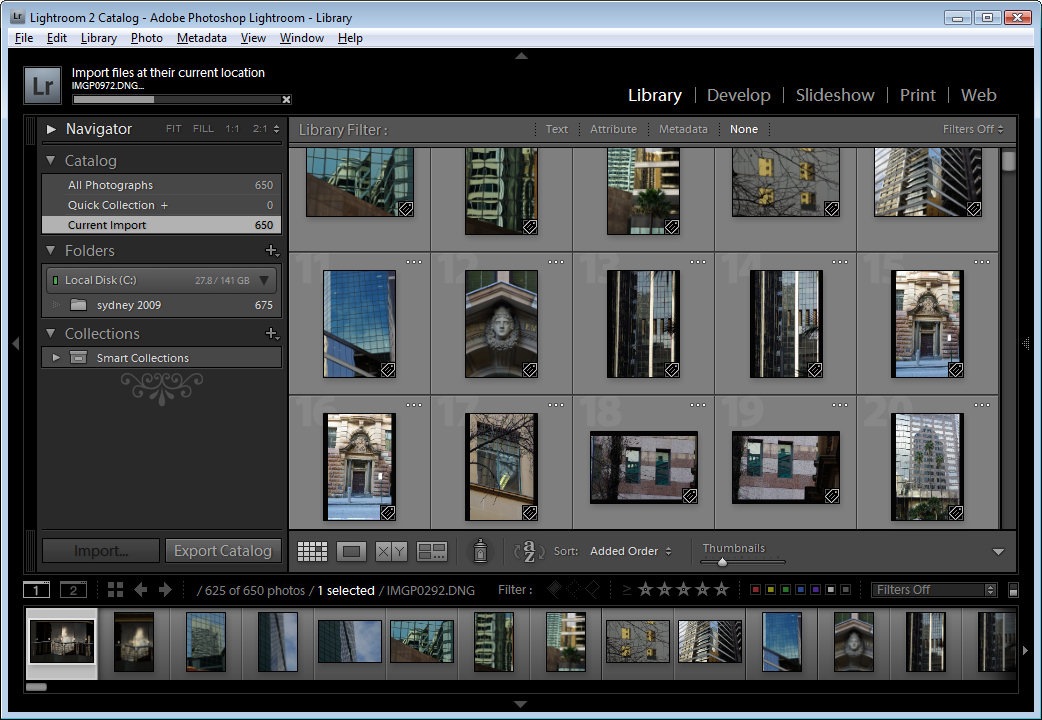
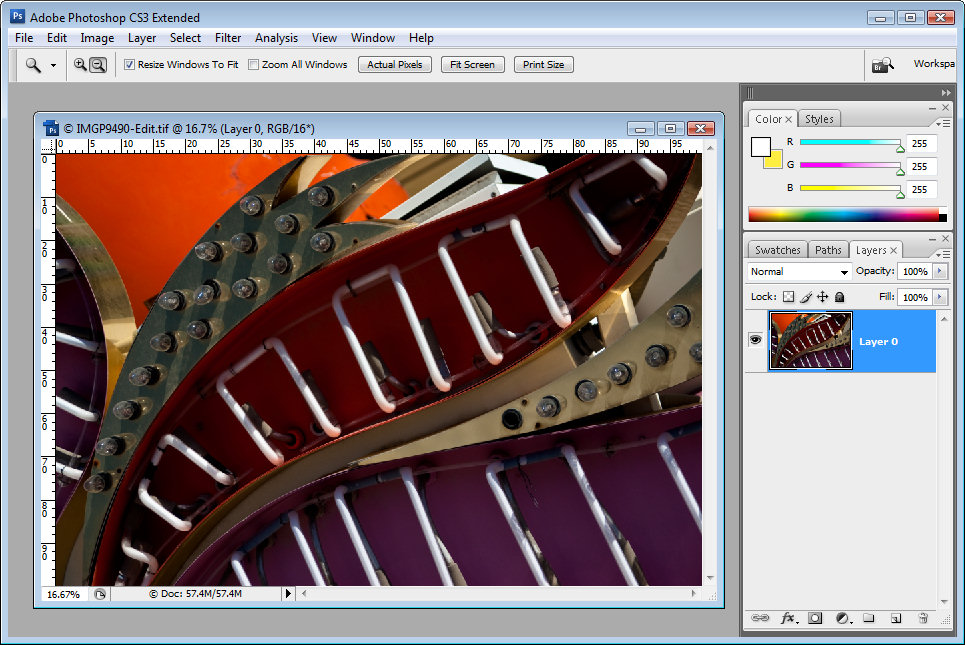
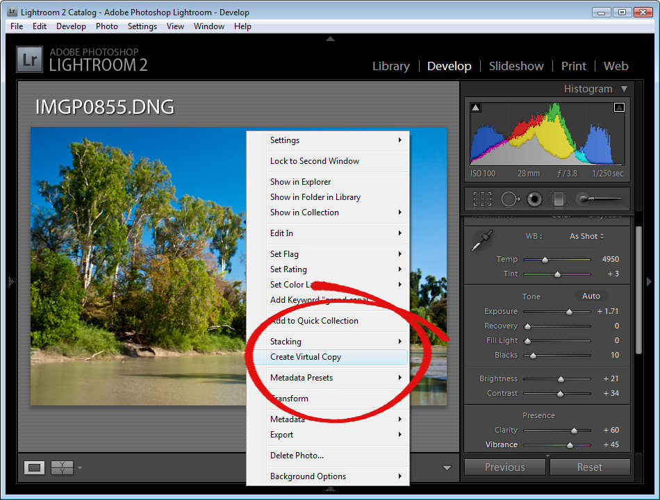
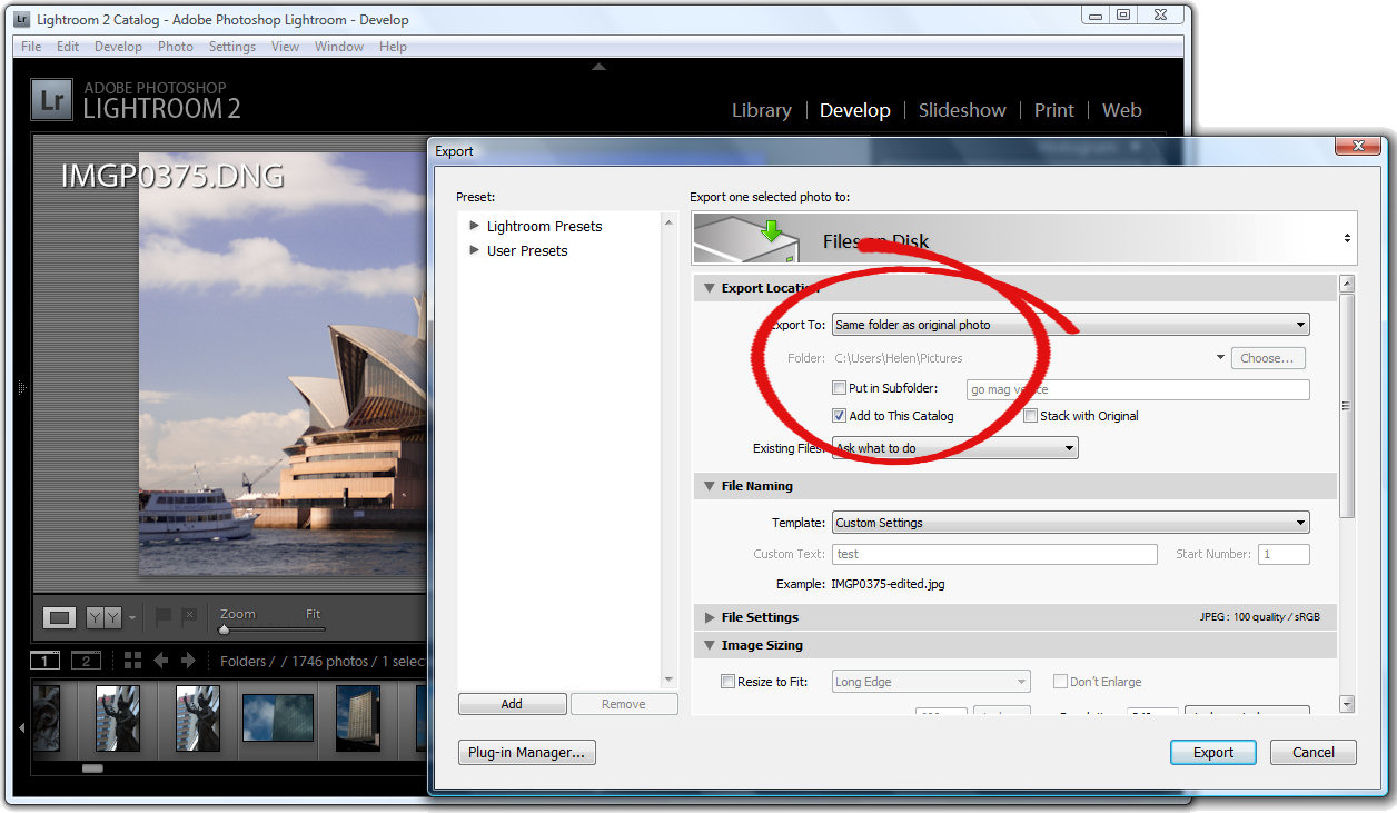
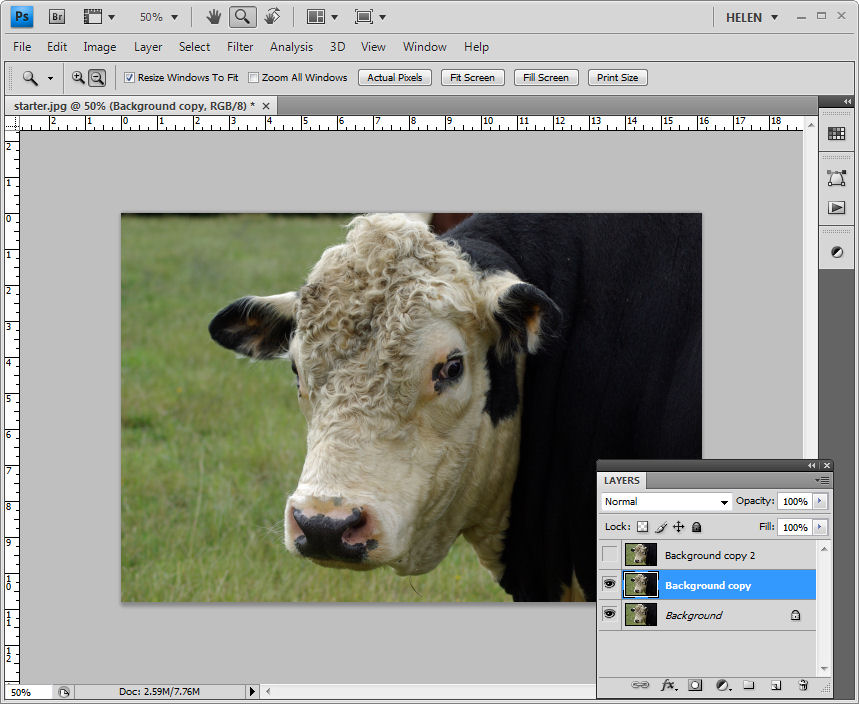
To get started with presets in Lightroom, select an image in the Develop module which is ready for some creative attention. Just be aware of any settings you have already applied to the image as these will be included in the preset if you don’t specifically exclude them. If you have done a lot of work to get the image to this stage, export a copy and re-import it back into the catalog – there’s an option that does this in one step in the Export dialog. If you now select and work on the edited version, only the upcoming changes will be included in your preset.

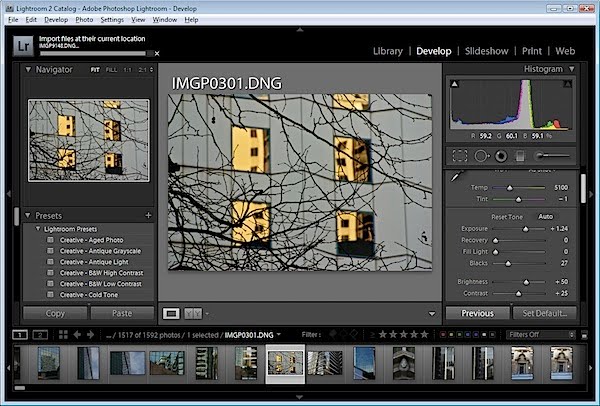
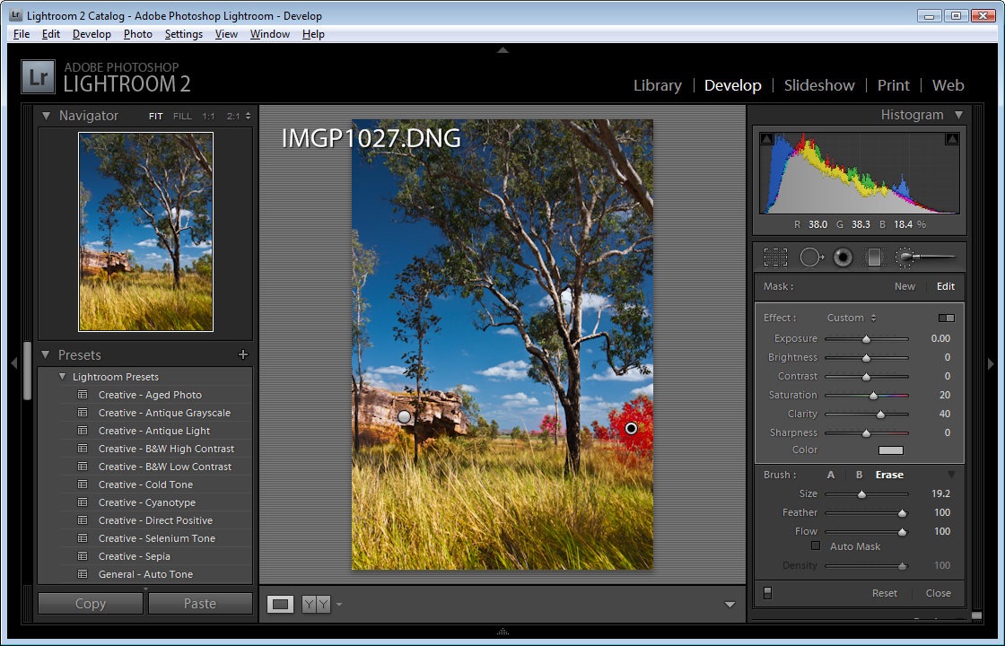
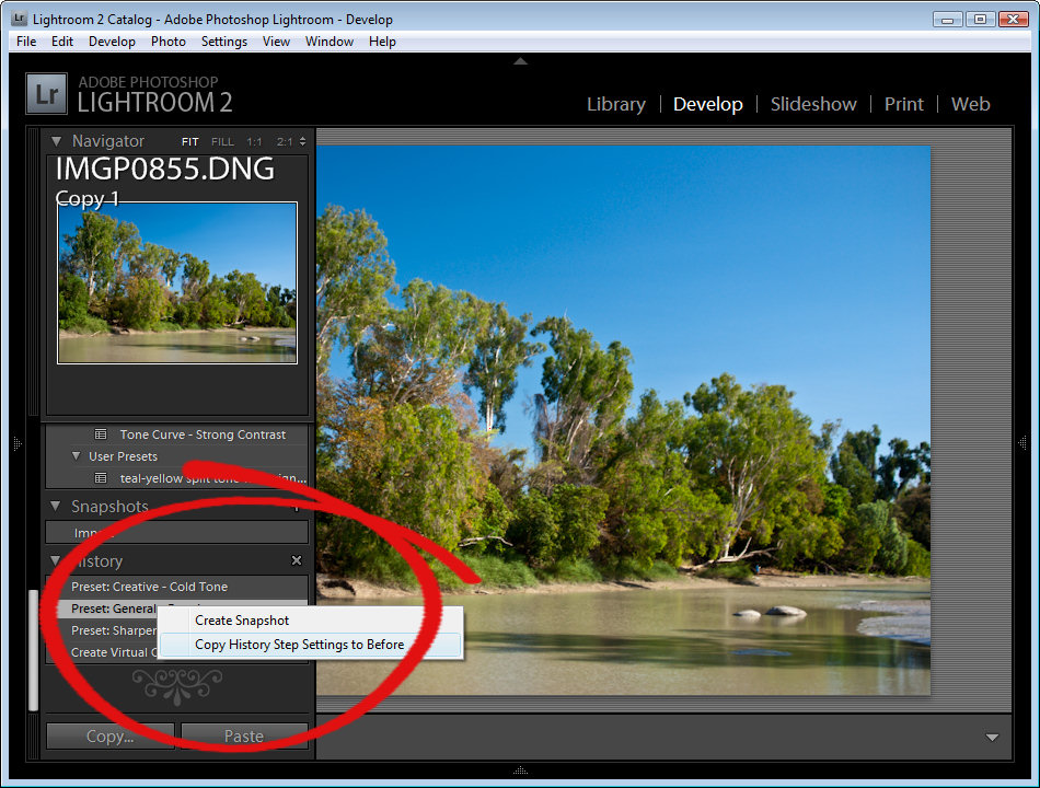
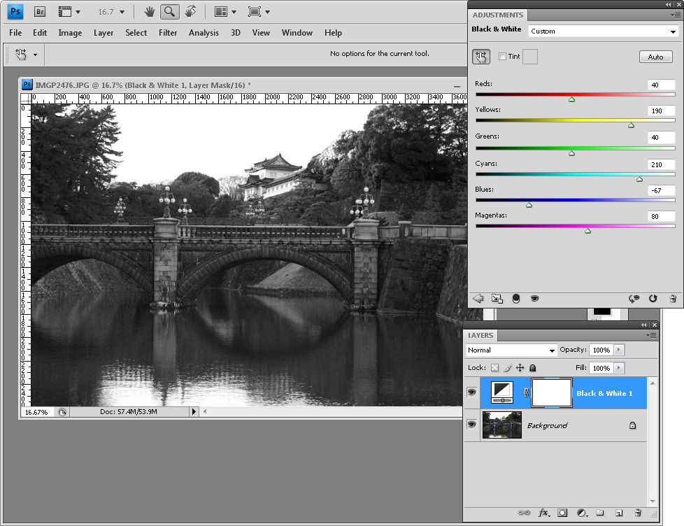
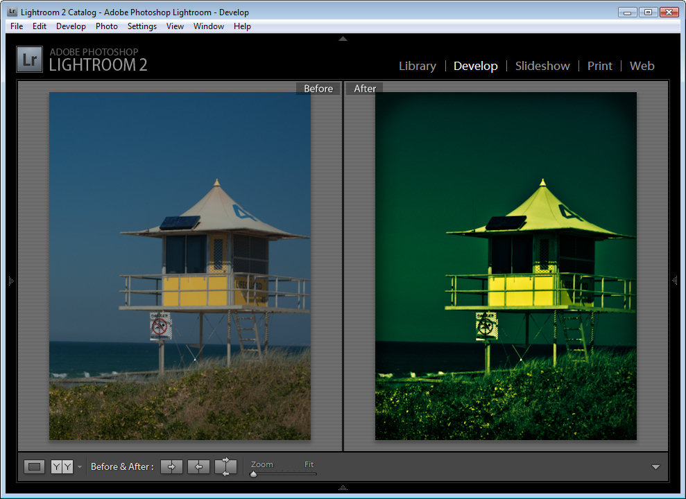
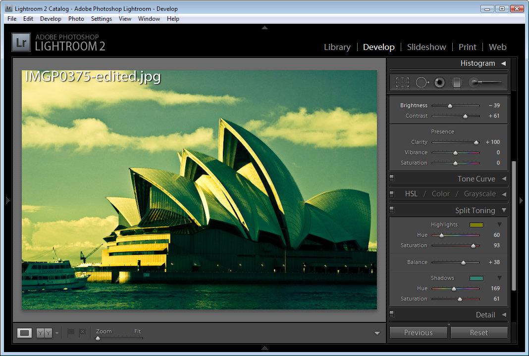
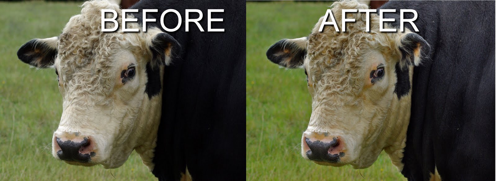
Now you’re ready to work creatively on the image. For example, to split tone the image, start by increasing the Contrast in the image and reduce the Brightness a little to compensate. Adjust the Clarity to a high value so you get more sharply defined edges.

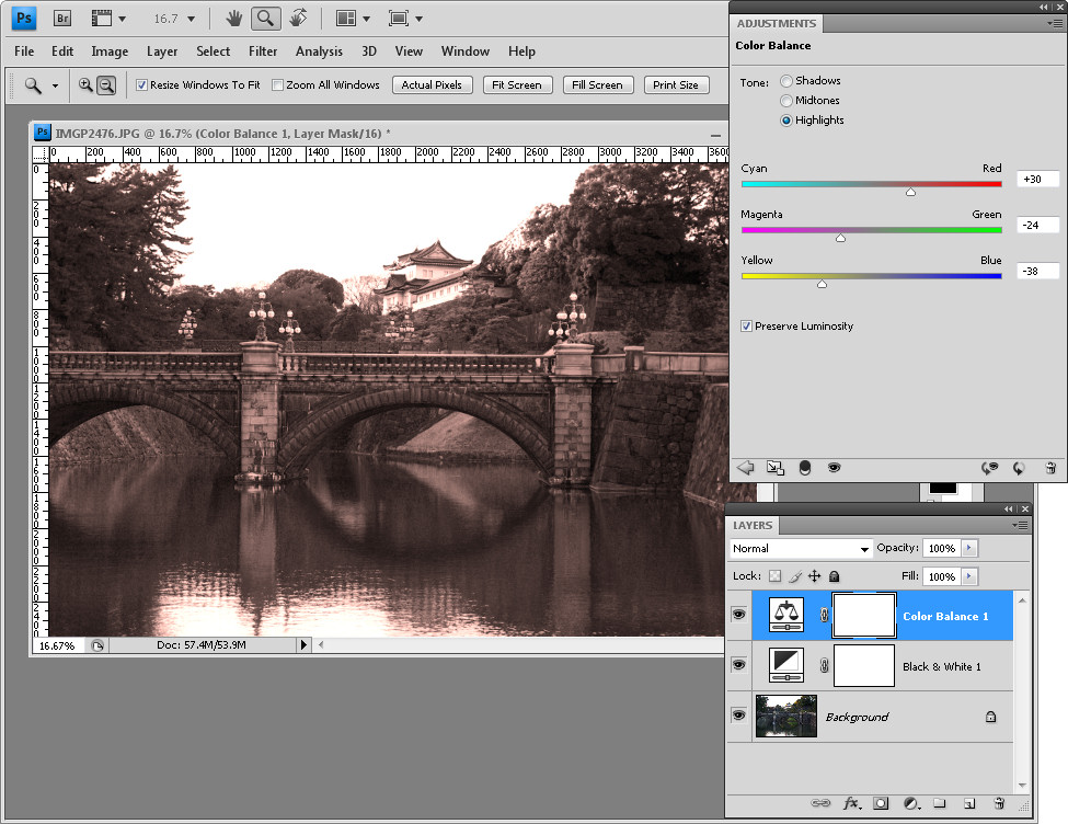
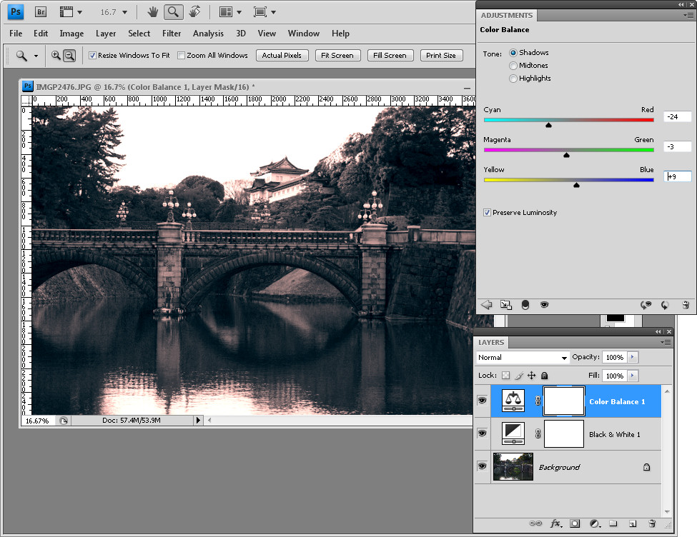
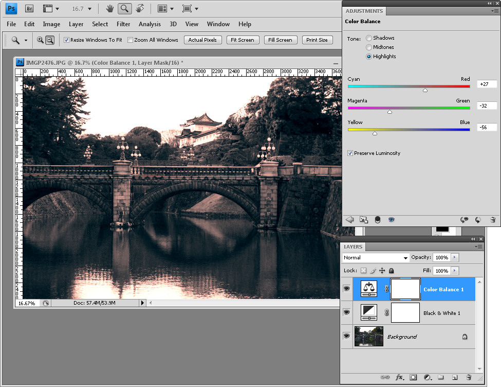
In the Split Toning options, for the Shadows click to select a dark blue/teal color and adjust its Saturation to suit. For the Highlights, select a mustard yellow and adjust its saturation to suit.

Adjust the Balance slider to favor the shadows or highlights as desired.

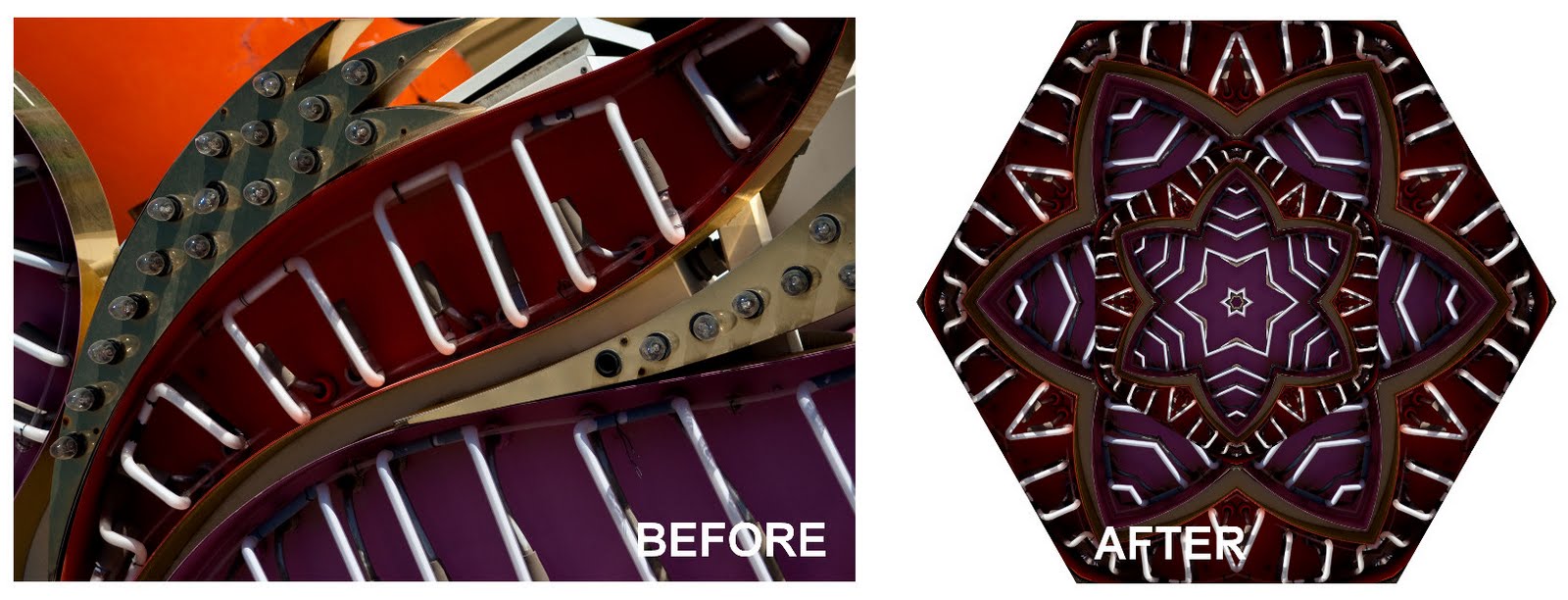
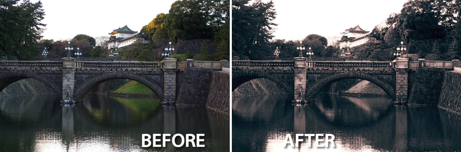
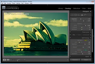
You may want to decrease Saturation and Vibrance or tweak other color settings to get the result you want. Here I added a Vignette too.

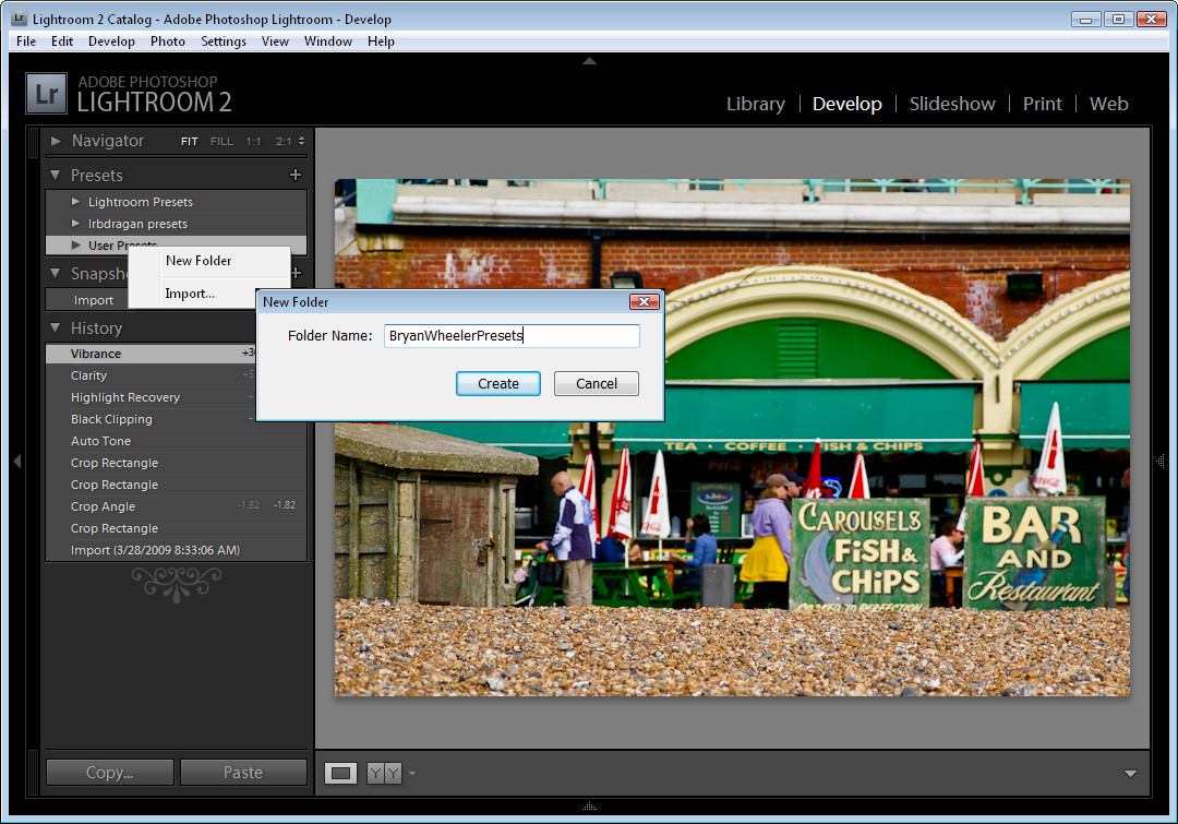
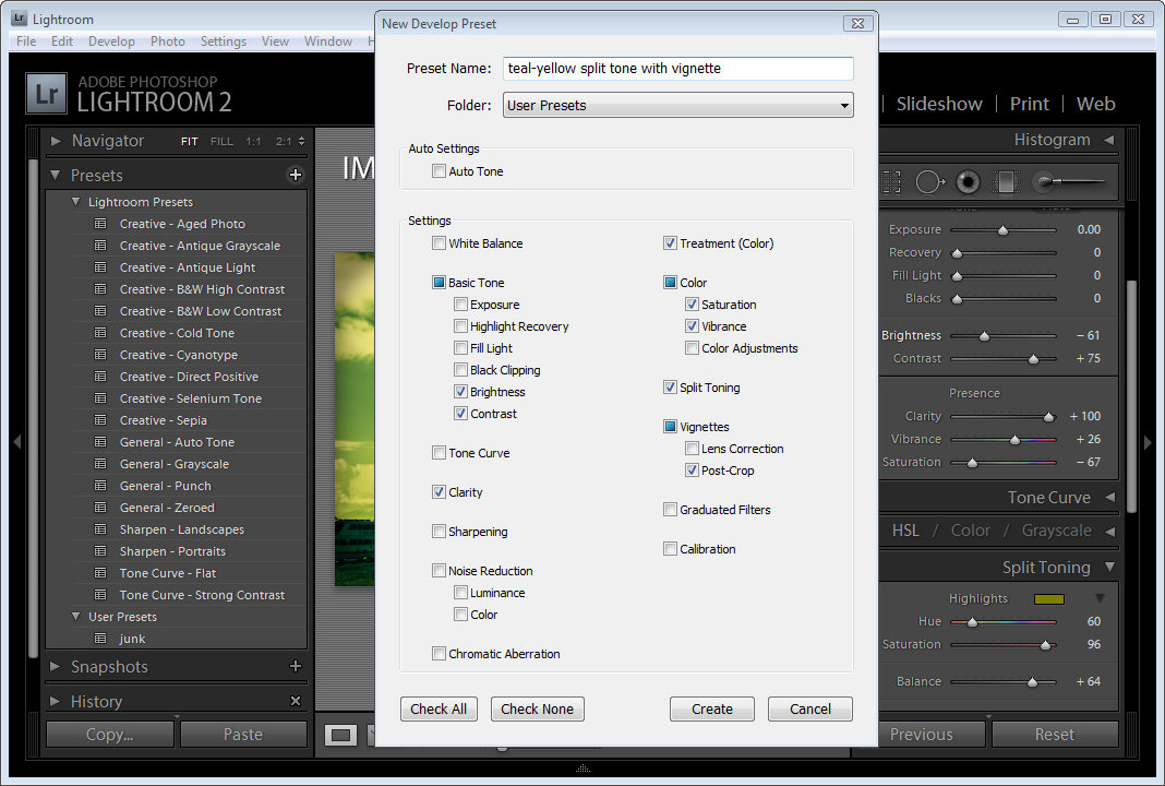
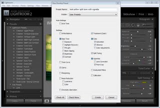
To save the settings as a preset, locate the Presets panel on the left of the Develop panel. Click the plus sign to the right of the word Presets to open the dialog.

Give the preset a name that describes what it does, in this case I called mine, ‘teal-blue split tone with vignette’. Disable any options that you don’t want stored with the preset – leaving selected only the options you have configured and want to use on every image.

For example, I set a Split Toning, added a Vignette and adjusted Brightness, Contrast, Clarity, Vibrance and Saturation.

When you’re done, click Create.

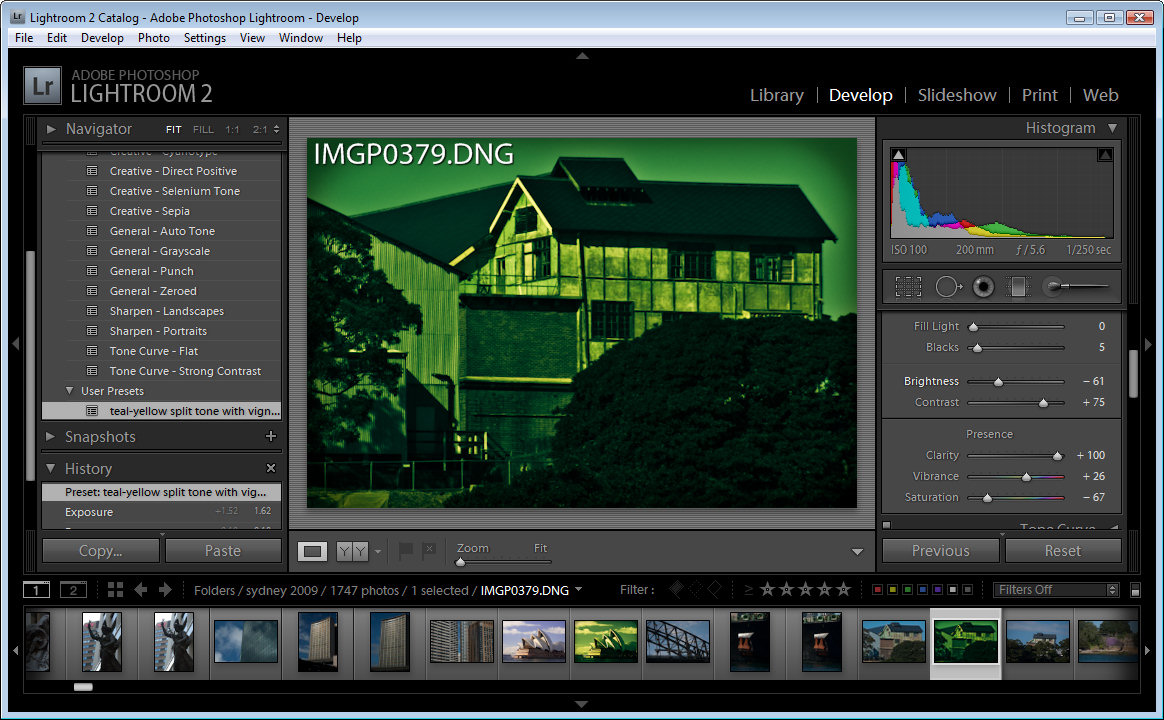
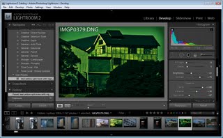
You’ll now find your preset in the User Presets collection and you can click it to apply it instantly to any image in future.

In some instances you may need to edit the image after applying the preset to it to fine-tune the effect for that image.

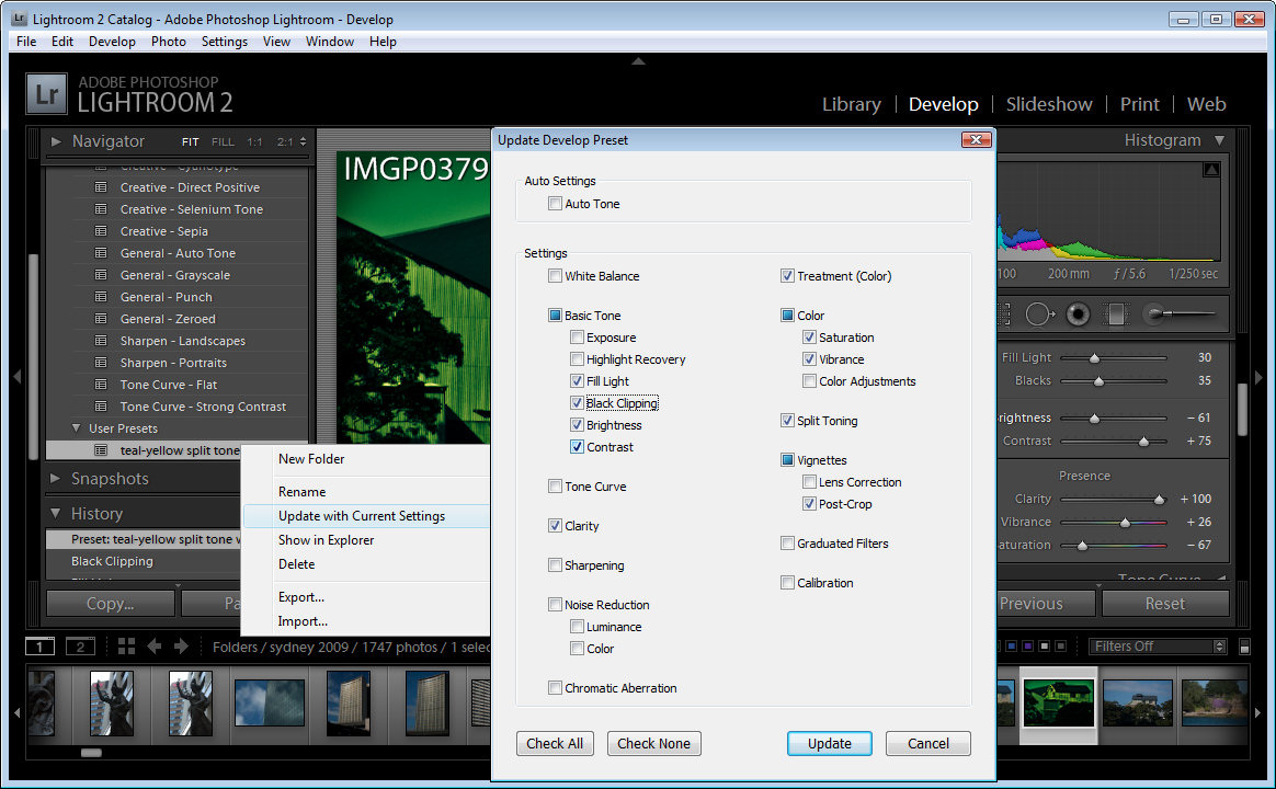
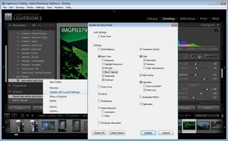
If you find that your Preset isn’t working quite as well as you imagined it would and if, for example, you always seem to make a particular change to the image after using it such as brightening it a little you can save an edited version of the preset without having to create it from scratch.

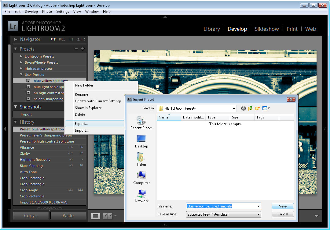
To do this, apply the preset and make your change. Then right click the preset and choose Update with Current Settings.

Select the settings to save in the preset and click Update. In future when you apply this to your images it will be applied using these new settings.

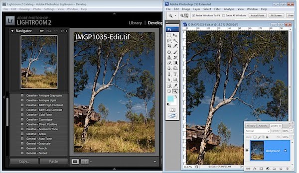
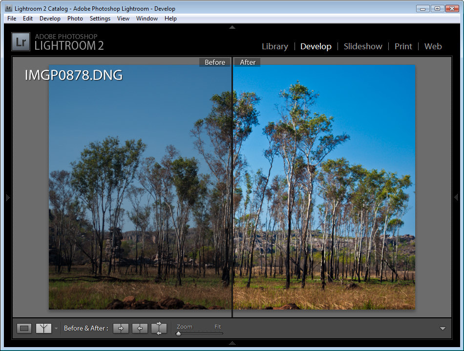
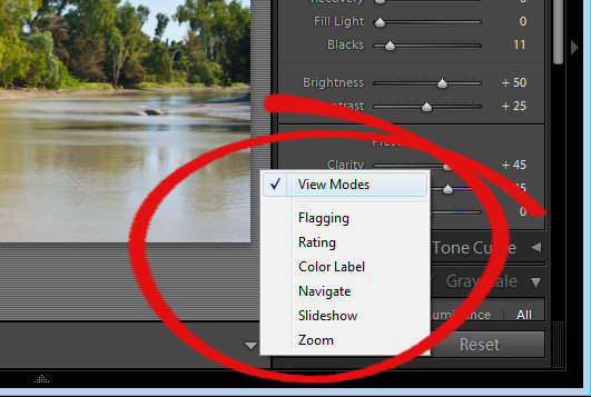
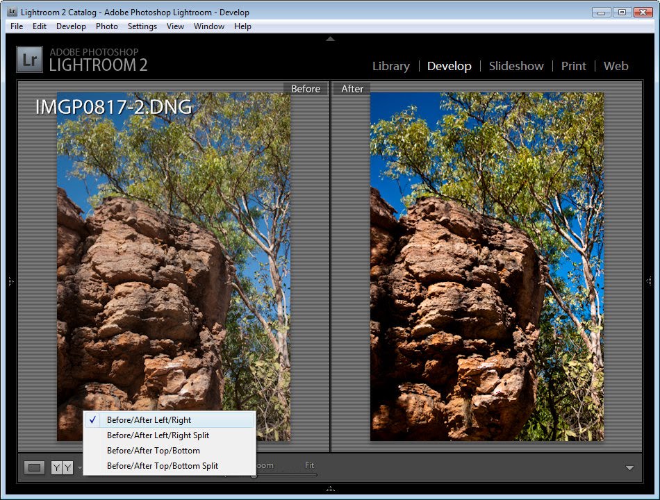
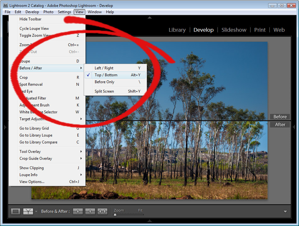
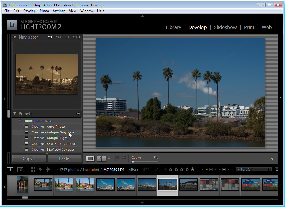
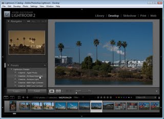
You’ll also find that a number of Presets ship with Lightroom. These are in the Lightroom Presets list. Click on any of them to apply it to your image. To see how the image might look with a preset applied, make sure that the Navigator is visible so you can preview the effect without actually applying it to the image.

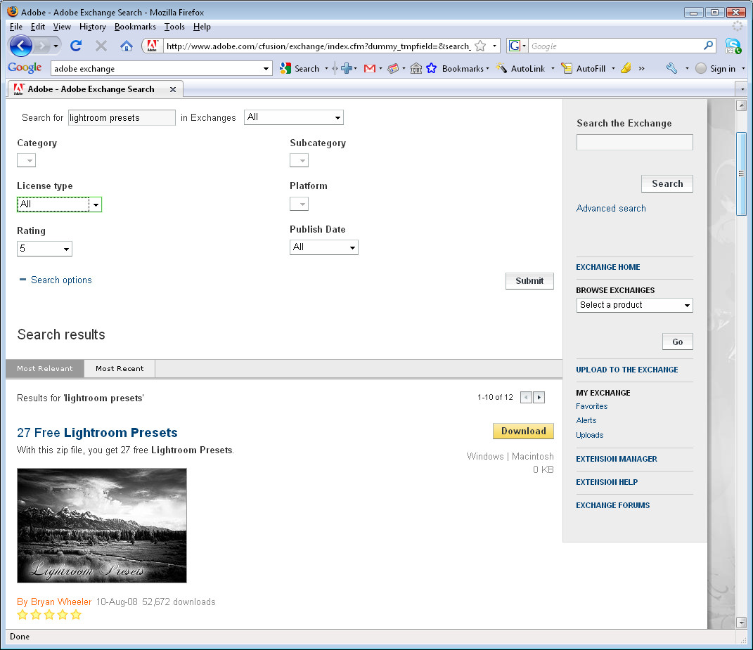
In later posts, I’ll look at downloading, installing, exporting and sharing Lightroom presets.

Helen Bradley

Sunday, January 10th, 2010

Photoshop: Selective fixes using masks

Sometimes a photo needs its tonal range fixed but some areas of the image may not need the same fix as others. Here’s how to limit the fix to a selected portion of an image using a mask.
Look at this photo and noticed that on the left are the light and highlight areas and on the right are the dark areas. The camera has exposed primarily for the light areas in the image and the darks are very black. I need to fix each side of the image independently of the other. Step 1
To fix the image make two copies of the background layer so that you do your work on duplicate layers. To do this, right click the Background layer in the Layers palette and choose Duplicate Layer and then repeat this step once more. Disable the visibility icon on the topmost layer and select the middle layer.Step 2
To bring detail out of the shadows, choose Image > Adjustments > Shadows/Highlight and adjust the Shadows but leave the highlights untouched. Typically the default setting will be all you need. Ignore any effect this fix has to the lighter areas of the image. Step 3
Now enable the visibility icon on the top layer and select it so you are working with this layer. Choose Image > Adjustment > Levels and adjust the levels to improve the contrast in the lighter areas of the image – ignore the darker areas as they have already been fixed. You can also adjust the saturation using Image > Adjustments > Hue/Saturation if desired.
Step 4
The top layer contains the adjustment for the light values and the middle layer contains the adjustment for the dark values. To blend these layers, use a layer mask to selectively adjust the opacity of a layer.

Unlike the layer opacity slider which sets every pixel to the same opacity value, a mask lets you adjust the opacity selectively so one area can be 100% opaque and others can be partially or fully transparent.

To do this, click to select the topmost layer and click the Add Layer Mask button at the foot of the layer palette to add a white layer mask to this layer. When working with masks, “black conceals and white reveals” so the white mask reveals everything on the top layer and the image is unchanged. Step 5
Set the foreground colour to black, select a round brush and set its Opacity to approximately 20%. Click in the mask to select it and paint over the dark areas of the image to reduce the layer opacity and to allow detail from the layer below to show through. Using a low opacity brush lets you reduce the opacity gradually.

Continue and paint over the area to make more transparent. It may help to turn the visibility of the top layer on and off to see what detail is available on the layer below that you may want to recover. Make sure to select the layer mask again before painting to reduce the layer opacity.

Helen Bradley

Friday, January 8th, 2010

Video! Painting with the Art History Brush in Photoshop

Here is a new video on painting with the Art History Brush in Photoshop:

A video on how to paint a photo using the Photoshop Art History Brush.

Helen Bradley