Thursday, August 26th, 2010

Get creative with Photoshop Actions

Actions are a feature of Photoshop that allow you to automate tasks. So you can record your steps as you work as an action and then play them back to make repetitive tasks more simple to perform. You can also find actions on the web that others have created and download them to use yourself. In this post I’ll explain how to find, download, install and play an action.

To find actions on the web, search for “Photoshop Actions” in your favorite search engine. You can also go to Adobe Marketplace and Exchange site at: http://www.adobe.com/cfusion/exchange/ where you can find a lot of actions for downloading. These are rated by other users so it is a good place to find good actions.

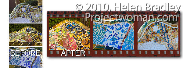
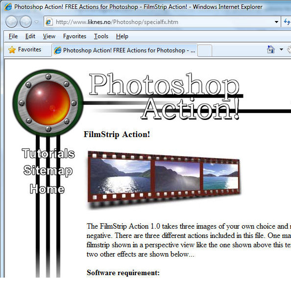
The action I will show you how to install and use is a filmstrip action for the PC that you will find at http://www.photoshop-action.no/specialfxgallery.htm. Download the filmstrip action to your computer and then unzip the file to expand the contents. Although this action states that it’s suitable for Photoshop 6, 7 or CS, it works in versions up to CS4. As a rule of thumb, most older actions work just fine in later versions of Photoshop.

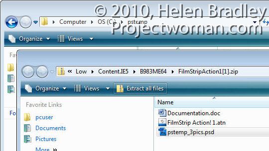
The zip file contains a .doc documentation file, a .atn action file and a .psd Photoshop file. Always read the documentation as it often contains an explanation of what you need to do to make the action work correctly.

In this case you must create a folder called \PStemp in the root directly of drive C and copy the file pstemp_3pics.psd from the zip file into that location. Do this now and leave the folder of extracted files open on your screen.

The instructions go on to tell you to close all open images and to open the three images to use for the filmstrip. It says these will be resized to approximately 730 x 530, (in reality they are resized to approx 735 x 575 pixels).  The developer suggests that the finished filmstrip looks best when you use landscape images. The order of the images as you open them is the left to right order of images in the filmstrip.

Launch Photoshop and make sure there are no open images. Make duplicates of the images you plan to use in the filmstrip and open the three duplicate images.

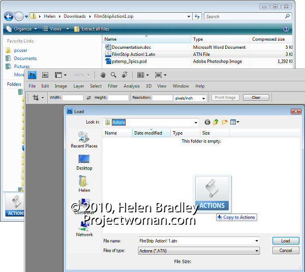
You must now load the filmstrip action and the smart way to do this is to place the file in your Presets\Actions folder so you can always find it easily. To do this, view the Actions palette by selecting Window > Actions. Open the fly-out menu and choose Load Actions.

The folder that opens is the Presets\Actions folder so drag and drop the .atn file from the dialog containing the unzipped files into this dialog to copy it into place.  Click the filmstrip!1.atn file and click Load to load it into your Actions palette.

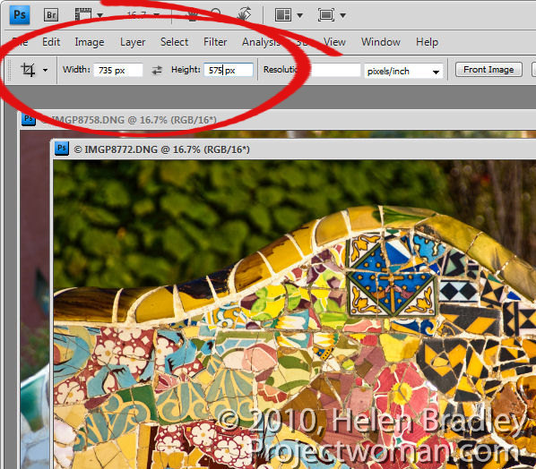
I find it best to crop the three images ahead of time to 735 x 575 pixels in size. To do this, select the Crop tool, set the Width to 735 px, the Height to 575 px and drag over the image to create the crop rectangle at the desired size. Double click to crop the image to that size. Repeat this for the other two images.

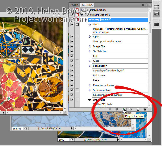
Now run the action by opening the Actions palette, locate the Filmstrip Action 1 action and click either Filmstrip [normal], Filmstrip [wavy] or Filmstrip [perspective] to run one of the three actions.

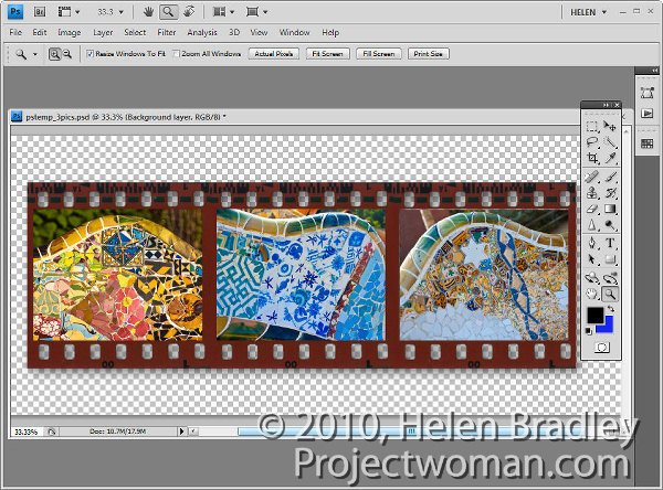
The action will stop and prompt you with a dialog telling you it is running. Click Continue and wait as the filmstrip is created for you. The action closes each of your images as it is finished with them. When you’re done, you can save the filmstrip image.

There are a few things to be aware of when you run an action. Always work with duplicate files and never with your originals, as you cannot be sure that an action will not crop or resize a file to a smaller size or change its resolution and then save it. Working with duplicate images ensures your originals won’t be damaged.

Always close all open files except those that are required by the action to be open. This will prevent you from losing unsaved work or having changes be applied to files you did not mean to be altered.

Always read the instructions for running an action before using it and make sure that any files required by the action are located in the correct place before running it.

Helen Bradley

Saturday, August 21st, 2010

5 (More) Lightroom Panel Tricks

When you spend a lot of your editing time in Lightroom it makes sense to learn how to work the interface so it behaves as you need it to. In a previous post (http://digital-photography-school.com/my-5-coolest-lightroom-commands) I listed some of my favourite Lightroom interface features. Here are my next favourite five, most of which have earned a place in my repertoire courtesy of spending far too much time editing on a 12″ laptop where screen space is at a premium:

Learn the F keys

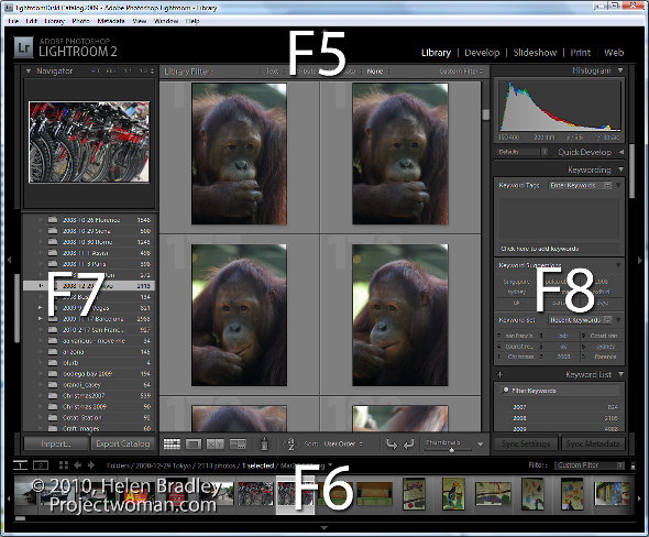
The function keys F5, F6, F7 and F8 can clean up the Lightroom screen very quickly. F5 controls the top panel, F6 the bottom, F7 the left and F8 the right panel. Pressing any one of these keys will hide or display the appropriate panel. It’s an easy way to get rid of a panel you don’t want to see without having to reach for the mouse.

It is T for toolbar

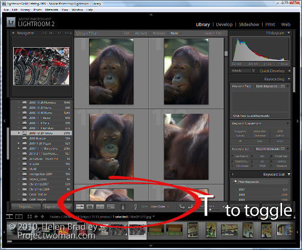
At some time you may have toggled your toolbar off by mistake. When it goes, it takes with it handy tools such as Flag, Rate, Color Labels, the rotation tools, zoom tool and your Loupe and Grid buttons. In short, one accidental press of the T key can wipe out a lot of Lightroom functionality. When these tools go missing, press T and they’ll all come back again.

More panel magic – Tab key

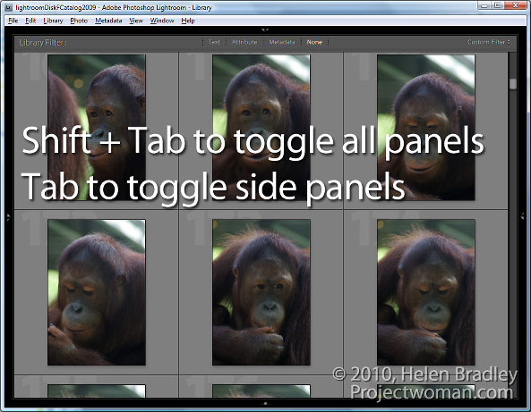
When you need to instantly remove the side panels from the screen, hit the Tab key. Shift Tab will toggle all panels on and off, Tab toggles just the side panels.

Open a second window – Yep – how cool is that?

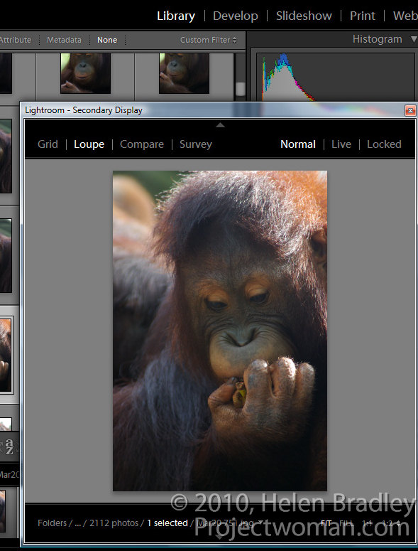
If you want to see the Grid, Loupe, Compare or Survey View in a new second window, press F11. Once the second window is open, you can select what to view in it.

In Loupe view you can Lock the second window so that you see a single image in it regardless of what is visible on the main screen or choose Normal to view the currently selected image or Live to see the image under the mouse pointer.

To get rid of this window, press F11 again or click its Close button.

Lights out and screen modes

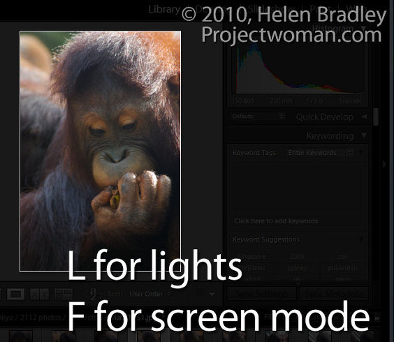
The L key toggles through the various lights out mode. The first is lights down, the second lights out and then press it again to return to the regular mode. This is handy when you want to see one image or the entire grid without any screen distractions. Similarly the F key scrolls around various screen modes including Normal, Full Screen with Menu bar,  Full Screen and Full Screen and Hide Panels.

More info for Mac users:

Thanks to Facebook user Victor Cincola for this additional information for Mac users. You will need to use Command + F11 to open a second window on the Mac. In addition if your function keys F5, F6 etc do not work  as described above you have Apple shortcuts enabled so you will need to use Fn + F5, Fn + F6 and so on – check your keyboard for the Fn key.

Helen Bradley

Monday, August 2nd, 2010

Photoshop – invert a path

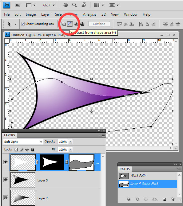
When you use a Vector Mask in Photoshop you can use the pen tool to create your path. All you need to do is to close the path and you will have a custom editable vector mask. However, if your mask is white where it should be not be selected and you need to invert it you need to invert the path.

To do this, click the Path Selection tool and target the Vector Mask and click on your path. On the tool options bar you will see an icon called Subtract From Shape Area – click it and the path will be inverted so anything which was masked before will not be now and vice versa.

Helen Bradley

Monday, July 26th, 2010

Photoshop: Pen tool trick


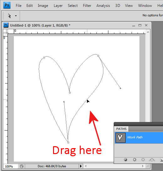
Ok, I am first to admit it, when I stumbled across this trick I went “Wow! I didn’t know you could do that!” I was designing a small heart using the pen tool and I dragged near one side of the shape with the Direct Selection tool and woah! The entire side of the heart moved. Amazing what you find when you get some time to play – well I was going over some notes for a Photoshop presentation I was doing but all the same – it was a lightbulb moment and I just love them when they happen.

 So, here’s how to do it. Make a shape with the pen tool or choose the Custom Shapes tool and the Paths option and draw a path in an image. Click the Direct Selection tool (it shares a toolbar position with the Path Selection tool). Drag over one of the nodes to select it and now drag near the path either side of that node. When you do, the path moves with you.  It’s yet another way of reforming your paths and it’s not what I would call intuitive but it is very handy when you know how it works.

Helen Bradley

Sunday, July 25th, 2010

Lightroom: Arrange files your way

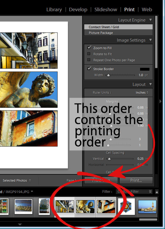
Often when you’re working in Lightroom you will want the images to be sorted in the order that you want to see them, not in as order such as capture date which is one of the Lightroom sort options.

You may want to do this when assembling images for a slide show or for printing, for example as the order of the images in the filmstrip will affect how the images appear in a print template and in the slideshow.

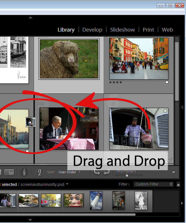
You can control the order of images in a Lightroom folder by dragging and dropping an image from one place to the other in the filmstrip view. To do this, grab the image in the middle and drag on it until you see a black bar appear between two images. If you let go the image it will drop into the indicated position.

This drag and drop process works in most instances but there are some exceptions to be aware of.

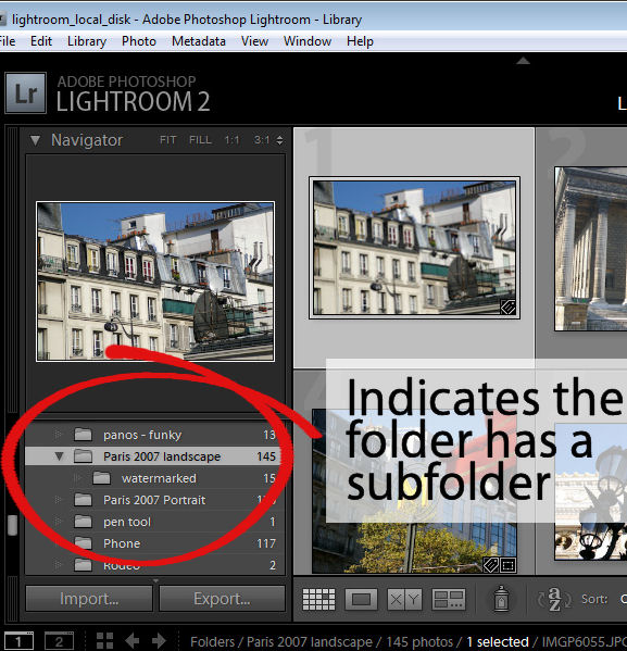
The first is that this will not work if you are in a  folder where there are images in a subfolder below it which are also visible. You can see if this is likely if you open the fly-out for the folder in the Folders panel in the library. If there is another folder the one you are working on, chances are that the images in the subfolder are included in the filmstrip and so you cannot arrange the images by dragging them into position if this is the case.

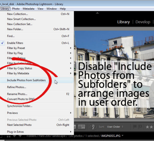
To workaround this limitation you can remove the photos in the subfolder from view – this just removes them from the grid and filmstrip and not from Lightroom or your disk. To do this, click Library in the menu and disable the Include Photos from Subfolders option.

With this disabled, you can now move images by dragging and dropping them into position.

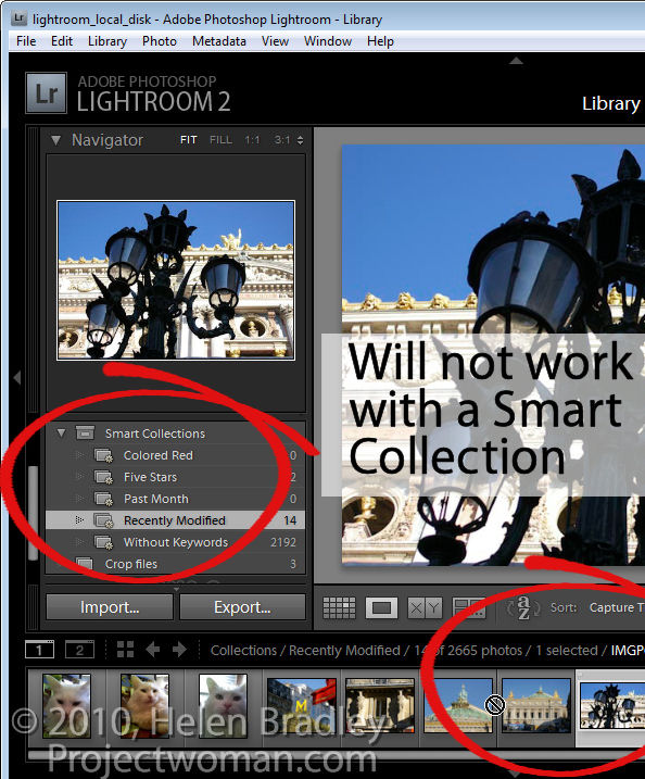
Another exception is when you are working with a Smart Collection. While images can be located in a regular collection and rearranged in order to suit, they cannot be rearranged if they are in a Smart Collection. If you have images in a Smart Collection that you want to be in a specific order, you will need to create a regular collection for them and add them to it to do so.

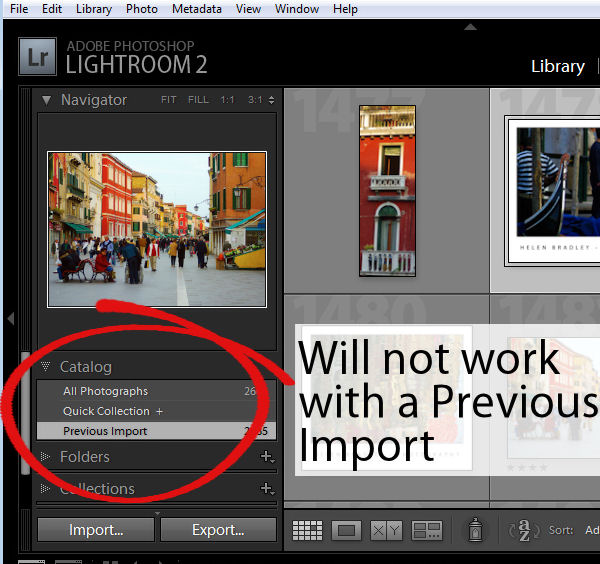
Another situation where you cannot reorder images to your own preference is when you are working on the images in the Catalog such as Previous Import. You must, instead, locate the folder or collection in which the images are stored and rearrange them there.

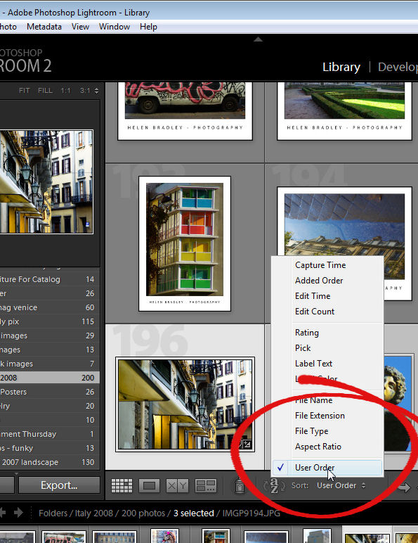
Once you have arranged the images as you want them to appear, Lightroom stores your ordering so it is as accessible as, for example, any other sort order options for that folder or collection. So, you can return to your preferred sort order at any time by selecting User Order from the Sort dropdown list.

Helen Bradley

Sunday, June 20th, 2010

Lightroom to Flickr

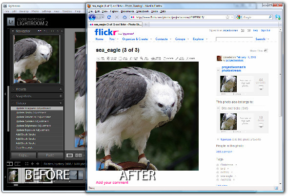
If you’re a keen photographer, chances are that you publish some of your photos to Flickr for sharing with friends and family. One of the disadvantages of Lightroom 2 is that it does not come with a built in tool for publishing direct to Flickr although this has been addressed in Lightroom 3 which does offer this ability.

There are, however, tools like Jeffrey Friedl’s Lightroom plug-in that you can use to do the job. Here’s how it works:

Step 1

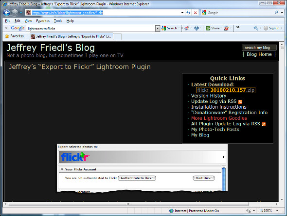
To download the tool, visit http://regex.info/blog/lightroom-goodies/flickr and locate the tool for your version of Lightroom. There are different downloads for Lightroom 1 and Lightroom 2 so get the right one.

Step 2

Download the zip file which, if you are using Lightroom 2 is via a link in the top right hand corner of the screen.

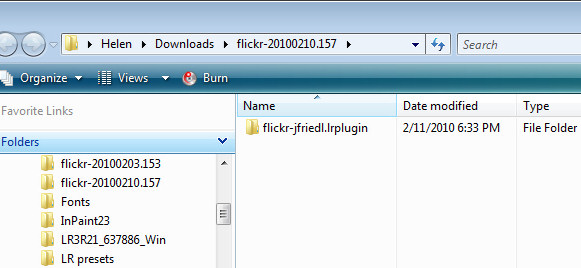
Unzip the downloaded file and, when you do, you will see a .LRPlugin folder inside the zip file.

You need the entire contents of this folder so drag and drop the entire folder from your Downloads folder into the place where you plan to keep it long term.

Lightroom isn’t fussy about where you place your plug-ins but it makes good sense to place them all in a central location where it is easy for you to find them. I suggest you place it nearby your Lightroom folder or in your Documents folder where it will be included in your regular system backup.

Step 3

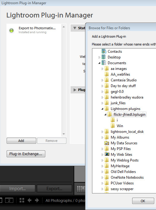
Now return to Lightroom and choose File > Plug-in Manager. This opens the Plug-in Manager dialog where you install your Lightroom plug-ins. Click Add and navigate to the folder that you stored the .lrplugin folder. Click the folder to select it and click Ok.

Click Update if prompted to update your catalog to support the plug-in. A dialog will appear with more instructions in it. Read the information and click Ok when you are done.

Step 4

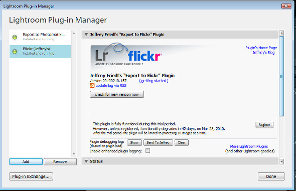
The Plug-in will be listed in the plug-in list so click Done to exit the dialog.

Step 5

Now select a few images to upload to Flickr. Right click one of the selected images and choose Export > Export.

At the very top of the dialog you will see the Files on disk heading, click this panel and locate the Flickr (Jeffrey’s) option in the list.

Go ahead and (ignoring the Export Location settings) complete the other areas of the Export dialog as you would for any export task.

Pay particular attention to the file names, file format and quality because, when you click to Export the files they are sent direct to Flickr.

If you plan to resize the images select the Image Sizing options and choose the desired option.

Step 6

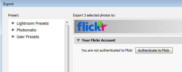
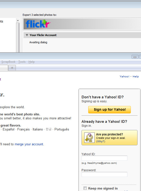
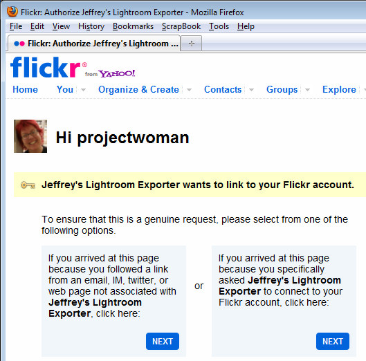
Click the Authenticate to Flickr button at the top of the dialog. You only need do this the first time you upload images. Your browser will open and you should sign in using your Flickr log-in and password.

Step 7

When prompted, click the second Next button to authenticate the connection then click Ok, I’ll authorize it if you are happy with the conditions displayed.

Once you have done this, close your browser, return to Lightroom and click the I’ve authenticated at Flickr.com button to confirm you have done so.

Step 8

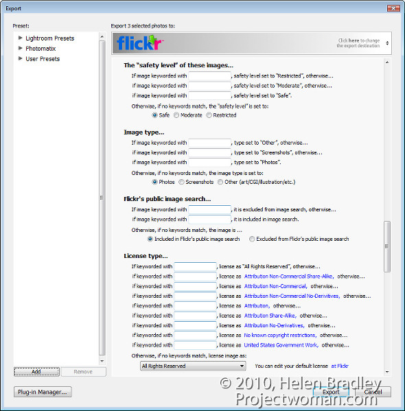
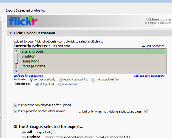
Once you are authenticated, additional options are available in the Export dialog. You can, for example, select the photosets for the images and ask to view the Flickr photoset when uploading is complete.

Step 9

You can also set Licence types for the images, add keywords and configure a range of options for uploading.

Step 10

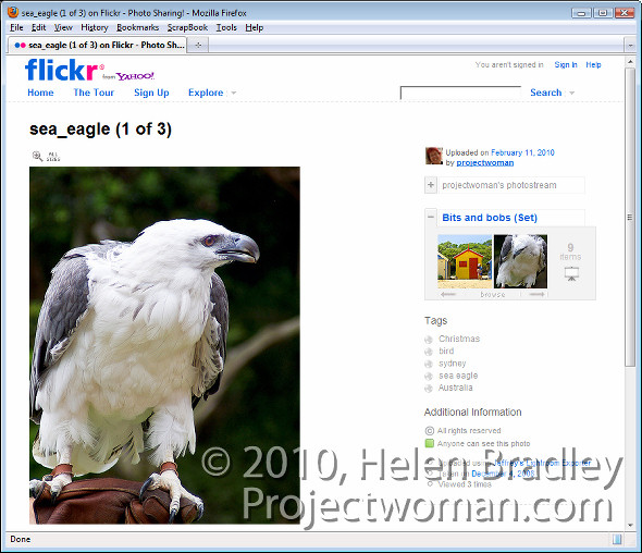
When you are done, click the Export button to export your images to Flickr.

This Lightroom plug-in is, what is called, donation ware. It is functional for six week and then you’re asked to register and make a donation one cent is the minimum PayPal fee. If you don’t register then functionality is reduced to uploading ten images at a time.

This plug-in works well and, until you upgrade to Lightroom 3 it is a smart addition to your Lightroom toolkit. For my money it makes the upload process seamless. And, because it saves me an entire step by rolling Export from Lightroom and upload to Flickr into a single step it represents the difference between things being left on my to do list and tasks getting a big black line drawn through them – and I like that!

Helen Bradley

Tuesday, May 4th, 2010

Cropping in Lightroom

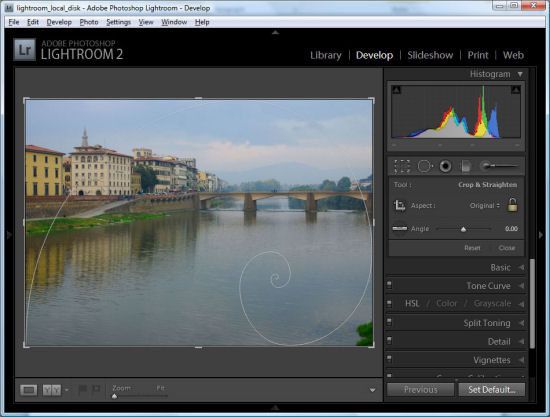
Ok, so it’s pretty easy to crop an image in Lightroom- just click the Develop module and click crop. But try to crop to 6 x 4 – there’s a 4 x 6 size but that’s not the same as 6 x 4 as you’ll soon find out.

Here is a link to a video tutorial that shows how to crop in Lightroom, including how to crop to that 6 x 4 and how to display handy crop overlays.

Watch the Video – how to crop in Lightroom.

Helen Bradley

Tuesday, April 20th, 2010

Lightening backgrounds in Lightroom

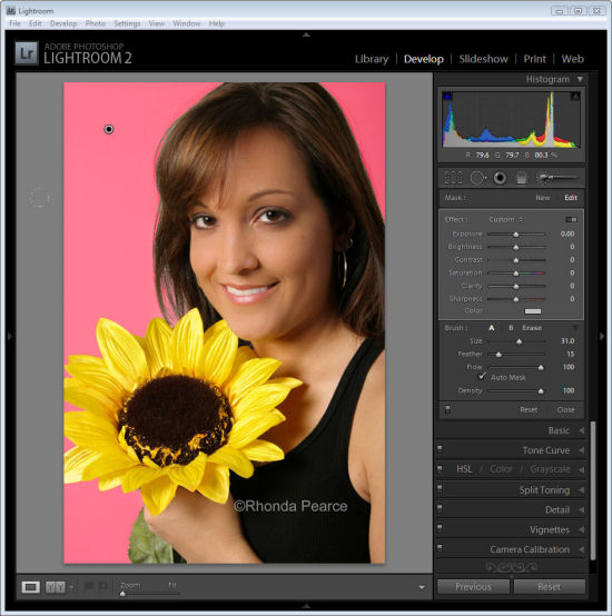
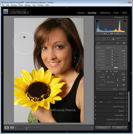
I was recently asked by photographer Rhonda Pierce to look at an image that she’d taken and to suggest how the background could be lightened to white in Lightroom.

This image raises an interesting question for anyone involved in postproduction and trying to understand when to use Lightroom and when to use Photoshop for editing.

Ultimately, if this image is to be printed at a large size then Lightroom really isn’t the tool for the job. There is too much wispy hair, particularly on the left side of the model’s face just opposite her mouth, which is cumbersome to work with in Lightroom. Selecting around the hair and doing a detailed job really isn’t possible or feasible in Lightroom. Ideally, Photoshop and a good extraction tool such as Vertus Fluid Mask would be the best combination to use.

However, if the image is not going to be printed at a large size and, for example, it’s destined for the web or if it is a preview image for a client where they’ll choose their favorite image from a series, then Lightroom is a good tool for the job. While Lightroom won’t do such a good job, it will do it very fast and, at the resolution we’ll be using the image we probably won’t see any real difference anyway. For this use, we can compromise on quality and harness the superior speed of Lightroom.

Later on, if this is the image the client chooses and if it will be printed at a large size, then we can wind back the Lightroom changes, export the image to Photoshop and do a proper job. We’ll only be spending time fixing those images that the client is actually paying for and that need a quality fix applied.

Lightening the background in Lightroom
So, assuming this image is destined for the web or for client preview purposes, let’s go back to the original question as to how the background can be lightened in Lightroom.

Any solution will require us to isolate the background. It’s not possible to lighten the background in Lightroom without affecting everything else in the image and that will destroy the rest of the image. The Adjustment Brush is the obvious solution.

Step 1
Click the Adjustment Brush in the Develop module and size Brush A so it is big enough to paint over the background. Add a small feather, and for this job, enable Auto mask so Lightroom will do most of the selection work for us. Set Density to 100.

Click and paint over the background with the brush. When you lift the brush you’ll see the Adjustment Pin. Make sure the cross hair in the middle of the brush stays on the background and then the Auto Mask feature will ensure that the brush doesn’t paint over anything but the background.


Step 2
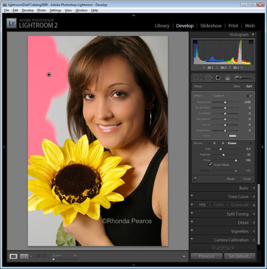
To see the painted area, press the O key and a red overlay will appear. This makes it easier to see where you are working.

Step 3
To get the background behind the very fine hairs you might be tempted to select a very small brush and try to isolate the areas manually. However, to do the job fast, it’s more efficient to size the brush very large so the center can be positioned over an area of the background and the rest of it extends over the wispy hair area. It might help to significantly decrease the density at this point to around 30 so that you only partially select the background in the wispy hair area.

Position the brush over an area of the background so the rest of it extends over the wispy hair area and click once.


Step 4
Return to 100% density and continue to work in the other background areas making sure to avoid the wispy hair.

When the area that you want to effect are selected, press O to hide the mask.

Step 5

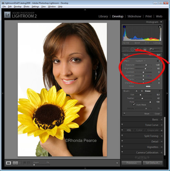
Now adjust the settings for the Adjustment Brush. Increase the exposure and brightness until the background is white.

Click Close to close the panel and deselect the Adjustment Brush.

Step 6
Check the wispy hair area and you’ll see that not all the grey has gone but, when viewed in context of the remainder of the image the results are acceptable.

Press the backslash key (\) to see the image before and after the fix.

Helen Bradley

Tuesday, April 13th, 2010

How to create an animation in Photoshop CS4

I recently posted a movie I had created in Photoshop CS4 Extended and I mentioned I’d do a post on how it was done. Here is the result. It is a video showing step by step the process of assembling the layered Photoshop file. How to clip the flash to the image, how to move the image using the 3D tools in Photoshop and then how to create the animation and render it as a mov file. It’s a pretty simple process once you know how and if you’ve had experience with making movies or animations before much of it will be familiar to you.

Click to go to Vimeo to view the movie

If you tried to view the video previously this is a replacement – the first version didn’t convert properly when uploaded to Vimeo.

Helen Bradley

Saturday, April 10th, 2010

Animations from Photoshop

One of the very cool things about Photoshop CS4 Extended is its 3D and animation features. I’ve been playing around with both and this video incorporates some 3D camera moves, animation techniques and Photoshop effects. The best thing of all is that it is all done in Photoshop – all the way from extracting the photographer, creating the flash, clipping it to the image,animating it and exporting it as a MOV file. I’m putting together a post on how it’s done – just thought I’d tempt you with the final results.

This is a 3D animation created in Photoshop. It is composed of multiple layers including the background photo, the guy taking the photos, his shadow and a faux flash. It’s pretty simple to create and showcases some of the features available in Photoshop CS4 Extended.

Helen Bradley

Thursday, April 8th, 2010

My 5 coolest Lightroom commands


There is so much of Lightroom that’s not apparent when you first begin using it and that takes time to discover and explore. Here are my five cool Lightroom techniques that you might want to add to your Lightroom toolkit.

Shortcuts

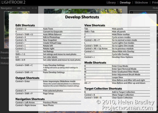
There are a lot and lots of keystroke shortcuts in Lightroom, and it takes time to learn them all. It’s also harder still to find them so you can learn them all! That is unless you know this one keystroke shortcut. Press Ctrl + / (Command + / on the Mac) to display an overlay of shortcuts over the top of your Lightroom window.

The list is module specific so check it in the Develop module for shortcuts for that module and in the Library for Library shortcuts and so on.

Go solo

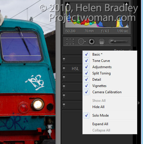
If you find that opening panels in Lightroom clutters your screen with lots of open panels why not have Lightroom automatically close each panel as you open a new one. This is called Solo Mode.

To change the panel behaviour, right click on one of the panel names and choose Solo Mode from the small dropdown menu which appears. With this enabled the disclosure triangles change appearance to show as a series of small dots instead of being filled with solid colour. This indicates that the panel is operating in Solo mode.

You can also enable this by Alt + Clicking (Option + Click on the Mac), on the panel name (not the disclosure triangle). The selected panel will open and the mode will toggle between Solo mode being selected and not.

Note that some items like the Navigator and the Histogram are not part of this behaviour so even if you have solo mode operating these panels won’t close down.


Colour your life

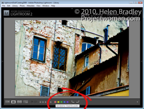
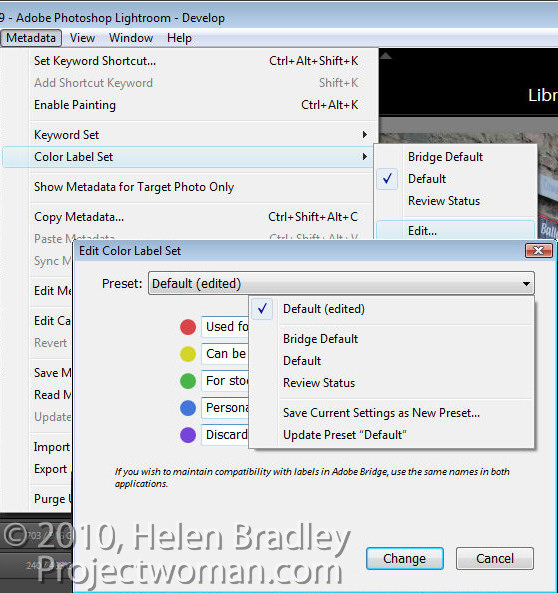
If you find the colour labels; Red, Yellow, Green, Blue and Purple just a little short of useless, why not customise them to suit your own needs. To do this, redefine what each stands for by switching to the Library mode, choose Metadata > Color Label Set > Edit and edit the colour labels to make them stand for whatever you like.

Type your own description for each colour and from the preset dropdown list, select Save Current Settings as New Preset and give the preset a name.

Alternatively, you can use one of the two other sets provided, Bridge Default, which matches the colour settings used in Adobe Bridge or Review Status, which is another option with preset descriptions for each colour.

When you choose either your own set or one of the other shipped presets and hold your mouse pointer over one of the colour labels you will see the custom description appear making colour coding images way more useful than before.


Faster Ranking

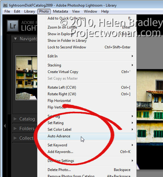
Until I discovered what was happening I used to find ranking photos a bit of a hit or miss affair. Sometimes when I pressed a number 1 to 5, to rank the image as a 1 – 5 star image the image would be ranked and Lightroom would progress to the next image. Other times Lightroom would rank the image but stay with the current image still selected.

The key to controlling this behaviour is to enable AutoAdvance mode. There are multiple ways to do this, and the simplest may be to set the Caps Lock key on. Then when you press a number to rank an image, Lightroom will automatically rank it and progress to the next image. You can also enable this option by selecting Photo > Auto Advance in Library mode.

Of course, it’s also possible to use Shift + one of the numbers 1 to 5 to do this too, but I prefer a single key solutions that do not require me to use two hands.

Before/After alternative

Often when you’re working in the Develop module you’ll want to see the effect of applying a single change to the image. This is most particularly the case when you are sharpening the image, and you want to see the result before and after sharpening.

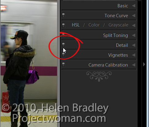
If you use the backslash key (\) you’ll see the Before and After view where the Before view shows the image as it was when you imported it into Lightroom. If you want to see just the Sharpening effect you can use the On/Off switch at the top left of the Detail panel.

This switch turns Detail panel settings on and off so you can see the results of just removing and reapplying your sharpening with all other changes to the image still in place – even if you applied them before the sharpening.

This gives you additional flexibility in determining whether the edits that you’ve made to the image are those that you want to use.

So, these are my five cool Lightroom techniques and now it’s over to you. If you were to share with someone your favourite (and not so obvious), Lightroom tips or tricks, what would they be?

Helen Bradley

Thursday, April 1st, 2010

Create a Lightroom Slide Show


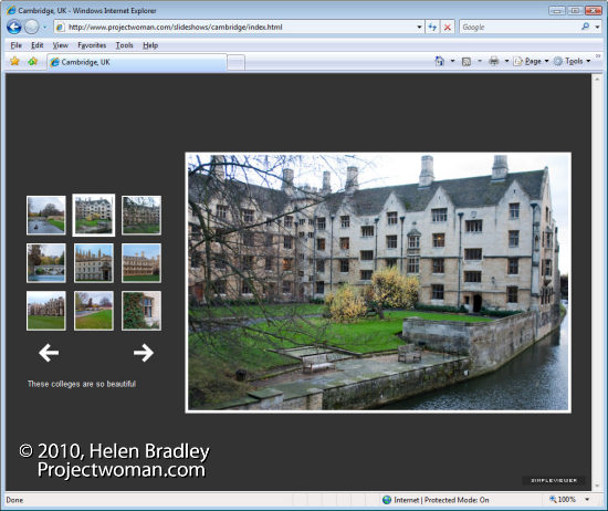
One of the really handy features of Lightroom is its ability to create web slideshows quickly and easily. There are various options you can use and I’ll show you how to use the SimpleViewer slideshow which is good looking and very functional.

Step 1
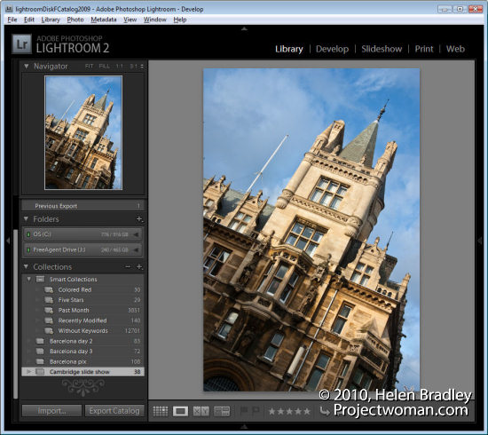
To get started, prepare all your images and save them as a collection. Use a Collection rather than a Smart Collection so you can arrange the images in the order that you want to see them in the slideshow by dragging them into position using either the grid or the filmstrip.

To create a collection, select the images to use, click the (+) plus symbol to the left of the Collections panel and choose Create Collection. Type a name for it, enable the Include Selected Photos checkbox and click Ok. You can then drag and drop additional images into the collection and order them as desired.


Step 2
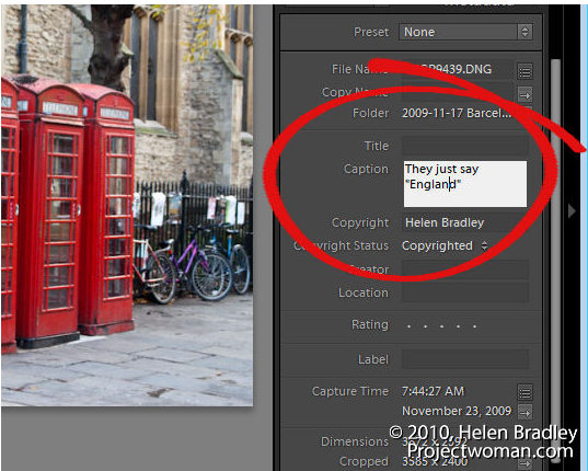
In Library view add a caption to each image so you can include the caption in the SimpleViewer slide show. To do this, open the Metadata panel and locate the Caption box. Type a caption for the first image, move to the next image and type a caption for it and so on.


Step 3
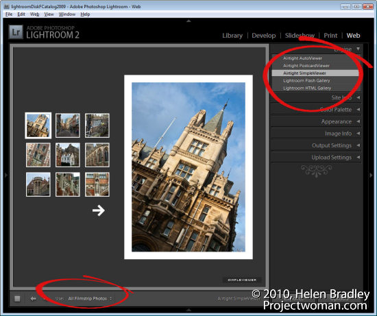
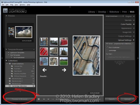
Click to open the Web module and, from the Engine options in the top right of the screen, choose Airtight SimpleViewer. This is an attractive and functional slideshow tool. From the options across the bottom of the screen choose All Filmstrip Photos.


step 4
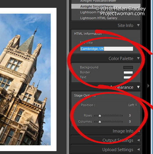
In the Site Info area type the title to use for your slideshow, this is the page title and it appears in the browser title bar. In the Color Palette options, set a background color and border color for your images and a text color. In the Appearance Options select the position of the thumbnails and the number of rows and columns of thumbnail images. You may find that by increasing the number of rows beyond 3 you will lose the captions so it is best to use a smaller number of rows so you have the benefit of including captions.

Step 5
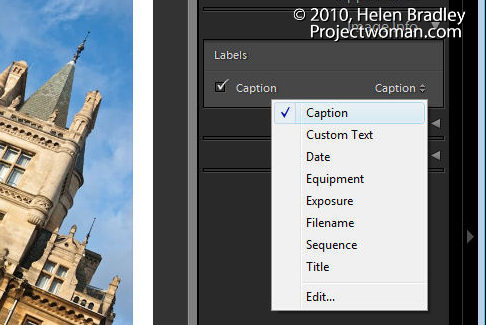
In the Image Info panel select the Caption checkbox and then from the dropdown list, select what you will use as captions. If you followed step 2 and typed caption information in the Metadata then chose Caption for this option.

Step 6
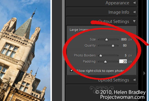
In the Output Settings panel, specify the size of the larger images which is the size of the selected image in the slideshow. You can also specify the quality of that image. The Photo Borders option controls the size of the border around the images, which by default is set to 20, but which you can increase or decrease as desired. The Padding Value controls the offset of the image from the remainder of the page. You can enable or disable the option to allow the viewer to right click to view a photo.

Step 7
In the Upload Settings area select the FTP server dropdown list click Custom Settings > Edit and enter the details for the ftp account for your website. You must type your server name, your user name and password – you can, if desired, include the password in the preset so that you won’t have to type it each time. Include the server path for storing the files and, if necessary, adjust the protocol port and the mode used for data transfer although these defaults should work in most circumstances.

Once you have created your settings, from the Preset dropdown list, select Save current settings as new preset so that these will be available next time you use the program.

Step 8
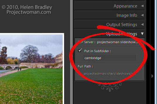
By selecting a subfolder, you can separate the slideshow and its files from other files on your server. This is a good idea as it will eliminate any possibility that files that you upload will overwrite or conflict with files used elsewhere on your website.

Step 9
Click Preview in Browser in the bottom left of the screen to preview the slideshow or simply click the Upload button and upload the files to your server.

Step 10
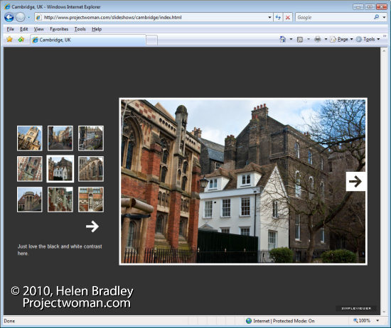
When the upload is complete, launch the slideshow by pointing your browser to your website to the folder that you created and to the file index.html.

Step 11
Once you have checked your slideshow and if it is all working correctly you can save the template by clicking the plus sign opposite the Template Browser and create a new template in your User Templates folder. This will automatically give you access to your preferred slideshow setup at any time in the future. All you will need to do is to change the Slide Title and the Folder in which the images should be saved on your server.

Helen Bradley

Saturday, March 27th, 2010

Thank you Kevin Ames

fantasy portrait collage

I have just returned from Photoshop World in Orlando and I am full of inspiration for upcoming projects. However one of the classes just inspired me so much that I had to start playing with the concept first. The idea is from Kevin Ames who taught it as a class called Fantastic Portraits…It’s Smoke, Mirrors & Photoshop.

The starting point is half a face, mirrored and stuck back together and then it’s up to you. This is my finished project – it’s a tiny file as I did it on the plane home and I really wanted to conserve battery but still get a reasonable result. With smaller images in Photoshop, of course everything goes much faster but the downside is that the final image is less useful because it is very small.

Here in addition to mirroring the face, I replaced the lips, pupils and part of the nose to get the face I wanted. I used the liquify filter repeatedly to reshape the face and the dodge and burn tools to add highlights and shadows – my additon to the basic concept. Then I brushed on the dots, added lots of backround interest and fashioned her a gold necklet. It helps if you have lots of textures and other interesting elements to use – for example, her hat is a fancy street light from a local park and there is a metal grate, a stairwell and a rusty texture making up the background.

It is a fun way to blow a few hours.

If you’re interested, here’s my starting image (courtesy of my friend Brenda), as you can see, the journey from start to end gave me something totally unrecognizable.

Helen Bradley

Friday, March 26th, 2010

Faux panos in Lightroom


Lightroom finished panorama of Cam River Cambridge, Uk

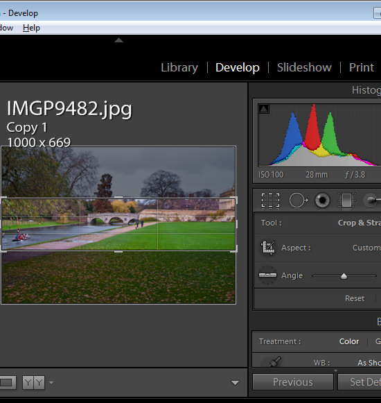
Ok, so I am using Lightroom for this but seriously you can do this in Photoshop or any application you like. It’s a faux panorama and you do it with one image by simply cropping the image to a long width and a small depth. You need the right image – it needs to have plenty of data across the middle of the image but it does have so much punch that it can turn a ho hum snapshot into something that looks so much more.

Lightroom crop to create a panorama

So, in Lightroom, select your image, move to the Develop module, crop the image to as wide as you can and a small height/depth and then Export it. This one I framed in the Lightroom Print module before printing to a file and posting it. All too simple really and everyone will think you’ve been snapping panos instead of infusing your images with a little creativity.
Oh, and for a tip in a tip, press Control + ‘  (Command + ‘ on the Mac) to make a virtual copy before cropping so you still have your original visible in Lightroom.

Helen Bradley

Wednesday, March 17th, 2010

Photoshop: High Impact Sharpening

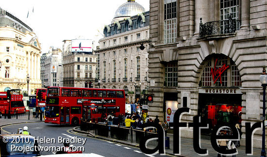
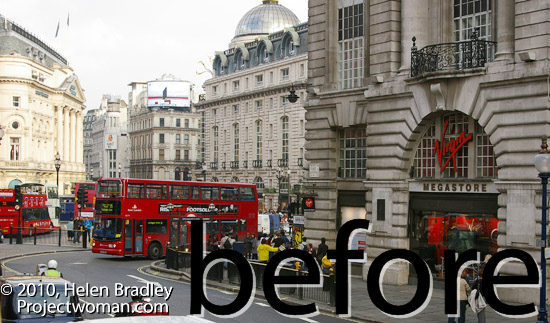
after image high radius low amount sharpening

There’s a lot been written about sharpening your images and traditionally when you sharpen you’ll choose a low radius value. In fact, Photoshop will let you choose really large radius values when sharpening even though, for correct sharpening what you need is a Radius of around 0.5 – 1 for a sharp image and just a little larger for an image that lacks sharpness.

before high radius low amount sharpening

So what is the value of being able to select really large radius values? The answer lies in a technique known as high radius low amount sharpening. It’s a way to add a huge visual impact to your images.

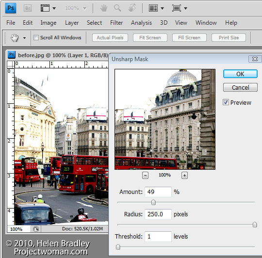
To see it at work, choose Filter > Sharpen > Unsharp Mask. Reduce the Amount to around 30 and push the Radius value up very high. You’ll need to keep the Threshold amount very low.

What Amount does is adjust the amount of sharpening so you don’t want a lot of this type of sharpening. By setting the Radius to a high value you’re pushing the sharpening halos away from the edges in the image into the image content areas so that everything is being given a significant contrast boost.
The Threshold setting is an amount representing the difference between pixels on the edges that you want to effect. It works the opposite to how you might think it would work – a small value gives you much more impact than a large value. So a value of 1 or 2 up to 10 is sufficient.
Once you have a high Radius and low Threshold value set, adjust the Amount to suit your taste.

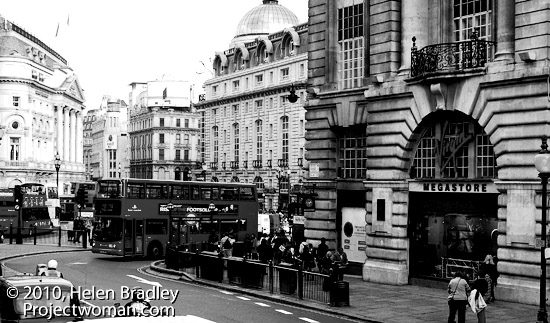
While this feature works really well on color images particularly busy color images, it also gives black and whites a really big shot in the arm.

Apply high radius low amount to a black and white photo of london

And while you’re in Photoshop, know that this is the only place you can apply this fix. You cannot do this in Lightroom or in Camera RAW. The reason is that both Lightroom and Camera RAW allow a maximum radius setting of 3.0 and here, because we want to crank up the radius really high, Photoshop is our only option.

Helen Bradley