Friday, March 4th, 2011

Multiple image printing in Photoshop CS4 & CS5

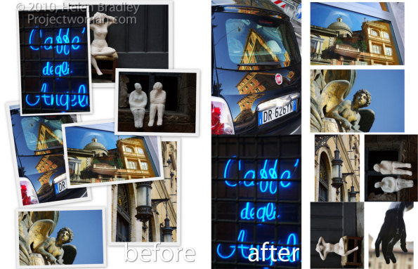
One real annoyance with Photoshop CS4 and CS5 is that Print Package and Contact Sheet printing is missing. These options appeared in earlier versions of Photoshop but they aren’t installed automatically in Photoshop CS4 & CS5.

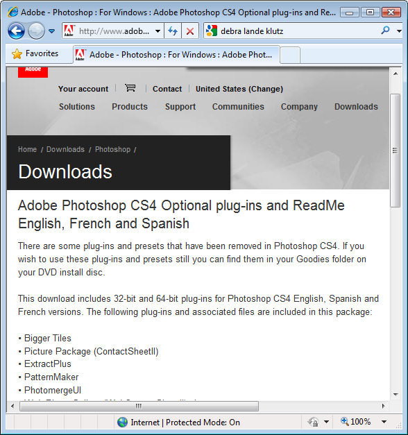
You might be excused for thinking this means you can’t print multiple photos per page in Photoshop CS4 & CS5. Nothing could be further from the truth. The secret is to find the missing features on your program disk or, quicker still, download them from the web.

Here are links to the files you need for the Mac and the PC:

Mac version for CS4:

http://www.adobe.com/support/downloads/detail.jsp?ftpID=4047

and for CS5:

http://www.adobe.com/support/downloads/detail.jsp?ftpID=4687

Windows version for CS4:

http://www.adobe.com/support/downloads/detail.jsp?ftpID=4048

and for CS5

http://www.adobe.com/support/downloads/detail.jsp?ftpID=4688

Download and run the files. If you’re on a PC the download zip file contains an executable file you simply run and it places the files you need in a folder on your desktop.

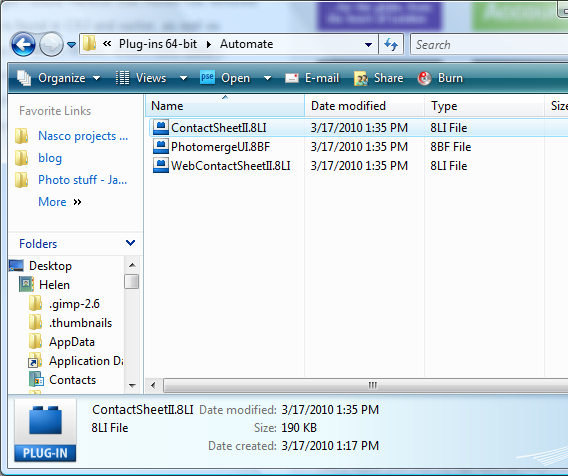
Open the desktop folder, open the appropriate English, French or Spanish folder, choose Goodies > Optional Plug-ins. Then choose the plug-ins appropriate to your version of Windows. In the folder are the Contact Sheet, Web Contact Sheet and PhotoMerge plug-ins. You need the Contact Sheet plug in as it provides both the Picture Package and Contact Sheet features.

Copy the ContactSheetII.8LI file to your C:\Program Files\Adobe\Adobe Photoshop CS5\Plug-ins\Automate folder.


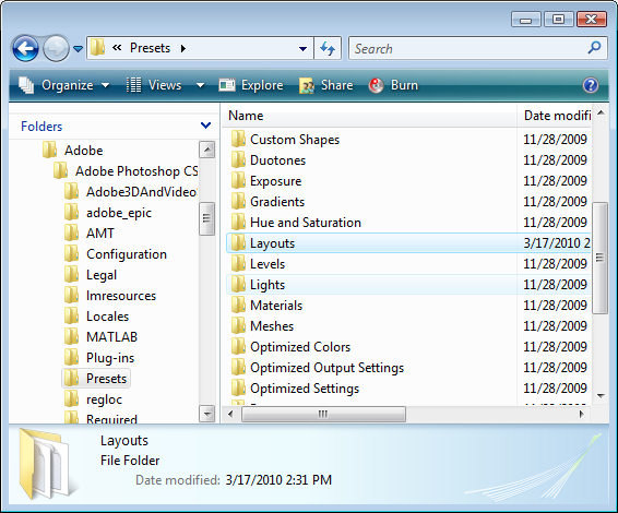
You will also need to copy the Goodies> Presets > Layouts folder and place it in your C:\Program Files\Adobe\Adobe Photoshop CS5\Presets folder – just drag and drop the entire Layouts folder into the Presets folder.


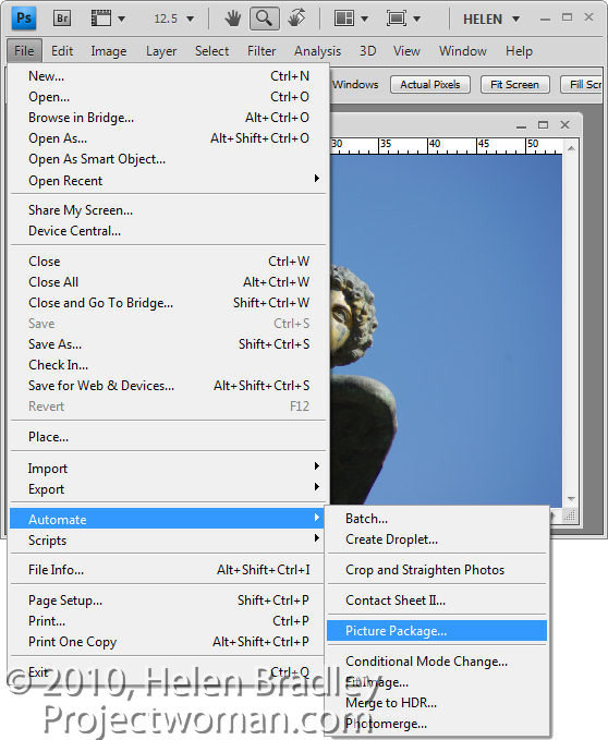
Restart Photoshop, open a file and choose File > Automate > Picture Package.

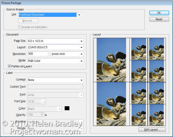
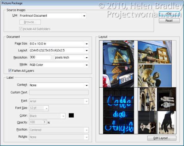
When you launch the Picture Package choose either the Foremost Document, Folder or File from the Use menu as the image(s) to start with.

Select the page size to use and then the layout arrangement. You can, for example, print four 4 x 5 images or a combination of 4 x 5 and 2 x 2.5” – there are plenty of options to choose from.

If you enable the Flatten All Layers checkbox you will end up with all images on a single layer rather than each  image appearing on its own layer.

Set the printing Resolution and add Labels to your images if desired and click Ok.

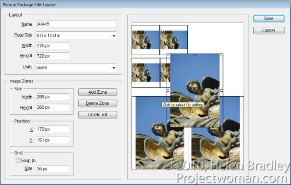
To customize a layout, click Edit Layout and you can click and drag to resize any of the images in the layout.

To add an additional image click Add Zone and then size it.

If the ratio of your selected image’s height and width are different to the ratio of the zone the image is placed in, the image will be scaled to fit one dimension – it will not be cropped – but it will print slightly smaller in the other dimension.

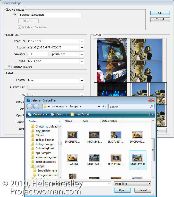
What isn’t at all obvious is how to print multiple images at various sizes in the Picture Package.

To do this, click on an image in the Picture Package and a File dialog will open. Select the image to print at this location in the Picture Package.

Continue and select different images for every one of the layout boxes if desired.

When you are done, click Ok.

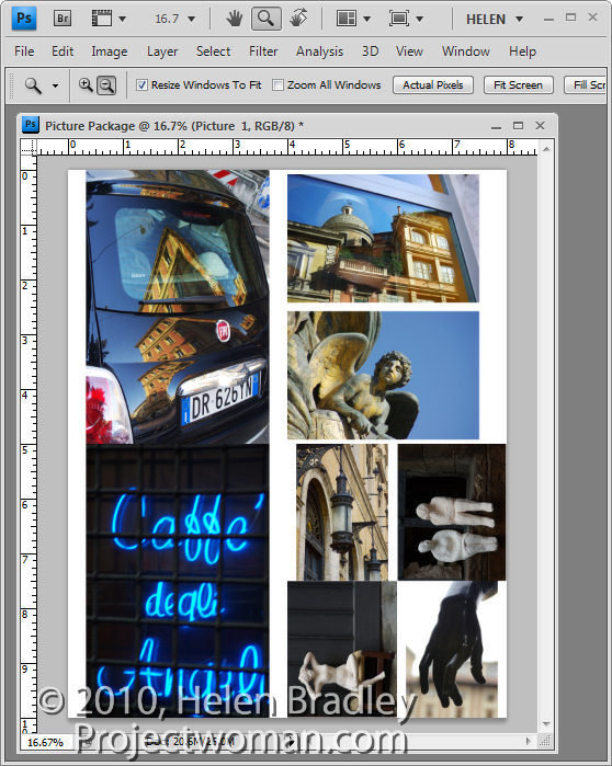
Photoshop creates an image the size that you specified with all the images that you selected sized and positioned in the layout. Depending on whether you had Flatten All Layers enabled or not, each image will be on a separate layer or your image will have one layer full of images.

You can now save or print this image.

Print Package is a feature of Photoshop that really should have been included in a regular install of Photoshop CS4 or CS5. It shouldn’t be as difficult as it is to find and install.

The good news, however, is that once you’ve gone to the trouble of installing it, it will be there every time you need it and also, by adding this feature you’ve also reinstated the Contact Sheet option.

Helen Bradley

Monday, February 28th, 2011

Scale a Gradient in Illustrator CS5

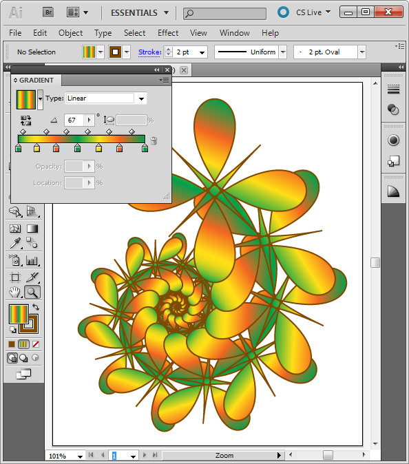
If you’re working with Illustrator CS4 or Illustrator CS5, you can scale, rotate or vary the opacity of a gradient using the gradient bar.

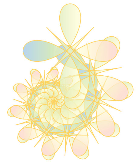
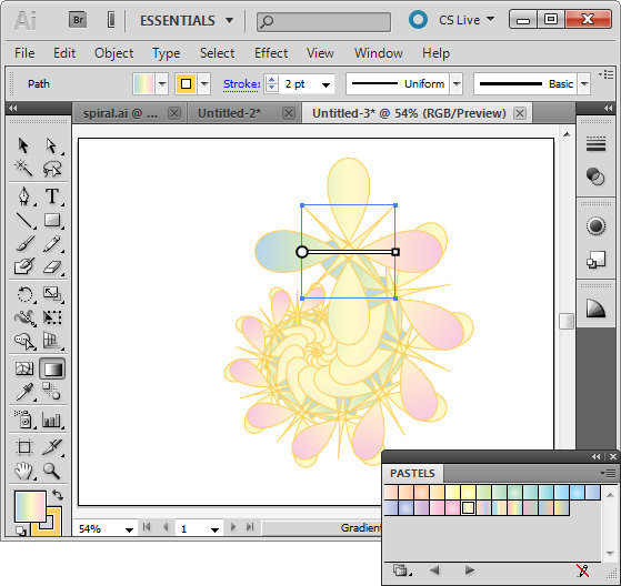
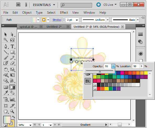
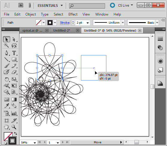
Here I am working with the spiral shape I created in an earlier post on Creating Cool Spirals in Illustrator. Here I have selected the original path using the Selection tool and then clicked the Gradient tool in the toolbar. This displays the gradient bar over the image.

To make a color from the gradient partially transparent double click the marker for that color on the gradient bar. This displays the Swatches dialog with a slider which lets you change the Gradient Opacity at this point.

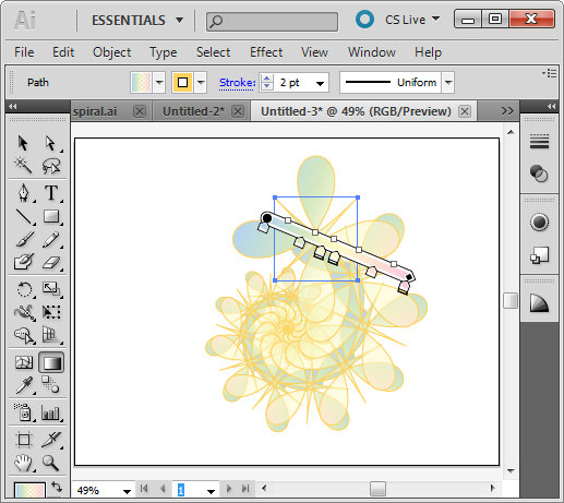
You can repeat this for other color markers on the bar. Adjusting the opacity of colors for this spiral shape lets colors from shapes underneath appear through the original gradient.

To rotate the gradient, hold Alt as you drag on the square marker to rotate it.

To scale the gradient drag on either end of it to stretch it. You can also move the bar to change how the gradient is applied to the shape.

Helen Bradley

Wednesday, February 23rd, 2011

Find and install Gradients in Illustrator

If you’ve come to Illustrator from Photoshop then Gradients will be a feature that will take some getting used to.

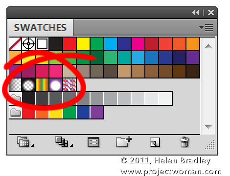
There is no fly out menu on the Gradient palette to use to load new gradients and instead gradients are available through the Swatches palette.

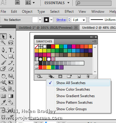
Choose Window > Swatches to view the Swatches palette and make sure that you click the Show Swatch Kinds menu at the foot of the palette and click Show All Swatches. This will display all the swatches you have available.

In the middle are your gradients. These include Fade to black, Super Soft Black Vignette, Green Yellow Orange, Purple Radial, and Laguna.

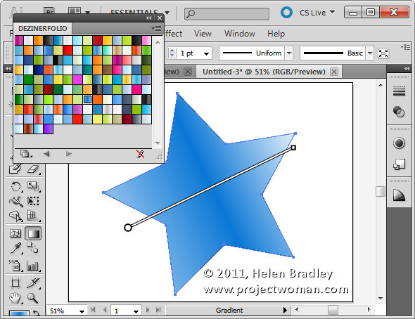
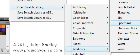
To find and load additional gradients, click the fly out menu on the Swatches palette and select Open Swatch Library > Gradients and then select a set of Gradients to open. These open in a palette all of their own.

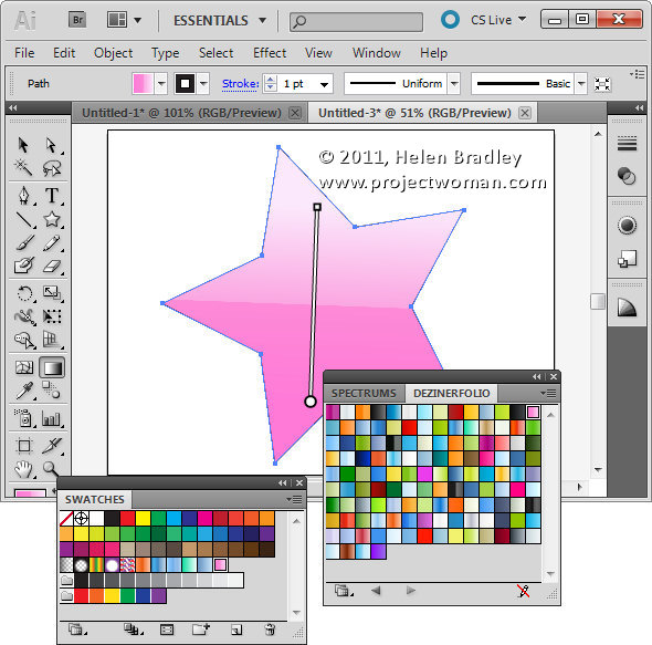
Select a gradient to use for an object from this palette and, when you do, it is automatically added to your Swatches palette.

Like Shapes, Brushes and other features of Illustrator you can also find, free gradients online and then download and install them into Illustrator.

How To Install downloaded Gradients

To install downloaded gradients first locate and download the file and, if necessary, unzip it. Once you unzip the gradient you should have an AI file which is your gradient file. I downloaded a set off Web 2.0 Gradients from http://www.dezinerfolio.com/2007/10/15/130-web-20-gradient-swatches-for-illustrator/

Place the .AI file you downloaded in your Illustrator Swatches folder. The location of this depends on your operating system. On Vista it is [user name]\AppData\Roaming\Adobe\Adobe Illustrator CS5 Settings\en_US\Swatches. For other versions and countries you may need to choose Adobe Illustrator CS4 Settings or en_GB etc..

On the Mac choose: [user name]:library: ApplicationSupport: Adobe: Adobe Illustrator CS5: en_US: Swatches.

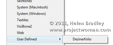
Close and reopen Illustrator and the gradients will be available in the Swatches palette in the User Defined group.

You can then select and use any of the downloaded Gradients for your objects.

Helen Bradley

Monday, February 21st, 2011

Replacing skies in Photoshop

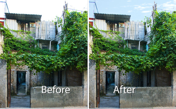
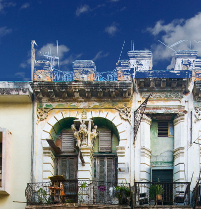
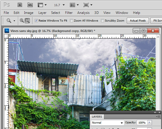
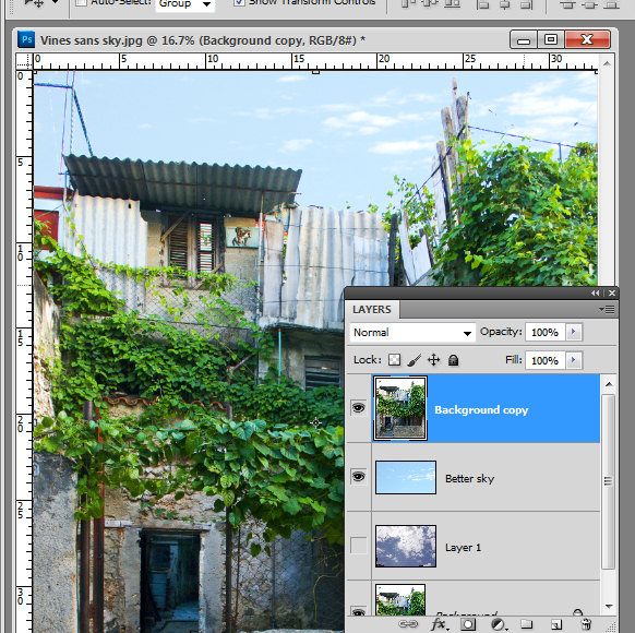
Reader Michael P. recently sent me an image he’s been working with – his challenge was to replace the sky in the image. The problem was that in replacing the sky the image had ended up with a lot of halos around the edges making the sky replacement look less than believable.

Kindly Michael sent me some of the images he wanted to work on to explain how to fix them more realistically.

This is the building we’ll work with:

Here’s what I did:

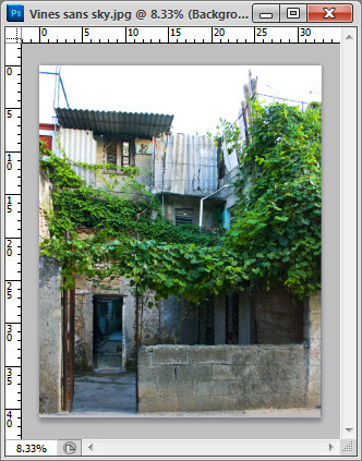
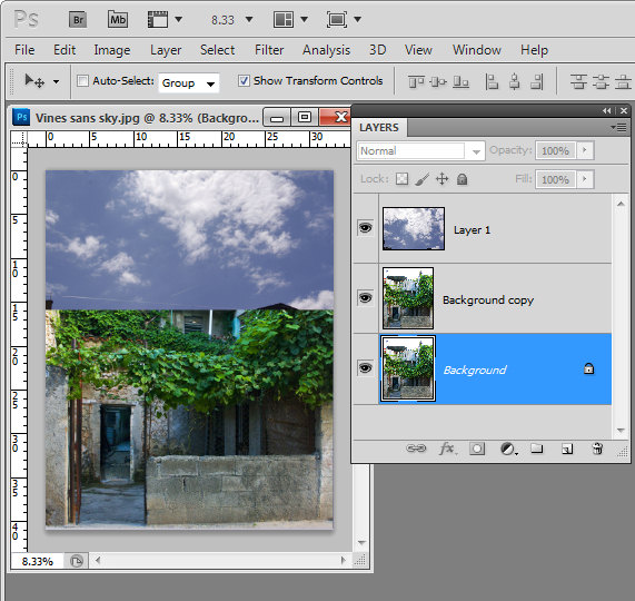
Start by duplicating the background layer.

Drag the background layer from your sky image into your image – if you hold Shift as you do this it  will be positioned in the middle of the image.

Move this layer so it is over the blown out sky.

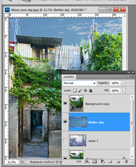
Move the sky layer so it sits between the two image layers.

Select the topmost layer of the image, select the Add a Layer Style icon at the foot of the layer palette and select Blending Options.

In the Blend If  area locate the This Layer bar and drag in from the right hand side of the bar. To split the adjuster in two, hold the Alt key as you drag one marker away from the other.

If you have a really blown out sky set the right side of the marker at 255 and the left side at a value that gives you a good blend effect for the sky – such as 248 or so.

Each image will require different settings.

Look at the result and see if the sky that you’ve brought in really suits the image.

Unfortunately I don’t think this sky works particularly well for this image and the image needs something a lot less dramatic.

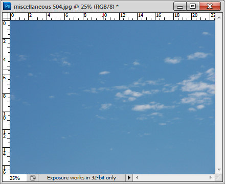
Here is a sky from my own collection which I think will work better.

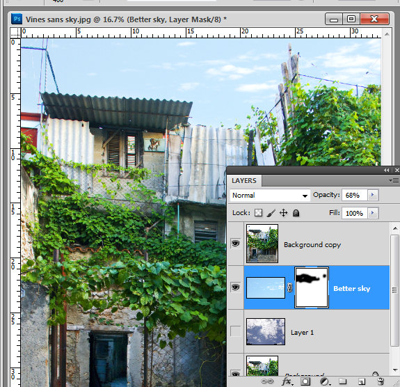
I dragged it into the image above the first sky layer but under the second image layer. The original Blend If adjustment settings work just fine with this sky so there is nothing more to do there.

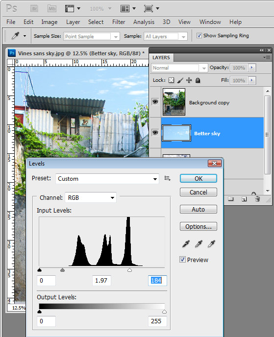
However, there are still problems along the skyline. These can be easily fixed by lightening the sky which I think is still way too dark for this image.

Select the sky layer and choose Image > Adjustments > Levels. What I am looking for here is to lighten the sky so that it blends in more with the image and looks more like it belongs.

Having lightened the sky, you’ll can further blend it into the image by adjusting the opacity of the sky layer down a bit.

Because the original image is underneath the sky as well as on top of it the effect of reducing opacity is to blend the sky into the underlying image.

If you find some bleeding of the sky into the buildings you can add a mask to the sky layer by selecting that layer and click the Add Layer Mask icon at the foot of the layer palette.

Paint with black on the mask to remove any blue sky in lighter areas of the building.

Typically if you find that you’re getting distinct over-lapping of sky around the edges where the blown out sky meets buildings or other elements in the image, the problem will be that you’re trying too hard to replace the blown out sky with something that is too much sky for the image.

You’ll get a better result if you work with a much lighter but still interesting sky.

If you find that you have some very light elements in the original image that are showing white fringing over the blue sky you can avoid these by placing a portion of the sky with white clouds in it under these areas to minimize the obvious white edges.

Helen Bradley

Friday, February 18th, 2011

Create Cool Spirals in Illustrator

Spiral shapes are simple to create in Illustrator using some of its built in effects.

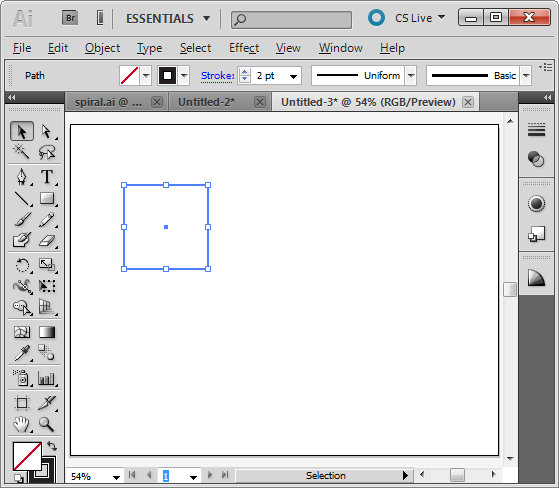
To get started, create a new image and select the rectangle tool. Hold Shift as you drag to create a small square on the artboard.  Set the stroke to around 2 pixels, set black as the stroke color and don’t apply any fill.

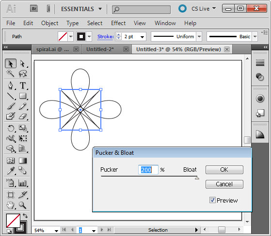
With the shape still selected, choose Effect > Distort & Transform > Pucker & Bloat. Enable the Preview checkbox and drag the slider to create an interesting shape. Here I dragged it to 200, which gives an interesting floral shape. Click Ok to confirm the transformation.
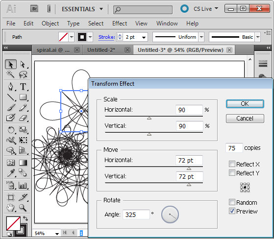
To create the spiral, with the shape still selected choose Effect > Distort & Transform > Transform to open the Transform Effect dialog. Enable the Preview checkbox. Set the number of copies to, for example, 75 and then experiment with various settings of the various sliders.

Changing any of the sliders will alter the shape significantly. Here I set Scale: Horizontal and Vertical to 90% so the shape gets incrementally smaller each transformation. I set the Move: Horizontal and Vertical to 72 pt so the shape moves both horizontally and vertically a small increment each transformation and the Rotate Angle to 325 degrees so each shape is rotated as it is transformed.
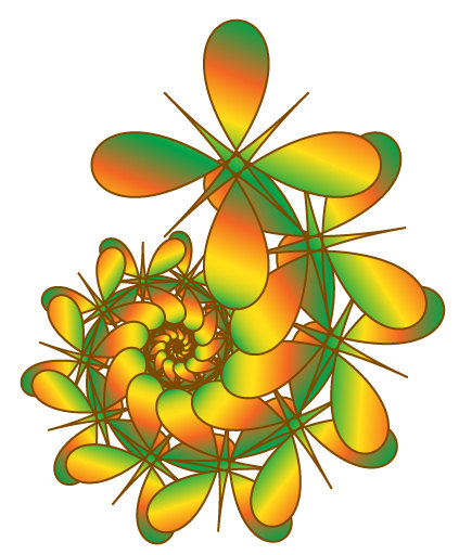
Once you have a shape that you like, click Ok.

If necessary, use the Selection tool to move the shape back so it sits within the artboard.

With the shape still selected, set the Stroke to a color of your choice. Select Fill and select a gradient such as the built in Green, Yellow, Orange gradient. By changing the angle of the gradient, for example, you can change the look of the filled shape.

In an up coming blog post I’ll show you more about working with Gradients in Illustrator.

Helen Bradley

Tuesday, February 15th, 2011

Create the Orton effect in Lightroom

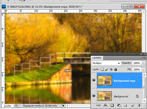
The Orton effect is a process named after photographer Michael Orton. The process is a darkroom one where you take two negatives, both overexposed – one properly focused and one slightly out of focus. Sandwiching these together and processing them gives you an image with a slightly surreal look to it.
In Photoshop you can create a faux Orton look by duplicating your image’s background layer, set the layer’s blend mode to Screen and flatten the image. Duplicate this layer and set the blend mode to Multiply. Add a medium size radius Gaussian Blur to the topmost layer and, if desired, lighten the image and add some grain to it to give it a classic Orton look. I have a detailed blog post showing how to do this step by step here.

I’ve seen a few people who have said that you can’t replicate this effect in Lightroom because you don’t have layers in Lightroom. However, I’ve developed a workaround solution that gives a comparable result which I really like.

The advantage of this solution is that it can be saved as a Lightroom preset so you can apply it to other images at any time in future.

The process involves starting out with a well-adjusted image so process it as you would any image.

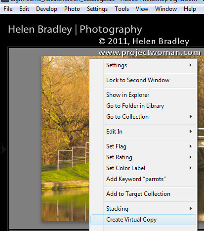
If desired make a virtual copy of the image by right clicking it and choose Create Virtual Copy.

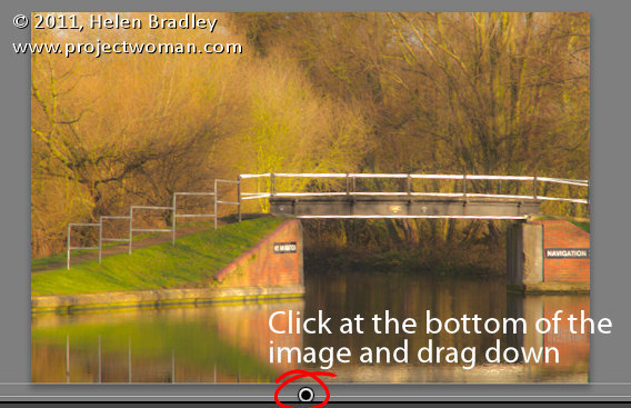
Add a graduated filter to the image. Start the filter just inside the bottom edge of the image and drag down until you are just over the edge. What you want is for the filter to be anchored to the top edge of the image and to extend all the way across the image at a full intensity.

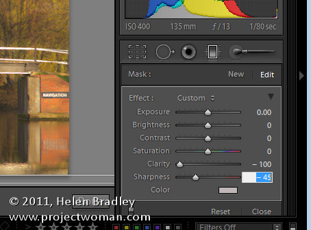
Set the Graduated filter so all values are zero except Clarity = -100 and Sharpness = -45. The combination of negative clarity and sharpness softens the image. Click the Done button under the image.

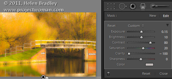
Now add a second Graduated filter over the top of the other one. Apply these settings to the image. Exposure +0.15, Brightness +10, Contrast = +80, Saturation +20, Clarity -100.

You can vary any of the settings on this last Graduated filter if desired to improve the image. What you’re looking for is an image with an ethereal glow.

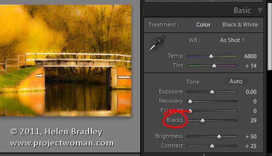
It will help you to get this effect if you boost the Blacks in the image in the Basic panel.

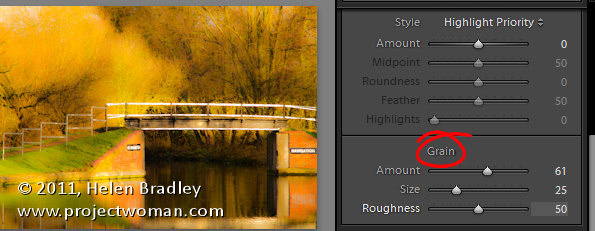
Finish off the effect by opening the Effects panel and add some grain to the image.

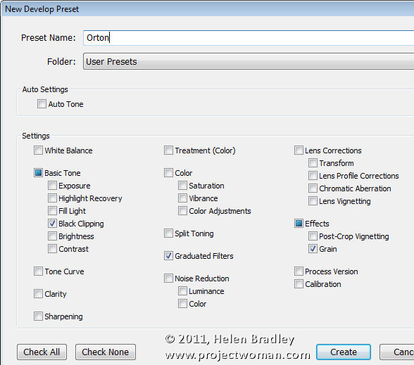
To save this as a preset, click the plus symbol opposite the Presets panel on the left – give the preset a name and disable all checkboxes and then select only the Grain and Graduated Filters checkboxes. If you want to add the increased Black to the preset, click the Black Clipping checkbox too. When you’re done, click Create to create the preset.

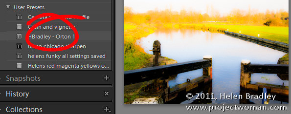
You can now apply this preset to another image. First make sure to properly expose the image and then, open the Presets panel and click your preset to apply it to your image.

You may need to tweak some of the settings for the image as a result of doing this but you should have an image that has a glow effect to it and with a good approximation of the classic Orton look.

Of course, you can achieve the same effect in Adobe Camera Raw.

If you want to avoid the work and use my preset instead – here’s a link to download my free Orton Lightroom preset.

Helen Bradley

Friday, February 11th, 2011

Lightroom – working with RAW and JPG

Lightroom how to handle raw and jpeg jpg images captured at the same time separately
When your camera is set to capture in RAW+ so it is recording not only the RAW image but also a JPG image to match you may find that Lightroom shows you only the RAW version of the file.

This is because Lightroom, by default, treats the RAW version and the JPG images as one.

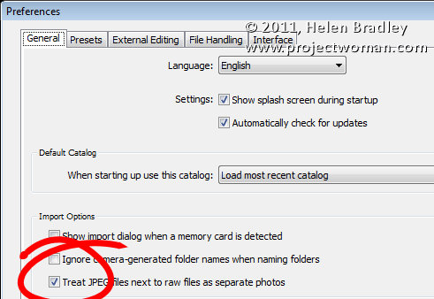
However, if you want to deal with them separately, choose Edit > Preferences (Lightroom > Preferences on the Mac) and select the General tab and select the option: “Treat JPEG files next to raw files as separate photos”.

Now Lightroom will treat the RAW and the JPG images as being different images so you’ll see both images in your Grid, Loupe and Filmstrip views.

Helen Bradley

Tuesday, February 8th, 2011

Lightroom Maximize, Minimize, Restore, Size, Move and Close buttons missing?

Lightroom maximize minimize close restore size title bar missing

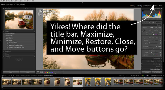
One of the most frustrating things that you’ll encounter with Lightroom is when your entire title bar for the application disappears. You’ll see your menu but everything else including the Close, Minimize, Maximize and other buttons will be missing.

The problem is that you’ve pressed the F key to get to full screen mode.

The solution is to press the F key repeatedly until the screen returns to normal. Too easy? Maybe but it sure is frustrating when you don’t know what happened and how to fix it.

Helen Bradley

Wednesday, February 2nd, 2011

Photoshop: High Pass Softening

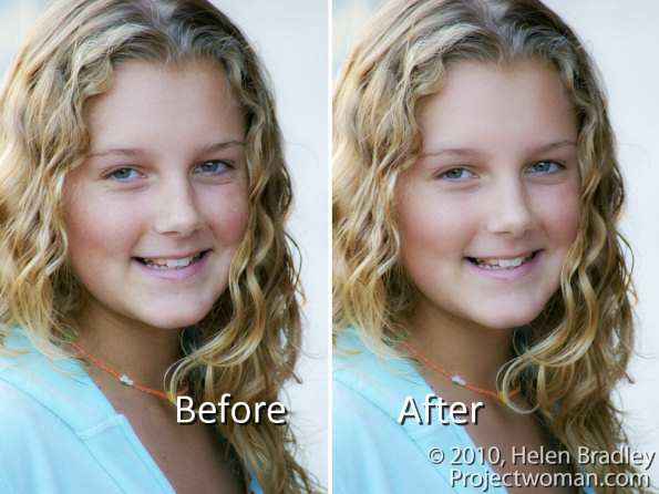
You may already know that it is possible to sharpen an image using the High Pass Filter. But did you know it’s possible to use the filter to soften an image?

To see this at work, start with an image open on the screen.
Step 1

Duplicate the image background layer or if you have an image that has adjustments in it, create a flattened version of the image on a new layer at the top of the layer stack. To do this target the topmost layer and choose Layer > New > Layer.
Target this new layer and press Ctrl + Alt + Shift + E (Command + Option + Shift + E on the Mac) to create a flattened version of the image on this new layer.

Step 2

You will apply the High Pass Filter to this layer.

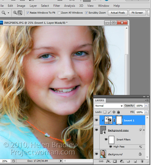
To do this, you can convert the layer to a Smart Object by choosing Filter > Convert for Smart Filters.

If you’re working on a version of Photoshop earlier than CS4, you can still use this process without converting the layer to a Smart Object.

Choose Filter > Other > High Pass and set the High Pass filter Radius to a value that shows gray and white lines on the image. Stop short of the image showing too much color. The larger the radius value, the more the softening effect although too large a Radius will be counter-productive. Click Ok to apply the filter to the image.

Step 3

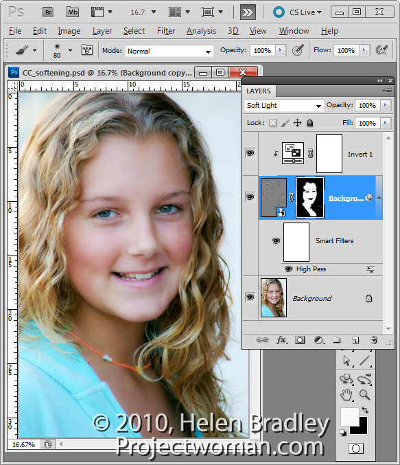
In the Layers palette, set the Blend Mode of the top layer to Soft Light.

To soften the image, select the High Pass filter layer and choose Layer > New Adjustment Layer > Invert. You’ll need to create a Clipping Group between the Adjustment Layer and the High Pass Filter layer by selecting the Adjustment Layer and choose Layer > Create Clipping Mask.

Step 4

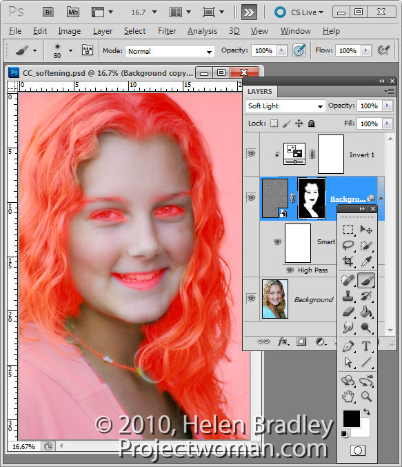
Create a black filled mask on the High Pass Filter layer by Alt + Clicking on the Add a Layer Mask button at the foot of the Layer palette (Option + Click on the Mac).

Set the Foreground color to white and paint on the mask with a soft round brush in the areas that you want to soften the image such as the skin tones here. This image shows the masked area – you won’t see this as you work.

Step 5

If you created a Smart Object the High Pass Filter can be adjusted by double clicking on the filter in the Layers palette and adjust the Radius value.

You can use a different blending mode on the masked layer such as Overlay if that gives results you like better and you can also change the opacity of the layer to reduce the intensity of the effect.

Helen Bradley

Friday, January 28th, 2011

Crafting images in Lightroom

Lightroom has more tricks up its sleeve than simple photo fixes such as exposure and contrast. It’s possible to craft images inside Lightroom and, in many ways, the tools in Lightroom make the task easier than it would be in Photoshop or another editing program.

In this post I’ll show you a way to turn a relatively hum drum image into something much more visually exciting. So, when you don’t get the image you want straight out of the camera see if, armed with some simple Lightroom tools, you can coax some better results from it. Remember too that this is a creative technique – you’re not looking for realism as much as a way to create a different look for your image.

Step 1

Start out with an image that has what I call “good bones”. It needs to be pleasingly composed and it needs to have something that compels you to want to look at it and to spend some time working with it. Good contenders for this process are images with interesting skies and these include heavy clouds and clouds captured at sunset and sunrise.

Step 2

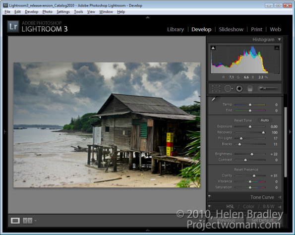
In the Develop module use the adjustments in the Basic panel to apply global adjustments to the image. I focus in detail on the adjustments that aren’t available in the Adjustment Brush and Graduated Filter such as Blacks, Fill Light, Recovery and Vibrance.

I will adjust the Recovery slider at least half way to the right and adjust Fill Light to get some detail from shadows. I’ll adjust the Blacks even to the extent of plugging some shadows for now. I’ll also use other adjustments such as Exposure and Brightness just as a start.

The fact that none of these changes are permanent is a big plus because if you don’t like the results later on you can come back and readjust them.

Step 3

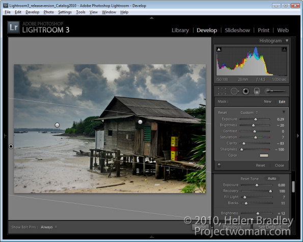
Having dealt with the overall image I’ll now turn my attention to parts of it. Here there are three areas in particular – the hut and bottom right of the image, the bottom left and the sky.

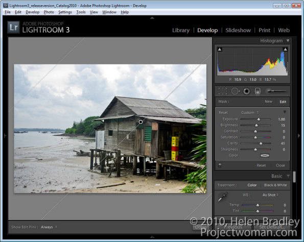
Starting with the hut I’ll drag the Graduated filter in from the bottom right of the image. Then I’ll bring some detail out in that area by adjusting Brightness, Exposure and Clarity.

Step 4

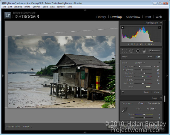
The sky is treated the same way as the hut. This time the Graduated Filter is dragged down from the top. Then I decreased Exposure and Brightness to reveal the detail in the clouds. I added some Contrast and Clarity and a hint of dull yellow color.

Step 5

In the bottom left of the image another Graduated Filter adjustment fine tunes this area of the image and adds a hint of dirty yellow color. Reducing both Sharpness and Clarity softens the details here.

At this point I might consider adding a second Graduated Filter over the top of this one to again reduce Clarity to soften the details even more. The Graduated Filter can be used cumulatively so adding one on top of the other enhances the effect.

Step 6

Once I’ve finished with the Graduated Filter, I will return to the Basic panel and fine tune the settings there. Here I adjusted the Brightness and Fill Light to lighten the image a little.


Step 7

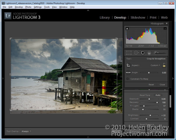
At this point I cropped the image to remove some excess detail from the bottom and right edges to focus interest more in the water and the hut.

Step 8

To finish, I used the Adjustment Brush on the plastic crates. By painting over them with the brush and reducing the Exposure slightly they are made a little less distracting.

At any time I can revisit any of the changes I have made including those applied with a Gradient Filter or the Adjustment Brush and adjust the settings if desired.

Not every image will lend itself to this treatment but many will. You should note too that here I was working on a jpg image and because of the in camera processing applied to jpg images and the fact that much of the data that the camera captures is discarded in the process of saving an image as a jpg, the scope for adjusting this image was significantly less than would have been the case if I had the image captured as a raw file.

Helen Bradley

Tuesday, January 25th, 2011

Color an object to match an exact color in Photoshop

Completed image color matched to a selected=

Finished project: a garage door color matched to a selected Pantone color. Image (c) Sarej, sxc.hu.

One issue that a lot of people face is matching color in Photoshop. You may have a Pantone color that you want to match to or some other color and you want an image to be colored this way.

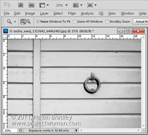
The solution is to start with a Grayscale version of the image, so desaturate the image to start with and make sure it is light enough to take your color – so if you want to use a light color brighten it to suit.Image of desaturated image ready to apply color to it

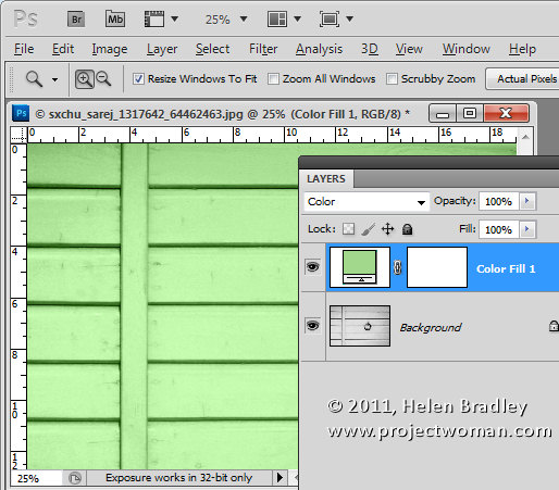
Now add a new fill color layer to the image by choosing Layer > New Fill Layer > Solid Color and click Ok.

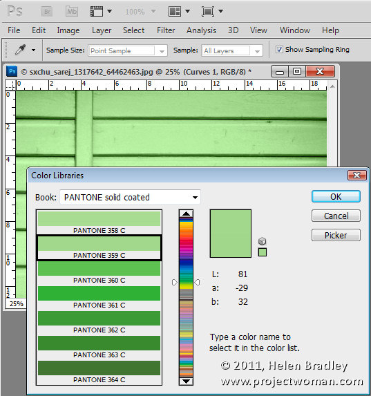
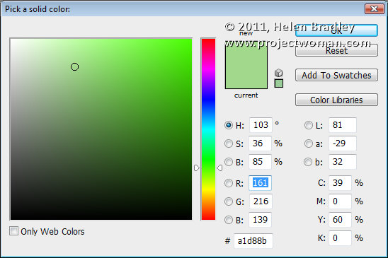
Set the solid color to the RGB or CMYK values of the color that you want to match. Set the Blend Mode for the layer to Color.

Color blended layer showing initial recoloring of subject to match a pantone color

I chose Pantone 359C which has RGB values of 161, 216 & 139.

Right now you’ll have a reasonable match for the color but not as good a one as you can get.

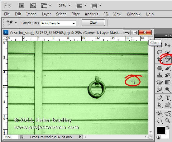
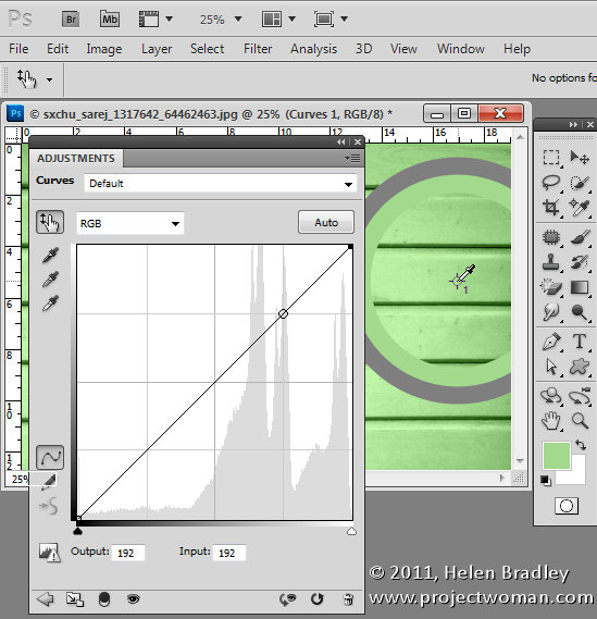
To improve it, select the Color Sampler Tool, which sits under the Eyedropper tool in the tool palette, and click in an area of the image that you want to be that particular color.

Because the grayscale values will vary, you need to identify a place in the image that you want the color to be exactly your chosen color. Around it, the other tones in the image will vary as they should – some will be lighter and some will be darker. Click on that point to add a color sample point.

Image showing color sample point in place we want to exactly match the Pantone color

Now add a curves adjustment layer by choosing Layer > New Adjustment Layer > Curves. Click Ok to create the curve adjustment. If you’re using Photoshop CS3 or earlier, Ctrl + Shift + Click (Command + SHift + Click on the Mac) on the color sample point to mark this point on the curve in the Red, Green and Blue channels.

If you’re using CS4 or later, the functionality of the curves dialog has changed. In this case, you should use the On Image Adjustment tool, which is the tool in the top left corner of the curves dialog, which has a hand on it. Click this, then Ctrl + Shift + Click (Command + Shift + Click on the Mac) on the sample point to add the marker to the Red, Green and Blue channels.

Image showing marking color sample point on the RGB curves

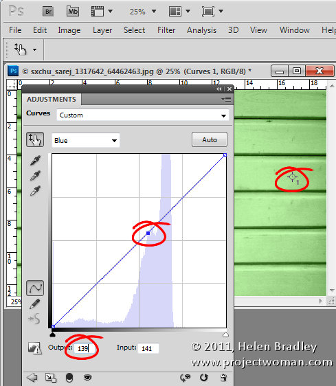
Now select the Red channel, click on the marker you just added and adjust the Output value to the Red value of the RGB color number that you want to match. Repeat this for the Green and the Blue channels. Then close the dialog. In my case I’ve set the Red output value for this selected point to 161, the Green to 216 and the Blue to 139 to match the Pantone color values. If you are trying to match a CMYK value then you’d do the same thing but for the Cyan, Magenta, Yellow and Black channels.

Image showing curves dialog and adjusting the Red green and blue curves to match the RGB values of the chosen Pantone or CMYK color

To remove the Color Sample Point, select the color sample tool and hold Alt as you hover over the sample point. It turns into an icon like a pair of scissors which you then click to remove the sample point.

You will end up with an image where, at your designated point, the color is exactly as you wanted it to be.

Thanks to blog reader Lesley Clarke for posing the question.

Helen Bradley

Monday, January 24th, 2011

Photoshop – Free Valentine heart shapes download

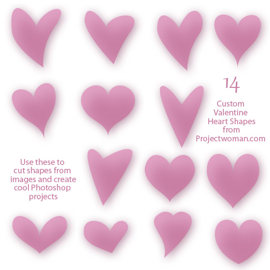
free download 14 valentine heart shapes for photoshop

I’ve been messing around in Photoshop this week making heart shapes. As a result I wrote a blog post to show you how to make these shapes yourself.

Just in case you want to take the easy way out, here is a free download with a collection of 14 hearts just in time for you to use for Valentine’s Day projects.

As with all  my downloads, you are free to use them for non commercial purposes, they may not be given away, they may only be downloaded from this site. Commercial licenses are available by request.

Helen Bradley

Tuesday, January 18th, 2011

Use Lightroom to Remove Sensor Dust

One of the annoyances most photographers encounter from time to time is sensor dust. This is dust that you get on the camera’s sensor and which shows up in your images as dark marks or flaws on your photos. Most often you’ll see this in the sky but it can appear anywhere in an image and it will appear in the same place in all your images – the tell tale sign that you have problems.

Of course, the only way to get rid of the dust is to clean your camera either using its dust removal option or by physically cleaning it. However, chances are that the reason you know you have a dust problem is that you see it on your photos. For these images, at least, cleaning the camera won’t help. Instead, digital removal is required.

If you’re faced with a series of photos that have dust problems, Lightroom can simplify the process of fixing them. Its Spot Removal tool can be used to fix sensor dust and, the benefit of doing the work in Lightroom rather than Photoshop, for example, is that once you have one image fixed, you can automatically fix most of the others.

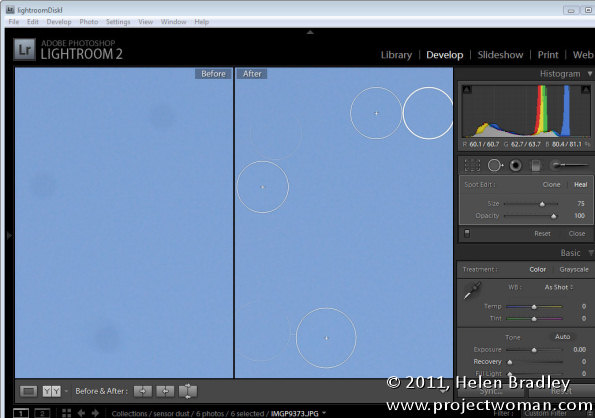
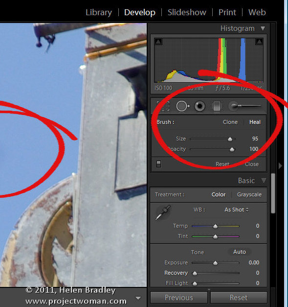
To get started, locate one image in the sequence that has sensor dust issues. Switch to Develop move and select the Spot Removal tool. Set it to Heal (the other option is Clone). Set the brush size to something large enough to cover the problem area and set its Opacity to 100 percent.

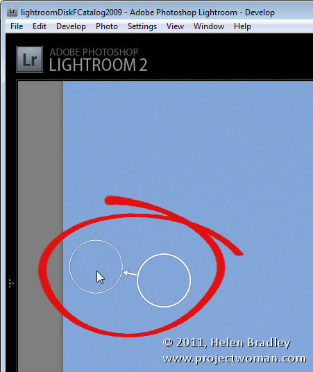
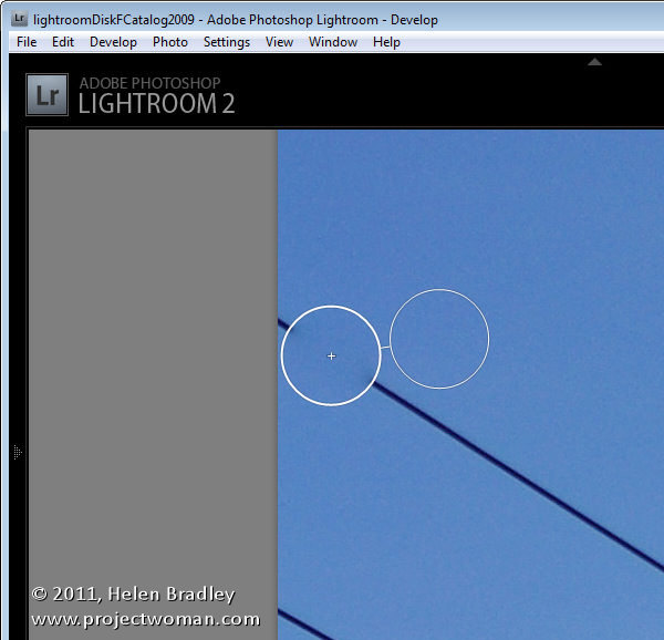
Click on the dust to set the location for the fix. You’ll see two circles appear on the image; one over the problem area (the spot circle) and the second over the area used to fix it (the sample circle). You can tell which circle is which as the arrow between them points from the sample circle towards the spot circle.

You can drag to reposition either circle and you can drag on one circle when the mouse pointer shows as a double headed arrow to resize the pair.

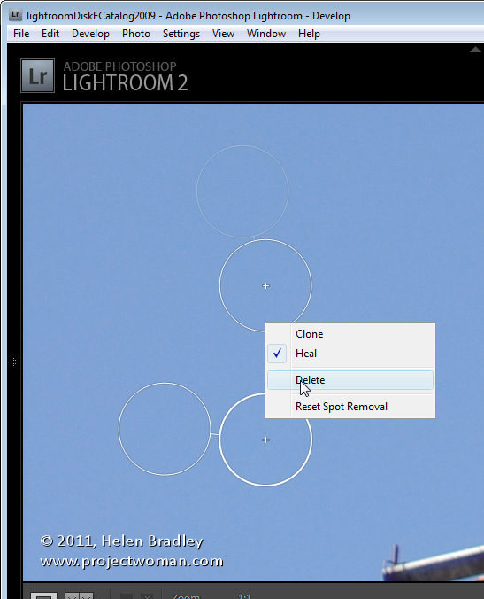
You can add multiple fixes to one image and, if you make too many, right click on the one to delete and choose Delete from the menu.

You can also use the right click menu to change from Heal to Clone to see if you get a better fix with this setting.

Once you have fixed the spots on the current image, you can copy these to other images. To do this, click the Close button to close the Spot Removal Tool drawer.

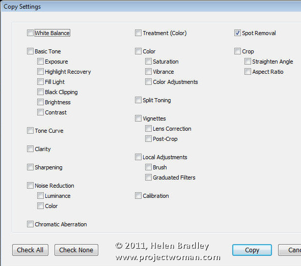
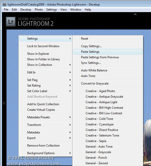
Right click the image and choose Settings > Copy Settings and when the dialog appears, select Spot Removal, disable all other options and click Copy.

Select one or more images in the sequence that you shot and that need the fix applied to them. These do not have to share the same aspect ratio as Lightroom can fix portrait and landscape images at the one time.

Right click and choose Settings > Paste Settings. This will paste the fix onto the other images. Alternately you can select the fixed image and one or more other images, click Sync and select Spot Removal.

Check each fixed image in turn. Some images may have image content under the sample circle that doesn’t provide a suitable match for the problem area so you will need to move the sample circle to adjust the fix.

However, the entire process should be quicker than performing the fix to each image individually in Photoshop, for example.

Helen Bradley

Thursday, January 13th, 2011

Unlocking layers in Photoshop

Unlock the Background layer in Photoshop

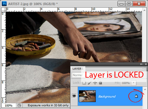
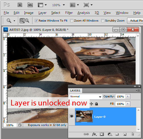
When you first start working with layers in Photoshop, you’ll discover something about the background layer. The layer is locked which means a few things. Firstly, you can’t move the layer anywhere else in the layer stack because it’s locked. Secondly, while you can use the eraser on the bottom layer – because it is the bottom layer the eraser doesn’t erase to transparent and instead it erases to the background color. You also can’t add a layer mask to the background layer again, because it is locked and it cannot have any transparency applied to it.

When used on a Background layer the Background Eraser and Magic Eraser might look like they are making the background layer transparent but they are, in fact, first converting the background layer into a regular layer unlocking it in the process and then they perform the erase.

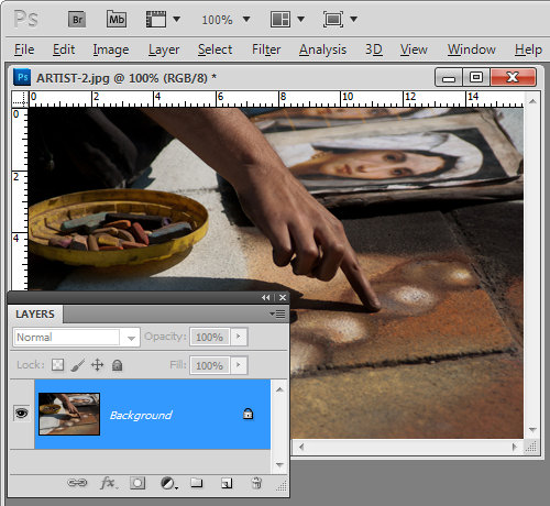
You will see that the background layer of a document is locked if you open the layers palette by choosing Window > Layers. There is a lock icon opposite the layer.

How to unlock a layer in Photoshop and Photoshop Elements

There are a few ways to unlock the layer in Photoshop (these also work in Photoshop Elements). The first one is to double click on the background layer and a New Layer dialog will appear. If you want to rename the background layer, type a name for it, otherwise just click Ok and the background layer will be converted to Layer 0. You’ll see that the lock icon is now removed allowing you to add a layer mask to the layer and delete content from it as well as move it elsewhere in the layer stack.

Another way to unlock a locked layer is to drag the lock icon onto the trashcan. You can also right click the background layer and choose Layer from background and click Ok.

Photoshop - how to unlock a layer in Photoshop and Photoshop Elements

Helen Bradley

Tuesday, January 11th, 2011

Crop to a Valentine heart shape in Photoshop

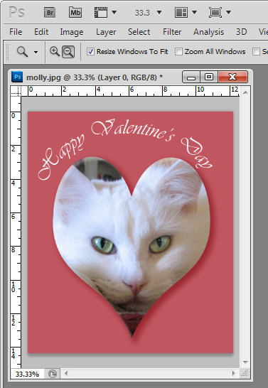
With Valentine’s Day coming up shortly you might be wondering how you create heart shape images in Photoshop. Well, here’s how:

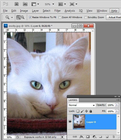
Start by opening an image that you want to use and convert the background layer to a regular layer by double clicking the background layer in the layers palette and click Enter.

Crop image to Valentine's heart shape in Photoshop

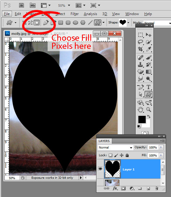
From the tool palette, select the Custom Shape tool, which sits below the Rectangle tool.

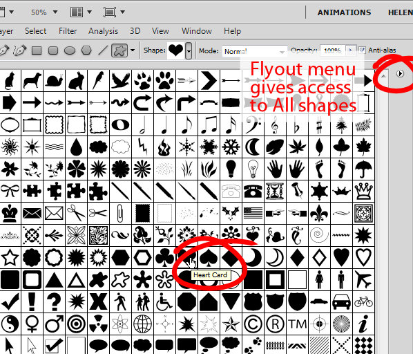
From the Shapes dropdown list on the Tool Options bar, select a heart shape.

If you don’t have a heart shape in your list, click the flyout menu and select All. Click Append to append all the shapes available which will give you access to at least one heart shape. In fact you probably have a Heart Card shape, a Heart shape and a Heart Frame shape.

To cut a heart shape out of your image you’ll want the Heart shape or the Heart Card shape.

Crop an image to a heart shape in Photoshop

Click the New Layer icon at the foot of the layers palette or choose Layer > New > Layer.

From the toolbar, select the option that says Fill pixels. Drag a heart shape over your image. Don’t worry that there is a fill color associated with the heart and that it is covering up your image. Size the shape using the move tool until it’s positioned pretty much where you want it to be.

Crop image to valentine heart shape

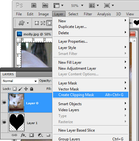
Now with the heart layer selected, drag it below the image layer and select the image layer again.

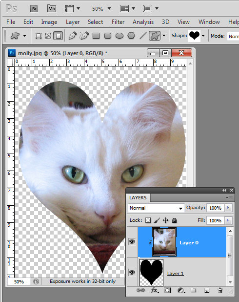
Choose Layer > Create Clipping Mask and your image will be clipped to the heart shape.

crop image to valentine heart shape

This method of creating a heart shape is ideal as the heart can be moved into a different positioned and resized by selecting the heart layer and resizing the heart appropriately.

In addition, you can click to select the image layer and drag with the Move Tool (V) on the image to place the image inside the heart in an appropriate position.

Crop an image to a Valentine heart shape

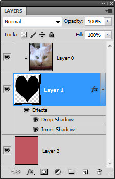
If you want a background for your image, click the bottommost layer and then Ctrl + Click (Command + click on the Mac) on the new layer icon at the foot of the layers palette.

This adds a new layer below all the other layers.

Select a foreground color to use, target your new layer and press Alt + Backspace (Option + Delete on the Mac) to fill  this layer with the foreground color.

Finish your Valentine heart effect by selecting the heart layer and apply a drop shadow to it by clicking the Add a Layer Style fx button at the foot of the layer palette and choose Drop Shadow.

Add some text and you’re ready to save and print the file.

There is a YouTube video of this process using Photoshop CS6 here – it is the same in any version of Photoshop.

Helen Bradley