Tuesday, September 20th, 2011

Stacking images in Lightroom

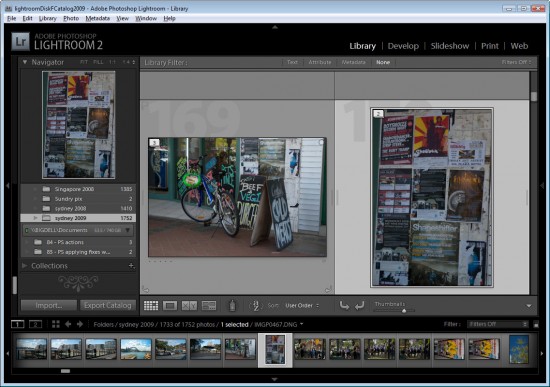
When you have a lot of similar images from a shoot, you can organizing them using the Lightroom Stacks feature. This allows you to stack images together so that only one image representing the stack appears in the Grid, Filmstrip and Loupe. This can clean up the screen reducing the number of images you see.

Get started with Stacks in Lightroom
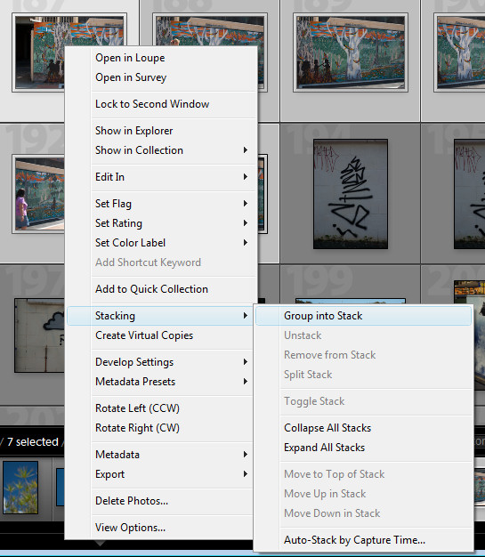
To stack images, in the Library module, select the images to stack, right click and choose Stacking > Group Into Stack. This stacks the images on top of each other.

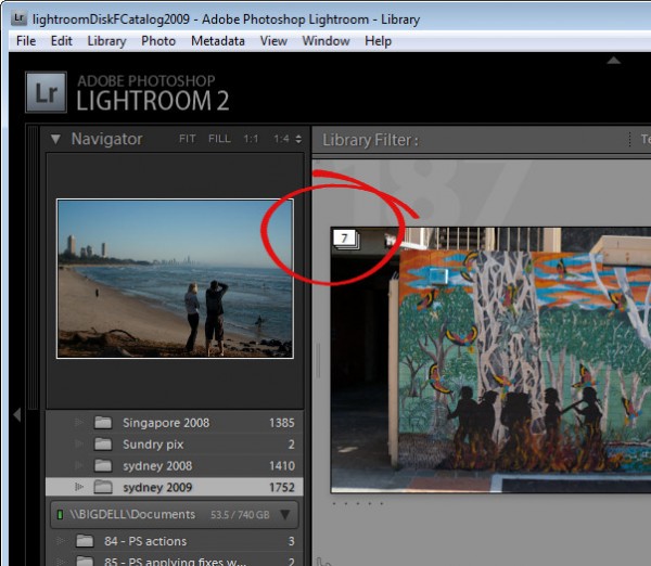
In Grid view you will see a small number in the top corner of the image at the top of the stack showing the number of images in the stack.

You can add an image to a stack by dragging and dropping it on top of a stack.

Expand a Stack
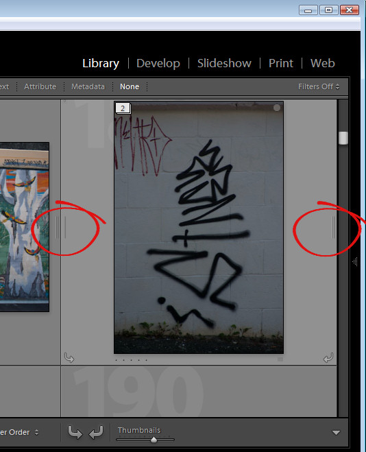
To expand a stack, right click on the number showing the number of images in the stack and choose Expand Stack from the Stacking shortcut menu or click the double line marker either side of the stack. Click the double line marker again to collapse the stack or right click an image in the stack and choose Stacking > Collapse Stack.

When you expand a stack, the images from the stack have a darker color underneath them indicating that this is an expanded stack.

There is some important terminology to know about stacks. You collapse and expand a stack to view or hide the images in the stack. If you unstack a stack you permanently remove the stack – you do not remove the images just the stack. There is no restack command so, when you unstack a stack, your only option for getting it back is to reselect the images and stack them again. You also cannot create a stack in a collection – you may only stack images in a folder.

Change the visible image
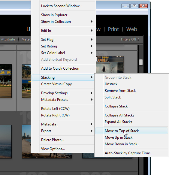
To change the image at the top of the stack, expand the stack, click the image to use as the top image and choose Stacking > Move to Top of Stack. The topmost image is the one that is visible when you collapse the stack again.

Remove an image from a Stack
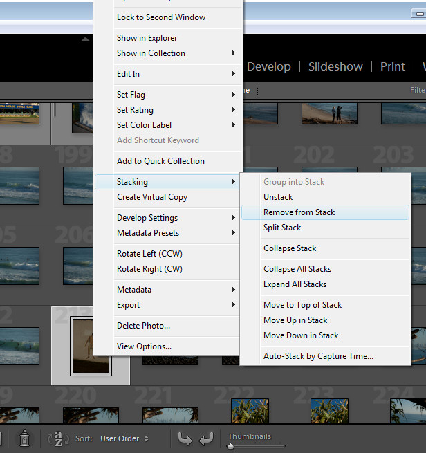
You can remove an image from a stack by expanding the stack, right click the image to remove and choose Stacking > Remove from Stack.

Stack for HDR
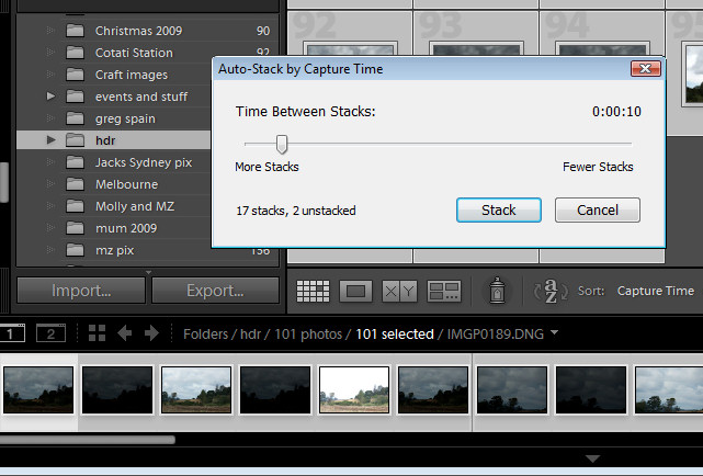
There is another stacking option you can use, for example, where you have captured a series of images to use for a panorama or where you have captured a series of bracketed exposures for HDR processing. Because these images will have been captured within a short period of time, you can stack them based on capture time. To do this, select all the images, right click and choose Stacking > Auto-Stack by Capture Time. Set the time between stacks value – as you do you will see an indicator telling you how many stacks this will give you and how many images will remain unstacked. Use this as a guide to the optimal value to use. Click Stack to have Lightroom create your stacks for you.

Once this is done, right click and choose Stacking > Collapse Stacks to view the stacks that you have made. This is a quick way to group images that are most likely to be part of the same sequence of images and if one or more stacks aren’t correctly formed, you can either unstuck them or split a stack in two by right clicking the image at the point that the split should be made and choose Stacking > Split Stack.

Stacks are a useful way to restore order to a large folder of images containing a lot of similar images. By stacking images you’re not altering the images in any way, simply organizing them a little more neatly.

Helen Bradley

Thursday, September 15th, 2011

Color correction in Lightroom

Lightroom has tools for correcting color not just across the entire image but also for correcting individual colors.

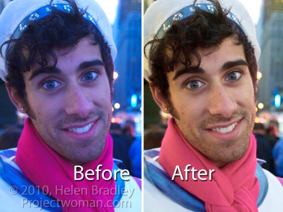
This image was captured in New York’s Time Square where the light is unpredictable at best especially at night because of the bright advertisements and neon signs. Because the colors of the lights change constantly it’s impossible to correct the color in camera using its white balance adjustment. Instead this has to be handled in post production.

Step 1
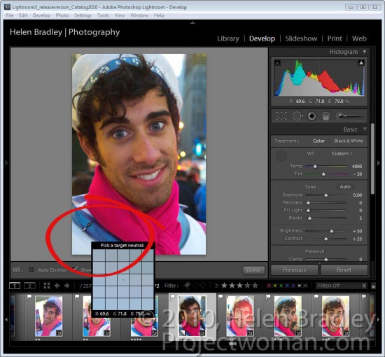
To start off color correcting an image in Lightroom’s Develop module, open the Basic panel and click the White Balance Selector which is the eyedropper in the top left corner of the panel.

Deselect the Auto Dismiss checkbox on the toolbar so the tool remains visible. Click on the image in a place that should be neutral gray to adjust it. If you don’t get the right correction the first time, click again on a different area of the image until you get an adjustment that looks correct to you. What you’re looking to do at this point is to remove the overall colorcast in the image.

Notice as you hold the White Balance Selector over the image that the Loupe shows a gird of pixels around the area you have the mouse held over and it also shows the relative percentages of red, green and blue in the pixels over which the mouse is hovering. Where the color in an image should be neutral grey, these values should be the same and if they are not, there is a color cast.

When you have a result you like, either return the White Balance Selector to its position in the Basic panel or press Escape.

Step 2
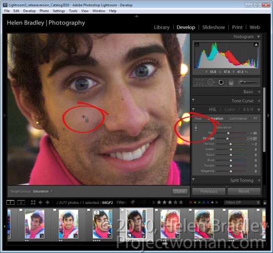
If some individual colors are still incorrect you can adjust these using the HSL panel. To do this, select HSL and then Saturation and use the Targeted Adjustment Tool to drag on an area of the image downwards to decrease or upwards to increase the color saturation at that point in the image. In this case, the skin needed to be desaturated because of the color of the light reflected on it.

Step 3
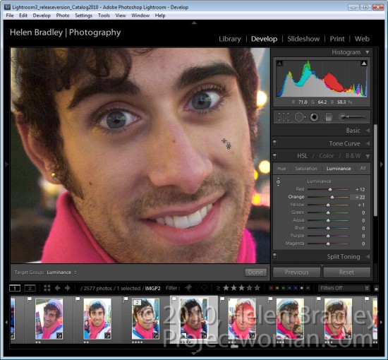
When you have adjusted Saturation, click Luminance and, if necessary use the same Targeted Adjustment tool to increase or decrease the Luminance in areas that are too dark or too light.

For this image I decreased the Saturation and increased the Luminance of the skin tones until I had a result I liked.

Once you’ve fixed the color problems, you can return to the Basic panel and continue to adjust the image using the tools there.

While sites like Times Square will never be an ideal place to capture images you can compensate at some level for poor color using the tools you have at hand in Lightroom.

Helen Bradley

Monday, September 12th, 2011

Targeted adjustments in Lightroom

Many of the features in the Lightroom 3 Develop module have targeted adjustment tools available to help you make the adjustment. Here’s where to find and how to use these on image adjustment tools.

Tone curve
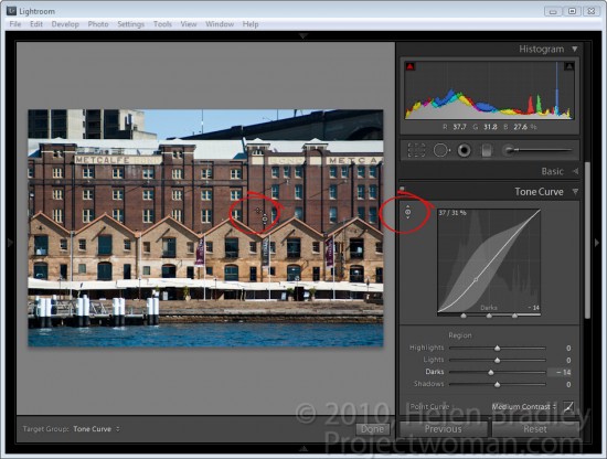
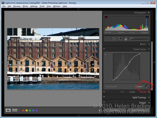
When you select the Tone Curve panel you can adjust an area of the image by clicking the targeted adjustment tool and then drag on the area of the image that you want to lighten or darken.

Click and drag up to lighten and click and drag down to darken.

If you click the Point Curve icon at the bottom of the dialog, you will change the look of the Tone Curve panel and the sliders will disappear. Now if you drag on the image using the targeted adjustment tool you will create control points on the curve. You can adjust these control points by dragging on them.

Control points are not added if you do not have the Point Curve icon enabled. So if you’re seeing the sliders, you’re not in this point curve editing mode.

To delete a control point, double click on it or right click it and choose Delete Control Point.

When you are working on the point curve in the tone curve panel, you can decrease the mouse sensitivity by holding the Alt or Option key as you drag on the image. This decreases the sensitivity so you will make smaller changes in the curve with even quite significant movements of the mouse.

HSL Adjustments
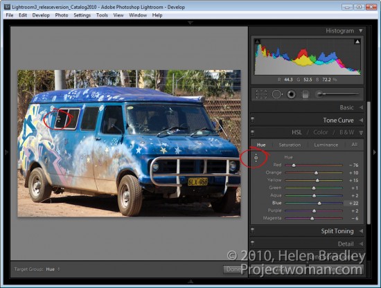
There is also a targeted adjustment tool in the HSL adjustment panel.

Here you can select Hue, Saturation or Luminance and then select the targeted adjustment tool and drag on the area of the image that you want to change. If you’re working in Hue, you’ll be applying a color shift to the selected area of the image. If you’re working in Saturation, you’ll be adjusting the saturation of the color under the mouse pointer as you drag on the targeted adjustment tool. Drag up to increase saturation and down to decrease it.

If you’re working in Luminance dragging up will lighten the color under the cursor and dragging down will darken it.

B&W Adjustments
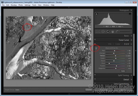
In the B&W or black and white adjustment area there’s also a targeted adjustment tool. In this case, when you drag up or down on a selected area of the image, you’ll lighten or darken that area so you can craft your own greyscale image.

Unlike in other versions of Lightroom, when you exit a panel while you have the targeted adjustment tool enabled it will be automatically disabled and you don’t have to remember to turn it off.

Helen Bradley

Tuesday, July 12th, 2011

Structuring a Photoshop workflow with Configurator

In a previous post, I explained how to create panels for Photoshop using Configurator. This time I want to show you a way to structure panels as something more than just a place to put the tools you use most often.

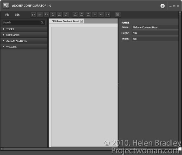
To follow along, you’ll need to download Adobe Configurator 1.0 if you’re using Photoshop CS4 or Adobe Configurator 2.0 if you’re using CS5. You can find both programs for downloading at http://labs.adobe.com/technologies/configurator/. Panels created using Configurator 1.0 only work in Photoshop CS4 so, if you’re using CS5, you must download the new Configurator 2.0.  To get started, launch Configurator and choose File > New Panel to create a new panel.

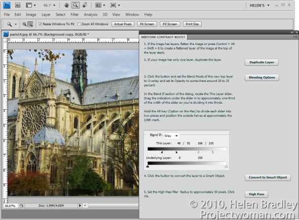
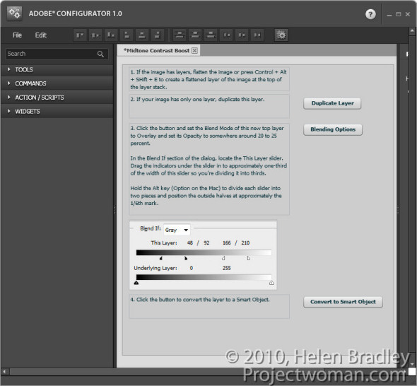
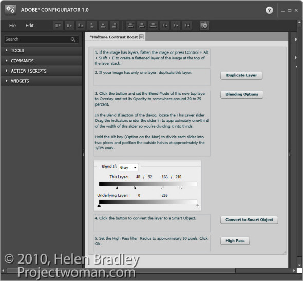
The panel I’ll show you how to create will step you through the process of enhancing midtone contrast in Photoshop that I discussed in a previous blog post. It will contain not only buttons that you press but also text that explains the workflow.  You can get the instructions for your panel from the steps in that post.

1          Set the panel title to read Midtone Contrast Boost and size the panel so it is quite large.

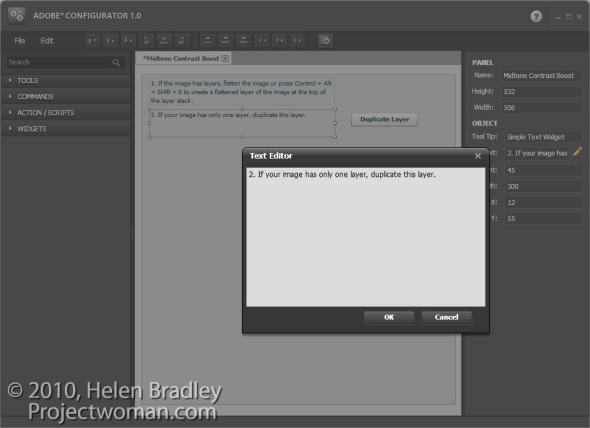
2 The first step in the midtone contrast workflow is to ensure that you have a flattened image or and, if not, you should flatten it. Open the Widgets area in Configurator and double click Simple Text to add a textbox to the panel.

Type number 1 and then the instructions for the first step into the text box.

Add a Simple Text box for the instructions for the second step. If you need to duplicate the background layer then this can be done using a button so add one to the panel by choosing Commands > Layer > New > Duplicate Layer/Group and drag the button onto the panel. Rename this button by typing a new entry in its caption property.

3 Add the instructions for the third step which are to adjust the opacity, blend mode and  blending options for the layer. This can all be done with one command so you can add a button to launch the Layer Style dialog at the Blending Options area. To find this button choose Layer > Layer Style > Blending Options and drag the button into position.

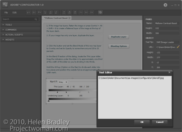
You can also add images to the panel illustrating crucial steps. For example, you could take a screen grab of the Blending Options dialog, crop it to show only the relevant portion of the dialog and save it as a JPG image. Make a note of the image’s width and height in pixels. To add the image to your panel, double click the SWF/Image Loader widget to add it. In the URL box, type the location of the image on your disk. Set the width and height of the Image Loader to match the width and height of the image and position the image in the panel.

4 The next step of the midtones contrast process is to convert the layer to a Smart Object. Add an explanation of this process to your panel and add a button to perform the task by choosing Commands > Layer > Smart Objects > Convert to Smart Object.

5 The next step is again a command, so choose Commands and then Filter > Other > High Pass and drag that command button into the panel. Add a textbox explaining this step.

To line everything up, select each of the textboxes in turn and select an appropriate alignment option from the toolbar.

Once you’ve completed your panel, save the design by choosing File > Save Panel. Saving the design means you can come back at a later date and alter the panel if required.

Export your panel to use in Photoshop by choosing File > Export Panel, select your Panels folder and click Ok.

When you next open Photoshop, you can load your panel by selecting Window > Extensions and click the panel’s name.

Panels like this, which step you through a process, are a handy way to document processes that you want to remember and use. They can also be shared with others as a learning tool.

6 Always test your panel once you have created it to make sure that it works as expected. If it needs to be changed, return to Adobe Configurator, open your saved panel file, make the changes, save it again and then re-export the panel. Back in Photoshop, close the panel and reopen it to get access to the changed form.

Helen Bradley

Saturday, July 9th, 2011

Copyright watermark your images in Lightroom 3

In Lightroom 3 Adobe built watermarking into the Export module (and it is available in the Print, Slideshow and Web modules as well).

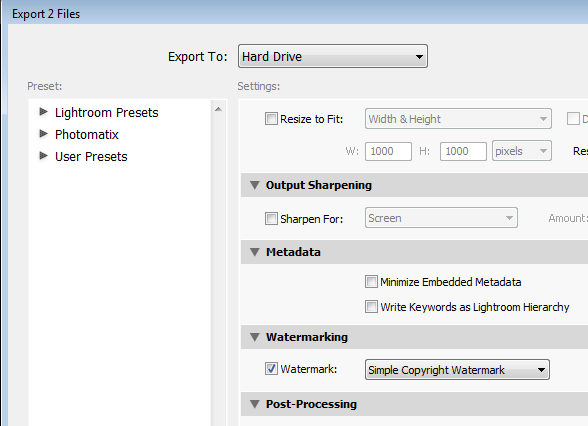
To watermark your images, select one or more images in the Library module, right click and choose Export > Export. In addition to choosing options such as the export location, file name and file type and sizing an image you will find the new watermarking option near the bottom of the dialog.

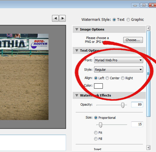
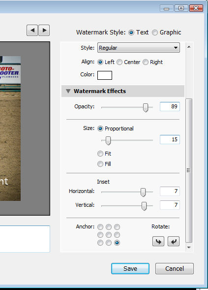
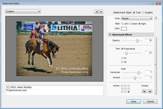
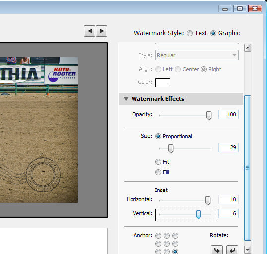
Enable the Watermark checkbox and from the dropdown list, select Edit Watermarks to display a watermark dialog. You can apply a text or a graphic watermark. For a text watermark, click the Text option button, then from the Text Options select your Font and Style.

Alignment controls the text alignment within the small box that it is placed inside so you will use this option if you have multiple lines of text. Color is the text color which you can select from a color picker – unfortunately there is no contrasting shadow added so you have to choose a text color that works on most images.

The Opacity setting adjusts the transparency of the copyright text and you can adjust this downwards to blend the copyright text in with the underlying image a little. Select Proportional size, Fit or Fill as desired. For my watermark I selected Proportional which is typically the option you will want to use.

The Anchor options allow you to place the copyright text within one of nine areas on the screen varying from top/left through center and to bottom/left.

Once you’ve selected the Anchor, adjust the Inset values to bring the text in from the vertical and horizontal margins so that it doesn’t sit at the very edge of the image.

You can rotate the text by clicking one of the Rotate options.

On the left of the dialog under your image is a text box with the word “copyright” in it. You can replace this with your own text – to create the copyright symbol type (C).

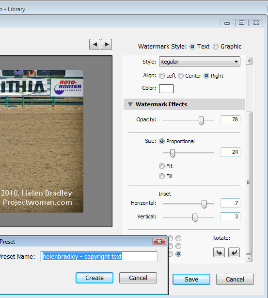
When you’re done, click Save and type a name to save the copyright data as a preset so you can use it again in the Export or any other module that supports watermarking of images.

If you are editing an existing watermark, click the down-pointing arrow in the top left of the dialog where it will show (edited) after the preset name and choose Update Preset or Save Current Settings as a New Preset depending on what you want to do.

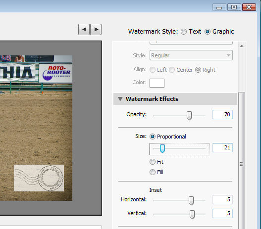
Instead of a text watermark, you can use an image you have created. To do this, enable the Image option at the top of the dialog and click to select the image to use.

A watermark saved as a JPG image will not be transparent so the watermark will appear as a solid rectangle on your image, as shown here.

If you want to have a transparent background around your watermark, create the watermark as a PNG image with transparency in Photoshop or another editor, and import that as your watermark.

When you export your images, your watermark will be automatically added to them.

These same watermark options are also available, for example, in the Flickr Publish Services so you can automatically watermark images as you upload them to your Flickr account.

Helen Bradley

Saturday, July 9th, 2011

Photoshop wizardry – create the Droste ‘frame in a frame’ effect

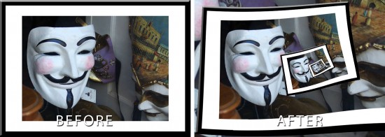
In previous posts I’ve introduced the Pixel Bender extension for Photoshop CS4 and CS5/5.5 and the Droste filter created by Tom Beddard. This post I’ll show you how to create the classic frame in a frame image effect using these tools.

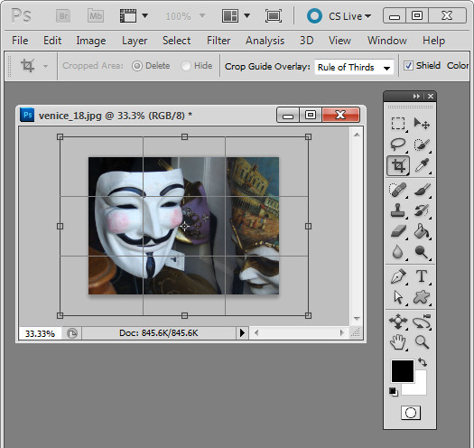
The critical part of this effect is getting the image right before you start. You need a framed image so start by opening an image to use. Add some white canvas around the flattened image by first setting the background color to White. Select the Crop tool and drag over the image. Let go the mouse button and then hold the Shift + Alt (Option) key as you drag outwards on a corner handle to add an extra canvas around the image.

Convert the background layer to a regular layer.

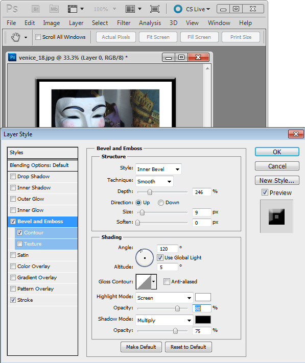
Now add a frame border. I did this using a Layer Style to add a black Stroke to the inside of the image and then I used Bevel and Emboss and Contour to make the frame more dimensional.

Check the image dimensions – they must be below 4096 x 4096 – so size the image down if it is too big. Flatten the image and save it as a .jpg image. Close and reopen the image.

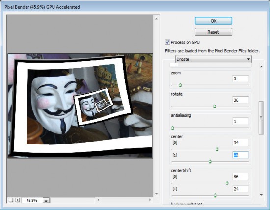
Now launch the Droste filter by choosing Filter > Pixel Bender > Pixel Bender Filter and select Droste.

Hold Alt (Option) as you click on the Reset button and then set these values:

Set Size [0] and Size [1] to the dimensions of your image – width and height.

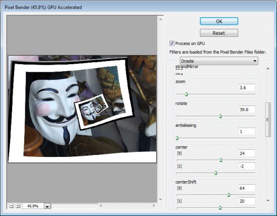
Adjust the CenterShift [0] and [1] values so that the part of the image you are most interested in seeing in the frame is where you want it in the effect – in my case I wanted the mask on the left but you may want the image in the center or on the right.

Adjust the Rotate slider to rotate the image so the frame is aligned as you want it to be. If you want the ‘frame’ to start other than where it appears, use the Zoom slider to move into the image – I did this so the composition would look better.

Adjust the Center [0] and [1] values to adjust the positioning of the effect in the image area.

Adjust the RadiusInside and RadiusOutside values to adjust the size of the image frame effect – in this case I wanted to have the main mask well outside the frame so it would be a focal point.

Finish off by fine tuning the values you have already set to ensure the best result. Click Ok to finish.

Helen Bradley

Sunday, June 5th, 2011

Install and use the Droste Filter in Photoshop CS4, CS5 & CS5.5

I an earlier blog post I introduced Pixel Bender a new extension for Photoshop CS4 and CS5 from Adobe Labs. In this month’s tutorial I’ll show you a great filter which lets you create a Droste effect with an image. The filter is free to download and once it is installed you can apply it from inside Pixel Bender. It was created by Tom Beddard who is author of a lot of really wonderful filters – you can see more of them here: http://www.adobe.com/cfusion/exchange/index.cfm?event=authorExtensions&authorid=14858639

The Droste effect is an image effect named after a Dutch cocoa company called Droste. In 1904 it produced packaging for its cocoa product showing a woman carrying a tray with a box of cocoa and a cup on it. A small version of the package appeared on the cocoa box on the tray and so on – each version of the image being successively smaller than the last.

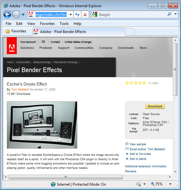
To create the Droste effect you must first have Pixel Bender installed so, if you don’t, visit my earlier post to learn where to find it and how to install it. Then, you’ll need to download the Droste filter from: http://tinyurl.com/pbdroste.

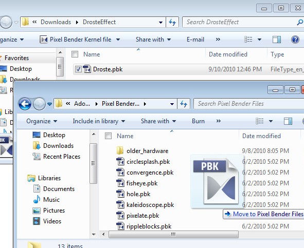
Unzip the folder and copy the .pbk file to your Program Files\Adobe\Adobe Photoshop CS5\Pixel Bender Files folder. Restart Photoshop and the Droste filter will be in place.


Start with an image that is square with some element of interest centered in the middle of the image. I chose a flower against a neutral background – start with something simple as you learn how the filter works – then plan to use a more complicated image later on.

Make a note of the size of the image by choosing Image > Image Size and write down the image width and height.

There is a physical limit to the file size of images you can use with Pixel Bender which is 4096 x 4096 so make sure your image is smaller than this. Even smaller images render faster.

To run the filter, choose Filter > Pixel Bender > Pixel Bender Gallery and select Droste from the dropdown list. If you have used the filter previously, hold Alt (Option on the Mac) and click on the Reset button to reset the filter settings.

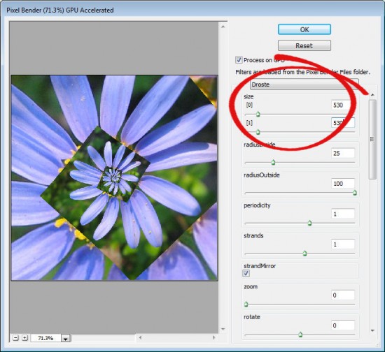
Set the Size [0] and Size [1] sliders to match the width and height of your image – my image is 530 x 530 pixels.

By default, you should see a typical Droste file image with straight edges.


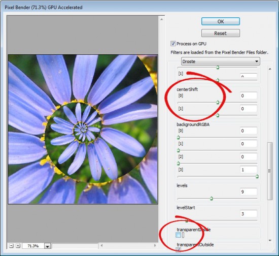
To turn the straight edges into a curved spiral, deselect the TransparentInside checkbox.

If the image is off center, the spiral will look askew at this point. To change the center point of the image and align it with the center of the spiral, adjust the centerShift [0] and [1] sliders – each of these operates in a different dimension. Adjust the center of the image until the spiral looks correct.

To adjust the center of the image itself, use the Center [0] and [1] sliders.

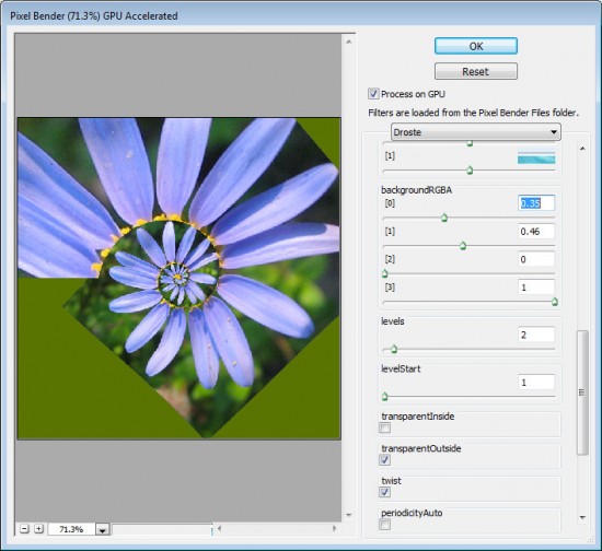
If you do not have an image spiral that completely fills the image area you will see some black background color outside the spiral. You can control the color used for this background by setting the BackgroundRGBA values. The [0] setting controls the Red value, [1] controls Green, [2] controls Blue and [3] controls the opacity of the background. The default is that all sliders are set to 0 and the Opacity slider to 1 which gives the black color. You can view the current background by setting Levels to 2 and the LevelsStart value to 1. Then create your own background color and, when you’re done, increase the Levels value to back up again to around 7.

To make the spiral tighter or looser, adjust the RadiusInside value. Set it to a very small value to get a small number of loops and to something like 50 to get one with lots of loops. The default setting is 25.

Decreasing the OutsideRadius twists the spiral more tightly. The default value of 100 makes the spiral looser.
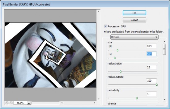
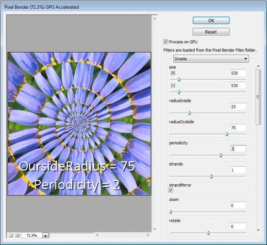
Periodicity is the number of times the image repeats in each loop of the spiral. If you set this to 2 the image will be repeated twice per spiral – the Default value is 1.

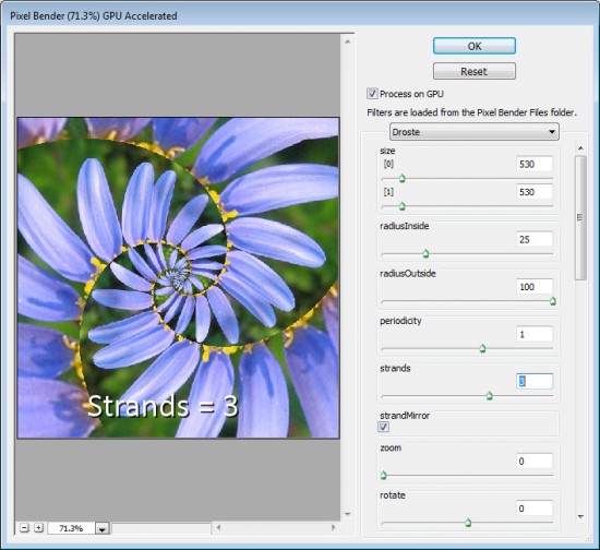
The Strands value sets the number of loops in the spiral. If you set this to 2 you will have two interlocking spirals and if you set it to three you’ll get three strands/spirals  and so on.

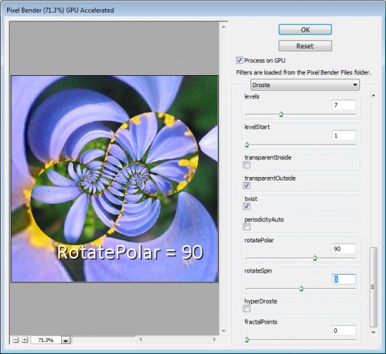
Other interesting effects include using the RotatePolar value. By setting it to, 90 as shown here you will get different spiral loops on the screen. Having done this, you can then select RotateSpin to adjust the effect.

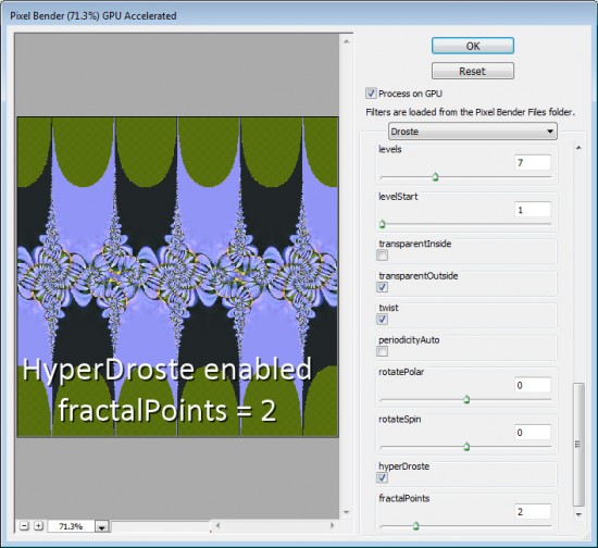
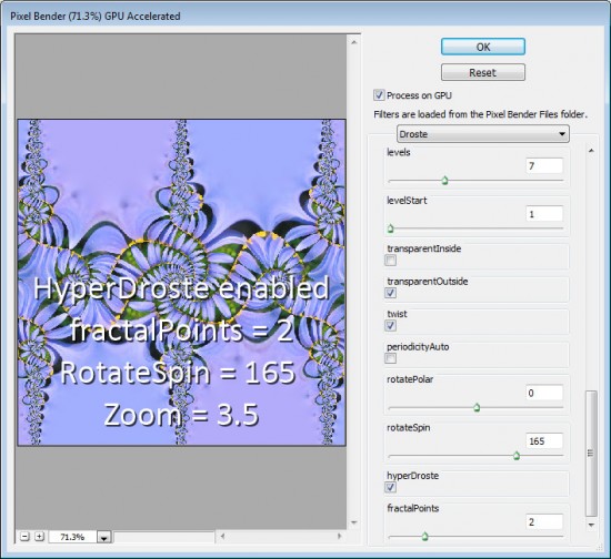
If you enable HyperDroste then adjust the FractalPoints value, you will create an image that is reminiscent of a fractal style image.

If desired adjust the Zoom value to zoom into the design.

Use RotateSpin and RotatePolar with FractalPoints and HyperDroste to fine tune the effect.

When you have a design you like, click Ok button to apply the Droste effect to your image.

Once you know how the controls in the Droste filter work you’re ready to apply it to a more complex image.

To get best results, start with a square image with something of interest in the center and make sure to set the image dimensions in the filter before working with the other sliders.


Helen Bradley

Thursday, May 26th, 2011

30 Second Photoshop Background

Here’s a quick and easy way to make an interesting background in Photoshop that totally rocks.

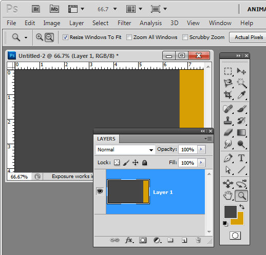
Create a new image the size of your background and fill it with a color. Make a selection on either edge of the image – I made mine on the right – and fill it with your second color.


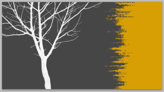
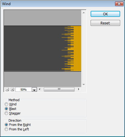
Now choose Filter > Stylize > Wind and select the Blast and the From the Right options and click Ok. When you do the filter will be applied to the image and the edge will begin to fracture.

Continue to apply the filter by pressing Ctrl + F (Command + F on the Mac) – this shortcut repeatedly reapplies the last filter you applied. Stop when you get the effect that you want.

You can stop here or you can go ahead and apply and additional filter to the image.

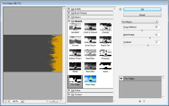
Filters such as Splatter, Patchwork, Glass, Torn Edges, Water Paper and Rough Pastels all give an interesting result.

Finally, I’ve been using some cool tree silhouette brushes lately and I’ve finished the design off with a simple tree brush stroke.

Helen Bradley

Thursday, May 12th, 2011

Make a Path Bigger or Smaller in Illustrator

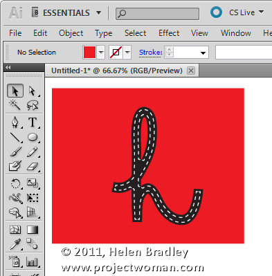
I had a job recently which involved preparing a scanned drawing for a screen printer. One problem was that many of the lines in the image needed to be thicker so they would stand out when printed. The lines had been converted by the tracing application to be filled paths. Essentially I needed to make all black filled paths larger so that the blacks would print more strongly. The job could have taken five minutes or five hours depending on whether or not you know how to expand a path.
The first thing to do is to select the path or paths to alter. For me that involved selecting one of the black filled paths then choosing Select > Same > Fill Color to select every other path that has the same fill color. If you have only one path to adjust you’ll select just that path.

Make a path larger or smaller in Illustrator

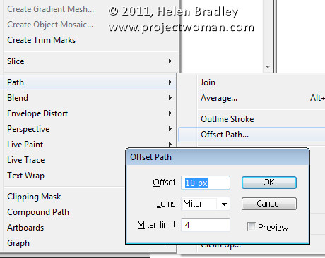
Now choose Object > Path > Offset Path. While offset path doesn’t sound much like it will sort out the problem it is the tool for resizing paths and with it you can grow or shrink a path, making it larger or smaller by a value of your choice.

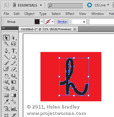
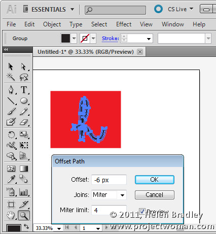
For my project I used an increase value of 0.5 points but you can type any value into the Offset box – make sure Preview is checked so you see the result. Use a positive value to make the path larger or a negative value to make it smaller – as I did below. To control joins choose Miter, Round or Bevel and set the Miter Limit. Click Ok to confirm the change.

Whenever you need to scale a path in Illustrator to make it larger or smaller the Offset Path tool offers a quick and easy solution.

Helen Bradley

Monday, May 9th, 2011

Set a background for a MadPattern pattern

If you’ve started using the MadPattern templates to create repeating patterns you may have run into some problems when trying to change the background color.

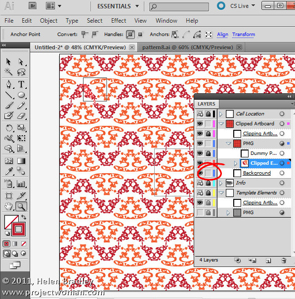
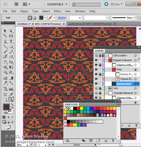
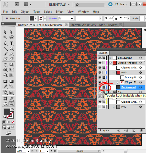
To do this first display the Layers palette using Window > Layers and locate and select the background layer. Click the lock icon for this layer to turn it off – this unlocks the layer making it editable.

Target the background layer by clicking the circle to its immediate right in the layer palette now select the fill color icon in the Tools palette and select a fill color for the background.

When you’ve done this you can reselect the lock icon in the Layer palette so the background layer is protected.

Click again on the clipped elements path to continue to work with your design.

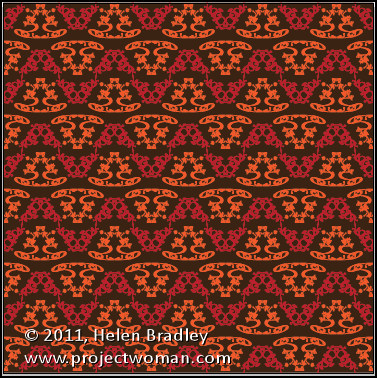
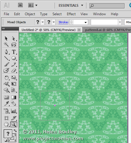
In a future post I’ll show you how to quickly and easily create new color combinations to use to recolor the pattern.

Helen Bradley

Friday, May 6th, 2011

Illustrator – my Direction handles have gone!

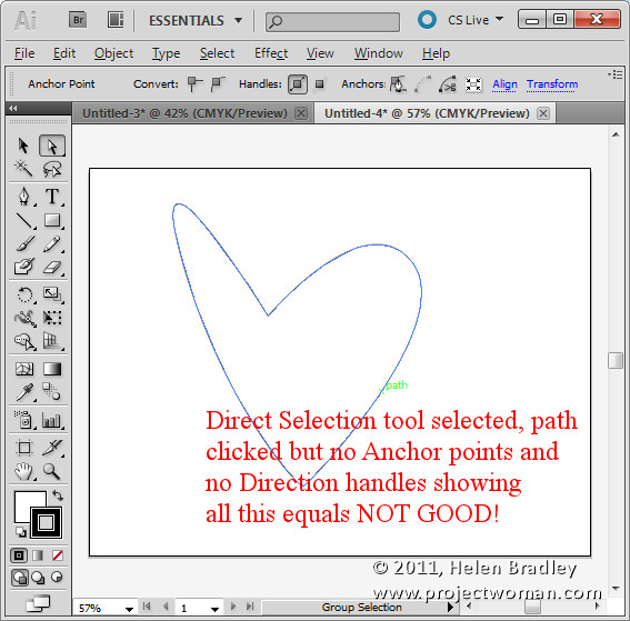
Ok, this has probably happened to you before and it is horribly frustrating. You draw a shape with the Pen tool or you open a file with a shape on it. You click the Direct Selection tool and you click on the shape expecting the anchors and direction handles to appear. But they don’t!

Your direction handles and anchors are gone, vanished, not there – nada – yikes!

The solution is to press Control + H (Command + H on the Mac). Quite simply it’s the shortcut for Hide Edges and that means it’s not exactly obvious that it hides or reveals anchor points and direction lines – like these are edges? Well, I for one don’t call them edges – but, swallow your frustration with the poor terminology and hit the keys – it works.

Now write it down – share it with your friends, someone you know needs this shortcut key – today!

20110924-160039.jpg

Helen Bradley

Tuesday, May 3rd, 2011

Quick and easy pattern making in Illustrator CS4 & CS5

Creating repeating patterns in Illustrator can be a time consuming process but, with MadPattern, it can be simplicity itself.

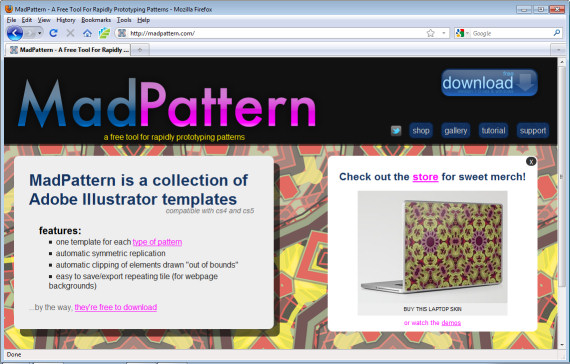
MadPattern is a series of templates you can use to quickly and easily create repeating patterns in Illustrator CS4 and CS5.

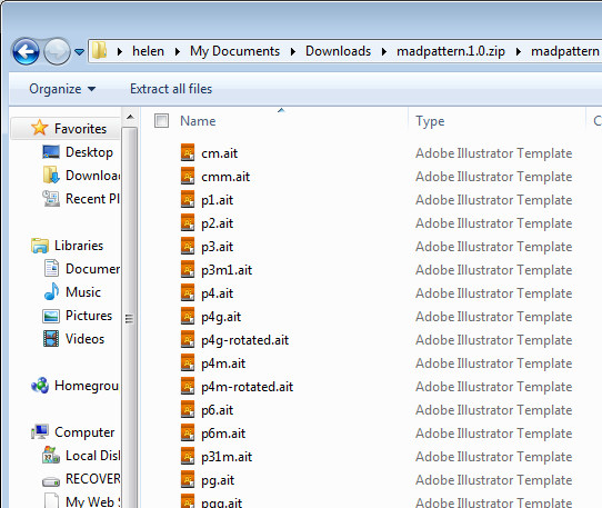
To get started, visit http://madpattern.com and click the download icon to download the zip file. Double click it and extract its contents.

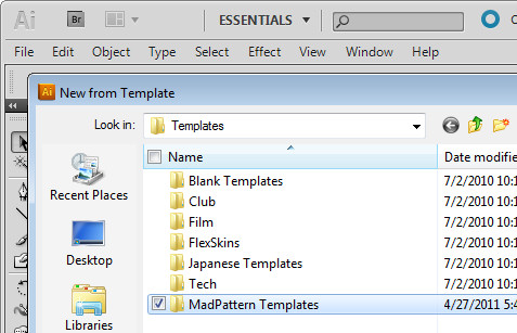
You’ll need to put these files in your Illustrator template folder. The easiest way to do this is to open Illustrator, choose File > New from Template to open the template folder. In Windows, right click and choose New > Folder and add a new folder for these templates. Drag and drop the templates that you just unzipped and extracted – they are all .ait files – into the template folder that you just created.

You can now select a template to get started with. I suggest you choose p3m1.ait at this point.

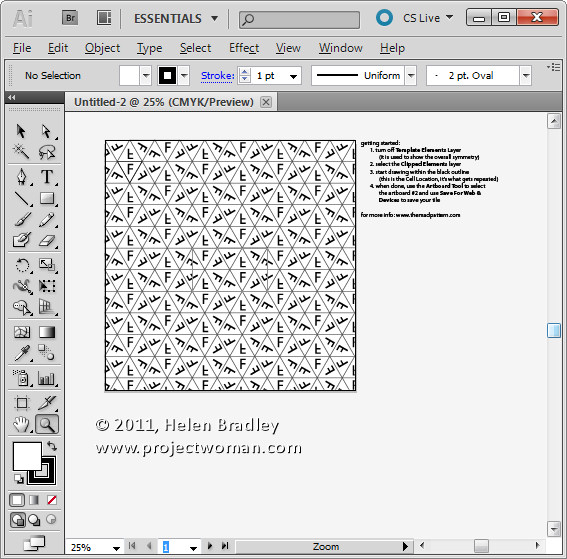
What you’ll see on the screen is a grid with characters and some instructions along the right of the screen.

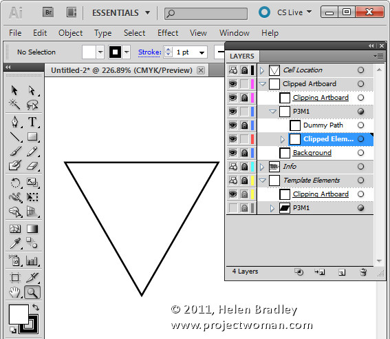
Open the layers palette (Window > Layers) and locate the bottommost layer which will be called p3m1 (the template’s name). Click its visibility icon to make it invisible.

You’ll now see clearly the triangle in the top left corner of the Artboard and a rectangle in the middle of it. Before you leave the layers palette, click the Clipped Elements layer to select it. This is the layer you will work on.

Use the Zoom tool to drag over the topmost triangle to make it larger – this is where you’ll create the image for your pattern.

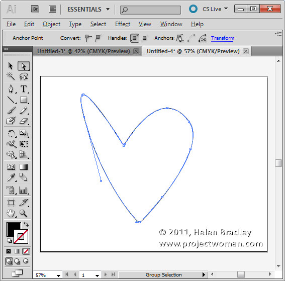
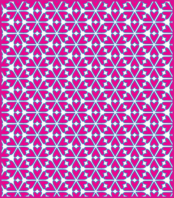
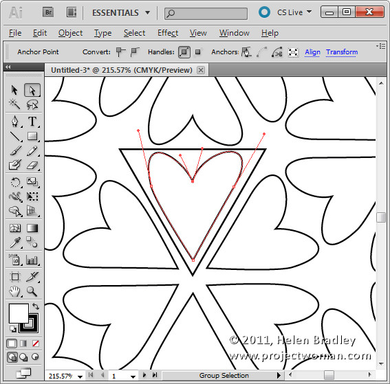
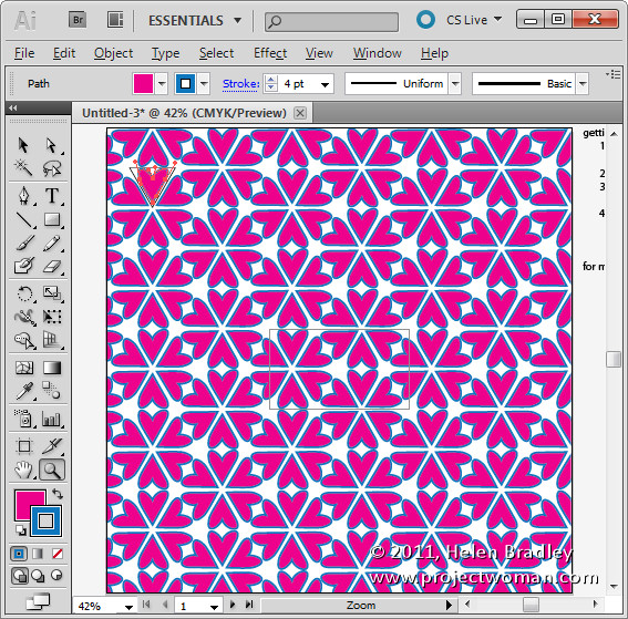
Create a shape within the triangle. For example, you can select the pencil tool and draw a wiggly line or use the pen tool. Here I’ve drawn a rough heart shape using the pen tool – as soon as the shape is created you will see it repeated across the Artboard.

You can now use the Direct Selection or any of your favorite tools in Illustrator to fine tune your shape – for now, keep the shape within the triangle.

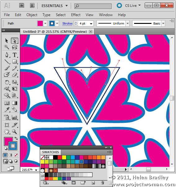
Choose a fill and stroke color for your shape.

Each of the templates in the MadPattern download contains the same basic elements and works in this same way. You will find a small triangle on the template in which you design your pattern and the remaining elements in the template take care of the rotation and duplication of the shape.
In this tutorial I’ve shown you how to design within the triangle shape but this is only the tip of the iceberg of what you can do – the edges in most templates can be used to create mirror shapes as I’ll show you in a future post.

In the meantime you can learn more about the math behind repeating patterns by visiting http://en.wikipedia.org/wiki/Wallpaper_group. This Wikipedia article includes reference to a 17 groups – click on any of them to learn more about the pattern. You can work backwards from this article by finding a pattern that has the elements that you want to use rotated as you want to see them and then identify which of the MadPattern templates you’ll need to use to create it.

I have also created a page showing thumbnails of all the MadPattern patterns so you can quickly preview them to see which ones you want to use.

In future blog posts I’ll show you how to change the background color, how to save and reuse your patterns and how to create way more complex patterns with ease.

Helen Bradley

Sunday, April 24th, 2011

Photoshop – “repeat rotate with a copy” shortcut

This week I discovered a totally cool new keystroke combination which I just have to share. Here’s the back story…

I love making regular shapes from irregular ones. Think kaleidoscopes but not always made from images – sometimes I make the kaleidoscope shapes from other shapes. Shapes are the best kept secret in Photoshop because, unlike brushes, they can be scaled up or down to any size and they don’t lose their smoothness.

So, here’s how to make shapes from shapes and how to put my new keystroke to use:

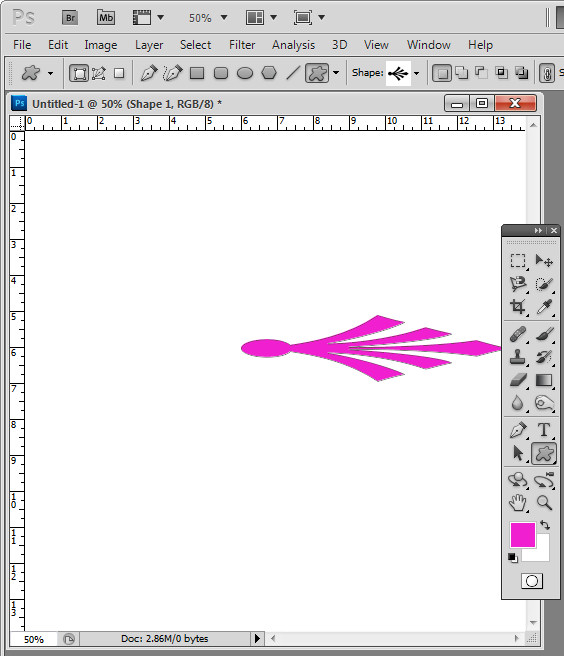
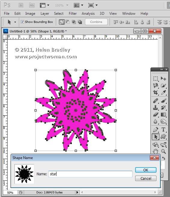
Click the Custom Shape tool and select a shape to use – you can use anything – I’ve used an ornament. On the Tool Options bar, click the Shape Layer icon – it’s the first of the three at the far left of the bar.

Drag the shape onto the image. It will appear as a new layer. It doesn’t really matter what color your shape is right now.

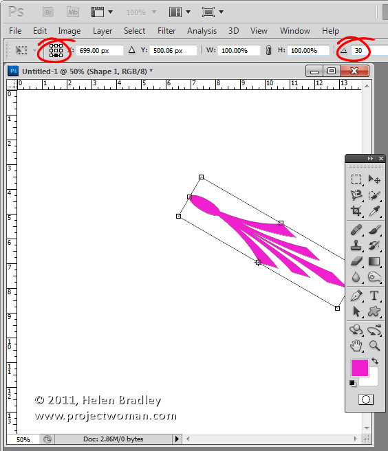
Click the Move tool then choose Edit > Free Transform Path (or press Control + T), click to select the point around which the shape will rotate. You do this using the small indicator on the toolbar – you can choose any of the squares to get an interesting effect – each one will give a different result.

On the Tool Options bar set the Angle to something which is a factor of 360 – 10, 15, 30, 45, 60 and so on. I typically use 30. Press Enter to confirm the rotation.

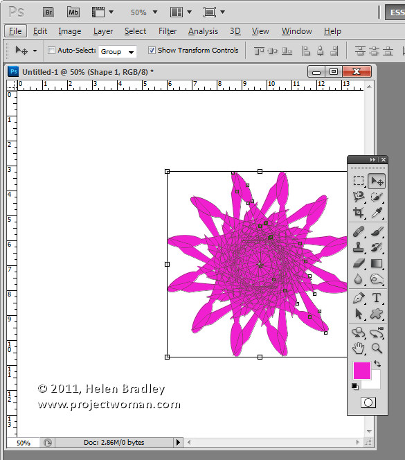
So far you have created a shape and rotated it. Now for the fun stuff – it is time to use the new keystroke combination. With the shape layer selected press Control + Alt + Shift + T (Command + Option + Shift + T on the Mac). Press it a few times until you have duplicated the shape sufficient times to rotate around 360 degrees. The key combination Control + Alt + Shift + T (Command + Option + Shift + T on the Mac) repeats the most recent rotation with a new copy of the shape. Totally cool stuff.

If the final shape goes off the edge of the image you can automatically resize the canvas to include the shape by selecting Edit > Reveal All.

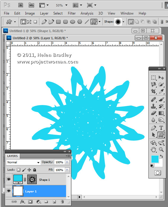
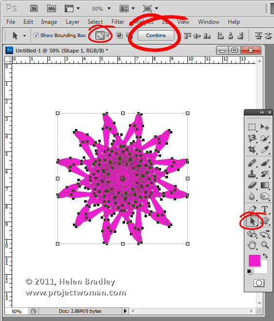
If you like the final shape you can make it a single shape – instead of multiples – by selecting the Path Selection tool and drag over all the shape so you have it selected. From the Tool Options bar select the Add to Shape Area icon and click the Combine button. This makes a single shape from all the combined shapes.

To save the shape so you can use it again in future – with it still selected, choose Edit > Define Custom Shape. Now your kaleidoscope shape is a shape you can use any time in Photoshop by selecting it from the Custom Shape collection.


Helen Bradley

Wednesday, April 20th, 2011

Photoshop – How to fill a shape with a gradient

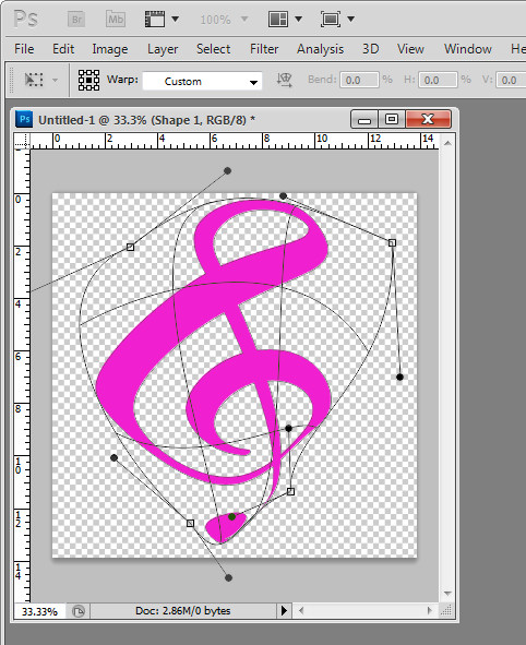
Tricky this one. There are three ways to create a shape in Photoshop and I’ve been working with shape layers so I can warp the result. So far so good. You select the Custom shape tool and then from the tool options you select the Shape Layer option and create your shape. You get a Fill layer with a vector mask showing the shape.

To change the color – double click the Fill layer thumbnail and choose another color. Again – so far so good.

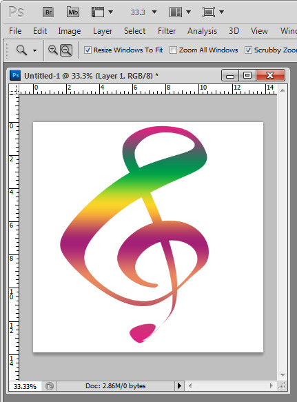
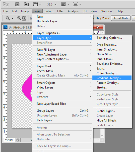
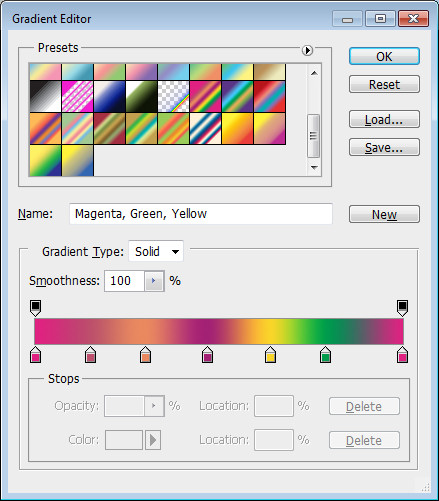
To fill the shape with a gradient – yikes.. there is no obvious option. Here’s a hint – Layer styles! Click the shape layer so you have it selected, choose Layer > Layer Style > Gradient Overlay. Select the gradient to use or make your own custom gradient and click Ok.

Now you know…

Helen Bradley

Friday, April 15th, 2011

Lightroom Vignettes aren’t all equal

I was recently looking around for some cool Lightroom Presets to replicate vintage and toy camera effects. I found a couple of Lomo ones which had some good features but one horrendous failure that really made them usable in all conditions and that’s sad ’cause it didn’t have to be that way.

You see the problem was that the designer didn’t know the difference between vignette tools in Lightroom and they picked the wrong one to use. They used the Vignette tool in the Lens Correction panel to add the vignette – Way Wrong Technique. This tool is for removing vignettes and while it might seem to work for adding vignettes when used on one or a few images it won’t work on all images – hence it is a very poor choice for a preset when there is a better alternative.

The Lens Correction vignette tool removes a vignette from (or adds one to) the edges of the image. So, if you later crop the image, the vignette gets cropped away. If you’re using the tool to remove a vignette then that’s not an issue at all. However, if you are using it to add a vignette – it is a big issue. The presets I found with the vignette added using Lens Correction made a mess of any image I’d cropped – the vignette either got cropped away or worse still it appeared on one side of the image and not the other – yikes!

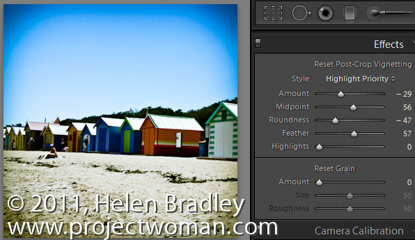
The correct tool to use to add a vignette is the Effect panel’s Post Crop Vignette. This, as its name suggests is a vignette added after the image is cropped so it always appears around the edge of the image regardless of whether it is full size or severely cropped or anything in between and regardless of when you choose to crop the image.

To add a vignette to darken the image edges drag the Amount to the left – dragging to the right will lighten the edges. The Midpoint setting moves the vignette inwards or pushes it outwards. The Roundness setting makes it rounder or squarer and Feather adds a softer or harder edge. For Style, I prefer Highlight Priority although Color Priority is ok – Paint Overlay is an overlay effect and not a blended one so I like it least of all.

So, next time you need a vignette effect for an image, choose the one that not only has plenty of customization options but also the one that will survive any cropping applied to the image.

Helen Bradley