Friday, November 25th, 2011

Craft great Black and white images in Lightroom

Most of us know we can convert and image to black and white in Lightroom by simply pressing the letter V. However, for the exact same image, your version of Lightroom might give a very different result to my version of Lightroom. The explanation is that there are two settings available for black and white conversions in Lightroom.

I’ll show you what these are, how to configure the one you want to use and how to quickly switch between them.

With a color image on the screen in Lightroom’s Develop module, press the letter V to convert it to black and white.

Open the B&W panel – it’s called Greyscale in Lightroom 2 – and check out the color sliders.

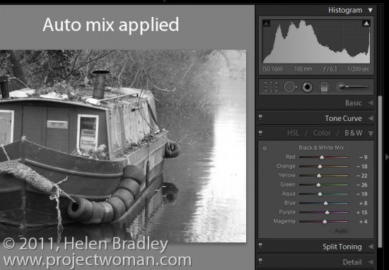
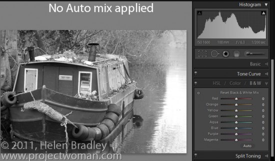
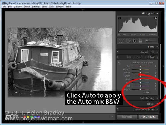
Depending on the preferences that you have set, the sliders might all be set to zero or they might show a black and white adjustment tailored to the image itself which Lightroom calls Auto mix.

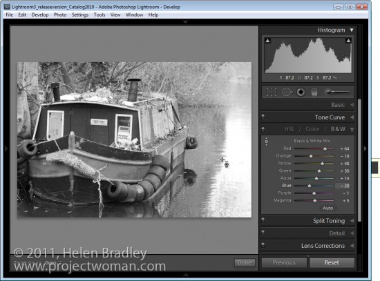
The auto mix adjustment applies an auto exposure adjustment to the image as well as a conversion that maximizes the distribution of the grey tones in the image. This is customized for the image so every image will be given a custom adjustment much as you will get if you click the Auto Tone button in the Basic panel. Notice the subtle differences in the histograms in each of the adjustments here.

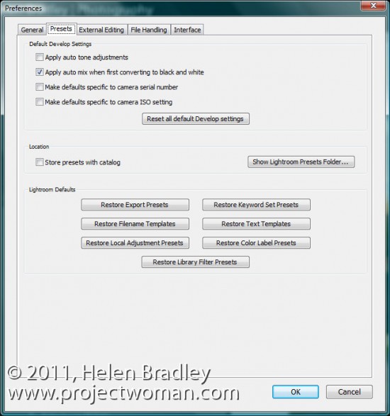
Whether or not you see this Auto mix applied to a black and white image is controlled by your Lightroom preferences. To see these, choose Edit > Preferences (or Lightroom > Preferences on the Mac), select the Presets tab and there’s an option there which reads “Apply auto tone mix when first converting to black and white”.

If this is checked you will get the auto tone mix applied to the image, if not, you will see a black and white adjustment where each color is given the same adjustment value of zero.

Regardless of which setting is in place you can switch between the two in the B&W panel.

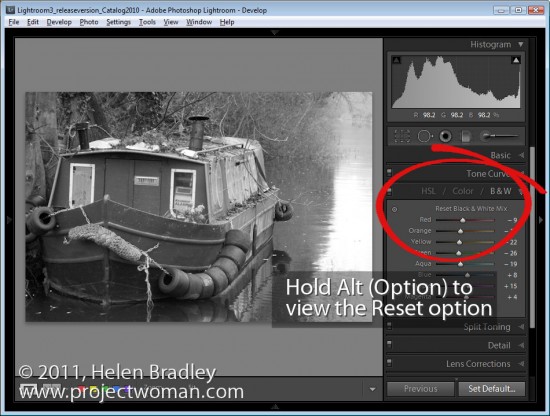
If an Auto mix has been applied, hold the Alt key (Option on the Mac) and you will see an option Reset Black and White Mix. Click this and all the sliders will be set back to zero.

On the other hand, if your sliders are all set at zero, click Auto to apply the auto mix adjustment to the black and white image.

Step 5

You can further adjust the black and white regardless of whether you have an auto mix applied automatically to it or not by adjusting the sliders.

You can also select the Target Adjustment Tool and drag on an area of the image to adjust whether it is light or dark. Dragging downwards will darken it, dragging upwards will lighten it.


Helen Bradley
Wednesday, November 23rd, 2011

Lightroom’s Selected and Most Selected Images

One of confusing things when you’re getting started in Lightroom is understanding the concept of selected images and the most selected image in Lightroom.

Step 1

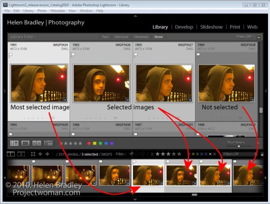
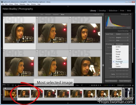
To see this at work, start in the Library module and press G to move to Grid view. Click on any image to select it and Shift + Click on another image. You’ll now have a sequence of images selected.

Notice that in both Grid view and on the Filmstrip the first image that you selected has a lighter border around it than all of the other selected images and notice that the unselected images have darker borders.

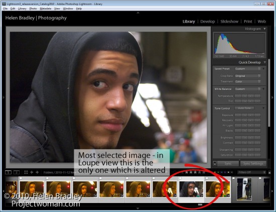
The image with the lightest border is the most selected image and it is the image that will be affected by changes that you make to various settings, in particular when you are working in Loupe view with multiple images selected.

Step 2

What you have selected in Lightroom and the view you are in impacts how changes are applied to an image.

In Grid view if you select the Quick Develop panel and choose a different white balance setting then all the selected images that are selected will be altered.

Step 3

However, if you are in Loupe view and if you make the same change only the most selected image will be altered and not all the selected images.

Grid and Loupe view work very differently and it’s important to understand, particularly in Loupe view, that when you have multiple images selected, there is one that is most selected.

Step 4

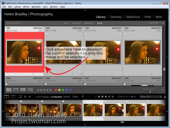
When you have all images in a folder or collection selected it can be difficult to see just how to deselect the images. To deselect a selection, click outside the thumbnail area of any of the selected images in an empty area of the cell it is in. This deselects the current selection so only the image that you just clicked will be selected.


Helen Bradley
Monday, November 14th, 2011

Photoshop – convert a black background to white

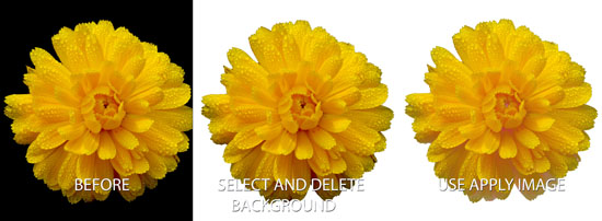
I was recently asked how to convert the background of an image from black image to white. It isn’t a trivial task so it got me thinking. One of the problems is that things shot against a black background actually pick up black or dark reflections so it’s not enough to merely remove the black – you also have to solve some of the reflection problems as well.

This method won’t work on every image but provided the subject is well lit so there are minimal dark reflections to deal with, it is quick and effective.

Step 1

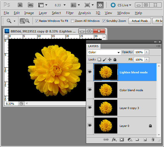
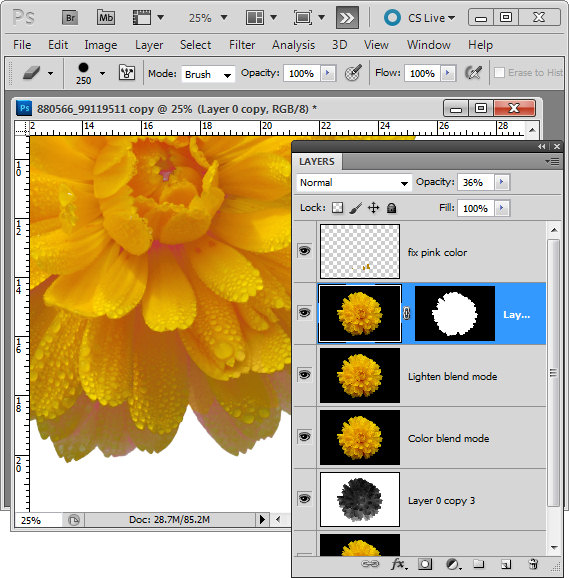
Start by making three copies of the background layer of the image by right clicking it and choose Duplicate Layer three times.

Set the top layer’s blend mode to Color and the second top layer’s blend mode to Lighten.

Step 2

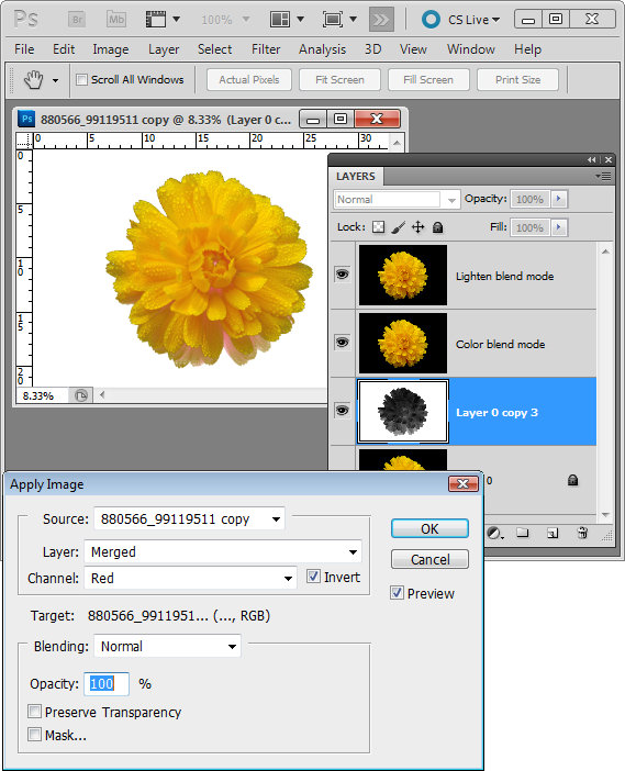
Target the third top layer and choose Image > Apply Image. Set the Channel to Red as it is typically lightest in the areas where the data is that you want to retain. Select Invert and make sure the Blend mode is set to Normal. You will see the image now with the background removed. Click Ok.

Step 3

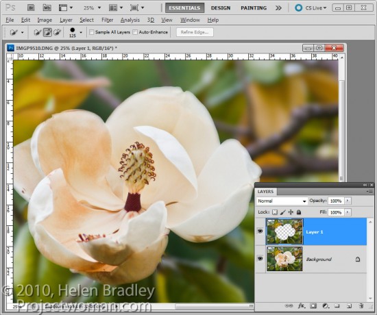
Now all you have to do is to tidy up the problems. Typically this is problems with color or the edges. For this I make yet another duplicate of the background layer and drag this to the top of the layer stack. Make a rough selection of the background using a tool like the Quick Selection tool and then hold Alt (Option on the Mac) as you click the Add Layer Mask icon at the foot of the layer palette. You can now use this layer to add color or to fix other problems.

In this image I reduced the opacity of this layer to around 30% to bring back some missing detail in the flower.

I also added a new layer, set its Blend Mode to Color, sampled some color from the flower and painted over some of the petals where they showed pink once the black was removed.

The image is © Lars Sundstrom from sxc.hu


Helen Bradley
Wednesday, November 9th, 2011

Personalize Lightroom with identity plates


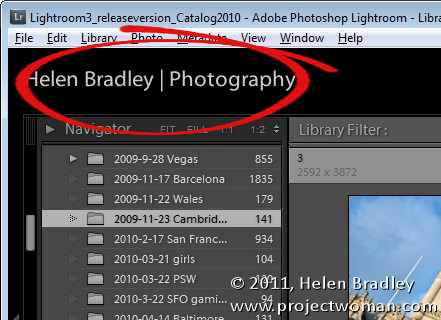
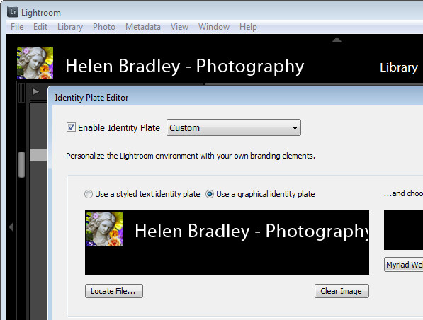
If you’re a professional photographer, teacher, someone who routinely shows off images in Lightroom or if you just like the personal touch, why not personalize your Lightroom interface? The Lightroom branding which appears in the top left corner of the screen is customizable using the Lightroom Identity Plate feature. Identity Plates are usable throughout Lightroom to brand your prints, slideshows and some web sites but what suits one of these modules won’t necessarily work for customizing the interface.

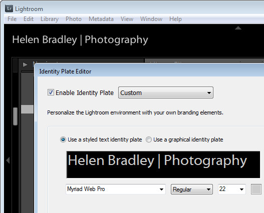
The Identity Plate that appears in the top left of the Lightroom screen is configured by selecting Edit > Identity Plate Setup (on the Mac choose Lightroom > Identity Plate Setup).  To create a simple Identity Plate, choose Use a Stylized Text Identity Plate and type the text into the text area. You can select and format the text in the font, font size and color of your choice. Click the Enable Identity Plate checkbox and the changes you make will appear in place so you can check how they look. You may need to size the text to fit the space – Lightroom won’t scale it to fit automatically.

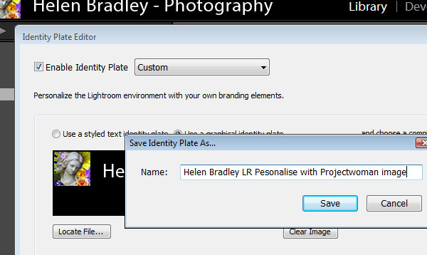
To save the Identity Plate, choose Save As from the dropdown list and type a name for the Identity Plate. You can then select and use it in one of the modules later on – for example you can add it to a print layout.

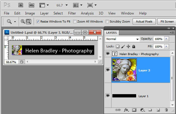
If you prefer to use graphics in your design such as your signature or a graphical design element you can create a graphical Identity Plate in another application such as Photoshop. The file you use should be no more than 60 pixels in height so it fits in the space available – there is no option to scale it to a smaller size, for example. For this reason, if you plan to use a Graphical Identity Plate such as this for more than just customizing your Lightroom interface you will need two of them – one small image for customizing Lightroom and another one sized appropriately for printing at a high resolution.

When creating your Identity Plate in an application like Photoshop, build it in a layered file and make sure the bottom layer of the document matches the color of the Lightroom interface – ie make it black. This way you test the Identity Plate to make sure it will look good when placed on a black background. Then turn off the visibility of the black background layer and save the file as a .png, .psd or another format that maintains transparency (not jpg). If you save as a .jpg image the transparent background will be white and you will probably also have small unsightly artifacts in your design.

Back in Lightroom, open the Identity Plate Editor and choose Use a graphical Identity Plate, click Locate File and browse to find the file on disk.

Save this Identity Plate so you can always reuse it if you change the Identity Plate in future.

You can use this same process to create a transparent image in your graphics program to use as a graphical Identity Plate for the other modules. In that case make sure that the Identity Plate is created at an appropriate size for printing. Crop closely around the image so that it can be easily sized and moved into position later on. You need to do this because it is not possible to size an Identity Plate any larger than the screen or page size and you cannot skew an Identity Plate out of shape when resizing it – its proportions will be constrained as it is sized up or down.


Helen Bradley
Thursday, November 3rd, 2011

Photoshop CS5: Oil Painting with Pixel Bender

One of the cool new tools from Adobe Labs is Pixel Bender. This free extension lets you apply any one of a series of filters that comes with the extension to your images in Photoshop CS5. But that’s not all – Adobe also provides a simple interface for Pixel Bender that lets you create your own filters. As a result a community is building around Pixel Bender with users sharing custom created filters with others. In this post I’ll show you how to get started with Pixel Bender.

You will find the Pixel Bender extension here for download: http://labs.adobe.com/downloads/pixelbenderplugin.html this is the version for Photoshop CS5 and CS5.5. Go to this site to find the Pixel Bender download for Photoshop CS4 you will see the link in the top right of the page. Make sure to download the version that matches your operating system and your version of Photoshop CS4, or 5/5.5 (32 or 64 bit). The extension is an .mxp file and you need to install it using the Adobe Extension Manager.

You can install the extension by double clicking on the file to launch the Adobe Extension Manager. If you’re using Windows Vista or Windows 7, you should run the Adobe Extension Manager as an Administrator. So, from the Start menu, locate the Adobe Extension Manager entry, right click it and choose Run as Administrator. The reason for this is that the extension needs to be placed in a folder that you can only access if you have administrator privileges. If you launched the program manually choose File > Install Extension and locate and select the extension that you just downloaded.

Accept the license terms and the extension will be automatically installed inside the appropriate Photoshop CS5 program folder.

When you’re done, close the Extension Manager, close Photoshop and reopen it.

Pixel Bender won’t work on images larger than 4096 x 4096 so start by resizing your image if necessary. If desired, you can convert an image to a Smart Object before applying a filter.

To run Pixel Bender open an image and choose Filter > Pixel Bender > Pixel Bender Gallery. You’ll see a list of filters in the dropdown list which currently displays CircleSplash. Select the OilPaint filter and then adjust its settings. Using Stylization, you can adjust the length and bend of the brush strokes – the larger values look best.

Cleanliness will adjust the smoothness of the effect and typically looks good at around 7 or 8. Colorization allows you to apply more or less color to the image. BrushScale changes the size and length of the darker brush strokes – a small value gives thin long lighter brush strokes and a larger value gives shorter thick very dark brush strokes. BrushContrast will adjust the contrast of the brush strokes and is probably better left at a value approaching 1.

In short, adjust the sliders until you get a result you like. If you are unsure how a slider is affecting the image drag it all the way to the left or right to see the effect. Then adjust from there.

When you’re done, click Ok to apply the result to the image. Unlike most filters which convert images to look like an oil painting, this one does well at identifying edges in the image so the painting looks more realistic.


Helen Bradley
Friday, October 28th, 2011

3 Cool tips for working in Adobe Bridge

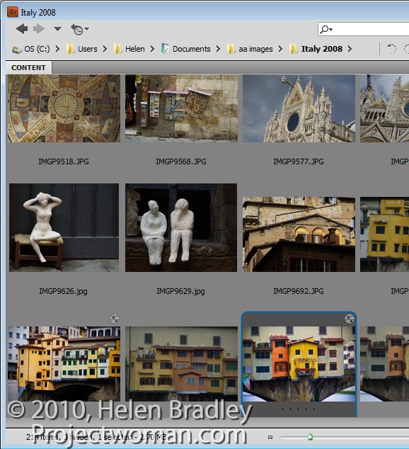
Do you open photos direct into Photoshop or do you use Bridge? If you don’t use Bridge, there are some good reasons for changing your habits. You may not realize it but some of how Camera Raw behaves depends on whether you open an image from Bridge or from Photoshop. Here’s how:

Freeze Photoshop or not?

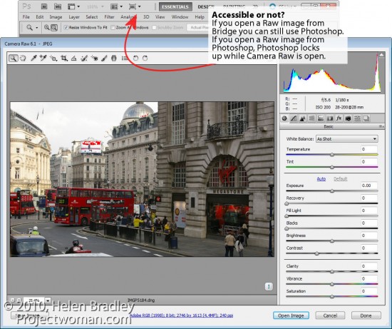
Open a Raw image in Photoshop and it opens, of course, in Camera Raw. But look at the screen – Photoshop is open but the window is frozen. You can’t minimize it and you can’t work in Photoshop at the same time as work in ACR.

Close the image and now do the same thing from Bridge – right click a Raw file and choose Open in Camera Raw. See the difference? When you open a Raw file from Bridge it opens in Camera Raw but without seizing the Photoshop window as well. You can still work in Photoshop at the same time as you work in Bridge.

In short, if you want the best of both worlds – Photoshop and Camera Raw then head to Bridge to open your images from there.


Bypass Camera Raw

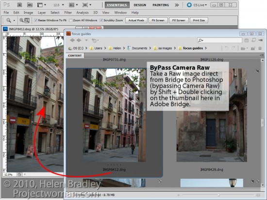
If you’re in Bridge, you can bypass Camera Raw entirely and open a Raw file direct in Photoshop by holding the Shift key as you double click the image in Adobe Bridge. The image opens automatically in Photoshop. This is handy, for example, if you’ve already processed an image in Camera Raw in the past and if you now want to work on it in Photoshop.


JPGs to Camera Raw

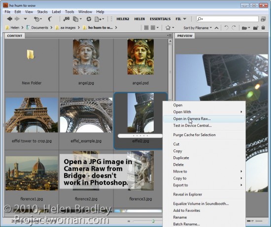
In Camera Raw you can make adjustments and craft images often much more quickly and easily than you can in Photoshop. This being the case, you may want to use Camera Raw for your JPG files as well as your Raw files. In Photoshop CS3 and later versions, you can open any JPG in Camera Raw by right clicking the JPG in Bridge and select Open in Camera Raw. You can’t do the same thing from inside Photoshop.

As a bonus the changes you make to JPG images in Camera Raw are undoable. So, for example, if you convert a JPG to greyscale in Camera Raw and click Done, the photo will show as greyscale in your Bridge thumbnails. However, open the JPG in Camera Raw again and you’ll see the changes aren’t permanent – you can undo them and return the image to full color – don’t try that in Photoshop!

So, if you’re not using Bridge – there are three good reasons for considering changing your workflow habits.

Helen Bradley
Monday, October 24th, 2011

Lightroom toolbar techniques

If you’ve seen items come and go in your Lightroom interface and if you’re confused about what exactly is happening chances are you hit a keyboard shortcut that displays or hides one of the interface features. When I was new to Lightroom it was the Toolbar – I could make disappear in a heartbeat – problem was it took a lot longer to work out what had gone and how to get it back.

As I soon learned, the toolbar can be hidden and displayed using the T shortcut or you can choose View > Toolbar. The toolbar is visible in Library, Develop, Slideshow, Print and Web view – but here’s the catch – there is a separate toolbar for each module and hiding one doesn’t hide them all – likewise displaying a toolbar only does so for the current module not all of them.

That said, you’ll want to have the toolbar visible in most of the modules most of the time because it has some handy features that you will use regularly.

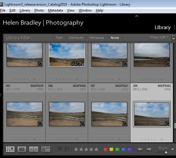
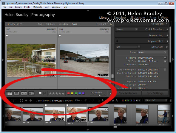
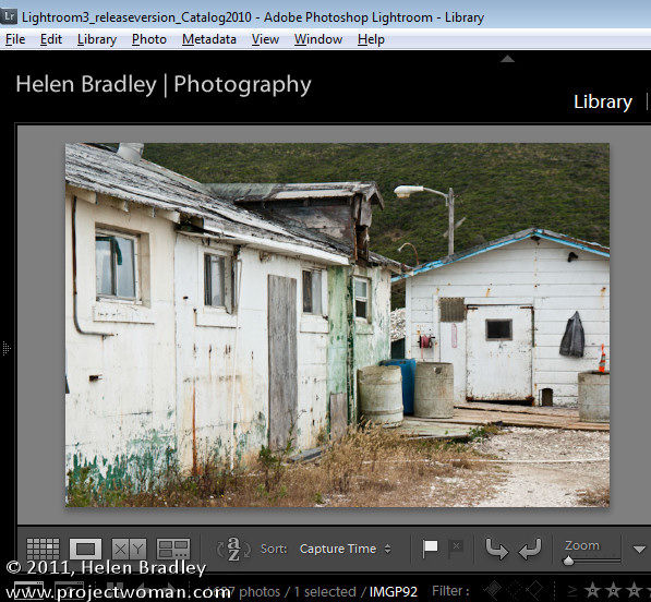
The toolbars in the Library and Develop modules are customizable – those in the other modules are fixed in what they display. To add to the general confusion, the toolbar you see in Grid view and the one you see in Loupe view in the Library module are both toggled on and off as if they were the same toolbar but they are separately customizable so you can select which tools appear in which view and they can look very different in each view as shown in these images of firstly Loupe view then Grid view:

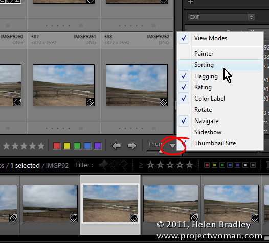
To customize a toolbar click the down pointing arrow at its far right and select the options to display and hide. When you are working on a laptop, for example, and where screen real estate is a valuable commodity, you’ll need to be judicious about what tools are visible and which are not.

One option on a laptop that I like to disable is the rotation tool in Grid view in the Library. The reason is that I can set the thumbnails in Grid view so they show rotation icons so I don’t need the additional tool on the toolbar. However, in Loupe view this rotation tool doesn’t appear so I add it to the toolbar.

If you often resize your thumbnails then including the Thumbnail Size slider is a good idea – if you need the space it takes up for other tools then hide it and learn the = and – shortcut keys for managing the thumbnail size instead.

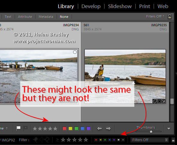
One gotcha that is a guaranteed disaster in the making for new Lightroom users is the apparent duplication of rating, color and flags on the Toolbar and on the bar across the top of the Filmstrip. These are NOT duplicates and instead they are each very different options. The tools on the Toolbar are used to apply a flag, color and rating to images in the Grid or Loupe views. Those above the filmstrip are filters that you use to filter your images based on the flags, colors and ratings you have applied to them. It is important to understand the difference. If you get into trouble and some of your images disappear, selecting Filters Off from the dropdown list above the filmstrip will display all your images again.

Helen Bradley
Wednesday, October 19th, 2011

Photoshop: Working with Locked Pixels

If you’ve ever wondered what the small icons in the Layer palette do, you might be surprised at how useful they can be. Here’s what the Lock Transparent Pixels icon does and how you can use it.

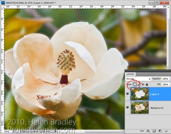
There are times when you are working with content on layers in Photoshop that the layers can do things that you don’t expect them to do. For example, in this image, I have extracted the background to a layer of its own by selecting it and then choose Layer > New > Layer via Copy.

I now want to blur this layer so if I select it and apply a Gaussian blur filter to it, you will see that the Gaussian blur filter pushes the background over the edges of the flower.

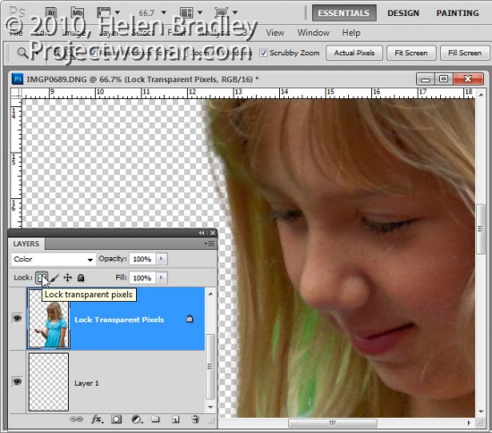
This time, instead of selecting the layer contents I selected the Lock Transparent Pixels icon in the layers palette.

Now when I apply the same heavy blur filter you’ll see that the edges of the background are maintained.

The layer is blurred but only the area that was covered by the original pixels is blurred and the blur isn’t permitted to ‘bleed’ into the area that contains fully transparent pixels.

This option is useful when painting over details to change their color. For example, when you photograph someone against a green screen background you will find hairs and areas around the very edge of your subject may have a green tinge.  Or when you extract a subject, like a building, photographed in bright sunlight it may display some chromatic aberration around its edges.

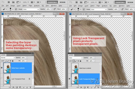
If you select the layer by Control + Clicking on it (Command + Click on the Mac) and sample a color from adjacent pixels you can set the Brush to Color mode and paint over the edges. The problem is that, as you paint, the color is built up on partially transparent pixels which, if you paint too many times, begin to lose their transparency.

If, on the other hand, instead of selecting the layer, you click the Lock Transparent Pixels option and then paint with the brush set to the same Color blend mode and sampling colors from the image as you go, you’ll paint out the problem colors but without affecting transparency.

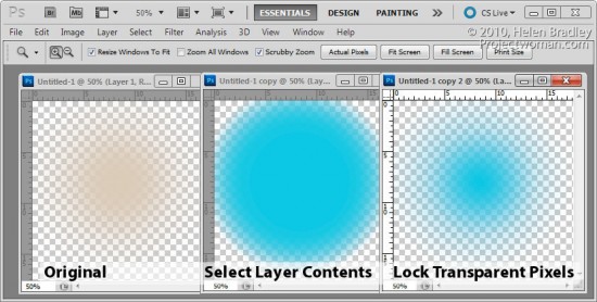
The same option can be used when you fill a selection with a foreground or background color by pressing Alt + Backspace (Option + Delete on the Mac). If the selection is partially transparent and if you simply Control + Click on the layer to select it, the more you fill it the more transparency is lost. On the other hand, if you select Lock Transparent Pixels you can fill it over and over again and no transparency is lost.

In short, using Lock Transparent Pixels ensures that an object on a layer can never become more or less transparent than it was when first created and that its edges won’t change if you, for example, add a blur to it.

Helen Bradley
Thursday, October 13th, 2011

Photoshop CS6 – What’s on your wish list?

When you’ve been using a program like Photoshop for a length of time, you begin to develop a wish list of things you’d like to see in future versions. Sometimes these are addressed by new releases and sometimes they’re not.

Now I know Photoshop CS5 isn’t that old but there are still things on my wish list that aren’t in Photoshop. Here are some things I’d like to see in the next version of Photoshop:

Give me some Clarity

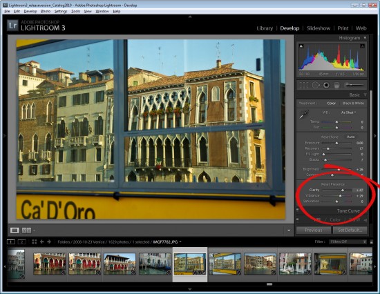
While Vibrance, which first made its appearance in Lightroom, has now been included as an adjustment in Photoshop, Clarity has not yet made the grade – it’s available in Camera Raw but not in Photoshop itself.

In Lightroom and ACR the Clarity slider lets you adjust the midtone contrast and it gives a much needed boost to the midtones in an image with quite spectacular results. At the top of my list for the next version of Photoshop would be the inclusion of a Clarity adjustment.

Paste into a Selection

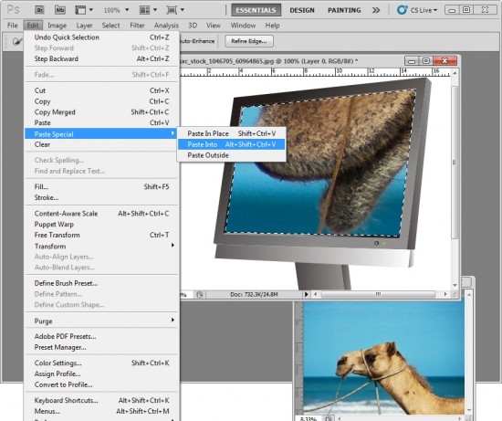
One thing I’d love to see in Photoshop is the ability to paste a copied item from one image in Photoshop into a second image but with the copied selection being pasted in at a specific size.

In short, I’d like to make a selection on the target image with the marquee tool and have Photoshop paste the clipboard contents into the marquee area at a size that fits it to the selection.

You can make a selection and paste the clipboard contents into it but the pasted image isn’t resized to fit – I’d like the option to do both.

Print Multiple Images

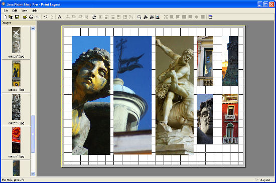
Having used PaintShop Pro for many years, the feature that I’d love to see Photoshop ‘borrow” from that program is some means of easily assembling multiple images to a layout for printing on a single sheet of paper.

PaintShop Pro has a very smart Print Layout tool which displays images down the left of the screen which you can drag and drop into a page for printing. You can drag to resize the images, right click and size them to a fixed size or add them automatically in position on a pre-designed template – built in or custom made.

Adobe has some workarounds to this problem available: Lightroom 3 has a multiple print feature which is reasonably flexible and simple to use and which I wrote about in this post http://projectwoman.com/2010/02/lightroom-3-print-improvements.html. You can assemble multiple images for printing on a single page through Adobe Bridge but the tool is a little cumbersome and it’s in Bridge and not where most people will expect it to be – in Photoshop itself.

You can add the Picture Package tool back into Photoshop CS4 and CS5 (which Adobe removed in these versions) as I explained in this post: http://projectwoman.com/2011/03/multiple-image-printing-in-photoshop-cs4-cs5.html.

But, workarounds aside, I dream of the day a really smart multiple picture print tool appears in Photoshop.

So, now you know the top three things I’d like to see in Photoshop CS6 – now it’s up to you – what’s on your wish list?

Helen Bradley
Friday, October 7th, 2011

Round tripping with Lightroom

One of the most confusing things for new Lightroom users is understanding how documents get round tripped from Lightroom to Photoshop and back.

Step 1
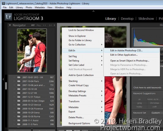
To start, open Lightroom with the image displayed in the Develop, Library, Slideshow or Web modules. Right click the image and choose Edit In > Adobe Photoshop.

If you chose a raw file then the image is sent direct to Photoshop.

Step 2
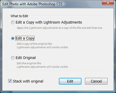
If you chose a jpg or tiff file, then other options are available. You can choose Edit a Copy, Edit Original or to Edit a Copy with Lightroom Adjustments. If you want to take the changes that you’ve made to the image in Lightroom with you to Photoshop, then use the Edit a Copy with Lightroom Adjustments option.

This is exactly what happens if you are working with a raw image – you don’t see the dialog – and the image is sent direct to Photoshop with the Lightroom adjustments in place.

Edit Original ignores any changes that you have made in Lightroom and sends the unedited original image to Photoshop.

Edit a Copy sends the image direct to Photoshop ignoring any changes you’ve made to the image in Lightroom but at the same time it creates a copy of the image so you won’t be editing your original.

Step 3
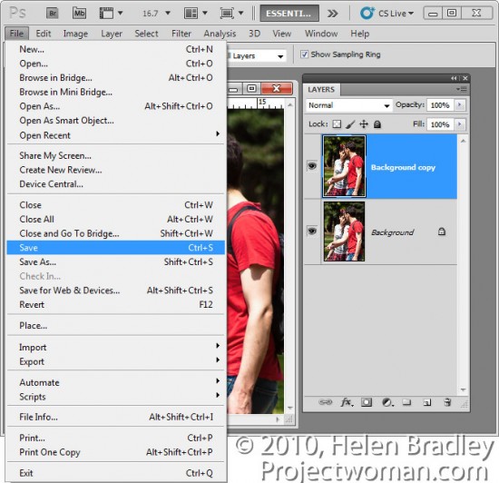
When you’ve finished editing the image in Photoshop, click File > Save to save the image.

The one thing you should avoid when saving a photo that you have taken from Lightroom to Photoshop is to rename it when you save it. If you rename an image by choosing File > Save As then the link between the image in Lightroom and Photoshop won’t be retained and the edited saved version won’t appear in Lightroom catalog. To get the image back into Lightroom you have to find it and then import it into the catalog. This is typically the step where new Lightroom users fall foul of the process and get understandably frustrated.

Step 4
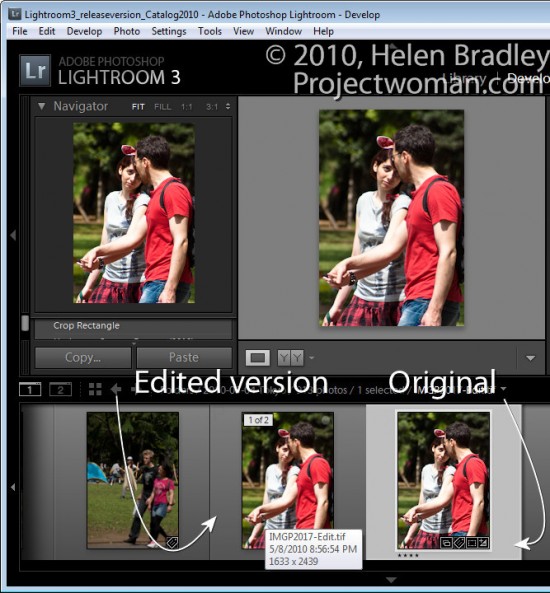
When you return to Lightroom, if you were editing a raw file or if you chose to Edit a Copy, you will find your original file and the edited version in place in the Lightroom catalog. The edited version of the file is stored in the same folder as the original.

The edited version has the same file name as the original but with -edit added to it. In the case of a raw file, the edited version will be saved by default as a tiff file.

If you chose Edit Original then only the original file with its edits will appear in Lightroom.

Step 5
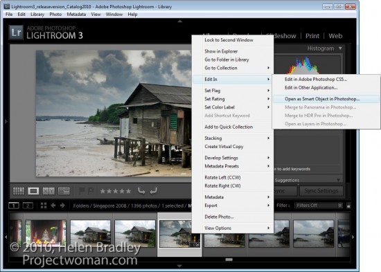
If you wish to do so, you can send also send an image to Photoshop as a Smart Object by right clicking it in Lightroom, choose Edit In > Open as Smart Object in Photoshop.

This opens the document in Photoshop with the image on a layer converted automatically to a Smart Object. You can do this for tiff, raw and jpg images.

When you save the file it is saved as a tiff with –edit added to the filename – the tiff file format supports Photoshop Smart Objects so the Smart Object will be there when you edit the file again.

Step 6
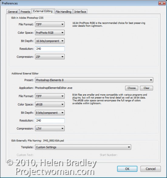
You can determine how Lightroom sends files to Photoshop by choosing Edit > Preferences and click the External Editing tab. Here you can select the file format to be used, the color space that will be applied to the image, the bit depth, resolution and any compression available for the chosen file format.

From the foot of the dialog you can also configure the file naming convention used for files sent from Lightroom to Photoshop. By default, it will be the original file name with –Edit attached to it, although you can change this if desired.

Here too you can add other programs to the shortcut menu so you can take your images from Lightroom direct to programs such as Photoshop Elements or your favorite editor.

Helen Bradley
Tuesday, October 4th, 2011

Batch resize images in Photoshop Elements

Some time ago I wrote a post on batch resizing images in Photoshop. You can find the link here: http://projectwoman.com/2009/09/batch-resize.html. I also wrote an article on resizing in Lightroom which you can find here: http://projectwoman.com/2009/10/resizing-images-in-lightroom-2.html.

Someone then wrote to me explaining that they are using Photoshop Elements and that the resize feature in Photoshop does not work in Photoshop Elements. They are correct, but there is a way of batch resizing in Photoshop Elements and here’s how to do it.

Step 1
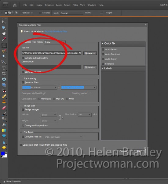
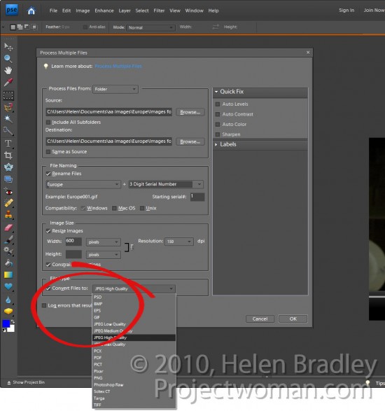
In Photoshop Elements, choose File > Process Multiple Files. This opens the Process Multiple Files dialog.

Here you can select which images to process. You can select either a folder of images, all opened files or you can click import and import images from an external device such as a camera card.

Typically, the best option will be to place all the images in a folder and process the files from that folder. To do this, click the Browse button opposite the Source box and choose the folder to process. Enable the Include All Subfolders checkbox if desired.

Step 2
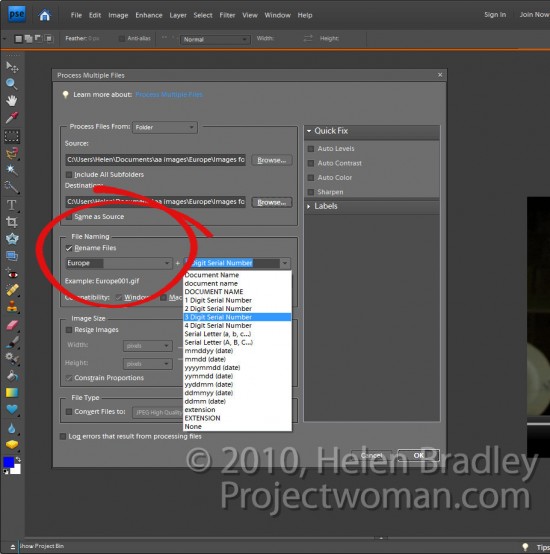
Select the destination folder for the resized images (you can create one from this dialog), or, if desired, select Same as Source.

In the file naming area, select Rename Files if this is desired. You can then choose the naming convention such as typing a document name and the sequential numbering system to be used.

Step 3
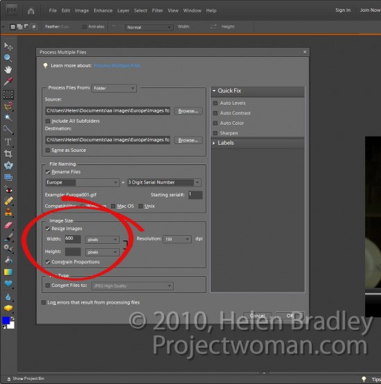
In the image size area, select Resize Images as that’s what we came here to do.

Select Constrain Proportions as you will want your images to be resized in proportion and not skewed or distorted out of shape.

Now type the largest Width or Height to use for your resized images. If you enter 600 for the Width you will be unable to enter a value for the Height and vice versa. This is because you can only set one value – width or height (in this situation this resizing tool works differently to the corresponding tools in Photoshop and Lightroom).

So if you enter, for example, 600 as the Width all images will be sized so their width is 600 and their respective heights will be adjusted in proportion. Portrait images will be taller than 600 pixels and Landscape ones will be shorter.

Here too you should set the resolution for the images. If you plan to send your photos to an online sites for printing, you may want to match the resolution to what that site requires. For the web select 72 dpi.

Step 4
To convert the files to a different format or to compress them, from the File Type dropdown list, select the file format to use. For JPEG format images, you can choose Max, High, Medium or Low quality.

Step 5
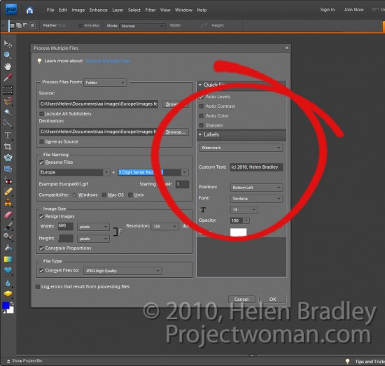
You can also apply a Quick Fix to your images as you process them. These fixes include Auto Levels, Auto Contrast, Auto Color or Sharpen.

You can also apply Labels to your image such as adding a watermark or caption by configuring the options in the Labels area.

When you are done, click Ok to process the folder of files or the group of files that you had selected for processing.

Tip
If you want to resize images so their longest edge is a set value such as 600 then you will need to presort Landscape and Portrait images into separate folders and process them separately.

Helen Bradley
Friday, September 30th, 2011

Secrets of the Lightroom toolbar

If you’ve seen items come and go in your Lightroom interface and if you’re confused about what exactly is happening chances are you hit a keyboard shortcut that displays or hides one of the interface features. When I was new to Lightroom it was the Toolbar – I could make disappear in a heartbeat – problem was it took a lot longer to work out what had gone and how to get it back.

As I soon learned, the toolbar can be hidden and displayed using the T shortcut or you can choose View > Toolbar. The toolbar is visible in Library, Develop, Slideshow, Print and Web view – but here’s the catch – there is a separate toolbar for each module and hiding one doesn’t hide them all – likewise displaying a toolbar only does so for the current module not all of them.

That said, you’ll want to have the toolbar visible in most of the modules most of the time because it has some handy features that you will use regularly.

The toolbars in the Library and Develop modules are customizable – those in the other modules are fixed in what they display. To add to the general confusion, the toolbar you see in Grid view and the one you see in Loupe view in the Library module are both toggled on and off as if they were the same toolbar but they are separately customizable so you can select which tools appear in which view and they can look very different in each view as shown in these images of firstly Loupe view then Grid view:

To customize a toolbar click the down pointing arrow at its far right and select the options to display and hide. When you are working on a laptop, for example, and where screen real estate is a valuable commodity, you’ll need to be judicious about what tools are visible and which are not.

One option on a laptop that I like to disable is the rotation tool in Grid view in the Library. The reason is that I can set the thumbnails in Grid view so they show rotation icons so I don’t need the additional tool on the toolbar. However, in Loupe view this rotation tool doesn’t appear so I add it to the toolbar.

If you often resize your thumbnails then including the Thumbnail Size slider is a good idea – if you need the space it takes up for other tools then hide it and learn the = and – shortcut keys for managing the thumbnail size instead.

One gotcha that is a guaranteed disaster in the making for new Lightroom users is the apparent duplication of rating, color and flags on the Toolbar and on the bar across the top of the Filmstrip. These are NOT duplicates and instead they are each very different options. The tools on the Toolbar are used to apply a flag, color and rating to images in the Grid or Loupe views. Those above the filmstrip are filters that you use to filter your images based on the flags, colors and ratings you have applied to them. It is important to understand the difference. If you get into trouble and some of your images disappear, selecting Filters Off from the drop-down list above the filmstrip will display all your images again.

Helen Bradley
Tuesday, September 27th, 2011

Color Correction in Photoshop

One of the most difficult things to do when you’re starting out in digital photography is to recognize and remove a color cast from an image. Not only do you need to work out that you’ve got a color cast, but you also need to find a means of fixing it.

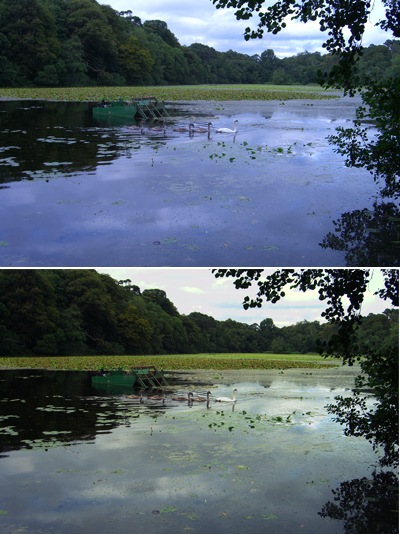
One method of color correction is one that I learned from Photoshop gurus, Dan Margulis and Taz Tally – any errors in this process are mine and not theirs. The process relies on reading data from the image and then adjusting the numbers that the image provides. It’s a way to remove a color cast that is relatively simple and which involves reading and setting RGB values rather than making objective decisions about an image. I’ll show you how to do this using an image shot in the early morning and which is hazy, underexposed and which has very poor color.

Step 1
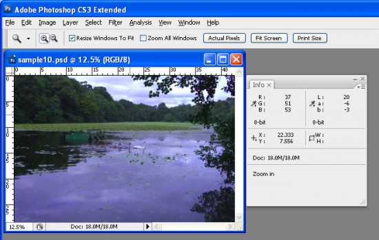
To get started, open an image that you think has a color cast. Choose Window > Info to display the Info palette. This gives you information about the pixels in your image and, if you’re working with a standard photo, you’ll have RGB mode displayed in the upper left corner of the dialog.

Step 2
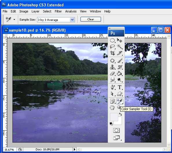
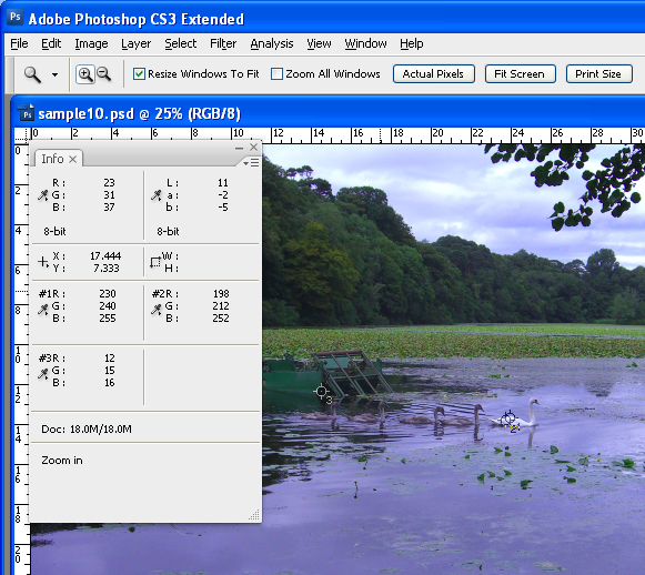
To make the color correction I’ll use the Info palette to display information about the image. To do this I’ll need to make some color sample points on the image and I’ll do this using the Color Sampler tool which shares a toolbar position with the Eyedropper. Click the Color Sampler tool and, from the toolbar, select the 3 x 3 Average Sample. This is important as you’ll want to sample a larger area than just a single pixel.


Step 3
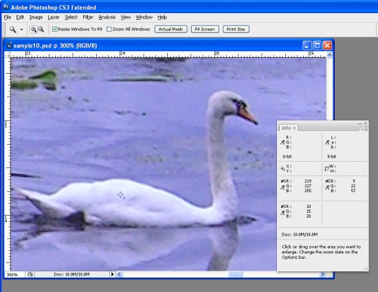
Now locate a place on the image which should be white or a light neutral gray in color. Click on it with the color sampler tool and you’ll see a marker appear on the image with the number 1 beside it. Make sure the point you select is one which should be white or light gray and don’t select an area of the image which is blown out such as a light spot.

Repeat the process, this time clicking on another point which should be either white, black or a neutral gray. This gives you a second sample point. You can continue and add a total of four markers if desired. Each should be placed in an area of the image which should be white, black or a neutral gray.

Step 4
Check back in the Info palette to read the color information for each of these points. For the lightest points you should see values of around 245 for the R, G and B channels. For the darkest points the value should be around 15 for each of the channels. For gray points you should have equivalent values of R, G and B, although they can be any value, they just need to be roughly the same for each.

Step 5
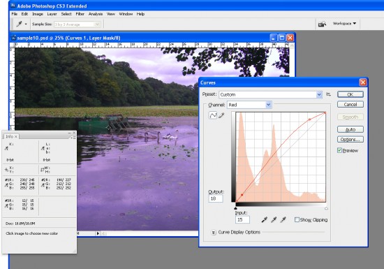
If your image has a color problem you’ll find that the numbers at each point are not within a range of 2 or 3 values of each other. To color correct the image what you’ll do is adjust the curves for each of these channels to bring them closer to each other. Choose Layer > New Adjustment Layer > Curves and click Ok. You’ll be correcting individual channels so from the Channel dropdown list select Red and then Ctrl + Click on the first point that you marked in your image. This adds a small marker on the curve line which shows you where this point in the image appears on the curve.

Identify whether you need to increase or decrease the value at this point. To increase it, drag upwards and to decrease the value drag downwards. You’ll see that you’re not making subjective judgments here; you’re simply adjusting the curve to bring the numbers closer together and closer to the desirable value of 245 for a white point and 15 for a black one.

Step 6
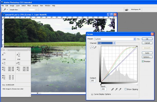
Repeat this last step for all the sample points that you created on the image and then repeat it for the Green and Blue channels so that you end up with all the sample points containing values that are within 2 to 3 values of each other.

Step 7
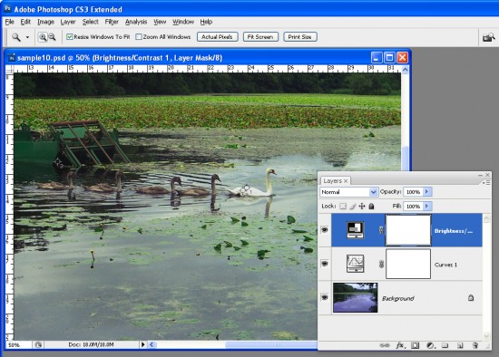
When you’re done, click Ok to close the Curves dialog. You can now apply other fixes such as adding contrast to the image with a further Curves adjustment or use the new Brightness/Contrast tool in Photoshop CS3.

Using the Info palette combined with sample points on the image makes it easier to remove color casts by reading and adjusting numbers.

Helen Bradley
Friday, September 23rd, 2011

Photoshop: Applying fixes using masks

Sometimes a photo needs two opposing fixes applied to different areas of the image. This poses a dilemma – if you fix one area you’ll make the other areas far worse than they started out being and vice versa. The solution is to apply both fixes but to do this on different layers and to blend the results together using a mask. Here’s how to do it:
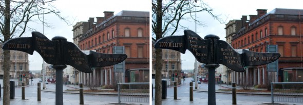
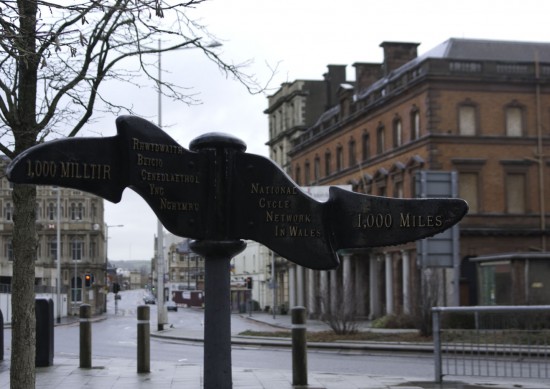
Look at this photo – the sign in the middle is dark and hard to read and the area behind it is lighter than it should or could be. The camera has exposed primarily for the lighter areas in the image but the entire image needs work.

Step 1

Make multiple duplicate layers

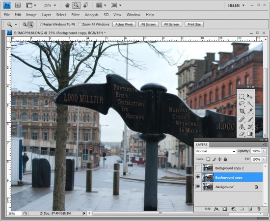
To fix the image make two copies of the background layer so that you do your work on duplicate layers. To do this, right click the Background layer in the Layers palette and choose Duplicate Layer and then repeat this step a second time. Disable the visibility icon on the topmost layer and select the middle layer.

Step 2

Using Shadow/Highlights to lighten the darks

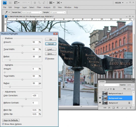
To bring detail out of the darker area in the sign, I’ll use the Shadow/Highlights tool. To do this choose Image > Adjustments > Shadows/Highlights and adjust the Shadows but leave the highlights settings untouched. Typically the default setting will be all you need but you can fine tune the settings using the sliders which appear when you click Show More Options if desired. Ignore the impact that this fix has on the lighter areas of the image.

If you prefer to use another tool for this fix, do so. The important thing is to fix the shadows and ignore any changes to the highlights.

Step 3

Levels to fix the highlights

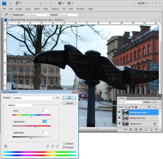
Enable the visibility icon on the top layer and select the top layer – this hides all the changes you have made so far. Choose Image > Adjustment > Levels and adjust the levels to improve the contrast in the lighter areas of the image – this time ignore the darker areas entirely as they are not part of this fix. You can also adjust the saturation using Image > Adjustments > Hue/Saturation if desired.

Again, if you prefer to use another tool, do so. The important thing is to fix the highlights and ignore any changes to the shadows.

Step 4

Blending the results with a mask

The top layer contains the adjustment for the lighter areas of the image and the middle layer contains the adjustment for the dark areas of the image. To blend these layers, I’ll use a layer mask to selectively adjust the opacity of the top layer so I can see the fix applied on the middle layer through it.

Unlike the layer opacity slider which sets every pixel to the same opacity value, a mask lets you adjust the opacity selectively so one area can be 100% opaque and others can be partially or fully transparent.

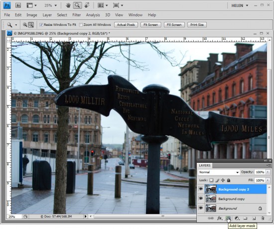
To add a mask to the top layer, first select the topmost layer and click the Add Layer Mask button at the foot of the layer palette. This adds a white layer mask to this layer. When working with masks, “black conceals and white reveals” so the white mask reveals everything on the top layer and the image is unchanged.

Step 5
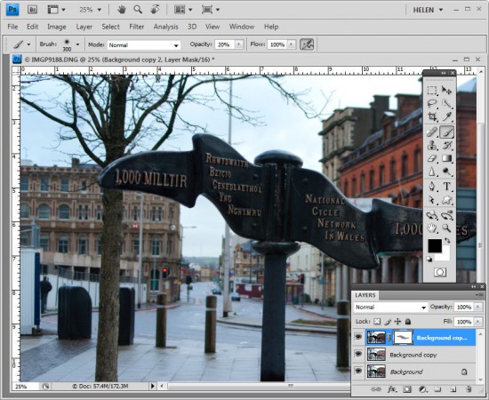
Set the foreground color to black, select a soft round brush and set its Opacity to approximately 20%. Click on the mask to select it – it will have a small border around it showing that you have it selected. Now paint over the darkest areas of the image to reduce the opacity of the top layer where you are painting – this reveals the fix from the layer below. Using a low opacity brush lets you reduce the opacity gradually to build up the effect.

Continue and paint over the darker areas of the image to reveal more of the layer below through the mask. It can help to see how much more detail you can still recover if you turn the visibility of the top layer on and off. Make sure to select the layer mask again before painting on the mask – if you don’t do this, you’ll paint on your image.

If you go too far, make white your foreground color and paint on the mask to bring back parts of the top layer of the image. This is one of the benefits of using a mask – simply by painting you can apply or remove the fix. You wouldn’t have this flexibility if you used the Eraser tool on the top layer, for example.

To finish, I rotated the image to straighten the sign and cropped it to remove the distracting elements on the left side of the image.

Helen Bradley