Sunday, December 30th, 2007
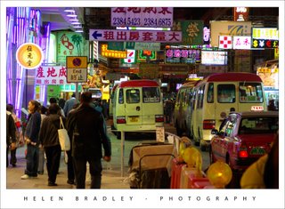
I really did not enjoy the experience of the Temple Street night markets in Hong Kong. Before I went there, I’d spent two days looking around Hong Kong at what I thought would be fun to see. And it was.
The guide book gave a wrap to the night markets, but as a place to hang out, it sucked – big time. The worst part were the hawkers spruiking knock off handbags and custom tailoring – I wasn’t sure that this was a lack of insight on their part – I don’t wear custom tailored stuff – or a “not so subtle” comment on my sloppy dress standards. Suffice to day, it didn’t wash.
However, there were some good photo ops and this was one of them, taken looking up a crowded street. The lights, neon signs and all the activity was wonderful if you were prepared to look only superficially at it. Under the surface were too many junky souvenirs and way too many tourists!
Helen Bradley
Labels: Hong Kong, Night Markets
posted by Helen Bradley @ 2:21 pm2 Comments - links to this post
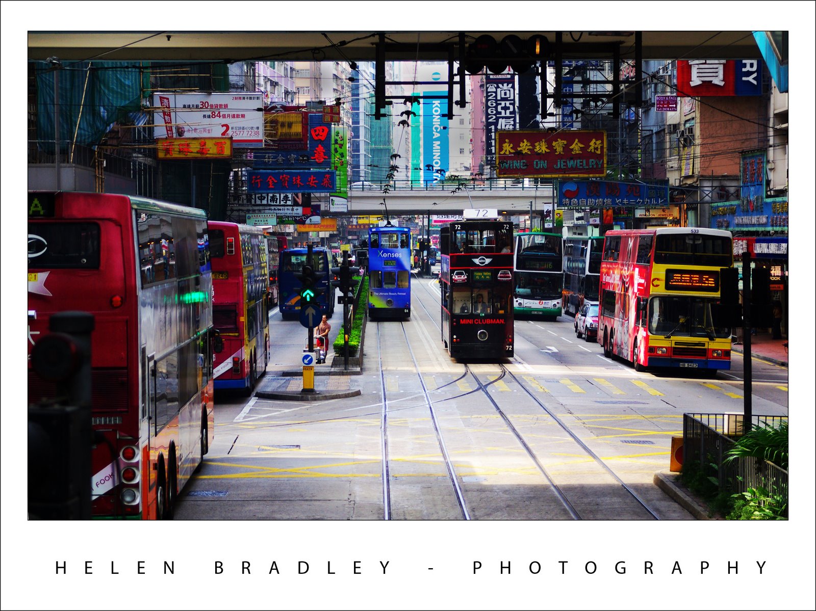
Sunday, December 30th, 2007
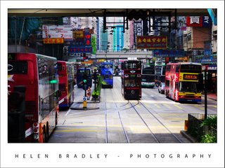
In late December, I got a chance to savour the delights of Hong Kong for a few days. I have to say, I totally fell in love with the place. I loved the less touristy areas and this is one of them. These too cute trams run along a few miles of track on Hong Kong Island. They’re double decker trams and they are so fun to ride. This photo was taken along the route and it’s very typical of what you see – lots of breathtaking colour and busy streetscapes but also it’s all about a slower and more simple pace of life. It’s the complexity and contrast that is so captivating about travelling in Asia.
The photo is straightened out of the camera and it is also colour corrected to bring back the colour. My new Pentax K10D – which I absolutely love – takes photos which lack saturation particularly when I use a polarizing filter on it. I have yet to get a real handle on its behaviour but, for now, just shoot away and rely on Photoshop to fix the results.
One aspect of this photo and some others I took is the contrast between the saturated colours in the ligths and trams and the delicious pastel colours of the roadway.
Helen Bradley
Labels: Hong Kong, Hong Kong island., tram
posted by Helen Bradley @ 2:06 pm0 Comments - links to this post
Wednesday, December 19th, 2007
Ok, this post is Color that Rocks not Color that Pops.. I am really really sick of hearing the word POPS, it is officially Over, Out, Done, Finished – Gone!
I have to hold myself back from screaming “No! No! No! can’t you find another word” whenever someone uses it. Seriously, we need something different, it is so overused.
Ok, Rant [officially] over.
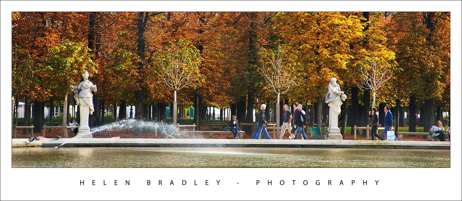
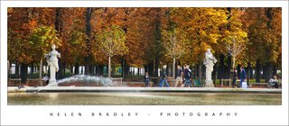
This photo is yummy.
I shot it in Paris in, duh! Autumn. The colors took a lot of work to bring out but they are dazzling. Next work I do on it will be to remove the people. I love them… it gives the image a sense of life … but a friend doesn’t – so they are going.
I have used this image as an example for the color change tool in Photoshop. Open an image to change colors in and choose Image > Adjustments > Selective Color. Now you can select colors in the image – yellows for example and add red or green or blue to them. Select any color and add more of something else to it.
This photo turns from Autumn into Spring in a few minutes – bypassing Winter entirely!
If you make your changes on a duplicate of the image then you can blend and control the effect with a layer mask. So simple and so effective.
Helen Bradley
Labels: color adjustments, Paris, Paris - the Seine in Autumn, Photoshop CS3, Selective color
posted by Helen Bradley @ 6:27 pm0 Comments - links to this post
Sunday, December 16th, 2007
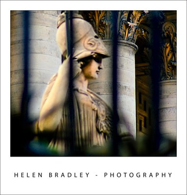
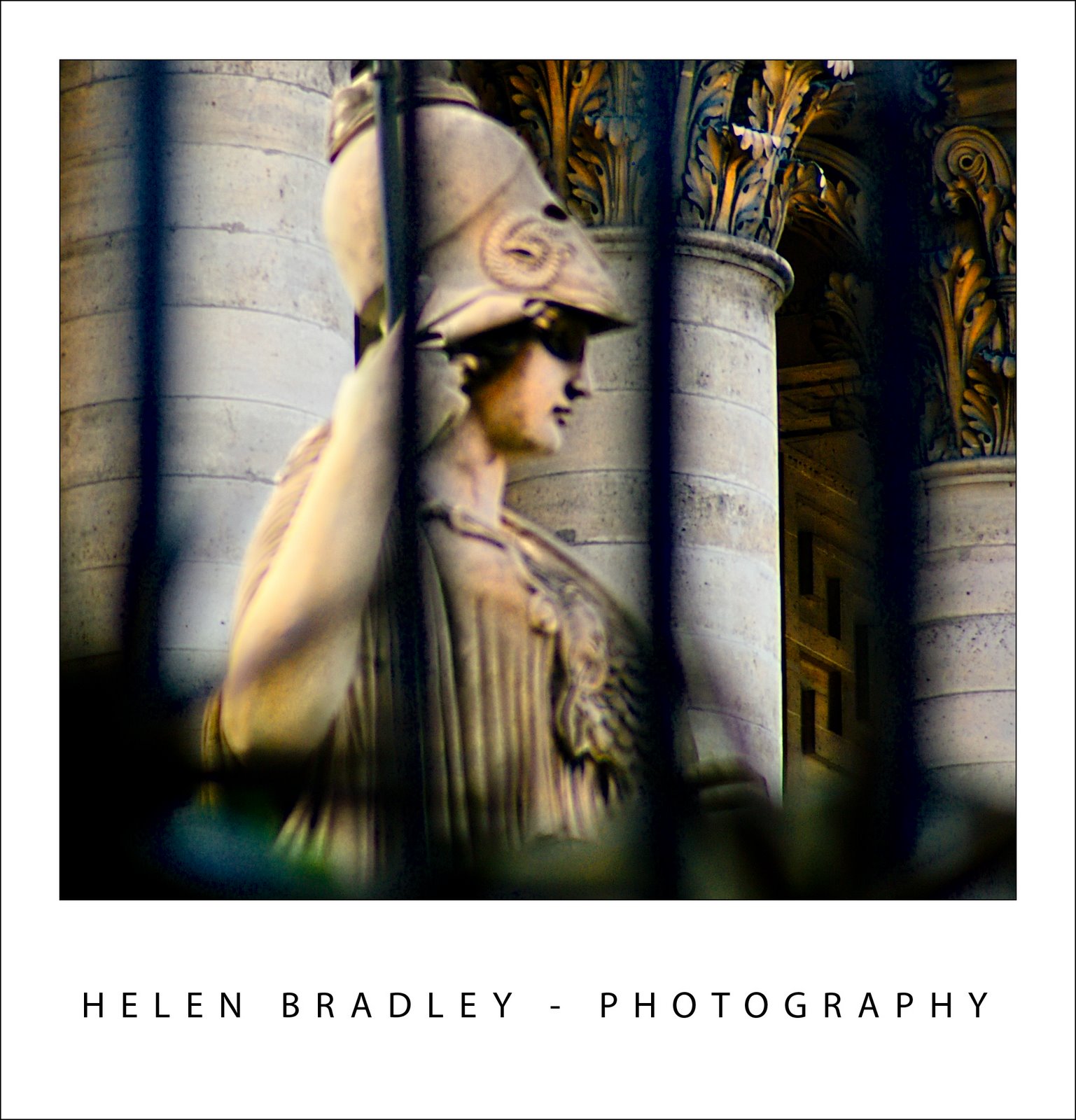
This beautiful photo was taken at The Opera in Paris. It was early morning and I was walking past as I saw this beautiful statue. There were bars between me and it and the photo isn’t actually in very good focus. But there, a bit of work in LAB and it looks just fantastic.
BTW, as I was working on this image, I encountered a problem – I couldn’t save a copy as a JPEG. Yikes! what is happening here? I thought about it for quite a while, then discovered I hadn’t moved back to RGB from LAB color – can’t save a JPEG image using the LAB color space – so now you know. Switch back to RGB when you’re done and you can save it.
Helen Bradley
Labels: LAB, Paris, save jpeg, The opera
posted by Helen Bradley @ 6:30 am0 Comments - links to this post
Wednesday, December 12th, 2007
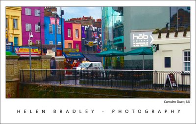
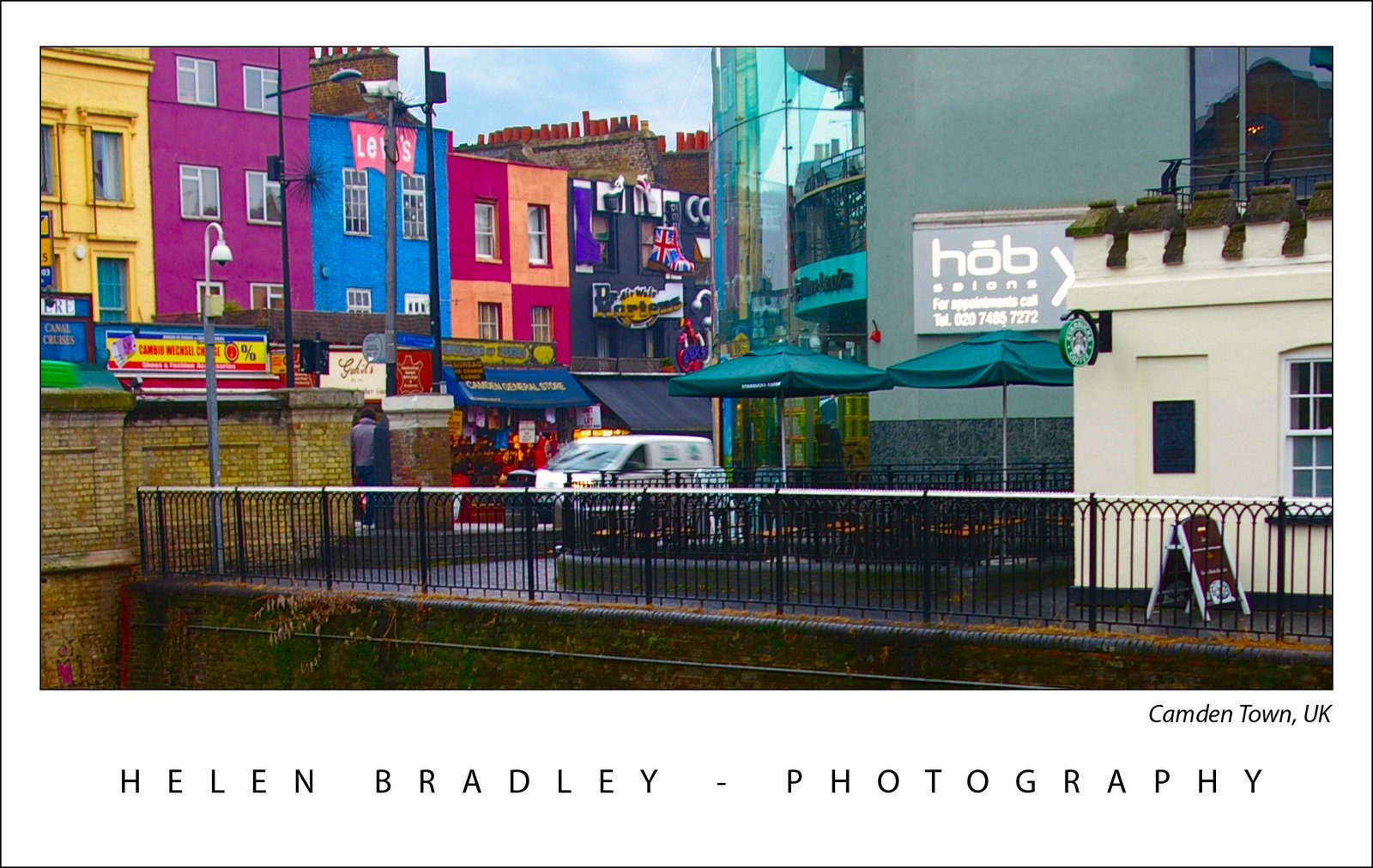
This is one of my UK images – it is of the lock area at Camden Town. Right in the middle of London there are waterways and locks, this is one of them. I took a trip in a long boat from here up the waterways and it was just wonderful. This photo, however is taken before the boat trip and it was just after a rain shower.
Often rainy days don’t look great for photography but they can rock like this photo shows. The fact that everything is wet helps boost the color and, with a flash of blue sky behind the buildings, it makes for a great shot of color.
Camden markets are a great place to visit, lots of cute shops selling lots of wonderful stuff. Worth putting on your “must visit” list – but while you’re there, don’t forget to add a trip on Jason’s long boats to the list. Those folk run even at off times of the year, the boats are old and cool and the trip, well, has to be experienced to be believed.
Helen Bradley
Labels: Camden markets, color, lock, London, long boat
posted by Helen Bradley @ 7:36 pm0 Comments - links to this post
Wednesday, November 28th, 2007
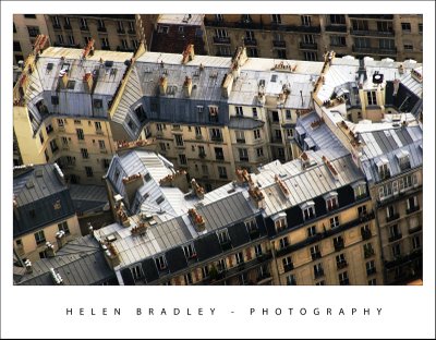
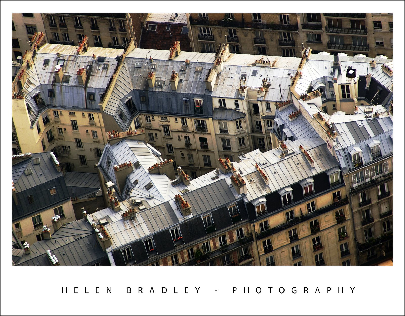
Ok, so there is this really cool place in Paris to shoot from. It’s called the Montparnarse Tower – it’s in Montparnarse (duh) and it’s this big office building. The beauty of it is that it has a rooftop area you can visit and it doesn’t cost a heap. It also has breathtaking 360 degree views of Paris all the way to the Eiffel Tower and across the Seine.
Ok, so they can be breathtaking views if it isn’t foggy and smoggy. Memo to self: don’t go there early in the morning before the wind has blown the mess away.
The Eiffel Tower could be seen, just!
Here is one of the photos I took of the rooftops in Paris from the tower. The poor air quality killed the color so there was precious little to recover and the overall image was muddy. The solution was to duplicate the image a few times and then drag bits and pieces of color and detail back out of it. The light roofs were a big issue, fix the tonal range enough to fix the image and the gorgeous detail in the roofs disappeared.
The solution is to fix the image multiple times on multiple layers. On each layer, focus on a specific detail. Then clobber the whole lot together again using Layer Masks you just paint on the bits you want and paint out those you don’t.
Helen Bradley
Labels: adjustment layers, layer masks., Photoshop CS3
posted by Helen Bradley @ 7:25 pm0 Comments - links to this post
Thursday, November 22nd, 2007
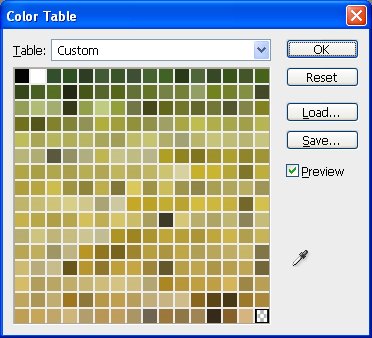
I like to look at what users type into Google when they land on my blog. Today, someone wanted to create a monochromatic swatch from a monochromatic image. I don’t have explicit instructions for this, so I thought it a good concept to consider.
To do this, first convert your image to monochrome by choosing Image > Mode > Greyscale and click to Discard the color. If the image doesn’t show the variety of greys you want, use a Levels adjustment to alter the tonal range in your image.
Now choose Image > Mode > Indexed color and then Image > Mode > Color Table. Here is your custom swatch sourced from your image. Simply click Save to save the color table.
Now, you don’t have to make a monochrome swatch. Say you need some lush greens for a project. Grab an image that shows the greens you like. Choose Image > Mode > Indexed Color and, for now, select the defaults and click Ok. Now choose Image > Mode > Color Table and you have a color table created from your image with your lovely greens and you can save them to use any time. If you get too many other colors in the swatch, crop the image to just the green area before making the conversion. Save the Color Table but don’t save the image and you’ll find no photos have been harmed in the process of creating your own custom color swatch.
To add the color table as a swatch, display the Swatches palette (Window, Swatches) click the menu and choose Load Swatches. From the Files of type list choose Color Table (*.act) and then browse to find your saved file and open it.
Helen Bradley
Labels: color swatch, custom swatch, indexed color, monochrome
posted by Helen Bradley @ 3:06 am0 Comments - links to this post
Wednesday, November 21st, 2007

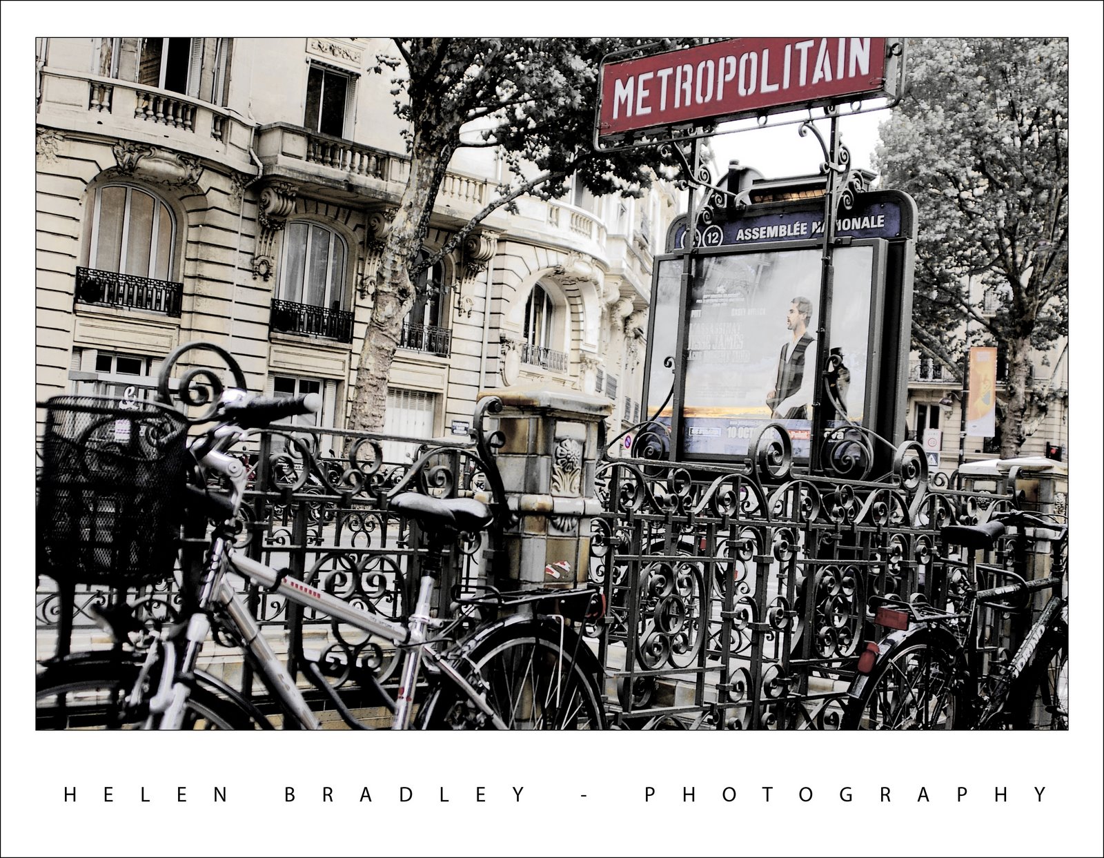
This was one of my favourite shots of the Paris metro stations. It was a throw away shot – I just took it walking past because I loved the bikes around it and there weren’t many people around.
I dumped most of the color in the photo as it just looked so good when you look at the blacks and whites in it.
I duplicated the background layer and turned the top layer into a black and white using the new Photoshop Black and White adjustment layer which lets you select which direction to take each colour into. It’s way more sophisticated than anything we’ve had in the past. Then I adjusted the opacity of the layer a little to show some of the colors from the layer underneath. The result is an almost ethereal photo. I’ve put it on a white tee shirt at CafePress in my store if you like it and want to wear it.
Helen Bradley
Labels: adjustment layers, black and white, Metro, Paris
posted by Helen Bradley @ 12:33 am0 Comments - links to this post
Tuesday, November 20th, 2007
Ok, here’s the dilemma. You have two images open in Photoshop and you want to add one image as a layer mask into the other.
One solution is to copy the first image, then switch to the second. Click the layer mask and switch to the Channels palette. The layer mask appears as a channel. Select the channel’s visibility icon to make it visible, select the channel to make it active, and click Edit, Paste. Deselect its visibility, reselect the RGB channel to make that one active, switch back to your Layers palette and the pasted selection is in your layer mask. This solution has the advantage that the copied/pasted piece doesn’t have to be the same size as the layer mask.
The alternate solution if the two images are the same size, is to use Apply Image. Select the target layer mask, choose Image, Apply Image and, as the Source, select the image to copy from, the layer to copy and click Ok. Now the selected layer (or the merged source) is pasted into the Layer Mask.
Two alternatives, the second is easier to use but it does require two same size images.
Helen Bradley
Labels: Apply Image, layer mask, Photoshop CS3
posted by Helen Bradley @ 12:21 am2 Comments - links to this post
Monday, November 19th, 2007
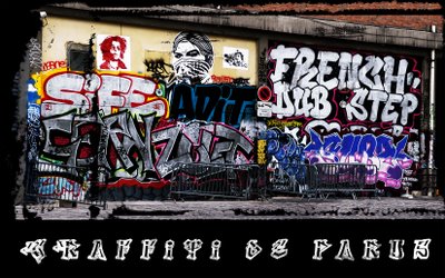
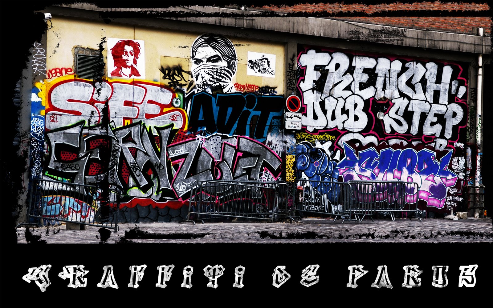
I was looking for an image to put on a t-shirt for a friend for Christmas. Let’s say, he’s a bit out there and pretty just won’t cut it.
I had two good photos of this graffiti covered wall so the Photoshop Automate > Photomerge tool put them together into a panorama. I used the clone and copy and paste to put back the missing bits as it was shot from a moving boat – a far cry from the ideal for shooting a panorama.
Color fix was an issue. I needed a channel to blend back into the image to boost the color and contrast. Problem was, the red killed the blue and the blue killed the red. Solution was to use both.
Duplicate the background layer twice. Select the first copy, choose Image > Apply Image and apply the red channel to the image. Then use the second copy and apply the blue channel to the image. Use the lighten blend mode on the top layer to blend the two together. You can use a Layer mask on the top layer if necessary to bring back detail from the layer underneath.
The grunge details are an image/edge from a set of grunge images from Graphic Authority applied as a layer mask with a black background layer put behind everything.
Helen Bradley
Labels: Apply Image, edge effects, graffiti, Paris
posted by Helen Bradley @ 5:58 pm0 Comments - links to this post
Friday, November 9th, 2007

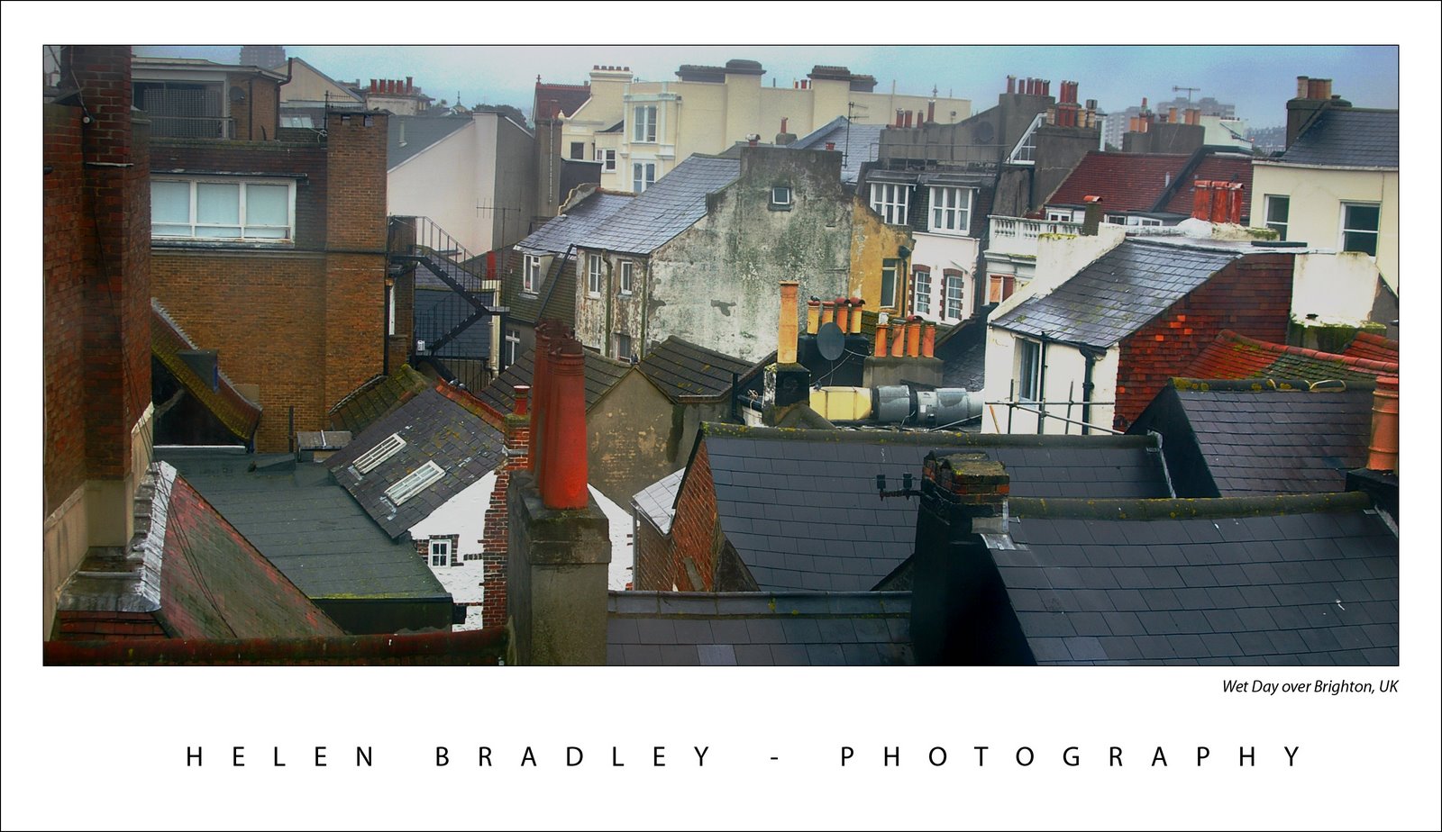
When I was in Brighton we had one beautiful summer like Sunday when everyone was walking along the beach and it was all so gorgeous and then, next day, it rained cats and dogs.
Here’s a photo I took from my hotel room window across the roofs of Brighton the day it rained. I don’t think the windows of the Queens Hotel had been washed since good ol’ Queen Vic gave her name to the hotel so they were pretty interesting to shoot through and, of course, they only opened 6in from the bottom so shooting through the gap was impossible.
The original was flat and lifeless as one might expect. A Levels adjustment is a great starting point for a photo like this. Simply choose Layers, New Adjustment Layer and then choose Levels. Drag the little triangle sliders in from the left and the right till they are just under the places where the chart data begins and ends. This darkens the darks and lightens the lights and instantly boosts the tonal range in the image and gives it more contrast and life. The middle slider handles the midtones so you can drag it to the right or left as required for your image.
For the rest of this image I worked hard to get the colour and detail back. The cream buildings in the background were treated independently of everything else as they just kept getting lost in every solution I tried. Masks are great for this, fix one part of the image with adjustment layers, then hide the adjustment layer and work with another one focusing on the other part of the image. Then, use the mask on each adjustment layer to paint in or remove the fix from areas of the image. When I want most of the fix I just paint in black over the areas that I don’t want the fix to be applied to. When I only want little bits affected by the mask, I fill the mask with black (white reveals, black conceals), then paint with a low opacity, soft white brush to bring back the fix in the small areas that it is needed.
I also used the Selected Color adjustment on this image, I’ll talk more about it in a future blog post.
Helen Bradley
Labels: adjustment layers, layer mask, levels, Photoshop, Photoshop CS3
posted by Helen Bradley @ 5:24 pm0 Comments - links to this post
Wednesday, November 7th, 2007
Often you’ll need to copy a layer mask from one layer to another so you can mask out the same area on two layers. I do this when I mask the hightlights highlights in an image to protect them from being blown out.
Copying a layer mask doesn’t look easy or intuitive – there’s no menu command for it. However it can be done very simply. Hold the Alt and Control keys at the same time and drag the layer mask from one layer and drop it onto another. If there is already a layer mask on that second layer you’ll be prompted to replace it, answer Yes to the prompt.
Helen Bradley
Labels: layer mask, Photoshop CS3
posted by Helen Bradley @ 9:29 pm0 Comments - links to this post
Friday, November 2nd, 2007
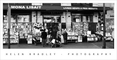
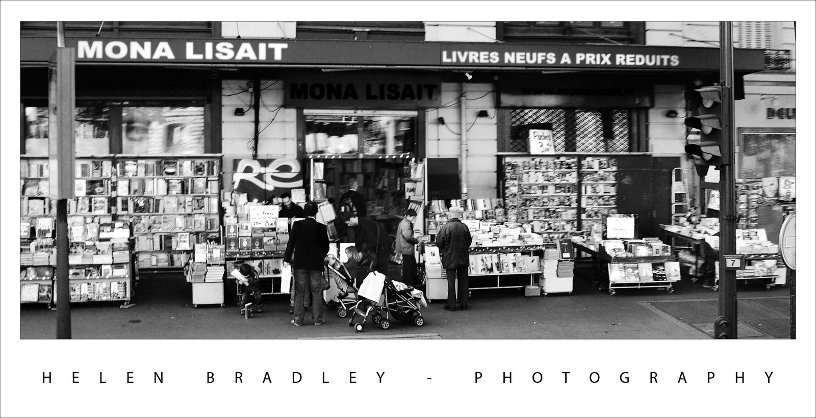
This bookshop in Paris is so wonderful jammed as it is with books and people browsing. It just begged to be converted to black and white. There’s even a small child in the foreground who is banging away at a book on the pavement. You can double click the image to enlarge it to see him.
Of course, you need to look closely too to see Mona Lisa herself in the photo.
Helen Bradley
Labels: Uncategorized
posted by Helen Bradley @ 6:41 pm1 Comment - links to this post
Thursday, November 1st, 2007
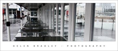
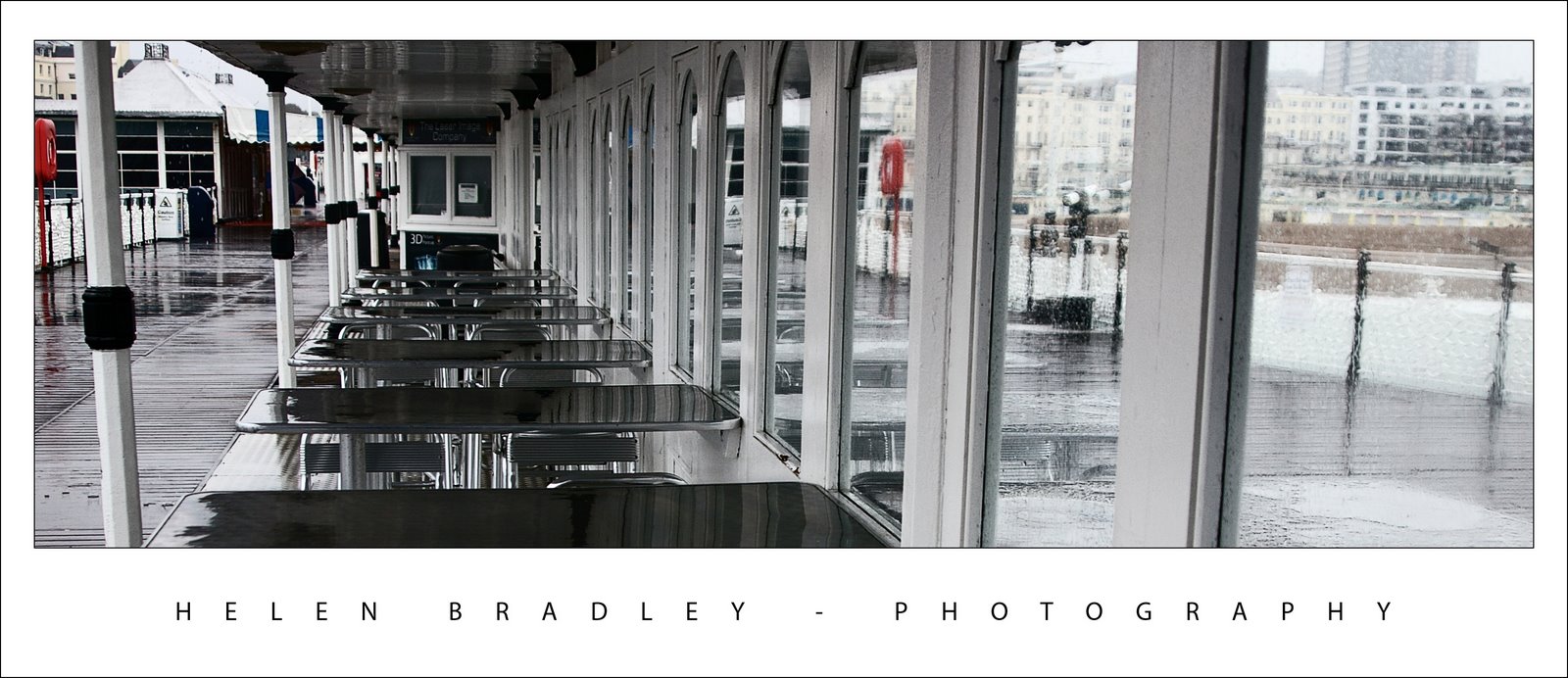
I fell in love with Brighton and Brighton Pier. The day I had to photograph it the rain nearly put an end to my photoshoot. However, I managed to get some great images. This is of the pier looking back to Brighton, the only real colour is in the life preservers and I love that you can see some of the Brighton buildings through the water pouring down the window. The repeated elements really work in this image.
The photo needed a bit of a levels adjustment, I use this to punch the contrast up a bit more than I get from the camera. The crop makes the image look so much more interesting than the size that it came out of the camera.
Helen Bradley
Labels: levels, Photoshop, repeated elements
posted by Helen Bradley @ 6:23 pm0 Comments - links to this post
Monday, October 29th, 2007
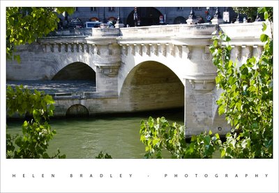
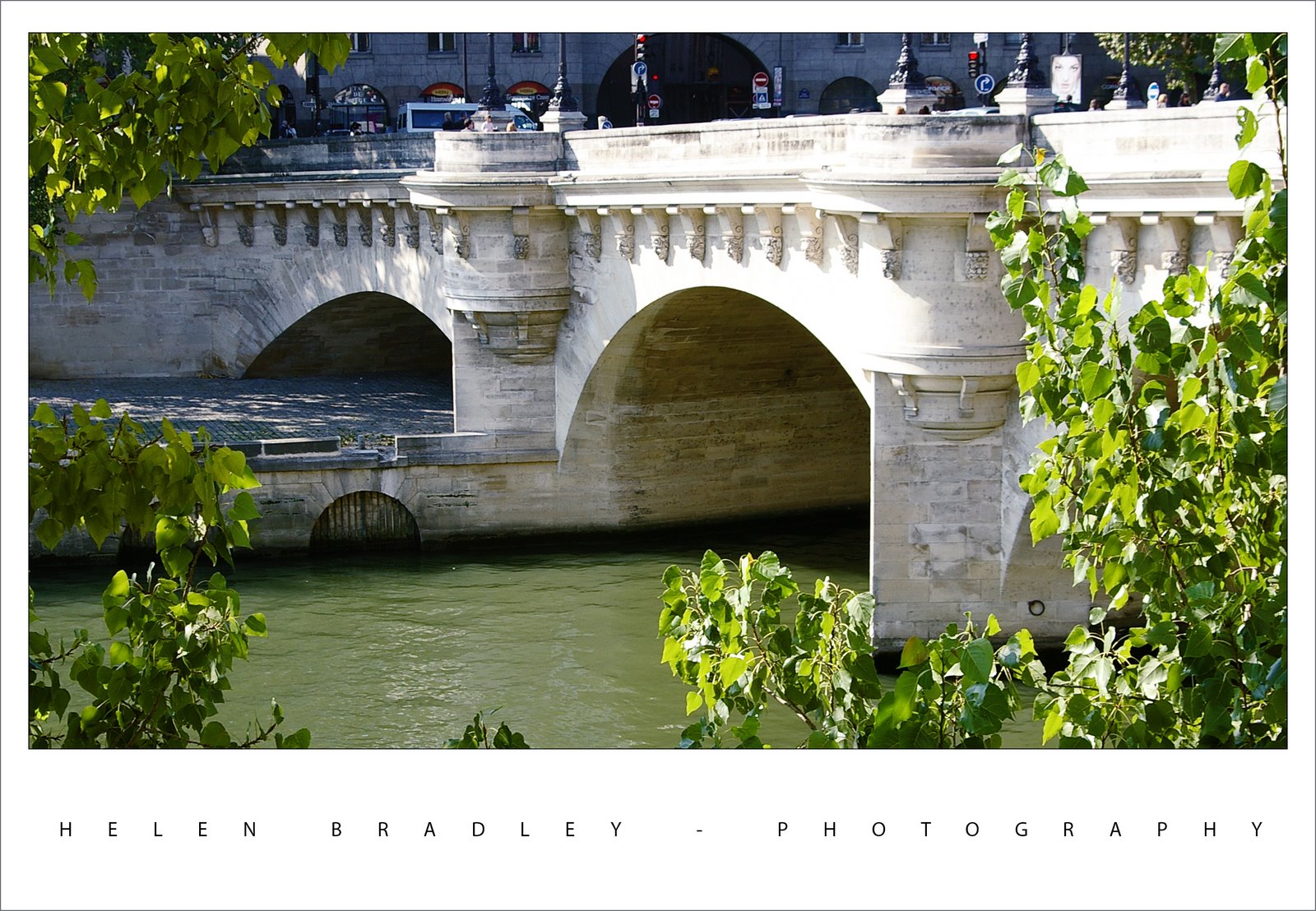
This photo of a bridge over the Seine shows one of the wonderful doors at river level. You have to wonder where they would have lead to?
It was a beautiful time of the year to be there. The trees were just turning and the weather was wonderful. I have a series of people sunbathing along the Seine to come, they’re great images and so Parisienne.
Helen Bradley
Labels: Paris - the Seine in Autumn
posted by Helen Bradley @ 7:12 pm0 Comments - links to this post