Saturday, August 15th, 2009

Cool Photo Apps #4 Build your own camera


Not all good applications come in big shinny boxes like Photoshop and Photoshop Elements. Many cool photo apps are available on the web and they’re free.

These apps do things that other programs don’t. They are fun to use and practical. In this Cool Photo Apps series I’ll show you some of these.

One of the neatest things about the digital camera revolution is that, in embracing all the fun there is to be had in photography as a hobby, many people are looking look at film cameras in a different light.

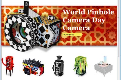
Corbis, a company better known for stock images, offers enthusiasts a series of downloadable printable pinhole cameras that you can construct yourself from cardboard and which use regular film. It’s the ideal partnership between technology and creativity.

You simply download a PDF file which contains the camera template and instructions and print the pieces. You assemble the camera over a recycled cereal box using a few simple tools that you probably already have.

Slip in a roll of ISO 200 film – which, if you’re like me, you probably have stuffed away in your fridge door – and you have a fun “grass roots” camera that’s guaranteed to give you hours of entertainment.

I’m willing to bet you’ll be scurrying to your nearest camera shop to get the photos printed just so you can see how cool they are. Find the Corbis pinhole cameras at www.corbis.readymech.com/en.

Helen Bradley

Friday, August 14th, 2009

Finding Lightroom presets

There are lots of Lightroom presets that you can download from the web and use in the program. The question then becomes where do you put these. There are a couple of ways to find the presets folder in Lightroom. One is to open the Develop module, locate the presets dropdown list and right-click one of the user presets that you’ve created and choose Show in Explorer. This opens the Lightroom presets folder inside Windows Explorer. If you’re using a Mac, the link will be to the Mac equivalent. The other method of doing this is to choose Edit > Preferences > Presets tab. Click the Show Lightroom Presets folder to view the presets folder location.

You will need this location to store downloaded presets, in and you will also need the location so that you can ensure that you back up your presets so that you do not lose them as, by default, they are not stored with the catalog and so will not be backed up with it.

Helen Bradley

Thursday, August 13th, 2009

Word 2007 – Sort Words, Paragraphs and Table Cells


Word 2007 finally fixed a huge problem that existed in earlier versions – it looked like there was no way to sort data in a list.

This wasn’t the case – you used the table sort feature but it was far from being self evident.

Now Word 2007 uses the same tool it just puts it in a smart place.

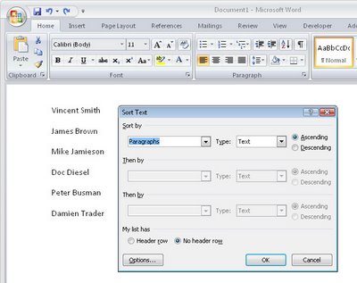
To sort a list or series of words or paragraphs, select the text.

From the Ribbon, click the Home button and click the Sort button in the Paragraph group.

Choose Paragraph to sort on the first word and click Ok to sort the data in order.

If you’re using an earlier version of Word, then visit this post to see how to sort in Word 2003 and earlier:

Sorting a Word list
http://www.projectwoman.com/labels/Table%20Sort.html

Helen Bradley

Wednesday, August 12th, 2009

Outlook 2007 – checking folder space

Outlook stores all your email, contacts and appointments in one big PST file. Unfortunately, working with a large PST folder in Outlook will decrease its performance.

Over time you will find that Outlook’s folders grow if you don’t regularly remove out of date messages from them.

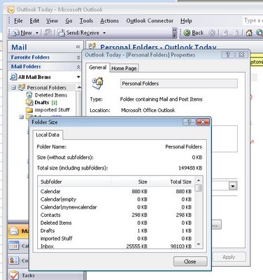
To see how big your folder is select the Mail option and click your Personal Folders item in the folders list. Right click and choose Properties for “Personal Folders” and then choose Folder Size to read the size of you PST file.

The closer to 2Gb that the file gets to be, the worse your Outlook performance will be and beyond that, it is possible that the file can become corrupt. Keep your file size below this for best performance.

Helen Bradley

Tuesday, August 11th, 2009

Better Travel Photography #1 – take the road less traveled

Do your travel photographs look just like everyone else’s?

If you wonder why you bothered lugging your digital SLR half way around the world and didn’t just settle for buying postcards, it’s time to revisit the way you photograph your travels. Here is part 1 in my new series of Better Travel Photography – a guide to getting great travel photos that don’t look like everyone else’s..

Today’s tip: Move out of the way
If you’re tempted to stand alongside other photographers to capture photos of popular tourist destinations then it’s time to move away.

The really unique photographs are those that you take when you look at something through your eyes rather than following what everyone else is shooting.

Look for things that are different and interesting to you in the place you are visiting..

For example, when photographing fountains look for something other than the big picture.

Get in close to the fountain to capture close-up detail or wait for something to happen.

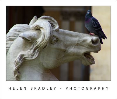
It might be a child splashing in the fountain, a couple sharing a kiss or it might be something as unusual as a bird perched on a statue.

Even in the most popular tourist places there are great and fun and unusual things to capture.

Helen Bradley

Tuesday, August 11th, 2009

Create A Three Up Photoshop Template

Recently LisaMarie from LisaMarieDiasDesigns.com asked me to look into creating a tutorial for her newsletter subscribers to show how to create a template with a 3 pixel frame around it and openings for three 2″x2″ or 3″x3″ images.

The process of designing a solution is a little complex so I’ve done two things. First of all, I’m giving you the templates as PSD files that you can use to create your own design, but secondly I’m going to show you how to do it yourself. So, if you want to know how to create a reusable design like this or one that can be used with different size photos, here’s how:

I’ll step you through creating a solution for displaying three 3″x3″ images at 72 dpi with a 3 pixel frame around each of them.
Step 1
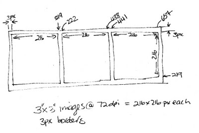
It’s a good idea to sketch the design on paper and work out the dimensions before you start. For three 3″x3″ inch images at 72 dpi the starting image needs to be 660 x 222 pixels and it will look like this.
Step 2
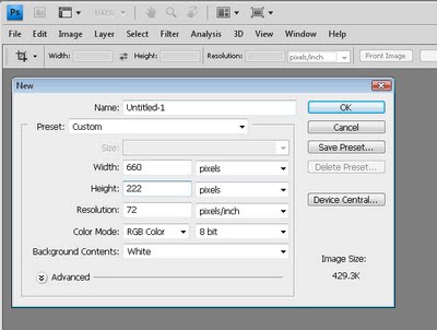
In Photoshop, choose File > New and create an image 660 pixels wide and 222 pixels high with a resolution of 72 pixels per inch.

Set the background to be white and click Ok.
Step 3
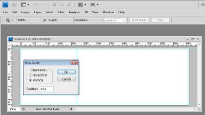
To add the gridlines, choose View > New Guide and create a vertical guide at 3 pixels. Repeat and create a second vertical guide at 222 pixels. Repeat and add a third vertical guide at 441 pixels and a fourth one at 657 pixels.

Add two horizontal guides, one at 3 pixels and one at 219 pixels.
Step 4
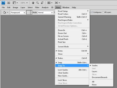
Now choose View > Snap To and select None.

Repeat and choose View > Snap To and select Guides.

Make sure that the View > Snap option in the menu is checked.

Now selections and images will snap to the guides that you have created.
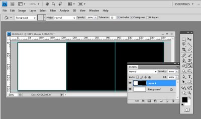
Step 5
Add a new layer by choosing Layer > New > Layer and click Ok.

Click the Rectangular Marquee tool and from the tool options area select Fixed Size and set the Width to 216 pixels and the Height to 216 pixels.

Click on the image where the two guides intersect in the top left corner of the image. The selection will snap to these guides.

Make sure that white is selected as your foreground color and press Alt + Backspace on the PC (Option + Delete on the Mac) to fill the selection with white.

Switch to black as your foreground color, press Ctrl + D (Command + D on the Mac) to deselect the selection and, with the Paint Bucket tool, click somewhere in the layer not where you added the white, to fill the remainder of the layer with black.
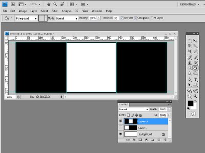
Step 6
Add a new layer to the document by choosing Layer > New > Layer. Hide the previous layer if desired.

Select the Rectangular Marquee tool and click at the intersection of the second vertical guide and the top guide. Your selection should appear in the middle of the image. Fill this with white. Deselect the selection and then fill the surrounds of that layer with black.
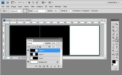
Step 7
Repeat once more, this time clicking at the intersection of the third vertical guide and the first horizontal guide.

Again, fill the selection with white and then fill the remaining portion of the layer with black.

Your layers palette should look as this one does.
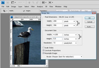
Step 8
Now open the images to use. You should size these to a minimum of 3″ by 3″ but the project will work just as well if they are a little bigger.

In fact, you may want to make your images bigger than this so that you can see how the masking process will ensure that your images do not have to cropped to the exact size for this design to work.

For example, to size an image to around 3.5 x 5 inches at 72 dpi, open the image, choose Image > Image Size. Enable the Constrain Proportions and Resample Image checkboxes and select Bicubic Sharper as the mode for resampling the image. Enter 72 pixels per inch as the resolution and type either the width or height to use such as 5″ – Photoshop will automatically calculate the other measurement. Click Ok to resize the image.
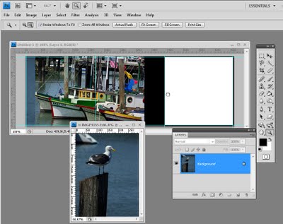
Step 9
Open the first of the resized images and drag its background layer into the composite image that you’re working on.

Repeat for the other two images. It doesn’t matter what the document looks like at this stage.
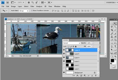
Step 10
Select one of the layers that has an image on it and use the Move tool to drag it roughly into position where you want it to appear in the final presentation.

Do this for the second layer and for the third.

Ignore for the moment that some of the images are overlapped and extend over the borders.
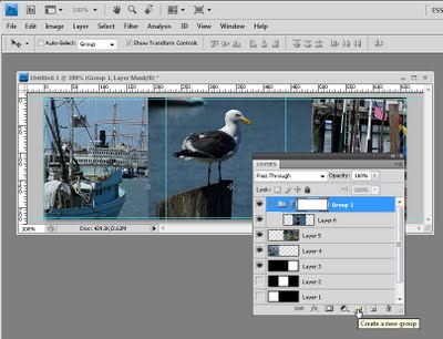
Step 11
Select the first of the image layers and click the Create a New Group button at the foot of the layers palette. Drag and drop the image layer onto the new group so that it is inset underneath it. Click the group layer name and click the Add Layer Mask button at the foot of the layers palette.
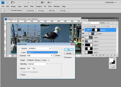
Step 12
Click on the layer mask thumbnail so that it is selected.

Choose Image > Apply Image and from the layer dropdown list, select the layer in the layers palette that has the white square where this image should be in the design. Click Ok.

This applies a layer mask to this layer masking it to that small square size.
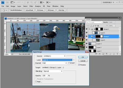
Step 13
Select the second image to work with and click the Create a New Group icon at the bottom of the layers palette.

Drag and drop the image layer onto the new group so that it is inset underneath it. Click the group layer name and click the Add Layer Mask button at the foot of the layers palette.

Click on the layer mask thumbnail so that it is selected.

Choose Image > Apply Image and from the layer dropdown list, select the layer in the layers palette that has the white square where this image should be in the design. Click Ok.

This applies a layer mask to this layer masking it to that small square size.
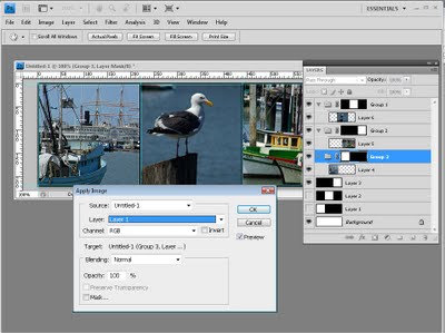
Step 14
Select the final image to work with and click the Create a New Group icon at the bottom of the layers palette.

Drag and drop the image layer onto the new group so that it is inset underneath it. Click the group layer name and click the Add Layer Mask button at the foot of the layers palette.

Click on the layer mask thumbnail so that it is selected.

Choose Image > Apply Image and from the layer dropdown list, select the layer in the layers palette that has the white square where this image should be in the design. Click Ok.

This applies a layer mask to this layer masking it to that small square size.
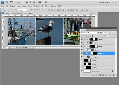
Step 15
You can now disable or delete the three layers which contain the black and white designs as they are only used to create the masks.

You can also remove the gridlines by choosing View > Clear Guides.

This is your final design.
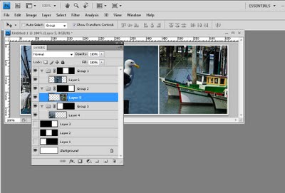
Step 16
Any of the images in the design can be adjusted by clicking on the image layer, click the Move tool and then drag the image around inside that layer.

Provided the image is larger than 3″ x 3″ you can move it so the piece of the image you want to feature appears in the desired position. The mask ensure the image does not extend over the borders.
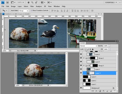
Step 17
You can also replace the images – this is how you will use the template in future.

For example, open another image to use and resize it as you did the earlier images.

Drag and drop the image into your file as a new layer. Drag the layer into the group for the position it will appear in the design and remove the image that currently occupies that position. As you can see, all you need do is to position and resize your images; none of the rest of the layout needs to be recreated.

Once you understand the basics of creating this design you can mark out and create a display image that will hold 2 x 2 images and even 2 x 3 or other varieties of sizes.

To make it simple for you, here are two PSD file downloads for the 2 x 2 and the 3 x 3 design that you can use yourselves:

2x2layout.psd

3x3layout.psd

Helen Bradley
Saturday, August 8th, 2009

Smarter sharpening with the High Pass filter


In previous posts I have introduced the basics of sharpening in Photoshop and I also looked at a way to spot sharpen an image in Photoshop Elements using faux layer masks. In this post I want to show you the benefits of using high pass sharpening in Photoshop as an alternative to using the Unsharp mask.

The Unsharp mask has historically been the sharpening tool that most Photoshop users start out using. There are, however, different and better tools to use and one of these is the High Pass filter. One reason for this is that the Unsharp mask operates on the actual image pixels and it makes changes to those pixels. The sharpening process that makes use of the High Pass filter doesn’t operate on the original image so it does not destroy the image pixels – this is particularly useful if you’re using Photoshop CS2 or earlier which doesn’t offer the Smart Objects for Filters option for applying the Unsharp mask filter.

In addition, instead of sharpening the entire image as the Unsharp Mask does, using this High Pass filter process limits sharpening to the edges in the image which is where the most value can be obtained from sharpening the image.

Step 1
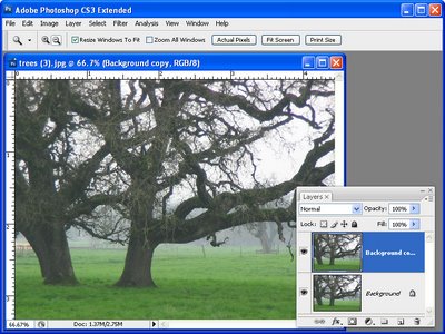
To see the process at work, open an image and duplicate the background layer of the image. If your image has multiple layers, add a new layer at the top of the layer stack, click it to select it and press Ctrl + Alt + Shift + E (Command + Option + Shift + E on the Mac) to fill the top layer with a flattened version of the image – without affecting the other layers.

Step 2
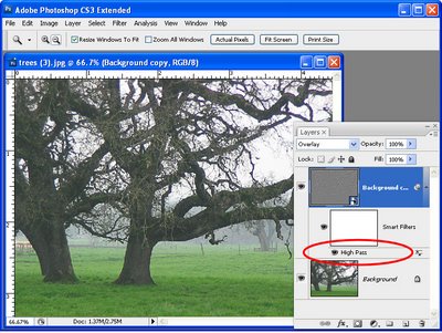
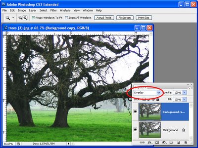
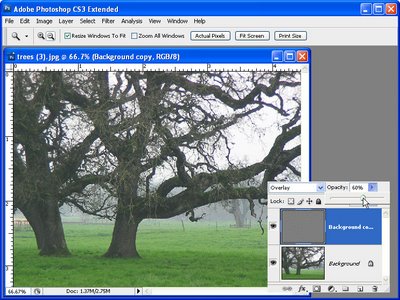
In the Layers palette set the blend mode of the new top layer to Overlay. This will let you see the sharpening results in place on the image in the next step.

Step 3
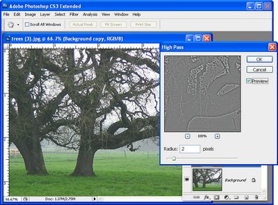
With the topmost layer still selected, choose Filter > Other > High Pass. This filter has one slider to adjust the Radius value. Drag the slider until you see a pretty much gray image in the preview window with the only detail being around the edges of objects in the image. If you can see color in the preview image then the radius is set too high. Typically a Radius value of well under 10 pixels should be sufficient – we used 2. Click Ok.

Step 4
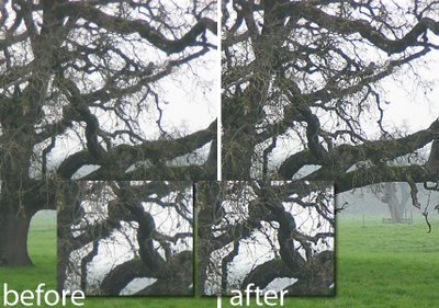
The image is now sharpened – check the original against the sharpened version by clicking the Layer Visibility Icon for the top layer on and off to compare the result.

To finish the effect, adjust the Opacity of the top layer to 0 and then move it back up stopping when you have a good sharpening result. The ideal Opacity will depend on your personal preference.

If desired you can use blend modes other than Overlay, for example Soft Light and Hard Light can be equally as effective depending on the result that you are looking for.

Tip
When you are sharpening an image, adjust the image to the way you want it to look if you’re planning to display the image on the web. If you’re printing it you can (and should), sharpen more aggressively.

Tip

If you are using Photoshop CS3 or CS4, before you apply the High Pass filter to the top layer of the image, convert it to a Smart Object by selecting the layer and choose Filter > Convert for Smart Filters. Then apply the High Pass filter to the new smart object in the same way as I have outlined above. When you apply a filter to a Smart Object you can return later on to edit it – simply double click the filter name in the layer palette and the filter dialog opens allowing you to change the Radius value.

If you’re new to sharpening, check out these recent posts:

Sharpening 101 – Understanding the basics of Sharpening

Sharpening in Lightroom 2

Photoshop Elements, Spot sharpening with a faux layer mask

Helen Bradley
Friday, August 7th, 2009

Cool Photo Apps #3 Create a life poster


Not all good applications come in big shinny boxes like Photoshop and Photoshop Elements. Many cool photo apps are available on the web and they’re free.

These apps do things that other programs don’t. They are fun to use and practical. In this Cool Photo Apps series I’ll show you some of these.

Popularized by the Mac and its iLife software, life posters are a collage of images arranged in a grid layout. Life posters look best when you use square images. On the PC you can create a life poster using the tools built into Picasa which you can download from http://picasa.google.com.

Here’s how to do it:

Step 1
Start with a new album by selecting File > New Album and give the album a name like Life Poster.

Step 2
Add the photos to the album that you want to use for the life poster. The order in which the images appear in the album are the order in which they will be arranged into your life poster so the first images appear across the top line of the poster and the next series of images will appear through the next row etc.. If you predetermine how big your grid will be, such as 4 x 4 images or 5 x 5 images you can determine which photos will be next to which other photos.

Step 3
When you create the poster, Picasa will automatically crop the images to a square format. If there are images that you would prefer to crop yourself, double click the image to open it and crop it to a square shape before beginning.

Step 4
To create your life poster, right click the album name and choose Select all pictures. Click the Collage button at the bottom of the tray area and choose Picture Grid from the Type list. From the location dropdown list choose a folder in which to save the finished collage image. Check the preview and, if you’re happy with the result, click Create to create the poster.

Step 5
You’ll find the image ready for printing in the folder you selected. Of course, having created your poster, you could convert it to a wall size poster ready for downloading and printing. Here’s a blog post that will show you how to do it: Cool Photo Apps #2 big huge photo prints

Helen Bradley
Thursday, August 6th, 2009

Managing Public Holidays in Outlook


When is Memorial Day in the US or Anzac Day in Australia?

If you’re unsure, luckily for you, Outlook isn’t.

Most national holidays are stored in Outlook – you just need to find them and add them to your calendar.

Here’s how:

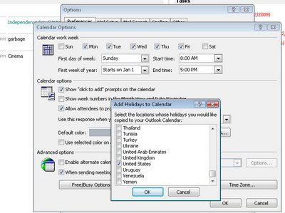
Choose Tools > Options > Preferences tab ad click the Calendar Options button.

Click the Add Holidays button and from the list choose the country (or countries) you want the holidays for and click Ok.

Wait while Outlook adds these details to your calendar and click Ok twice to exit.

The holidays will appear under the date in most Calendar views.

Helen Bradley
Tuesday, August 4th, 2009

Outlook 2007- Save attachments

When you delete an Outlook email you’ll also delete any attachments which are included in it.

You won’t be warned you’re about to do this either so you can find yourself having lost important data if you haven’t saved it.

To save files attached to emails, right click the attachment and choose Save As from the menu and choose a place to save it to.

A good rule of thumb is to do this every time you get an attachment so you won’t be caught out in future. Even saving all attachments to a special attachments folder will save you losing them.

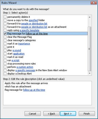
If you need to remind yourself to do this, you can create a rule which checks for emails with attachments and flags them for follow up. This will remind you that you need to save the attachments or at least look at them to see if you need to do this.

Helen Bradley
Page 2 of 3123