Tuesday, February 7th, 2012

Create a collage in Gimp

One task I perform regularly in Photoshop and Lightroom is to assemble multiple images on a single page for printing.  I love displaying my photos, for example, as triptychs –which are three side by side images.

I’ve posted before on the process in Lightroom here (http://projectwoman.com/2009/07/creating-a-triptych-in-lightroom.html) and here (http://projectwoman.com/2009/10/how-to-select-and-compose-a-triptych-in-lightroom.html)and today I’ll show you how to do this in Gimp using a set of templates I have created for you and that you can download free.

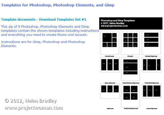
These templates work with both Gimp and Photoshop and you can find them here: http://projectwoman.com/articles/45PhotoshopTemplates.html

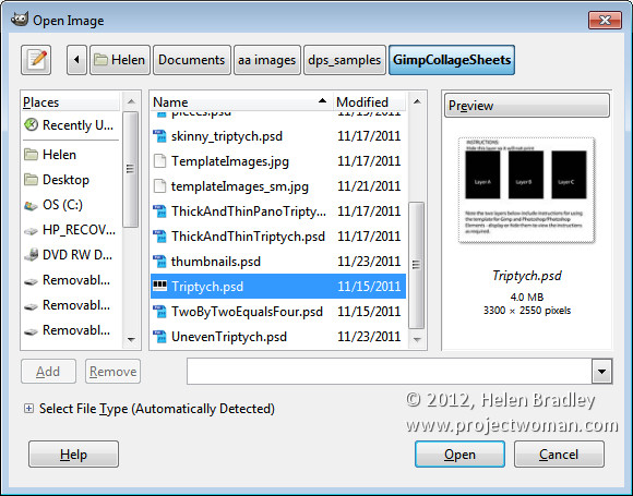
Unzip the files and open the one to use in Gimp along with the images that you want to use. I’m using the Triptych.psd file.

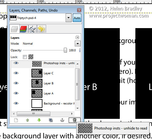
Start by viewing the template you are using and, in the Layers palette select and discard the top three layers which include the instructions for using the template in Gimp and in Photoshop and Photoshop Elements.

Select the first of your images, choose Select > All  and then select > Edit > Copy to copy the image to the clipboard.

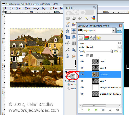
In the template click on the layer marked A and choose Edit > Paste as > New Layer. This pastes the image from the clipboard into the layer immediately above layer A.

Click the Move tool (set it to Layer) and drag the image over the top of the shape on the right. If desired, click the Scale tool and scale the image to size it larger than the black rectangle.

Move the portion of the image that you’re most interested in seeing over the shape.

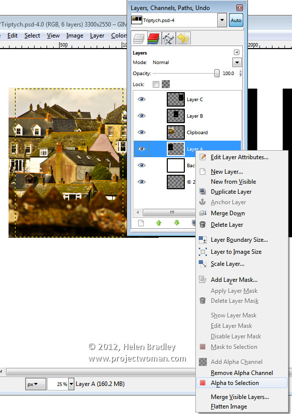
Now, to crop the image to size, click layer A, right click and choose Alpha to Selection.

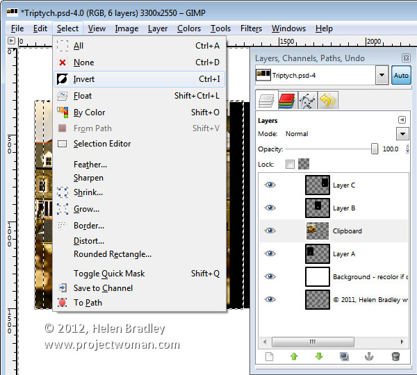
Now select the Clipboard layer that you’ve been working on, choose Select > Invert and press Delete.

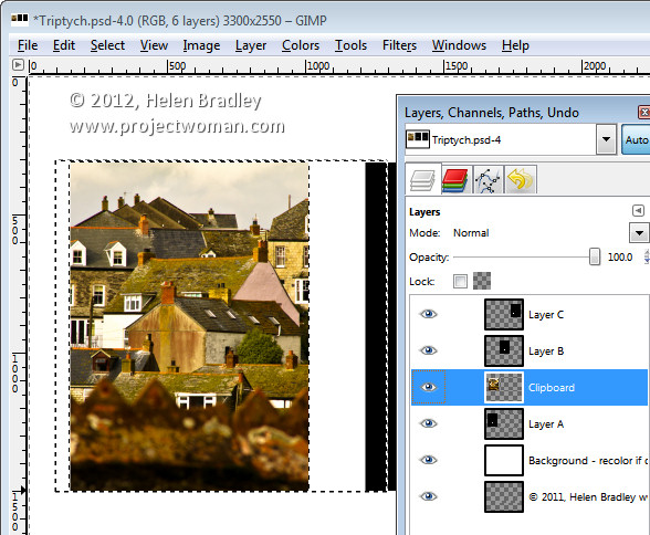
The image will be clipped to size using the template shape as a guide to the size. Choose Select > None before continuing.

Repeat this process for layers B and C – select and copy the image to use, click the layer you’re working with (B or C) and choose Edit > Paste As > New Layer.

Move the image into position and scale it if desired. When scaling, making sure to lock the width and height so that the image is scaled in proportion.

Right click the layer you’re working with – Layer B (or C) and choose Alpha To Selection. Click your newest clipboard layer and choose Select > Invert and then Delete.

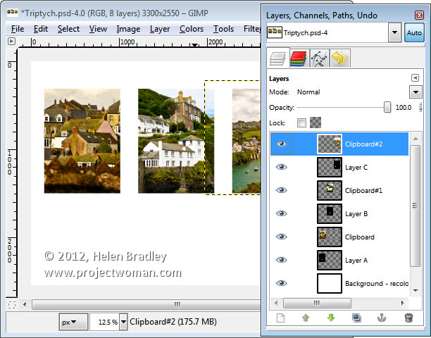
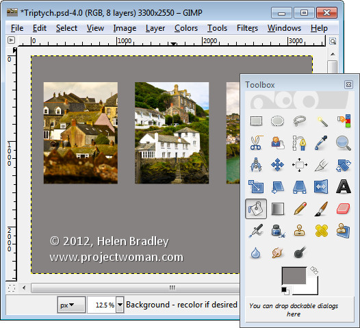
When you are done you should have all 3 images in position.

This image has a background layer behind the pictures which currently shows white. If you prefer to add a solid color behind everything, delete this layer and add a new layer filled with your choice of color. Here I’ve added a new dark grey filled layer.

You can finish off the design with some text or simply save the resulting image.

These storyboard templates are a good place to start with your picture layouts. You can find similar templates elsewhere on the web so start with a search for “Free Photoshop Clipping Mask Templates” or “Free Storyboard templates”


Helen Bradley

Monday, February 6th, 2012

Cool Suffolk Sheep

On the weekend I had the chance to photograph some suffolk sheep, the lambs were so cute and the ewes too. Click here for the picture gallery.

Helen Bradley

Saturday, February 4th, 2012

Slideshow Titles with Identity Plates in Lightroom

Identity plates are one of the best kept secrets in Lightroom. There are lots of ways that you can use Identity Plates in Lightroom not only to customize the interface as I discussed in this post: http://projectwoman.com/2011/11/personalize-lightroom-with-identity-plates.html but also customize your print, web and slideshow applications.

In this post, I’ll show you how to create and use identity plates to create custom title and ending slides in the Lightroom Slideshow module.

Create a slideshow

For a slideshow, it is a good idea to start by placing all the images in a collection – then select the collection and switch to the Slideshow module.

From the toolbar choose All Filmstrip Photos to set up the slideshow with all those images.

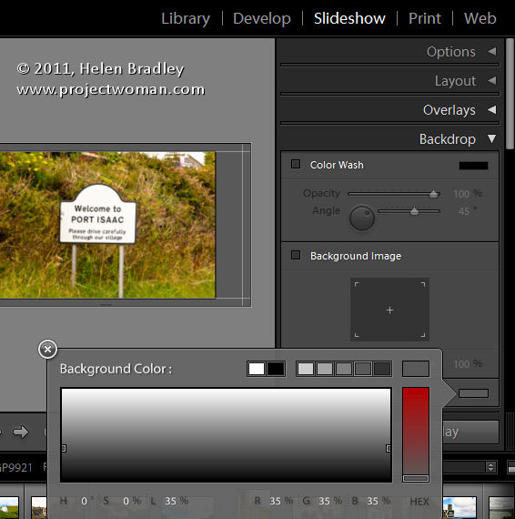
From the Template Browser choose the Default template. Chose a background color by opening the Backdrop Panel and choose Background Color and sample a color to use.

You can add a background color with or without a color wash. You can also set a background image – for example use an image from your slideshow with a reduced opacity as the background.

Here I have settled for a plain dark gray background.

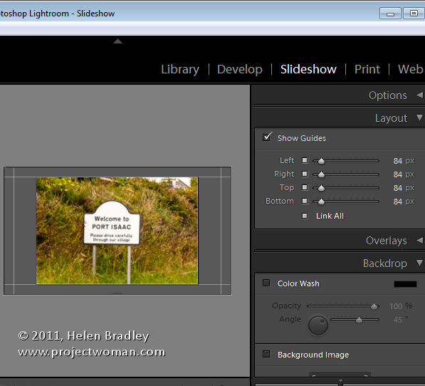
From the Layout panel select Show Guides and make sure Link All is selected and then drag in on the guides so you have some space around the images.

By unlinking the guides, you can set one guide to be smaller than the others – I like to make the top margin smaller than the others to push the images higher on the screen.

Use your Identity Plate

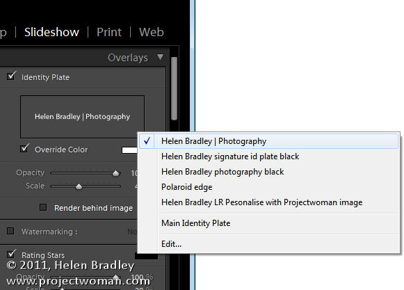
The first place you can use an identity plate is in the Overlays panel. This Identity Plate will sit on each slide and it will show as the slideshow plays. For this, I like to use a plain text identity plate so make sure Identity Plate is checked and then click the down-pointing arrow and select an identity plate that you’ve already created.

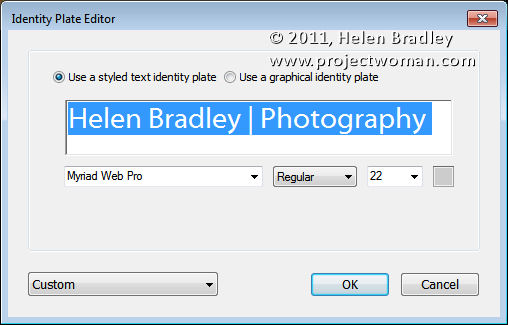
Alternatively, click Edit and type identity plate information into the box and then select it and select a font, font size and color. When you’ve done this, click the Custom button, click Save as and give your identity plate a name.

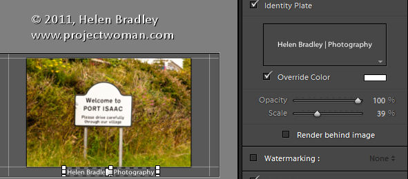
It doesn’t matter what color you have selected for the Identity Plate text because you can select the Override Color checkbox and select an alternative color for your text identity plate. Adjust the scale to a large value so that you can see the identity plate text on the screen, drag it into position and then fine-tune the scale and opacity to suit.

Identity Plate for a Title

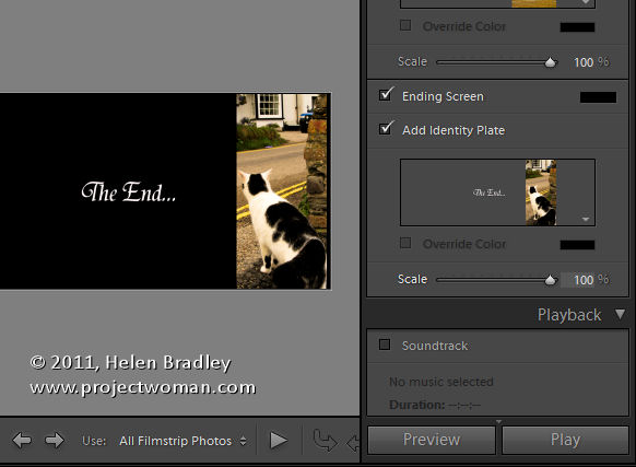
Another place you can use an Identity Plate is the Titles panel. Here you can add an Intro and Ending screen to your slideshow. While you could use a simple identity plate configured for the purpose, you can also use an image.

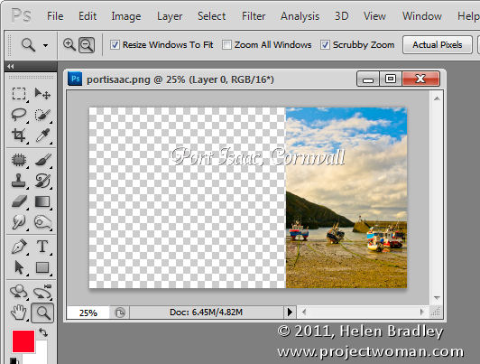
Here I have taken one of the images from the slideshow into Photoshop by right clicking it and choose Edit in Photoshop.

I cropped a portion of the image and used it to create an interesting starting slide for the slideshow. Here I added some text to the image to introduce the slide show. Where possible, it’s a good idea to leave as much of the image transparent as possible so you keep the file size small.

Size the image to approximate the size of the slideshow window – I used 1408 x 800 pixels.

Save the image in Photoshop as a PNG file so it retains its transparency. Later you can control the background color for the title slide by selecting a color from the Intro screen color selector rather than having the color already in the Identity Plate image.

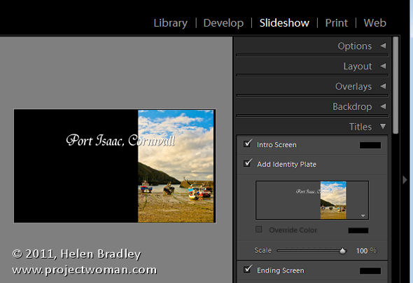
Now, back in Lightroom, in the Title panel click Add Identity Plate and select Edit and this time select Use a Graphical Identity Plate. Click Locate file and either drag and drop the image into the window or find the image on disk. Click Ok to load it as an identity plate – you may be prompted that it is very big – click Use Anyway to continue.

The image will appear for a second or two on the title slide and it will then disappear from the main screen but you will see it in the Titles panel. It will probably be too small so adjust the Scale slider to increase its size.

You can go ahead and create a similar graphical identity plate if desired for the ending screen.

By creating a second Photoshop image in the same way and importing it as a Graphical Identity Plate you can have a different and custom ending screen for your slideshow.

To view the slides and your new titles, click the first image in the slideshow and click the Play button.

Helen Bradley

Friday, February 3rd, 2012

Winter Photography Tip # 9 – Camera care

Most cameras work just fine in cold weather but their batteries don’t so you’ll treat your camera one way and batteries another.

To avoid condensation affecting your camera it’s best to keep it cold rather than taking it from warm to cold all the time. So, don’t tuck your camera inside your jacket, and if it’s wet use a rainproof covering for it only.

If you get the camera covered in snow just brush or shake it off – don’t rub so it melts into the camera!

On the flip side, a battery’s chemicals will simply not work efficiently if the batteries are cold so tuck them close to your body in an inside jacket pocket until you need them. And expect to consume more batteries in winter as they won’t last as long as they do in warmer months.


Helen Bradley

Tuesday, January 31st, 2012

5 Gotchas in the Lightroom Print Module

When you’re setting up single or multiple image printing in the Lightroom Print module here are some things to be aware of:

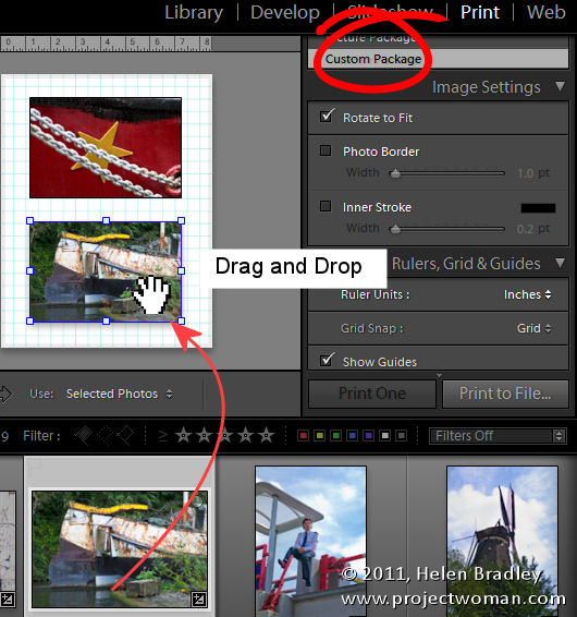
Nonexistent Drag and drop

You can drag and drop pictures onto a print template in Lightroom in some circumstances but not in others. This can be confusing but there is some logic behind it.

When you select a Lightroom template from the Template Browser, make sure to open the Layout Style panel on the right at the same time. Templates can be one of three layout styles and each operates differently. Knowing what style a template is will help you understand its behavior.

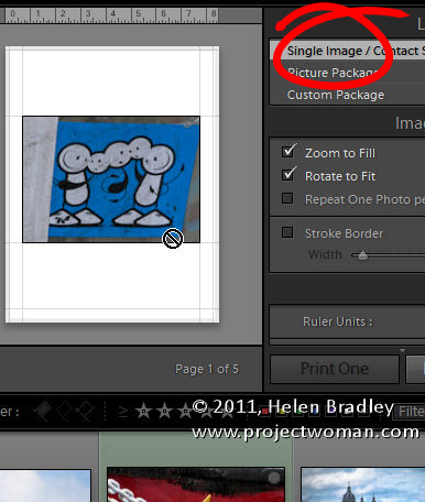
If it is a Single Image/Contact Sheet template then you must select images on the filmstrip to add them to the contact sheet and they appear in the layout in the order they appear in the filmstrip. You can’t drag and drop images from the filmstrip into a Single Image/Contact Sheet layout.

If the template is a Custom Package then you can drag and drop an image into any of the containers on the screen. You can also drag and drop an image into any position in the layout and it will sit on the screen even overlapping other images.

If a template is a Picture Package, then you can fill it by clicking an image in the filmstrip. A picture package prints multiple images on a single sheet of paper. If you select two images in the filmstrip, you’ll then have two pages in your picture package – one for each of the selected images. You can drag and drop an image into a Picture Package but when you do, you’ll create all sorts of issues. Not only will you add a new image to the layout page you are seeing on the screen but you’ll do the same for all the pages in the current layout. It’s generally best not to drag and drop images into an already tightly designed picture package layout.

Understand Border behavior

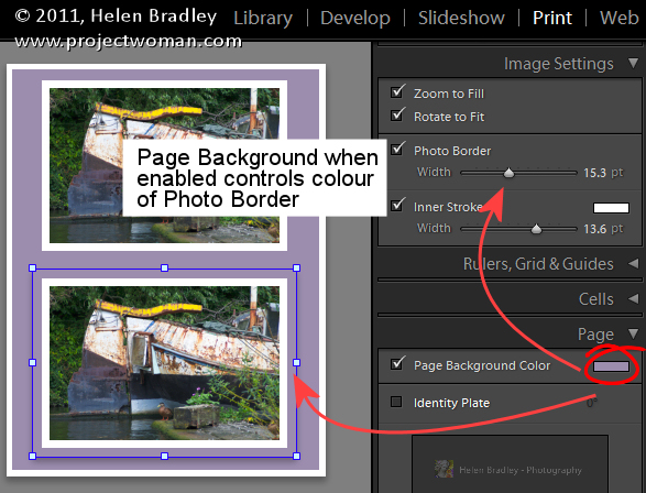
If you have a Photo Border enabled for a either a Custom Package or a Picture Package then the width of the border will make the image smaller. The color of the border is the color of the page background if you have a page background selected. If not, it will be white. If you set an Inner Stroke then it too will reduce the size of the image but it can be set to your choice of color.

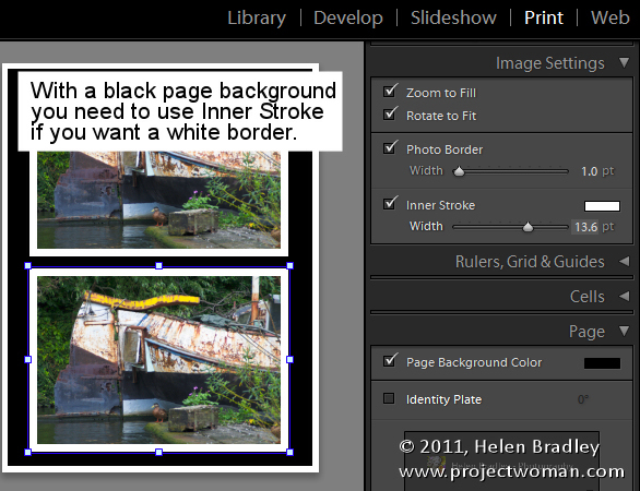
So, for example, if you want a black page background but a white border around your images, set the page background color to black and use the Inner Stroke rather than the Photo Border to apply the white border to the image.

Identity Plate Behavior

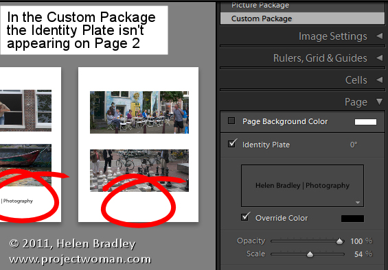
When you add an Identity Plate to a Custom Package it appears once on the page and you resize it to suit and place it where you want it to go. However, it only appears once in the layout so, if you add a second page to the print layout, the identity plate will appear only on the first page.

Alternatively you can add the identity plate to every image by selecting Render On Every Image. Now the identity plate will appear on each image rather than on each page but it will appear in the very middle of the image and  you can’t move it.

So, if what you want is your name on each printout as an Identity Plate, create a Custom Package design with an Identity Plate but not set to render on every image. Make sure the identity plate is in the correct position and fill the page with images and print or save it. Then fill it again with a new set of images and output the result and repeat as required.

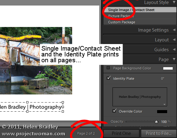
On the other hand, an Identity Plate added to a Single Image/Contact Sheet prints on every page of the document in the place you position it in.

Any size JPG output

You can print your layout to a JPG file that you can then upload to the web or send out for printing. To do this, from the Print Job panel, click the Print To: dropdown list and choose JPEG File.

Set the File Resolution and then the Custom File Dimensions for the page. Then, when you’re done assembling the images, click Print to File to print the layout to an image file rather than to a printer.

Crop your images

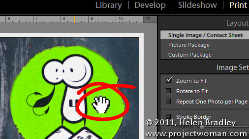
When you’re working with a Single Image/Contact Sheet, if the image is set to Zoom To Fill it will be made large enough to fill the container on the page. If the image height and width does not match the size of the container then part of the image will be removed. You can adjust the positioning of the image within the container by dragging on it with the mouse.

If you have a Picture Package or Custom Package selected you can move an image within its container also, but to do so you must hold the Ctrl key (Command) on the Mac.

The different behaviors of images within what appear to be similar layouts in Lightroom can be confusing but once you understand that different layout styles bring with them different key combinations and behaviors you’ll be on your way to creating great looking prints in Lightroom.

Helen Bradley

Tuesday, January 31st, 2012

Winter Photography Tip #8 – White balance

When you are photographing in snow conditions there are situations where you’ll need to adjust the white balance so that snow is white and so it doesn’t have a blue cast.

On the other hand the colourcast you get when you shoot in the early morning or at sunset is desirable so don’t remove it or your sunsets and sunrises will be ruined.

To capture the colour of the light set the camera’s white balance setting to sunny day – the camera makes almost no adjustment to white balance when you do this. This makes it a good setting to use when capturing sunsets, for example.

However, when there is a colour cast that you don’t want to capture such as blue light on snow, then adjust the white balance setting in your camera to remove it. To warm up an image, set the white balance to shade as this adds a pink/ orange warming cast to the image and counteracts the blue/colder light.

Helen Bradley

Friday, January 27th, 2012

Smarter Content Aware Fill

If you’re like me, you’ve tried out the new Content Aware Fill feature in Photoshop CS5 and you’ve been left just a little bit disappointed.

What Content Aware Fill does is to replace unwanted areas of an image in a smart way. It can reduce the amount of time you spend working with the Clone Stamp and other fixing tools when you have something you need to get rid of in an image. However, where the Content Aware Fill feature appears to fail is when you want to remove a large portion of an image – those very times you wish it would work perfectly.

Well, last week I learned a cool technique to use with Content Aware Fill that solves these problems, thanks to Adobe’s Bryan Hughes. So here’s a way to make Content Aware Fill behave a whole lot smarter.

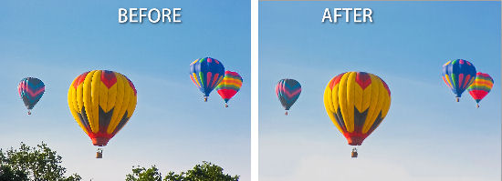
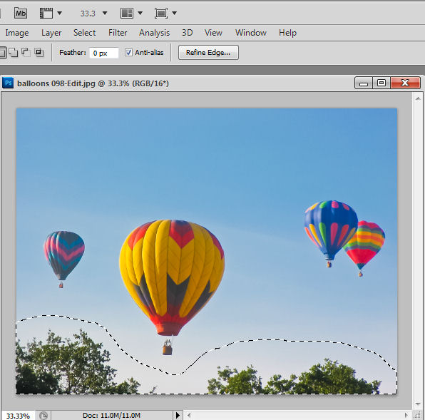
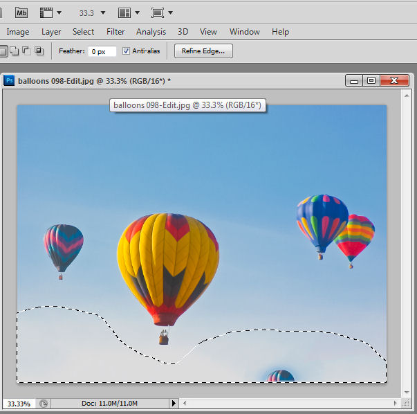
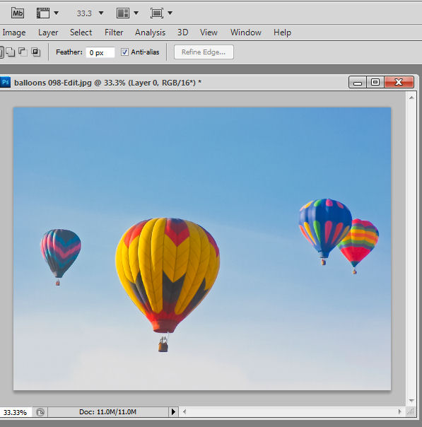
In this balloon image, if I want to remove the trees at the bottom of the image, I would make a selection around them with, for example, the Lasso tool.

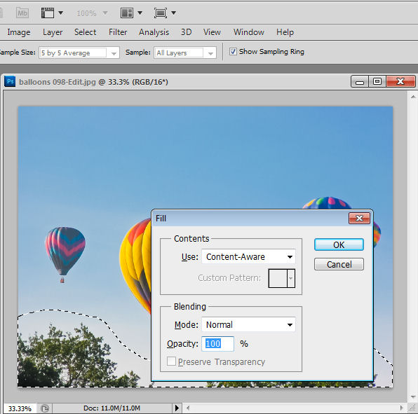
Then, in Photoshop CS5 – even though the bottom layer of the image is a Background layer I would press Delete to open the Fill dialog. Here I can choose Use: Content Aware Fill and press Enter to have Photoshop remove the trees for me.

The problem is, that as often as not, part of one or more balloons will appear in the filled area. What I want is blue sky and not balloons. I could repeat the “Select and Delete” process until the image looks as I want it to but there is an alternative way to use the Content Aware fill feature. This way of working is great when you are trying to remove a large object and where there is not a lot of clean image data for Photoshop to use to do the fill with.

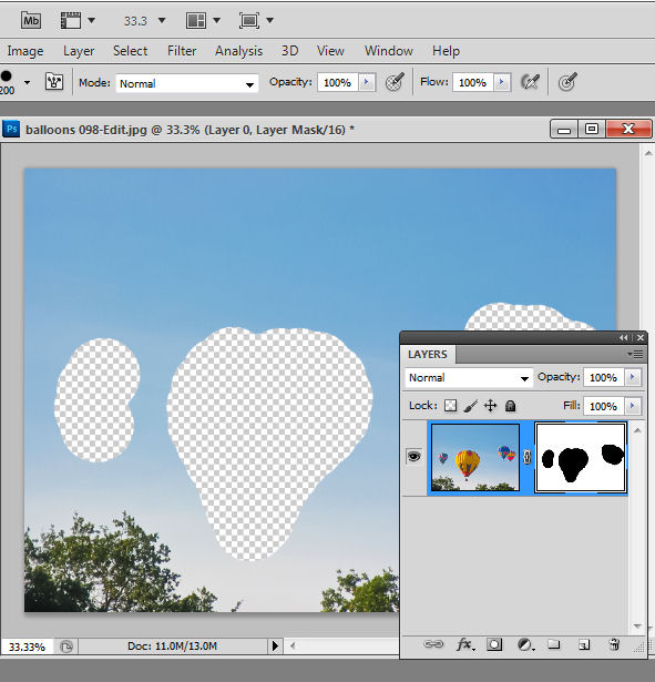
This solution involves removing any part of the image I don’t want the content aware fill feature to use – here that is the balloons – temporarily leaving only the content I want it to use – here that is blue sky. To do this I converted the background layer to a regular layer by double clicking it and pressing Enter.

Then I added a layer mask using Layer > Layer Mask > Reveal All and painted on the mask in black to remove the balloons – a hard edge brush is a good choice here.

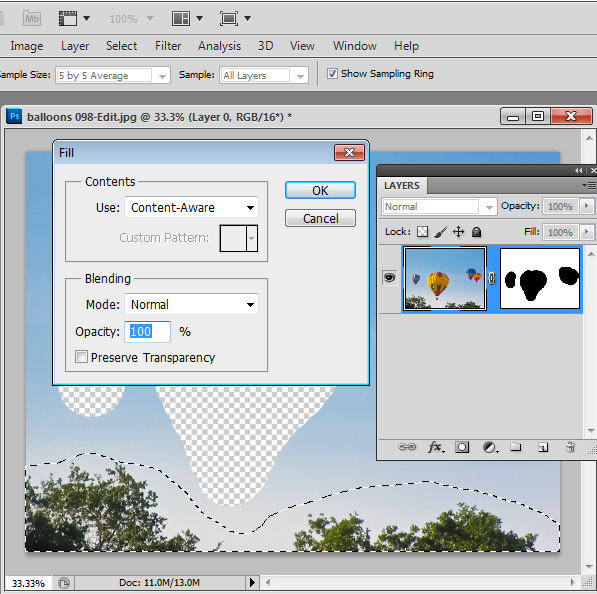
Now I’ve reselected the image – not the mask – and made a selection around the trees again using the Lasso tool. Pressing Delete this time won’t work – it just deletes the selection so, instead, I need to press Shift + F5 or choose Edit > Fill to open the Fill dialog. Make sure that Use: is set to Content Aware and click Ok.

This time Photoshop uses only the visible content to fill the area and because the balloons aren’t visible they aren’t used to fill the area when the trees are removed.

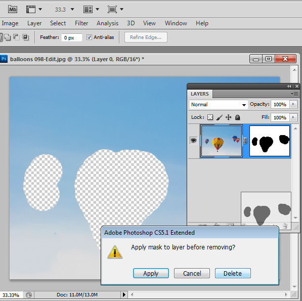
Once you are done, you can bring back the balloons by dragging and dropping the layer mask into the trashcan – select Delete when prompted so you remove the mask – don’t apply it.

Now the content aware fill tool works as you would expect it to – allowing you to remove large portions of an image and have the area filled in an intelligent way.

Helen Bradley

Thursday, January 26th, 2012

Winter Photography tips #7 – Work with what you have

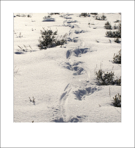
Winter scenery typically lacks the bold colors of the other seasons. However, there’s still plenty of good subject matter to photograph. Look for the contrast of bare trees against wintry skies or soft snow hanging from the boughs of prickly conifers.

Contrast in line and texture make a great focal point for your images.

In the city, look for winter fogs and mists that partially hide buildings and in the country, look for elements which break the landscape drawing your eye to them such as a stream running through snow, a fence, hoof prints in icy paddocks or early bulbs.

Helen Bradley

Tuesday, January 24th, 2012

Do you clean your own Sensor?

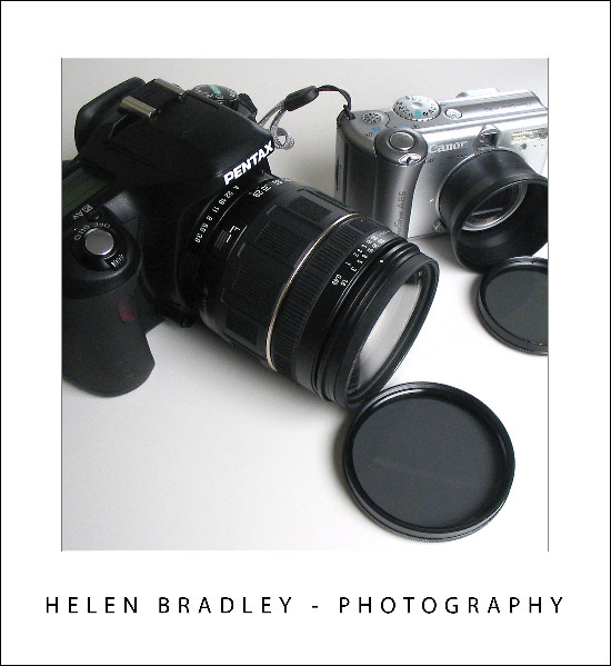
Every digital camera user will have confronted or will confront one day the issue of sensor dust. Every time you change the lens on your SLR there is a chance that dust will enter your camera. Some of this dust finds its way to the camera’s sensor with the result that you see unwanted and distracting spots on your images.

Built-in dust removal

Most cameras have some sort of dust removal feature built in. For example, my Pentax K7 has one that applies (according to its manual) “ultrasonic vibrations to the filter on the front surface of the CMOS sensor for approximately one second”. Sometimes this is all it takes to remove the dust. Just as often, however, the dust remains stuck fast.

This isn’t unusual because there are different ways dust can get to the sensor area and not all of it is ‘loose’ in the sense that it can be shaken off. Some particles can actually become stuck to the sensor.

Also, just to be clear, when I am talking about dust on the sensor, it isn’t really on the sensor itself but rather on a thin glass plate that is on top of the sensor. It’s just easier to call it sensor dust and to talk about cleaning the sensor than talk about cleaning the glass filter on top of the sensor.

When built-in methods fail

If your camera’s on board dust removal feature fails, the recommended solution is to send your camera to a service center that is authorized by your camera manufacturer and to have them clean it.

Because this is a service, you’ll be charged appropriately for it. You’ll also be without your camera for the length of time it takes to get it cleaned. Inspite of these issues, for most camera owners this is the safest and best solution.

Another option is to utilize the cleaning services provided by your local camera store. However, this is not without its risks – if the service technician isn’t authorized by the camera manufacturer to clean the camera then the cleaning could void your warranty -even if the cleaning doesn’t cause damage to the camera.

However, for a lot of photographers these options are just plain expensive and inconvenient.

For me, the issue is just that – cost and convenience. To get my camera cleaned at the local camera store costs $75 a time and it involves a one week turnaround – the service technician picks up and delivers to the store only on Tuesdays. In addition I have two one-hour round trips to drive to the camera store to drop it off and pick it up and I have to strip everything off the camera including the camera strap before it goes out and then put it all back together when it is done. All of this I was content to do until Mike from my local camera store suggested an alternative – cleaning the sensor myself.

Not for the faint of heart

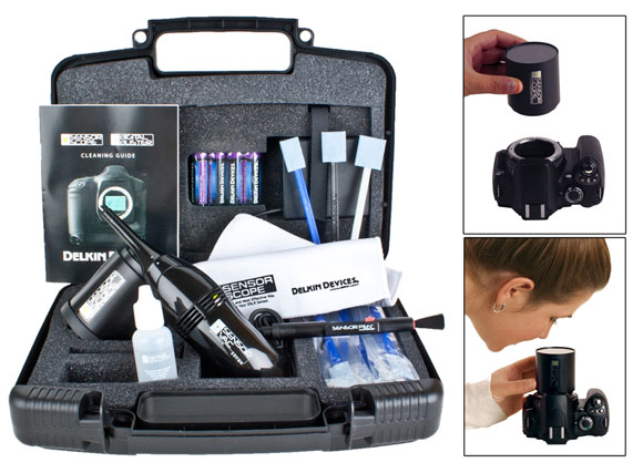
On Mike’s recommendation, I bought a sensor cleaning kit which included a vacuum, wipes and cleaning solution as well as a magnifying light all packaged in a padded toolkit. The cost of the kit was a little more than one cleaning so on my second cleaning I stood to be ahead on cost.
Kiss your warranty goodbye

I’m not recommending self-cleaning to anyone. It is a decision each camera owner needs to make themselves. You need to do as I did and ask yourself if you are prepared to shoulder the cost if you damage your camera and void your warranty? If not, then pay your money and leave it to the professionals.

I accepted I would be up for the cost of a new camera body if I damaged it because that’s about what it would cost to fix the damage I would do if the cleaning went wrong. I also acknowledged that I have probably voided my camera warranty by cleaning the camera myself even if it isn’t damaged by the cleaning. However, for me it made sense to see if I could save some time and effort by doing my own cleaning.

Scouts’ motto: Be prepared

Here is what I suggest you do if you plan to clean your own camera:

1 Read the Manual

However you behave and whatever you do in any other aspect of your life this is the one time you should read the manual for your camera and your cleaning kit before you get started. In fact, read it four or five times until you’re completely familiar with what you’re about to do and the risks.

I also found a good deal of useful information at the Cleaning Digital Cameras website (http://www.cleaningdigitalcameras.com).

In short the better informed you are the more likely you are not to fail. And if it all sounds too risky and beyond your skills, then don’t do it – after all that’s why they have service centers that do it for you!

2 Power it up

If your camera has an AC connector, connect it to the AC so that you won’t run out of power in the middle of the cleaning. This is an extremely dangerous situation as lack of power will cause the camera to shut down and if it shuts down on your cleaning tool then you are almost guaranteed to damage something.

If you don’t have a mains power connector for your camera, make sure to charge a fresh set of batteries and put these in the camera before you begin.

3 Make sure you have a problem

This probably should really be step 1 – you need to make sure you have a problem before you start. If your camera is not dirty then don’t clean it.

Many cameras will have some form of dust alert system that will show you dust on the sensor. For the Pentax K7 there’s a dust alert setting that requires you to set the camera in C or AF.S shooting mode and point at an evenly lit even color subject such as a white wall or an empty word processing document on a computer screen and take a shot. The resulting image shows you if there is dust and where it is.

You will need to read your camera’s manual to see if you have a similar system and how to capture an image of the dust.

Of course, some of us will be in no doubt that our camera needs cleaning because we can see the dust on our photos. My own cleaning efforts were driven by a particularly large gob of dust stuck in the middle of the sensor which showed up on nearly every image I shot and which just wouldn’t move inspite of numerous attempts to vibrate it free.

4 Check your tools

Check your tools before you begin making sure that you have everything that you need arranged on a clean work surface in a clean environment. Because you’ll be removing the lens from the camera you don’t want to risk getting dust into it while you are cleaning it.

5 Prepare the camera

Your camera will have a sensor cleaning feature in it. You use this to raise the mirror so you can access the sensor to clean it. Check your camera’s manual for instructions as to how to access this feature and how to return the camera to its usual setting when you are done. On my camera, simply powering it off resets it – so I have to be very careful not to touch the power button while cleaning it and that’s why freshly charged batteries are critical.

6 Clean the sensor

Clean your camera following the instructions in your camera’s manual and those in your sensor cleaning kit (all the time having regard to the terms of your camera’s warranty).

Take care – this is a delicate piece of equipment and needs to be cleaned with a light and steady hand. A half cleaned sensor in a camera that still works is better than a squeaky clean sensor in a broken camera.

7 Check the results

When you have finished cleaning, check the results to make sure the dust is gone.

Now for the good news

The good news is that many people do clean their sensors successfully.

If you do it yourself and if you do it right, you will find the cost of sensor cleaning is much less than sending the camera away to be cleaned. It’s also very convenient because you don’t have to be without your camera for a period of time and it feels good to know you can deal with a dust problem yourself.

For me, it will be a task I’ll always approach with some trepidation and mindful that it’s one that needs to be done carefully and not hurriedly or under stress. It does however give me a new sense of freedom particularly when traveling. With my cleaning kit I’ll never be caught on day one of a two-week trip with a nasty gob of dust on the sensor and no way to remove it until I get home.

Helen Bradley

Sunday, January 22nd, 2012
Winter Photography tips #6 – Light and Shadow


The light in winter is different to light in summer and because the sun is lower in the sky you get longer shadows.

When taking photographs in winter, take notice of where the shadows are falling.

If you photograph with the sunlight falling across the scene you can capture detail in not only the light but also in the play of light and shadow.

This contrast adds detail and interest to a landscape or anywhere where you have objects large enough to cast shadows and the sun to create them.

Helen Bradley