Learn to create a vector sunburst in Illustrator – This works with all versions of Illustrator including the new CS6. The process is simple and uses a stroke to make the sunburst – it is quick and doesn’t require a lot of fiddling to create.
Transcript:
Hello, I’m Helen Bradley. Welcome to this video tutorial. In this tutorial I’m going to show you how you can create a sunburst vector shape in Illustrator.
Before we get started creating our sunburst effect let’s have a look and see what it is that we’re aiming for. Here I have a sunburst and it’s just offset in this rectangle, but you could have a circular one if you like.
We’re going to start with circular and then we’re going to crop it to a rectangle. So if you’re ready let’s have a look and see how we create this effect in Illustrator. And we’re going to start by creating a brand new document so I’ll just choose File, New. It doesn’t matter too much what my document looks like.
I’m going to start with the Ellipse tool. So, I’m going to select the Ellipse tool and drag a shape on my image. And I need this to be a perfect circle so I’m going to hold the Shift key as I draw it and then just let go. I want this to be black stroke and no fill so I’m just going to click on the fill here and turn the fill off.
Now let’s go to the Appearance panel for this selected path and I’m going to click the Stroke option. And I’m going to set the stroke to about 200 points. And when I do you’ll see that we get this sort of circle all the way around our shape which is pretty near exactly what we want when we click the Dash Line option. Now with the Dash Line option I can set the dashes to whatever I want and this is going to affect how many of these sunbeam things there are around the shape.
So let’s just go to 20 and try that. This is what I’m a little concerned about. You can see that there’s an uneven spacing here, but you’ll see that you can adjust that by clicking this option here. So just work out how many points you need to get the number of sunrays that you want for your particular shape. I’m going to do a few more in this one rather than less so I’m going to 10 points. And when I’ve got what I want I’m just going to click away from this. And this is the basic shape. Now before we can do anything with this shape we’re going to first have to expand its appearance.
So with the shape selected I’m going to choose Object and then Expand Appearance and then Object, Expand because I want this dialogue here. And I’m going to expand both fill and stroke So I’ll select both of those and click Ok. And now each of these sunbursts is a separate shape and I need now to close up the middle. And I can do that by grabbing the Lasso tool. It’s the easiest tool to use. And all I’m going to do is just drag around because I want to select all the nodes and pointers’ handles in the middle.
Now I’m going to choose Object and then Path, and I’m going to choose Average. And with Average I’m going to select both Horizontal and Vertical and click Ok. And what that does is it just closes up the middle nicely for me. So I’m going to click outside my shape and here is my sunburst shape. So with it selected I can then go to what is now my fill color and I can choose a different fill color for it. And we could fill it with a gradient.
We could do anything we liked at this point. So let’s see now how we’re going to crop it. So I’m going to select the Rectangle tool. I’m going to start by drawing a rectangle and I’m just going to hold the spacebar as I bring it in position over the top of my sunburst because I want to work out exactly where the sunburst is going and where the rectangle is going relative to it. So I think that’s a pretty good position for me. So I’m going to let go of the spacebar and let go of the left mouse button and now select all my objects. I’m selecting other everything, and in the Pathfinder I’m going to select Crop. And that crops the shape to the size of that rectangle. And we lost our fill here so let’s just click on the fill and put the fill back on.
So here is a shape that we could save to our Symbol library. And those sunbursts are very, very easy to create in Illustrator as vector shapes. And of course if you add it to your Symbol library then you’ll have it available anytime you want to use it. And it’s very easy to create ones with different numbers of rays in them.
I’m Helen Bradley. Thank you for joining me for this video tutorial. Look out for more of my videos on this YouTube channel and please like and comment on the videos. Look out too for my website at projectwoman.com. There you’ll find more tutorials and tips and tricks for Illustrator, Photoshop, Photoshop Elements, Lightroom, GIMP and a whole lot more.
Lost your Adjustment Brush or Graduated Filter fix? here’s how to find it.
When you add an Adjustment Brush fix or add a Graduated Filter to an image in Lightroom a marker, called an Edit Pin, is placed on the image to indicate where the fix is located. You need to click this if you want to ever edit the fix.
To select the adjustment, target the tool that you want to fix – so, if you want to fix a Graduated Filter adjustmt will change to a black circle surrounded by a lighter circle – this tells you the adjustment is selected so you can now go and edit it.
Understand the limits of the Photo Stream and how to save images from it so they aren’t removed from your iPad or iPhone
Sometimes you may know that you had some images on your iPad or iPhone but suddenly you find that they’ve gone.
This happens to me when I drop some images into my Photo Stream on my Windows PC that I want to use on my iPad. I drop images into the Uploads folder on my PC and, via the iCloud, they are synced automatically to my iPad. I know the images got there safely – I put them there months ago and I know that I saw them on my iPad but suddenly today they aren’t there. Confusing? Happened to you? It probably has and here is the explanation as to why they disappear and how to stop them from doing so.
The issue is the Photo Stream. The photo stream on the iPad and iPhone only store the last one thousand images – if you shoot lots of images and, say have your iPhone and iPad synced then you’ll run out of space pretty quickly. When you do then images are knocked out of the Photo Stream to make room for more recent ones.
The issue doesn’t happen on your Mac or PC because they have plenty of space so photos in your Photo Stream folders there are always there – it is just a protection against junking up your iPhone or iPad with ‘stuff’.
So, what do you do when you want to keep some of the images from your Photo Stream permanently and you don’t want to lose them? The answer is to move them to an album or to your Camera Roll. The images in your camera roll and in albums are there to stay. And just to clarify, you don’t have to move images from the Photo stream that you captured with that device – because images you capture on the iPad for example are in the Camera Roll and stay there. The images you want to save are those that get synced to the iPad via iCloud from other devices such as your iPhone or PC or Mac – they are the ones that only hang around for a short time.
How to move images from your Photo Stream to an album
So, to move a lot of images to an album (an easy solution for lots of images that you want to save to somewhere that isolates them from all your other images), tap Photos, tap Photo Stream, tap My Photo Stream.
You should now see all the thumbnails of images in your photo stream. Then tap Edit.
In this mode you can now tap the images that you want to save – each of them should have a blue checkmark on them. Now tap Save and choose to Save to an Existing Album or Save to New Album.
I have an album for images I want to edit and play with on the iPad called Editable Pix so I typically tap that to select it. This lets me store those images so they are isolated from all the other images in my Camera Roll.
How to move images from your Photo Stream to your Camera Roll
It is also possible to save photos from the Photo Stream to the Camera Roll. The advantage of this is that they are in the Camera Roll itself and in some situations that might work best for you.
To do this, again tap Photos, tap Photo Stream, tap My Photo Stream so you see all the thumbnails of images in your photo stream. Again tap Edit. In this mode you can now tap the images that you want to save – each of them should have a blue checkmark on them. Now, tap the Share button in the top left of the screen:
And choose Save to Camera Roll. (It is very confusing that these two processes that really are so similar are handled so differently in iOS6).
How to save one image from your Photo Stream to your Camera Roll
Now, if you just want to save one image from the Photo Stream to the Camera Roll, tap Photos, tap Photo Stream, tap My Photo Stream so you see all the thumbnails of images in your photo stream. Tap the one image that you want to copy to the Camera Roll so it is showing full screen. Now tap the Send to button that is a box with an arrow coming out of it in the top right of the screen and choose Save to Camera Roll from the menu.
Now you will never again lose images off your iPhone or iPad that you really want to keep.
Using Word to Create Multiple Return Address Labels
Create your own return address labels in Word 2010 or 2013 by selecting the Mailings tab and clicking the Labels button. Type your address into the text area under Address.
Alternately, select the ‘Use return address’ checkbox and select the address to use from your address book or from your Outlook contact list.
Select the ‘Full page of the same label’ option button and select Options to select your paper from the list.
Select New Document to create a document full of your labels or click Print to send the job straight to the printer.
Area Picker – Viewing a Preview Image when sharpening
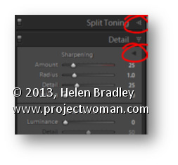
The Detail panel of the Develop module in Lightroom contains the features you need to sharpen an image. In this panel is a small square icon with lines radiating from it. Click this once and now hover over an area in the larger image. As you do this you will see that area of the image appears in the preview panel at 100% magnification. Use this tool to click on an area of interest in the image that you can view in the preview area so you can see how the sharpening is being applied.
If minor adjustment is required, drag the preview image in the preview area with your mouse to fine tune its placement.
Photographing at the zoo offers unique opportunities for getting great animal photos
Zoos are a great place to polish your photography skills and to get photos of animals and birds you may never see otherwise.
However, just because the animals are caged doesn’t mean they are easy to photograph so there is plenty to think about and work around.
The plus is that your perseverance will be rewarded and you can get some truly great photos if you know how. Here are some tips for a successful day photographing at the zoo.
Camera settings
To get in close to the animals, use the longest zoom lens you can handle. The downside of a zooming in close with a big zoom lens is that any movement will be exaggerated so you will need to hold the camera steady to capture the shot in focus.
Using a large aperture like such as f3.8, f4.0 or f4.5 will let more light into the camera so the exposure time can be reduced to help you get sharper images. Also consider increasing the ISO to get a faster shutter speed.
A side benefit of using a large aperture on the lens is that you will get a shallower depth of field around the subject and the background and foreground will be blurred. When you’re shooting at the zoo this is an advantage as it minimizes the impact of cages and man made objects.
Just ensure that the camera focuses accurately on the animal you are photographing because of this short depth of field is a double edge sword – if you’re not focused tight on the subject it will be out of focus.
Shooting in low light
Some displays at the zoo are indoors and to shoot in these low light conditions start by adjusting your camera’s ISO equivalency to a high value such as 800, 1,600 or 3,200.
At these settings the camera is more sensitive to light so you can capture your image without using a flash. Not only is the use of a flash typically not permitted in indoor displays, it is also unlikely to give you good results because, instead of lighting the scene it is more likely to bounce back at the camera or wash out the scene.
Take care to adjust for what lighting there is in indoor displays. Very often the lights throw an orange or green cast over the image.
Adjust the white balance setting on the camera to negate the cast and you won’t have to clean up your photographs later on.
What to capture
When you’re planning what to shoot, look for opportunities such as capturing an animal when it is looking directly at you.
To do this, you will need to be in a good position relative to the animal and you will need to be patient – and lucky.
Another option is to capture the animal where you can see its eyes and when it is doing something interesting like eating or yawning. Again, take your time, be ready with your camera positioned and be patient.
In some circumstances you may find yourself forced to shoot through glass or perspex. Walk around the area to find a good place where there are minimal reflections and where dirt on the window won’t be distracting.
If you’re forced to shoot an animal through a fence, get close to the fence so you can shoot through gaps in it or make the fence an interesting feature.
Even if you’re forced to crop parts of the animal away to get a clear shot you can still end up with a worthwhile image.
Of course, always photograph from a safe distance – some animals are belligerent and dangerous and up close to a fence won’t be safe if they are the other side of it.
If you have the luxury of spending time with animals that are active and in a good position for you to capture them, spend the time you have wisely.
Take your time
Instead of taking a couple of good shots and moving away from the animal, wait around to see what creative opportunities arise that might give you a great shot.
By waiting, you may find the animals interact with each other, playing or fighting or that they arrange themselves in interesting patterns that turn a good photograph into a great one.
When you’re next looking for an opportunity to hone your photography skills it may be time for a visit to your local zoo to take advantage of the wealth of photographic opportunities offered there.
See how to create some effects such as rotations and a transparency heart effect in Illustrator. This is Part 2 of the videos on halftone hearts.
Transcript:
Hello, I’m Helen Bradley. Welcome to this video tutorial. In this tutorial we’re going to take a step further from our halftone hearts tutorial and have a look and see what we can do with the halftones that we create. In this video we’re going to go one step further than the last video.
In this video we’re going to create this sort of circular effect from the string of hearts that we created using the Blend tool in Illustrator. And then I’m going to show you how you can use a transparency mask to create this sort of effect in Illustrator as well.
We’re going to start with a brand new file. And I have some of the elements left over from the first video here that we’re going to use. And we’re going to bring in this heart shape. And I also have a spare set of this string of hearts that we created so I’m going to bring that in. That just saves us having to recreate those. Now I want two sets of this so I’m just going to drag a second set away from the first.
Let’s have a look first at how we would create that sort of spiral. I’m going to size the hearts down in proportion so I have a small set because I’m going to rotate these around to create the full rotation. To do that I’m going to choose Effect and then Distort and Transform and I’ll select Transform. I’m going to click Preview so I can see what’s happening, and I’m going to rotate these around at this bottom point. So this is the very bottom point of this chain of hearts and I’m going to rotate them 10 degrees. Now I haven’t got Copy set so this individual string is going to be rotated 10 degrees but I want enough rotations that I can go all the way around a circle. And if I rotate something 10 degrees in 10 degree increments I need 36 of those to go around the circle because a circle has 360 degrees. And that’s all I need to go to create this shape so I’ll click Ok.
And now that shape is created but of course it is still really just a string of heart. And to make it into the individual shapes we’ll choose Object and then Expand Appearance. And now it is those little heart shapes individually. The other thing I want to do is to create a set of halftone hearts that we can use as a transparency mask for this particular heart.
First of all I’m going to switch the foreground and background colors here so that we have a pink heart. And I need to create a box, a sort of rectangle of these hearts. So again I’m going to shrink these down so they’re about the same size or height as this heart is because they’re going to be used for a transparency mask for that. I’m going to select these and again I’m going to do is the transform so I’m going to choose Effect, Distort and Transform and then Transform. This time I’m going to create about 20 copies. And I want to move these so I’m going move these in a horizontal direction about 7 or 8 pixels, let’s say 8 pixels here, and just click Ok.
I just want a block of hearts big enough for me to put my heart on top of that. So they just need to be that size. I’m going to expand the appearance of this halftone effect so I’ll choose Object and then Expand Appearance. And then I want to copy it to the Windows clipboard so I’ll select it all and choose Edit and then Copy. So it’s now in the Windows clipboard and I can just tuck it outside out of the way because we don’t need it anymore.
With the heart shape selected I’m going to use the Transparency palette which we can get to by choosing Window and then Transparency. And I’m going to click to make a mask. And because I want this mask to be clipped to the heart shape I’ll click Clip. I’m going to select on the mask here and I’ll just choose Edit and then Paste. And here is the halftone heart shape. And I’m just going to position it into position here. And I want the little hearts to be pretty much up around the top curve of the heart so it’s really quite well defined. So I’m thinking that’s probably going to be about the right position. And then to go back to working with my heart I’ll click on the heart in the Transparency palette. And that’s how the final effect looks.
What I did when I showed it to you earlier was I created a filled, a red filled square that was over the top of the heart. I’m just going to create my square. And this needs to be sent behind so I’m going to send it to the back. And the heart itself instead of being filled with pink was filled with black so I’ll just click the fill color and we’ll fill it with black. Now if the mask is not in exactly the right place we can also just select back on the heart, reselect the mask and perhaps adjust the positioning of the mask by a pixel or two, reselect the heart and we’re back working with the heart itself.
So there are some effects that you can create using this sort of halftone effect which we created this time using halftone hearts rather than halftone dots in Adobe Illustrator.
I’m Helen Bradley. Thank you for joining me for this video tutorial. Look out on this YouTube channel for more of my video tutorials and go to my website at projectwoman.com for more tutorials, tips and tricks on Illustrator, Photoshop, Photoshop Elements, Lightroom and more.
One easy and fun way to add visual interest to a text heavy page is to use a Drop Cap. A Drop Cap is when the first letter of a paragraph is increased in size and, more often than not, put in a more ornate font.
To create a Drop Cap, place your insertion point in the paragraph you wish to start with a Drop Cap. Then, choose Insert on the Ribbon, click Drop Cap > Drop Cap Options. The ‘Drop Cap Options’ allows you to either insert the Drop Cap into the paragraph, with ‘Dropped’, or place it separate from the text, with ‘In margin’. If you’re unsure what to use, I would suggest ‘Dropped’ and increase the ‘Distance from text’ setting to .3cm and the ‘Lines to drop’ setting (which affects the Font size of the actual Drop Cap) to 5 and click OK.
To change the font of the Drop Cap, you can either select the font you want directly in the ‘Drop Cap Options’ window or highlight the letter (which appears in a Frame) afterwards and changing it. You could even use Format, Borders and Shading, Shading tab to fill the frame with colour.
Learn how to make half tone effects with hearts (instead of dots), in Illustrator. Uses the Blend and the Transform tools for this effect. This is part 1 of a two part series on halftone hearts.
Transcript:
Hello, I’m Helen Bradley. Welcome to this video tutorial. In this tutorial I’m going to show you how you can make halftone hearts in Illustrator.
Before we get started creating our halftone heart effect let’s see what it is that we’re aiming for. And this is the effect that we’re going to create by the end of this video tutorial. And if you look at the link below for the next video tutorial in this series I’m going to show you have to create this effect and this one too.
But for now let’s get started on this effect. I’m going to create a new file by choosing File and then New and click Ok. I’m going to view my rulers so that I can drag a guide in that I will use as a guide for drawing my shape. I’m going to grab the Pen tool. I’ll click and drag on the guide. I’m going to add a curve over here, another one here, and one finally back here down on the guide. And I’m just going to Ctrl click outside to disable that Pen tool. And here is my shape. And obviously I need to do something with it before we go any further.
I’m just going to adjust these points so that we get something looking a little bit more like a heart shape. I’m going to get rid of my guides so I’m just going to clear my guide. And let’s go back over, select this shape and let’s give it a stroke. So with the shape selected I’m going to give it a pink stroke, and I’m just going to make that a bit of a larger stroke so we can see it clearly. To flip this shape to make the rest of my heart I’m going to first select the shape and then I’m going to click the Reflect tool which shares a toolbar position with the Rotate tool.
The first thing to do with this tool is to click on the anchor point across which you want to flip it. So that’s going to be either this top point here or this one here. It doesn’t matter which. I’m going to Alt click on it. Now I’m getting that reflected shape sort of across the vertical access and all I want to do is to click Copy to make that a heart shape. And now I’m going to join it together by selecting it and choose Object Path Join. And here is now my heart shape.
Now I want to size this down a bit. Actually I’m going to scale it in proportion. And I’m going to make a duplicate of it so I’m going to hold it as I drag a duplicate away. And I just want to tuck this duplicate out of the way for the minute. I don’t want it around but I’m but I’m going to need it a bit later on. So let’s go and select this one and let’s size it down to be the starting point for our halftone heart. So I’m just going to fill this with pink. And I want another duplicate of this so I’m just going to Alt drag a duplicate away. And this is going to be the top one of my hearts. And I want these to line up, although right now is not the time to line them up. I’m going to size it down first of all. So this is going to be my little heart. This is going to be my big heart. And now I’m going to place it in position.
So I want these to align perfectly to their mid lines. They’re not doing that right now. There we are. This is the line that I want. I want to make sure that they’re perfectly aligned so that the point of this heart lines up with the point of this one. And I’m going to change the color so this one I’m going to make quite a sort of dark crimson color. Only I wanted that for its fill and not its stroke. So we’ve got a dark large heart and a very pale pink small one. What we’re going to do now is to blend these two shapes together so we’re going to blend the little and the big heart together. So we’re going to use the Blend tool here on the toolbar. So I’m going to select it and then I’m going to click on the first of the shapes and click on the second. And that blends these two shapes together.
Well it does such a good job that it looks nothing like what it is that we really want. So I’m going to double click the Blend tool to open the Blend options dialog. First of all I’m going to enable Preview and I don’t really want Smooth Color. I want Specified Steps. At the moment there are 127 steps to blend these two shapes and colors together. And I don’t want that. I want to actually see the shapes. So I’m thinking I’m going to start with something like 25 steps and see how that looks. That’s pretty good. Probably let’s just try down to 20 on this one. The other thing that you can do is you can also use Specify Distance as well as Smooth Color. So we don’t want Smooth Color. We definitely want to see these shapes. And we can either go with steps or distance. But I think that’s pretty good so I’m going to click Ok to accept that.
So now we’ve got the first of our lines of hearts and we just want the rest. And we get the rest with a Transform effect. So I’m going to click Effects and then choose Distort and Transform and we’re going to choose Transform. And here’s the Transform dialog. Again I always want to click on Preview so I can see what’s happening here. And let’s do 15 copies. And what I want to do is to make each copy a little bit to the side of this one. So I’m just going to choose Horizontal Move here. And I’m going to move these apart until they are looking like what I want them to look like. Now I quite like that but I think I don’t have enough copies. So I’m going for 25. What I want here is I want these hearts to run into each other. I made it so that the ones would run into each other in the vertical direction. And I want these in the horizontal direction also to run into each other so that I get this final effect. So I’m just going to click Ok.
And there is my effect that we came here looking for. This is a halftone set of hearts. And they vary from light at the top, very small too dark at the bottom. And if we want to create these so that we can work with them we’ll expand them. So with this line selected I’m going to choose Object and then just Expand Appearance. And these are now grouped but their appearance is expanded so we can work on them a little more time. Here is the Link on working