Wednesday, October 24th, 2012

PowerPoint 2013 – What’s new and cool

PowerPoint just got a whole lot cooler, so come check out what’s new. I’ll walk you through many of PowerPoint 2013’s features, including the new start screen and account screens, how saving is new, using the new task panes, charting options, and discovering theme variants.

Transcript:

Hello, I’m Helen Bradley. Welcome to this video tutorial. Today we’re going to be looking at the new PowerPoint 2013 and asking what’s new and cool for PowerPoint users. There is a lot to like about the new PowerPoint 2013. And we’re going to have a look at some of the features of it here in this video.

The first thing is the Start screen. This opens as soon as you open PowerPoint 2013. And there’s a lot here for new users. You can actually turn the screen off. But I think most people are going to opt to turn it on. The default is to start with a new presentation with a default theme, but you can see here that we’ve got recent files that we’ve opened in PowerPoint so they’re all available to us. We could go online and search for templates and themes online. And there are some suggested searches here. We can also click here to open other presentations that we might have stored on SkyDrive or on our local computer or SharePoint. And up here is the current account. So when You open PowerPoint 2013 or any of the new Office 2013 applications you’re going to be logged into your SkyDrive account, and this is access to it. And here we could switch accounts if we wanted to. These are just for testers so I think that they’re probably going to go in the final production.

But let’s have a look and see what would happen if we selected one of these templates. So I’m just going to click this one to open it. And you can see here that there’s some variants in this theme. We’re having a look right now at the More Images so we can see what this layout is going to look like if we select this particular one. And there’s this title layout, and this is what the chart would look like, and then smart art graphics, and this is a photo layout. And then there are different variants, different color combinations that we could use in this particular theme. Now what they’ve done in PowerPoint 2013 is that they’ve removed some of the color options that we had previously and sort of scaled them down to a more manageable group. So this particular design has four color options and you choose one of them and go with it rather than having to select from a set of color schemes that are probably twenty or thirty of them.

So I’m really liking this sort of red one so let’s click Create. And we’re now all ready to start our PowerPoint presentation. None of this is going to be unusual for PowerPoint users. A little bit has changed with the interface here. You can see that it’s got a metro style look to it so everything is a lot flatter. There’s no dimension in the screen, no shading. The buttons have sort of all gone to the back and really what we’re doing is focusing a little bit more on the content of our presentation.

Let’s go to Backstage View before we come back here though and see what’s there. I’ll click File to go to Backstage View. Now some of these options have changed. There’s Save and Save as. If we go to Save as you’ll see that by default we’re now saving to SkyDrive so this is the SkyDrive account that I was already logged into. Details are up here, and it’s opting to save it to SkyDrive by default. If I want to I can save it to my own computer so I can click Computer and this gives me access to my own folder structure. I can also add a place. So I could add things like a SharePoint location or a different SkyDrive account. Print is pretty standard. There’s not much changes here but Share has some options. You can invite people to share your document on your SkyDrive account. You can email it. You can present it online or publish your slides here. Export here we’ve got our PDF, XPS document support. Here’s the video option. Here’s packaging it for a CD, creating handouts and changing our file type. Down here are the standard options. This is general options for working inside PowerPoint and there’s not much changed here. Let’s go back here however to this Account area. And this is where you manage your accounts. So at the moment you can see that I’ve got a connected service with my Facebook account, my SkyDrive account, Twitter. I can also add LinkedIn if I wanted to. I could add Flickr. There’s the ability to add SharePoint or another SkyDrive account, lots of options here. And I imagine that over time we might see even more appearing here. This is also showing me where I am with my product. I can get updates and get information about whether the updates are installed, whether there are any, and it’s just telling me which version of Microsoft PowerPoint I’m using. So there’s our Backstage View. There’s our Start screen.

So let’s go back now and have a look and see what’s different inside the PowerPoint interface itself. The ribbon is pretty standard from the older versions of the ribbon. The difference is that the Design tab is split in two now with the themes and the variants. So here we have the various themes that we can use. We’re using this one here, but you can see that what we’re using this variant of it. This is another one of the built in themes for PowerPoint 2013, and here are the variants so we could make it blue or pink, whatever we want to do here.

The Developer tab is now visible by default so that’s a big change for people who want access to macros. I’ve got some additional things open here, and it’s picked up my old handy Tools tab which is one that I added to my PowerPoint 2010 and it’s been brought forward into 2011. So too has the add-in Visual Bee. But these are things that I’ve added in myself. They’re not actually in the default PowerPoint install. There is a new button here on the toolbar. It’s the Touch Mode button, and you can enable it if you’re on a touch screen. With that enabled, if I just tap it what happens is that the buttons become a little bit further apart and everything is a little bigger for work on a touch screen. Click it again and everything shrinks down just a little bit.

Let’s have a look at adding a chart so I’m just going to go back to the Home screen. And we’ll do a new slide with a chart so I’m going to choose a title and a content slide. And let’s just add a chart to our Presentation and close this down. These settings here are new, and these are in Excel as well. So these give you the ability to add chart elements or remove them. For example if we don’t want a legend we could just disable the legend here. We could also for example disable the chart title if we planned to add the chart title in as the slide title. There’s access here to styles and color options. And you can see that we could change the colors but we’ve got a smaller subset of colors this time. And they’re more true to the theme itself. So we’ve been given smaller numbers of options but probably more relevant options if you could think of it that way. And then here we’ve got other settings. We can change the values and the names. So there’s options here for working with our chart.

Let’s go again and let’s add another new slide. This time I want to add an image. So I get a choice of selecting pictures from my own computer or online pictures. Online pictures allows me to select images from Office.com clipart. I can search them using Bing or I could go and get them from my SkyDrive account. It’s also possible for me to get them from my Flickr account. So let’s just go and get an image right now. Let’s go and get a coffee image. Okay, let’s grab this one here. And I’m going to insert it so I’m just clicking it and tap Insert. And now we’ve got our image inserted on our slide.

Now if we wanted to make changes to this image we would typically go to the Picture Tools Format tab. But watch what happens when I right click the image here and choose Format Picture. What we get is this new format picture pane here. It’s a task pane. And in it are all the things that we can use to format our pictures. So let’s go ahead and let’s add a reflection to this picture, just add a very simple reflection to it.

Okay, let’s go now and add another slide and this time I’m going to add a small art graphic. So let’s just add a default smart art graphic. But look what’s happened to our pane. Now we’re seeing Format Shape options because these are the options that we can use with this smart art graphic. If we go back to this slide here and click on the picture the pane is still there. It stays in place if we want it to, but it changes to show us the kind of options that we have for the object that we’re working with. And I think users are going to really like this because you don’t have dialogue sitting over the top of your slides. This is all tucked away on the side and you can leave it open as you work. And it’s just giving you much quicker access to things. You can see we haven’t moved away from the Home tab and yet we’ve got most of the smart art tools available that allow us to format the smart art as we work.

Now another handy tool we’ve got is the eyedropper tool. So I’m just going back to this image and I am going to click on the image and go to Picture Tools Format tab. And I’m going to select Picture Border. So instead of actually choosing one of these theme colors what I can do is use the new eyedropper tool. What the eyedropper tool does is to allow me to select a color from the image itself. So I can just mouse over an area of the image and select that as the color of my picture border for example. So it’s now my selected color so I can now add a border to the image that is a color that I’ve selected from the image itself. Now you may be missing the color options that you used to have inside PowerPoint, but we still have access to them. We just have access to them in a limited way.

So let’s say that we like this general layout, but we’d really like it to be a different color combination. In this case we’ll go to the View option and we’ll go to Slide Master View. In Slide Master View we can control the slide master that controls the look and feel of out presentation. And you can see here that the All Theme Color options are back again. So for example if we wanted to use a theme color for example medium we could do that. And here’s our medium color scheme that’s now been applied to the presentation. I’ll close Master View and let’s go back into the Design View.

We’ve still got the four options that came with this slide presentation, but we also have our own custom option that’s a Slide Master that we can use. Now if we like this color scheme in preference to the other variants we can save it as we always could, just drop down this theme option and save the current theme. So you do get the customization options of being able to change colors, but you get it where they really should have been all along which is in the Slide Master because you really want it to be thematically strong and you want this color scheme to be applied throughout the entire presentation. Now some of the other options that are available inside PowerPoint 2013 is the Video options so you can select Online Video or Video on your PC. There are a few more options in working with video content. You’ll find things in the Slide Show menu.

When you go to rehearse a slide show or set up a slide show you’ll have different options in terms of viewing presenter view so you can actually see presenter view if you want to. So let’s just do that. And let’s send the slide show to the monitor and the primary monitor which is not the one I’m using right now, and let’s do Presenter View. And let’s just view the slide show. So here’s our Presenter View. You can see that we can see which slide we’re on and we can navigate through the slides. In fact this is my title slide and this is the next one up. And there’s two and three. We can also use a See All Slides option where you can see the slides themselves. You can press Escape here and you’re just going back into Presenter View, not ruining the presentation which is actually running on my second monitor right now. You’ve got the ability to zoom into the slide show so you can click on here and zoom it up full screen. And there are the standard laser pointers so you can use a laser pointer on your screen and you can see other slide show options here.

So there’s plenty to like about this new PowerPoint 2013. I think you’ll like it a lot. If you haven’t already done so why not go and download the customer preview and install it and have a play around with it. I’m Helen Bradley. Thank you for joining me for this presentation. You can find more of my videos here on my YouTube channel. I encourage you to subscribe to the video channel as we’re releasing at least two new videos every week. And also follow me at projectwoman.com where you’ll find tips and tricks for all the Office applications as well as much, much more. If you liked this video please go ahead and like it and I’m always happy to hear your comments.

Helen Bradley

Thursday, July 19th, 2012

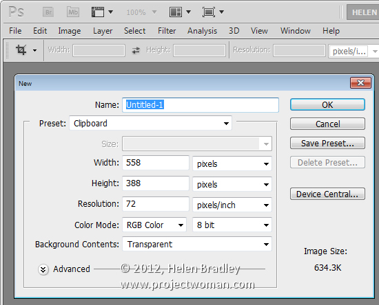
Create a file the size of the Clipboard in Photoshop


It is easy to save an image copied from the web to a Photoshop file. To do this, first copy the image to the Windows clipboard then choose File > New and press Ok.

The Photoshop file will be sized automatically to exactly the same image size as the image on the clipboard.

Now choose Edit > Paste to paste the image into position and you are ready to save it.

Helen Bradley

Sunday, March 25th, 2012

Use Lightroom Presets in Adobe Camera Raw

If you’re like me, you have some presets that you’ve created in Lightroom that you would like to use in Adobe Camera Raw. Unfortunately the format of the preset files in each program is different so you can’t just install a Lightroom preset in ACR. However you can make an ACR preset from a file that has had that same preset applied to in Lightroom. Here’s how:

Apply the Preset

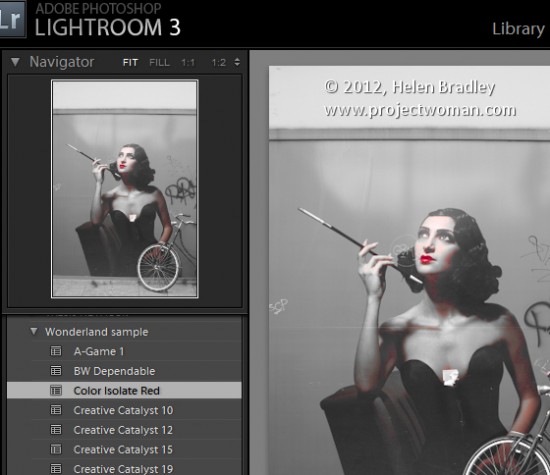
To begin, open an image in the Develop module in Lightroom. Without applying any other changes to the image, apply the Preset that you want to take to ACR. Here I have applied one of the free Wonderland presets from wonderlandpresets.com.

Export the Image

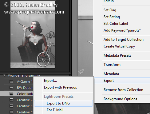
Now export the image as a DNG file so that the changes will be written to the file. To do this, right click the image and choose Export > Export to DNG and export the image to folder of your choice.

Open in ACR

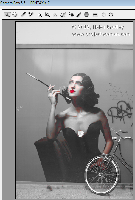
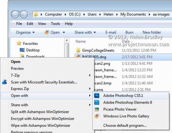
Launch Windows Explorer and locate the image on disk. Right click it and choose Open With > Photoshop CS5. Because it is a DNG file, it will open automatically in ACR.

Create the Preset

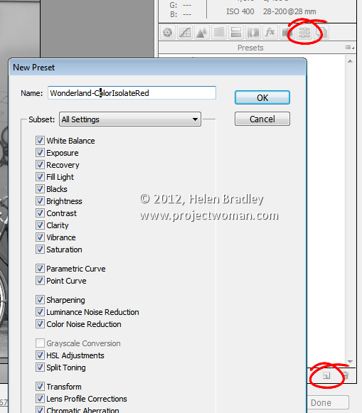
Click the Presets tab and click the Create New Preset option at the foot of the Presets panel. Type a name for your preset and then select the options that you want to include as part of the preset. Type a name for the preset and click Ok.

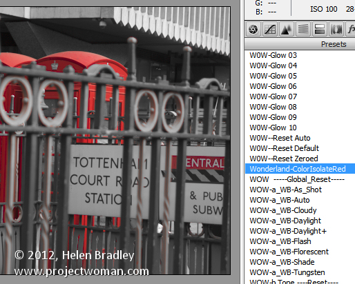
The preset will now be available from the Presets panel in ACR and will be able to be used to adjust any image.

Features not included

You should note that while most of the Lightroom adjustments that can be stored in a Lightroom Preset can also be saved as an ACR Preset, one exception is any Graduated Filter adjustment.

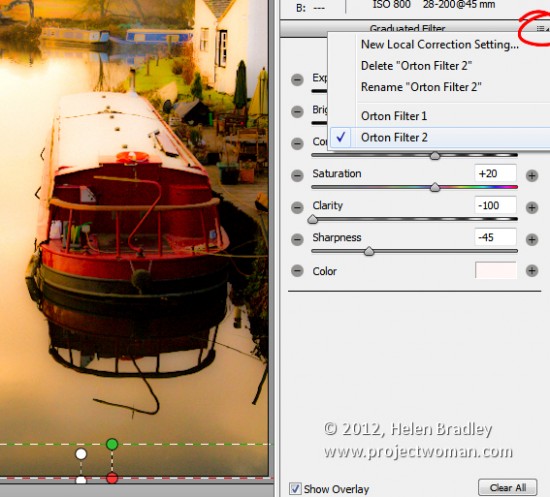
In Lightroom any adjustments you make using the Adjustment Brush cannot be saved in a Lightroom preset and in ACR those made using the Graduated Filter cannot be saved either. You will see the Graduated Filter adjustments that you made in Lightroom in ACR if there are any but you cannot save them in your preset as a Graduated Filter adjustment. What you can do however, is to save the settings for the Graduated Filter but not its placement as a separate setting. To do this, click the Graduated Filter icon in ACR to select the tool then click the Graduated Filter to save the settings for. Click the icon in the top right of the Graduated Filter panel and choose New Local Correction Setting and save it giving it a name.

You can apply this to an image in future using the Graduated Filter tool – just select the setting to use from this menu and drag to create the Graduated Filter for the image. The solution isn’t perfect but it can save you some work as shown here with the two Graduated Filters which are part of my Orton Preset for Lightroom. I can apply the preset then switch to the Graduated Filter and quickly apply the two Graduated Filter adjustments with their individual settings.

Advantages of taking Lightroom presets to ACR

One of the reasons you may want to take presets from Lightroom to ACR using this process is to take advantage of the free presets available for Lightroom. There are lots more of these than there are presets for ACR. If you use ACR as well as Lightroom then having your favorite presets available in both program will be useful.

Helen Bradley

Saturday, February 4th, 2012

Slideshow Titles with Identity Plates in Lightroom

Identity plates are one of the best kept secrets in Lightroom. There are lots of ways that you can use Identity Plates in Lightroom not only to customize the interface as I discussed in this post: http://projectwoman.com/2011/11/personalize-lightroom-with-identity-plates.html but also customize your print, web and slideshow applications.

In this post, I’ll show you how to create and use identity plates to create custom title and ending slides in the Lightroom Slideshow module.

Create a slideshow

For a slideshow, it is a good idea to start by placing all the images in a collection – then select the collection and switch to the Slideshow module.

From the toolbar choose All Filmstrip Photos to set up the slideshow with all those images.

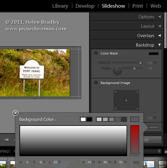
From the Template Browser choose the Default template. Chose a background color by opening the Backdrop Panel and choose Background Color and sample a color to use.

You can add a background color with or without a color wash. You can also set a background image – for example use an image from your slideshow with a reduced opacity as the background.

Here I have settled for a plain dark gray background.

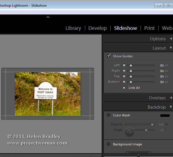
From the Layout panel select Show Guides and make sure Link All is selected and then drag in on the guides so you have some space around the images.

By unlinking the guides, you can set one guide to be smaller than the others – I like to make the top margin smaller than the others to push the images higher on the screen.

Use your Identity Plate

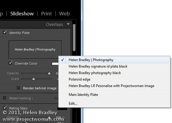
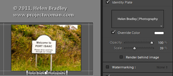
The first place you can use an identity plate is in the Overlays panel. This Identity Plate will sit on each slide and it will show as the slideshow plays. For this, I like to use a plain text identity plate so make sure Identity Plate is checked and then click the down-pointing arrow and select an identity plate that you’ve already created.

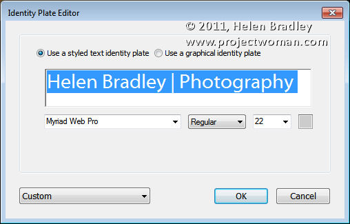
Alternatively, click Edit and type identity plate information into the box and then select it and select a font, font size and color. When you’ve done this, click the Custom button, click Save as and give your identity plate a name.

It doesn’t matter what color you have selected for the Identity Plate text because you can select the Override Color checkbox and select an alternative color for your text identity plate. Adjust the scale to a large value so that you can see the identity plate text on the screen, drag it into position and then fine-tune the scale and opacity to suit.

Identity Plate for a Title

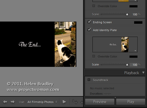
Another place you can use an Identity Plate is the Titles panel. Here you can add an Intro and Ending screen to your slideshow. While you could use a simple identity plate configured for the purpose, you can also use an image.

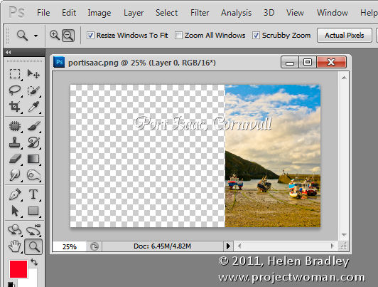
Here I have taken one of the images from the slideshow into Photoshop by right clicking it and choose Edit in Photoshop.

I cropped a portion of the image and used it to create an interesting starting slide for the slideshow. Here I added some text to the image to introduce the slide show. Where possible, it’s a good idea to leave as much of the image transparent as possible so you keep the file size small.

Size the image to approximate the size of the slideshow window – I used 1408 x 800 pixels.

Save the image in Photoshop as a PNG file so it retains its transparency. Later you can control the background color for the title slide by selecting a color from the Intro screen color selector rather than having the color already in the Identity Plate image.

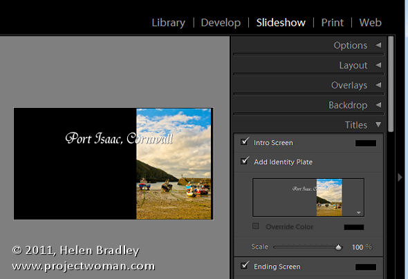
Now, back in Lightroom, in the Title panel click Add Identity Plate and select Edit and this time select Use a Graphical Identity Plate. Click Locate file and either drag and drop the image into the window or find the image on disk. Click Ok to load it as an identity plate – you may be prompted that it is very big – click Use Anyway to continue.

The image will appear for a second or two on the title slide and it will then disappear from the main screen but you will see it in the Titles panel. It will probably be too small so adjust the Scale slider to increase its size.

You can go ahead and create a similar graphical identity plate if desired for the ending screen.

By creating a second Photoshop image in the same way and importing it as a Graphical Identity Plate you can have a different and custom ending screen for your slideshow.

To view the slides and your new titles, click the first image in the slideshow and click the Play button.

Helen Bradley

Tuesday, April 26th, 2011

Permanently fix Word’s image insert behavior

I was at dinner the other night and talking computers with some friends. We were joking about Excel not being a word processor when the subject of images came up. And Lo! and behold someone suggested that Excel was a much better option to use than Word so far as images are concerned.

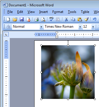
This has been a particular issue for me for years. You see Word inserts all images, by default as in line with text which is the option you’d probably never want to use.

I promised my friends to show them how to fix Word – permanently – so images get inserted as you’d want them to be – with a square wrap around. It’s a good starting point and my recommended default for Word. You can change the wrapping if you want but 99.9% of the time this is the setting you’ll want to use.

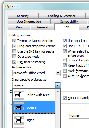
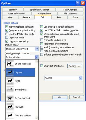
In Word 2003, choose Tools > Options > Edit tab and from the Insert/Paste Pictures as dropdown list choose Square and click Ok.

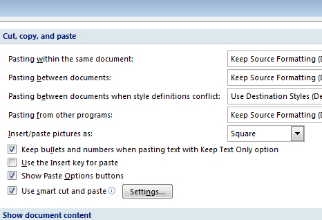
In Word 2007 choose File > Word Options > Advanced tab and locate the Cut, Copy and Paste group. From the Insert/Paste Pictures as dropdown list choose Square and click Ok.

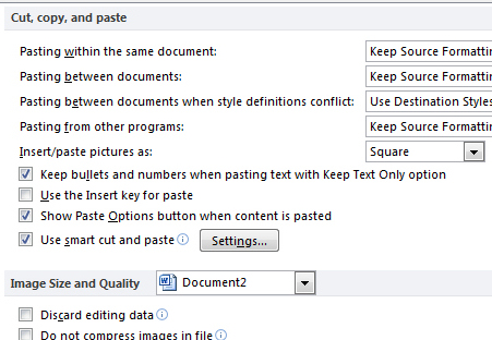
In Word 2010 choose File > Options > Advanced tab and locate the Cut, Copy and Paste group. From the Insert/Paste Pictures as dropdown list choose Square and click Ok.

Now you know how to fix it … spread the love and tell a friend!

Helen Bradley

Friday, November 26th, 2010

Crop an image to size in PowerPoint 2010

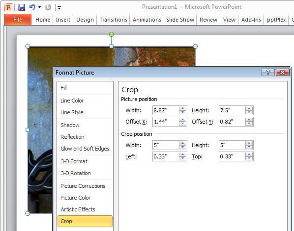
When you have an image in a PowerPoint presentation and you want to crop it to a specific size, click on the image, and from the Picture Tools > Format tab, select the Size and Position dialog by clicking in the dialog launcher in the bottom right corner of the Size group.

Click on the Crop group of options and then in the Crop Position area, type the dimensions that you want to crop the image to. Once you have done this, the image will be cropped to the desired size.

If there is not enough data in the image to crop it to that size, the image will be placed inside a placeholder the size you determined. Once you click Close to finish cropping the image you can increase the size of the image so it fills the placeholder by clicking on the Crop tool on the Picture Tools > Format tab and choose Fill. This increases the size of the image to fill the placeholder.

Helen Bradley

Tuesday, February 9th, 2010

Controlling Images in Word 2010

For many years now Microsoft has made it hard for new users to control inserted images in their documents.

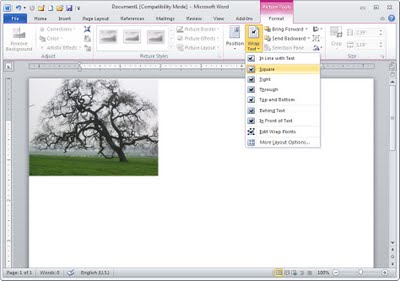
Unfortunately, Word 2010 is no exception and, by default, images are inserted into a new Word document as inline images. This means that they cannot be moved or easily positioned on the page without you needing to first change the image’s wrap settings.

This leaves hapless new users with absolutely no clue that this feature is available or needed much less where to find and set it.

To change the way that images are inserted into Microsoft Word documents to make it a one-step process that never needs to be tweaked, in Word 2010 choose File > Options and select the Advanced tab. Locate the Cut, Copy and Paste options and set the Insert/Paste Pictures As setting to Square, Tight, Behind Text, In Front Of Text, Through or Top And Bottom – in fact anything other than the default Inline With Text.

Once you’ve done this, when you insert an image into a document it will be inserted with the setting that you determined. This makes it easy to move the image around the screen and position it exactly where you want it to be.

If you have images in your document and if you need to change their wrapping so that you can work with them, click the image, click Picture Tools > Format and from the Wrap Text dropdown list, select Square or another setting (other than Inline with Text).

Microsoft, this default setting earns you a score of -10 it’s not the typically required setting and it doesn’t make good sense as a default.

Helen Bradley

Thursday, March 15th, 2007

Inserting Images in Word

In recent implementations of Word they broke the image insertion tool. When you insert an image it comes in as “Inline with text” which means it won’t move, it breaks up lines and, in general, looks awful.

Luckily it’s fixable and permanently so. To do this, choose Tools, Options, Edit tab. From the Insert/Paste pictures as dropdown list choose something like Square or In front of Text (in fact anything other than In line with text). Click Ok and the change will be permanent. Although you can, of course, always change the setting for any inserted image if you really do want to put it inline with text by selecting the option from the Picture toolbar on an image by image basis. My bet is you won’t ever do it though!

Helen Bradley

Tuesday, February 13th, 2007

Make room for graphics in Publisher

When you’re working on a Publisher document, chances are you may not have all the final images in hand. If you’re waiting on graphics, you can add a placeholder for each image to your Publisher file so you can allocate the space for the images and so everything else can be finalized in the meantime.

To do this, click Picture Frame and choose Empty Picture Frame then drag a frame into your document. Size it to the size required. Later, when the image comes in, you can add it to your placeholder by right clicking the placeholder and choose Change Picture, From File and locate the file to use.

Helen Bradley

Page 4 of 41234