This technique shows a quick way to create even complex layouts using selections and layers in Photoshop. It is simple to achieve for any one with advanced beginner skills or better in Photoshop.
Transcript:
Hello, I’m Helen Bradley. Welcome to this video tutorial. In this tutorial I’m going to show you how you can use Photoshop to make a reusable layout template. In a later video I’ll show you how you can go ahead and reuse that template.
This is the type of template that I’m going to show you how to create in this video and in the next video I’m going to show you how to populate it. Basically the template is made up here of a background layer which can be any color you like and you can also change the color if you want to. And into the template we’re going to put two black boxes and these later on are going to be filled with images. Here’s one image and here’s another. And it’s going to be done in a way that’s going to be very easy for you to limit the size of these images to match these black boxes. And then you can add copyright symbol.
Now I’ve got two in this particular template because I’m not sure whether I’m going to need a black one or a white one. And that will pretty much depend on what the images are that I’m using. So into this template I’m going to put both of them so they’re both available. So in this particular video this is the point at which we’re going to have the template created. We’ll have a backing, the two boxes and then two alternate copyright symbols that we can use. So let’s get started.
The first thing to do is to choose File, New and then make a size for your template. I’m using one that could be used for a blog so it’s a mere 650 by 300 pixels in size, 72 pixels per inch because this is going to the web, RGB color mode, and because I want a white background I’m just going to select Background Contents White. But we could color that later on if we wanted to, and I’ll just click Ok. And here is my new document. It has just a background layer.
The next thing to do is to add a guide that I’m going to use to make it just a little bit easier to make those black boxes. I’m going to choose View and then New Guide and I want this one to be at 40 percent vertical. So that’s a little bit more than one-third of the way across this document. Now I’m going to add a new layer by clicking the Add New Layer icon here at the foot of the layer pallete. I’m going to target the Rectangular Marquee tool. And making sure that I’m pointed to this new layer I’m going to drag over to create a rectangle. Now I’m going to do that again so that you can see that I start my rectangle here outside the edge of the image to make sure that I get all the image up to this line. And because View is set to Snap I’m snapping to this guide so I’m making sure that I’m filling this exact area.
I have black selected here as my foreground color so I’m going to press Alt Backspace or Option Delete on the Mac to fill my rectangle with that black color. Now I’m going to add another new layer and this time I’m going to choose Select, Inverse because what that does is to select everything that I didn’t have selected before. Now I’m going to fill this with black again, Alt Backspace, Option Delete.
Now right now I’ve got two black boxes. And if I turn off these guides, I’m just going to clear the guides, you’ll see that these two boxes in fact butt onto each other so they’re creating an entire document. That’s not what I want. I want a marker between the two of them.
So I’m going to click on the topmost layer, click the Move tool and then just tap with the right arrow key and I’m just visually deciding how much space I want between these two boxes. And I think that’s a pretty good amount. So having done that I’m just going to select a different tool and that will turn this off. So here I’ve got my two layers and my background layer.
And all I need to do now is to add the copyrights so I’m just going to choose File, Open Recent because I recently opened my black and my white copyrights. So here they are. I’m going to just pull these images out of the way so that I can see my main image. And this is the white copyright here that is selected so this is its layer. So I’m just going to drag and drop it into my image. It’s way too big but we’ll worry about that in a minute. I’ll close it down. And now this is my black copyright image and I’m going to drag and drop its background layer into my image. And again, it’s way too big too. I’m now going to select the black copyright layer here and I’m going to press Ctrl and T and then Ctrl and zero. And what that does is it lets me see my sizing handles because this image this copyright image is really, really huge.
So I’m just going to size it down so it’s going to fit better in this area here. I’m going to make sure that I click this link here so that it’s sized in proportion. And now I’m going to just drag it back to approximately where I want it to be and click the checkmark. I can hide that now. And now let’s focus on the white layer exactly the same, click the layer thumbnail to select it, Ctrl and T and then Ctrl and zero. Now I’m going to drag in on the sizing handles to make my copyright small enough to position it in place on my image. I’m just going to click this link again just to make sure that this is scaled in proportion and click the checkmark.
So this is my template. It’s all done and now I can save it. So I can choose File and then Save as and I would give it a name such as 40, 60 something, like that to indicate to me that this is a template that I can now use to create other documents in future. In the next video I’ll show you exactly how to do that.
I’m Helen Bradley. Thank you for joining me for this video tutorial. If you liked the tutorial please click Like. Think about subscribing to my YouTube channel and look at my website at projectwoman.com for more tips, tricks and tutorials on Photoshop, Lightroom, Illustrator, iPad and a whole lot more.
Create the Orton Effect in Lightroom with the Clarity Slider
The Orton Effect is named after photographer Michael Orton. This process results in a somewhat surreal image which has a slightly out-of-focus look while retaining lots of edge detail.
You can quickly give an image a faux Orton look using the Clarity slider in Lightroom. All you need to do is drag the Clarity slider to the left close to -100 and then, increase the Blacks in the image to an higher than usual value.
Of course there is a lot more to the Orton effect than this but this gives you a good start and, for many images, may be all you really need.
Give an image’s Midtones a Boost with the Clarity Slider
The Clarity slider helps you adjust the Midtones in the image so it adds Contrast to them which also results in them looking a little crisper and more saturated too.
It’s a great tool, but try not to overdo it. Typically, a Clarity adjustment of around 25 is a good choice for most images. In Lightroom 4 the adjustment has been tweaked a bit so you can add more Clarity in Lightroom 4 than you are perhaps used to doing in Lightroom 3.
Find Lost Details Hidden in Shadows and Darker Parts of an Image
When you have an image that has details lost in the shadows or darker areas of the image, the Fill Light slider in Lightroom 3 or the Shadows slider in Lightroom 4 can be used to recover this detail.
Don’t use either of these as a tool for lightening an image or to lighten shadows if there is nothing interesting in the shadows. Use them instead when you want to get some interesting detail out of the shadows.
The result of using the Fill Light and sometimes using the Shadow tool is that some contrast in the image will be lost – so you nay need to increase Contrast as a result of using the Fill Light slider in Lightroom 3 or apply a tone curve adjustment in Lightroom 4.
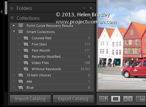
Undertand the Collections in the Catalog panel in Lightroom
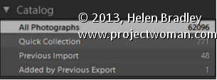
Some collections are created and maintained by Lightroom. You will find these in the Catalog panel in the Library module.
One of these, All Photographs, is a collection of all the photos in your Lightroom catalog. If you need to search all your images, click this before creating a search or filter.
The Previous Import Collection contains the images added to the catalog during the most recent import. As soon as new images are imported, the older images disappear from the Previous Import Collection.
Added by Previous Export is a collection of images you recently exported from Lightroom. When you did so, you selected the option to import the exported images back into Lightroom.
Quick Collection is a temporary collection that you can use to store images temporarily.
Understanding why you should use Collections in Lightroom
A Lightroom collection is different to a folder. A folder contains images but a Collection contains only pointers to those images, which exist somewhere on your disk. In Lightroom each image exists in just one folder but it might be in many different collections.
For this reason collections are a great way to organize your photos. For example, you can use collections to assemble images for printing or for creating a slideshow.
You can add images to a collection from one or many folders. So, collections are a great way to create a central location where you can view and work with a set of images that may be located in multiple folders on your disk. Because collections are merely pointers to your images they take up very little disk space.
If you have thousands of images to add a copyright watermark to, you can use Lightroom to do this very quickly. This video shows the workflow to use to import thousands of images into Lightroom and how to export them and create your own watermark to add to them. This is a minimalist workflow designed to process a lot of images very quickly.
Transcript:
Hello, I’m Helen Bradley. Welcome to this video tutorial. In this tutorial I’m going to show you how you can copyright in bulk the images as you export them from Lightroom. One of my blog readers recently contacted me and asked me how easy it would be to add watermarks to a series of images that they had. And so this video is for them and for anybody else who’s considering applying a watermark to a lot of images all at once. And my suggestion is, and she had something like two and a half to three and a half thousand images, is that Lightroom is the tool to use.
So I’m going to get started and I actually have a folder of images that I am going to import into Lightroom to show you exactly how it will work. So I’m going to click on Import and then I’m going to select the folder that contains the images that I want to import in. So this would be the folders that contain the two and a half thousand or so images that this particular reader has. So I’m just looking for my particular set of images. And I know they’re here. So all I’m going to do to start off with is just to select the folder of images. And it’s these Cornwall images that I’m going to import. Now I’m going to add them to Lightroom. And in this case because I want to do this very quickly because all I want to do is to add watermarks to them, I’m going to select Minimal as my previews because that’s going to render everything very, very quickly. And because I want lots of images I’m going to deselect Don’t import selected duplicates. So all I’m going to do at this stage is now to click Import and bring those all into Lightroom.
Now the images are coming into Lightroom and I can start getting ready as soon as they’re in to export them with their watermarks. Now some of these are portrait orientation and some of them a landscape. That may or may not be an issue. I’m going to select the first image and Shift click on the last so that we can export them. I’m going to Right click and choose Export and then Export again. And this takes me to the Export dialogue. So the first thing I need to do is to determine where I want to export them to. So I’m just going to put them into a folder in my My Documents folder. And I’m just going to create a brand new folder for them. But I’m going to select My Documents as the location, and I’m going to put in a subfolder called watermark. And then I will check if I want to rename my files. I don’t want to rename them. The idea of this is to get in and out as quickly as possible.
I can convert them if they were not JPGs and I could select the quality for them. Again 85 percent quality might be sufficient. If you’re that particular reader 100 percent quality might be your preferred quality. I can resize them or not. So if I want to leave them at the exact same size I just deselect everything.
What we’re most concerned about here is this Watermark option. So I’ve got it selected, and I’m going to click it, and I can choose Edit Watermarks. So this means that I can now create my own watermark. So I’m just going to delete what’s here. I’m going to press and hold the Alt key as I type out 0169 on the keyboard because that gives me the copyright symbol, and I’m going to type my copyright text. And I’m going to do two lines. And it’s Helen Bradley, projectwoman.com. And you can see it up here and it’s up there because that’s where I’ve got it positioned right
now. Here’s the anchor. If I wanted it down the bottom corner I could place it there. And then there’s an inset which is inset off that option.
So I could push it further down into the corner if I wanted to or not. It looks like it’s also centered right now. And no it isn’t. It’s right justified. So we could left justify it or center it if we wanted to. And we can also resize it either by dragging on its sides or we can drag it just to make it bigger if we wanted to. So I’m going to inset this a little bit horizontally and a little bit vertically. But you could see that we have a lot of power in where we place it.
Its opacity is 100 percent. And I always suggest that you do apply a shadow to your text because the shadow will help its readability if it’s over a lighter background. So I would normally put a very, very small shadow. And you can change the angle so that you can make the shadow come from whatever angle that you want it to come from. I prefer mine to come from about 30 to 45, something like that, so it’s coming in from this angle here. And if you’re happy with that that’s all you need to do. So you click Save. And we’re going to save this. And we’ll call it test watermark, you can call it whatever you want your watermark to be called, and I’ll click Create. And it’s now being selected as the watermark for my images.
I’m going to select to after export to show in Explorer. But literally at this point we could have two and a half or three and a half thousand images selected and they would all be ready for export. And all I do is click Export and now they’re going out. They’re exported out of Lightroom. And when they appear in that folder in My Documents, which we’re going to see in a minute, here it is now, they’re all going to have the watermark on them. So if I double click on this image we’re going to see that the watermark is in place.
So that’s how easy it would be to apply a watermark. If that were all you wanted to do and you had thousands of images to do it with, that’s all you need do to watermark your images. Bring them into Lightroom, don’t even bother rendering big previews, just use the minimal, select to export them, click and create your watermark and then just click Go and Lightroom will just go and do it all for you.
I’m Helen Bradley. Thank you for joining me for this video tutorial. Please if you have any questions feel free to pose them to me. I’m quite happy to make videos to answer questions. Look out for more of my videos on this YouTube channel. And follow me at projectwoman.com where you’ll find more tips, tricks and tutorials for Lightroom, Photoshop, Illustrator and a whole lot more.
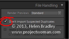
Avoid duplicate images in Lightroom by importing Only New Images
There is little that is more annoying than having duplicate images in your Lightroom catalog. Duplicate images not only take up room on your disk but they also bloat your catalog and can cause confusion when you are working with your images.
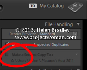
To ensure that you don’t import images that are already in your catalog, enable the Don’t Import Suspected Duplicates checkbox in the Import dialog. With that setting enabled you will no longer be able to select to import images that are already in the catalog. So any images that you can select to import aren’t duplicates so it is safe to import them.
This feature is particularly useful when you only want to import images from a camera card that you haven’t previously imported into the catalog.
Create a cancelled postal stamp watermark to use in Photoshop and Lightroom. See how to use the path tools to create the watermark and then save it as a png image with a transparent background so it can be used over your images.
This is the video explanation of the blog post on the same topic which you can find here:
Transcript:
Hello, I’m Helen Bradley. Welcome to this video tutorial. In this tutorial I’ll show you how to create a postage style copyright stamp that you can use on your images. In this tutorial I’m going to show you how you can create a copyright symbol like this which is a couple of concentric circles and some wavy lines and text. And it’s got an overall texture to it.
This is a tutorial that I created for digital-photography-school.com when one of my readers there was having a bit of difficulty following along. So that’s why I’ve created this as a video tutorial. And because of this I’m going to be doing it step-by-step as I did it for that particular tutorial on the Digital Photography School site. And you’ll see in the comments here just below the tutorial I’ve given you a link to that site if you want to follow along.
So the first thing that I did in that tutorial was to create a brand new image. So I’m going to do that now. I’m going to choose File and then New. And I’m going to do a letter size image, landscape. So it’s 11 inches wide by 8.5 inches tall, and it’s 300 pixels resolution, RGB color and the background contents are white. So I’m just going to click Ok. And here’s our starting image.
Now we’re going to add a new layer so I’m going to have my layers palette visible. So if you don’t have it visible choose Window and then Layers so that you can see it. And we’re going to add a new layer and we do that by clicking this little icon here. It’s the Add New Layer icon. It looks like I clicked it twice. So I only want one new layer here. And we’re going to draw our circles using the Ellipsis tool. And it’s here in the toolbar so let’s just have a look and see what we’re looking for.
We’re looking for this tool here. It’s the Ellipsis tool. And when you choose it you want to choose Paths from the tools option palette. Now the options are a little bit different in earlier versions of Photoshop. There are three icons here and you want to make sure that you click the icon that says Path when you mouse over it. They’re the exact same options. They just deliver differently. And this is Photoshop CS6’s version so I have Path selected.
I’m going to drag to draw an ellipsis, but you can see that this is going to be a sort of oval. I want it to be a circle so I’m going to hold Shift as I draw it. And if it’s not in the correct position before I let everything go I’m going to hold the Spacebar and move it into position, let go the Spacebar and just make sure that I have the outermost of my circles created. And when it’s dead right, I’ve still got the Shift key held, I’m going to let go of my Left Mouse button.
So now I have a circle the shape of this outer circle that we’re going to use. Now this is now going to be colored in and we want to stroke this circle. And we do this by going here to the Paths palette. Now the Paths palette you get to by choosing Window and then Paths. And the topmost path is going to be called your work path and that’s the one that you’re working with. This is this circle here. We want to stroke the circle with a brush so we’re going to go and select a brush to use.
So I’m going to click on my Brush tool and then I’m going to select the kind of brush that I want to use. And I’m going to use a hard sort of brush here. So I’m going to select that brush. It’s a hard brush. And let’s just check and see from the original tutorial just how big it needs to be. And apparently it needs to be 40 pixels. So let’s just take it up to around 40 pixels. That’s 39, but that’ll be fine.
I’m going to set black as my foreground color. So I’ve set my brush and my foreground color and what I want to do now is with this path selected I’m going to choose the option that says Stroke Path with Brush. So that’s this icon here. So I’ll click it to stroke the path with a brush. Now I’ve got a funny sort of stroke here and the reason is that my stroke is set to something I don’t want it to be set to. So let’s just wind that back with Edit, Undo.
Then I’m going to right click on this Path option here and choose Stroke Path. And I want to disable this option here, Simulate Pressure. I just want to stroke it with the brush so I’m going to click Ok. Now it’s working the way I want it to. So now I have my path stroked, well at least the outside stroked. Now I need to use the outside to make the inside because it’s going to be really easy to make a concentric circle. To do that I’m going to click on this tool here. It’s the Path Selection tool.
This is the one I want and it shares a position with the Direct Selection tool. But it’s the black one, the Path Selection tool that I want, and I’m going to click on my path so it is selected. Now I want to transform this. And the transformation handles have not appeared so I’m going to press Ctrl T to make them appear. I want to drag in on this handle. But I want to make sure that I don’t lose the circle and I want to make sure that I don’t lose the fact that it needs to be concentric. So I’m going to just hold down both Shift and Alt as I drag in on this handle. So let’s Shift Alt and drag inwards. And you can see that what I’m doing is making a concentric circle. It has the exact same middle as the original circle. I’m going to let go of my Left Mouse button and then let go of the shift and the Alt keys. Now my work path here is a much smaller path so I’m just going to click the checkmark here.
Now I’m going to do exactly the same thing. I’m going to select my brush and I’m going to stroke it, make sure black is my foreground color, and I’m going to stroke this path with the brush. And I get the exact same effect. Now what I need to do is to make a path for my type. And it needs to be a little bit bigger than this inside circle. So again, I’m going to click this Path Selection tool. I’m going to press Ctrl and T to show my handles, I’m going to hold down Alt and Shift, that’s Option and Shift on the Mac, and this time drag out just a little bit so that I get a path for my type, let go of the Left Mouse button, let go the rest of the keys and click the checkmark. Now I’m going to add my text. And to do that I’m going to select my Text tool and then select my type. And I want to use Myriad Pro.
So I’m going to go down here until I find Myriad Pro. And I think the type that I suggested in the article that we used was about 24 points so I’m going to click that. I have black as my type color. So everything looks pretty good. I’m going to hold my mouse over the line, over this path that is still selected, and when I do you’ll notice that the I-beam pointer changes from this I-beam to an I-beam with a short of squiggly line. That means I’m typing on the path. So I’m going to click to do that.
Now the first thing I need to do is to add my copyright symbol. So I’m going to hold down the Alt or Option key and type out 0169 on the keyboard because that gives me copyright, and now 2013, and I’m going to type my copyright details. And I think I’ll do this all in capitals. And I’m using Helen Bradley, projectwomam.com. And I think actually I just want to put a www in there so I’ll just arrow back and make that change.
Now so far my type hasn’t quite stretched all the way around my words. So the next thing we need to do is to stretch it just a little bit more. And I’m going to do that using the Character Spacing tool. So first of all, I’m going to make sure that all my text is selected and then I’m going to choose this dialogue here which will get me to the Character Spacing dialogue. Now this is two dialogues.
There’s a paragraph and a character, and we want the character. And what we want is this tool here, this VA tool. And it’s a scrubby slider so all I need to do is to adjust it a little bit. And can you see that the text is getting bigger every time I drag on it? And I think I’m going to wind that back just a little bit because I could probably add a trailing dash to this. And that’s now all the way around that shape. And let’s just up that to bold because I don’t think it’s really quite dark enough for me. And if I’m using bold I’ll going to have to wind back up on my character spacing a little bit. And so now I’ve created my text on a circle.
Now the only thing that I’m a little bit concerned about is I think that this circle could be a little bit smaller. So I’m going to reselect my text layer here, and again with Alt and Shift selected, I’m going to drag inwards just a little bit to resize that circle path that the text is on because I just think it was a little bit on the big side. So I’m a little bit happier with my text now.
So we’re ready now to go ahead and to create the wavy lines. And we’re going to do that by clicking on the Custom Shape tool here that shares that toolbar position with the Ellipse tool that we used earlier. But this time we want Custom Shape. And from the Shape dropdown list here what we’re looking for is this wiggly line wave shape. Now this is shipped with Photoshop so you will have the wave shape. If you don’t have it in your collection you can click this little fly out arrow and choose All to add all the shapes or append all the shapes to your shapes collection. But this is the one we’re using.
I’m going to drag the shape onto my image and then use the Path Selection tool to just move it into position. Now at the moment it’s a series of closed paths and I want to open these paths. And I’m going to do that by clicking here on the Add Anchor Point tool. Unfortunately you can’t just delete points in Photoshop to open up these curves.
We first of all have to add a point in here that we can then go and delete to open it up. It doesn’t work otherwise. It’s a bit of a nuisance. But this is how we’re going to do it. So I’m going to click once with this Add Anchor Point tool on the ends up all of the shapes. And now I’m going back to the Direct selection tool. And I’m going to make sure that I’m selected on this point that I just added, so it’s black and everything else around it is not, and I’m going to press the Delete key. And that will just break that path in two. And I’m going to repeat that for each of these points.
So select it and press Delete, select it, press Delete, select it, and press Delete. Now if Photoshop is running out of memory if you’ve been using it quite a bit, you might find as I just did earlier that that was not working. Every time I pressed Delete the entire path was going. So I just closed down Photoshop and reopened it and went back to where I was working and it’s working perfectly. So now I have my lines. And you’re probably beginning to see a pattern here because this is just another path. And we can stroke it because we have our tool that we can stroke it with.
So I’m just going to go back and make sure my brush is selected. The same brush is selected, black paint, click on the work path so that I have it selected and now I’m going to stroke it. And that is giving us our lines. And so if you wanted to leave it at this point you could because everything is in place. But I’m going to go ahead and add a Grunge effect to it.
Now we’re ready to create our Grunge effect. And to create that, first of all what we need to do is to flatten the image. But in flattening it I need to remove the white layer from the flattened version. That is because later on when I will put this copyright image over my photograph I want the background to be transparent. So I want to keep this white layer out of the action right now. So I have two visible layers. I’m going to click on the topmost layer and press Ctrl Alt Shift and E to create a new flattened version of this layer. So this is the version that I’m going to use. And now I’m going to bring in a texture layer.
So I have a texture image open here, and I think it’s a really nice texture to use. So I’ve got the texture open. And to add the texture to this particular layer I’m going to select the layer and click the Add Layer Mask icon because that adds a layer mask to the image. And now this texture has to be made the exact same size as this image so I’m going to choose Image and then Image Size. And I want to resize it to the exact same size as this one.
So I can do that by just clicking Window and just pointing to the image whose size I want to borrow. And that’s apparently the size of this image here so I’m just going to click Ok. And because it’s a texture image it doesn’t matter that I’m skewing it a bit out of proportion because nobody really knows what a scratch is supposed to look like. Having done this, and it’s critical that you resize the texture to the exact same size as this image or you can’t use this next technique, which is to apply the texture as a mask.
So I’m going to click on the mask, and I’m going to choose Image, Apply Image. And if you don’t have the texture file the exact same size it will not appear here. So it does obviously appear here so that’s exactly what I want. I want to apply the texture to the image. And at the moment it’s set to Multiply blend mode. But I can test other blend modes and I can even test inverting the layer. So I’m just going to look for the best effect that I can get here.
In fact in the tutorial I suggested that we use Hard Light. So that looks like the one that we’re going to use, Hard Light. So I’m just going to click it and click Ok. And that gives us the sort of texturize look to our shape. And again, I was going to create this as a new layer so I’ll click on this layer and again press Ctrl Alt Shift and E to gives me a newly stamped layer. Well it’s not appearing to work right now. So let’s just add a new layer and press Ctrl Alt Shift E because that will work. And then we’re going to save this as a PNG image. But before I do it I think it’s going to be cropped because I think it’s a bit too big at this stage.
So I’m just going to crop down to get rid of the bits of the image that I don’t want and click the checkmark. And now I’m going to save this but making sure that I have this background turned off because I want it to be a transparent image. So I’m going to save it as a PNG image. So I’ll choose File, Save as, and I’m going to call this HB copyright, black, and PNG. And I’m going to make sure that I select PNG from this list here. And here’s PNG. So I’m going to select it and just click Save and click Ok. And that’s now saved as a PNG image.
Having done that I then want to make it white. So I’m going to choose Image and then Adjustments and then I’m going to invert it so what was black becomes white. And now if I just test this with a black filled layer behind it, you’ll see that it’s now a white image. So we could use that to go over the top of for example a very dark image.
So having created that I’m going to turn off my background because I want this to be a transparent image, and I’m going to resave it this time as a PNG. But this time I’m going to call it white. So again, this is going to be HB copyright, and it’s going to be white, PNG. I’m going to save it as a PNG image, and Ok. And so this is now the copyright image that I can use on my images in future.
I’m Helen Bradley. Thank you for joining me for this video tutorial. And look out for more of my tutorials both on digitalphotographyschool.com and also on my own website at projectwoman.com.
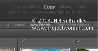
You have four import options for your photos – Copy as DNG, Copy, Move and Add. In some circumstances, not all these options are available – for example, you may choose Copy or Copy as DNG when importing from a camera card but you cannot select Move or Add when you are importing images from a card.
When you select one of these options that choice may affect the other options you have. For example, if you choose Add to add images to the catalog from a folder, you cannot choose to back up your files at the same time. You can also not convert RAW images to DNG if you are adding them to Lightroom.
So, if you want to convert images, or back up, or rename images as you import them, it is best to import them direct from your camera card. Copying them into a folder on your disk before adding them to your Lightroom catalog diminishes your options when working with your images.