Wednesday, November 9th, 2011

Personalize Lightroom with identity plates


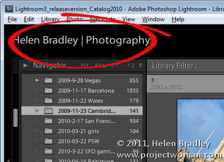
If you’re a professional photographer, teacher, someone who routinely shows off images in Lightroom or if you just like the personal touch, why not personalize your Lightroom interface? The Lightroom branding which appears in the top left corner of the screen is customizable using the Lightroom Identity Plate feature. Identity Plates are usable throughout Lightroom to brand your prints, slideshows and some web sites but what suits one of these modules won’t necessarily work for customizing the interface.

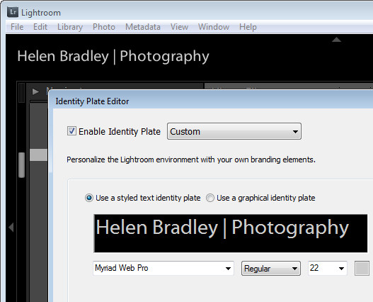
The Identity Plate that appears in the top left of the Lightroom screen is configured by selecting Edit > Identity Plate Setup (on the Mac choose Lightroom > Identity Plate Setup).  To create a simple Identity Plate, choose Use a Stylized Text Identity Plate and type the text into the text area. You can select and format the text in the font, font size and color of your choice. Click the Enable Identity Plate checkbox and the changes you make will appear in place so you can check how they look. You may need to size the text to fit the space – Lightroom won’t scale it to fit automatically.

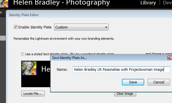
To save the Identity Plate, choose Save As from the dropdown list and type a name for the Identity Plate. You can then select and use it in one of the modules later on – for example you can add it to a print layout.

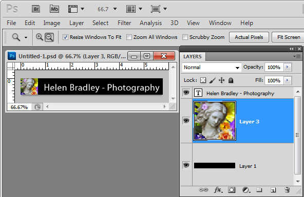
If you prefer to use graphics in your design such as your signature or a graphical design element you can create a graphical Identity Plate in another application such as Photoshop. The file you use should be no more than 60 pixels in height so it fits in the space available – there is no option to scale it to a smaller size, for example. For this reason, if you plan to use a Graphical Identity Plate such as this for more than just customizing your Lightroom interface you will need two of them – one small image for customizing Lightroom and another one sized appropriately for printing at a high resolution.

When creating your Identity Plate in an application like Photoshop, build it in a layered file and make sure the bottom layer of the document matches the color of the Lightroom interface – ie make it black. This way you test the Identity Plate to make sure it will look good when placed on a black background. Then turn off the visibility of the black background layer and save the file as a .png, .psd or another format that maintains transparency (not jpg). If you save as a .jpg image the transparent background will be white and you will probably also have small unsightly artifacts in your design.

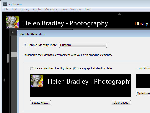
Back in Lightroom, open the Identity Plate Editor and choose Use a graphical Identity Plate, click Locate File and browse to find the file on disk.

Save this Identity Plate so you can always reuse it if you change the Identity Plate in future.

You can use this same process to create a transparent image in your graphics program to use as a graphical Identity Plate for the other modules. In that case make sure that the Identity Plate is created at an appropriate size for printing. Crop closely around the image so that it can be easily sized and moved into position later on. You need to do this because it is not possible to size an Identity Plate any larger than the screen or page size and you cannot skew an Identity Plate out of shape when resizing it – its proportions will be constrained as it is sized up or down.


Helen Bradley

Thursday, November 3rd, 2011

Photoshop CS5: Oil Painting with Pixel Bender

One of the cool new tools from Adobe Labs is Pixel Bender. This free extension lets you apply any one of a series of filters that comes with the extension to your images in Photoshop CS5. But that’s not all – Adobe also provides a simple interface for Pixel Bender that lets you create your own filters. As a result a community is building around Pixel Bender with users sharing custom created filters with others. In this post I’ll show you how to get started with Pixel Bender.

You will find the Pixel Bender extension here for download: http://labs.adobe.com/downloads/pixelbenderplugin.html this is the version for Photoshop CS5 and CS5.5. Go to this site to find the Pixel Bender download for Photoshop CS4 you will see the link in the top right of the page. Make sure to download the version that matches your operating system and your version of Photoshop CS4, or 5/5.5 (32 or 64 bit). The extension is an .mxp file and you need to install it using the Adobe Extension Manager.

You can install the extension by double clicking on the file to launch the Adobe Extension Manager. If you’re using Windows Vista or Windows 7, you should run the Adobe Extension Manager as an Administrator. So, from the Start menu, locate the Adobe Extension Manager entry, right click it and choose Run as Administrator. The reason for this is that the extension needs to be placed in a folder that you can only access if you have administrator privileges. If you launched the program manually choose File > Install Extension and locate and select the extension that you just downloaded.

Accept the license terms and the extension will be automatically installed inside the appropriate Photoshop CS5 program folder.

When you’re done, close the Extension Manager, close Photoshop and reopen it.

Pixel Bender won’t work on images larger than 4096 x 4096 so start by resizing your image if necessary. If desired, you can convert an image to a Smart Object before applying a filter.

To run Pixel Bender open an image and choose Filter > Pixel Bender > Pixel Bender Gallery. You’ll see a list of filters in the dropdown list which currently displays CircleSplash. Select the OilPaint filter and then adjust its settings. Using Stylization, you can adjust the length and bend of the brush strokes – the larger values look best.

Cleanliness will adjust the smoothness of the effect and typically looks good at around 7 or 8. Colorization allows you to apply more or less color to the image. BrushScale changes the size and length of the darker brush strokes – a small value gives thin long lighter brush strokes and a larger value gives shorter thick very dark brush strokes. BrushContrast will adjust the contrast of the brush strokes and is probably better left at a value approaching 1.

In short, adjust the sliders until you get a result you like. If you are unsure how a slider is affecting the image drag it all the way to the left or right to see the effect. Then adjust from there.

When you’re done, click Ok to apply the result to the image. Unlike most filters which convert images to look like an oil painting, this one does well at identifying edges in the image so the painting looks more realistic.


Helen Bradley

Friday, October 28th, 2011

3 Cool tips for working in Adobe Bridge

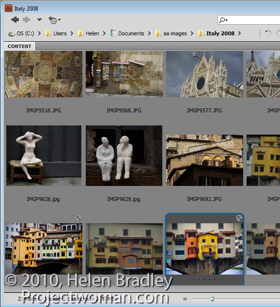
Do you open photos direct into Photoshop or do you use Bridge? If you don’t use Bridge, there are some good reasons for changing your habits. You may not realize it but some of how Camera Raw behaves depends on whether you open an image from Bridge or from Photoshop. Here’s how:

Freeze Photoshop or not?

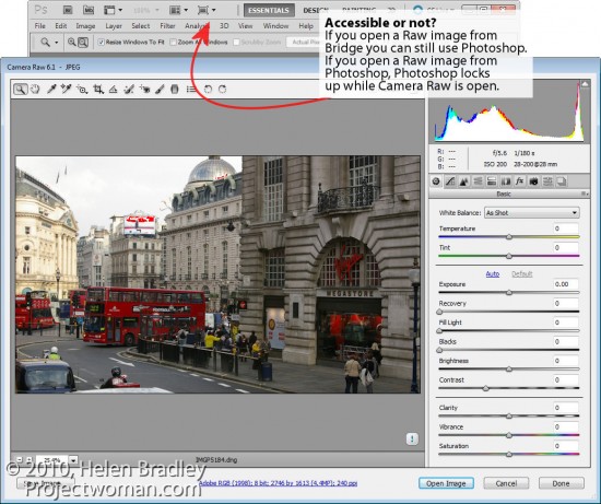
Open a Raw image in Photoshop and it opens, of course, in Camera Raw. But look at the screen – Photoshop is open but the window is frozen. You can’t minimize it and you can’t work in Photoshop at the same time as work in ACR.
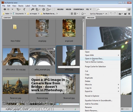
Close the image and now do the same thing from Bridge – right click a Raw file and choose Open in Camera Raw. See the difference? When you open a Raw file from Bridge it opens in Camera Raw but without seizing the Photoshop window as well. You can still work in Photoshop at the same time as you work in Bridge.

In short, if you want the best of both worlds – Photoshop and Camera Raw then head to Bridge to open your images from there.


Bypass Camera Raw

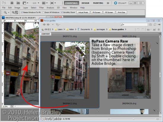
If you’re in Bridge, you can bypass Camera Raw entirely and open a Raw file direct in Photoshop by holding the Shift key as you double click the image in Adobe Bridge. The image opens automatically in Photoshop. This is handy, for example, if you’ve already processed an image in Camera Raw in the past and if you now want to work on it in Photoshop.


JPGs to Camera Raw

In Camera Raw you can make adjustments and craft images often much more quickly and easily than you can in Photoshop. This being the case, you may want to use Camera Raw for your JPG files as well as your Raw files. In Photoshop CS3 and later versions, you can open any JPG in Camera Raw by right clicking the JPG in Bridge and select Open in Camera Raw. You can’t do the same thing from inside Photoshop.

As a bonus the changes you make to JPG images in Camera Raw are undoable. So, for example, if you convert a JPG to greyscale in Camera Raw and click Done, the photo will show as greyscale in your Bridge thumbnails. However, open the JPG in Camera Raw again and you’ll see the changes aren’t permanent – you can undo them and return the image to full color – don’t try that in Photoshop!

So, if you’re not using Bridge – there are three good reasons for considering changing your workflow habits.

Helen Bradley

Monday, October 24th, 2011

Lightroom toolbar techniques

If you’ve seen items come and go in your Lightroom interface and if you’re confused about what exactly is happening chances are you hit a keyboard shortcut that displays or hides one of the interface features. When I was new to Lightroom it was the Toolbar – I could make disappear in a heartbeat – problem was it took a lot longer to work out what had gone and how to get it back.

As I soon learned, the toolbar can be hidden and displayed using the T shortcut or you can choose View > Toolbar. The toolbar is visible in Library, Develop, Slideshow, Print and Web view – but here’s the catch – there is a separate toolbar for each module and hiding one doesn’t hide them all – likewise displaying a toolbar only does so for the current module not all of them.

That said, you’ll want to have the toolbar visible in most of the modules most of the time because it has some handy features that you will use regularly.

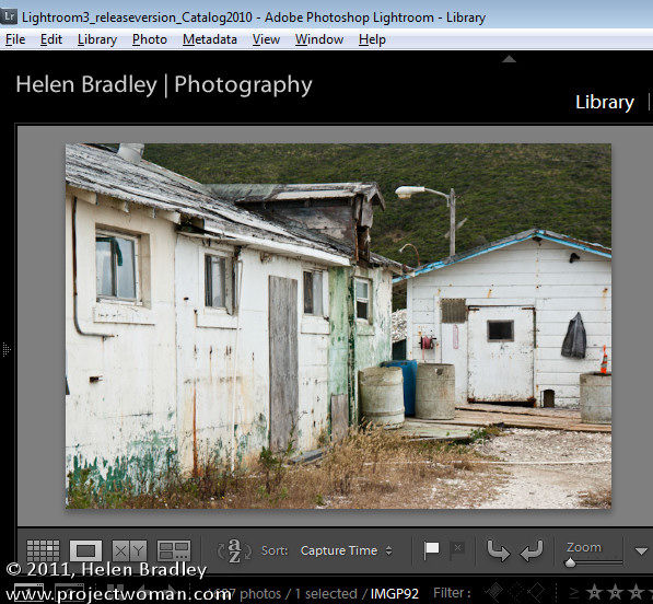
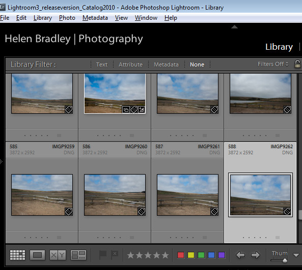
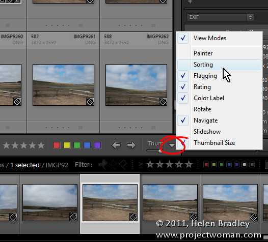
The toolbars in the Library and Develop modules are customizable – those in the other modules are fixed in what they display. To add to the general confusion, the toolbar you see in Grid view and the one you see in Loupe view in the Library module are both toggled on and off as if they were the same toolbar but they are separately customizable so you can select which tools appear in which view and they can look very different in each view as shown in these images of firstly Loupe view then Grid view:

To customize a toolbar click the down pointing arrow at its far right and select the options to display and hide. When you are working on a laptop, for example, and where screen real estate is a valuable commodity, you’ll need to be judicious about what tools are visible and which are not.

One option on a laptop that I like to disable is the rotation tool in Grid view in the Library. The reason is that I can set the thumbnails in Grid view so they show rotation icons so I don’t need the additional tool on the toolbar. However, in Loupe view this rotation tool doesn’t appear so I add it to the toolbar.

If you often resize your thumbnails then including the Thumbnail Size slider is a good idea – if you need the space it takes up for other tools then hide it and learn the = and – shortcut keys for managing the thumbnail size instead.

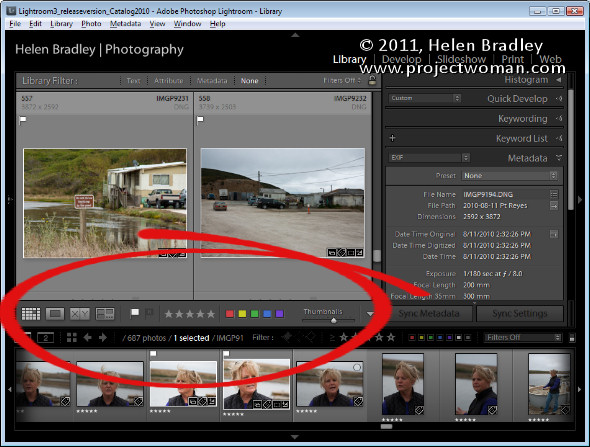
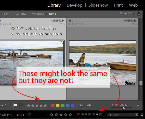
One gotcha that is a guaranteed disaster in the making for new Lightroom users is the apparent duplication of rating, color and flags on the Toolbar and on the bar across the top of the Filmstrip. These are NOT duplicates and instead they are each very different options. The tools on the Toolbar are used to apply a flag, color and rating to images in the Grid or Loupe views. Those above the filmstrip are filters that you use to filter your images based on the flags, colors and ratings you have applied to them. It is important to understand the difference. If you get into trouble and some of your images disappear, selecting Filters Off from the dropdown list above the filmstrip will display all your images again.

Helen Bradley

Wednesday, October 19th, 2011

Photoshop: Working with Locked Pixels

If you’ve ever wondered what the small icons in the Layer palette do, you might be surprised at how useful they can be. Here’s what the Lock Transparent Pixels icon does and how you can use it.

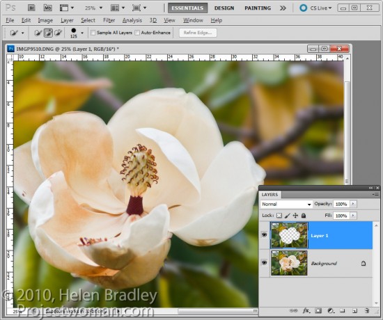
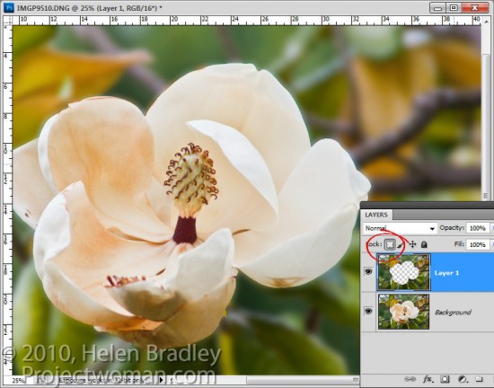
There are times when you are working with content on layers in Photoshop that the layers can do things that you don’t expect them to do. For example, in this image, I have extracted the background to a layer of its own by selecting it and then choose Layer > New > Layer via Copy.

I now want to blur this layer so if I select it and apply a Gaussian blur filter to it, you will see that the Gaussian blur filter pushes the background over the edges of the flower.

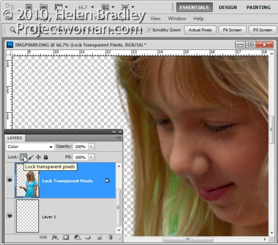
This time, instead of selecting the layer contents I selected the Lock Transparent Pixels icon in the layers palette.

Now when I apply the same heavy blur filter you’ll see that the edges of the background are maintained.

The layer is blurred but only the area that was covered by the original pixels is blurred and the blur isn’t permitted to ‘bleed’ into the area that contains fully transparent pixels.

This option is useful when painting over details to change their color. For example, when you photograph someone against a green screen background you will find hairs and areas around the very edge of your subject may have a green tinge.  Or when you extract a subject, like a building, photographed in bright sunlight it may display some chromatic aberration around its edges.

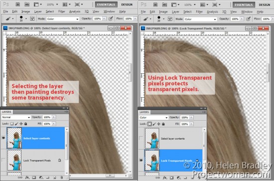
If you select the layer by Control + Clicking on it (Command + Click on the Mac) and sample a color from adjacent pixels you can set the Brush to Color mode and paint over the edges. The problem is that, as you paint, the color is built up on partially transparent pixels which, if you paint too many times, begin to lose their transparency.

If, on the other hand, instead of selecting the layer, you click the Lock Transparent Pixels option and then paint with the brush set to the same Color blend mode and sampling colors from the image as you go, you’ll paint out the problem colors but without affecting transparency.

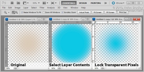
The same option can be used when you fill a selection with a foreground or background color by pressing Alt + Backspace (Option + Delete on the Mac). If the selection is partially transparent and if you simply Control + Click on the layer to select it, the more you fill it the more transparency is lost. On the other hand, if you select Lock Transparent Pixels you can fill it over and over again and no transparency is lost.

In short, using Lock Transparent Pixels ensures that an object on a layer can never become more or less transparent than it was when first created and that its edges won’t change if you, for example, add a blur to it.

Helen Bradley

Tuesday, October 18th, 2011

How to set up your PC and your iPad for the free iWork and iCloud

If you have an iPad and if you have upgraded to the new iOS 5 then you can take advantage of the free iCloud and iWork tools for synching files and storing them in the Cloud. iCloud allows you to synch not only photos but also data such as files across your devices. So you can use this new technology to share Microsoft Office documents with Numbers, Keynote and Pages on your iPad. And you do this on your PC using a browser and by passing iTunes – something I for one am really glad about.

So, if you’re using a Windows PC, you can automatically access documents that have been sent from the iPad to the iCloud without needing to plug your iPad into your computer or use iTunes. It is a long over due technology and it provides a more professional approach to the task of file exchange – not to mention it will solve the problem that some users experience where their network administrators block iTunes.

Getting this all configured is simple but it is far from intuitive. Nowhere could I find step by step instructions so I had to piece this stuff together bit by bit. Hence this post – it will explain all you need to do. From start to finish, I’d allow about 1.5 hours – if you finish early that’s a bonus but none of this stuff is totally trivial so allow time to get it all done.

Start by updating iTunes to 10.5 on your PC. If you haven’t done this – you do this from inside iTunes. Then, connect your iPad to your PC and update the iPad to iOS 5 – this might take some time depending on how much data you have on your iPad as everything will be backed up – then reinstalled once the operating system is updated.

While iTunes is updating and iOS 5 is being configured, you can – on your PC – visit the Apple site at http://support.apple.com/kb/DL1455 and download and install the iCloud control panel for Windows.

Back on your iPad when everything is running again, go into Settings and create your iCloud account.

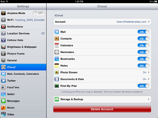
On the iPad, in Settings > iCloud you can set up syncing for email and other items such as your Photo Stream and Documents & Data. For Documents & Data you have a choice of using your cellular data plan to upload or Wi-Fi only – for your Photo Stream you can only synch this using Wi-Fi.

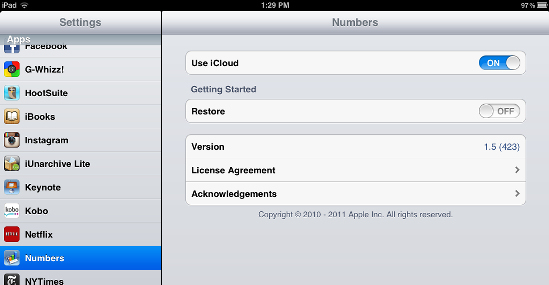
If you have Numbers, Pages and/or Keynote installed, in Settings select these each in turn and enable the Use iCloud option – you need to turn this On before any of these apps will access iCloud.

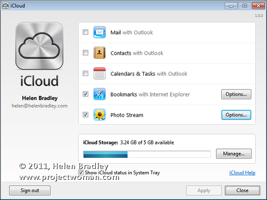
iCloud can be accessed on your PC by opening the system tray and clicking on its icon – if it isn’t there, choose the Start menu and type iCloud. Use the settings to configure how and what you want your iCloud and iPad to share. For example, click Photo Stream and configure a folder for images to upload to the iPad and one to use to download into. On the PC you can select whether email, contacts and Calendars & Tasks should be shared with Outlook. I suggest you backup your Outlook pst file before you even consider enabling this!

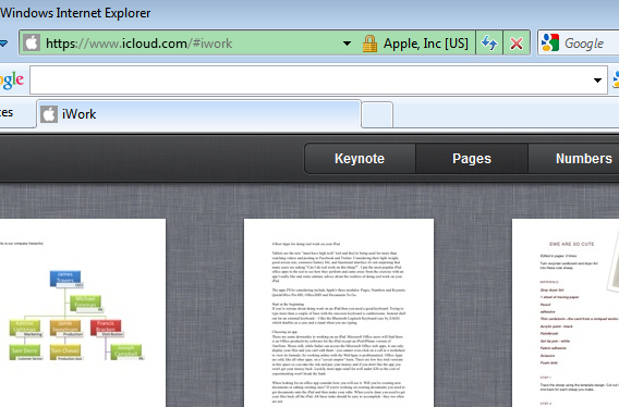
So far you have everything working except your documents. For this, confusingly enough, you head back to your PC and crank up your browser and visit www.icloud.com. Sign in using your Apple ID. If prompted you should download and install the browser plug-in.

Here you will find links for Keynote, Numbers and Pages. Click on one of them to view the documents synched from your iPad – first time you do this it might take a while as the synching takes place.

In future, every time you create a document on your iPad or edit one it will be synched automatically and will appear in this list.

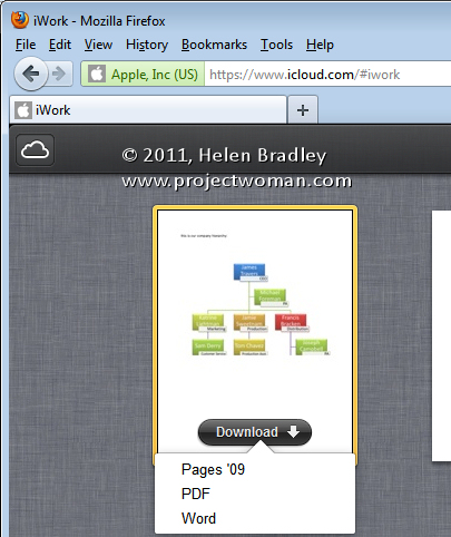
Although it is not obvious that you can do this, you can also drag and drop a document, spreadsheet or PowerPoint document into the appropriate panel and it will be synched with your iPad. You can double click a document in the list to download it to the appropriate application on your computer – here I’ve chosen a Pages document which will open in Word.

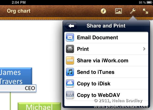
You can also now share documents with others who have Apple IDs using iWork. So, on your iPad, open a document, spreadsheet or presentation and click Share and Print (it looks like a spanner) and choose Share via iWork.com. Type the email address of the person you want to share it with and they will receive an invitation to view the shared document:


Helen Bradley

Monday, October 17th, 2011

Shape images and Clip Art in Word 2010

There is a healthy range of free clip art available from Microsoft and it includes some photos including content from iStockPhoto.com. However, the process of getting them into your document any other way than by choosing Insert > Clip Art is not always obvious.

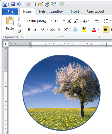
Here’s how to add a clip art image to a circle shape:

Choose Insert > Shape and select the Oval. Hold Shift as you draw to create a circle on the screen. If you choose Drawing Tools > Format > Shape Fill you get the option of applying a picture to the shape but not clip art.

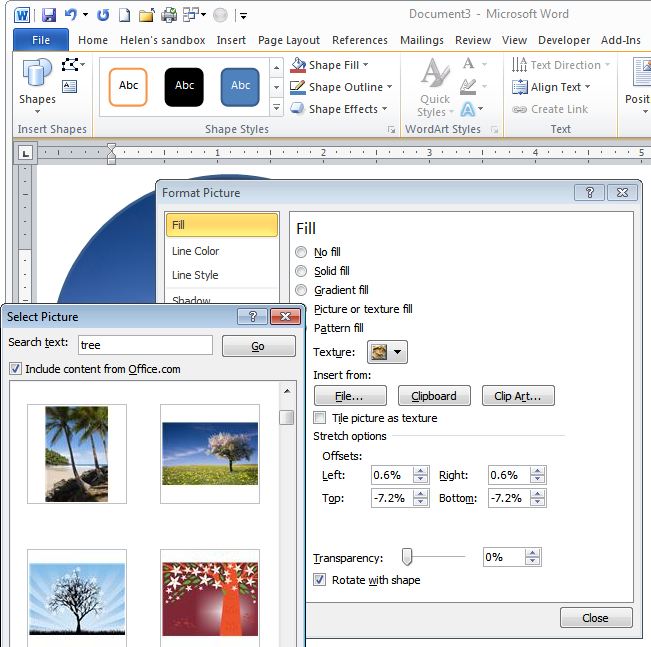
Instead, right click the shape and choose Format Shape to get access to the new to Word 2010 – Format Shape dialog. Choose Fill > Picture or Texture Fill and click the Clip Art button.

Browse or search for an image. You could also have placed a Clip Art image into your document using Insert > Clip Art and then selected it and cut it to the Clipboard. Here in this dialog you can choose Clipboard to add the image from the clipboard – in short you have more options here for using image than you have using the Shape Fill list.

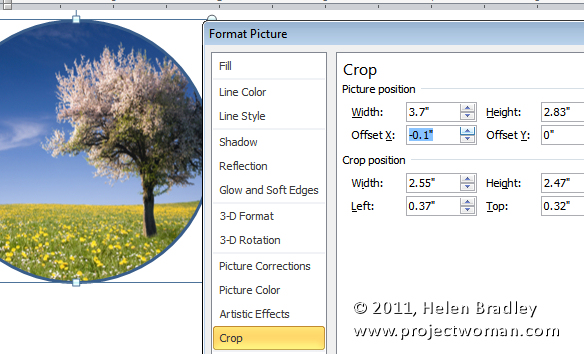
If the image is skewed out of shape – and it will be if it is a portrait or landscape image inside a circle which is pretty much a square with the corners cut off – you can adjust it.

Select Crop and, for a landscape orientation image inside a circle, increase the Picture Position Width value. For a portrait orientation image inside a circle, increase the Picture Position: Height value.

Then adjust the Offset X or Offset Y values, if desired, to control which portion of the image shows up inside the circle.

Helen Bradley

Friday, October 14th, 2011

Reformatting pasted text in Word

I recently grabbed some text from an email that I’d sent to someone. The text was in numbered point form and I wanted to add some more items inside the list of points. This is where everything started to go hair-raisingly wrong.

It seemed as if my list was no longer reformatting correctly and the numbers were everywhere. Worse still, that old standby of copying and pasting formats using the FormatPainter didn’t fix the problem.

By selecting the Show/Hide¶ icon on the Home tab in Word I immediately saw the problem. Instead of paragraph marks at the end of each paragraph there were bent arrows indicating a manual line break. I didn’t put them there but the email software had.

To get my list back to something that I could work with, I needed to quickly replace the manual line breaks with paragraph breaks.

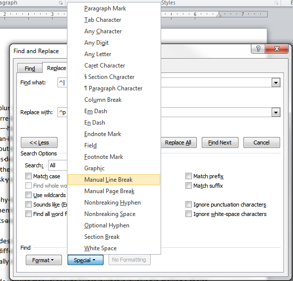
If you open the Find and Replace dialog and click in the Find What: box you immediately see the problem – how do I tell it what a manual line break is and what a paragraph break is? The solution is to click the More button to show more options. Then click Special to get access to the Manual Line Break character. It’s actually a carat and what looks like a pipe symbol but it’s easiest to get this by clicking  this by clicking Manual Line Break because the pipe symbol on the keyboard isn’t the right one – go figure!

Then click in the Replace With box and select the Paragraph Mark  – this one you can type manually as it is carat + p (^p) but since you’re there why not click to insert it instead. Now click Less to return the dialog to what it looked like before and click Replace All to turn all the manual line breaks back to regular paragraph marks. Now my numbering worked just fine.

Helen Bradley

Thursday, October 13th, 2011

Photoshop CS6 – What’s on your wish list?

When you’ve been using a program like Photoshop for a length of time, you begin to develop a wish list of things you’d like to see in future versions. Sometimes these are addressed by new releases and sometimes they’re not.

Now I know Photoshop CS5 isn’t that old but there are still things on my wish list that aren’t in Photoshop. Here are some things I’d like to see in the next version of Photoshop:

Give me some Clarity

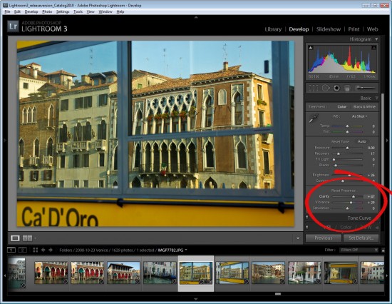
While Vibrance, which first made its appearance in Lightroom, has now been included as an adjustment in Photoshop, Clarity has not yet made the grade – it’s available in Camera Raw but not in Photoshop itself.

In Lightroom and ACR the Clarity slider lets you adjust the midtone contrast and it gives a much needed boost to the midtones in an image with quite spectacular results. At the top of my list for the next version of Photoshop would be the inclusion of a Clarity adjustment.

Paste into a Selection

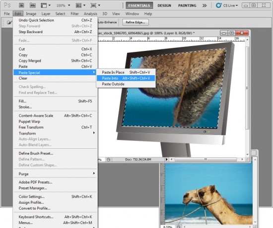
One thing I’d love to see in Photoshop is the ability to paste a copied item from one image in Photoshop into a second image but with the copied selection being pasted in at a specific size.

In short, I’d like to make a selection on the target image with the marquee tool and have Photoshop paste the clipboard contents into the marquee area at a size that fits it to the selection.

You can make a selection and paste the clipboard contents into it but the pasted image isn’t resized to fit – I’d like the option to do both.

Print Multiple Images

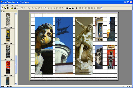
Having used PaintShop Pro for many years, the feature that I’d love to see Photoshop ‘borrow” from that program is some means of easily assembling multiple images to a layout for printing on a single sheet of paper.

PaintShop Pro has a very smart Print Layout tool which displays images down the left of the screen which you can drag and drop into a page for printing. You can drag to resize the images, right click and size them to a fixed size or add them automatically in position on a pre-designed template – built in or custom made.

Adobe has some workarounds to this problem available: Lightroom 3 has a multiple print feature which is reasonably flexible and simple to use and which I wrote about in this post http://projectwoman.com/2010/02/lightroom-3-print-improvements.html. You can assemble multiple images for printing on a single page through Adobe Bridge but the tool is a little cumbersome and it’s in Bridge and not where most people will expect it to be – in Photoshop itself.

You can add the Picture Package tool back into Photoshop CS4 and CS5 (which Adobe removed in these versions) as I explained in this post: http://projectwoman.com/2011/03/multiple-image-printing-in-photoshop-cs4-cs5.html.

But, workarounds aside, I dream of the day a really smart multiple picture print tool appears in Photoshop.

So, now you know the top three things I’d like to see in Photoshop CS6 – now it’s up to you – what’s on your wish list?

Helen Bradley

Wednesday, October 12th, 2011

Excel – get the day or month name from a date

Often you will want to extract a month or day of the week from an Excel date. This is extraordinarily easy to do using the text function.

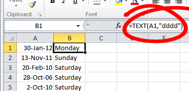
To get the name of the day of the week from a date in, for example, cell A1 type this into another cell:

= TEXT(A1,”dddd”)

This will give you the full day name spelled out such as Monday or Tuesday.

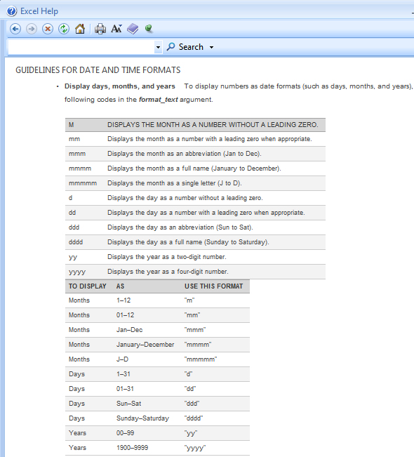
If you want a three character name use:

= TEXT(A1,”ddd”)

The same basic formula can be used to get the month of the year from a date. Use this to get the month name spelled out in full:

= TEXT(A1,”mmmm”)

Use this to get the month of the year spelled out in three characters:

= TEXT(A1,”mmm”)

and this for a single letter month:

= TEXT(A1,”mmmmm”)

This formula can be easily constructed and copied down a column of dates to extract just the information you want very quickly and easily.

The Excel help file has some information about the different formats you can use to extract data using the TEXT function.

Helen Bradley