Tuesday, August 31st, 2010

Photoshop: Applying Fixes using Adjustment Layers and Masks

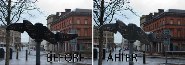
Sometimes a photo need two opposing fixes applied to different areas of the image. This poses a dilemma – if you fix one area you’ll make the other areas far worse than they started out being and vice versa. The solution is to apply both fixes but to do this using adjustment layers and to blend the results together using a mask. Here’s how to do it:

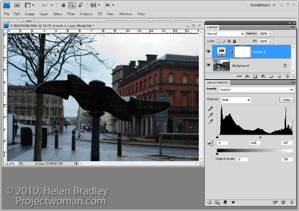
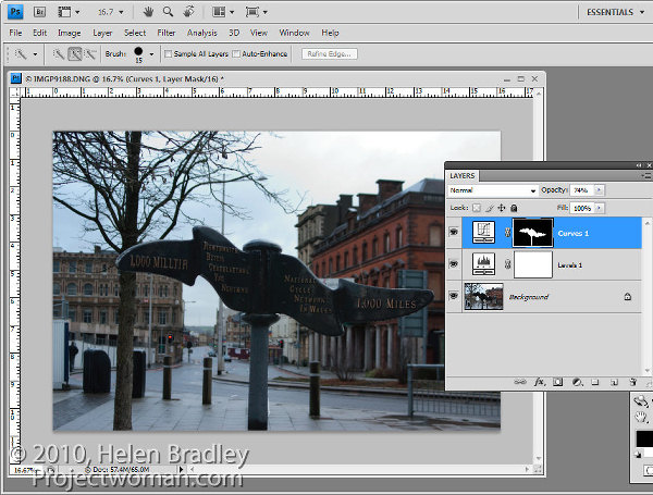
To fix the background of the image, choose Layers > New Adjustment Layer > Levels and adjust the levels to improve the contrast in the lighter areas of the image. Ignore the darker areas of the image as they are not part of this fix.

If desired, you can also adjust the saturation using Layers > New Adjustment Layer > Hue/Saturation.

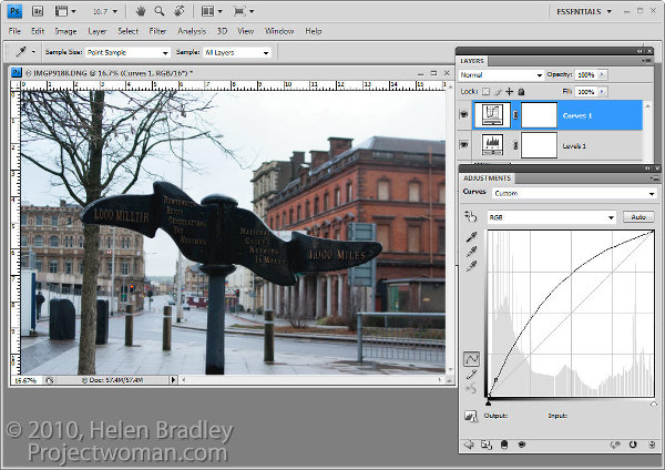
To bring detail out of the darker area in the sign you will use an additional adjustment layer. In the original blog post I used the Shadow/Highlights tool but this is one fix you cannot apply using an Adjustment Layer so you will have to use a different adjustment for this image. I will use a Curves adjustment layer here.

To do this choose Layers > New Adjustment Layer > Curves and adjust the darker end of the curve –on the left side. Drag upwards on the curve line to lighten the shadows.

If you prefer to use another tool, you can do so. However, the important thing is to fix the shadows and ignore any changes to the highlights.

The top adjustment layer contains the adjustment for the darker areas of the image and the bottom adjustment layer(s) contain the adjustment for the lighter areas of the image. To blend these layers, you will use the layer masks attached to the adjustment layers to selectively add the fixes to the image.

Unlike the adjustment layer’s Opacity slider which sets every pixel to the same opacity value, a layer mask lets you adjust the opacity selectively so one area can be 100% opaque and others can be partially or fully transparent.

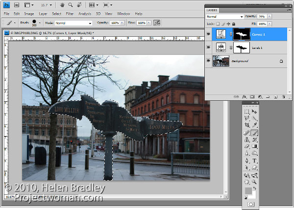
For this image, as I want to lighten the sign but not anything else, it will be quickest if I start by selecting the sign on the background layer.

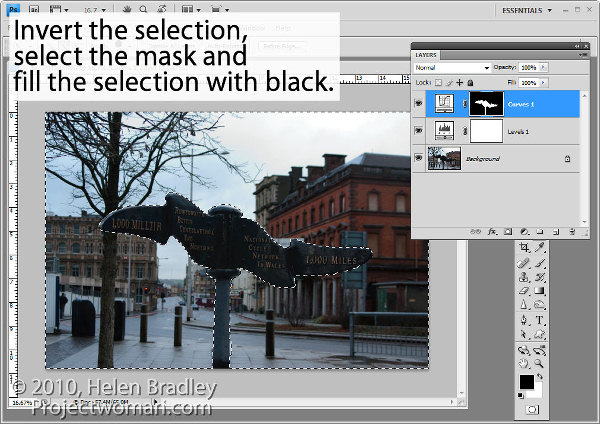
Select the mask on the Curves layer. When you are working with masks remember that “black conceals and white reveals” so painting with white on the mask reveals the adjustment on this layer and painting with black on the mask hides the adjustment.

Press Control + Shift + I (Command + Shift + I on the Mac) to invert the selection so now we have everything except the sign selected. Set the foreground color to black and press Alt + Backspace (Option + Delete on the Mac) to fill the mask except where the sign is with black.

Press Control + D (Command + D) to deselect the selection.

If the fix looks too intense, you can adjust the opacity of the top Curves layer down a little.

When adjusting opacity you may find it easier to judge an ideal value if you drag the Opacity slider to zero and then increase the value until you find a good fix rather than dragging it down from 100% looking for the ideal setting.

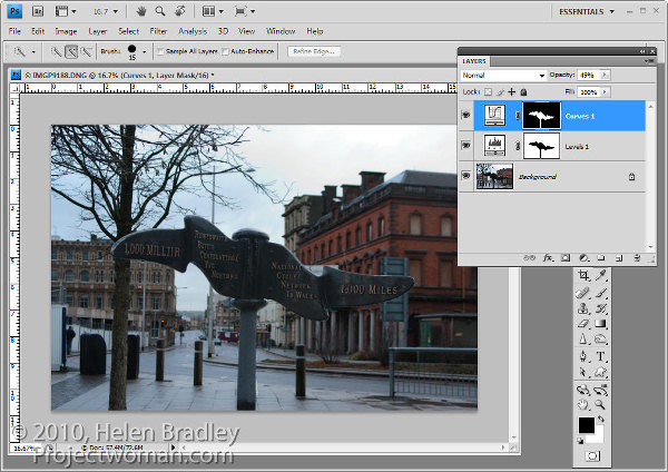
If you want to remove the sign from the Levels adjustment you can do so using an inverse of the layer mask you have already created.

To copy and invert the mask, press Alt + Shift (Option + Shift on the Mac) as you drag the mask from one adjustment layer and drop it on top of the mask on another layer. When prompted to replace the mask, answer Yes. (If you simply want to copy a mask use Control + Alt or Command + Option instead).

If you do this, you’re removing the Levels fix from the pole and you may need to adjust the Opacity of the Curves adjustment layer to compensate for this.

You can also adjust  masks by painting on them in black, white or a shade of grey. Painting in black hides the fix on this layer, painting in white reveals the fix on this layer and painting in grey partially hides the fix.

Here I have Control + Clicked on the mask on the top Curves adjustment layer to select the white areas of the mask, then painted in grey on the mask to hide some of the lightening effect on the pole. By selecting the white area of the mask before painting I limit the paint to only the selected area which lets me work quickly.

If you go too far, switch colors and paint back the effect back.

To finish, I rotated the image to straighten the sign and cropped it to remove the distracting elements on the left side of the image.

Helen Bradley

Thursday, August 26th, 2010

Get creative with Photoshop Actions

Actions are a feature of Photoshop that allow you to automate tasks. So you can record your steps as you work as an action and then play them back to make repetitive tasks more simple to perform. You can also find actions on the web that others have created and download them to use yourself. In this post I’ll explain how to find, download, install and play an action.

To find actions on the web, search for “Photoshop Actions” in your favorite search engine. You can also go to Adobe Marketplace and Exchange site at: http://www.adobe.com/cfusion/exchange/ where you can find a lot of actions for downloading. These are rated by other users so it is a good place to find good actions.

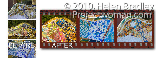
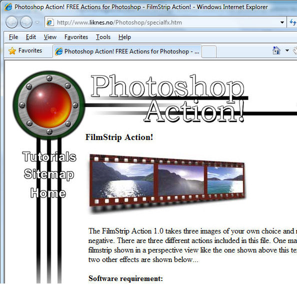
The action I will show you how to install and use is a filmstrip action for the PC that you will find at http://www.photoshop-action.no/specialfxgallery.htm. Download the filmstrip action to your computer and then unzip the file to expand the contents. Although this action states that it’s suitable for Photoshop 6, 7 or CS, it works in versions up to CS4. As a rule of thumb, most older actions work just fine in later versions of Photoshop.

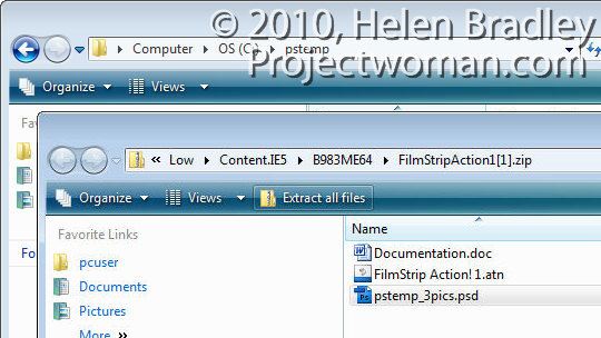
The zip file contains a .doc documentation file, a .atn action file and a .psd Photoshop file. Always read the documentation as it often contains an explanation of what you need to do to make the action work correctly.

In this case you must create a folder called \PStemp in the root directly of drive C and copy the file pstemp_3pics.psd from the zip file into that location. Do this now and leave the folder of extracted files open on your screen.

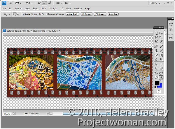
The instructions go on to tell you to close all open images and to open the three images to use for the filmstrip. It says these will be resized to approximately 730 x 530, (in reality they are resized to approx 735 x 575 pixels).  The developer suggests that the finished filmstrip looks best when you use landscape images. The order of the images as you open them is the left to right order of images in the filmstrip.

Launch Photoshop and make sure there are no open images. Make duplicates of the images you plan to use in the filmstrip and open the three duplicate images.

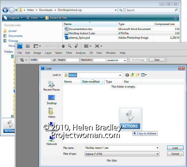
You must now load the filmstrip action and the smart way to do this is to place the file in your Presets\Actions folder so you can always find it easily. To do this, view the Actions palette by selecting Window > Actions. Open the fly-out menu and choose Load Actions.

The folder that opens is the Presets\Actions folder so drag and drop the .atn file from the dialog containing the unzipped files into this dialog to copy it into place.  Click the filmstrip!1.atn file and click Load to load it into your Actions palette.

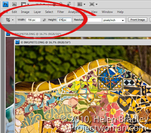
I find it best to crop the three images ahead of time to 735 x 575 pixels in size. To do this, select the Crop tool, set the Width to 735 px, the Height to 575 px and drag over the image to create the crop rectangle at the desired size. Double click to crop the image to that size. Repeat this for the other two images.

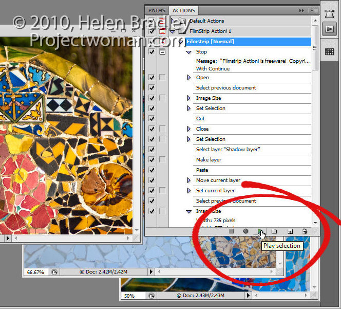
Now run the action by opening the Actions palette, locate the Filmstrip Action 1 action and click either Filmstrip [normal], Filmstrip [wavy] or Filmstrip [perspective] to run one of the three actions.

The action will stop and prompt you with a dialog telling you it is running. Click Continue and wait as the filmstrip is created for you. The action closes each of your images as it is finished with them. When you’re done, you can save the filmstrip image.
There are a few things to be aware of when you run an action. Always work with duplicate files and never with your originals, as you cannot be sure that an action will not crop or resize a file to a smaller size or change its resolution and then save it. Working with duplicate images ensures your originals won’t be damaged.

Always close all open files except those that are required by the action to be open. This will prevent you from losing unsaved work or having changes be applied to files you did not mean to be altered.

Always read the instructions for running an action before using it and make sure that any files required by the action are located in the correct place before running it.

Helen Bradley

Saturday, August 21st, 2010

5 (More) Lightroom Panel Tricks

When you spend a lot of your editing time in Lightroom it makes sense to learn how to work the interface so it behaves as you need it to. In a previous post (http://digital-photography-school.com/my-5-coolest-lightroom-commands) I listed some of my favourite Lightroom interface features. Here are my next favourite five, most of which have earned a place in my repertoire courtesy of spending far too much time editing on a 12″ laptop where screen space is at a premium:

Learn the F keys

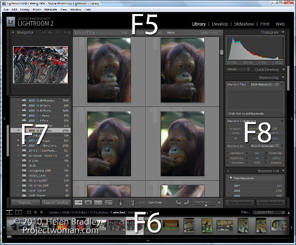
The function keys F5, F6, F7 and F8 can clean up the Lightroom screen very quickly. F5 controls the top panel, F6 the bottom, F7 the left and F8 the right panel. Pressing any one of these keys will hide or display the appropriate panel. It’s an easy way to get rid of a panel you don’t want to see without having to reach for the mouse.

It is T for toolbar

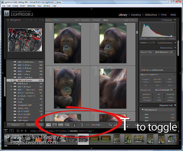
At some time you may have toggled your toolbar off by mistake. When it goes, it takes with it handy tools such as Flag, Rate, Color Labels, the rotation tools, zoom tool and your Loupe and Grid buttons. In short, one accidental press of the T key can wipe out a lot of Lightroom functionality. When these tools go missing, press T and they’ll all come back again.

More panel magic – Tab key

When you need to instantly remove the side panels from the screen, hit the Tab key. Shift Tab will toggle all panels on and off, Tab toggles just the side panels.

Open a second window – Yep – how cool is that?

If you want to see the Grid, Loupe, Compare or Survey View in a new second window, press F11. Once the second window is open, you can select what to view in it.

In Loupe view you can Lock the second window so that you see a single image in it regardless of what is visible on the main screen or choose Normal to view the currently selected image or Live to see the image under the mouse pointer.

To get rid of this window, press F11 again or click its Close button.

Lights out and screen modes

The L key toggles through the various lights out mode. The first is lights down, the second lights out and then press it again to return to the regular mode. This is handy when you want to see one image or the entire grid without any screen distractions. Similarly the F key scrolls around various screen modes including Normal, Full Screen with Menu bar,  Full Screen and Full Screen and Hide Panels.

More info for Mac users:

Thanks to Facebook user Victor Cincola for this additional information for Mac users. You will need to use Command + F11 to open a second window on the Mac. In addition if your function keys F5, F6 etc do not work  as described above you have Apple shortcuts enabled so you will need to use Fn + F5, Fn + F6 and so on – check your keyboard for the Fn key.

Helen Bradley

Saturday, August 21st, 2010

PowerPoint Save to CD doesn’t include the viewer

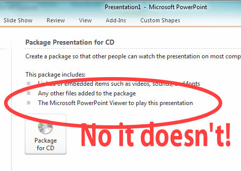
If you’ve tried to save a presentation to a CD from PowerPoint 2010, you might be misled by the onscreen instructions into believing that the PowerPoint Viewer application will be added to your CD.

This is anything but the case. The PowerPoint Viewer is not added to your CD so you won’t have it with you and if you take your PowerPoint presentation to a computer that doesn’t have the viewer on it and you don’t have an internet connection, you’re SOL. Poor show Microsoft!

What the presentation CD will contain is a HTML file that will launch when you place the CD in a computer. This contains a link to download the PowerPoint Viewer from the web. You have to go to the web site and then download and install it on the target machine – the Viewer cannot be run from the CD.

While most people won’t have a huge problem with this, it would be nice if Microsoft actually told the truth about the process and warned you what you need to have and to do. Otherwise many hapless folk are going to assume that it all works as it has in the past and arrive at presentation time without PowerPoint on the computer they are presenting on and having to download and install the viewer before they can begin. The situation will be worse still if an internet connection isn’t available.

So, as always, make sure to test your presentation thoroughly before you start. Know that you may need extra time to download the viewer or go ahead and download it ahead of time and take a copy with you that you can install on the computer you will be presenting on.

Helen Bradley

Monday, August 2nd, 2010

Line feed in VBA textbox

When you need to create a line feed (new line) in a VBA text box you can do so in the string that you’re using to assemble your message using any one of a  number of methods.

You can use Chr(13) which is an old style character conversion of ASCII character 13 which is the carriage return and line feed character. Or you can use vbNewLine or even vbCrLf.

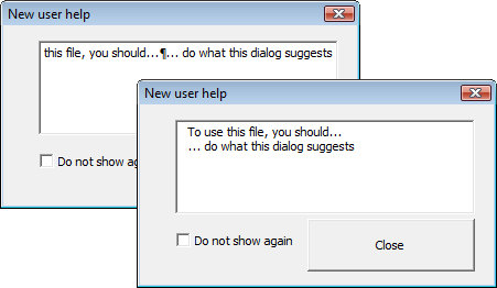
But, try as you might, all you will get in your textbox is a silly paragraph marker and not a new line if you don’t set your textbox up as a multiline text box in its Properties.  Don’t say I didn’t warn you!

Helen Bradley

Monday, August 2nd, 2010

Photoshop – invert a path

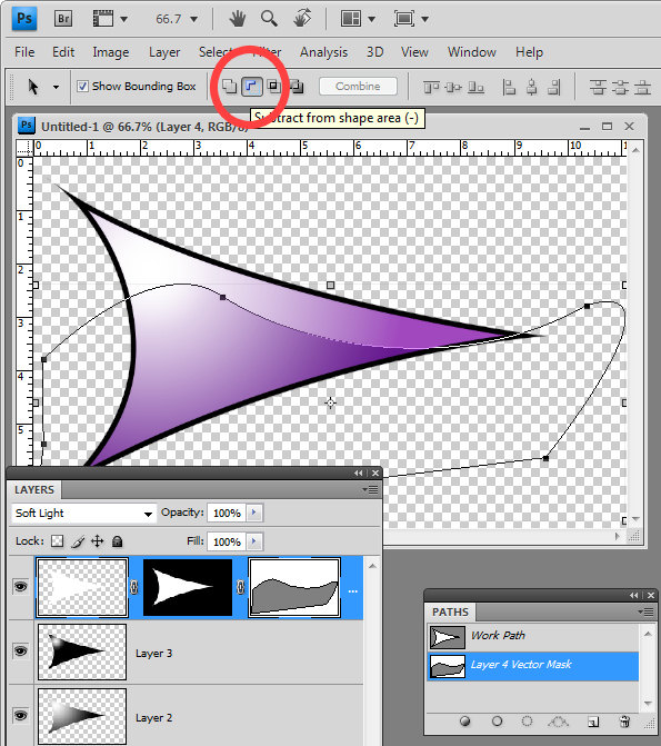
When you use a Vector Mask in Photoshop you can use the pen tool to create your path. All you need to do is to close the path and you will have a custom editable vector mask. However, if your mask is white where it should be not be selected and you need to invert it you need to invert the path.

To do this, click the Path Selection tool and target the Vector Mask and click on your path. On the tool options bar you will see an icon called Subtract From Shape Area – click it and the path will be inverted so anything which was masked before will not be now and vice versa.

Helen Bradley

Monday, July 26th, 2010

Photoshop: Pen tool trick


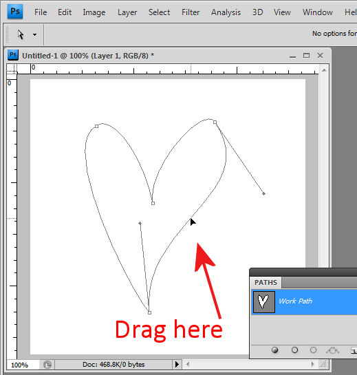
Ok, I am first to admit it, when I stumbled across this trick I went “Wow! I didn’t know you could do that!” I was designing a small heart using the pen tool and I dragged near one side of the shape with the Direct Selection tool and woah! The entire side of the heart moved. Amazing what you find when you get some time to play – well I was going over some notes for a Photoshop presentation I was doing but all the same – it was a lightbulb moment and I just love them when they happen.

 So, here’s how to do it. Make a shape with the pen tool or choose the Custom Shapes tool and the Paths option and draw a path in an image. Click the Direct Selection tool (it shares a toolbar position with the Path Selection tool). Drag over one of the nodes to select it and now drag near the path either side of that node. When you do, the path moves with you.  It’s yet another way of reforming your paths and it’s not what I would call intuitive but it is very handy when you know how it works.
Helen Bradley

Sunday, July 25th, 2010

Lightroom: Arrange files your way

Often when you’re working in Lightroom you will want the images to be sorted in the order that you want to see them, not in as order such as capture date which is one of the Lightroom sort options.

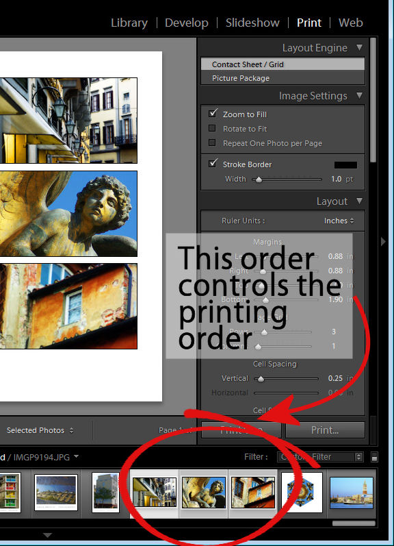
You may want to do this when assembling images for a slide show or for printing, for example as the order of the images in the filmstrip will affect how the images appear in a print template and in the slideshow.

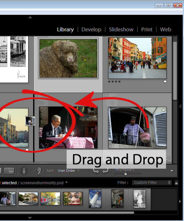
You can control the order of images in a Lightroom folder by dragging and dropping an image from one place to the other in the filmstrip view. To do this, grab the image in the middle and drag on it until you see a black bar appear between two images. If you let go the image it will drop into the indicated position.

This drag and drop process works in most instances but there are some exceptions to be aware of.

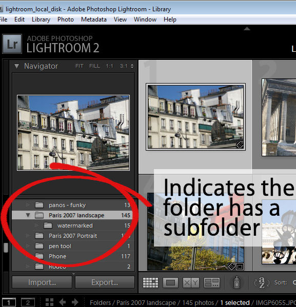
The first is that this will not work if you are in a  folder where there are images in a subfolder below it which are also visible. You can see if this is likely if you open the fly-out for the folder in the Folders panel in the library. If there is another folder the one you are working on, chances are that the images in the subfolder are included in the filmstrip and so you cannot arrange the images by dragging them into position if this is the case.

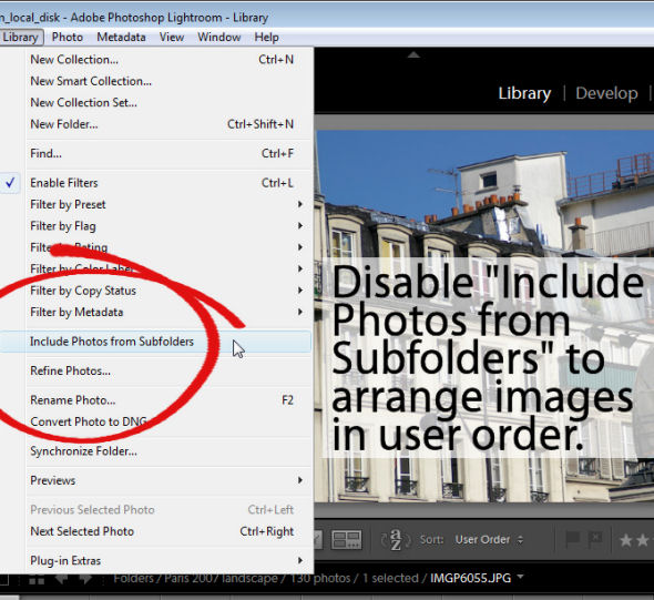
To workaround this limitation you can remove the photos in the subfolder from view – this just removes them from the grid and filmstrip and not from Lightroom or your disk. To do this, click Library in the menu and disable the Include Photos from Subfolders option.

With this disabled, you can now move images by dragging and dropping them into position.

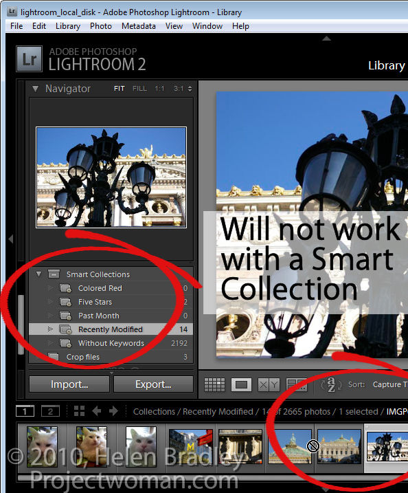
Another exception is when you are working with a Smart Collection. While images can be located in a regular collection and rearranged in order to suit, they cannot be rearranged if they are in a Smart Collection. If you have images in a Smart Collection that you want to be in a specific order, you will need to create a regular collection for them and add them to it to do so.

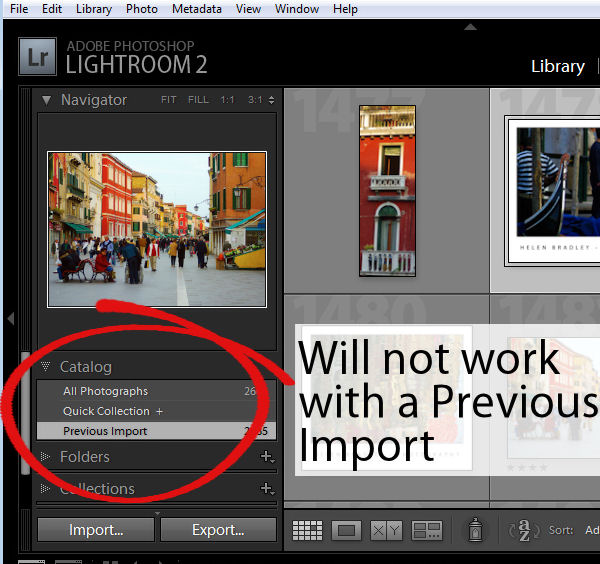
Another situation where you cannot reorder images to your own preference is when you are working on the images in the Catalog such as Previous Import. You must, instead, locate the folder or collection in which the images are stored and rearrange them there.

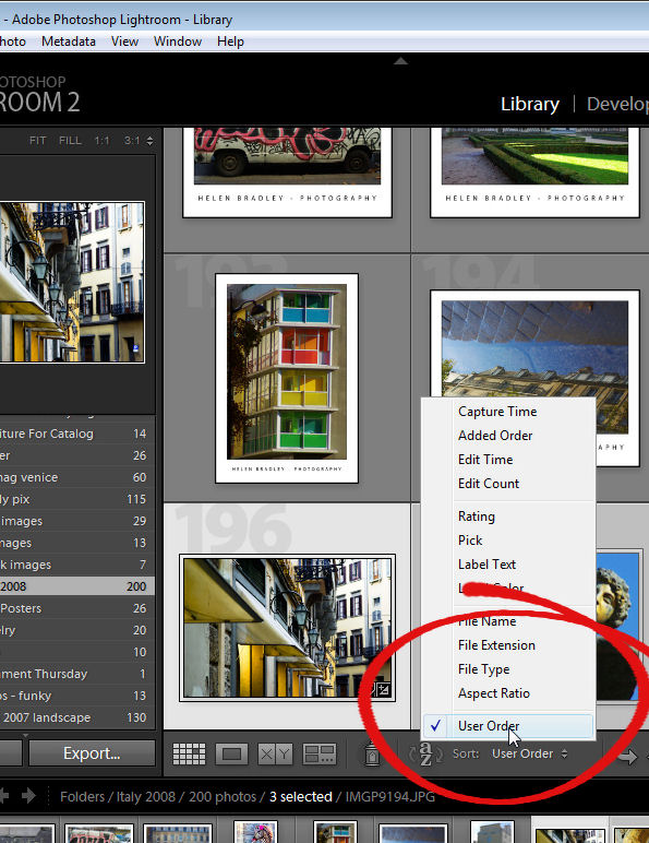
Once you have arranged the images as you want them to appear, Lightroom stores your ordering so it is as accessible as, for example, any other sort order options for that folder or collection. So, you can return to your preferred sort order at any time by selecting User Order from the Sort dropdown list.

Helen Bradley

Thursday, July 22nd, 2010

Excel – cell reference in SumIF

I love SUMIF. It’s a handy tool for summarizing data. So, today I was checking how much I had invoiced a client – I have actual charges for stories I write in one column and the invoice numbers that these were charged under in another. I wanted a summary so I know the total of invoice 1 was $x and invoice 2 was $y.

SumIF is the tool to use. It goes like this:

=sumif(G1:G200,”=1″,H1:H200)

this sums the values in the range H1:H200 only if the corresponding values in the range G1:G200 is 1. So, it does the deed for Invoice #1. Repeat as required for invoices 2-20 – no way!

It is much easier if I place the numbers 1, 2, 3 and so on in cells of the worksheet and reference them in a single formula that can be copied rather than writing this 20 times… or 100 times… you get the picture… it’s simply not on to do this.

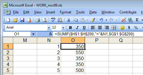
Problem is – how to refer to a cell in the SumIF function. This DOES NOT WORK!  =sumif(G1:G200,”=N1″,H1:H200). Excel doesn’t see the N1 as a cell reference – it sees it as a value to match.

So, you have to write it differently:

=sumif($G$1:$G$200,”=”&N1,$H$1:$H$200

the “=”&N1 references the value in N1 as the one to match and the $ symbols are needed so the formula can be copied.

Helen Bradley

Monday, July 19th, 2010

Format Hyperlinks in PowerPoint 2010

If you’ve added an email link or a website URL to a PowerPoint slide, you’ll know that PowerPoint 2007 and PowerPoint 2010 automatically format the hyperlinks for you.

Because PowerPoint doesn’t use styles, it’s not obvious exactly how the formatting gets applied and how you control it.

The first thing to know is that you simply can’t control the underlining, it’s there and it’s there to stay. You can, however, change the colors used.

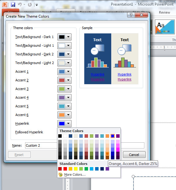
Click the Design tab > Colors > Create New Theme Colors, locate the Hyperlink color and change it to something different if desired. To control the Followed Hyperlink color, select that option and change it.

You now need to save your changes as a custom color scheme, so type a name for your color scheme and click Save.

Now the chosen hyperlink color and followed hyperlink color will be used to format the hyperlinks in your PowerPoint presentation.

Helen Bradley