Tuesday, December 28th, 2010

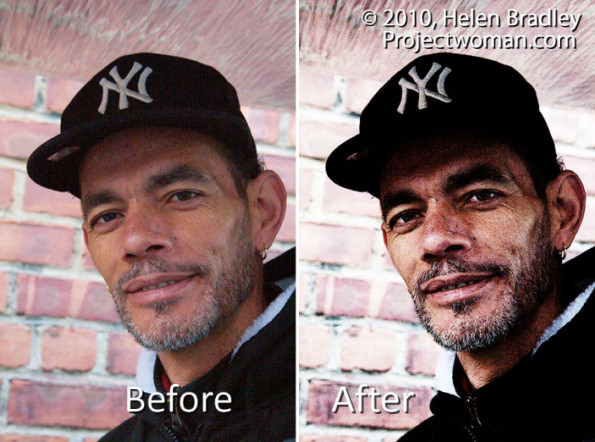
Photoshop: Grunge Portrait Effect

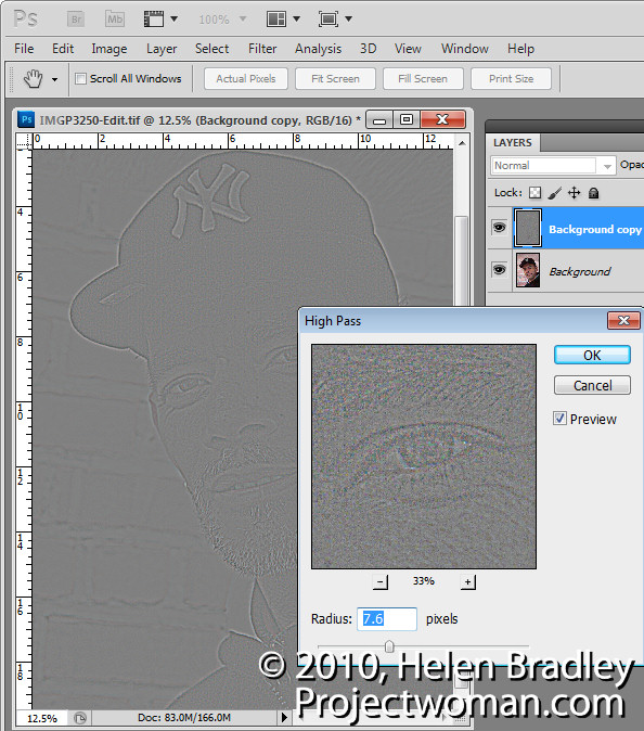
To create a high contrast grunge portrait effect, first duplicate the image background layer, then choose Filter > Other > High Pass, select a Radius that shows lines on the image but not a lot of colour – typically a value of around 5 is sufficient – and click Ok. Set this layer’s Blend Mode to Overlay.

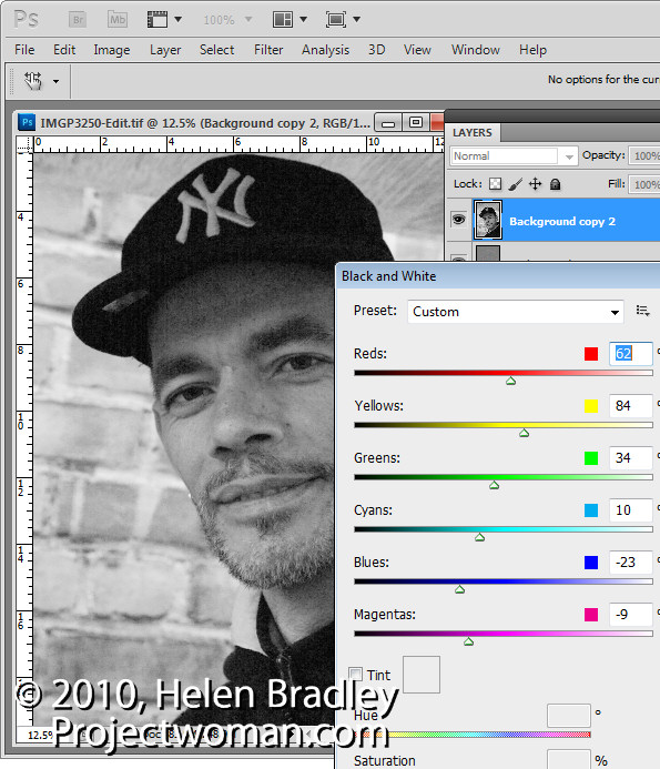
Duplicate the background layer again, moving the duplicate to the top of the layer stack and convert the layer to black and white by choosing Image > Adjustments > Black & White. Adjust the sliders to create an interesting black and white image – dragging the red slider to the left often to darken the reds often works well. Set the blend mode of the layer to Hard Light.

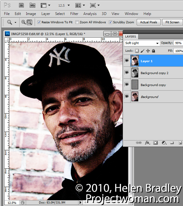
Select the top layer and press Ctrl + Alt + Shift + E to create a flattened version of the image and set this layer’s blend mode to Overlay, Soft Light or Hard Light as desired. Adjust the opacity to suit.

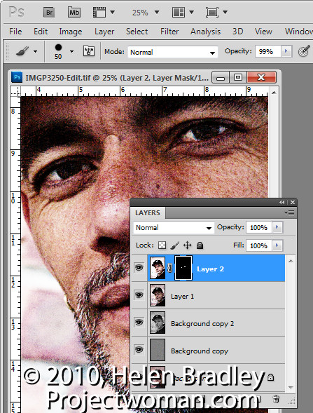
Make a new flattened layer by pressing Ctrl + Alt + Shift + E and use the same process as before to fix the eyes. Choose Image > Adjustments > Curves and adjust to brighten the eyes only. Add a black filled layer mask by pressing Alt as you click on the Add Layer Mask icon. Paint with white on the layer mask to bring details back in the eyes and adjust the opacity of the layer to suit.

Helen Bradley

Sunday, December 26th, 2010

Photoshop Creative: A Simple Composite


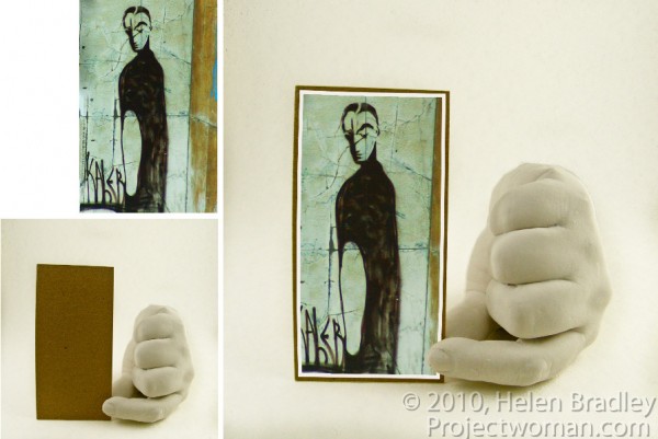
In this post, I’ll show you how to create a simple composite by placing one image in another. Along the way, I’ll not only bend one image to fit its new position but I’ll also show you a layer style trick that overcomes the problem that you’ll see if you scroll down to step 6 and take a look at what happens when I mask the image to make the fingertip show.

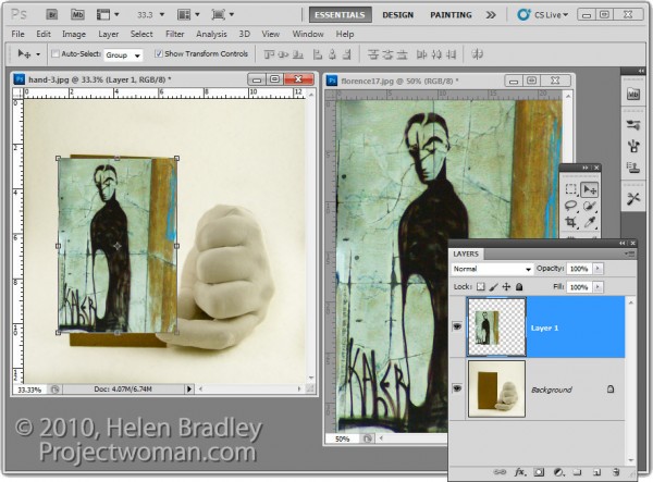
1 To create this composite, open the images to use. We’ll assemble the composite in the image of the plaster hand. Start by dragging the background layer from the photograph into the hand image. It will appear on its own layer and you can now close that image as it is no longer needed.

2 Size the imported image to fit where it needs to go. In this case the border will be added inside the image so I’ll make the image almost as large as the cardboard it will be ‘attached’ to.

Size the image in proportion so you don’t skew it. To get it to fit on in dimension it will probably be either too tall or too wide in the other dimension and that’s fine.

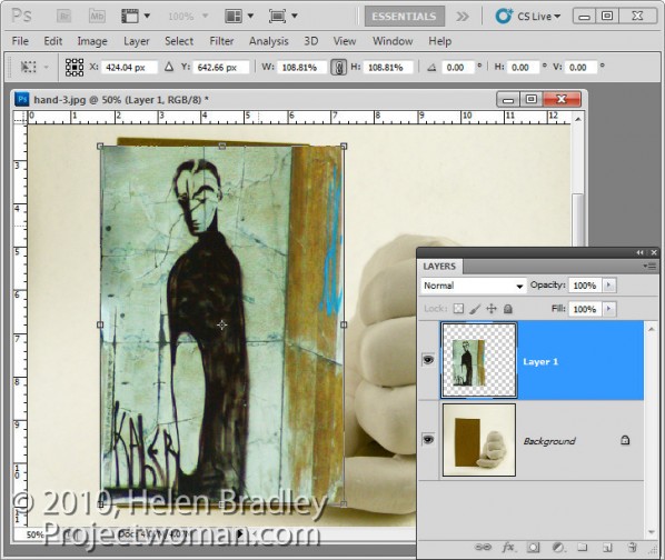
3 Once you’ve applied the transformation, select the rectangular marquee tool and drag over the area of the photo that you want to retain. Choose Select > Inverse to invert the section and press Delete to delete the excess image.

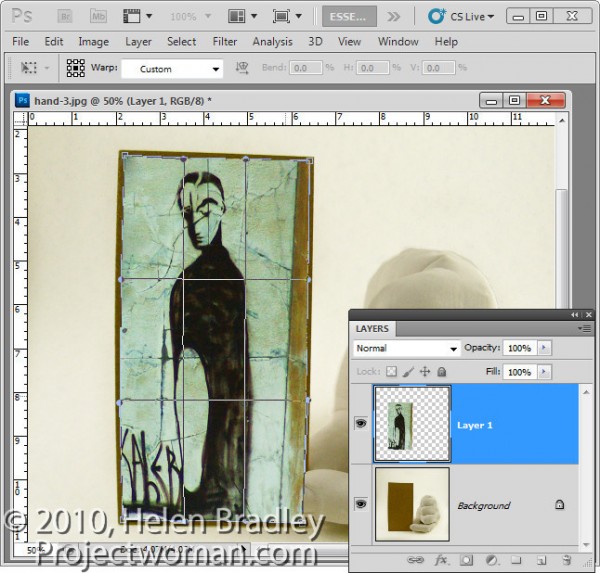
4 To warp the image to fit the shape of the card, select the image and choose Edit > Transform > Warp. This adds a series of warp handles to the image. Drag on these to bend the image so it fits over the area you want to cover.

When you’re done, confirm the transformation.

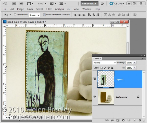
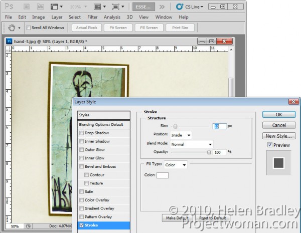
5 To add a white border around the image as if it were a photo stuck to the card, select the image layer, click the Add a Layer Style button at the foot of the Layers palette and choose Stroke.

Set the color to white and the size to a size appropriate for your image. Set the position to Inside so you get square corners on the image (if you choose Center or Outside the corners will be rounded).

 When you are done, click Ok.

6 With this image layer still selected, click the Add Layer Mask icon at the foot of the Layers palette.

Select a medium hard brush, set the foreground color to black and paint on the mask to reveal the finger on the underlying layer. This makes the finger look like it is above the image and not behind it.

One simple way to do this is to hide the photo layer and use a tool like the Quick Selection tool to select over the finger on the background layer. Then, with the selection in place, display the top layer and select its mask. With black as the foreground color, press Alt + Backspace (Option + Delete on the Mac), to fill the selected area on the mask with black.

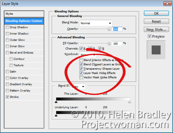
You’ll see that we have some problems with the mask because it distorts the stroke around the picture. We want the stroke applied to the image and we don’t want the mask to have any effect on it – right now it is having an unwanted effect.

7 To solve the problem, double click the Effects entry in the Layers palette to open the Layer Styles dialog. In the Blending Options area of the dialog, select the check box for Layer Mask Hides Effects.

This configures the mask on the layer to hide not only the image content on that layer but also a style applied to that layer.

Helen Bradley

Tuesday, December 21st, 2010

Lightroom: Embracing Brightness

In previous posts I’ve advocated using the Exposure slider to lighten an image but lately I’ve added the Brightness slider to my workflow. I’d encourage you, if you haven’t already done so, to experiment with it on your images.

However, before we begin a word of warning about Brightness/Contrast in general. Brightness adjustments in some programs aren’t as good as in others. If you’re using Photoshop CS2 or earlier, for example, use Curves or Levels to lighten an image not Brightness. In Photoshop CS3 the Brightness/Contrast tool was re-engineered and instead of adjusting all pixels equally as it used to do with the result that highlight areas were routinely destroyed in the process, it now protects the lightest pixels as it lightens the image. Before trusting your image to a program’s Brightness and Contrast tool, check your histogram before and after using it and make sure you aren’t blowing out highlights in your quest for a lighter/brighter image.

Now, back to Lightroom.


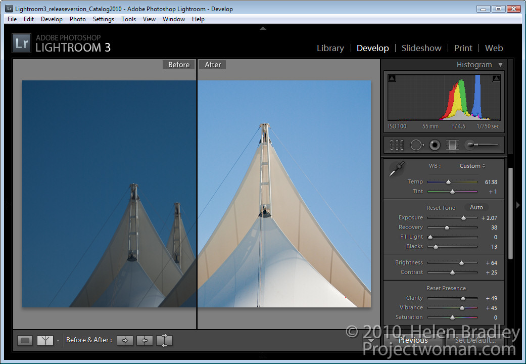
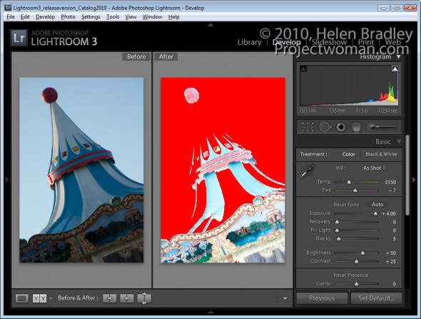
Take a look at the image shown here. If I leave Brightness at the default value – which for my camera is +50 but which may be different for yours, and if I crank up the Exposure to the maximum value, a lot of the lighter  pixels in the image get blown out.

Of course I would never adjust an image to this value but it’s a useful exercise to see how Exposure works.  


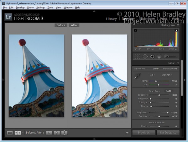
When I do the same thing in reverse and leave Exposure at its default value of 0 and crank Brightness up to its highest value only a small number of pixels are blown out.

Using the Brightness slider lightens the image while at the same time protecting the lightest pixels in the image from being blown out as a consequence.

So what does this knowledge mean to you in a typical Lightroom workflow? Well, my new Lightroom workflow for lightening and brightening an image involves using the Exposure slider first of all to adjust the overall exposure of the image but I stop short of where too many highlights get blown out.

Next I test the Recovery tool on the image. Hold the Alt key as you drag on the Recovery slider to check to see if there are blown out highlights (they show as varying colors on the black background). Drag to the right to see if they can be recovered . If they can’t be recovered ease off on the Exposure and check again.

If I have shadow areas in the image that are still overly dark I’ll adjust these using the  Fill Light slider. This tool helps recover detail hidden in shadows, but it’s not a tool I’d use for an overall brightening effect.

Finally, I use the Brightness slider to increase the overall image brightness. Somewhere between the Exposure slider and the Brightness slider is the sweet spot for lightening an image.

From there, I’ll adjust Vibrance and Clarity and sharpen the image.

While we’re on the topic of the Brightness slider, check out the default value on an unedited image so you know where your starting point is. For most raw images, Lightroom defaults to a Brightness of +50 and Contrast of +25 as its starting point.

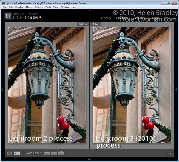
Also take care when working with images you had processed in Lightroom 2 with Lightroom 2 settings. When you upgrade to Lightroom 3, you’ll have a choice of Updating your images to the new Lightroom 2010 Process. My experience is that this can result in a significant lightening of images which were processed in Lightroom 2 so I apply this update on an image by image basis so I can reverse it or adjust for it as I go if necessary.

Helen Bradley

Thursday, December 16th, 2010

Using Lightroom Compare View

In an earlier post, I showed you how to use Lightroom’s Survey View to choose one image from a selection of images. In this post I’ll show you how to use another of Lightroom’s specialty views – Compare View which has a similar purpose but which operates very differently.

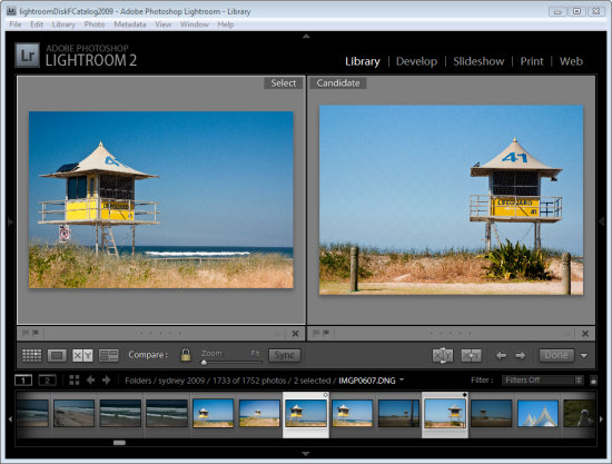
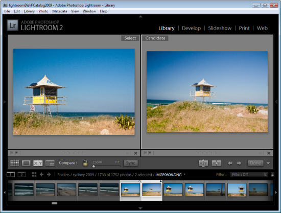
Start in the Library module, select an image and then click Compare View or press C. When you do, Lightroom shows two images, the one you had selected and the one you most recently selected before this one in this same folder.

If you didn’t previously select an image, for example if you selected Compare View immediately after you selected a folder, the first image in that folder will be the only one selected so Compare View will show the first image and the one immediately to its right in the Filmstrip.

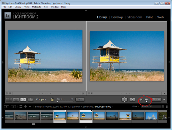
The two images you see are labeled Select and Candidate. The Select image is fixed and the Candidate image can be changed. To do this, click the left or right arrows underneath the Candidate image to move in the direction of the arrow through the folder. This replaces the Candidate image each time you click an arrow with the next image in the Filmstrip.

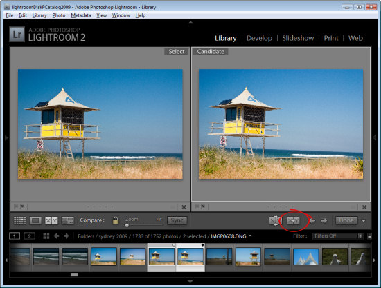
When you find an image that you want to use as your new select image, click the X<Y (Make Select) button and the Candidate image moves to become the Select image and the next image in the filmstrip in the direction that you had been moving will be the new Candidate.

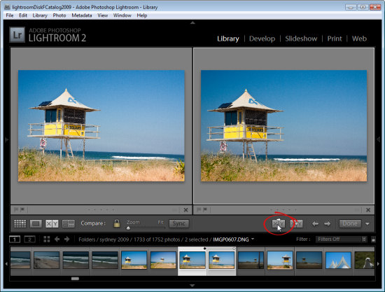
To simply swap the two images, click the Swap button to swap the two images. The current Select image becomes the new Candidate and vice versa.

Continue to work through the images on the filmstrip comparing them until you have the Select image that you want to use.

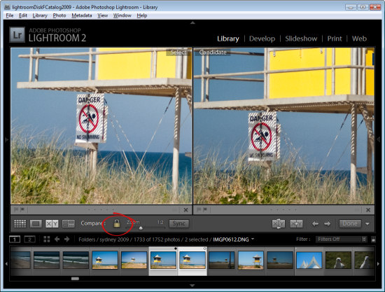
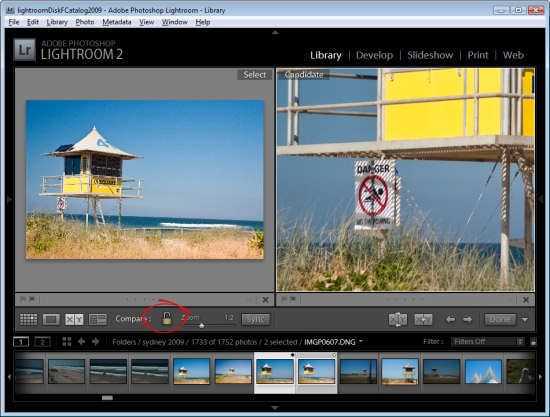
In Compare View, unlike Survey View, you can zoom the images. The lock icon on the toolbar, when locked, lets you scale both images at the one time using the Zoom slider.

If you unlock the padlock icon by clicking it, just the currently selected image (which can be either the Select or Candidate image) will zoom when you click the Zoom button.

You can also use Compare View with just one image by deselecting one of the images in the Compare View. Each image has a small X under its bottom right hand corner, which you can click to remove it. If you remove the Select image this way, you can work through images as Candidate images until you find a Candidate worthy of being a Select image and, when you do, click the Make Select button and the Candidate will become the Select image and the next image in the sequence will become the Candidate.

Click Done to exit Compare View with the Select image selected.

How Compare View and Survey View compare

While Survey View allows you to compare multiple images with each other and to remove images you do not want until you get the one that you do what, Compare View works a little differently in allowing you to view only two images. The Select image always remains in place, but you can scroll through multiple images very quickly to determine if any of them are a better candidate for your needs than the select image. If it is, you can replace them and continue your comparison.

While Compare View allows comparison between only two images, it is more complex to use and understand than Survey View. However it’s a useful way to make a choice from two images as to which is the better and then continue to compare your current ‘best’ pick with others in a sequence.

Helen Bradley

Sunday, December 12th, 2010

Choosing images using Survey view in Lightroom

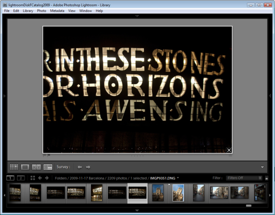
Lightroom’s Survey view is a tool that makes choosing one image from a group of images a simpler process. In this post I’ll show you how to use Survey View and some tricks for working with it.

Step 1

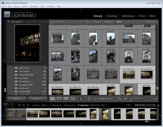
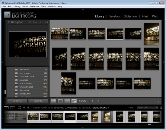
To see it at work, in the Library module, select a series of images on the filmstrip by clicking on one and Shift + Click on the last. Alternatively hold the Control key (Command on the Mac) as you click on each image that you want to make a choice from.

Step 2

To enter Survey View, choose View > Survey, click the Survey button on the toolbar or press the letter N.

Once in Survey view, you will see only the images that you had selected. You can add more images by Control + Clicking (Command + Clicking) on them to select them in the Filmstrip.

Step 3

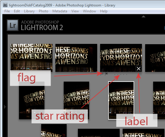
In Survey View, you can rate your images with a star rating, flag them and label them or simply use the view to narrow down your choices to a single image.

To rate an image, click the star value beneath the image – this appears when your mouse hovers the image.

You can pick an image by selecting it and press P to flag it, U to unpick or remove the  flag setting from it and X to reject it.

Click the label indicator under the far right of the image to select a label to apply to the image.

Step 4

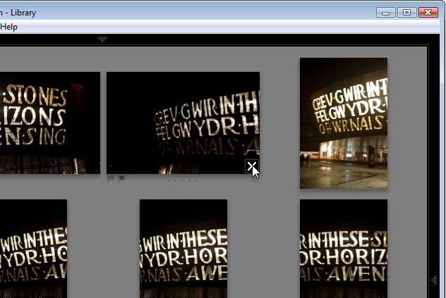
Press Shift + Tab to hide all the panels to maximize the viewing area. When an image is selected notice the X in its bottom right corner. Click that and the image will be removed from Survey View. Note that it is only removed from this view not from Lightroom and not from your disk – Survey View is simply a method you use to pick the best image from a sequence and has no other purpose.

Start removing those images you do not want by clicking their X buttons or Control + Click (Command + Click on the Mac) to remove them.

Step 5

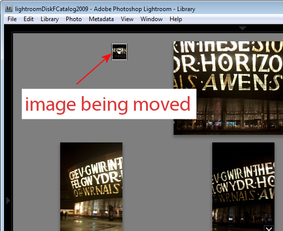
Provided you are working with a Folder of images or a Collection (but not a Smart Collection, All Photographs or Previous Import), you can reorder images in Survey View. To do this, drag and drop an image into the position you want it to appear in the group.

Files in a Smart Collection, All Photographs and Previous Imports can be selected and viewed in Survey View but you cannot reorder your images if they are selected from any of these collections..

Step 6

At any time you can exit Survey View by clicking G for Grid or E for Loupe.

The advantage of using Survey Mode is that you can quickly identify the image that you want from a series of images eliminating all the other images from the view as you do so.

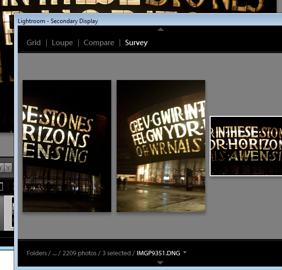
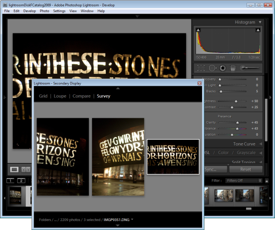
You can open Survey View in a separate window if desired. Press F11 to open the new window and select Survey as what should display in this window.

Using this secondary display window you can move Survey View to a second screen if you’re using two monitors or position Survey View in one area of your screen and work on one of the images in, for example, the Develop module at the same time.

Step 7

When you have only the image or images you want to use remaining selected, press E or G to exit Survey View. These images will remain selected so you can now do something with them such as adding them to a collection, export them or take them to Photoshop for editing.

Helen Bradley

Thursday, December 9th, 2010

Replace Windows Calculator

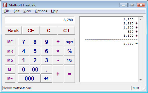
When I use a calculator I like to see the tape – that way I can see what I have done so I can check that the result is based on correctly input data and operators.

Frustratingly the Windows calculator does not include a tape function – seriously it’s not like it would be wasting trees to include one!

My solution is to use Moffsoft FreeCalc which you can find here: http://www.moffsoft.com/downloads.htm. This is a simple calculator you can enter values into using the buttons or the keyboard and it includes a tape that lets you check your entries.

Unbeatable value and a smart replacement for the Windows Calculator app.

Helen Bradley

Friday, December 3rd, 2010

DIY Photoshop Panels using Adobe Configurator

Most users don’t realize that you can create your own custom panels for Photoshop CS4 and for the new CS5. You do this using a free download called Adobe Configurator. In this post, I’ll show you how to get started making your first Photoshop CS4 panel using Configurator 1.0.

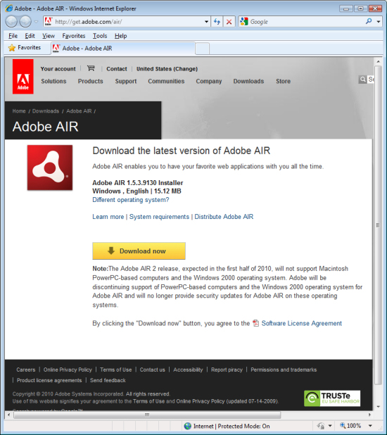
To make your panel you need to make sure that you have AIR installed. If not, visit http://get.adobe.com/air/, download and install it.

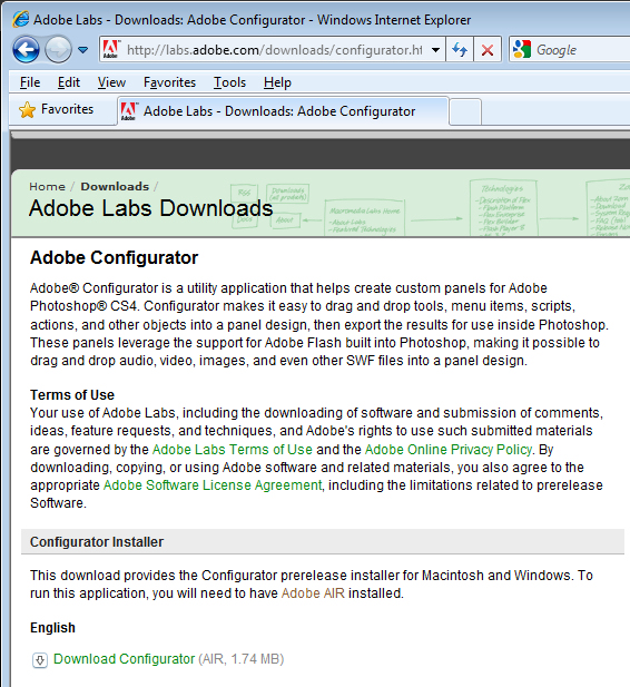
You then need to download the version of Configurator compatible with your operating system and your Photoshop version. Find your version at http://labs.adobe.com/downloads/configurator.html and install it.

Launch Configurator if it does not start automatically once installed.

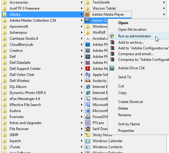
If you are using Windows Vista or Windows 7 you must run the program as administrator – if you do not do so, you will have difficulty saving your panels in the correct location. So, if you are using either of these operating systems, close Configurator, return to your Programs menu, locate Configurator, right click it and choose Run as Administrator. Of course, you’ll need to be using an administrator account to do this.

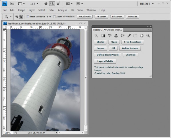
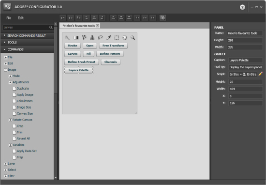
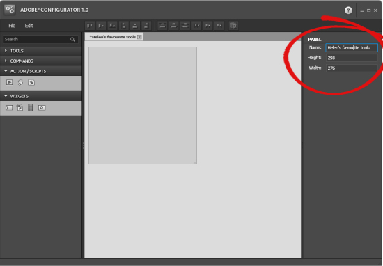
Inside Configurator, choose File > New Panel to create your new panel. The panel doesn’t have a title and it is the default size. On the right of the screen, type a title for the panel and either type a new size or alter its size by dragging on the sizing marker in the bottom right corner of the panel.

On the left are lists of tools and commands as well as action scripts and widgets that you can add to your panel.

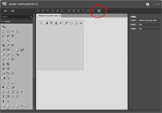
For now go to the Tools list, and drag and drop the tools that you want to include on your panel onto it. For example, if you do a lot of collage work, you can add tools such as the Rectangular Marquee, Lasso Tool, Brush, Clone Stamp, Gradient Tool and all the other tools you regularly use. If you use both the Lasso Tool and the Magnetic Lasso Tool, drag both into your panel as each tool is separate and not stacked as a group as they appear on the regular tool panel.

To align them, click the Auto Layout button on the toolbar.

You can also add menu items to the panel by selecting them from the Commands panel. Open up each menu name in turn to view the commands available. Drag and drop those you want access to onto your panel. Each of these installs as a button.

Change the size of the button by dragging on its sizing handles or adjust its height and width in the panel on the right. You can also change the button caption and tool tip.

Add those commands that make sense for the panel that you’re creating.

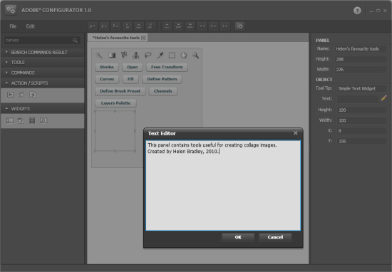
For now, we’ll ignore Action/Scripts and all Widgets except Simple Text. Open the Widgets panel, select Simple Text and drag and drop it into your panel.

Use this control to add some descriptive text to your panel. To do this, click the pencil icon in the right hand panel to open the text editor and type your text into it.

Size and place the text in position. Arrange your panel items by clicking the Auto Layout button.

If you have two or more items selected you can use the other alignment tools on the toolbar to align their edges, centers and so on.

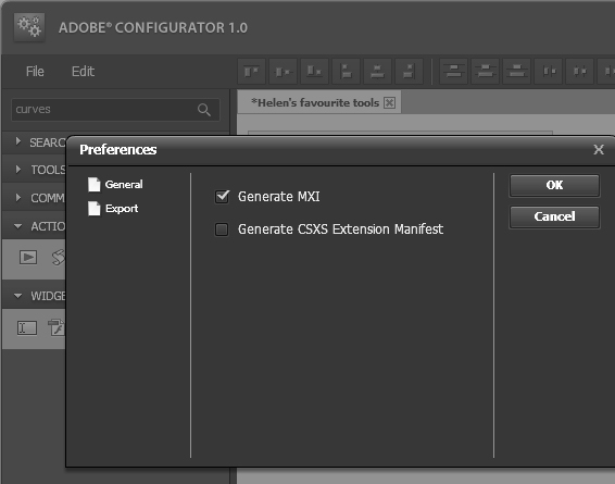
When you are done, select Edit > Preferences > Export and make sure Generate MXI is selected. If you choose Generate CSXS Extension Manifest, you can create your panel as a file that you can share with others. For now, Generate MXI is all you need.

Choose File > Save Panel as and save your panel layout as a .gpc file. You will need this if you want to come back later and edit your panel as you cannot edit the exported panel files.

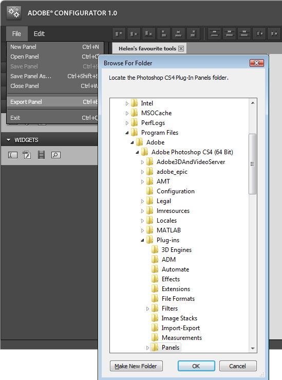
To export your panel in a format that is compatible with Photoshop, choose File > Export Panel and select the your Adobe\Adobe Photoshop CS4\Plug-ins\Panels folder (or the equivalent folder on your Mac).

This is where you’ll strike problems if you are using Windows Vista or Windows 7 and if you do not have administrator privileges because you won’t be allowed to save the files in that folder.

Click Ok and your panel files will be saved to the Panels folder and you’ll see a message confirming this.

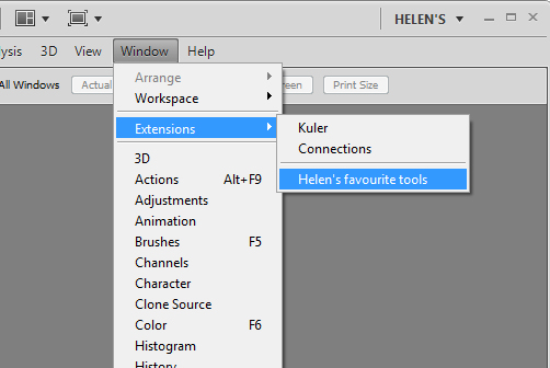
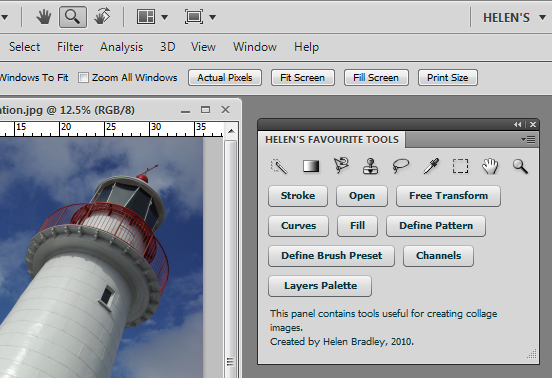
Close Photoshop and then reopen it. You’ll find your panel by selecting Window > Extensions and your panel will be listed in the extensions list. Select the panel and it will open and appear as a Photoshop panel.

You can create multiple panels, each for a different purpose. For example, one panel may have all the tools you need for creating collages and another for making vector selections

In a future post, I’ll go into more detail about some of the other elements that you can add to custom Photoshop panels and how you can create panels that support typical workflows and that you can share with others as teaching tools. In the meantime, have fun creating your first panel.

Helen Bradley

Friday, November 26th, 2010

Crop an image to size in PowerPoint 2010

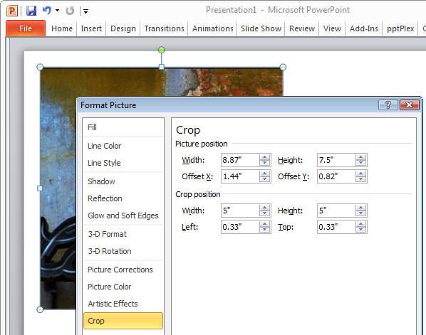
When you have an image in a PowerPoint presentation and you want to crop it to a specific size, click on the image, and from the Picture Tools > Format tab, select the Size and Position dialog by clicking in the dialog launcher in the bottom right corner of the Size group.

Click on the Crop group of options and then in the Crop Position area, type the dimensions that you want to crop the image to. Once you have done this, the image will be cropped to the desired size.

If there is not enough data in the image to crop it to that size, the image will be placed inside a placeholder the size you determined. Once you click Close to finish cropping the image you can increase the size of the image so it fills the placeholder by clicking on the Crop tool on the Picture Tools > Format tab and choose Fill. This increases the size of the image to fill the placeholder.

Helen Bradley

Wednesday, November 10th, 2010

Lightroom: Back up images on import

You know how important it is to back up images but the actual task of doing so can be a real pain. Luckily Lightroom makes it a breeze.

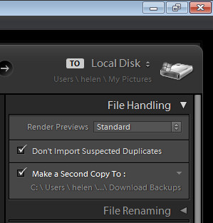
When you’re importing images into Lightroom in the Import dialog open the File Handling Panel on the right. Here you can select to make a duplicate of the images on import to a second location. That is provided you’ve chosen Copy to DNG, Copy or Move as your import preference. If you choose Add the option isn’t enabled and you can’t choose it.

By selecting to make a duplicate of your files you can then select the folder or drive and folder to place the copies in. If you’re converting to DNG as you import the copies will be raw files not DNG but you’ll still have copies. If you choose Add or Move then the copies will be the same format as the original files.

Now there’s  no excuse not to back up – is there?

Helen Bradley

Wednesday, November 10th, 2010

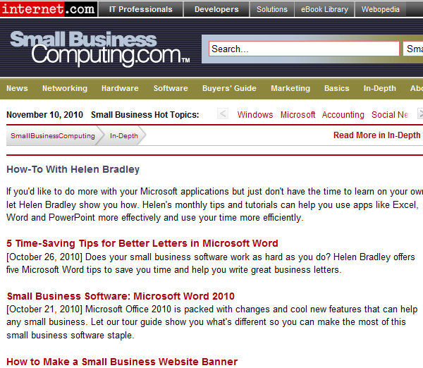
Microsoft Office columns at SmallBusinessComputing.com

I work for some totally cool people and organizations. One of them is SmallBusinessComputing.com. I write a lot of pragmatic Office columns for the site – I love getting down to the tools you most need to use every day and where you can make get the most time saved.

Well my editor loves my stuff so she has created a How To with Helen Bradley page which includes links to all my columns. You can either head over there and browse to find what you want, or read on – I’ve grabbed all the things there and the links to make it super simple for you to read any of the articles on the site. The first link to Time Saving tips for better letters in Word got picked up by one of the NYTimes business blogs:

5 Time-Saving Tips for Better Letters in Microsoft Word

[October 26, 2010] Does your small business software work as hard as you do? Helen Bradley offers five Microsoft Word tips to save you time and help you write great business letters.

Small Business Software: Microsoft Word 2010

[October 21, 2010] Microsoft Office 2010 is packed with changes and cool new features that can help any small business. Let our tour guide show you what’s different so you can make the most of this small business software staple.

How to Make a Small Business Website Banner

[September 20, 2010] Simple touches can make your small business Web design stand out. Helen Bradley explains how to create a great-looking collage banner for your small business website.

Small Business Solution: Manage Your Money in Excel

[August 23, 2010] Helen Bradley explains how any SMB can project and track cash flow with a budget in Excel.

5 Image-Editing Tips to Improve Any Photo

[July 20, 2010] Helen Bradley shows you five ways to make your small business website photos look better using Photoshop or Photoshop Elements.

MS Office Live Brings Small Business Computing Online

[June 21, 2010] Helen Bradley explains how you can leverage your small business software using Microsoft Office Live Workspaces and SkyDrive.

Microsoft Small Business Software: OneNote

[May 20, 2010] Helen Bradley introduces Microsoft’s note-taking and research tool (not to mention unsung hero), OneNote 2003.

Small Business Software: Survey Forms in Word 2007

[April 28, 2010] Surveys are a great way to find out what your customers are thinking. This Word 2007 tutorial will teach you how to create your own survey forms, plus it offers a few tips on writing better surveys.

Customer Databases as Marketing Tools

[April 21, 2010] A strong customer database is a valuable asset and a great small business marketing tool. Are you making the most of yours?

Small Business Software: 7 Tips for Excel Charts

[April 8, 2010] Use small business technology to your advantage. These seven handy Excel charting features make the data in your charts easier to read and comprehend.

Small Business Marketing: How to Create a Web Site

[March 22, 2010] A Web site is one of the most essential Internet marketing tools for a small business. Helen Bradley explains the basics of creating a Web site without spending a fortune.

Multimedia How-To: Producer for PowerPoint 2007

[March 8, 2010] Need a creative boost to your small business marketing materials? Helen Bradley shows how to add multimedia to your presentations with Producer for PowerPoint 2007.

E-mail Marketing: Create a Newsletter in Publisher

[February 19, 2010] Give your small business marketing a boost by making your own custom e-mail newsletter. Helen Bradley shows how easy it is to do in Microsoft Publisher 2003.

How To Make Image Maps in PowerPoint 2003

[January 4, 2010] Helen Bradley explains how to create clickable hotspots, or image maps, that simplify navigating a PowerPoint presentation.

Find Info Fast: How to Create an Index in MS Word

[December 17, 2009] Helen Bradley walks you through Word 2007’s built-in indexing tool and shows how to make document indexes — by hand or automatically.

PowerPoint 2003: How to Animate a Slide Background

[December 10, 2009] Helen Bradley explains how to create a moving picture background that, when used sparingly, makes a more compelling PowerPoint slideshow.

Web Site Design: Simplify with CSS

[November 23, 2009] Whether you’re redesigning your Web site or starting from scratch, consider using CSS — it’ll make future style changes much easier down the road.

Microsoft Tips: How to Make Signs in Word

[November 4, 2009] Ready for do it yourself signage? Our Microsoft tips guru explains the basics of creating professional, functional signs in Word.

Good Web Design Turns Visitors Into Customers

[November 3, 2009] A consistent Web design not only makes visitors more comfortable on your site, it increases your chances of converting them into customers.

How-To: Make a Feedback Quiz in PowerPoint

[October 9, 2009] Helen Bradley shows how you can gather information from someone while they view a Microsoft PowerPoint 2007 presentation.

How to Create Lists in Microsoft Word

[October 8, 2009] Helen Bradley walks you through the steps to create and customize bulleted and numbered lists in Word 2003.

How to Make Charts in Microsoft Access

[September 28, 2009] Helen Bradley explains how you can chart your data without ever leaving Microsoft Access.

Create Custom Functions in Excel 2007

[September 2, 2009] Helen Bradley shows how custom Excel functions save time and effort and how you can use your custom functions in all your workbooks.

How To Design Brochures in Microsoft Publisher

[August 26, 2009] Helen Bradley shares design tips to create great-looking brochures in Microsoft Publisher.

Microsoft Excel: Design Error-Free Worksheets

[July 29, 2009] Helen Bradley looks at simple ways to avoid introducing errors in Excel worksheets.

How To: No-Hands PowerPoint 2007 Presentations

[July 1, 2009] Helen Bradley walks you through building a PowerPoint slide show that can run automatically – a handy promotional tool to use at events or in reception areas.

Working with Word 2003: Add a Professional Look

[May 28, 2009] Helen Bradley shows you how to add finishing touches that make Word documents look polished and professional.

Word 2007: Working with Numbered Elements

[May 15, 2009] Helen Bradley shows how to create duplicate and sequential numbering in Microsoft Word 2007.

How to Create Custom Formatting in Excel

[February 17, 2009] Helen Bradley demonstrates Excel formatting tricks that will help you when things don’t work as planned.

Microsoft Excel 2007: Outlining Worksheets

[February 10, 2009] We show you how to summarize important data in your Excel 2007 worksheets and reduce the data to more manageable levels with the ultra-efficient outline tool.

How To Make Templates in Microsoft Word 2003

[January 27, 2009] Helen Bradley shows you how to create Word document templates to quick start your day-to-day tasks.

How to Use Teamwork Tools in Microsoft Word 2007

[January 7, 2009] When working on documents with other people, tracking changes has the potential to save time and help keep others well informed and on the same page.

Excel 101: Create Worksheets and Charts

[December 19, 2008] Helen Bradley introduces the basics of creating a worksheet and chart in Microsoft Excel.

Link or Embed: How To Add an Excel Chart to a Word Doc

[December 1, 2008] Microsoft maven Helen Bradley explains how to place an object from one Office application inside of another.

Microsoft Access: Customize Forms and Reports

[November 10, 2008] Our Microsoft application guru Helen Bradley explains how to make Access database forms and reports more functional and attractive.

Create a Web Site in Publisher 2003

[September 18, 2008] Helen Bradley shows how to use Microsoft Publisher to build a basic Web site for your business. Bonus: you can use the same design set for your Web site that you use for your print marketing materials.

Basic Formatting in Microsoft Word

[August 28, 2008] Our resident document diva, Helen Bradley takes us on a tour of the rudimentary, but essential, formatting features in Word 2003.

Create Custom Headers and Footers in Word 2007

[August 13, 2008] Tapping into the new document properties and content controls in Word 2007 generates some very sharp-looking professional building blocks.

Create Marketing Materials in Publisher

[August 4, 2008] Our designing diva, Helen Bradley shows you how to create your own sharp, professional marketing materials using Microsoft Publisher.

How-To: Animate Microsoft PowerPoint Presentations

[July 30, 2008] Our application expert Helen Bradley explains ways you can add animation effects to your slide shows.

Office 2007: Keep Excel Data Visible At All Times

[July 3, 2008] With a little imagination and skill you can work on one part of a spreadsheet and see data in other areas at the same time.

Microsoft Word: Working with Field Codes

[June 24, 2008] We look at ways to harness the power of Word Field codes to automate and simplify document production.

Discovering Dashboards in Excel 2007

[June 6, 2008] We step through the process of creating a Dashboard chart and data display in Excel 2007 for more efficient analysis of and quick access to your critical information.

Access 2003: Extracting Data Through Queries

[May 22, 2008] You’ve put in the time and effort to build and populate a database — now what? We take a look at the ways to create queries to find pearls of business wisdom. Plus: watch the video.

Microsoft Word Tips: AutoCorrect and AutoText

[March 10, 2008] Don’t get caught up in repetitive typing and correcting common typos. The AutoCorrect and AutoText tools in Word can help you to increase your efficiency and speed up your day.
Exploring Office 2007: Error-Free Worksheets in Excel 2007

[February 19, 2008] It’s critical to understand the problems that might occur in your Excel worksheets. In this article, we’ll show you how to keep them as error-free as possible.

PowerPoint Tips: Slide and Title Masters

[February 14, 2008] Mastering the art of PowerPoint masters will save you time, repetition and a whole lot of aggravation.

Hand-Drawn Charts in PowerPoint 2007

[January 24, 2008] We take a look at handy new features in PowerPoint 2007 that let you create attractive hand-drawn charts to give a visual boost to your presentations while still getting your message across to your audience.

Build Your First Database with Access

[January 14, 2008] Creating a database in Access can be a bit daunting for the uninitiated. We’ll walk you through how to build your own, plus a report and a query, too.

Exploring Office 2007: Quick and Efficient Data Entry in Excel

[January 4, 2008] There are many times in Excel when you find yourself entering the same data over and over again. In many cases, you can spare your fingers the work of typing and fast-track repetitive data entry. As the latest article in our Exploring Office 2007 series shows, it’s all about working smarter and more effectively.
Exploring Office 2007: Collaboration in Word 2007

[December 11, 2007] Microsoft Word 2007 is a great editing tool to use when you’re working with others on a project. We explore the features in Word 2007 that allow you to manage workgroup changes and contributions to documents.

Working with Action Buttons in PowerPoint 2003

[December 6, 2007] Action buttons let you navigate quickly through a PowerPoint presentation, add sounds or any number of other interactive effects. We’ll show you how easy it is to do.

Working with Images in Word

[November 20, 2007] They say a picture’s worth a thousand words, but wait ’til you see what Word can do with that picture. We take a look at the application’s image tools and how using them lets you add pop to any document.

Working with Tables in Word 2003

[October 22, 2007] Tables let you organize information in a concise, visual way, but working with them in Word can be a bit tricky. We’ll take a look at some of the tools and show you how to make the most of Tables.

Take the Guesswork Out of Printing in Excel 2007

[October 1, 2007] With a little pre-planning and some knowledge of the print options that can be configured to your advantage in Excel, you can turn your next Excel print job from an exercise in frustration to an effortlessly simple and successful procedure.

Learning About Lists in Excel

[September 11, 2007] Excel offers a simple way to manage lists of data without resorting to the complexity of a database. We show you how it works in both Excel 2003 and 2007.

MS Office 2007: Applying and Customizing Themes

[August 24, 2007] One of the new features in Microsoft Office 2007 that has everyone talking is Themes. Discover how this new feature can improve your everyday productivity and efficiency while helping you create attractive, professional-looking documents and presentations with minimal effort.

Analyzing with Excel

[August 23, 2007] Excel makes comparing business decisions a bit easier with its Scenario Manager tool. We take a look at how you can use the spreadsheet to set up different scenarios whether it’s comparing products or budget numbers.

Exploring Office 2007: Top Ten Excel Chart Tips

[August 2, 2007] Excel charts have been given a makeover in Excel 2007 and the Chart Wizard of earlier versions is now gone. Our Exploring Office 2007 series continues with a list of the top tips for creating functional and attractive charts in the new Excel 2007 release.

Three Must-Know Excel Tools

[July 25, 2007] Excel jockeys saddle up. We take a look at how using Reports, Views and Outlining saves you time and simplifies your spreadsheets.

Exploring Office 2007: PowerPoint 2007 Tips and Tricks

[July 3, 2007] PowerPoint 2007 delivers a wealth of new features and enhancements that make it easier to create attractive, professional-looking presentations. Our Exploring Office 2007 series continues with a list of the top tips for getting the most out of the new PowerPoint 2007 release.

Exploring Office 2007: Outlook 2007 Tips and Tricks

[June 15, 2007] While Outlook 2007 may look a lot like older releases, there’s a great deal to like about the upgrade and plenty of new tools to help you be more productive. Our Exploring Office 2007 series continues with a list of ten top tips for using Outlook 2007.

Word Mail Merge: It’s not Just for Letters

[June 11, 2007] Microsoft Word can merge more than just mail. Use the popular app’s mail-merge feature for create lists, nametags and even catalogs with images. We’ll show you how.

Exploring Office 2007: Using SmartArt Graphics

[May 22, 2007] Office 2007 delivers an abundance of new features and enhancements, many of which aren’t exactly obvious at first glance. The first article in our new Exploring Office 2007 series takes a closer look at working with the SmartArt tool to easily create everything from simple diagrams to cutting-edge business graphics.

Take Your Excel Charts Beyond the Basics: Five Cool Tips

[May 3, 2007] Add some life to your spreadsheets and make your data easier to understand. These five tips can make Excel charts sing.

Helen Bradley