Sunday, December 27th, 2009

Sharpening in Lightroom


When you’ve finished doing your basic color correction to an image in Lightroom you’re ready to look into sharpening the image. In a previous posts I explained the basics of sharpening and how to use the High Pass Filter in Photoshop to sharpen an image. Today I’ll show you how to sharpen in Lightroom.
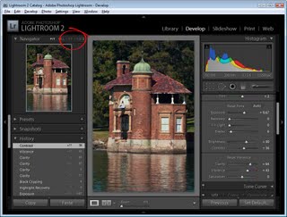
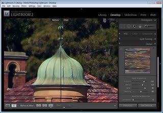
You’ll find the sharpening tools in the Detail area in the Lightroom Develop module. It’s best to work on the image at a 1:1 ratio as this ensures that the sliders that you’ll use can be seen at work on the image. If you aren’t in at least 1:1 view you will have to work from the small preview window. To select 1:1 zoom, click the indicator in the top left of the screen.
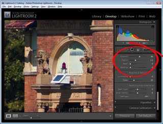

You have four sliders in the sharpening area. Amount controls how much sharpening is applied to the image. This can be considered to be your fine-tuning tool.

The Radius is one of the key settings to use. The Radius value can be moved between 0.5 and 3. Typically, a good Radius to start sharpening with is around 0.5 to 1 and then adjust it from there if the sharpening is insufficient. Images with large areas that are not very detailed such as portraits, may need larger values for the radius where images with a lot of fine detail may respond better to smaller values.
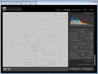

The Detail slider reduces the haloing in the image. The higher the value you use for Detail, the more halos you will see around the edges in the image. The lower the Detail value the less halo effect and the smoother the result.

You can see how the slider works when you are viewing a 1:1 preview size. Hold the Alt or Option key as you drag on a slider. The higher the Detail value the more lines you will see in the grayscale preview indicting the sharpening effect on the image.
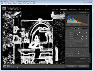
The Masking slider works to mask out areas of smooth color. What it does is to enhance the edges and remove the sharpening effect from areas in the image that have smoother color transitions which you probably don’t want to be sharpened.

Again, you can hold the Alt key as you work with the slider. The slider values range from 0 – 100. At zero, everything in the image is sharpened and at 100 only the edges are sharpened. In the preview, the white areas are those being sharpened and those that are black will not be sharpened.
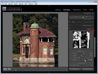

If you aren’t using 1:1 view you will need the preview window to be visible so you can see the results when using the Masking and Detail preview options. To view this, click the arrow in the top right corner of the Detail area.
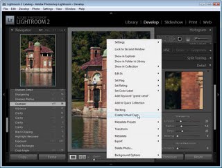

When you’re starting out learning how to sharpen it can be difficult to see just what effect the sharpening is having on the image. If you press the backslash key you’ll return to the unedited image rather than to the image as it was before you started sharpening it.

This is a time where virtual copies can be useful. Wind back the history to just before you started sharpening the image. Right click the image and choose Create Virtual Copy. This creates a virtual copy of the image whose starting history is the current view of the image after your initial fixes have been made.
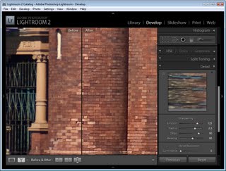

Now when you sharpen the image and use the Before and After settings you can see the change that the sharpening is applying to the image because that’s the only change to the virtual copy that you are editing.

Typically, if you are displaying images on the web you want to sharpen the image so that what you’re seeing on the screen is what you want to see when the image is on the web. On the other hand, for printing you generally apply heavier sharpening to the image as some of this will be lost in the printing process.

Helen Bradley

Saturday, December 26th, 2009

Outlook 2007 Display Saturday and Sunday

If your weekends are as full of activities as your weekdays are, you may want Saturday and Sunday to display in the Outlook 2007calendar all the time.

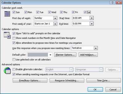
To permanently display Saturday and Sunday, choose Tools > Options > Preferences tab and click the Calendar Options button.

From the dialog select the checkboxes for both Saturday and Sunday and click Ok.This dialog is also useful for setting a non traditional work week. If you, like my friend Frank, work from Sunday to Thursday, you can set up your work week by selecting checkboxes for those days you actually work and disabling them for other days that are your “weekend” days.
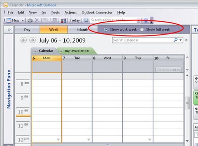
Only these days of the week will now appear in your Outlook 2007 calendar display when you have Show Word Week selected.
To toggle between viewing the Work week and the full week click the appropriate buttons on the Calendar toolbar.

If you have come to Outlook 2007 from an earlier version of Outlook, you should know that the old Compress Weekend Days option for showing Saturday and Sunday compressed into a single column is now no longer an option in Outlook 2007.

If you need to print calendars so that weekend days share a column, download and install the Calendar Printing Assistant for Outlook 2007 from here:
http://office.microsoft.com/en-us/outlook/HA101687211033.aspx

Helen Bradley

Saturday, December 26th, 2009

8 secrets of the zoom tool


Continuing with my ‘tool’ secrets posts, here are 8 secrets of the Photoshop Zoom Tool.

Quick toolbar shortcuts
The Zoom tool can be selected by pressing the letter Z – it’s an easy and handy shortcut to remember because it saves you from having to click the Zoom tool to select it.

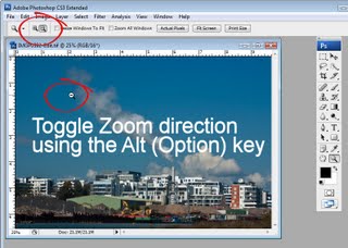
However, once engaged, the Zoom tool operates in only one direction, in or out depending on the option you have selected on the Tool Options bar. You can toggle the Zoom direction by holding the Alt key (Option on the Mac) as you zoom.

Zoom as you work
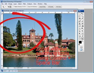
If you’re in the middle of painting, erasing or selecting an item and if you need to get access to the Zoom tool, press Ctrl + Space Bar (Command + Space Bar on the Mac) and you’ll get access to the Zoom tool’s current setting – which will be either Zoom In or Zoom Out depending on what you have selected. Use Ctrl + Alt + Space Bar (Command + Option + Space Bar on the Mac) to zoom the other way.

Zoom to a specific place
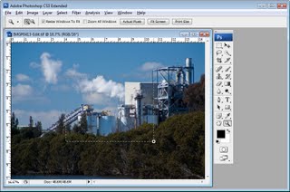
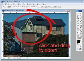
If your Zoom tool is set to Zoom In, you can zoom to a particular location in the image by dragging with the zoom tool over that location rather than simply clicking on it. If your tool is set to Zoom Out, press Alt (Option on the Mac), and drag over the place on the image that you want to focus on.

Size the window as you zoom
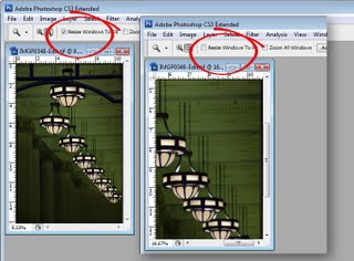
When the Zoom tool is selected, the Tool Options bar has a checkbox for Resize Window To Fit. Enable this and the window around the image will be resized to fit the zoomed image so you won’t have any space between the image and the edge of the window. With this option disabled, if you shrink the image, the window stays the same size and grey area is added around the image between it and the window edge. If you zoom in with this option disabled the window stays the same size as you zoom.

Other zoom options
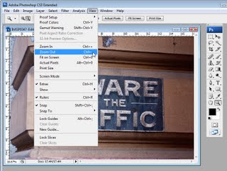
Some Zoom options can be selected from the View menu such as Zoom In, Zoom Out, Fit On Screen, Actual Pixels and Print Size. Each of these can also be selected using keyboard shortcuts such as Ctrl + + to zoom in, Ctrl + – to zoom out. Keystrokes appear in the menu opposite each item.

Zoom via the Status Bar
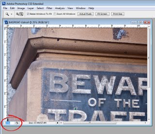
The current zoom percentage is shown in the left side of the image window’s Status Bar. To zoom to a particular percentage level such as 150%, type 150 in the Status Bar box and press Enter.

Hidden Zoom Options
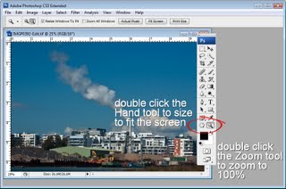
To quickly zoom an image to 100% size, double click the Zoom tool in the Tool Palette. The Hand tool can be used to size the image to fit the screen – to do this, double click the Hand tool. Exactly how big the image is when it is set to “fill the screen” depends on the position of toolbars and palettes.

Zoom with the mouse
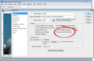
To zoom with your mouse wheel, choose Edit > Preferences > General and enable the Zoom with scroll wheel checkbox. Then you can roll the mouse wheel to zoom in and out of the image.

Helen Bradley

Saturday, December 26th, 2009

Christmas festivities

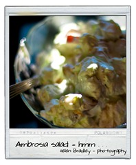
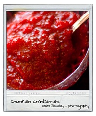
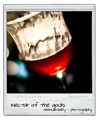
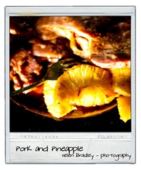
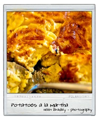
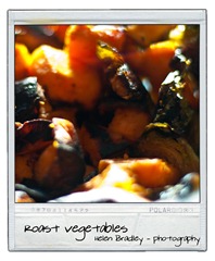
This Christmas Santa gave me a wonderful Holga camera but we didn’t realize it was going to use 120 film so were were forced back to the digital world for Christmas photos. No great hardship resulted however, as I got a chance to head out the door with my trusty 50mm f/1.4 portrait lens – an ideal lens for low light photography – you simply don’t have to worry about light with this lens – it shoots fast in just about any situation. And, because it is f/1.4 it has a tiny point of focus when you shoot close up. You get photos that have a small area in focus and everything else is wonderfully blurred. You can ignore messy backgrounds – they simply don’t show up.

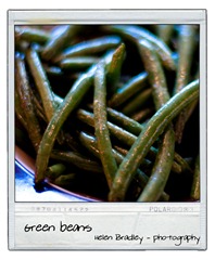
I totally love this lens and today, thanks to some totally wonderful food cooked by friends Mindy and Frank, I came home with wonderful presents, a stomach aching from great food and a fist full of food images to celebrate the day. The secret of the photos is to get close enough that you fill the viewfinder with the food but not so close that the lens won’t focus. Make sure the focus is exactly where you want it and go for it…

beans

ambrosia'


cranberries

drink


meat

pineapple


  potatoesvegetqables


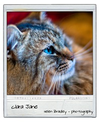
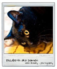
And here are Mindy and Frank’s wonderful cats..

clara

elizabeth


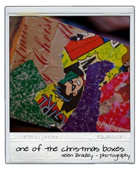
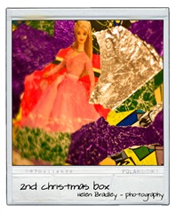
And, because it is Christmas, here are photos of the cool boxes we have used for years for present exchanges between houses… each time a box goes from one house to the other, for birthdays, Christmas and Hanukkah some of the papers we use to wrap are torn and glued to the box. There are 12 years of friendship and gifts celebrated with each box. There are Barbies, X-Men, Hanukkah stars and Christmas trees – there are M & M stickers and so much more in the memories the boxes contain…

boxes

boxes2


And one photo of some of the funky presents. I have to explain that the snowman makes appropriate Christmas noises and poops candy into his hat – as for the rest of the presents, most defy explanation… sorry, but you really had to be there…

gifts 


Happy Christmas to you and yours..

Helen Bradley

Wednesday, December 23rd, 2009

Photoshop – Making Steampunk gears

I’m very much into steampunk and creating steampunk gears and brushes. Here’s a simple way to create a gear using a Photoshop shape.
Step 1
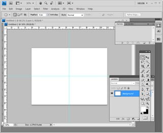
Create a new document and add two guides using the rulers by selecting View > Rulers and then drag a horizontal and a vertical guide from the ruler lines into the middle of the image. These guides make it easier to line everything up. Add a new layer and select it so you aren’t working on the background layer.Step 2
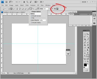
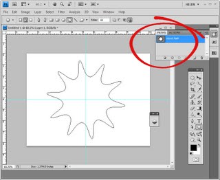
Select the polygon tool. Select the down-pointing arrow next to the shape options and set Smooth Corners, Star, Indent Sides by 65% , Smooth Indents and set the Sides value to 10. Make sure at the far right of the tool options bar you have Exclude Overlapping Path Areas selected.
Step 3
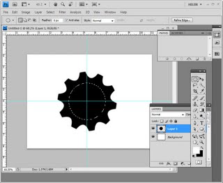
Hold the Shift key, click and drag over the intersection of the gridlines and drag outwards to create the star shape. Check the Paths palette to make sure that you have a white shape in the middle of the image. If not, stop and start over again. Step 4
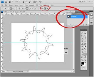
Now with the Subtract From Path Area Option selected on the tool options bar, select the Ellipse shape tool, hold the mouse pointer over the intersection of the gridlines and start drawing. Add the Alt key (Option key on the Mac) to center the circle over the shape.

Drag the shape across the star shape so that it intersects each of the star points. Let go the mouse pointer, then let go the Alt and Shift keys.

Check the paths palette to ensure that you still have a sort of circular white shape in the middle of the image. If not, you will need to undo this last step and start over.
Step 5
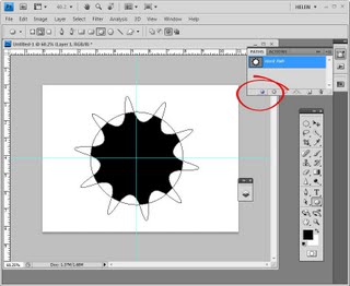
Select black as the foreground color and in the bottom of the paths palette, select the Fill Path With Foreground Color option. You should now have a gear shape filled selection.
Step 6
Delete the Working Path by dragging and dropping it on the trashcan icon in the Paths palette.
Step 7
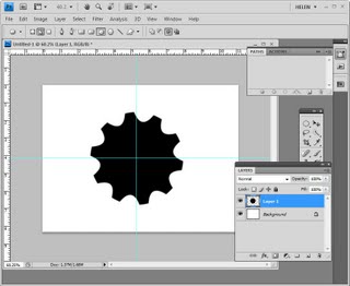
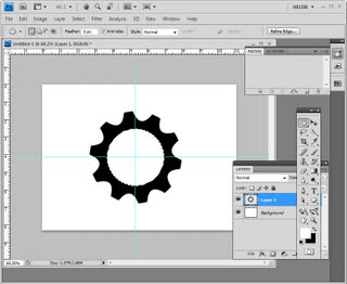
Return to the Layers palette and select the layer that you’re working on. Select the Elliptical Marquee Tool and holding the Shift key, click and drag from the intersection of the gridlines outwards. Before letting go of the mouse button, add the Alt or Option key so that the shape is centered inside the gear shape. Position and size the circle inside the gear as this will be the middle hole. When you have what you want, let go the mouse button and then release the Alt (Option) and Shift keys.Step 8
Press the Delete key to delete the contents of this layer. As you’re working on a separate layer, this will make a hole through the image to reveal the background layer underneath.

Select Ctrl (or Command) + D to remove the marquee and choose View > Clear Guides to remove the guides. Step 9
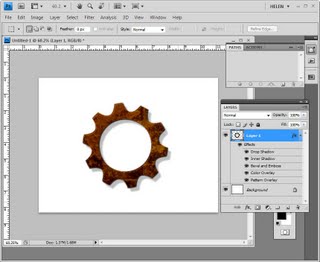
You now have a shape that you can make a brush from or add layer styles to make it look more like a gear.

Helen Bradley

Monday, December 21st, 2009

Contorting shapes

While Photoshop comes with a series of custom shapes, they don’t have to look the way that they were designed to look. Step 1
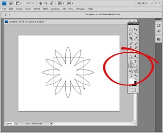
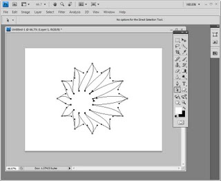
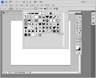
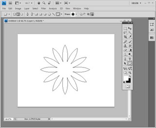
To see this at work, click the Custom Shapes button on the toolbar, make sure that you have Paths selected on the Tool Options Bar and select a shape such as a Flower5 from the Nature shape collection. Step 2
Hold the Shift key as you drag the shape into your image.step 3
Select the Direct Selection Tool and drag over just the middle points of the flower inside the outside edges. This will result in nodes showing on all the flower points but you need to just concentrate on those in the middle. Step 4
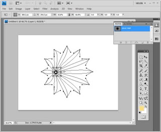
With all the nodes selected, click and drag on one of the middle nodes. Notice that all the middle nodes travel together and that you can pull on them to distort the flower shape in all sorts of ways. When you have the flower distorted as you want it to look, let go the mouse button.
step 5
To drag all the points in or out around a fixed point, choose Edit > Free Transform Points then hold the Alt key as you drag on the outside handles which appear. You can then let go the Alt key and move the selected area into position or reshape it. Select the Commit button or press Enter when you are done.Step 6
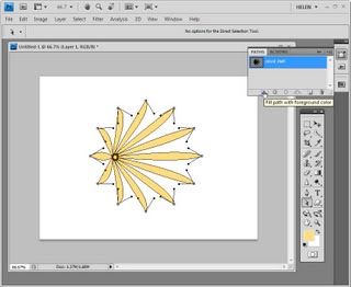
On the Paths palette you can now click the Fill Path With Foreground Color button to fill the path with the current foreground color. You can also select the Load Path As A Selection option, return to the Layers palette and, for example, fill the selection with a gradient fill by selecting a gradient and dragging across the shape to fill it.

Shapes that respond particularly well to this treatment are those with a definite center point such as the flower shapes, some stars and snowflakes.

Helen Bradley

Saturday, December 19th, 2009

Photoshop: Quick and easy tourist removal

Being a tourist would be more fun if there weren’t thousands of other tourists getting between you and the shot you want to capture.

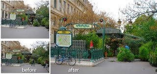
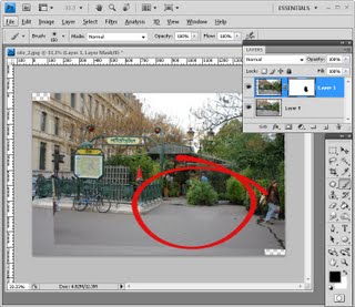
When you are visiting a popular location and if you have difficulty getting a photo that is free of people, take two (or more) photos making sure that somewhere in each you have a good clean portion of the sight you are interested in photographing.

On your return you can assemble the images in Photoshop and create one good, tourist free image.

Here’s how to do this with two images. This process relies on a feature called Auto-Align Layers which was first introduced in Photoshop CS3. If you have an earlier version of Photoshop you can manually align the layers but Photoshop won’t do it automatically for you as shown here.

Step 1

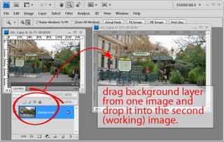
Open both images in Photoshop and drag the background layer from one into the other image so you have two different layers in one image. This will be your working image – you can close the other one as you no longer need it.

Step 2

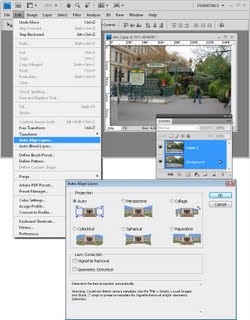
Select both layers in the Layers palette by clicking on one and then Shift + Click on the second. Choose Edit > Auto-Align Layers, click Auto and click Ok.

This feature automatically aligns the layers relative to each other. (You may not have noticed this tool before – it’s on the Edit menu when logic would suggest it should be on the Layers menu.).

Step 3

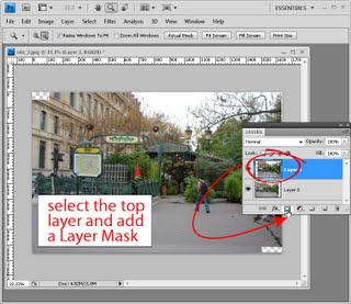
Select the topmost layer in the image and add a mask to it by selecting the Add Layer Mask icon at the foot of the layers palette.

Step 4

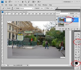
Set black as the foreground color, select a round soft edge brush and click on the mask icon in the layers palette so it is selected.

Step 5

Paint over the person or other thing in the top layer that you want to remove. Painting in black on a mask reveals the layer underneath so you should see the image underneath through this one. (If you need to paint back in some of the image, switch to white foreground color and paint on the mask in white).

Step 6
When you’re done you can merge the layers (Layers > Merge Visible). If you still have other tourists to remove, return to step 1 and continue with another of the images you captured.

If you are done, crop the image and apply any required fixes to the image before saving it.

Helen Bradley

Thursday, December 17th, 2009

Outlook – Edit Received E-mail

Occasionally you might have a need to edit a message that you have received in Outlook 2007.

The message will be already in your Inbox so, to do this, open the message.

Now click the Message tab on the Ribbon and, from the Actions group, select Other Actions > Edit Message.

You can now edit the message and, to send it back to the sender, click Reply and to send it on to someone else, click Forward, type the recipient’s address and click Send.

Helen Bradley

Thursday, December 17th, 2009

PowerPoint: Create handouts in Word

So, you’ve finished designing your presentation in PowerPoint and it’s time to you’re your final preparations.

One thing you will need is handouts for your participants. It is easy to use Microsoft Word to create custom handouts for your PowerPoint presentation.

First complete the presentation so the slides are all is complete select the Office button and choose Publish > Create Handouts in Microsoft Office Word.

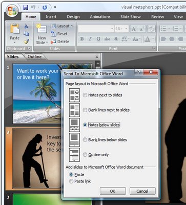
When the Send to Microsoft Office Word dialog appears, select the layout for the slides and text. There are various combinations of slides, notes and blank lines that you can choose from.

Select either the Paste or the Paste Link button depending on whether you want to embed the slides in the Microsoft Word document or simply link to them.

When you are done, click Ok and wait as Microsoft Word opens and the slides, notes and blank lines are created automatically for you in a new Word document.

Once the handouts are complete, you can format the document as you wish and add a cover page, headers and footers as desired and then print your slide handouts for distribution at presentation time.

Helen Bradley

Wednesday, December 16th, 2009

10 things for your camera bag

Regardless of where you are travelling to this holiday season here are my top 10 things to have in your camera bag:

  1. 3 sets of batteries – one in the camera, one in the charger and one in your pocket
  2. Battery charger and a power cable suitable for use wherever you’re travelling
  3. Spare memory stick or smart card for extra storage on the road
  4. Cooler to put the camera in if it’s hot where you are headed (leave the ice behind)
  5. Polarizing filter to suppress reflected light for more color in your images
  6. Tripod for capturing panoramas, macro shots and for longer exposures
  7. Camera manual to refer to if you have questions that you can’t resolve
  8. Lens cleaning cloths, cleaning fluid and a brush to blow dust from the lens (not your shirt tail – please!)
  9. A variety of lenses including a macro lens if your camera takes interchangeable lenses
  10. Underwater camera housing for your digital so you can take it swimming with you

Helen Bradley