Thursday, March 26th, 2009

7 steps to throwing a Photo Party


Forget Photoshop for a day and put away your Digital SLR then grab a point and shoot, some photo paper and a lunchbox size printer and host a photo party that everyone will remember.

Make any occasion more memorable when you make it a photo party too. Instead of just taking photos, print them on the spot so everyone takes home a memory of the occasion. From weddings to birthdays and from retirements to anniversaries here is my 7 step approach to take any party to the next level.

1 Gather your tools
You will need one or two cameras – any digital camera will do and older ones are great because they take smaller images. If you have a newer camera, adjust the file size down to around 1200 x 800 in size and the quality to good (not superfine) as that is all you need to print a 6 x 4 photo quickly. Just remember to set these values back to normal after the party!

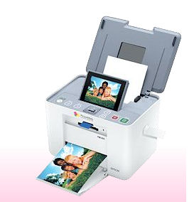
2 Grab a printer – lunch box size
To print the photos a small lunchbox photo printer is a great choice – it will print 6 x 4 and it can operate without needing to be connected to a computer. Simply pop the camera card or memory stick into the printer and start printing.

3 It is all in the planning
Test everything well before the party and get set up early on the day – you want to be able to enjoy the party not have to trouble shoot problems! I like to use one camera and two or more camera cards – in fact the piteously small cards you got with the camera are great for this job. Using it you can capture your first dozen or more photos, switch it out for a second (empty) card and get started printing.

4 Print and shoot
As the first photos are being printed, you can start capturing the next lot. Take one photo of each person or couple and don’t waste time editing or cropping photos – just set them up to print and get on with capturing more photos.

5 Share the wealth
Once you’ve finished printing them – hand out the photos to all the guests. I like to keep a laptop to one side to copy the images to so I can delete them from the cards and still have them as a permanent record in case anyone wants duplicates.

6 Fancy a part time job?
Affix pre-printed sticky labels with details of the date and occasion to the back of the photos. If you’ve had fun being chief photographer at the photo party, it’s a great sideline job so capitalize on the occasion and stick your details on the back of the photos too!

7 An album of Memories
For some parties like small weddings, showers, graduations, anniversaries, retirement parties and farewells I purchase a small album and add the printed photos to the album instead of giving them to the guests. Everyone then writes a message to the guest of honour beside their photo and the album is then given as a unique parting gift. If someone can’t make it to the party, have them send a note and a photo ahead of time so you can include it in the album.

Photo Party Check list
-Check everything works before party day
-Train a friend to use your printer and camera so they can help out
-Photograph everyone as they arrive
-Print contact sheets – they’re great for mini photos
-Have plenty of paper and ink on hand
-Delete bad photos in the camera so you don’t print them

Helen Bradley

Saturday, March 21st, 2009

Better Hash Tags with Tagal.us

While hash tags have been around on Twitter for ages (at least ages in Twitter time!), they’re a little bit difficult to manage. Hash tags are like this #psw and they’re used as a way to tag a post with its contents. This one, #psw is for Photoshop World – using this in our Tweets lets us share messages during the conference. Problem is to find the hashtag tweets. You can do it in Twitter search but it’s cumbersome to say the least.

Enter Tagal.us which gives you an interface for setting up hash tags and monitoring the tag content. The idea is that someone registers a tag at Tagal.us for an upcoming event. So there’s already one #PSW set up for Photoshop World. Once the hash tag has been created anyone can go to the Tagal.us site using the tag as part of the URL, for example http://tagal.us/tag/psw and view the tweets that mention this tag.

Even if you’re not following someone you’ll still see them in the list and see their tweets. This is a great way to monitor activity at a tradeshow or other event where there is lots of activity in a short period of time. You can find everything relating to the hash tag you’re interested in at one easy to find (and bookmark) location.

Helen Bradley

Sunday, March 15th, 2009

Calculating printer costs


If you own an inkjet printer it won’t be long before you realise that the cost of the printer is far less than the cost of consumables for it.

I have a great HP printer which has separate colour cartridges for 5 colours and black so I only change cartridges when I run out of a colour – it’s more cost effective than replacing a composite cartridge which has multiple inks in it because you only replace a colour when you’re out of it.

However, I’m always curious about what ink costs and how much my printer really costs to run. I found, courtesy of OfficeWatch.com this calculator from the American Consumer site which helps you calculate what your printer costs. You type in how many pages in black and white, colour and photos you print a week and it calculates the cost of your printer over 3, 5 and 7 years. It’s an eye opener!

Helen Bradley

Sunday, March 15th, 2009

Stupid Photoshop tricks #1 – hold your own photo

There are heaps of creative things you can do with your images in Photoshop and one I think totally rocks is a collage technique that turns your photo into a photo of itself. If you’re totally confused, check out the image – you’ll see a hand holding up what appears to be a Polaroid image in front of a scene – the Polaroid image itself shows part of the background scene and it’s all done in Photoshop – here’s how:


To create this image you will need a photo with an interesting subject. I’ve used a spring landscape.


You will also need a photo of your hand held as if you are holding a photo in it. Take the photo of your hand with your point and shoot camera held in one hand and your other hand stretched out in front of you. You may need to use macro mode to ensure that the hand is in focus and not the scene behind. The ideal setup for photographing your hand is with a road or carpark as the background – the contrast between your skin and the road will make it easy to select around your hand.

While you can create your own faux Polaroid image, there is a good one you can download from http://lured2stock.deviantart.com/art/Polaroid-3262470.

Open the photo of your hand, the landscape and the Polaroid image in Photoshop. Crop the hand to remove excess background.

Select around the edge of the Polaroid image and remove its excess background so you have only the image itself.

Drag the background layer from the Polaroid image and the hand image into the landscape image. Each element will appear on its own layer.


Drag the hand to the top of the layer stack and hide the other two layers. Use your favourite section tool to select around the hand and add a layer mask by clicking the Add Layer Mask icon at the foot of the Layer palette (use Alt + Add Layer Mask if you selected the background rather than the hand). Using a layer mask makes it easier later on to remove parts of the hand so the Polaroid will look like it is held in your hand.


To transform the Polaroid image so it is the correct size, Ctrl + click on its layer thumbnail and select the Move tool. Press Ctrl + T to select the free transform tool and then Ctrl + 0 (zero), to scale the image so that you can see its sizing handles. Drag the Polaroid into the approximate position it should appear in the image and size it to suit. It should appear partially covered by the hand.


Make a selection around the inside of the Polaroid image and delete it or add a mask to hide it. Select the background layer and hide the two top layers. Move the selection over the underlying image – choose Select > Transform Selection and resize it in proportion if desired.


Choose Edit > Copy to copy the selection onto the clipboard, then Edit > Paste to paste it into a new layer, size it to fit the hole in the layer above. Brighten this layer if desired. Select this layer and the Polaroid image by Shift + clicking on each of them and choose Layer > Link Layers. Rotate the Polaroid slightly.


Make the hand layer visible again. Select the brush and black paint, click on the layer mask for the hand layer and paint out portions of the hand that should be behind the Polaroid. Add a new layer below this layer and paint a small drop shadow along the edge of the fingers over the Polaroid.

Helen Bradley

Saturday, March 14th, 2009

Solving printing problems in Excel


I’ve seen adults brought almost to tears over printing worksheets. Big worksheets consume lots of paper and when things go wrong they do so in a spectacularly wasteful way. Sometimes the best you can do is hit the printer Off switch to at least achieve a short term solution to the problem. A longer term solution is to understand how you can control what is printed and that’s what I’ll cover this month. I’ll look at the basics of printing a worksheet and then explore some more advanced options which offer better control over your printouts.

Troubleshooting problems
When you choose File > Print or click the Print button in Excel, the program determines what to print and does so. By default it prints everything on the currently active sheet. So, if you have a small set of data in the top corner of the worksheet and have accidentally typed something into a cell way below this (even if it is just a single space), you’ll get your data and everything else between this and the one cell with the mistaken entry printed. It could be pages and pages of blank paper – or lined paper if you have gridlines enabled and it’s perilously hard to track what went wrong.

You can see ahead of time that you’re about to have problems if you use the Print Preview tool. When the Next button is visible there are more pages to print than the one you can see. Of course, you should take care to never place a space in a cell. If you need to remove the cell’s contents, click in the cell and press Delete never use the spacebar.

If you can’t find the problem cell to delete it, you can try to fix the problem by deleting all the rows below your data and all the columns to the right of it and try again. In the long term this will avoid the problem happening when you print the workbook again next time. If this is a one off worksheet, you can select the area to print before printing it. Drag over the area to print and choose File > Print (don’t click the Print button on the toolbar as it prints the entire sheet regardless of what is selected). When the Print dialog appears, click Selection so only the selection will be printed.

Adding Page Breaks
To preview the page breaks on the worksheet to see where the data will be broken up into individual pages, choose View > Page Break View. Lines will appear on the screen indicating where the page breaks are. You can change these by adding your own manual page breaks but you have to do this inside the current page breaks – for example you can add a break inside a page but you can’t configure a page to be longer or wider using this method.

To add a manual page break, click to select the entire column or row where the break should appear and choose Insert > Page Break – the page break will be added to the immediate left of this column or immediately above the row. You can also click a cell and choose Insert > Page Break and a page break will be added above and to the left of that cell. When in Page Break View, not only are page breaks visible on the screen, you can also move them by dragging on them with your mouse.

Headings on all worksheet pages
Another issue when printing is that as soon as a sheet prints on more than one sheet of paper, the column headings or row headings appear on the first page but won’t appear on the other pages. This makes the data on the second and subsequent pages almost impossible to understand unless they’re taped together to form a single large sheet.

To avoid this, configure Excel to print column and row headings on every page of your printout. Choose File > Page Setup > Sheet tab and click in the ‘Rows to repeat at top’ box – type the row letters in the form $1:$1 (to print only the first row) or $1:$2 for the second etc.. If preferred, you can click the Collapse Dialog button to hide the dialog while you select the rows to use. Likewise you can set the columns that contain the row titles – generally these are in column A and you specify it in the ‘Columns to repeat at left’ box with an entry like $A:$A to use just the first column or $A:$B for the first two, etc..

More printing controls
When printing a worksheet that is wider than it is tall, you can print onto paper in landscape orientation to take advantage of the dimensions of the paper. To do this, choose File > Page Setup > Page tab and select Landscape. At the same time, make sure you’ve selected Letter or A4 paper depending on what you’re using as each has different dimensions.

Shrink to fit
When you have a worksheet that is just too large to print on a single piece of paper you can shrink it to fit on a single sheet by choosing File > Page Setup > Print tab and click the ‘Fit to 1 page(s) wide by 1 page tall’ option and it will be reduced to fit on a single sheet.

If your data is very long and you want to print it one page wide but on many pages long you can use the same option – in this case set it so it reads ‘Fit to 1 page(s) wide’ and delete the entry in the second box – Excel will constrain the width to a single page but print on as many sheets as are needed length-wise.

The same can be done for a worksheet that is wider than it is tall – remove the entry from the first box so it reads ‘Fit to page(s) wide by 1 page tall’. Of course, you can also set the value to 2 pages wide or tall or more as required.

When a worksheet will print over multiple sheets in both directions the order in which the sheets are printed may be important. You have two choices – you can have Excel print down the left side of the worksheet first and then across to the next series of pages to the right or you can have it print the width of the worksheet first then the pages below this. This order can be controlled using File > Page Setup > Sheet tab – and select either ‘Down, then over’ (the default) or ‘Over, then down’.

Helen Bradley

Saturday, March 14th, 2009

15 ways to size a Tweet to 140 characters

If you’re a twitterer you know Twitter gives you only 140 characters to get your message across. So you have to be short and sweet – but not so much so that no one gets your message.

Lance Ulanoff editor of PC Mag (an organisation I have had a long and very happy association with as a Contributing Editor to the mag), has a great post 14 Tricks for making 140 character Tweets.. to which I am going to add my 15th!

What are you trying to say?
Focus on what you are trying to say first and add descriptive extras later. I do a lot of posts mentioning cool free Photoshop brushes so I put Free Photoshop brushes first in my post as that’s the most important part. Then I briefly describe the set so folks know if it might be of interest to them and finally I’ll add a tinyurl link.

I know there are other link shortening services like the bit.ly that Lance mentions but, personally, I’ve had problems with using links created by just about every service except TinyURL – somehow, TinyURL has never let me down. I prefer to use up a few extra characters and stick with what works.

I also assume that folks know that if I’m putting up a link to free brushes that the brushes are worthy of notice, but sometimes I can’t help myself so I add that I like them. In future I’ll be putting in place Lance’s suggestion to do ME:They Rock type additions… ME: I think that suggestion rocks!

I’m also always stripping out extra spaces and full stops when I post. I’m a big fan of using ellipsis… if you haven’t noticed but on Twitter they just gobble up precious space. Instead I use dashes between words-they still give me the change of pace I need but don’t take up any more space than a space would.

As for one of Lance’s suggestions that you remove unnecessary vowels, I’m reluctant to misspell words by removing vowels. I am a little old school here and I prefer to spell correctly – it’s all about my brand – I pride myself on accuracy – technical and otherwise so I never want my tweets to go out in a way that might have someone look at them and think I don’t know how to spell or that I’m careless about accuracy. That said, this is my pet peeve – you make your own choices!

Helen Bradley

Thursday, March 12th, 2009

PowerPoint slide show file – PPSX vs PPTX


What is in a name? Is there a difference between a PowerPoint 2007 PPSX and a PPTX file? (or a PPS and a PPT file in PowerPoint 2003 and earlier versions?)

The simple answer is, of course, yes there is a difference.

The long answer explains that difference so sit tight, here’s the long version:

The PowerPoint Slide Show files (PPSX and PPS) are files you can double-click on in Windows Explorer and the presentation will launch and start to display automatically bypassing PowerPoint itself. When you exit the presentation you will be taken back to Windows rather than left in PowerPoint with the presentation layout visible on the screen.

On the other hand, when you double click to open a PPTX or PPT file, it opens inside PowerPoint ready for editing or presenting. When you’re done, you get dumped back in PowerPoint with, you guessed it, your presention visible on the screen – not very professional if your audience is watching.

To save a presentation as a PPS file in PowerPoint 2003 and earlier, choose File > Save As and from the Save As Type dropdown list choose PowerPoint Show (*.pps) and click Save. In PowerPoint 2007, choose File > Save As > PowerPoint Show and the correct format will be automatically created for you.

PPSX and PPS files can be edited in PowerPoint in the same way as PPTX and PPT files can – you just have to open PowerPoint first and then choose File > Open to open the PPSX or PPS file as you can’t double click to open it.

So, now you know.

Helen Bradley

Wednesday, March 11th, 2009

Instant text boxes in Microsoft Word


Just a short tip today, I just tripped over this and thought “WOW! I didn’t know that!” so I wonder if you know it too?

Ok.. step back a bit. I’m doing a column on columns in Word and I’m showing how to place a text box or image in a document laid out in 2 columns so the text box or image travels with the text and how to take it out of the line of text so it floats independently.

To create the text box, I select my text, then realize I need to create the text box first and click the Text box button without deselecting the text. [insert WOW moment in here].

What happened was that the text box got created automatically and the selected text appears inside it – just like that – how cool is that?

So, next time, instead of creating a text box and then copying and pasting text into it, select the text and click the Text Box button on the Drawing toolbar in Word 2003 and earlier and it will all be done automatically for you in one smooth step. The same process works in Word 2007 too but you must click the Insert tab, click the Text box button and choose Draw Text Box for it to happen.

Instant text in text boxes in Microsoft Word – can’t ask for anything more simple than that.

Helen Bradley

Thursday, March 5th, 2009

Photoshop: Color that packs a punch


I like to see lovely saturated color in my photos but sometimes the color I capture just doesn’t do justice to the subject and it isn’t what I remember the scene looked like. Boosting the color can turn a lackluster image into one that totally rocks. So, if you find that the color in your photos is lacking, here’s what I do to make it better. The process is ridiculously simple, it requires no selections to be made, and it can be recorded as a simple action. It’s my kind of fix – quick, easy and very powerful.

A word about LAB
The fix uses the LAB color space. This is not an often used color space and it isn’t available in most other programs so you won’t be able to mimic this effect in, for example, Photoshop Elements. However, LAB has been around in Photoshop for years.

In the RGB color space you work with the red, green and blue channels and in CMYK you work with cyan, magenta, yellow and black channels. In LAB you have three channels; L, a and b. The L channel is the lightness channel and, if you adjust it you adjust only the lightness in the image and you don’t change any of the color in the image. This sets Lab apart from RGB and CMYK as color and lightness are separate in LAB where they aren’t in the other modes.

In Lab the two color channels are a and b. The a channel contains color information for the green and magenta in the image. The b channel manages the blue and yellow colors in the image. If you were to look at these channels they would look very light because they contain only color information and no lightness data.

By separating lightness from color as LAB does you can make adjustments that would be difficult or time consuming to do in any other color space. However, that said, I think this fix works best on animals, landscapes and streetscapes – but not on close ups of people. On people it tends to destroy the natural skin tones.

How to fix in Lab
To see this LAB fix at work pick an image that has color in it but which you think could use a color boost.

Step 1
With the flattened image open in Photoshop, choose Image > Mode > LAB Color. If you’re working on a flattened image you won’t see anything except LAB/8 appearing in the title bar of the image.

Step 2
Duplicate the background layer of the image by right clicking it and choose Duplicate Layer. You’ll make your adjustments on this duplicate of the background layer so that you can blend them into the background layer later on.

Step 3
Choose Image > Adjustments > Curves to apply the curves adjustment to the duplicate background layer. Don’t use an adjustment layer as you’ll only have to flatten it on returning to RGB anyway.

In the curves dialog, the L channel is visible on the screen. This channel that contains only lightness and darkness values so that you can drag on the curve to adjust this if desired.

Step 4
Select the a channel – this is the magenta/green channel. In a standard Photoshop setup green is on the left and magenta is on the right. Drag the bottom edge of the curve inwards 2-3 squares. Then drag the top edge of the curve inwards the same number of squares. It doesn’t matter how many squares you drag but you must drag the same number on either end so the curve line crosses the middle of the grid – this stops you from inadvertently inducing a color cast into the image.

Step 5
When you’ve adjusted the a curve, repeat the process with the b curve. At this point the image is probably looking very scary indeed. However, you need to make the adjustment strong enough that you get too much color rather than too little at this stage. Click Ok to apply the curve to the top image layer.

Step 6
To return to RGB mode choose Image > Mode > RGB Color. When prompted, select the Don’t Flatten option. This is critical because you want both layers intact back in RGB mode.

Step 7
Now drag the Opacity slider for the top layer back to 0 so you see the original image and slowly walk the slider back up until you get the amount of color you want in your image. When you’re done, save the result.

Once you’ve done this a couple of times, you’ll appreciate how much of a boost in color you can get and how fast you can do it. Record the fix as an action and you can do it in one click and then just adjust the opacity to suit.

In some cases altering the blend mode of the top layer can yield pleasing results. The blend modes in the Overlay, Soft Light, Hard Light, Vivid Light, Linear Light and Pin Light grouping in the Blend Mode list give the best results. You can also duplicate the top layer and apply different blend modes to each copy to bring out different areas of the image.

So, if you want to produce eye-wateringly beautiful color in your photos, chances are that a Lab color fix like this is just what you need.

The images below show the original image on the left and the LAB color fix applied to it in the image on the right. No adjustments other than working LAB and blending the resulting layers have been used on the right hand versions.


Post Script: To learn more about LAB color mode and the fixes that you can perform using it, look no further than Dan Margulis’ book— Photoshop LAB Color: The Canyon Conundrum and Other Adventures in the Most Powerful Colorspace – it’s practically the definitive book on Lab by the master of Lab himself.

I contibute to the Post Production blog at Digital Photography School and this post first appeared there.

Helen Bradley

Wednesday, March 4th, 2009

Sharpening in Lightroom 2

Sharpening is the last step in editing an image. If you’re working in Lightroom then you have a very sophisticated Sharpening tool at your disposal. It’s hard to determine what the coolest part of the process is – the Detail and Masking sliders or the fact that sharpening is applied to only the image luminosity so it doesn’t mess up the image colors.

To sharpen in Lightroom, open the Develop module and the Detail panel to show the sharpening tools. A good starting point for most images is to set the Amount to 100, set the Radius to 1.0 and the Detail to around 25. As an aside, it’s nice to see that Lightroom is realistic about the appropriate radius to use and it limits you to a value between 0 and 3 which takes some of the guess work away from determining what value you should use.

Now you have a starting point, adjust the Detail and Amount sliders to see how they affect the sharpening. To see the before and after, press the backslash (\) key. The Detail slider is unique to Lightroom – it doesn’t appear in Photoshop. What it does is to remove halos around the sharpened edges. Low values for Detail reduce halos and higher values allow them.

The Masking slider is a way cool tool. It lets you remove the sharpening from texture areas of the image and areas that you typically would not want to be oversharpened such as skin tones. To use it, drag the Masking slider to around 75 and compare the results. You should see less sharpening in areas that don’t typically need it the larger the Masking value. To see what the mask looks like, hold the Alt key (Option on the Mac) as you drag on the slider and you’ll see a grayscale mask in place of your image. The white areas of the mask are the areas that will be sharpened – they are the edges in the image – and the black areas are those that will not be sharpened or which will be sharpened with less intensity.

The mask gives you a lot of control over how the sharpening is applied to the image and it prompts the question “why isn’t this in Photoshop too?”

Helen Bradley