Saturday, January 10th, 2009

Converting Imported data in Excel

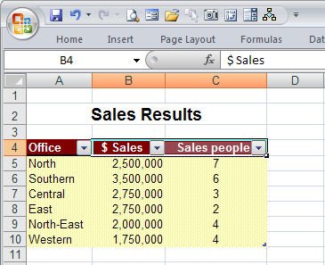
I encountered an interesting problem with Excel this morning when I tried to import data copied from a table in a PDF file. The table was bad news from my accountant about my retirement investments. I won’t be retiring any time soon 😉

The point of the issue however was that the data when copied and pasted into Excel came in neatly aligned in column but the numbers wouldn’t add up because they’d been added as text.

The solution to this is to use a feature previously called data parsing. What it does is to look at the data and convert it from one format to another. My only alternative would have been to select each cell, double-click on the cell to get the number on the screen, remove any characters that were causing issues such as any leading dollar signs or spaces and then press Enter to convert the text value into a number.

Luckily data parse does the work for you almost instantly. To do this, select the column of numbers that you’re working on. If you have a whole lot of columns to do, you still have to do each column one at a time. That’s the bad news; the rest of it is all good.

Select the column of numbers (if it includes some text entries that doesn’t matter), choose Data > Text to Columns and then select Delimited as the Original Data Type and click Next.

Click Next again and this is where you get to do the work. To convert text to numbers select the General option. If you have dates then select the Date option and select the date format that the data was created in. My values came from Australia so the date format used was dd-mmm-yy. Provided you select the date format that matches the dates you have, everything will convert just fine. Later if you want to show these in another format such as mm-dd-yy you do so using a date format. When you’re done, just click Finish.

The data will be instantly converted and you can move forward to do the same thing on the next column.

I estimate that this process took me about three minutes to do and on the data that I had it could have taken me half an hour or more to fix it all manually.

So next time you’ve imported data from an external source and when you need to convert text back into numbers check out the Data > Text in Columns option.

Helen Bradley

Friday, January 9th, 2009

Change spelling wavy underline color

Ok, so this post can happily be filed in the “Gee I really needed to know that – NOT!” category. It’s seriously fun but, unless you’re color blind, not something you absolutely HAVE to know.

It’s easy (if you’re a dab hand at changing registry entries) to change the color of the wavy underlines used for spelling and grammar errors in Word 2007. Choose Start > Run > Regedit and locate this key:

HKEY_CURRENT_USER\Software\Microsoft\Shared Tools\Proofing Tools

If the SpellingWavyUnderlineColor entry exists, double-click it and when the Edit DWORD value dialog appears, click Hexadecimal and type an eight digit hexadecimal number representing the RGB color value of the color to use (add two leading zeros to the value). So to use Blue, type 000000FF and click Ok. If the value isn’t in the list, choose Edit > New > DWORD value, type SpellingWavyUnderlineColor and then double-click it and change its DWORD value to the hexadecimal number you want to use.

To change the grammar underline color, change the GrammarWavyUnderlineColor value, and to change the contextual spelling error color change the ContextualSpellingWavyUnderlinecolor entry. If any entries don’t exist, just create them.

When you’re done, close the registry, restart the computer, and restart Word and the changes will be in place.

If you don’t know what hexadecimal color is what, visit http://www.patman.org/webdesign/hexcolors2.asp and find a color and its appropriate hexadecimal value here. Add two leading zeros and you’re done.

Of course, before you touch the Registry you should back it up in case everything goes pear shaped. Also – NEVER mess with anything you don’t understand!

Helen Bradley

Thursday, January 8th, 2009

Turn daylight into sunset


The Photoshop Color Match tool lets you borrow the color from one image and use it to recolor another one. So, for example, if you have an image shot in daylight that you want to make look more like a photo taken at sunset, Color Match can do all the work for you.

Open the two images in Photoshop – the image to change and an image shot at sunset which contains good sunset colors. It doesn’t matter what the sunset image looks like – it doesn’t have to be in focus or nicely shot – all you need is good sunset colors.

Click on the image to convert to a sunset image and choose Image > Adjustments > Match Color. From the Source dropdown list select the image that you will be borrowing the colors from. This automatically recolors your photo to match the sunset image’s colors more closely.

You probably won’t get a perfect result just from doing this so now adjust the Color Intensity, Luminance and Fade sliders until you get a result that you like. The Color Intensity slider adjusts the color saturation, the Luminance slider lets you adjust the brightness of the effect, and the Fade slider fades the effect to blends it back into the original image.

In some circumstances choosing the Neutralize checkbox may also give good results.

Click Ok when you are done.

Helen Bradley

Wednesday, December 31st, 2008

Akemashite omedeto gozaimasu


Happy New Year!

This year marks my second year in Tokyo for New Years. This time I’m lucky enough to be staying at the Park Hyatt Hotel in Shinjuku. Featured in Lost in Translation it is as beautiful and wonderful as shown in the movie.

Here are a batch of my photos. Starting out with a couple snapped at Harajuku yesterday. It’s the home of Cosplay – costume play and such a fun place to hang out.

Reflections abound in this city of skyscrapers:


These drink machines are everywhere and sell some very interesting and colourful drinks:


Love this inside neon sign – some things look very different when lit up:


This time I’m finding a lot more graffiti around. Some angry, some artistic and some colourful:


I think this is a old bowling alley sign, the alley is long gone but the sign is still there…


Very strange indeed. There was a whole wall dotted with these signs. Not sure what these guys did but I imagine it wasn’t good!

Helen Bradley

Sunday, December 28th, 2008

Don’t Spell Check This..


Often when you’re working on a document including one which contains code, or foreign language words you will want the document spell checked but you’d like the code or foreign language words omitted – so you’re not distracted by the red underlining everywhere.

To do this, in Word 2007, select the text you don’t want to be checked and double click the Language entry on the status bar – typically this will show English (United States) or similar. When the dialog appears, choose the Do not check spelling or grammar checkbox. This disables spell checking for this particular word or selection. The rest of the document is spell checked as usual but words you don’t want to be checked, won’t be.

Helen Bradley

Saturday, December 20th, 2008

Drawing Organic Shapes in Word

I needed something cute for a magazine sample the other day so I decided to create an organic shape. I needed three edges to be straight and one rounded.

Here’s how it’s done, it makes use of nodes and Bezier curves, fairly simple to do when you know how.

Start with a new Word document. Display the Drawing toolbar and choose AutoShapes > Lines > Freeform. Start in one corner and click once to begin. Click at each point around the shape so you’ll have a polygon shape. If you hold Shift as you click you’ll make a straight line and, if desired, it will be perpendicular to the previous one too. It’s important you get straight sides and square angles when you want your shape to butt up against a page edge.

Click the shape to select it, right click and choose Edit Points. Control + Click on a point to delete it if you don’t need it. Right click on a point that you want to be rounded and choose Smooth Point and then drag on the handles to shape it nicely.

When you’re done, click outside the shape to deselect it. click it again and right click, choose Format AutoShape. Choose Line Color > No Line and choose your Fill Color. Hold Control as you click and drag on the shape to duplicate it and set the Fill Color of this one a different color. Repeat if desired.

To arrange the shapes, click one to select it, right click and choose Order > Send to Back to send it below the others. Choose Order > Send Behind Text to send it below the text. The second command is used to move the shape to the bottom layer of the document below the text. Use the first command to change the layer order of the shapes so they are stacked as you want them to be.

When you’re done you should have a page that looks something like this, I sized the shape to fill the page and moved it to the edge of the page. I also added a gradient filled rectangle under everything just to finish it all off.

Helen Bradley

Wednesday, December 17th, 2008

Fix the Headings in your Excel 2007 tables


Excel 2007 has some great tools for working with and formatting tables (previously called Lists in earlier versions). To create a table, select the range that contains the table data and from the Home tab select Format As Table. Select a table format style and, when prompted to, confirm that the selected area contains all the data for your table, whether or not your table has headers and click Ok. When you do this you will see that each heading cell displays a dropdown arrow to the right of its contents.

Unfortunately, if your headers are right aligned, the table headings will run into the arrows and be partially hidden. I don’t know why Microsoft doesn’t create a fix for this because it looks awful. To avoid this happening, select the heading cells, right click and choose Format Cells. Click the Custom setting and type @ and four spaces and click Ok. This should add sufficient spaces to the right of a heading to move the headings a little to the left so the headings can be seen clearly. Now it all looks much nicer as you see above.

Helen Bradley

Thursday, December 11th, 2008

Singapore – East meets West


Singapore is totally amazing and in places totally unexpected. There is colour everywhere – in the temples and in the regular buildings too. The Hindu temples are so beautiful that they simply take your breath away.

The heat is ubiquitous and the humidity ensures you never feel dry! It is monsoon season so yesterday we had a huge thunderstorm – lightening and thunder and inches of torrential rain. It’s so well designed that everything drains instantly so it’s just left wet and steamy afterwards.

I walked to Little India and took a cruise on the river. Just spent time acquainting myself with the layout of the city and got a hint of its magic.

Here are some images and the stories they tell. First up, details from one of the Hindu temples:

The buildings are so colourful and what would a day in Asia be without laundry!

Elevators at the W hotel:

Shophouses on the river and window detail:

Muslim temple detail:

Gotta love neon – the Singaporeans do!

Detail from a city building – looks like snowflakes:

Helen Bradley

Thursday, December 11th, 2008

Adding Keywords to multiple images in Lightroom


Let’s preface this blog entry by stating that what follows makes no sense at all.

I ran into some inconsistent Lightroom behaviour when trying to add keywords to images. The scenario was this: I needed to add the same keyword to a number of photos all at once. While you can do this as you import the images, sometimes you’ll be importing images which shouldn’t all have the same keywords so doing it in Lightroom later on makes more sense.

Problem is that you have to be in the right view to do it – choose the wrong one and you can waste a lot of time and have precious little to show for it. Please Adobe – make this simpler and more intuitive because right now it’s darn right frustrating and it really makes no sense at all.

Until Adobe fixes the problem, here’s the low down on adding the same keywords to multiple images in Lightroom. First select the Library and then choose Grid View, if you don’t this things will fail, miserably. Choose View > Grid or click the Grid View button.

Now select the images to add the keywords to – click on one and Shift + Click on the last, for example. Type the keywords in the box which says “Click here to add keywords” and press Enter.

You can also copy keywords from one image and then paste them into others by copying the keywords then select the images to paste into (making sure you are in Grid view – it doesn’t work otherwise) and then paste the keywords into the “Click here to add keywords” box – use Control + V to do this.

If you try this and it fails you’re not in Grid view. Heaven help me – there’s no reason I can see why you should have to go into Grid View to do it but you do.. so now you know.

Helen Bradley

Wednesday, December 10th, 2008

Curves + Luminosity = Better Tones.


In the last blog entry I mentioned some cool things you can find in the Curves dialog that help you adjust the tonal range of your image. Today I’m going to show you how to wreck the color in an image in the name of improving tonal range.

The Curves dialog has four channel options – you can work on the RGB composite channel (the default), or you can work on the separate R, G or B channels. Problem is that although adjusting the R, G or B channels independently can help you improve the tonal range of the image – it can also totally mess with the color. For this reason, few users bother working with the individual channels. Makes good sense? No!

You see working with individual channels is a good fix. If the Red or Green channel lack contrast you can hype it up using a curves adjustment. You’ll mess up the color but, if you’re using an Adjustment Layer, you can simply change the blend mode of the adjustment layer to Luminosity and immediately the messed up color disappears and the adjustment is limited to luminosity only. Instant fix.

So, next time you need to apply a Curves adjustment, check the channels in the Channels palette. If you see a channel that lacks contrast – adjust it to add contrast to it. Then set the blend mode of the adjustment layer to Luminosity to remove the color problems you just created.

Helen Bradley