One easy and fun way to add visual interest to a text heavy page is to use a Drop Cap. A Drop Cap is when the first letter of a paragraph is increased in size and, more often than not, put in a more ornate font.
To create a Drop Cap, place your insertion point in the paragraph you wish to start with a Drop Cap. Then, choose Insert on the Ribbon, click Drop Cap > Drop Cap Options. The ‘Drop Cap Options’ allows you to either insert the Drop Cap into the paragraph, with ‘Dropped’, or place it separate from the text, with ‘In margin’. If you’re unsure what to use, I would suggest ‘Dropped’ and increase the ‘Distance from text’ setting to .3cm and the ‘Lines to drop’ setting (which affects the Font size of the actual Drop Cap) to 5 and click OK.
To change the font of the Drop Cap, you can either select the font you want directly in the ‘Drop Cap Options’ window or highlight the letter (which appears in a Frame) afterwards and changing it. You could even use Format, Borders and Shading, Shading tab to fill the frame with colour.
Learn how to make half tone effects with hearts (instead of dots), in Illustrator. Uses the Blend and the Transform tools for this effect. This is part 1 of a two part series on halftone hearts.
Transcript:
Hello, I’m Helen Bradley. Welcome to this video tutorial. In this tutorial I’m going to show you how you can make halftone hearts in Illustrator.
Before we get started creating our halftone heart effect let’s see what it is that we’re aiming for. And this is the effect that we’re going to create by the end of this video tutorial. And if you look at the link below for the next video tutorial in this series I’m going to show you have to create this effect and this one too.
But for now let’s get started on this effect. I’m going to create a new file by choosing File and then New and click Ok. I’m going to view my rulers so that I can drag a guide in that I will use as a guide for drawing my shape. I’m going to grab the Pen tool. I’ll click and drag on the guide. I’m going to add a curve over here, another one here, and one finally back here down on the guide. And I’m just going to Ctrl click outside to disable that Pen tool. And here is my shape. And obviously I need to do something with it before we go any further.
I’m just going to adjust these points so that we get something looking a little bit more like a heart shape. I’m going to get rid of my guides so I’m just going to clear my guide. And let’s go back over, select this shape and let’s give it a stroke. So with the shape selected I’m going to give it a pink stroke, and I’m just going to make that a bit of a larger stroke so we can see it clearly. To flip this shape to make the rest of my heart I’m going to first select the shape and then I’m going to click the Reflect tool which shares a toolbar position with the Rotate tool.
The first thing to do with this tool is to click on the anchor point across which you want to flip it. So that’s going to be either this top point here or this one here. It doesn’t matter which. I’m going to Alt click on it. Now I’m getting that reflected shape sort of across the vertical access and all I want to do is to click Copy to make that a heart shape. And now I’m going to join it together by selecting it and choose Object Path Join. And here is now my heart shape.
Now I want to size this down a bit. Actually I’m going to scale it in proportion. And I’m going to make a duplicate of it so I’m going to hold it as I drag a duplicate away. And I just want to tuck this duplicate out of the way for the minute. I don’t want it around but I’m but I’m going to need it a bit later on. So let’s go and select this one and let’s size it down to be the starting point for our halftone heart. So I’m just going to fill this with pink. And I want another duplicate of this so I’m just going to Alt drag a duplicate away. And this is going to be the top one of my hearts. And I want these to line up, although right now is not the time to line them up. I’m going to size it down first of all. So this is going to be my little heart. This is going to be my big heart. And now I’m going to place it in position.
So I want these to align perfectly to their mid lines. They’re not doing that right now. There we are. This is the line that I want. I want to make sure that they’re perfectly aligned so that the point of this heart lines up with the point of this one. And I’m going to change the color so this one I’m going to make quite a sort of dark crimson color. Only I wanted that for its fill and not its stroke. So we’ve got a dark large heart and a very pale pink small one. What we’re going to do now is to blend these two shapes together so we’re going to blend the little and the big heart together. So we’re going to use the Blend tool here on the toolbar. So I’m going to select it and then I’m going to click on the first of the shapes and click on the second. And that blends these two shapes together.
Well it does such a good job that it looks nothing like what it is that we really want. So I’m going to double click the Blend tool to open the Blend options dialog. First of all I’m going to enable Preview and I don’t really want Smooth Color. I want Specified Steps. At the moment there are 127 steps to blend these two shapes and colors together. And I don’t want that. I want to actually see the shapes. So I’m thinking I’m going to start with something like 25 steps and see how that looks. That’s pretty good. Probably let’s just try down to 20 on this one. The other thing that you can do is you can also use Specify Distance as well as Smooth Color. So we don’t want Smooth Color. We definitely want to see these shapes. And we can either go with steps or distance. But I think that’s pretty good so I’m going to click Ok to accept that.
So now we’ve got the first of our lines of hearts and we just want the rest. And we get the rest with a Transform effect. So I’m going to click Effects and then choose Distort and Transform and we’re going to choose Transform. And here’s the Transform dialog. Again I always want to click on Preview so I can see what’s happening here. And let’s do 15 copies. And what I want to do is to make each copy a little bit to the side of this one. So I’m just going to choose Horizontal Move here. And I’m going to move these apart until they are looking like what I want them to look like. Now I quite like that but I think I don’t have enough copies. So I’m going for 25. What I want here is I want these hearts to run into each other. I made it so that the ones would run into each other in the vertical direction. And I want these in the horizontal direction also to run into each other so that I get this final effect. So I’m just going to click Ok.
And there is my effect that we came here looking for. This is a halftone set of hearts. And they vary from light at the top, very small too dark at the bottom. And if we want to create these so that we can work with them we’ll expand them. So with this line selected I’m going to choose Object and then just Expand Appearance. And these are now grouped but their appearance is expanded so we can work on them a little more time. Here is the Link on working
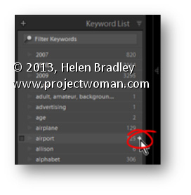
In the Library module in Lightroom the Keyword List panel tells you how many images are keyworded with a particular keyword. It can also find these images for you so, open the Keyword List panel, and click the arrow to the right of a keyword to view images that have that keyword associated with them.
These arrows appear only when you are hovering over a keyword in the list.
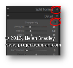
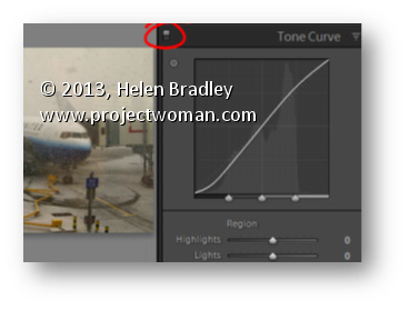
Switches in Lightroom appear in areas such as the Develop module where they can be used to enable or disable a setting such as the Tone Curve. You can use this switch to compare your image with or without the effect in place.
Set the switch to the up position to turn it on and to the down position to turn it off.
The benefit of doing this is you can turn the effect on and off in isolation to any other changes made to the rest of the image and you don’t have to wind back your history to see the change.
Learn to make lines thicker or thinner using a Filter in Photoshop. This is useful for adjusting scanned line art images, as well as, for thickening up lines on images which you have converted to a line drawing inside Photoshop.
Transcript:
Hello, I’m Helen Bradley. Welcome to this video tutorial. In this tutorial I’m going to show you how you can easily make lines thicker or thinner on line art images that you either scan into Photoshop or create in Photoshop yourself. In this video tutorial I’m going to show you a really quick technique for making lines a lot thinner or a lot thicker. And this is handy for images where you’ve actually converted it to line art or where you’ve got line art like this that we’ve actually scanned in.
To make the lines thicker choose Filter and then Other and then Minimum. And with Minimum you can then select the minimum radius which is going to make the image lines a lot thicker and you can test these out. Generally just one or two pixels is like all you need to do. And this is the original image and this is the thicker lined image. So let’s perhaps take this up to 4 and I’ll click Ok. And that has just thickened the line. So if that were all we wanted to do we could just save this and be off. But let’s have a look and see how we can make the lines thinner.
I’m going to choose Filter and this time, Other, and this time we’re looking at Maximum. And we’re just going to set the maximum line width. And so we want this down to something that gives us the lines that we’re looking for. So here I have it set to 5. This is what it was. This is what it is now. If I go a bit smaller the lines are going to get thicker. If I get bigger the lines are going to get thinner to the extent where they actually totally disappear. So you need to find this sweet spot here for your particular image. But if you do want to make the lines that are fairly thick right now to be a little bit finer then you can do that here with this tool. And these are again Filter, Other. Maximum allows you to set it so it’s smaller and minimum allows you to set the width so it’s larger.
I’m Helen Bradley. Thank you for joining me for this video tutorial. Look out for more tutorials on my YouTube channel. Please like and comment on this video if you do like it. And look out for more videos, tips, tricks and techniques on my website at projectwoman.com.
In the top left corner of the Library and Develop modules you’ll see the Navigator. Hover your mouse over an area of the image in the Navigator – it will look like a magnifying glass – click to view that portion of the image in the main preview.
In addition, whenever you see a rectangle in the Navigator you can drag on it to move the area of the image being viewed.
Learn how to make an image its own mask using Apply Image in Photoshop.
Here we use an image of a cast iron grill and apply it to itself to show another image through it.
Transcript:
Hello I’m Helen Bradley. Welcome to this video tutorial. In this tutorial we’re going to look at using an image as its own mask in Photoshop. And we’re going to do this using the Apply Image tool.
Before we get started with this tutorial let’s have a look and see what it is that we’re trying to achieve. I have an image here that’s just some oranges and then I have another image here of a grate. And what I want to do is to put the grate over the oranges just as I’ve done here. And I’ve actually got a drop shadow behind it to give it some dimension. And what we’re going to do in this tutorial is see how we can use an image and use itself as its own mask to mask that image and how we can also adjust the mask so that we get this effect that we’re looking for and adding a drop shadow to it. So if you’re ready let’s just get rid of the bits that we don’t want. I’ve now got my orange image and let’s get started.
The first thing I’m going to do is bring in my grill image. So I’ve got these images just floating loose because I find that the easiest way of doing it. And I’m just going to drag this image’s background layer away from it, hold the Shift key and just drop it over the top of this image. Now of course it hasn’t disappeared from its original image. I’ve just dragged a copy away. And I don’t need that any longer so I can just get rid of it. With this image it’s a little bit on the small side, so I’m going to press Ctrl T and Ctrl 0 (zero) to see my handles and to set transform on. I’m also going to enabled this lock so that the ratio between the height and width is fixed. This means that the image is not going to be skewed out of proportion. And now I’m just going to drag it into position and I can place it anywhere I want. So I think this is a pretty good arrangement so I’ll click the checkmark here.
Now right now we’re not seeing through this image because of course it brought its own background with it and it’s got a sort of dark background with some light aspects. We’re going to need to do some work to fix this image up. And in actual fact the work that we’re going to do is in masking so I’m just going to drag this up a little bit. What I want to do is I really want to turn this image into its own mask.
So once I’ve got it in position it’s fairly critical that I actually get it in the right position before I start because I want the mask and the layer to be in the same place. I’m going to add a layer mask to this layer by just clicking the Add Layer Mask icon. But what I want to do is put this image in this mask. And an easy way to do that is to click the mask itself and use Apply Image. It’s up here, Image, Apply Image. And what it lets us do is to apply an image as a mask. So for example layer zero is the oranges themselves so that in this case we would be applying the oranges as a mask. But we can also select layer 1 which is applying this particular grill as its own mask. Now it’s not looking good right now but it is certainly masking it. I could invert it if I wanted to but that’s only going to give me the orange images over the grill work not where I want it. I want it in the bits in between the grill work so I’m going to disabled invert because I don’t want it inverted. If I’ve got that right I’m just going to click Ok.
Now the problem with this mask is that this particular image is not black and white. It’s not. Let’s just turn everything off here. You can see that this is actually really quite gray. And for the mask to really be doing its work it needs to be almost black and white. So I need to boost the contrast up on the mask alone. So I’m going to click the mask to target it so any changes I’m making now are to that mask alone. And I’m going to choose Image Adjustments and Curves because curves will allow me to adjust the mask and have a look here on the mask itself as I work. What I’m doing here is I’m increasing the whiteness of the mask and then I’m increasing the black areas. The whiter and lightest areas are going to ensure that we can see the grill in these places. And the black the darker black areas are going to cope with the areas that we’re seeing through. So I need a fairly sharp change from black to white and I also need to make sure that my sharp change from black to white copes with the fact that there’s a sort of darker gray bar behind the image. And I want to make sure that that dark gray bar goes to the right color. It needs to go to black and not to white. And what I’m looking for here is to make sure that I can really see the image through this grill, and when I’ve got it I’ll click Ok.
Now if I wanted to I can lighten my grill. That’s fine. I need to make sure that my mask is black and white so that the image behind is being shown through and then if I want to change the actual grill itself well then I can add an image adjustment to that. But the two are very different adjustments. One is adjusting the grill color itself and the other is changing it as it appears as a mask over that original grill image. So if I want to make that a bit more light I can do so just to add that extra contrast. And now to add a drop shadow to push the orange image behind that grill I’m just going to click on the grill layer and choose Drop Shadow. And here’s the default drop shadow. Well that’s what you would see as a default drop shadow. And I can add as much or as little drop shadow as I want to push that behind and gave us the sense that there is a dimension or a distance between the grill and the actual orange image itself. And we can make that deeper or less deep as we want to and then click Ok.
So here we’ve used an original image of some oranges. We’ve added an image of a grill and we want to see through the holes in the grill to the image of the oranges behind. And we’ve done that using the image as its own mask so it’s showing us where we want to see through. We’ve added a lot of contrast to this so this mask is almost pure black and white. The image itself can be anything. We just gave it a little bit more of a pop by making it a little bit brighter but it could be anything. And we’ve finished with a drop shadow to add some dimension to the entire scene.
I’m Helen Bradley. Thank you for joining me for that this tutorial. Look out for more tutorials on projectwoman.com and on this YouTube channel. And please if you liked the video click to like it and consider subscribing to this YouTube channel.
Learn to use recursivedrawing.com to create a fractal tree that you can then use in a Photoshop collage. This video shows you step by step how to create the fractal tree and then how to copy and paste it into a Photoshop collage. Also, how to blend it seamlessly into the collage document.
Transcript:
Hello, I’m Helen Bradley. Welcome to this video tutorial. In this tutorial I’m going to show you how you can create fractal trees online that you can then use in collages and other images in Photoshop. This is the kind of recursive tree that we’re going to draw. And one of the benefits of this is that we can grab it and use it in a Photoshop image.
So let’s have a look and see how it’s put together. It’s put together with a single rectangle that’s a long rectangle and then we’re just going to draw it as a fractal tree. So I’m just going to click down here, this plus sign, to get started with a new image and let’s start with our first tree.
To create a tree we’re going to start with a rectangle or square and drag it to make a nice long thin rectangle which is going to be the trunk of the tree. And I’ll just place it in position at the bottom here. Then I’m going to go and drag this element which is the element I just created but this time I’ve got multiple versions of it. I’m going to push it so that I make this sort of recursive element.
Now it is really easy for this tree to get away from you. And if it does just stop it and just go and start again until you get really used to the tool and what it’s going to do it because it can behave really, really recursive and go everywhere really, really quickly. So I’ve now got that part of the tree. Now I’m going to go and grab the tree back again because I want it in here. And this is usually where if I’m going to lose it I’ll lose it at this point. But let’s call that good for our tree because that actually is quite a good tree. You’ll watch it until it’s finished drawing and when it’s finished drawing you won’t see any more changes around the edges.
So this is looking pretty good to me so I’m going to press the Print Screen key to take a screen print of it. And now I’m going to launch Photoshop. In Photoshop you can see I’ve already got a few trees hanging around. I’m going to choose File and then New and then click Ok because that is an image now the size of my clipboard. So all I have to do is do Edit Paste. And here is my tree.
So the first thing I’m going to do is make a selection around the tree itself and then I’m going to choose Select Inverse so the rest of the image is selected and I’m going to delete it just to get rid of it. I’m also going to get rid of the background layer so all I have right now is the tree itself. I’m going to select the magic wand tool and I can just click on the white and just press Delete and that will get rid of all the elements except the tree itself. And at this point I can just crop it down to size.
Now I would save it at this point because that means I’ve got a tree then I can use in anything in future. Now I have a texture image here and it’s a pretty big texture. And this image is pretty small so I’m probably just going to reduce the size of this down say 50 percent so that our tree is going to look a little bit better on it. With the texture image and the tree image both visible I’m just going to drag the layer of my tree image onto my texture. And here it is. I’m just going to make sure that I move the tree and not the background.
Now if you find that there’s a little bit of haloing around the edges of your tree so if you brought in a little bit of white that you want to get rid of you can do so. And the easiest thing probably is just to set this blend mode to darken because what that does is the white pieces on the tree anything that was a sort of legacy piece of white isn’t going to be brought in because it’s going to be lighter than the background.
So there are all sorts of trees that you can create using that tool. You can be successful and less successful depending on how you go. You can see I’ve got some really nice trees and I’ve got some pretty horrible ones as well. But that tool can be used to create fractal trees that you can then access to use in your images in Photoshop this way.
I’m Helen Bradley. Thank you for joining me for this video tutorial. I hope you enjoy the recursive drawing tool. Look out for more videos on my YouTube channel here and visit projectwoman.com for more tips, tricks and tutorials on Photoshop, Photoshop Elements, Illustrator, Lightroom and lots of other handy graphics techniques.
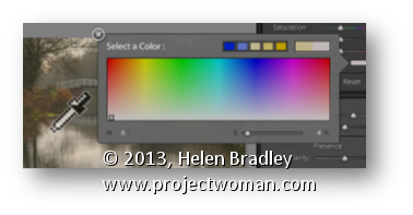
Sometimes when you need to grab a color in Lightroom you’d really like to use a color sampled from your image. This is easy to do.
In any situation where you have access to the Color Picker, click on the color swatch to open the Color Picker and hold your mouse over it. Press the left mouse button to get the Eyedropper but don’t let go – instead move out of the dialog and over the image and sample your color from there.