You can easily enable offline viewing of any Google Docs documents. By default this ability is turned off, so you may want to enable it for emergency situations if you rely on Google Docs for viewing and editing important files. Keep in mind that you must be using Google’s Chrome web browser to do this. Chrome can be downloaded here. Also note spreadsheets can only be viewed, not edited, using this method.
To do this, go to your Google Drive and click the More button along the left side, under the Create button. This will open a small dropdown menu that includes the Offline option. Select this, and then follow the simple instructions to enable offline mode. This really involves just two clicks and some waiting. Once you have selected the Enable Offline button, you’ll have to wait some time so that all of your documents can be downloaded to your computer for offline storage. All offline documents will be listed in the Offline section once this is done.
If you want to disable offline editing for any reason, simply click the gear icon toward the top right of Google Drive and select Disable offline.
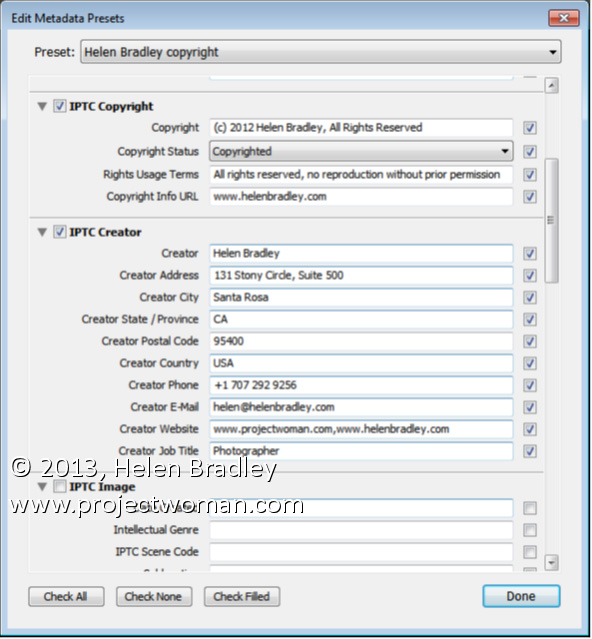
Protect your images by adding Copyright metadata to them as you import them
Using the Metadata tool in the Apply During Import panel you can add copyright data to your images as you import them. If you write this data automatically into every image you will ensure that your images always include your contact details and copyright information.
To create a preset to use, from the Metadata drop-down list choose New and create a copyright preset that has, at the minimum IPTC Copyright and IPTC Creator data entered. Type a name for it and save it and select it in the Metadata list.
As this data will be added to all images only provide data that is applicable to every image such as your copyright information, copyright status, rights, usage terms and details about you and how you can be contacted. Leave out image specific data such as what the image contains and its location for example as this will be different for most images.
If the skies in your photos are a lighter blue than they should be here is how to capture bluer skies in your photos
If you find that the skies in your summer photos look less vibrant than they should consider investing in a polarizing filter.
A polarizing filter cuts out reflected glare and the result is that colours look more saturated so your skies look bluer. The polarizing filter will also allow you to capture, for example, fish in a pond rather than capturing the glare from the sunlight bouncing off the pond.
When purchasing a polarizing filter, make sure to select the right polarizer for your camera – some won’t work on a camera that uses a through the lens metering system. The polarizer is a glass filter that simply screws onto the lens on the camera so its diameter needs to match the size of the thread on your lens.
If you are using a point and shoot camera then you may need a special attachment to be able to add a polarizer to the camera.
When you are using the polarizer, screw it onto the camera and then turn the ring on it to find the position that gives the best results before capturing the shot.
When creating a new presentation or document in Google Docs, you might find that the default templates don’t provide the theme you want. Fortunately, Google provides an easy way to find the perfect template for your situation, from baby photo albums to résumés. To find a template suitable for you, simply visit https://drive.google.com/templates?view=public. You can search by name, category, and popularity to quickly find whatever you need.
Once you’ve selected a template you like, simply click the Use this template button and a new document will automatically open with the chosen template, ready for use.
Learn how to combine two images to make a collage. Includes use of Blend modes in Photoshop, color range color selection, clipping mask, layer mask, hue saturation adjustment layer, drop shadow layer style.
Transcript:
Hello, I’m Helen Bradley. Welcome to this video tutorial. In this tutorial I’m going to show you how you can create some simple collage effects using blend modes in Photoshop. This is the effect that we’re going to create in this video tutorial. I’m going to show you how you can put the pieces of this together in just a few minutes using a couple of images and some blend modes.
We’re going to start off with this image and another one that I shot at the neon boneyard in Las Vegas, and that’s giving us the texture. And we’re going to combine these two images with a blend mode. And then we’re going to extract the color from this original image, this sort of orange color. And we’re going to recolor it using a Hue/Saturation adjustment layer. But if we wanted to leave it at this point we could leave it just with that additional color. And we’ll also going to add a drop shadow with a different color behind it.
So let’s see how we would create this effect. And I’m going to start with my two images, and I’m going to put one image into the other. So I’m going to grab this neon boneyard image and I’m just going to drag and drop its background layer in on top of this original image. I’m just going to size it so that it’s right over the top. And the first thing I would do with a collage like this is look and see what sort of opportunities I had with blend modes.
So I’ll generally select the first blend mode in the list, Dissolve, which generally gives me nothing at all. And now I can just arrow down and see what happens when I click on each of these blend modes. And all I’m looking for is something interesting. And you’ll generally get a better effect with this if you use images that are a little bit more textural and a little less like something where you don’t really particularly want to bring out of the image exactly what was in it. But you want to discover how these two images can interact with each other and what you can do with them as they interact. So that’s all the way down through the blend modes. And so I’m going to go back up and I’m going to settle on something that I want to use. And generally the most interesting bits are going to be in the overlay or the contrasty area. So in this area and sometimes even with lighten and darken.
So let’s just go up through these and find something that we like. And I’m thinking actually I might like something like this perhaps with the Opacity dragged down a little bit. Now what I want to do is to bring out the orange color in the original flower so that I can lighten them a little bit in this layer here. And what I’m going to do is create a duplicate of the background layer. And I’m going to drag it above the image. So right now all we’re seeing is this original background. And what I want to is to select the leaves in it.
Now the leaves are really bright colored here. So I’m going to choose Select. And in this case I’m going to use Color Range because it’s going to be the easiest way to select these leaves. Now either I can select on the sampled color and add to it this way by just clicking on these leaves or I could use just the reds and just grab the reds. But I think Sampled Colors is actually going to give me a slightly better effect here.
So let’s just go back to this and let’s choose Sampled Colors here and just click Ok. Now that has isolated the leaves here and what I want to do is to keep these leaves but drop the rest of the image out. And I’ll do that with a mask. And because my leaves are selected, all I need to do is to click on the Add Layer Mask icon. And what happens is that the leaves are then masked and left behind and the rest of the image is just dropped away. So this is the before and this is the after. And you can see we have brought in the color from these leaves.
Now if we wanted to we could even lighten this color. We’ve got some of the orange color in. But we may want to brighten it up even more. So I’ll make sure that my image layer is selected and choose Image, Adjustments. And then I could use levels or curves. I’m going to use levels, and I’ll just lighten this is a little bit and click Ok. Now in the earlier image that you saw we had actually colored these blue and it’s very easy to color them blue.
To do that we’ll choose Layer, New Adjustment Layer and we’ll choose a hue/saturation adjustment layer and just click Ok. Now I want this adjustment layer to only affect the red leaves so I’m going to clip this. So with this adjustment layer selected I’m going to choose Layer, Create Clipping Mask. And so anything that I do to this adjustment layer here is only going to affect the layer below, just these red flowers. So now let’s double click on the Hue/Saturation adjustment layer and now we can go and make some changes to it. And I’m looking for a blue color which will either be at this end or this end of the hue slider. So I can get to either this sort of greeny blue if I wanted or I can get to a sort of purplely blue. I’m thinking the greeny blue will be pretty good here. And now I can adjust its saturation and its lightness from here. So when I have what I like I’m just going to close that dialogue. So that has recolored those leaves to a bluey color.
And finally let’s add a drop shadow behind the leaves. So I’m going to select the leaf layer, and I’m going to choose a drop shadow effect. Now drop shadows might start out being dark but they don’t have to end up being dark. So what I’m going to do is go and find a really cool color for this drop shadow. And I’m thinking a really, really bright pink will do me. So let’s choose that. And I want to up the opacity of this. I could set it to normal so it’s going to be a very, very pink shadow. And then I’m going to adjust the settings for this. Spread is going to be the size of the shadow and softness or size is going to give me some softness. But there’s a very small sweet spot here on this that I can very, very easily exceed. So I’m just going to add my shadow in. And I think I’m going to multiply blend mode my shadow, not apply it with the normal blend mode. Although I could use normal for example with a much lower opacity if I wanted to give it this sort of pinky color. I might leave it at that.
So there’s a way of creating some interesting collage effects. And all we’ve done is grabbed a couple of images and put them on top of each other and blended them with something that counts as being an interesting blend mode. And then I isolated the orange flowers in the image and brightened them up. I also added a drop shadow in a very contrasty color. And I added to a hue/saturation adjustment layer that only effects these orange flowers to use the brightness of them but to color them a different color. And you can do all sorts of things by just combining images. And that gives you lots of practice at making color selections, using clipping masks, using masks, using blend modes and just having a little bit of playtime and a little bit of fun creating interesting effects in Photoshop.
I’m Helen Bradley. Thank you for joining me for this video tutorial. Look out for more of my tutorials on this YouTube channel and please like and comment on the tutorials if you would. Also visit my website at projectwoman.com where you’ll find more tips, tricks and tutorials on Illustrator, Lightroom, Photoshop and a whole lot more.
If you like working with the cleanest view possible, Google Docs makes it easy for you. First select View > Full screen. This will remove all menus from the screen, so make sure you don’t need to access any buttons while using this view. Now you can make your browser itself full screen. In most browsers you can accomplish this by pressing F11. With these options you will see absolutely nothing but the page you are typing on.
To undo these options, press F11 again to eliminate the browser full screen, then esc to eliminate Google Doc’s full screen mode.
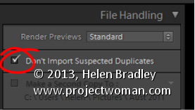
Avoid duplicate images in Lightroom by importing Only New Images
There is little that is more annoying than having duplicate images in your Lightroom catalog. Duplicate images not only take up room on your disk but they also bloat your catalog and can cause confusion when you are working with your images.
To ensure that you don’t import images that are already in your catalog, enable the Don’t Import Suspected Duplicates checkbox in the Import dialog. With that setting enabled you will no longer be able to select to import images that are already in the catalog. So any images that you can select to import aren’t duplicates so it is safe to import them.
This feature is particularly useful when you only want to import images from a camera card that you haven’t previously imported into the catalog.
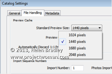
Set the size of your Standard previews to match your screen size.
When you choose to render Standard previews you can choose how large the previews will be. You should do this because setting the size to match your screen size maintains a good balance between disk space the previews take up, the time they take to render, and general usability.
To configure the image preview size for Standard size previews, choose Edit > Catalog Settings (or Lightroom > Catalog Settings on the Mac) and select File Handling.
From the Standard Preview Size drop-down list, you can choose from one of four sizes; 1024, 1440, 1680 and 2048. Choose the size that matches the size of your monitor or which is a little smaller.
This setting will be applied to previews that you create on Import or which you create from inside the Library module itself.