In the first flush of excitement of owning a new digital camera you’re probably like the rest of us and you read the camera manual. Well, you don’t actually read it but you sift through it far enough to find the ‘important bits’ like how to turn it on and how to view your images. You might also learn how to use a few of its settings and then you put it away. As long as you’re taking pretty good photos, is there any reason the manual shouldn’t stay on the shelf? Yes, there are. Your camera manual is chock full of good reasons for getting it down off the shelf. Reading it will show you more about the features it has for improving the quality of your images and for shooting special effects.
Improve image quality
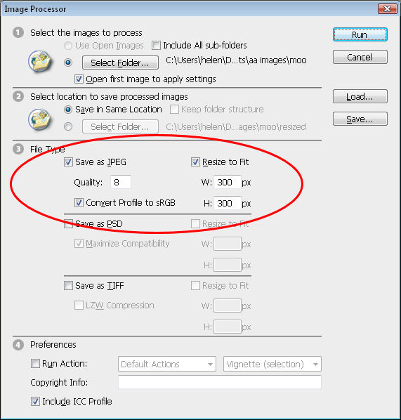
Not all cameras come configured for shooting in the highest quality mode or for saving images with the lowest loss of data. This is because the memory cards which come with most cameras are so small they don’t hold many high quality/low compression images. If you’ve replaced your camera’s card with a better one (and chances are that you have), you will want to take images at the best possible quality. So, check your manual so you understand what quality settings are available and how to configure your camera to use these. Also ensure you’re using the lowest compression mode so that more data is not lost than is absolutely necessary when your photos are saved to the memory card. This is particularly important if you’re using an older camera with a low number of mega pixels – you want to retain as much image data as possible.
Changing ISO
If your camera is capable of some manual operation one of these features might be the ability to alter its ISO equivalency. ISO is a method of rating film’s sensitivity to light. The lower the ISO number the less sensitive the film is and it’s said to be slower film because the shutter must be open longer to make up for this lack of light sensitivity.
At the other end, high numbers indicate a high sensitivity to light and the film is said to be faster. Typically the film (or camera ISO equivalency), you’re most likely to use is in the range 100-400. So why wouldn’t you use ISO 400 all the time? While 400 film is fast and while it can freeze action and is handy where the light is poor, the downside is that the images it produces are grainy. In fact, the higher the ISO number, the more grainy the images are and this is true of film and digital images.
If your camera supports different ISO values – use higher numbers (400), on cloudy days or indoors – you might even find you can do without a flash with this setting. On a bright day, use 100 or 200 to get better results in the bright light.

This photo can be captured with a low ISO as the background is very light. You can also step up the exposure to ensure the subject is well lit even though the sky will be blown out.
White balance
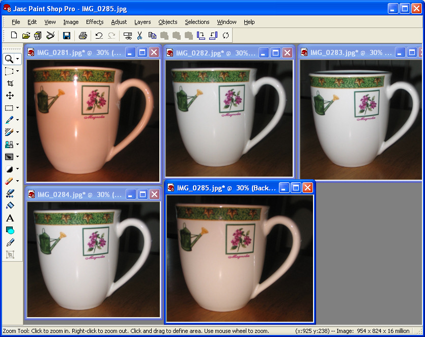
Most cameras have a white balance adjustment which lets you adjust the image for the kind of light you’re shooting in. Sunlight has a different colour to the colour of the light you use when shooting indoors. If you don’t adjust white balance you will find images which you take indoors will have a yellow or a blue cast depending on what type of light source (incandescent or fluorescent) is used. You can adjust for this colour cast by setting your camera’s white balance setting to match the type of light you’re using.
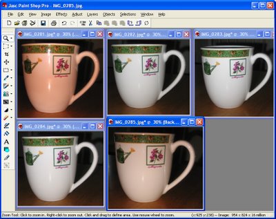
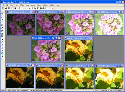
This is one object photographed with a range of white balance settings – choose the one which gives the most desired effect.
Exposure controls
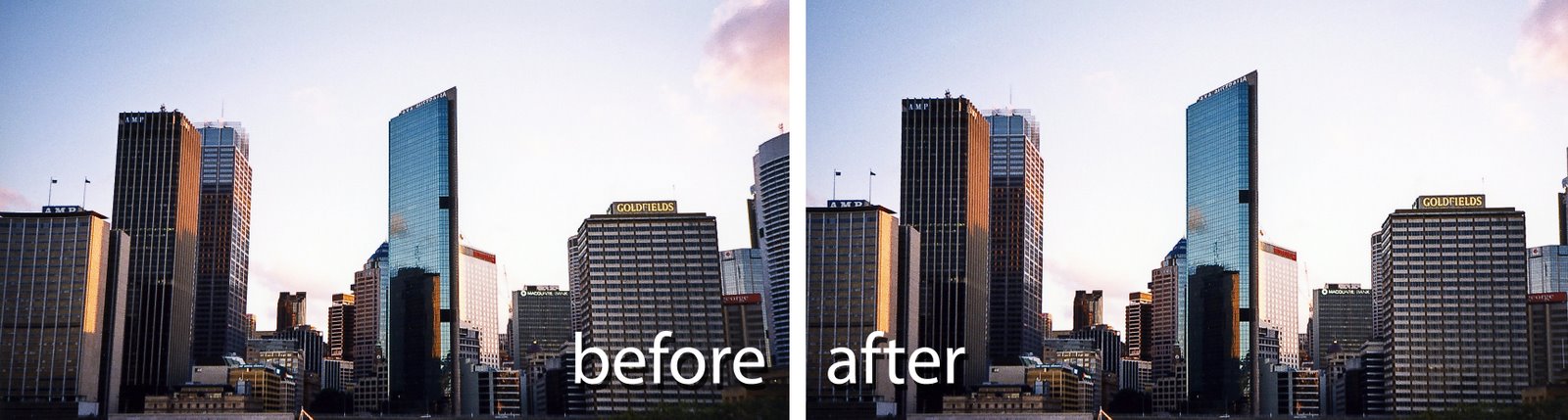
When shooting objects on light backgrounds or people standing in front of very light or back lit backgrounds you may find the object or person is too dark. This is because the camera is taking into account the light background when it’s setting its exposure. Even if your camera has no manual exposure control, you can generally increase or decrease exposure by one or two stops using an Exposure Value adjustment. Increase exposure to lighten the subject (even at the expense of ‘blowing out’ the background) or decrease it to darken the subject if there’s too much light.
From left to right are the central image shot using -2, -1, +1 and +2 exposure value settings.
Other features
There are numerous other features your camera has available and which you may not have realised were there when you purchased it. Look for options such as shooting in black and white or in sepia. In many cases a simple snapshot can take on the look of a work of art when shot in black and white. Look out too for opportunities to shoot in black and white in the early morning (just after sunrise) or when shooting close ups of children or animals.

By selecting the macro setting on your camera you can capture items close up and they will still be crisply in focus with a sophisticated depth of field effect.
Your camera may also offer a slower than usual shutter speed setting. This will require you to use a tripod to ensure the camera is kept steady while you’re shooting. Using a slow shutter speed gives great results at night or in low light situations where a flash doesn’t have the required range. For example use a slow shutter speed for fireworks to get the benefit of the shower of lights coming after the firework has exploded or to capture tail lights from moving vehicles.
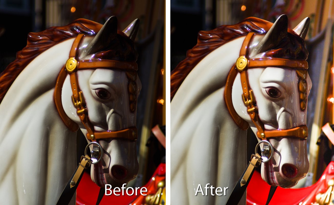
Your camera will have a setting for saturation which you can boost to get wonderfully saturated photos like this.
Information on all these options can be gleaned from reading your camera’s manual. At the same time, look out for other options such as the ability to use PAL output format so you can plug your camera into a TV to replay your images on the TV screen. You can also purchase a power adapter for most digital cameras which lets you use mains power to save batteries in some indoor situations.
So, when should you read your camera’s manual? I suggest you read it when you first buy your camera so you’re able to get started using it. A week or two later, revisit the manual – you’ll be ready to learn more about other features at this time. Then, look at it again in about six months, by then you’ll have taken some shots you’re not happy with for one reason or another. You’ll be ready to look at more advanced tools such as white balance or exposure control to see if these would help avoid repeated problems in future.
Helen Bradley


 When filming indoors using light such as tungsten globes or florescent light, the color of the light will show in the photo.
 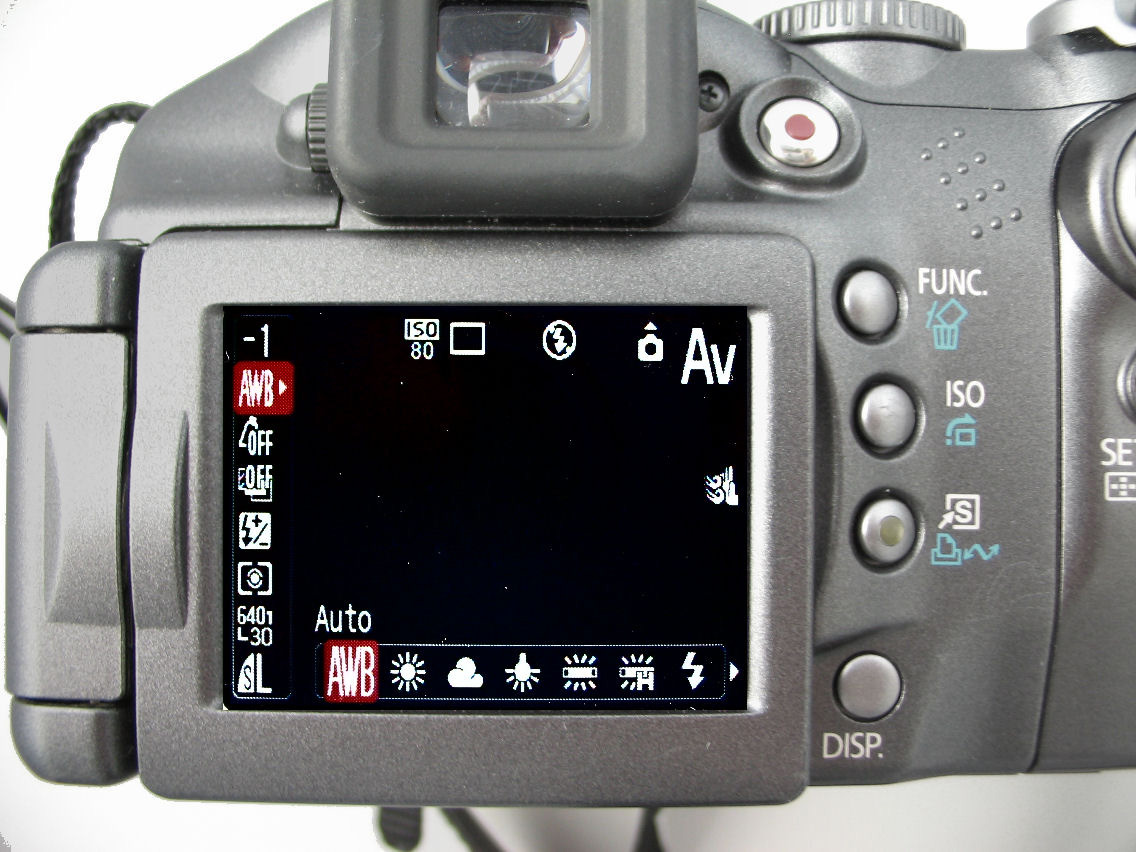 When using a flash you won’t generally need to adjust for the colour of surrounding light as the flash will cancel this out.