Tuesday, July 14th, 2009

Excel: Print a worksheet your way


When you need to print one version of a worksheet for yourself and another for the boss and you like it small and he likes it to be – well just how he likes it, then you need Views. The Excel Views tool lets you configure a worksheet for different printing options and to save these so you can use them again later on.

You can set views up so you do one for your boss and one for you. Or, you can set one up to print only the summary part of a worksheet and another to print the lot. Even if the print areas and the print settings change, Views let you preconfigure them so you don’t have to set them up manually every time. Better still, Views are saved with the worksheet so they’re always available.

Step 1
To save a set of printing settings, first set up your worksheet with the print settings you want to use including setting a print area if needed.

Step 2
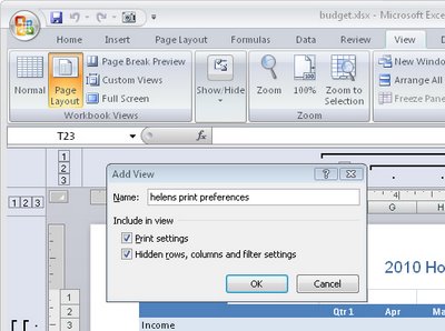
To save this set up, choose View > Custom Views > Add (in Excel 2007 choose the View tab > Custom Views > Add). Type a name for the view that explains what settings you have selected. Enable the Print Settings checkbox and click Ok. You can now create another view and save it. Do this for as many different settings as you need. Save your worksheet.

Step 3
In future, before you print, choose View > Custom Views > select the View you want to use and click Show. Now go and print the worksheet – your settings were saved so you don’t need to configure them.

Helen Bradley

Monday, July 13th, 2009

Summer – 10 cool photo ideas

It’s summer time and if you’re a creative photographer you might be wondering just what to shoot. Look no further, here are some cool ideas for topics for summer photography:

1 Perfect Sunsets
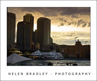

The optimal shooting time in summer is in the early morning and the early evening at sunrise and sunset. At these times of the day the light is much softer and it has a pleasant color cast to it which will warm the image.

To take advantage of these light conditions set your camera’s white balance setting to full sun – do not allow it to sit on Auto White Balance or the camera will remove the beauty of the color of sunset when it attempts to neutralize the color cast in the image. Setting the camera to full sun which doesn’t have a color cast means the camera won’t adjust the image so you’ll get great sunsets and sunrises.

2 Water reflections
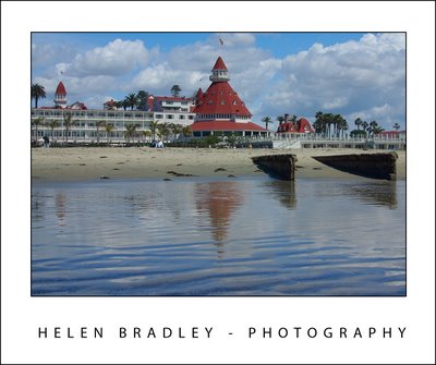

Some of the best summer photos can be captured by looking down rather than across a scene. The reflection in the water as it washes over sand can give spectacular and unexpected results. Even objects set well back from the water can be caught reflecting in it.

If it is safe to do so, position yourself where the waves break over the sand facing back up the beach – make sure you have a good stretch of wet sand in front of you and check to see what reflections you can capture.

3 Capture running water
When you are shooting running water such as a fountain or a waterfall you have a couple of options for capturing the water. If you use a fast shutter speed you can freeze the action. You do this by adjusting the manual settings on your camera using the shutter priority setting (indicated by a T or TV setting). Set the shutter speed to a fast setting such as 1/250 or 1/500 of a second to freeze the action. When you do, you will see water drops in the fountain or waterfall.

On the other hand if you use a slow shutter speed – for example, 1/10 of a second or less you will get a silky even flow in the water. The slower the shutter speed the more silky the effect will be as the camera will capture the movement rather than freezing the action.

Experiment with different shutter speeds to get different results. Be aware that slow shutter speeds will require you to use a tripod to steady the camera. As a rule of thumb, the slowest speed you should handhold a camera at is 1/focal length of your lens so, for a 200mm lens anything slower than 1/200 second should be captured with a tripod.

4 Fairground fun
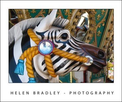

Summer is a great time for county and state fairs. Even if you’re not someone who rides the rides you can still capture all the color and fun of the fair. Look for creative opportunities such as capturing the Ferris wheel at night using a small aperture such as f8 and a long exposure will let you pick up the light trails in the Ferris wheel as it turns.

The carousel is also a good place to capture some stunning close up images. If the kids are riding fast rides use your motion capture skills and a fast shutter speed and move the camera with the movement of the ride to capture the kids clearly and blur the background attractively.

5 Fireworks
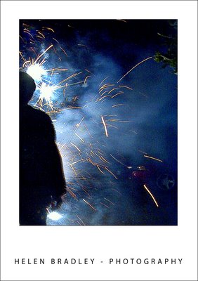

Summer and July the 4th are synonymous with firework displays. To capture fireworks you will need to turn off the camera’s flash and set it to a long exposure. Set the camera on a tripod and out of the way of bright local lights which will ruin the effect because they will provide light at the expense of the fireworks themselves. Set the aperture to a value of f8 or f16 and experiment with different exposure times to find something that gives you a sky full of fireworks color.

6 Nighttime lights
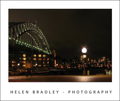

Good weather is a good excuse for getting out in the evenings and carrying your camera is a must do. With the light lasting until quite late in the evening you have good opportunities for capturing a mix of nighttime lights and activity. Set the camera on a tripod and use the flash curtain settings and a long exposure to capture the background night lights with the flash lighting the subject close to the camera.

Most cameras let you set the flash curtain so it either goes off when the shutter opens or just before it closes. Depending on the effect you want to create, you can place a subject close to the camera and light them with the flash. Because the shutter remains open, you will then capture the detail in the lighted scene behind them which would otherwise be black. This way you can capture two different types of images at the one time.

7 Window seat
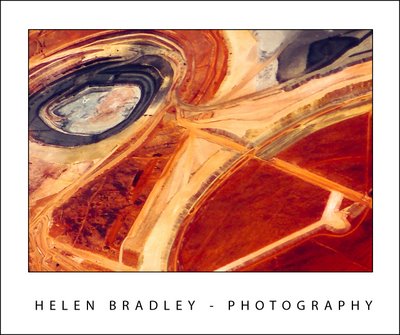

When you’re flying across country and if you have a choice of seats make sure to get a window seat on the side of the plane that is not looking directly into the sun. This way you can capture images from the airplane window. Avoid using the polarizing filter on your camera in these circumstances or you’ll get funny rainbow colored reflections on your images. Everything from a summer thunderstorm to patterns in the landscape make for wonderful photo opportunities.

8 Build your sky portfolio
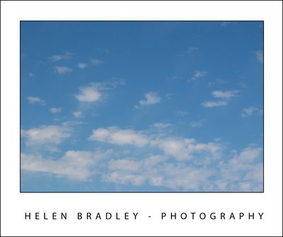

The photos you shot in fall, winter and in inclement weather typically lack the crisp blue skies you see in summer. Summer, therefore is a great time to capture great skies to add to your skies portfolio. Then they’ll be ready for you to use later in the year to replace the poorer skies in your other photos.

To build your skies collection, take time every time you’re shooting to look up at the sky. When you see an interesting sky whether it be a crisp blue sky or one peppered with clouds, photograph it and store these images in a special skies folder. Later in the year when the skies are lackluster use these skies as replacements so you can produce photos with wonderful skies all year round.

9 Capture silhouettes
Summer is a great time to capture silhouettes because of the very bright light and long twilights. The essence of a silhouette is placing your subject in front of a bright sky or a sunset or sunrise. You’ll want your subject to be in deep shadow with the rest of the image properly exposed. This is one time you’ll turn your camera’s flash off so it does not fire.

With the subject between the light source and the camera, take the shot and check to see if you’ve got a good silhouette or if the subject is still too well lit. If the subject is too light, use the camera’s exposure compensation to underexpose the shot by setting it to a negative value. Reducing it to even as little as -0.5 will be sufficient to get a darker silhouette and still have the sky nicely exposed. Good subjects for silhouettes include palm trees in front of sunsets, striking elements such as a person’s profile in silhouette and even masses of electric light wires can make for an interesting image.

10 Capturing harsh light
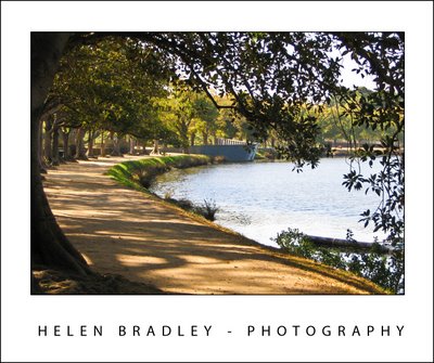

One of the downsides of shooting in summer is the harshness of the light. Because the sun is in the same hemisphere and overhead the light is very crisp and very bright. Shooting at midday is fraught with difficulties because you’ll get areas which are very bright and some which are in deep shadow.

On the flipside, this is a good opportunity to capture images which make the most of the mix of light and shadow. Instead of looking at the scene itself, look for the play of light and shadow and for interesting shapes and patterns in the shadows cast by objects such as trees. It’s a great time of the year to capture creative images which showcase the harshness of the light.

Helen Bradley
Friday, July 10th, 2009

Fixing Blemishes in Lightroom

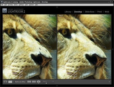
Spot_before-after.jpg
When you have an image which needs some spot fixing before printing you can often do the work in Lightroom and avoid the necessity of a round trip to Photoshop. Lightroom has both a Clone and a Heal tool available for fixing blemishes and removing problems such as spots caused by dust on your camera’s sensor.

To see how to use these tools in Lightroom, start by selecting an image to fix and select the Lightroom Develop module.

Step 1

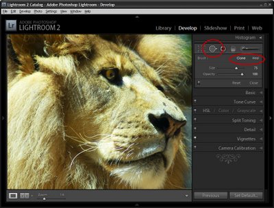
Locate the Spot Removal tool which is situated below the Histogram and to the immediate right of the Crop tool. You can also select it by pressing its shortcut key N.

For the brush options, you have the choice of Clone or Heal so select the option to use.

Clone works similarly to the Clone Stamp in Photoshop where you select the portion of the image to fix and then the portion to replace it with. Apart from choosing the Size of the brush and the Opacity Lightroom simply replaces one area of the image with another without making an attempt to blend the fix.

If you choose Heal then Lightroom samples the area you’re trying to fix and attempts to blend in the replacement area so the fix is less apparent.

Step 2

Select Clone or Heal and then adjust the size using the slider or the square brackets [ and ]. Your brush size needs to be large enough to cover the area to fix.

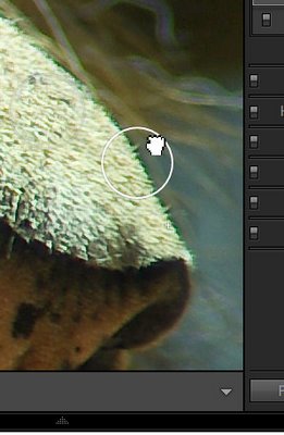
You can click on the area to fix and leave Lightroom to choose the source image data to fix it with or click on the part of the image to fix and continue to hold the left mouse button as you drag to find an area to use to for the fix. You will see a preview of how the fix will look to help you determine a good part of the image to use. Only let go the mouse button when you have your selection in place.

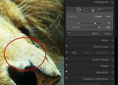
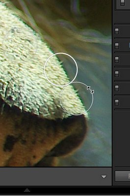
When you have applied the fix you will see two circles on your image – they appear when you hold the Spot Removal Tool over the image. The circle with the thickest edge is the selected area and the circle with the + symbol in it defines the area you are fixing.


If you did not get the fix exactly right you can click inside either of the circles and drag the selected circle to a different position.


You can also select a circle and then position your mouse over the edge till it turns into a double headed arrow and then drag to resize it.

You can change a fix applied using the Heal option to a Clone fix (or vice versa). To do this, select either of the two circular marker and click Heal or Clone in the Develop tools panel to change the fix type. This allows you to experiment to find which gives the better results.

In our example, Heal worked well on the lion’s nose in areas which were all hair and Clone worked along the top edge of the nose where the fix markers spanned part of the nose and part of the background behind.

To see the image without the circular markers, press H to hide them. Press H again to display them.

To see the Before/After results reflecting just the effect of applying the Spot Removal Tool, click the On/Off switch in the Spot Removal tool area of the Develop panel. This works better than the backslash key (\) which toggles on/off all the fixes you have made to the image and not just the most recent one.


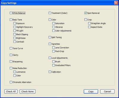
If you have problems such as sensor dust that appear in the same position in a series of images, you’ll appreciate the ability to copy the Spot Removal tool fix from one image to others. Right-click the fixed image, choose Settings > Copy Settings and from the Copy Settings dialog enable the Spot Removal checkbox disabling all other options that you do not want to copy. Click Copy to copy the effect and then paste it onto the other images which also suffer the same problem. While this may not be an ideal fix for all of them, it will give you head start on fixing most of them.

Helen Bradley

Thursday, July 9th, 2009

Excel page headers and footers


When you’re printing a 50 page worksheet, you want to hold onto the printed pages very carefully. If you don’t the entire project is prone to disaster as it is all too easy for the pages to get out of order and it’s nearly impossible to sort out the mess. So, either staple them very quickly or use the header and footer tool in Excel to add page numbers to all your pages.

Of course, while page numbers are one of the most common things you might put in a header or footer it isn’t the only thing. You can add everything from the date to your company’s logo.

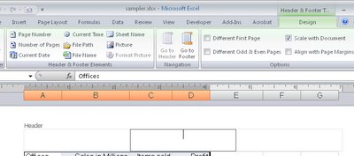
To add a header or footer that will print on every page of an Excel workbook, choose View > Header and Footer in Excel 2003 or, in Excel 2007 choose Insert tab > Header & Footer. In Excel 2003 you can select from a range of preset headers and footers which are configured using typical combinations of items usually used in headers or footers – for example, sheet and worksheet names, page numbers, filename and folders.

If you’d prefer to create your own headers and footers, click the Custom Header or Custom Footer button and create your own design – this is the way you create a header or footer in Excel 2007 too.

Click in the Left, Center or Right areas of the dialog to place information at any of these places on the page. In Excel 2003 the buttons you can select from to add preset information aren’t labelled but you can usually tell what they are. From left to right, they let you change the font used, insert the page number, number of pages, date, time, filename and folder, filename, sheet name, and an image. In Excel 2007 they are labelled.

When adding an image to a header or a footer, make sure it is small enough to fit in the header area – there’s no tool in this dialog to resize the image if it’s too big. When you’re done, check the header by selecting Print Preview.

Helen Bradley
Wednesday, July 8th, 2009

Word 2007 – Update Normal Style

The Normal style is applied to text by default if no other style is applied.

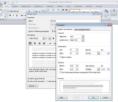
If the Normal style for any of the style sets is not to your liking, select it in the style list, right click and choose Modify.

You can now alter the style, for example you can reduce the inter-paragraph spacing by clicking Format > Paragraph and reduce the Spacing After value.

Click Ok and then, to apply this change to all new documents based on this template, select the New Documents Based on This Template option and click Ok.

By configuring the styles to suit your needs you can quickly format your documents to a consistent look without having to make all the format changes individually.

Helen Bradley
Monday, July 6th, 2009

Big Occasion Photography


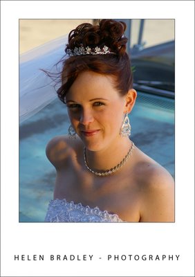
When you are a deft hand at taking photographs you’ll find that you’re asked to help out or be the main photographer at big occasions. If you’re helping out, you can focus on taking candid shots leaving the professional photographer to take the rest. If you’re “it” then you have a big job ahead. So, when you’re about to photograph group of people at an occasion such as a wedding, birthday party, graduation, or retirement party, here are some ways to ensure a successful assignment.

Know Your Place
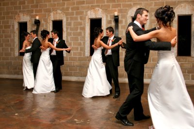
At a wedding where there is a professional photographer already employed, leave the photographer to take the big shots of the bride, bridal party, and key guests and concentrate on everyone else. At key events during the ceremony such as the cutting of the cake and the bridal waltz, use your camera to capture the reactions of the other guests to what is going on.

At the reception, concentrate on taking candid shots of guests and casually composed shots of groups of guests interacting with each other. Ask small groups of people to take a minute or two to organize themselves into a close huddle in front of a mutual or some other attractive background. Take two or three photographs, first warning them that you intend to do so. Don’t hesitate to ask people to stop and pose for you, you’ll find that, with a little extra care, you’ll get much better quality shots of the guests and your photos will complement the more formal photographs taken by the professional photographer.

When You Are It
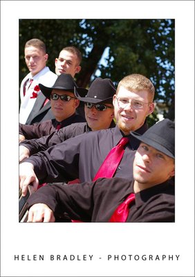
When you are the key photographer for an occasion when there are lots of people involved, your key responsibilities will be to get a mix of group and individual shots and some photos that set the overall scene for the occasion. Organize larger groups by having everyone line up in two or three lines with the front row seated and, if necessary, a group seated on the floor at their feet. Again, warn everyone that you intend to take a number of photos so that everyone is well prepared. Frame the shot carefully, ensuring you don’t leave out the people at either ends of the group and making sure you don’t chop off the heads of the people in the back row.

Where very small children are involved, encourage the parents to hold the children on their knees to keep them steady for the photograph. If the occasion is a birthday party or, for example, a retirement party, take one or two photos with everyone else looking at the guest of honour. Don’t forget to take a photo of any special food or gifts like a retirement plaque or the birthday cake. If it is a child’s party, take some photos of the decorations and the table so the child, in the years to come, can recall what their party was like.

© AngelIce, istockphoto.com

In addition to the main group photos, work around the occasion asking smaller groups of people to pose for you. If you are knowledgeable about who’s who in the guest list, you can encourage partners and close friends to pose for a photograph together making the finished spread of photographs a more attractive collection not only for the people who were at the event but also the guest of honour. Often occasions like birthdays and weddings are times for families that rarely see each other to come together so look out for opportunities to capture family groups and photos of multiple generations.


Image © Rosemarie Gearhart, istockphoto.com

When you’re organizing people to pose for you, ask them to stand close together and, where appropriate, to put their arms around each other or interact in some way. The warmth of the composition will show through in the final photograph. When posing two people, have them stand side-by-side and arrange three people into a loose triangle for ore visual interest.

Know Your Equipment
Before embarking on any project involving groups of people at an occasion that is unlikely to be repeated, make sure that you know and understand your equipment. Practice taking photographs indoors if that is where you will be taking them or out of doors in the full sun if that’s where the party will be. Pack your supplies carefully ensuring that you have a camera card with plenty of space available on it, a backup card, backup batteries, a tripod, and everything you need to take great photos.

Having an assistant or a volunteer to assist you in getting everyone organized will let you focus on composing the photograph and getting a good shot without needing to manage a large group of people at the same time.

When you’re done, download all the photos to your computer and burn them onto a series of CDs. If you hand a bunch of CDs to the party organizer or guest of honour, everyone who wants one can have one. You’ll find it easier and cheaper to burn a few disks than print mountains of photos for everyone.

Helen Bradley
Sunday, July 5th, 2009

Protect an Excel worksheet


When you create a worksheet for others to use the last thing you want is for them to clobber your formulas or mess up your design. To keep them from making changes to the worksheet, either maliciously or inadvertantly, protect the worksheet.

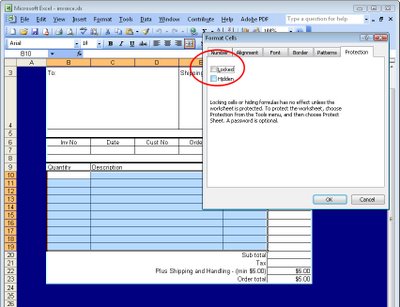
If you haven’t protected a workbook before you may find the process of doing so a little confusing. First you hage to unlock the cells that you want your user to have access to. These will be the cells that they can make changes to such as cells they need to add data to. You do this because all cells, by default, are locked against changes.

Select the cells the user should be able to change and choose Format > Cells > Protection and disable the locked checkbox.

Now choose Tools > Protection > Protect Sheet and, if desired, enter a password that will be required to unprotect the sheet so that it cannot be unprotected without permission. Click Ok and the cells that are locked — in other words everything that you didn’t unlock — will now be protected so that the user cannot change them.

The only cells your user will have access to are those that you unlocked for them to use. In this way, you can protect your formulas so that users cannot change them or overwrite them with fixed values which would render the worksheet potentially inaccurate.

Helen Bradley
Saturday, July 4th, 2009

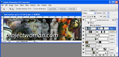
Photoshop Creative: Make a Collage Photo Banner


When you’re creating a photo blog or website a photo banner lets you showcase a range of your work. You can create a collage of photos for a banner in Photoshop or Photoshop Elements very easily. Here’s how


Step 1
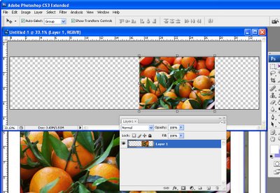
Start with a new image the size of your banner or a multiple of it. So, for example, if your banner is going to be 1200 pixels wide by 250 pixels you can start with this size image or double it so you have a bigger space to work and size it down as the last step.

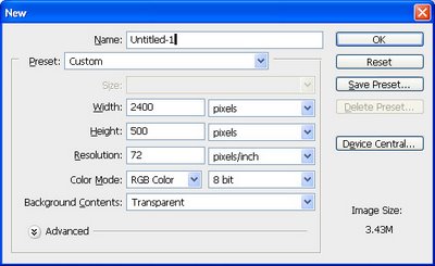
Here I’ve created a document 2400 x 500 at a Resolution of 72 pixels/inch, RGB Color and with a Transparent background..


Step 2
Open the photos to work with. These should be fixed and color corrected but they don’t need to be sized. I like to open more images than I will use so I have lots to choose from. A combination of close-ups and distance shots gives your banner a lot of variety. Flatten all the images to a single layer.

Select the Rectangular Marquee tool and drag over an area to use from the first photo. Select a generous portion of the image allowing plenty of room to the left and right of the main portion of the image that you are interested in as you will use this area to blend the layers. Chose Edit > Copy and then switch to the banner image and choose Edit > Paste. Close the original image.

Press Ctrl + T and then Ctrl + 0 and size the image to fit your banner. Use the Move tool to position it in place.


Step 3
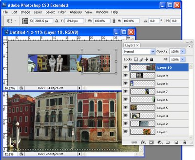
Select the next photo to use. Copy a piece from it and paste it into your banner image. Size it and move it into position. Continue to do this until your banner is full. The images should each appear on a separate layer and they should all overlap by significant amounts.

If desired, drag the layers into a different order to position the images where they should appear in the collage.


Step 4
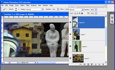
Starting on one side of the image, select the Eraser and select a soft brush or a textured one such as the Chalk 44 pixels brush. Adjust the brush size so that it’s big enough to work with, reduce its Opacity to around 50 percent and click on the layer in the layer palette that contains the image to blend.

Erase over the edge of the image to reveal the layers below. As you work, give some consideration to how you want the images to blend together. In some instances, simply softening the hard edge of the image will be sufficient. However, if there are significantly different colors on each layer you may want to be more creative about how you blend the layers together.


Step 5
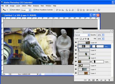
If you’re familiar with using masks you’ll find that you’ll get better results with a mask than you do with the eraser as the blending can be easily undone.

To use a mask, add a mask to the layer that you’re working on and then paint over the mask in black to remove the image from this layer. If you make a mistake, paint in white. To add a layer mask, click the Add a Layer Mask icon at the foot of the Layer palette.

Work across the image softening the edges where the images overlap. It’s at this point that you will see the benefits of having plenty of overlap between the images as this will give you plenty of room to blend the images together.

Some layers may lend themselves to being used as overlays rather than a part of the image. For example, a photograph of text can be placed over another image with its Blend Mode set to Multiply and its Opacity lowered so you get a layering of photos.


Step 6
Finish your banner by adding some text. Click the Text tool and click on the banner and type your text. Use a Drop Shadow layer style to make the text rise above the background so it will be more easily read.

Ready to learn more? Here are some more creative Photoshop tutorials from my blog:

Photoshop: Fold a photo

Photoshop: Turn daylight into sunset in one easy step.

Helen Bradley
Friday, July 3rd, 2009

Social marketing with Twitter – find people to follow


When you’re developing a social marketing campaign using Twitter you will want to find people to follow who are the kind of people that you want to sell your services to.

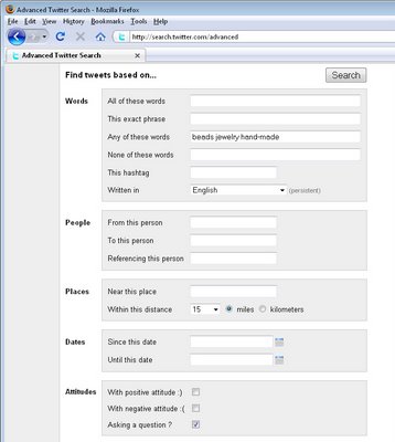
Twitter’s advanced search tool at http://search.twitter.com/advanced can help you here. In the Advanced Search tool you can find Tweets based on words that are in the tweet or which contain a certain hashtag. You can find tweets by references to people or places as well as attitude or those that contain links.

Using this you can locate people within a specific geographical location or who appear to have an interest in something that you are interested in. By being able to find these people very quickly you can then follow them in the hopes that they will follow you back and so you build your follower list.

If, in time, you find that you have a lot of people who you are following and if you suspect that not all are following you, it is time to cull your following list. Visit this post to learn more about how to quickly cull your Twitter list as a batch job so you don’t have to do it one person at a time.

Helen Bradley
Thursday, July 2nd, 2009

PowerPoint: Custom slide navigation with Action buttons


While many people make their presentations in the presence of an audience and they move from one slide to the next, not all presentations are delivered this way. Many slide shows are viewed by people at their desk and when you are creating presentations for display this way, you can create a custom navigation scheme for the user to use to progress through the show.

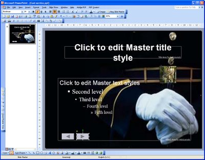
To do this, start by choosing View > Master > Slide Master to move to the Slide Master view. In PowerPoint 2007 select the topmost slide in the layout pane. Choose Slideshow > Action buttons and select the Action Button: Back or Previous. Click and drag the Action button on the slide – the Action Settings dialog shows Hyperlink To: Previous Slide – click Ok.

Repeat and this time add the Action Button: Forward or Next. This Action button is hyperlinked by default to the next slide.

Add an Action button that goes to the first slide by choosing Slideshow > Action buttons > Action Button: Home.

To size the Action buttons Control + Click on each of them in turn, right click and choose Format AutoShapes. Select the Size tab and adjust the width and height for all at the one time.

Click the Draw button on the Drawing toolbar, choose Align or Distribute > Distribute Horizontally to create even spacing between each button. Drag the shapes into the footer area so they are clear of the area covered by the slide content. Click Close Master View to return to your presentation.

Any shape can be configured to perform like an Action button. Add the shape to the slide, right click and choose Action Settings from the menu. You can hyperlink the shape to any slide, Office document or web page.

Helen Bradley