Wednesday, June 20th, 2012

Print big images with Paint


Well, who knew the humble Microsoft Paint could do what just about no other program can easily do? Well it can. I recently assembled a very large image from a series of screenshots of a help screen. The help screen was really long so I captured screenshots of each portion of it, assembled them into one really narrow and long file and then got stuck – how the heck could I print this? Hmm… enter Microsoft Paint… but first, here’s the entire process from Print screen to Photoshop to Paint!

I brought all the screen capture images into Photoshop, cropped them using an action to do it very quickly, rotated them counterclockwise 90 degrees and then saved the images with sequential numbering. There was a bit of overlap in each image – you need this for the panorama merge to do its stuff and they need to be rotated or they won’t assemble properly.
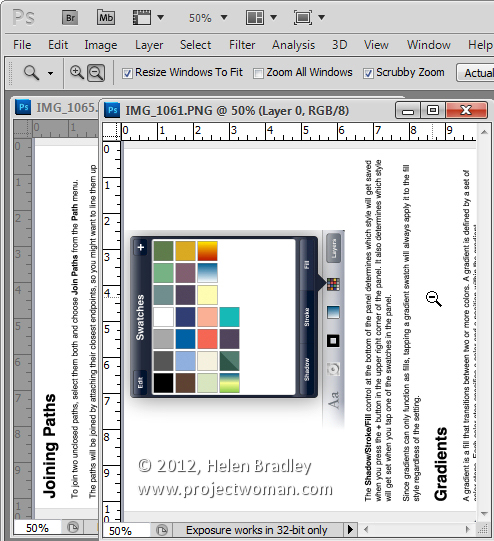


Having done that I then used the photo merge tool in Photoshop (File > Automate > Photomerge) to create a merged image from the individual images.
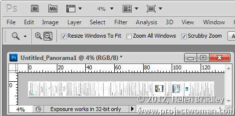


Then, once the merge was complete, I rotated the image back this time 90 degrees clockwise to get a vertical image that was 770 pixels wide and over 9,000 pixels long.

The problem with an image this size is that when you try to print it from Photoshop – it has to be squeezed down to a very small size to print on a single page and no other option is available so you can’t print it on multiple sheets.

The question then becomes how to print a very large image in lots of smaller pieces. The solution is nearer than you think and, curiously, it comes in the form of Windows Paint.


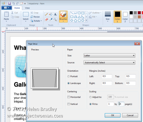
Launch Paint and open the image. Choose File > Print > Page Setup. Here you’ll find an option for sizing the printout to a fixed number of pages wide or long or you can shrink option to adjust the percentage scaling size. Wow! This is really very smart indeed.

When you do this, watch the boxes below as this will tell you how many pages tall and wide the image will be printed at. When you’re satisfied with the results, you can go ahead and click to print the document. If you have a PDF printer then you can print the document direct to a PDF file or if preferred, feed some paper into the printer and print the image. Then get out some sticky tape and stick it all together.

Helen Bradley

Tuesday, June 19th, 2012

Photographing in Black and White Part 3 Portraits


Black and white is particularly attractive for use in portraits photography. You can use it when your subject is dressed in or surrounded by colours that are not complimentary to them or which are distracting to the eye.

By shooting in black and white, you remove the impact of the clashing colours allowing the subject to become the focus of the image and not their clothes or, worse still, the background.

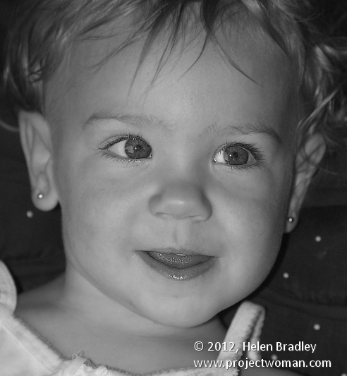
Bathed in soft light, babies captured in black and white look wonderful and the impact of jaundiced skin or blemishes is reduced.

For subjects that have facial details that can handle harsh light, try capturing your portraits with strong side lighting such as sunlight pouring in through a window. The dramatic contrast between light on one side of the face and shadow on the other can bring a portrait to life.

This type of setup is best used for a subject who has very strong facial features such as older subjects with lots of wrinkles or for subjects who live life hard as it reinforces their personalities and lifestyle.

Children’s and baby’s portraits captured in black and white do away with distracting colours and blemishes and allow you to focus on the child.

Helen Bradley

Tuesday, June 19th, 2012

Transparency and the Gimp


One of the most confusing things for Photoshop users will be the concept of a transparent layer in Gimp.

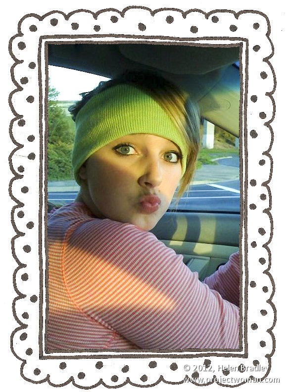
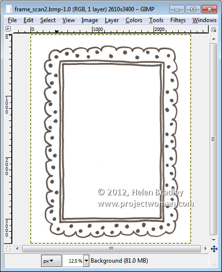
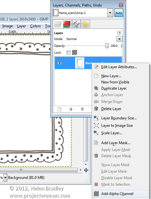
Consider the situation where you open an image such as this hand drawn frame here. The image is a BMP image and what I want to do is grab the middle out of the frame so that I can put something behind it.


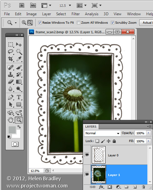
If this were Photoshop, I would convert the background layer to a regular layer by double clicking on it and press Ok. Then I would target the Magic Wand tool and click in the middle of the frame to select the middle area then press Delete to make it transparent so I can drop an image in behind it.


If you try this process in Gimp, all you get is an extreme level of frustration as nothing seems to work. Select and delete does absolutely nothing !

Here’s the solution. With the layer with the image on it selected, right click and choose Add alpha channel. This then allows you to select an area on the image using the Fuzzy Select tool, and press the Delete button. Then choose Select none and you will have a transparent middle to your image. It’s an easy process once you understand what’s happening but an extremely frustration one until you do.


Helen Bradley

Saturday, June 16th, 2012

iPad style Apps come to Photoshop – At last!

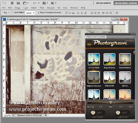
If you envy your friends their iPhone Instagram app and their iPad grunge photo editing apps then PSKiss has the solution. PSKiss recently released its PSKiss Photogram which is the first ever (at least as far as I’m aware) app like extension for Photoshop. It has all the coolness of an iPad app and it works on the desktop.

PSKiss Photogram is an extension so it installs like any extension and, when running, you see an iPad style interface with Instagram like features all running in a panel inside Photoshop.

You can download the extension from pskiss.com and right now the starter price is $9.90 which is comparable with many iPad apps. The extension is called Photogram and it has a distinctly retro look – it’s tag line is “Bringing the 70’s into Photoshop”.

Once you’ve downloaded the zip file, unzip it, fire up your Adobe Extension Manager and install the ZPG file. If you are using Windows 7 or Vista you may need to run the Extension Manager as an Administrator to install the extension in the correct location. To do this, right click the Adobe Extension Manager in your Start menu and choose Run as Administrator.

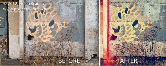
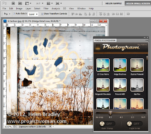
Once installed, close Photoshop if it’s open and then re-launch it. Start by opening an image that you want to work with. I grabbed an image of some graffiti I shot this morning  with a view to using it with this extension.

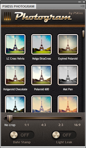
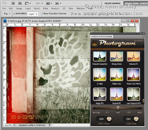
Run the extension by choosing Window > Extensions > PSKiss Photogram. The panel opens showing a series of image effects including Holga, Expired Polaroid, PolaroidPZ, Wrong Velvia and others. They are a mix of faux retro camera effects which are guaranteed to give your photos a very different look.

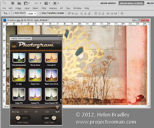
In addition to applying effects you can also crop your image to one of a number of crop ratios including No Crop, 1:1, 4:3, 2:3 and 16:9.

The app also lets you add light leaks by turning on the Light Leaks switch and add a date stamp which is set using the image metadata.

To apply an effect to an image, set the crop ratio, set the date stamp and light leaks switches then click an effect. You can wind back the processing using the History palette so click on Open in History to revert to the original image. If you choose a different effect it replaces the one you just applied and isn’t added to it so you don’t need to wind back your changes if you want to experiment with different effects.

The light leaks are random so they move around each time you click to add an effect.

If you want the same effect but a different crop, select a different crop and then reapply that same effect to it. You can tell which effect is in use as it has a glow around it and the title bar of the image indicates which effect is in use.

When you’re done, you can save the image as you would any regular image.

Helen Bradley

Friday, June 15th, 2012

Photographing in Black and White Part 2

What to capture?

When you remove the colour from an image, you are left without one of the key elements that attracts the eye to an image – the differing colours in it.

However, colour is also distracting so removing colour removes a distractive element allowing the eye to focus on other elements in the image.

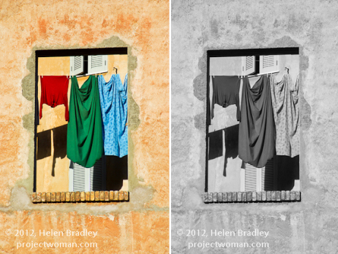
This image isn’t a good one to shoot in black and white as most of the interest in it is colour:

As photographer it’s your job to find other elements of interest to capture.

Look for different shapes, textures, tones and contrast in the scene that will be visually interesting and make these your subject matter.
For example, one element that works particularly well in black and white is repetition.

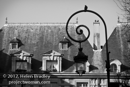
When you capture a series of repetitious elements such as trees, fence posts, light poles; then by removing the colour, you’ll be able to focus the viewer’s eyes on the repeated elements.


Helen Bradley

Thursday, June 14th, 2012

Shoot right at night – Tip #9 Shoot from Hotel Windows

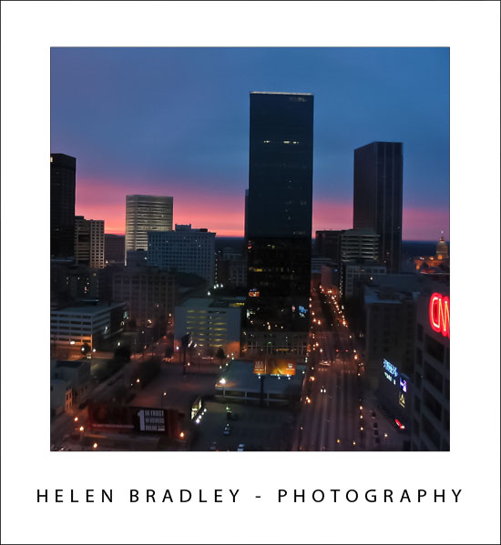
If you’re travelling for work or pleasure, ask for a room on a high floor in the hotel and shoot the night skies from your hotel window. There’s always something of interest happening in the streets below even if you have a totally awful view in daytime, the nightlights can offer photographic opportunities you don’t get in the daytime.

When you’re shooting from a hotel or office window at night, turn out the room lights so you minimise the reflections in the glass. Look for interesting buildings and light effects, jam your lens up against the window and start shooting. A table or windowsill can be used to steady the camera for long exposures too.

Helen Bradley

Wednesday, June 13th, 2012

Add or Edit Outlook E-mail Subject Lines


It is just plain annoying when you receive an email without a subject line or with one that makes little sense or which doesn’t relate to the email topic. Luckily you can fix this  very easily.

First locate and open a message that doesn’t have a sensible subject line or which has none at all. Click in the subject area – it’s greyed out but it is actually editable. Make your desired changes to the subject and add one if there is none.

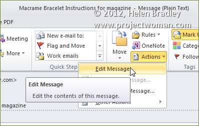
It is also possible to edit the message itself if you click the Message tab and choose Actions > Edit Message.


Once you are done, click Save to save your changes and close the file.

Helen Bradley

Tuesday, June 12th, 2012

Photographing in Black and White Part 1


Artistically black and white photos take a lot of beating. There is something about a good black and white image that invokes a level of appreciation that many colour images can never achieve.

In days of film, shooting in black and white meant that you had to commit to an entire roll of film for your black and white photos. Today you have a lot more choices and black and white is only a setting away in your camera.

However, shooting in black and white is a little different to shooting in colour so here is what you need to know:

Camera settings for black and white shooting

The first thing to do is to work out how your digital camera captures in black and white.

Most cameras have a setting that allows you to switch to monochrome or black and white capture.

You’ll need to be familiar with how to switch the camera into this mode, how to identify from its display that you are in this mode and how to return to full colour mode when you’re done.

When you capture in JPEG using a point and shoot camera or a digital SLR, your camera will discard all the colour information before saving the image. You can’t go from monochrome to colour later on.

However, if you shoot with a digital SLR and capture the image using Camera RAW you can generally configure your camera to capture monochrome images but, behind the scenes, the camera will still capture all the RAW data it would capture if you were shooting in colour and this will be available later when you process the RAW image.

Helen Bradley

Thursday, June 7th, 2012

Recording Yes, No, Maybe so in Excel

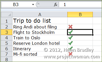
You can use Excel to fill a range with ticks and crosses to indicate Yes and No using a simple Excel Conditional Format.

To see this at work place a list such as to do items in column A of your worksheet. In column B, type the numbers 0 or 1 depending on when the task is completed or incomplete – 1 is completed, 0 is incomplete.

To make the numbers appear as checkmarks and crosses instead of 1 and 0, select the column of numbers and choose Conditional formatting from the Home tab on the Ribbon.

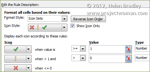
Select Icon Sets and then select the indicator set that has a checkmark, exclamation mark and cross in it.

To fine tune this conditional formatting rule so it displays just the checkmark or the cross and not the numbers themselves and so it works correctly, keep the range selected and, from the Conditional Formatting dropdown list select Manage Rules. Select the Icon Set rule, select Edit Rule and click Format all cells based on their values in the top of the dialog.


Select the Show Icon Only checkbox and, set the checkmark to read >= 1 and set the Type to Number. For the ! icon set it to read > 0 and set its type to Number also. Click Ok.
You can change the icons by simply typing 1 or 0 into a cell.

Helen Bradley

Sunday, June 3rd, 2012

Edit and Create on the go with Adobe Photoshop Touch

By Helen Bradley

On Monday, Adobe launched its Photoshop Touch application for the iPad. This long sought after app runs on the iPad 2, and not on the iPad 1, and it requires that you have iOS 5 installed. The app costs $9.99 which is at the high end of the price range for photo-editing apps in general but Photoshop Touch seems to have got the feature set about right so most people will probably consider it worth the money.

I use the iPad a lot for working with photos I’ve shot using a digital SLR camera in raw and which I’ve resized, converted to jpeg and downloaded to the iPad. Those images I have on the iPad are there because they are funky or because they lend themselves to some artistic play. So, I looked at Photoshop Touch in this light – I wanted to see if it would be part of my iPad image creative workflow. For heavy duty work, Photoshop and Lightroom will remain my tools of trade.

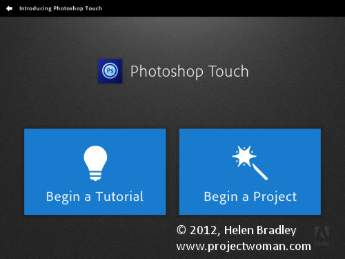
When you launch Photoshop Touch you get two options, viewing the tutorials or doing some work.

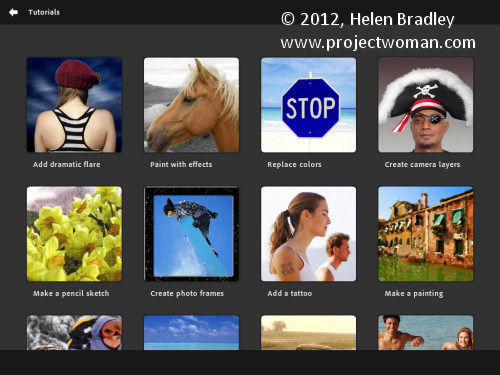
There are 10 tutorials that you can work through each of them is project based so you learn the program by learning a technique not by learning how individual tools work. These are text and image tutorials and not video ones, but they are interactive so you can learn as you go.

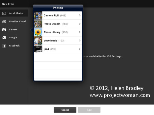
The second option is Begin a Project which is where I’ll start. You get the choice of adding an image from your iPad, the Adobe Creative Cloud, the Camera, Google or Facebook. I chose Local Photos then the Photo Library and an image from my iPad.

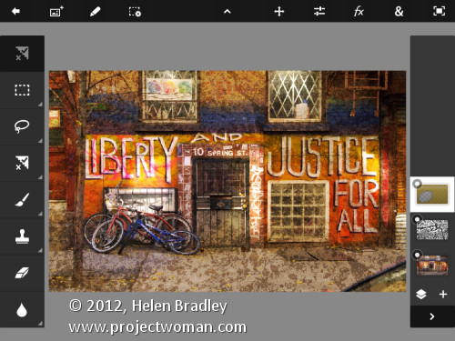
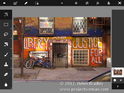
In the main editing area you’ll find the tools on the left, layers on the right and menus across the top. The program pays lip service only to Photoshop.  Some icons are familiar but others are more iPad than Photoshop so Photoshop users may find it a bit confusing where iPad artists will find it more familiar.

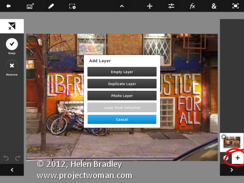
You can add multiple images and multiple layers. I wanted to texture this image so I clicked the Add Layer button and selected Photo Layer.

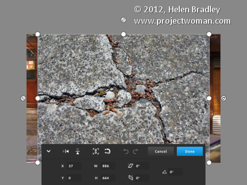
Once you select a second photo you get to size it as you import it – you can also rotate, flip or skew it too. Click Done to proceed to the editing area.

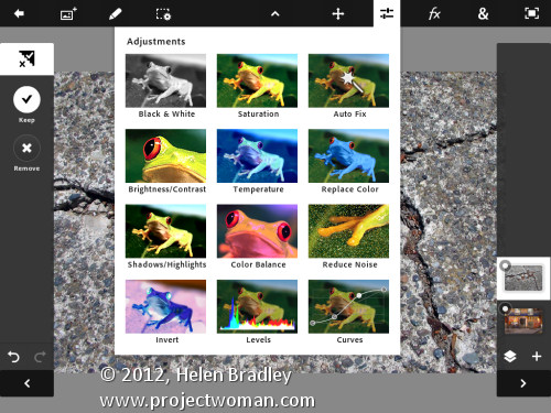
Now, with the layer selected, you can apply adjustments to it.

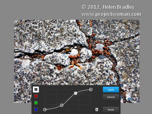
I chose Curves as this was a texture and I wanted more contrast. There are no adjustment layers so the Curves adjustment is being applied just to the targeted (top) layer. As you can see, you can adjust the RGB composite channel or the individual red, green and blue channels.

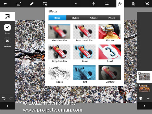
With the texture layer still targeted you can apply a filter to it by clicking the FX button. There is a range of filters including Basic, Stylize, Artistic and Photo. Some add things like drop shadows, blurs and glows and others are more artistic.

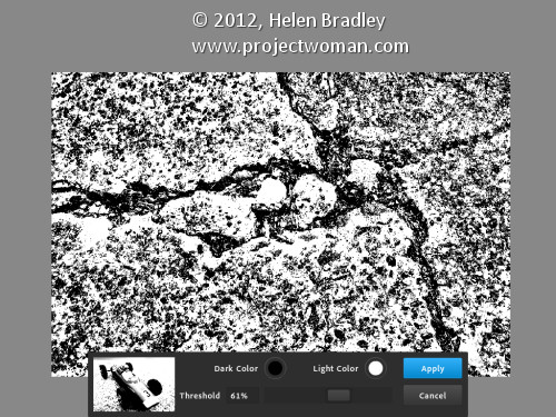
I chose Stylize > Old Photo, configured the settings and tapped Apply. Unlike Photoshop where the foreground and background colors need to be selected before you run a filter, here you can select the colors to use in the filter settings – this really is a feature that Photoshop should have.

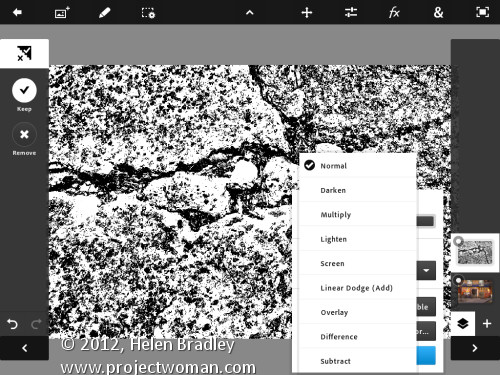
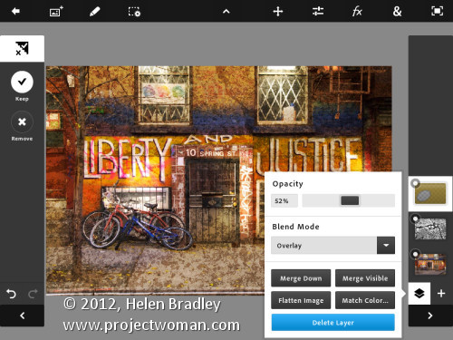
To blend the layers you click the Layer icon and you get a choice of blend modes and the chance to adjust the layer opacity.

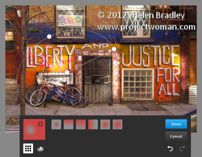
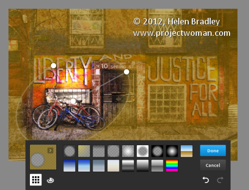
There are no masks but you can use a gradient to fade the effect – when you do the gradient is applied to the layer and you can only undo it by tapping Undo – you can’t go back and edit it.

You can also add a new Empty Layer and fill it with a gradient.

And then blend it using a layer blend mode as I have done here.

I finished by cropping the image and then saving it.

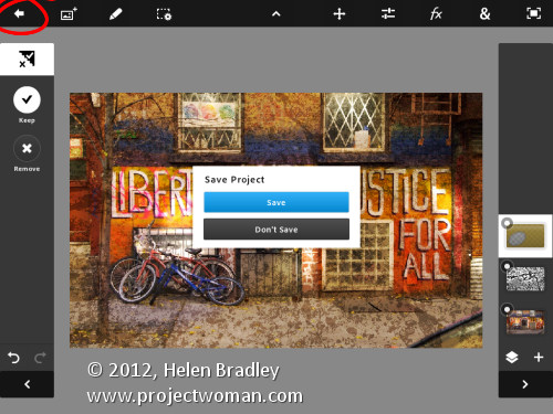
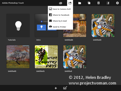
You can then email it or send it to the Camera Roll or upload the project to the Adobe Creative Cloud so you can access them from there.

There are limits to Photoshop Touch and one is the 1600 x 1600 pixel image size limit. The text tools are rudimentary and, as a long time Photoshop user, I’d like to see editable masks and editable text. That said, for fixing photos and tinkering with creative projects this program is a welcome addition to the Adobe family.

This app will appeal to a range of users. There are plenty of basic tools that are easy to use but also some more advanced features for working with images. The Scribble Extract tool does a reasonable job of extracting a subject from a background and you can tinker with gradients and fades to get some interesting effects. You don’t need to know how to use Photoshop to use the app but your knowledge won’t go astray.

Helen Bradley

Page 2 of 212