Helen Bradley - Photoshop and Lightroom tips and techniques
I'm Helen Bradley - I'm a photographer and Photoshop professional. In this Photoshop and Lightroom blog you will find powerful Photoshop and Lightroom tips, tricks and techniques that will help you get more out of both programs. You will also find step by step guides for working creatively with your photos in Lightroom and Photoshop and any other cool applications I know you will be interested in knowing more about.
Did you know you don’t actually have to choose File > Open to open a document?
Yup! It is so!
To avoid having to choose File > Open anytime you want to open a new image in Photoshop just double click on the workspace and the Open dialog opens automatically for you.
Simple and quick. What’s not to like about techniques like this?
How to resize your artboard to match the size of your Illustrator image
You’ve probably experienced the problem where you draw something in Illustrator and, when you are done, the artboard is way too big for the image. For convenience you need to scale down the artboard so it matches the size of your image.
Now you could go and grab the Artboard tool and start adjusting its size but there is an easier way. Start by selecting the objects on the artboard and then click the Artboard tool in the Tools panel twice. This opens up the Artboard Options Panel. From the Preset dropdown list choose Fit to Selected Art. The artboard will be instantly resized to fit the art on the artboard.
Click another tool such as the Selection tool to deselect the Artboard and you are good to go – you’ve cropped the excess artboard away from your artwork.
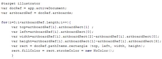
I used to have this information buried at the end of another post but I keep looking for it and never finding it. So, if I have trouble finding it, you probably do too! So, here is a post dedicated to creating a rectangle the size of the artboard in Illustrator. If you have multiple artboards then each gets a rectangle.
I found the script over at the Adobe forums there is a short script from a user called moluapple which creates a rectangle the size of the artboard. It’s a great script and I use it just about every day.
To use the script, head over to the forum and copy the code from there, paste it into a plain text editor such as Notepad or WordPad and save it as a script file with the .jsx extension and a name that makes sense to you. Put it in the Presets/Scripts folder for your Illustrator installation. Restart Illustrator and you’re ready to go.
Just in case the forum thread one day disappears, here is a screenshot of the script which makes a rectangle the size of the artboard – that way, you can always type it by hand!
Also, here is a link to my Youtube video on scripting in Illustrator just in case you need some more help downloading and installing scripts:
So, now you are all ready to download, unzip, locate and run scripts in Illustrator and I have a post I can refer to anytime I need to do it too!
Instantly view the entire Illustrator Symbol collection
Illustrator comes with a lot of handy symbols but opening each set in turn looking for something usable is a major time suck.
If you think like me then you’ll love this blog post over at Tiny Tutorials’ Adobe Classroom which has a honking big image with all the symbols shown in it for your enjoyment.
Here’s a mini preview of what you will find there – go! click! savor the goodness! Tell them I sent you.
I recently imported a heap of stock images into Lightroom so I could easily find images I wanted to use for various projects. When I added keywords to the images I ended up removing a lot of the images’ own keywords before replacing them with my own.
The problem I then encountered was that I had a heap of Keywords in my Keyword list with 0 images associated with them. In short my keyword list was bloated with useless keywords.
While you can right click a keyword and click to Delete it – this was an impossible task it would have taken hours. Instead you can clean up the list instantly with one simple command. In the Library in Lightroom click Metadata and choose Purge Unused Keywords – instantly all the keywords that aren’t associated with images are deleted. Simple!
Learn to quickly turn a Shape into a Path in Photoshop
Sometimes you get caught in Photoshop working with a shape when what you really want is a path. Luckily it’s easy to convert from one to the other – even if it isn’t obvious how to do it.
Start with the Layers palette open and make sure you have at least one layer in the document in addition to your shape layer. If you don’t, choose Layer > New > Layer and click Ok.
Click on the Shape layer in the Layers palette and open the Paths palette.
You will see the shape path there – double click it and give the new path a new name such as path1 and press Ok.
Now remove the original shape layer by clicking it and press Delete and you will be left with just your path.
So there’s a simple but not obvious answer to the question “How do I convert a shape to a path in Photoshop?”
When you create a path but you want a shape, here’s how to make a path into a shape in Photoshop
1. First create your path – it should be a closed path. In most cases this will already be done because it is at this point you realise that you have a path but what you really want is a shape.
2. With the Path selected in the Paths palette, choose Layer > New Fill Layer > Solid Color, click Ok, choose a color and click Ok again.
3. If you now look in the Layers palette you will see that you have a Shape layer – the shape having been created from your original Work Path.
Switch between the Dodge and Burn tools with one key press
While you are making small photo edits one easy trick that could save you a lot of time is switching between pairs of editing tools like Dodge and Burn with one key press.
So to change from the Dodge to the Burn tool (or vice versa), hold down the Alt key (Option on the Mac).
While you have the Alt key (Option key) held you will be using the other tool. Let go the Alt (Option) key to return to the original tool you were using.
Now you can easily move back and forth between tools to speed up your edits.
Quickly change the brush size (without using the slider)
When you’re using any tool in Photoshop that uses a brush such as the Brush itself, Eraser, Dodge, Burn and many others, you can change the size of the brush using a keyboard shortcut rather than having to use the size slider. This fast and easy shortcut can save you a lot of messing around.
To change the size of the brush for any tool that uses it, press the opening square bracket key ([) to decrease the size of the brush and press the closing square bracket key (]) to increase the size of the brush.
Notice from the top image to this one the brush has increased in size (I pressed the keyboard shortcut ] to do this) and I can easily make my adjustments without having to mess around with the brush size slider.
Automatically put placeholder text in a newsletter mock up in Photoshop
If you are creating a mock up of a newsletter in Photoshop I suggest you use “Lorem Ipsum..” as your sample text instead of real text. One thing the human eye is always looking for is readable text, but when you use “Lorem Ipsum” because it makes no sense at all your reader’s eye will go to your design instead of tying to read the placeholder text.
To create a text box and fill it automatically with “Lorem Ipsum”, select the Type tool on your tool bar and click and drag where you wish your text box to go.
Select the font face, font size, and font color on the tool options menu.
To fill the text box with your placeholder text, click Type on your main menu then click Paste Lorem Ipsum on the drop down menu.
This fills your text box with the placeholder type.
Only make and fill one text box at a time, if you need more text then click in the text box and reselect Type>Paste Lorem Ipsum to refill it.
Unfortunately when Adobe changed how Kuler works with Illustrator CC they broke a great tool. Instead of being able to search for color schemes from inside Illustrator you now have to do this on the web and favorite a color scheme if you want it to appear in Illustrator. At least that’s the theory – in practice Kuler is very slow to update in Illustrator making it nearly impossible to use it in a meaningful way – unless you know how to force it to update.
While you should be able to click the Refresh button at the foot of the Kuler panel most of the time this is greyed out – so you can’t force a refresh. The only solution that reliably works for me is to sign out of your Creative Cloud account inside Illustrator then sign in again.
So, to force the update, go to Help and click to sign out – in practical terms you are deregistering your Adobe account on this computer for now. Now close Illustrator and restart it – when prompted to do so, log in to your Adobe account and voila! Kuler will update.
Seriously Adobe really should be more proactive in fixing this stuff when it breaks like this. It shouldn’t be too hard to do – just make the Refresh button do what it is supposed to do!
For what it is worth, the problems with Kuler occur with both the Windows and Mac version of Illustrator.
Help! How to center a layer’s contents in Photoshop
Whether you’re making a simple document, newsletter or editing a photo a necessity is being able to center your layers. This task took me by surprise as to how challenging it was but in a few steps it can easily be done.
First press Control + click (Command + Click on the Mac) on the layer thumbnail for the layer you want to center in your Layers panel.
Click Select > All (Control/Command + A). This selects the entire image. You can tell this is done by the marching ants around your full image.
Click Layer >Align Layers to Selection > Horizontal Centers.
Notice that your layer is now centered horizontally. You can do the same vertically by choosing Layer >Align Layers to Selection > Vertical Centers.
Press Control/Command + D to deselect your layers.
Now your layer content is deselected and aligned horizontally (and/or vertically) and you’re free to continue editing.
Despite their existence in earlier versions of Photoshop some categories of filters are mysteriously missing from the menus in Photoshop CS6, Photoshop CC and Photoshop CC 2014. This is the default behavior so you won’t find the Artistic, Brush Strokes, Sketch, Stylize or Texture category of filters in the Filters menu. This is a problem if you use these filters so luckily you can bring the filters back when you know how.
It turns out that an option in the Preferences menu acts as gatekeeper for displaying the missing filter categories. To re-enable them, select Edit > Preferences > Plug-Ins…. Then check the box that reads Show all Filter Gallery groups and names. Click OK and restart Photoshop. This will put the filter categories back in the Filters menu.
Now you could have accessed the missing filters from the Filter Gallery but the way the filters are named in the Layers palette is different if you access them from the Filter Gallery rather than from the menu itself. So, if you use Convert for Smart Filters to create a smart object before applying the filters and if you start a filter from the menu then the filter name appears below the layer so you can tell the name of the filter you are applying. This image shows this situation:
If, on the other hand, you start your filter from the Filter Gallery the Layers palette simply shows Filter Gallery – with no indication of which filter you applied. This is what the Layers palette looks like – not very helpful at all.
In short, having the filters back on the menu and selecting them from there is the better option.
Be aware too that the Oil Paint filter was removed from Photoshop CC 2014 so it is gone for good.
Need to check what you didn’t pick in Lightroom – here’s how!
My workflow for choosing the best of my photos in Lightroom is to go through the photos in a folder and either click the Pick flag, the Reject flag or simply move past the photo onto the next one. Now sometimes I’d like to review the photos that I haven’t picked – they aren’t the best but they aren’t rejects. I will do this just in case there are some good images I have overlooked.
So, how do you display only the unflagged photos? Luckily it’s dead easy to do this.
These icons across the top of the filmstrip are, from right to left: Show Flagged Photos (ie Pick Flag is on), Show Unflagged photos (no flag present) and Show Rejected photos (Reject flag on).
So, click the middle flag to see only those photos that don’t have either the Pick or Reject flags enabled.
Now, if you add a Pick (or Reject) flag to one of the images it will immediately disappear from view – that’s because this filter is a live filter – it only shows the unflagged photos and as soon as a photo has a flag it no longer matches the filter so it is removed from view.
Of course, when you are done, make sure to select Filters Off from the Filters: list (or click the same flag a second time) to return to viewing all your photos.
Love Canva? Here are some keyboard shortcuts to speed up your designs
Control (or Command) + A Select everything in the design
Click on an area which is not selected – Deselect current selection
Control (or Command) + ] or Control (or Command) + Down Arrow – Move the selection down one layer
Control (or Command) + [ or Control (or Command) + Up Arrow – Move the selection up one layer
Control (or Command) + ; Show/Hide the layout grid
Alt (or Option) + Shift + B – Add a border around the text
Alt (or Option) + Shift + + (the plus symbol above the main keyboard – not the one on the numbers pad) to make the border wider
Alt (or Option) + Shift + – (the minus symbol above the main keyboard – not the one on the numbers pad) to make the border thinner
Control (or Command) + Shift + K – selected text to uppercase/lowercase (toggle) (this may not be visible if you are using an all caps font)
Control (or Command) + Click on an already selected object to select the object directly below it (Canva suggests this works, it doesn’t for me but YMMD)
Up arrow / Down arrow / Left Arrow / Right arrow – Nudge a selected shape in the direction of the arrow
Shift + Up arrow (or Down arrow / Left Arrow / Right arrow) – Move the selected shape a larger amount in the direction of the arrow
To rotate an object to 45 or 90 degrees (or multiples of these), rotate it slowly when you are near a 45 degree increment and you will see it snap into position