Wednesday, July 10th, 2013

Understand the differences between Vibrance and Saturation
The difference between Vibrance and Saturation is often misunderstood. If you drag the Vibrance slider to the right, you increase the saturation in under-saturated colors in the image. Fully saturated colors are adjusted less and skin tones are protected.
In contrast, increasing the Saturation boosts the saturation across the entire image which can destroy skin tones and which can oversaturate already saturated colors.
Typically you’ll use Saturation if your image needs an overall boost to all colors and use Vibrance to boost under-saturated colors.
Helen Bradley
Labels: color, Develop, Develop Module, difference, image, Lightroom, saturation, skin tone, slider, tone, under-saturated, vibrance, vs
Categories:Lightroom, photoshop
posted by Helen Bradley @ 10:07 amNo Comments links to this post
Sunday, July 7th, 2013

Recover Detail with the Recovery Slider for Clipped Highlights
When you have clipped highlights you can recover detail from them in Lightroom 3 if you hold the Alt key (Option on the Mac) and drag on the Recovery slider.
As you do this you will see the clipped highlights in the image and they will disappear as you drag to the right. Do not adjust the Recovery slider any further than you need to to recover your clipped highlights.
In Lightroom 4 you can achieve the same effect if you hold Alt or Option as you drag on the Whites slider – the whites are the lightest portion of the image.
Helen Bradley
Labels: Alt, Clipped, Clipped Highlights, Develop, Develop Module, image, key, Lightroom, option, recover, recovering, recovery, recovery slider
Categories:Lightroom, photoshop
posted by Helen Bradley @ 7:07 amNo Comments links to this post
Thursday, July 4th, 2013

Learn how to check to see if you have any Clipped Highlights in your image
You can see the clipped highlights in the image by clicking on the white triangle in the top right corner of the histogram. Portions of the image that show red are clipped highlights.
Next time we’ll show you how to recover detail in these clipped highlights.
Helen Bradley
Labels: Clipped, Clipped Highlights, Develop, Develop Module, histogram, image, Lightroom, portion, red, white
Categories:Lightroom, photoshop
posted by Helen Bradley @ 3:03 pmNo Comments links to this post
Sunday, June 30th, 2013

Exposure vs. Brightness vs. Whites Vs. Highlights – Understanding the differences
When you increase Exposure, you’re increasing the exposure across the image and the entire histogram will move to the right. When processing it is best to adjust Exposure until the histogram moves to the right but stop short of clipping the highlights. So make sure the right hand side of the histogram doesn’t hit the right wall of the chart.
Brightness in Lightroom 3 is a midtone lightening tool, which protects the highlights more so than Exposure does. So, if you can’t get the image bright enough without blowing out highlights using Exposure, adjust the Exposure but without blowing out the highlights and then use Brightness to lighten the image further.
In Lightroom 4 you can adjust the Whites slider to lighten the whites or the Highlights to lighten the next brightest areas of the image.
Helen Bradley
Labels: Adjust Exposure, Brightness, exposure, histogram, lightening tool, Lightroom, midtone, midtone lightening tool
Categories:Lightroom, photoshop
posted by Helen Bradley @ 7:40 amNo Comments links to this post
Tuesday, June 25th, 2013

Learn to control and manage the White Balance tool and loupe in Lightroom
The White Balance Loupe shows you information about the color under the cursor. Across the bottom you will see the percent of Red, Green and Blue in the current selection. If the color is neutral then all values will be equal.
If you un-check the Auto Dismiss check-box at the foot of the preview, the Loupe will stay visible allowing you to click multiple times to find a good place to use to adjust the white balance. I think this setting should have been set to be not selected by default – it just makes white balance corrections so much easier because, let’s face it, none of us ever get it right first time every time!
Helen Bradley
Labels: adjust white balance, Auto Dismiss, balance, Lightroom, Loupe, show, show loupe, white balance, white balance adjustment
Categories:Lightroom, photoshop
posted by Helen Bradley @ 8:32 amNo Comments links to this post
Sunday, June 23rd, 2013

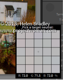
Learn how to quickly and easily adjust an image’s White Balance
In the Lightroom Basic panel’s White Balance area is a White Balance Selector. You can get to it by pressing the letter W. Hold the White Balance Selector over an area of the image which should be a neutral color, such as gray, black or white – gray is the better choice.
You will see the Loupe appear (which is a grid of 25 cells showing the color under and around the cursor). Click once to set the white balance, using the center color as a reference. If the result isn’t what you want, click again to sample another area. Continue until you get a good fix for the image.
Helen Bradley
Labels: 25, adjust white balance, Develop, Develop Module, develop toolbar, eyedropper, grid, Lightroom, Loupe, neutral color, w, white balance, white balance adjustment, white balance selector
Categories:Lightroom, photoshop
posted by Helen Bradley @ 7:49 am1 Comment links to this post
Wednesday, June 19th, 2013

Create the Orton Effect in Lightroom with the Clarity Slider
The Orton Effect is named after photographer Michael Orton. This process results in a somewhat surreal image which has a slightly out-of-focus look while retaining lots of edge detail.
You can quickly give an image a faux Orton look using the Clarity slider in Lightroom. All you need to do is drag the Clarity slider to the left close to -100 and then, increase the Blacks in the image to an higher than usual value.
Of course there is a lot more to the Orton effect than this but this gives you a good start and, for many images, may be all you really need.
Helen Bradley
Labels: -, 100%, Blacks, blur, clarity, detail, Develop, Develop Module, edge, effect, faux, focus, image, Lightroom, negative, orton, out, out of focus, Photoshop, slider, surreal
Categories:Lightroom, photoshop
posted by Helen Bradley @ 6:15 amNo Comments links to this post
Sunday, June 16th, 2013
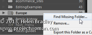
How to solve the problem of Lightroom reporting a folder as missing
If a folder is missing, it will have a question mark beside its name in the Lightroom library.
You can sort out Lightroom’s problem by locating the missing folder – to do this, right click the folder name in Lightroom and choose Find Missing Folder.
Now navigate on your disk to find the folder that Lightroom can’t find. When you have done this all the contents from that folder will be added back into the Lightroom catalog automatically.
The reason that Lightroom can’t find your folder is because you have done something to it outside Lightroom. In future, move and rename folders from inside Lightroom and this problem won’t occur.
Helen Bradley
Labels: ?, Find, Find Missing Folder, folder, Library, library module, Lightroom, locate, missing, missing folder, question mark
Categories:Lightroom, photoshop
posted by Helen Bradley @ 8:27 amNo Comments links to this post
Thursday, June 13th, 2013

Add that Softened Look to Your Portraits with the Clarity Slider
One time when you’ll want to use a negative value for Clarity in Lightroom is when you have a portrait that you want to give a softened look to.
Negative clarity softens an image so it’s a good choice to use. Just adjust the slider to the left to around -20 or more depending on the results.
Use this on portraits of women and children or to give an image an ‘Early Hollywood/Casablanca’ feel.
Helen Bradley
Labels: clarity, Develop, Develop Module, Lightroom, negative, Photoshop, Portrait, slider, soft, soften
Categories:Lightroom, photoshop
posted by Helen Bradley @ 6:09 amNo Comments links to this post
Monday, June 10th, 2013

Give an image’s Midtones a Boost with the Clarity Slider
The Clarity slider helps you adjust the Midtones in the image so it adds Contrast to them which also results in them looking a little crisper and more saturated too.
It’s a great tool, but try not to overdo it. Typically, a Clarity adjustment of around 25 is a good choice for most images. In Lightroom 4 the adjustment has been tweaked a bit so you can add more Clarity in Lightroom 4 than you are perhaps used to doing in Lightroom 3.
Helen Bradley
Labels: clarity, contrast, Develop, Develop Module, enhance, Enhancing, image, Lightroom, midtone, Photoshop, Sharp, slider, tip, tool, TrickCrisp
Categories:Lightroom, photoshop
posted by Helen Bradley @ 6:03 amNo Comments links to this post

