Helen Bradley - Photoshop and Lightroom tips and techniques
I'm Helen Bradley - I'm a photographer and Photoshop professional. In this Photoshop and Lightroom blog you will find powerful Photoshop and Lightroom tips, tricks and techniques that will help you get more out of both programs. You will also find step by step guides for working creatively with your photos in Lightroom and Photoshop and any other cool applications I know you will be interested in knowing more about.
Learn how to make an image its own mask using Apply Image in Photoshop.
Here we use an image of a cast iron grill and apply it to itself to show another image through it.
Transcript:
Hello I’m Helen Bradley. Welcome to this video tutorial. In this tutorial we’re going to look at using an image as its own mask in Photoshop. And we’re going to do this using the Apply Image tool.
Before we get started with this tutorial let’s have a look and see what it is that we’re trying to achieve. I have an image here that’s just some oranges and then I have another image here of a grate. And what I want to do is to put the grate over the oranges just as I’ve done here. And I’ve actually got a drop shadow behind it to give it some dimension. And what we’re going to do in this tutorial is see how we can use an image and use itself as its own mask to mask that image and how we can also adjust the mask so that we get this effect that we’re looking for and adding a drop shadow to it. So if you’re ready let’s just get rid of the bits that we don’t want. I’ve now got my orange image and let’s get started.
The first thing I’m going to do is bring in my grill image. So I’ve got these images just floating loose because I find that the easiest way of doing it. And I’m just going to drag this image’s background layer away from it, hold the Shift key and just drop it over the top of this image. Now of course it hasn’t disappeared from its original image. I’ve just dragged a copy away. And I don’t need that any longer so I can just get rid of it. With this image it’s a little bit on the small side, so I’m going to press Ctrl T and Ctrl 0 (zero) to see my handles and to set transform on. I’m also going to enabled this lock so that the ratio between the height and width is fixed. This means that the image is not going to be skewed out of proportion. And now I’m just going to drag it into position and I can place it anywhere I want. So I think this is a pretty good arrangement so I’ll click the checkmark here.
Now right now we’re not seeing through this image because of course it brought its own background with it and it’s got a sort of dark background with some light aspects. We’re going to need to do some work to fix this image up. And in actual fact the work that we’re going to do is in masking so I’m just going to drag this up a little bit. What I want to do is I really want to turn this image into its own mask.
So once I’ve got it in position it’s fairly critical that I actually get it in the right position before I start because I want the mask and the layer to be in the same place. I’m going to add a layer mask to this layer by just clicking the Add Layer Mask icon. But what I want to do is put this image in this mask. And an easy way to do that is to click the mask itself and use Apply Image. It’s up here, Image, Apply Image. And what it lets us do is to apply an image as a mask. So for example layer zero is the oranges themselves so that in this case we would be applying the oranges as a mask. But we can also select layer 1 which is applying this particular grill as its own mask. Now it’s not looking good right now but it is certainly masking it. I could invert it if I wanted to but that’s only going to give me the orange images over the grill work not where I want it. I want it in the bits in between the grill work so I’m going to disabled invert because I don’t want it inverted. If I’ve got that right I’m just going to click Ok.
Now the problem with this mask is that this particular image is not black and white. It’s not. Let’s just turn everything off here. You can see that this is actually really quite gray. And for the mask to really be doing its work it needs to be almost black and white. So I need to boost the contrast up on the mask alone. So I’m going to click the mask to target it so any changes I’m making now are to that mask alone. And I’m going to choose Image Adjustments and Curves because curves will allow me to adjust the mask and have a look here on the mask itself as I work. What I’m doing here is I’m increasing the whiteness of the mask and then I’m increasing the black areas. The whiter and lightest areas are going to ensure that we can see the grill in these places. And the black the darker black areas are going to cope with the areas that we’re seeing through. So I need a fairly sharp change from black to white and I also need to make sure that my sharp change from black to white copes with the fact that there’s a sort of darker gray bar behind the image. And I want to make sure that that dark gray bar goes to the right color. It needs to go to black and not to white. And what I’m looking for here is to make sure that I can really see the image through this grill, and when I’ve got it I’ll click Ok.
Now if I wanted to I can lighten my grill. That’s fine. I need to make sure that my mask is black and white so that the image behind is being shown through and then if I want to change the actual grill itself well then I can add an image adjustment to that. But the two are very different adjustments. One is adjusting the grill color itself and the other is changing it as it appears as a mask over that original grill image. So if I want to make that a bit more light I can do so just to add that extra contrast. And now to add a drop shadow to push the orange image behind that grill I’m just going to click on the grill layer and choose Drop Shadow. And here’s the default drop shadow. Well that’s what you would see as a default drop shadow. And I can add as much or as little drop shadow as I want to push that behind and gave us the sense that there is a dimension or a distance between the grill and the actual orange image itself. And we can make that deeper or less deep as we want to and then click Ok.
So here we’ve used an original image of some oranges. We’ve added an image of a grill and we want to see through the holes in the grill to the image of the oranges behind. And we’ve done that using the image as its own mask so it’s showing us where we want to see through. We’ve added a lot of contrast to this so this mask is almost pure black and white. The image itself can be anything. We just gave it a little bit more of a pop by making it a little bit brighter but it could be anything. And we’ve finished with a drop shadow to add some dimension to the entire scene.
I’m Helen Bradley. Thank you for joining me for that this tutorial. Look out for more tutorials on projectwoman.com and on this YouTube channel. And please if you liked the video click to like it and consider subscribing to this YouTube channel.
Learn to use recursivedrawing.com to create a fractal tree that you can then use in a Photoshop collage. This video shows you step by step how to create the fractal tree and then how to copy and paste it into a Photoshop collage. Also, how to blend it seamlessly into the collage document.
Transcript:
Hello, I’m Helen Bradley. Welcome to this video tutorial. In this tutorial I’m going to show you how you can create fractal trees online that you can then use in collages and other images in Photoshop. This is the kind of recursive tree that we’re going to draw. And one of the benefits of this is that we can grab it and use it in a Photoshop image.
So let’s have a look and see how it’s put together. It’s put together with a single rectangle that’s a long rectangle and then we’re just going to draw it as a fractal tree. So I’m just going to click down here, this plus sign, to get started with a new image and let’s start with our first tree.
To create a tree we’re going to start with a rectangle or square and drag it to make a nice long thin rectangle which is going to be the trunk of the tree. And I’ll just place it in position at the bottom here. Then I’m going to go and drag this element which is the element I just created but this time I’ve got multiple versions of it. I’m going to push it so that I make this sort of recursive element.
Now it is really easy for this tree to get away from you. And if it does just stop it and just go and start again until you get really used to the tool and what it’s going to do it because it can behave really, really recursive and go everywhere really, really quickly. So I’ve now got that part of the tree. Now I’m going to go and grab the tree back again because I want it in here. And this is usually where if I’m going to lose it I’ll lose it at this point. But let’s call that good for our tree because that actually is quite a good tree. You’ll watch it until it’s finished drawing and when it’s finished drawing you won’t see any more changes around the edges.
So this is looking pretty good to me so I’m going to press the Print Screen key to take a screen print of it. And now I’m going to launch Photoshop. In Photoshop you can see I’ve already got a few trees hanging around. I’m going to choose File and then New and then click Ok because that is an image now the size of my clipboard. So all I have to do is do Edit Paste. And here is my tree.
So the first thing I’m going to do is make a selection around the tree itself and then I’m going to choose Select Inverse so the rest of the image is selected and I’m going to delete it just to get rid of it. I’m also going to get rid of the background layer so all I have right now is the tree itself. I’m going to select the magic wand tool and I can just click on the white and just press Delete and that will get rid of all the elements except the tree itself. And at this point I can just crop it down to size.
Now I would save it at this point because that means I’ve got a tree then I can use in anything in future. Now I have a texture image here and it’s a pretty big texture. And this image is pretty small so I’m probably just going to reduce the size of this down say 50 percent so that our tree is going to look a little bit better on it. With the texture image and the tree image both visible I’m just going to drag the layer of my tree image onto my texture. And here it is. I’m just going to make sure that I move the tree and not the background.
Now if you find that there’s a little bit of haloing around the edges of your tree so if you brought in a little bit of white that you want to get rid of you can do so. And the easiest thing probably is just to set this blend mode to darken because what that does is the white pieces on the tree anything that was a sort of legacy piece of white isn’t going to be brought in because it’s going to be lighter than the background.
So there are all sorts of trees that you can create using that tool. You can be successful and less successful depending on how you go. You can see I’ve got some really nice trees and I’ve got some pretty horrible ones as well. But that tool can be used to create fractal trees that you can then access to use in your images in Photoshop this way.
I’m Helen Bradley. Thank you for joining me for this video tutorial. I hope you enjoy the recursive drawing tool. Look out for more videos on my YouTube channel here and visit projectwoman.com for more tips, tricks and tutorials on Photoshop, Photoshop Elements, Illustrator, Lightroom and lots of other handy graphics techniques.
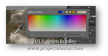
Sometimes when you need to grab a color in Lightroom you’d really like to use a color sampled from your image. This is easy to do.
In any situation where you have access to the Color Picker, click on the color swatch to open the Color Picker and hold your mouse over it. Press the left mouse button to get the Eyedropper but don’t let go – instead move out of the dialog and over the image and sample your color from there.
Learn to use Masks in Photoshop. Here we look at how to collage a series of images together, using masks in Photoshop.
Transcript:
Hello, I’m Helen Bradley. Welcome to this video tutorial. In this tutorial we’re going to look at Masking 101. So we’re going to get you started with masks in Photoshop.
In this introduction to masks I’m going to show you how you can use masks to create images like this collage image. This collage image has been built up from a number of images and they’ve all been masked so that everything can appear nicely on top of each other.
The first image was the tail end of some cows and then I added an image of a tree. And this image has been masked so that we can see part of the cows’ tails behind it. But you can see that these two images are sort of blending into each other with this mask effect. Then we have the cow by herself and again we’ve masked her so that we can see the image of the tree behind her. And then we’ve added an image of some hay over here, and again added a mask to the hay image around the edge of the cow so that we’re getting this sort of almost seamless blended effect all the way across the image. And then we’ve got some milk cans and then finally we had some different effects that sort of tied the whole thing in together. But we’re going to have a look at masks and we’re going to have a look at it doing the last three images in this particular collage, just seeing how that would have been put together.
So I’m going to open the images. I’ve got a couple here open already. I’ve got the milk cans and the hay and let’s just go and get the cow. And I’m going to create an image that these will all going into. I think a thousand pixels is a bit too big so let’s try 800. And to start off with I’ll just drag and drop these images in. But this cow needs to be flipped first of all because I had her flipped in the original. So I’m going to flip her there and then just drag her in here. I’m just dragging on the layers and then just pressing V for the move tool so that I can move her into position. I’m holding Shift as I scale her up to full size. I don’t want to save the cow image. I want the hay image now so I’m going to drag and drop it into position. And I’m going to make sure I’ve got a fairly hefty overlap here because the overlap is going to allow me to blend these images together. And finally the milk cans and drag and drop them into position. And that’s a pretty big image too. I think actually it’s much bigger than the others. I’m pressing Ctrl T and then Ctrl 0, that’s Command T, Command 0 on the Mac, to just re-size these milk cans and just drag them into position.
So I’ll start off with a collage like this by just grabbing my images and just pulling them into position with a nice hefty overlap. And in this case I’m going to crop these images so that we don’t have anything extra hanging around. And now let’s go ahead and do the blending. And I’m going to do this by first looking at this layer here the cow and the hay. So I’m going to zoom into this area so that I can see what I’m doing, move the image across, and I need to mask this hay layer.
So to do that I’m going to click the Add Layer Mask icon here and that adds a mask to the hay layer. I need to have that mask selected. I need to select a brush to use. I’m just going to make sure that I have a brush here. I’m looking for a sort of solid-ish brush. This is a hard mechanical 38 pixels. Now it’s too hard but I can soften it by just taking down its hardness to make it nice and soft. And then I’m going to make sure that my mask layer is targeted and I’m going to set these colors here to their defaults by pressing the letter D.
Now we can already see that if this mask is white we’re seeing the hay. So that means if I want to see the cow I need to paint on it with black. So I’ve got black paint now. I’ve got the mask targeted and I’m painting on the mask where the cow is to bring the cow back in through the grass. Now I’m not going to be a 100 percent fussy at this stage because one of the benefits of using masks is that we can come back later on and edit it. So I’m looking for the edges of the cow but I’m not worried that I’m getting a bit of extra green here because I want to know where her edges are so then I can get a little bit closer to her in a minute. So I’ve got her pretty much there.
Now I just need to neaten it up. And to neaten it up I’m going to switch to white being my foreground color. I’m going to get a much, much smaller brush, make sure I’ve got my mask targeted and I’m going in close to the cow’s face here to make sure that I get an edge that gives me none of this green because it’s a really, really bright green that she’s standing on. And it’s not really doing a lot. The hay image I think is the prettier image. So again I’m just going to get close in to her here. Now this might take me half an hour to do to get a really nice result and the sort of result that I want. And I can also start working with a larger softer brush so I can make sure that I have it even softer. And I can work with a lower opacity if I want to and I can even paint in mid gray because with masks you can paint in black or white or any shade of gray because a mask is a gray-scale image. Now I’m just having a look at these milk cans. And I think that probably there’s one too many. So before I go much further I’m going to select the milk can layer and get rid of this first one because I don’t really like it that much. Now I’m going to grab the next three, I’m just going to move them over a bit.
There’s a bit of excess image hanging around but I’m not too worried about that. I’m going to add a layer mask to this layer. So now we have the overlap. And I want to bring the grass through the milk can so I’m going to paint on this layer again in black and white. So again a nice big brush, I’m going to switch colors by pressing the X key because I want to blend these images in together. I want to sort of suggest that there’s a seamless transition from one image to the other. And I’ll do that with a very soft edge so we almost can’t see where the grass image ends and the milk cans begin. And with this particular image I found that there was enough shine on the milk cans that we could perhaps even suggest that the grass image was showing through the milk cans. And I’m doing that by just adjusting down the opacity of the brush. So I’m not painting it full opacity and I’m just tapping where I want perhaps a little bit of the grass image to appear, again to really blend these images together. And if I’ve made a mistake and if I want to go back then all I need to do is change my paint colors and I can go back and paint out the effect that I’ve just painted in. And I can do this over and over again until I get the exact effect that I’m looking for.
Masks are a handy way of blending images in a way that allows you to come back later on and make changes to it. If I were saving this masked image because I want to make changes to it later, I want to come back and work on it a little bit later, I would do so by saving this as a PSD file. So I’d choose File and then Save As and make sure that when I’m saving it, it’s being saved as a PSD image. That will ensure that the masks and the layers are all there when I come back next time. The biggest mistake you’re going to make when you’re working with masks is when you actually work on the image instead of the mask itself. So if you start seeing that you’re painting in black, that’s telling you that you have the image layer selected not the mask layer. If you’re working on a mask you really need to have that mask layer selected.
I’m Helen Bradley. Thank you for joining me for this video tutorial. Look out for more video tutorials on this YouTube channel and visit my website at projectwoman.com for more tips, tricks and techniques with Photoshop, Photoshop Elements, Lightroom, Illustrator and lots more.
You have probably played around with the styles in Photoshop Elements and added things like a drop shadow to an image. But did you know that these can be edited once they are created? Doing this gives you the ability to customize the shadow to suit your needs.
To adjust an effect such as a drop shadow, with the layer that you have applied the shadow to selected in the Layers palette, choose Layer > Layer Style > Style Settings. Alternately you can double click the fx icon in the layer to open this dialog.
This dialog has the tools you need to adjust the shadow or other effect you have applied. Note that when you are working with shadows the Size is really a feather type effect and Distance is more what you might consider to be size and it positions the shadow at a distance from the original shape or object.
Here too you can change the shadow color and the direction it comes from by altering the Lighting Angle. You can also click and drag on the shadow on the image itself to move it into position. Click OK when you are done.
Learn how to recolor line art in Photoshop and how to change the colors very easily.
This video shows the use of the Lock Transparent Pixels option in the Layers Palette in Photoshop and also a Hue/Saturation adjustment layer.
Transcript:
Hello, I’m Helen Bradley. Welcome to this video tutorial. In this tutorial I’m going to show you how you can recolor your art in Photoshop. In this video tutorial we’re going to have a look and see how we could recolor this car and how we can do it in a way that would allow us to perhaps change the colors later on.
I’ve got the car on one layer here and the background which is white on another layer. So I’m going to add a layer between these two layers where I can start painting my colors. I’m going to select one of these color schemes that in an earlier video I created from Kuler and I’m going to just grab my toolbar here so that I can grab a paintbrush and a relatively hard paintbrush, not totally hard but relatively hard. I think I’ll just back it off a little bit here to about 84 percent. And on this layer I’m going to start laying down paint. I’ve got my opacity right down from another job that I was doing so let’s just kick that up.
Now I’m just going to paint over the areas where I want the paint to be. And how detailed you are with this and how accurate you are with it depends on just what sort of effect you want. Now I don’t want it to be quite so accurate so while I am going to erase a little bit of this I’m not going to erase all of it because I do want some over-painting. Now I could leave this layer underneath but you’ll see that there is a little bit of white there that’s showing through. I can get rid of this by going to this layer here and setting its blend mode to darken and that will darken the areas but will let the white pixels blend in with the layer below. I think that gives me a better result.
So let’s go now and let’s get another color in this color palette and let’s just go and paint here. And I’m just going to pick the paintbrush up rather than the eraser and let’s Just paint in these areas. Again depending on what sort of effect I want I may be more or less accurate and I can always come back with the eraser and just tidy up if I want to. Most of these areas of the image are also trapped so if I wanted to I could just make a selection from the original image and pour paint into them. But I don’t really want that effect for this image. I just want it to be a little bit more organic than that. And I’m going to add the orange to various portions of the image but I’m going to do it all on this one layer. So that means that later on I can come back and replace the orange with another color and every element that was orange will be replaced accordingly. So let’s just go here. I think I’ve got a slight problem with my green. So I’m just going to continue until I have my car painted to my satisfaction and then we’ll come back and see how we would recolor it.
Now I’ve finished painting the car and I’m ready to go ahead now and have a look at my options for recoloring it. One of the ways I can change the color of this image is to click on the topmost layer and choose Layer, New Adjustment Layer, Hue/Saturation. And this allows me to recolor the entire image just using a single adjustment layer. So I’m just going to drag here and then if I drag around on this color selector here you can see that all of the colors bar that sort of gray color are now changing. And they’re changing in the same relationship to each other. So that’s one of the options I have for recoloring this vehicle is to just adjust the hue/saturation of the entire image using a hue/saturation adjustment
layer and just stopping when I get to the color scheme that I want to use for example.
Now another alternative is if I want to just selectively recolor areas because I put each of these colors on a different layer I can then just change those layers. So for example let’s go and pick up another Kuler color scheme. I’m in beach ball but that doesn’t really matter too much. Let’s go and get this beach combo color scheme from Kuler. And if you haven’t yet watched my Kuler video and if you want to know how to do this then I suggest that you go and have a look at it.
Now my mouse and my video tool aren’t running very well together right now so I’m having a bit of trouble selecting this. Ok, it’s now in the Swatches panel. So I’m going to go ahead and select this blue color as my foreground color. And I want to replace this color green with the blue. Now what I’m going to do is because there’s a lot of detail on this layer and I want to replace the whole lot, I’m just going to lock the pixels on that layer. And what happens when I lock the pixels is if now I press Alt and Backspace, Option Delete on the Mac, what I’m doing is flooding just the filled pixels on this layer with that Color and so now that layer has been recolored. I’m going to select this layer and lock the pixels on it and pick up a color to use for it and then I’ll Alt Backspace, Option Delete on the Mac, to change its color.
And finally I’m going to lock the pixels on this layer and let’s go and get a color to use for that. We’ll choose this darker blue, Alt Backspace, Option Delete. Of course these layers are now locked so if I want to be able to edit them for example erasing any excess paint or making any changes to them, I’ll need to unlock them. But this Lock Transparent Pixels tool allows you to quickly isolate the contents of a layer, select a color to use for it and just Alt Backspace, Option Delete on the Mac, to immediately select and refill all the pixels on that layer.
I’m Helen Bradley. Thank you for joining me for this video tutorial. If you liked this tutorial please give it a thumbs up and feel free to comment on it. Please consider subscribing to my YouTube channel and visit me at projectwoman.com for more tips, tricks and tutorials on Photoshop, Photoshop Elements, Lightroom, Illustrator, GIMP and a whole lot more.
Learn how to use Kuler color schemes in Photoshop via the Kuler Extension.
This video includes details of how to add color schemes to swatches and how to edit, customize, and create Kuler color schemes inside Photoshop CS4, CS5 & CS6.
Transcript:
Hello, I’m Helen Bradley. Welcome to this video tutorial. In this tutorial I’m going to show you how you can use Kuler colors in Photoshop. In this video tutorial we’re going to have a look at Kuler which is a way that you can find custom color schemes from inside Photoshop.
Now Kuler is also available online but we’re going to work with the Photoshop extension. And that’s been there since CS4. To see it choose Window and then Extensions and then Kuler. And when Kuler launches you get to see some of the color schemes.
Now I last looked for vintage car and that’s in actual fact what we’re going to look for now. So I’ve typed in vintage car and clicked the Search button and here are color schemes that are related to vintage cars. And if I can’t see anything I like there I can click the View Next Set of Themes option and we can go forward to see other themes. Now these themes have been designed by other people and they’re available online. And people put them up online when they create them and then they are accessible for us to use if we want to use them.
So I’m looking for a theme to use for my car. And let’s say that I find one, so let’s just go and find one that we sort of like. I’m thinking this one here. And if I like it I can just click on this arrow icon here and I can add it to my swatches panel. And when I do that it becomes the last five colors in my swatches panel and I can click on any of these colors to add it as my new foreground color. And that allows me to paint on it for example to recolor my car.
Now if I sort of like it but think I like to edit a color for example maybe the red in this, then I can click here and choose Edit this theme. And this opens the Kuler panel but this time in the edit mode. And this is where I can change some of these colors.
For example I can take the red and walk it around to maybe make it an orange. And if I like that then I can use this particular color scheme. If I want to save this theme to my swatches panel I can do so by clicking here, Add this theme to swatches panel, again this time all five colors go into the swatches panel. I could upload it to Kuler if I wanted to and I can name and save the theme.
You can also create your own custom themes here so for example if you wanted to create an analogous color scheme you could do that. So you could just click there and then you can drag around on these sliders to make the color scheme that you want to use. If you want to use a complementary one you can do that and just drag in and out on these colors to create your own complementary color scheme. And if you like it then you can add it to your swatches panel. You can upload it to Kuler.
Kuler is a really handy tool for finding color schemes if you’re not sure what you want to use and so you can quickly and easily find color schemes and add them to your swatches panel. So it can help you get inspiration when you want to use a limited color palette on your images and you’re just not really inspired to find it yourself.
I’m Helen Bradley. Thank you for joining me for this video tutorial. Look out for more tutorials on this YouTube channel. Also visit my website at projectwoman.com for more tips, tricks and tutorials on Photoshop, Photoshop Elements, Lightroom, Illustrator and a whole lot more.
Learn how to make a collage or montage in Photoshop using fractal trees, a texture image and some masks.
The images used in this video are free to download and an earlier video shows you how to make fractal trees so you can make the collage yourself. The tutorial covers beginner level masking to help make the collage and two pieces are created from the same basic elements.
Hello, I’m Helen Bradley. Welcome to this video tutorial. In this tutorial we’re going to look at using masks, textures and some fractal trees to create composite images in Photoshop. In this video tutorial I’m going to show you how you can create a couple of interesting effects just using images that you can find online.
The background image here is from Flickr and details are in the end of the video. And the house image is actually from sxc.hu, and again I’ve got details at the end of the video. The tree is a fractal tree and you can see one of my other video tutorials for how to create fractal trees. And this is just done with my masking so that’s one of the images we’re going to create. We’re just going to reverse the mask here to create this image. So let’s see how we would do that and I’m going to start by showing you the two images we’re going to use. This is the one from sxc.hu which is free for download online and this is the background from Flickr.
The first thing I’m going to do is just to bring this image in so I’m just dragging on the background layer and just bringing the image into my sort of collage area. Now what I wanted to do was actually line up this background and it actually worked perfectly. These images haven’t as far as I’m aware actually been adjusted from their downloaded original. But the horizon line just works perfectly on the back of this texture image so I’m just going to do that and then we’re going to mask the house. Now the easiest way to mask this house is probably to grab the quick selection tool. And with the quick selection tool you can select over those areas of the image that you want to select. And if it’s not perfect you can just go back with the Alt key and just drag over the areas that you want to take out of the selection. But it does a reasonably good job. And because we’re doing masking anyway it’s a little bit forgiving. So having done that we can choose Select and then Refine Edge. And Refine Edge will allow us to refine the edge of this and we can do this with marching ants or on black or whatever.
Now I’m going to ask Photoshop to have another look at some of these edges here because it hasn’t done the world’s best job of getting them right and particularly these edges around the bottom here. And once we’re happy with that if we are happy with it we can just make this into a selection or a new layer with layer mask. So I’m going to choose New Layer with Layer Mask and just click Ok. And that has created the image here this house image as a new layer with its own layer mask. And I can determine how much of this inside that I want to bring in.
So I’d actually thought in the past that actually bringing these windows in would be attractive and perhaps a little bit more worked on the door. And now I want to fill these areas with black in the mask. So I’m going to select or target the mask layer, black is my foreground color so I’ll do Alt Backspace and that allows me to see through the building to what’s behind. And then I’ll just go and open one of my trees. And I have some trees here and I’ll just grab one of my fractal trees, drag it into the image here.
I’ll make sure I’ve got the tree layer selected and drag it into position here. And when we were looking at these fractal trees we determined that actually using the darker blend mode or darken blend mode blended the trees into their background a little bit better because that meant that any residual white in the tree that was left over from the process of bringing it into Photoshop would be eliminated that way. So there’s the first of our images.
So having completed our first image the second one is done in a very similar way. In fact we can borrow the first to make the second. So I’m just going to make a duplicate of the image layer here. And what I’m going to do is just invert the mask so I’m just going to press Ctrl I on the mask and effectively that was pretty much the beginnings of this image. I then brought in the tree so it would be a little bit over the edge and then we’re going to create a shadow for the tree. So the first thing I’m going to do with that is on the tree layer once it’s already set, I’m going to add a drop shadow. And I’m just going to go with whatever I get here because I’m actually not going to use it exactly as it is here so I’m just going to click Ok.
And now I want to take the drop shadow layer off onto its own layer so I’m just going to click Create Layer and click Ok. And that takes the drop shadow back onto its own layer which means I can do things with it such as sizing it down, putting it in position and then rotating it so it becomes more like the kind of drop shadow that it should be. And I want it to come over the background there so I’m just going to click Ok and actually position it a little closer and perhaps even kill down its opacity a bit, multiply blend mode is what I wanted there.
Now on this layer too I had a drop shadow so let’s just go and add a drop shadow to this. Yes, it was a drop shadow but it was a lot smaller than that. So I just gave it a little bit of a softening effect that I wanted, not quite as harsh as it had been. And we could change the color of that if we want to. But I’ll just click Ok.
So there are the two possible effects that we can create using this particular image. It’s just done through layer masks and you can create all sorts of fun collage effects using layer masks in Photoshop. And I’ve combined these with nice textures and these fractal trees. And the beauty of all of this is that these images can be grabbed online. So you can go and create these image effects if you want to yourself by grabbing the images and playing around with these effects.
I’m Helen Bradley. Thank you for joining me for this video tutorial. Look out for more tutorials on my YouTube channel and visit projectwoman.com for more tips, tricks and tutorials for Photoshop, Lightroom, Illustrator, Photoshop Elements and more. And if you liked this please click Like and comment on it and think about subscribing to my YouTube channel.
Playing with color using a Gradient Map Adjustment Layer
I’ve been fiddling around with halftones and grayscale posterized images lately – partly for a magazine project and partly for some things I am designing. Sometimes, however, I just play for the sake of it and today’s post is all about that playtime.
Posterized images have a flattened color look – the entire image is flattened to a few bands of color and I was interested to see what color variations I could get with a Gradient Map over an image. Gradient maps work by mapping a color onto a tone in the image and, with a regular image, the colors sort of blend across the image. However, posterized images are different – they have flat areas of color so the Gradient Map will not be seamless and instead it is going to recolor the posterized image in great big solid blocks of color.
Here is the image I started with:
To see this at work, first convert the image to black and white using Image > Adjustments > Black & White and create a nice contrasty black and white.
Then add the posterized effect by choosing Image > Adjustments > Posterize and set the Levels to 4 or 5 – this makes the image into one that has 4-5 tones only in it.
Now to recolor the image with the Gradient Map choose Layer > New Adjustment Layer > Gradient Map and click Ok.
From the dialog select a color scheme to use. The new photo filters which are included in Photoshop CS6 are a great choice but absolutely anything will give a great result. The colors are mapped on to the image according to the light and dark tones in the image. If you click Reverse you’ll get a negative effect. Find the color to use and close the dialog.
Because you’re using an Adjustment Layer you can change the colors anytime by just double clicking the adjustment layer and choose a different color combination.
I finished off by finding an image to use with this one. I flattened the camel to a single layer by pressing Control + Alt + Shift + E (Cmnd + Option + Shift +E on the Mac) and then dragged the flattened layer into a second image.
Then I used a mask on the camel layer to select and remove the background. I positioned the camel in an interesting place and cropped the image to square. I added a small vignette around the image too.
Learn to add a texture to an image in Illustrator using an Opacity mask – also often called a Transparency mask.
This method is fool proof and it works – it’s also pretty simple… which is good!
Transcript:
Hello, I’m Helen Bradley. Welcome to this video tutorial. In this tutorial I show you how to add a bitmap texture overlay over an image in Illustrator CS6. To see how we can use a transparency mask on an image to give it a sort of grunge or a slightly distressed look.
Let’s start off with a rectangle. So I’m going to create a rectangle the shape and size of my art board. And I already have it filled with a pattern here. This is the pattern that I’m using. It’s a pattern that we created earlier in another video. I’m going to choose Object and then Transform and then Scale because I want to scale the pattern down to around 75 percent of its original size. So I’ll just type 75 percent and in this case I’m transforming the patterns only. Actually that’s still a bit on the big side so let’s go back and scale this down to say 50 percent, again, just the pattern and click Ok.
So here is my pattern and I want to add a sort of grunge overlay effect to it so I’m going to choose Window and then Transparency because this is going to give me my transparency mask. And I’m going to double click here to create and edit my mask. So I have the mask selected here. This is my image selected. This is my mask selected and I’m going to add a file to it by choosing File Place and we’re going to select the sample that we created earlier and click Place. And here it is over the image. Now right now it’s fairly intense but I can invert it to reverse the colors from black and white to white and black so I get a different effect.
Now this particular mask is really quite a bit larger than the image so I’m thinking that if I scale it down to probably around 30 percent and fix the proportions of this it gets pretty near right here. So I’m just going to scale the original image to the size. Well maybe just a little bit smaller so that we can see that we’ve actually got this transparency mask effect on our image. This is the original look of our image and this is the mask version. Now again we can click Invert if we want to use the white areas of the image or here to use the black areas of the image as our mask. When I’m done with that I can just click back on my image to continue to work with it.
So here is my image or the original filled rectangle. As you can see the mask is applied to that filled rectangle and it’s going with it wherever it happens to go. So wherever I move my rectangle to three quarters or most of it is covered with this transparency mask. Just this bit is not covered. I wanted to show you that the transparency mask is only going to work on the areas of the image that we actually selected for it to work on. And it’s actually attached to this shape so it will travel with it.
So anytime you need to give an image a grunge or a distressed sort of look, head to Photoshop, grab a nice texture, turn it into as close to a black and white of an image as you can or even convert it to black and white. That’s fine too and then just bring it in onto a transparency layer as a transparency mask to give your underlying shape a more grunge look.
I’m Helen Bradley. Thank you for joining me for this video tutorial. Look out for more tutorials on my YouTube channel and visit projectwomam.com for more tips, tricks and tutorials on Photoshop, Photoshop Elements, Lightroom and Illustrator.
Learn to use the new Pattern Maker in Illustrator CS6 to make repeating patterns.
This video covers the tools in the dialog and how to save the pattern. Make half drop repeats, brick and hexagonal patterns in a few seconds.
Transcript
Hello, I’m Helen Bradley. Welcome to this video tutorial. In this tutorial I’m going to show you how to make a repeating pattern in Illustrator CS6.
To make a repeating pattern in Illustrator we’re first going to need a shape to work with. So, I’m going to create just a little square shape to use, and I’m going to add a fill color to it. I’ll select a pink fill and then a blue border so we can see what we’re working with. And I’ll make it about a 5 point border. So that’s my shape that I’m going to work with. And I want it to be sort of like a flower shape so I’ll choose Effect, Distort and Transform, Pucker and Bloat. And I’m going to Bloat it to 200 percent and just click Ok. So, this is my shape that I’m going to be working with.
To make a repeating pattern all you need to do is choose Object and then Pattern and then Make. And we now have a pattern piece added to the Swatches panel so I’ll just click Ok. And that is as easy as it is to create a pattern in Illustrator. But of course now that we can see our pattern we may want to make some changes to it.
So firstly we can change the number of copies to say 3 by 3 but I have a 5 by 5 grid in place so I can see things clearly. Dim Copies allows you to dim the duplicate or the repeating pattern so that you can see which is your original piece and which is the repeating pattern I have that now set at 100 percent so the copies are not dimmed. Let’s go back to dimming them.
Now these settings here can be a little bit confusing when you first encounter them. What these Width and Height are is this blue box so that’s the box in which my pattern is created. So if I lock these together and if then I decrease them say to 150 these are going to be scaled proportionately because I have it locked. So I’m just going to press Tab. Now the box is squeezed up and you can see that my pattern is now going to overlap. And I can control how it overlaps by using these icons here. So I can show various pieces of my pattern. If I want it to be on top over here and underneath here for example I can adjust that. But if I take this up to larger than my pattern piece, and I know that this is going to be larger than my pattern piece, I’ve typed in 250 and pressed Tab.
Now you can see that we’ve built in extra space around our pattern piece so there is more room here for perhaps adding other elements. Here is the type of pattern. At the moment we have grid but we could do Brick By Row and then we can offset the brick by a certain amount, one third, three quarters and so on. There’s Brick By Column and the offset is in a different direction. There’s also Hex By Column and Hex By Row. And for this pattern piece I think Hex By Column looks pretty good so I’m going to settle on that. Now if I wanted to add a bit of extra horizontal spacing I could do so but I’ll need to size my tile to the art and then add it in because you can see that right now these are grayed out. But if I size the tile to the size of my art I can then add some extra spacing. At the moment this is unlocked so that’s 10 points of horizontal spacing and now 20 points of vertical spacing. But I prefer not to size my tile to the art so I’m just going to leave that as it is.
Now one of the other things that we can do in this pattern area is we can add extra bits to it. So this is actually looking a little bit small for me so let’s just take it up a little bit larger so I’ve got some extra room in here. And I’m going to select the Ellipse Tool and I’m just going to hold the Shift key as I draw in here a circle. And you can see that the circle has now become part of the pattern. So if I select on the circle here, hold the Alt key as I drag a duplicate away, I now have two circles. And they’re part of the repeating pattern. I’m going to hold my Shift key as I select over both, now hold Alt as I drag a duplicate away and here we have a total repeating pattern. But we’ve been able to add pieces to it because we were actually working in this Pattern Make feature in Illustrator when we did it. Now these can also be adjusted so we’ll see that in a minute. But for now let’s just click Done. And that has saved our pattern to the pattern Swatches in Illustrator.
So let’s just go and get our pattern piece and we’ll tuck it away here off the art board for a minute. I’m going to select a rectangle and draw a rectangle here and let’s turn off the Stroke and let’s fill it with our new pattern. And there it is. Now you might see a missing pixel through your pattern. Don’t worry. That won’t be there when you actually come to print it. It’s just a resolution issue. Now I have this shape here and I might say well that pattern is fine but it looks a bit big for the shape. So I’m going to choose Object, Transform and then Scale and I’m going to disable Transform Object so that will then scale the pattern down to 25 percent of its original size but not the object and then just click Ok. So there is my pattern filled shape.
Now this shape is, this pattern is in the Illustrator swatches. It is only going to exist for this document. So if you want to keep it go up here, select the dropdown list here and click Save Swatch Library as AI. So this means that you can get it back later on. I’m just going to call this flower55 and click Save. And so now that swatch will be available later on that I can come and get it if I want to reuse the swatch in another Illustrator document.
Now we’ve already seen how we can add shapes to our pattern. But what happens if we look at this and decide that the shapes are ok but the color is not? So what I’m going to do here is go to the Layers panel here and go and locate the actual pieces that are part of this pattern. So I’m going to select this piece here and with this piece selected I can now go and make changes to it. So I’m going to give it a green fill color and then I’ll go here and select the next piece. And this is now targeted and I’ll go and grab a different fill color for it. And let’s go and select this one. We’ll give it the same green fill color as we used previously. And then let’s target this one here and we’ll give it a yellow fill color.
So if you come back and look at your shape and say well yes the pattern looks really good but the colors are not right it’s very easy to open up the layers panel here and to make adjustments to it. So for example if we didn’t like the pink here I can grab the pink path here and you can see that the pink path here for the inside shape has been separated from the path that is the stroke. And then I can just select to apply a different fill color to this particular piece here. And it hasn’t adjusted the stroke. The stroke needs to be separately selected. Here is the blue stroke color here and we could perhaps make it a darker blue. So once I’ve got that looking the way I want it to I can just double check by filling it back in.
And if I say yes that’s fine, that’s exactly what I want, and now this has been created as a new pattern. But if it wasn’t, if I’d already created this as a pattern in the pink color and I wanted to also save a green version what I can do is click Save a Copy and I’m going to call this flower 45 and it will then be saved as a different pattern swatch so it won’t be created over the top of the original. And when I’m done I’ll just click Done.
So now I have two pattern swatches so I’m just going to click the shape here. You can see here now that we could fill it with this green pattern swatch or we can go back to the original pink one. If we go to green again we would probably want to scale this down. So we’ll go to Object, Transform, Scale, again transforming only the pattern, not the object itself. So there you have the ability to create repeating patterns very, very easily in Illustrator CS6.
The Watermarking feature in Lightroom was significantly overhauled in Lightroom 3. As a result you can now add sophisticated watermarks to your images on export either to disk or via the Print and other modules.
Not only can you add a text watermark to an image but you can also add an image watermark – and that’s what this post is all about – making and using images as watermarks in Lightroom 3 and Lightroom 4.
Create the image
To use an image watermark in Lightroom you will need an image and for that you’ll need an image editor. You can use anything that can create .png images – Photoshop and Photoshop Elements are obvious contenders but basically any photo editor or painting program will do.
Unlike text watermarks you can’t set the color of an image watermark in the Watermark dialog so you need to get it right before you begin. For that reason I create two – one black and one white – which cover most situations.
I do this in Photoshop working on a transparent layer – the reason is that I want this transparency to appear in the watermark when it is placed over the image. So, even if I use a fill layer behind the watermark so I can see the design as I work, I’ll hide this before saving the image.
When saving the image I’ll save it as a .png format file – this flattens the image to a single layer but retains transparency – something that the .jpg format does not.
To create the image as a watermark open a module that has Watermarking such as the Print module. Click it to enable it and then choose Edit Watermarks from the dropdown list.
Click Graphic in the top right corner to select that as the Watermark Style. When prompted select the image to use. This image is dark so I chose the white version of the copyright watermark image.
If you cannot see the image, scroll down to the Watermark Effects area and adjust the Size so you can see the image. Set the desired size and placement using the Size, Anchor and Inset settings. Typically you will use the bottom left anchor point (or the bottom right) and move the image a little in from the edge of the photo.
Once you have the position and size correct you can save this as a Watermark you can use anytime in future by clicking the Custom dropdown list and choose Save Current Settings as New Preset and type a name for the preset.
In future you can select and use this watermark in any of the panels in Lightroom that support Watermarking such as the slideshow module here:
As I mentioned in a previous post I am loving working with Trey Ratcliff’s HDR Presets for Lightroom. These presets really rock and for more than just images with great skies.
I have been sorting through a few thousand images I shot in Norway, Sweden and the UK last year and just seeing what is there. I tripped across these two images yesterday and something about them just screamed HDR.
This is the result and I have to say, these images totally rock. In the first, the intensity of the scene is enhanced by the HDR treatment – it makes this back alley really come to life.
In the lead image for this post, repeated here, I saw something in the HDR version I missed in the original – the guy’s reflection in the window. I checked back at the original – the reflection is there but it’s not obvious. In this version it is unmistakable and it takes the image from ho hum to wow – it makes it so much more than it was as an unprocessed image.
Now, as with all Lightroom presets there is nothing in the presets that you could not achieve if you adjusted the sliders in Lightroom yourself. However, these presets are single click fixes – they are quick to apply and they are great.
For me they’ve been an eyeopener and they are helping me to see my images in an entirely new light.
Sometimes you’ll capture an image that should be rectangular but is anything but. In this example I shot an image of a 6 x 6 inch sheet of paper for a project. The aim at the time was to have a reference image before the project was shipped.
Later I found I need to do more with the image and because it had been shot so casually the proportions were all wrong and the image does not look like a square sheet of paper. I also no longer have the project so reshooting is out of the question.
Luckily Photoshop and Photoshop Elements both share a similar tool for adjusting perspective which will go a long way towards fixing an image like this.
To do this choose Filter > Lens Correction in Photoshop and then click the Custom tab to access the custom tools. In Photoshop Elements choose Filter > Correct Camera Distortion.
Make sure the Show Grid option is checked and you may want to adjust the grid size so it is useful for determining the straightness of the edges in the image.
The Vertical Perspective adjustment will fix this image’s perspective problems so drag it to the left to increase the width at the top of the image to adjust for the incorrect perspective.
When you do this you may notice that the image has some geometric distortion. In this case it’s barrel distortion and the edges of the subject are billowed out.
To remove this adjust the Remove Distortion slider to counteract the distortion. It won’t be possible to get it perfect but it will be possible to reduce it to acceptable levels.
In this same dialog you may occasionally want to adjust the Vignetting slider if your lens causes dark vignettes in the corners of the image. In most cases you will drag to the right to slightly lighten the edges of the image.
Once you’re done click Ok to return to Photoshop.
The only problem that cannot be fixed in the lens correction filter is the one that would stretch the image so the subject looks closer to its original proportions which are of a 6 x 6 inch page.
For this you’ll need to click the Move tool and drag up or down on the image to stretch it.
If you need to stretch the image beyond the current image canvas dimensions, do so and confirm the change. Then choose Image > Reveal All to reveal the area of the image off the side of the canvas. While the final image isn’t perfect it looks a lot better than the original.
This same tool can be used to adjust perspective on buildings which show a keystoning effect where the building appears to be narrower at the top than at its base.
In this video I demonstrate having a little fun in the iPad app OmniSketch, which lets you create tons of funky and interesting brushes.
Transcript:
I’m Helen Bradley. Welcome to this video tutorial on creating a mirror drawing in OmniSketch on the iPad. If you followed my previous tutorial you know how to create this sort of Seurat background. Now we’re going to create some hearts.
So the first thing I’m going to do is select here and click this box here that has lines through it. This means that we’re going to start drawing four things at once and then I’m going to select a brush to use. So I’m going to start with probably this second brush in the top row and we’ll just see how we go. I’m going to choose a sort of red pink because I think I’m going to make some red pink hearts here, okay. And now I’m going to start drawing and you can see that I’m actually drawing all four at the one time.
Now everything is a bit light here so let’s go and see. Let’s increase the width and fiddle with the adjustments. So you can see now that I can get a heavier rendition of these hearts. So I’m going to change brushes and see if we can’t find some brushes that will go down a bit more quickly. Okay, the opacity is really low on that. The width is really low. Let’s go and get some change of color. You can see how these brushes all paint very, very differently. OmniSketch would be probably one of my favorite applications simply because it’s just totally funky. You can get some really, really interesting effects with it. And it’s the kind of application that you can play with for hours.
So I’m just trying to give you a look at – ohhh. Okay, probably not the bubbles. I’m trying to give you a look at some of these different brushes. But let’s just undo that one and let’s go and get a different brush. Okay, this one is pretty good. And for all these brushes you can adjust their opacity and width. And of course you want to keep changing your colors as you work so that you get some interesting designs happening. And I want to fill this one in pretty fast so this is usually a pretty good filler tool. And let’s make it pretty wide and let’s start filling it in. Of course we can always go back to our Seurat dots which are the dots that we used to create the background. I don’t want them to be very wide but you can slowly just draw in this area. And of course I can draw in any one of these and right now I’m working in the top left corner. But I can change and draw on any one of these that I like because wherever you’re drawing you’re just repeating all the way around the image.
So I just kind of work and build up, that was not a happy brush. If you make a mistake just tap Undo and wait as it undoes. It’s probably a little bit delayed here because I’m screen recording at the same time. I’m just going to change the color and yes, let’s just dial down the width on this brush. This is a really nice little brush. And I tend to use it a bit but sparingly because it does really, really funky things so I’m going to see. Sometimes it’s really not clear what adjustment does but varying it just has an interesting effect. I think I need this to be wider and certainly adjustment is going to help me here with this brush. This is really a nice little brush. I think I’m going to darken it up and use it quite a bit for my heart here.
So I’m just looking at building up an overall heart shape. And let’s go back to this brush and I think it’s a small width. I’m just testing this one here. We’ll just undo it. This is a brush I like to use at the very end because it has this really nice little spiky effect. So sometimes I’ll use it for sort of like the star effect because if you just tap you can get this like star happening on your heart shape. So let’s call that good for now. You can obviously work on something similar yourself.
Let’s have a look at what I’ve done in the past. I’m just going to save this and we’ll go back and have a look at some of the hearts that I’ve created previously. This is one of the hearts and it has that same effect down the side. Let’s just open this up. I’m not quite sure why it’s upside down but let’s just go with it. It’s got those little edges around it.
Here’s another set of hearts. This has been drawn on a white background but again it’s had these black hairs around it. Now I’m thinking with the black hairs I might have erased in the middle here as I was working after I did the black hairs. But this mirror drawing is really interesting. You can get some really, really nice effects with it. So there’s a little bit of an introduction to the wonders of OmniSketch on the iPad. And as I’ve said it’s probably one of my favorite applications for drawing because you get these wonderful, wonderful brushes to play around with. I’m Helen Bradley.
Thank you for joining me for this video tutorial. Look out for more iPad tutorials as well as Photoshop, Illustrator, Lightroom, Photoshop Elements on my YouTube channel. And visit projectwoman.com for more tips, tricks and tutorials. And please subscribe to my YouTube channel and Like the video if you liked it. Thank you.