Helen Bradley - Photoshop and Lightroom tips and techniques
I'm Helen Bradley - I'm a photographer and Photoshop professional. In this Photoshop and Lightroom blog you will find powerful Photoshop and Lightroom tips, tricks and techniques that will help you get more out of both programs. You will also find step by step guides for working creatively with your photos in Lightroom and Photoshop and any other cool applications I know you will be interested in knowing more about.
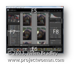
Use the function keys F5, F6, F7 and F8 to clean up your Lightroom screen.
F5 controls the visibility of the top panel, F6 controls the bottom (Filmstrip) panel, F7 controls the left panel, and F8 controls the right panel. Pressing any one of these keys will hide or display the appropriate panel.
To hide all the panels, press Shift + Tab. To bring them back again, press Shift + Tab again.
Learn to create a monochrome stamp effect from a photo in Photoshop. Includes using filters such as Posterize, black and white, threshold and the Photocopy and Stamp filter to adjust the image to get the effect. Also see how Dodge and Burn can help you fine tune the effect.
Transcript:
Hello, I’m Helen Bradley. Welcome to this video tutorial. In this tutorial I’m going to show you how you can convert an image so that it looks like a stamped monochromatic image.
Before we get started on this tutorial this is the effect that we’re looking for. I have an original bird image here and what we’re going to do is to firstly get rid of the background around the bird. And then we’re going to convert it to black and white. We’ll posterize it and then we’ll apply a filter to it. And finally we’re going to apply the Threshold Adjustment. And we’re going to end up with this sort of stamped monochromatic effect from an original photograph. So let’s just hide that and let’s get started on the image that we’re working with. And I have a duplicate image sitting here.
Now I’ve already gone ahead and made the mask for this image so that we’re not wasting a lot of time cutting out the bird. But essentially what I would use is the Quick Select tool to just select over the bird. And then I made a duplicate of the background layer by just dragging it onto the New Layer icon and then just clicked this Layer Mask icon and that adds a layer mask to the image. So there’s the bit that we had selected. Then obviously I would make a much better selection and this would give me my isolated bird here.
So the next thing that we’re going to do is to convert this to black and white. So I’m going to click on the topmost layer and we’re going to do this using an adjustment layer. The reason for this is that it can then be redone later on if we don’t like the effect. So I’m going Layer, New Adjustment Layer, Black and White and click Ok, and here is the black and white adjustment.
Now what I’m looking for here is that we’re going to make this into a pure black and white only image later on so I want plenty of detail here. So I’m just going to walk these sliders in either direction to see where they go. And I want some edge detail because that’s going to define the birds so I probably want to bring the blue channels and the purple channels over towards the black. And let’s just see where the red gets us. I want to definitely see the bird’s eye so I want that to be different to the colors surrounding the bird. So I’m just looking for a reasonably good black and white conversion at this point, and I’ll just close that down.
Next we’re going to use Layer, New Adjustment Layer, Posterize. And what the posterize adjustment does is it flattens the image to a certain number of colors. They’re called levels but here we’ve got four levels of lightness and darkness. So if we had a color image we’d have four colors. And we can wind this up to a sort of surrealistic amount or we can take it back to a less realistic, more stylized amount. And that’s exactly what we want here.
But you’ll see that every time you change this it has different affects around the edge. So the difference between 5 and 7 and perhaps 6 and 5 is really quite significant. So I’m looking for a number of levels that gives me a good result. I’m worried about the eye disappearing here. Three is not enough. Four is a whole lot better. I really quite like that four so I’m just going to let that be what we’re using here. At this point if we were not getting the exact result that we like we could go back and dodge and burn on this layer. So we could grab the Dodge or Burn tools here to darken and lighten the image by clicking on these, taking the highlights, just make the brush a little bit smaller and perhaps brush around the edges here to darken it up which will ensure that later on we’re going to get some dark edges around the edge of our bird. So if that’s of concern to you selecting a tool such as Dodge or Burn will allow you to lighten and darken the areas around this bird that you want to have lighter or darker.
So for example if we really wanted to see this eye we could lighten the areas around the eye. So you can craft that to an extent using the Dodge and Burn tools here. So I’m just going to burn in a little bit around the top of the leg and the sides of the leg here, and perhaps just under the belly. So once we’ve done that I’m going to come up to the topmost layer and I’m going to make a flattened version of the image so far. And I do that by holding Ctrl and Alt and Shift and E, that’s Command, Option, Shift E on the Mac. And this gives us a flattened version of this that we can now apply a filter to.
I could use smart filters but the filter is just going to be fine for this. So I’m going to choose Filter and then Filter Gallery but before I do this I’m making sure I’ve got black and white as my foreground and background colors because the filter set that we’re using relies on black and white for the color. So if you don’t have black and white selected as the color it’s not going to be a black and white effect that you’re going to end up with. So I’m just going to drag this back in. And I used the Photocopy earlier, and I found that that was a really good result for me.
But you could also try the Stamp and see if in the light and dark balance you can get what you want with the Stamp. We’re going to get pretty much the Stamp effect by just using the Photocopy. But I’ve got a way of getting rid of these sort of almost blurry sort of gradient detail in the bird’s back. So I’m going to ignore that for now and just go for a good sort of stamped effect. I’m looking at the blacks and the whites in this image because that’s essentially what I’m going to get at the end of this. So I’m going to say that that’s good and click Ok.
And the final tool that we need to make these areas disappear is a Threshold Adjustment. And again, I’ll do this using an adjustment layer with Layer, New Adjustment layer and then Threshold. Now Threshold is an unusual sort of filter. What it does is it turns everything either pure black or pure white. There is no in between. And this selector here tells Photoshop at which point we want the colors to go to white or to black. So if we wind this back down a little bit we’re going to get rid of some of these areas in here and they’re become darker or lighter according to how we have this selected.
So I’m just going to go around about that midpoint because we do have this as an adjustment layer which means that if we make changes to this layer they will affect the adjustment layer. So I’m just going back to the Dodge tool here and just see if I can get rid of the very obvious sort of circling effect here, so I’ll just make that a little less obvious that that was something that got left behind with the Photocopy filter. Let’s just bring the exposure right up. And there’s our finished bird there. And we can do whatever we like with it.
You may want to save it out so that you could use it perhaps with a background color or something like that. But there’s this sort of stamped monochromatic effect created in Photoshop. And it’s done very easily by first just isolating the object and then converting it to black and white in a way that gives you the contrast that you want, posterize it to flatten it to some levels of color or levels of tonal range, create a brand new layer from that and apply a Photocopy or Stamp filter to it and then finally finish off with the Threshold Adjustment.
I’m Helen Bradley. Thank you for joining me for this video tutorial. If you liked the tutorial please Like it and comment on it and share it with your friends. Look out for more videos on my YouTube channel and visit projectwoman.com for more tutorials on Photoshop, Photoshop Elements, GIMP, Lightroom, Illustrator and a whole lot more.
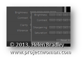
Learn to find some hidden options in Lightroom by using the Alt (Option) key
Some buttons and other features in Lightroom change depending on whether the Alt key (Option on the Mac) is pressed. For example in the Quick Develop panel in the Library module the Clarity and Vibrance options change to become Saturation and Sharpening when you hold the Alt (Option) key.
Also in the Library module the Import and Export buttons become Import Catalog and Export Catalog when the Alt (Option) key is selected. As you work in Lightroom, occasionally press the Alt or Option key to see if any useful options become visible when you do so.
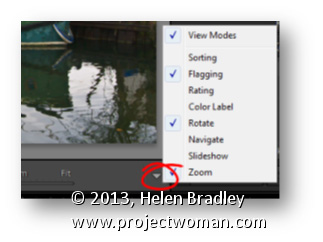
Learn to find and configure what displays on your Lightroom Toolbars
The toolbar which appears between the Filmstrip and the Loupe or Grid views can be configured to display a range of options. Click the down pointing arrow to choose which items to display on the toolbar from the popup menu. This is particularly useful when you are working on a laptop because there isn’t a lot of screen space. Also be aware that the toolbars for the Loupe and Grid views are different so you can set each independently of each other.
And, if your toolbar isn’t visible? Press T to toggle its visibility on and off.
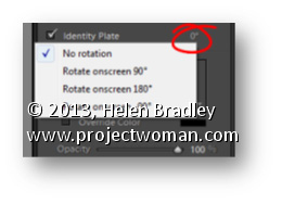
In the Print module, watch out for items that don’t even look like they are selectable. For example, in the Page panel’s Identity Plate area, when you have the Identity Plate check-box enabled you will see a small indicator to the right of it showing the current rotation in degrees.
When you click this you’ll see a popup menu offering other rotation options to choose from.
Learn to create a vector sunburst in Illustrator – This works with all versions of Illustrator including the new CS6. The process is simple and uses a stroke to make the sunburst – it is quick and doesn’t require a lot of fiddling to create.
Transcript:
Hello, I’m Helen Bradley. Welcome to this video tutorial. In this tutorial I’m going to show you how you can create a sunburst vector shape in Illustrator.
Before we get started creating our sunburst effect let’s have a look and see what it is that we’re aiming for. Here I have a sunburst and it’s just offset in this rectangle, but you could have a circular one if you like.
We’re going to start with circular and then we’re going to crop it to a rectangle. So if you’re ready let’s have a look and see how we create this effect in Illustrator. And we’re going to start by creating a brand new document so I’ll just choose File, New. It doesn’t matter too much what my document looks like.
I’m going to start with the Ellipse tool. So, I’m going to select the Ellipse tool and drag a shape on my image. And I need this to be a perfect circle so I’m going to hold the Shift key as I draw it and then just let go. I want this to be black stroke and no fill so I’m just going to click on the fill here and turn the fill off.
Now let’s go to the Appearance panel for this selected path and I’m going to click the Stroke option. And I’m going to set the stroke to about 200 points. And when I do you’ll see that we get this sort of circle all the way around our shape which is pretty near exactly what we want when we click the Dash Line option. Now with the Dash Line option I can set the dashes to whatever I want and this is going to affect how many of these sunbeam things there are around the shape.
So let’s just go to 20 and try that. This is what I’m a little concerned about. You can see that there’s an uneven spacing here, but you’ll see that you can adjust that by clicking this option here. So just work out how many points you need to get the number of sunrays that you want for your particular shape. I’m going to do a few more in this one rather than less so I’m going to 10 points. And when I’ve got what I want I’m just going to click away from this. And this is the basic shape. Now before we can do anything with this shape we’re going to first have to expand its appearance.
So with the shape selected I’m going to choose Object and then Expand Appearance and then Object, Expand because I want this dialogue here. And I’m going to expand both fill and stroke So I’ll select both of those and click Ok. And now each of these sunbursts is a separate shape and I need now to close up the middle. And I can do that by grabbing the Lasso tool. It’s the easiest tool to use. And all I’m going to do is just drag around because I want to select all the nodes and pointers’ handles in the middle.
Now I’m going to choose Object and then Path, and I’m going to choose Average. And with Average I’m going to select both Horizontal and Vertical and click Ok. And what that does is it just closes up the middle nicely for me. So I’m going to click outside my shape and here is my sunburst shape. So with it selected I can then go to what is now my fill color and I can choose a different fill color for it. And we could fill it with a gradient.
We could do anything we liked at this point. So let’s see now how we’re going to crop it. So I’m going to select the Rectangle tool. I’m going to start by drawing a rectangle and I’m just going to hold the spacebar as I bring it in position over the top of my sunburst because I want to work out exactly where the sunburst is going and where the rectangle is going relative to it. So I think that’s a pretty good position for me. So I’m going to let go of the spacebar and let go of the left mouse button and now select all my objects. I’m selecting other everything, and in the Pathfinder I’m going to select Crop. And that crops the shape to the size of that rectangle. And we lost our fill here so let’s just click on the fill and put the fill back on.
So here is a shape that we could save to our Symbol library. And those sunbursts are very, very easy to create in Illustrator as vector shapes. And of course if you add it to your Symbol library then you’ll have it available anytime you want to use it. And it’s very easy to create ones with different numbers of rays in them.
I’m Helen Bradley. Thank you for joining me for this video tutorial. Look out for more of my videos on this YouTube channel and please like and comment on the videos. Look out too for my website at projectwoman.com. There you’ll find more tutorials and tips and tricks for Illustrator, Photoshop, Photoshop Elements, Lightroom, GIMP and a whole lot more.
Lost your Adjustment Brush or Graduated Filter fix? here’s how to find it.
When you add an Adjustment Brush fix or add a Graduated Filter to an image in Lightroom a marker, called an Edit Pin, is placed on the image to indicate where the fix is located. You need to click this if you want to ever edit the fix.
To select the adjustment, target the tool that you want to fix – so, if you want to fix a Graduated Filter adjustmt will change to a black circle surrounded by a lighter circle – this tells you the adjustment is selected so you can now go and edit it.
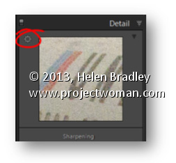
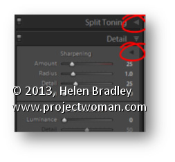
Area Picker – Viewing a Preview Image when sharpening
The Detail panel of the Develop module in Lightroom contains the features you need to sharpen an image. In this panel is a small square icon with lines radiating from it. Click this once and now hover over an area in the larger image. As you do this you will see that area of the image appears in the preview panel at 100% magnification. Use this tool to click on an area of interest in the image that you can view in the preview area so you can see how the sharpening is being applied.
If minor adjustment is required, drag the preview image in the preview area with your mouse to fine tune its placement.
See how to create some effects such as rotations and a transparency heart effect in Illustrator. This is Part 2 of the videos on halftone hearts.
Transcript:
Hello, I’m Helen Bradley. Welcome to this video tutorial. In this tutorial we’re going to take a step further from our halftone hearts tutorial and have a look and see what we can do with the halftones that we create. In this video we’re going to go one step further than the last video.
In this video we’re going to create this sort of circular effect from the string of hearts that we created using the Blend tool in Illustrator. And then I’m going to show you how you can use a transparency mask to create this sort of effect in Illustrator as well.
We’re going to start with a brand new file. And I have some of the elements left over from the first video here that we’re going to use. And we’re going to bring in this heart shape. And I also have a spare set of this string of hearts that we created so I’m going to bring that in. That just saves us having to recreate those. Now I want two sets of this so I’m just going to drag a second set away from the first.
Let’s have a look first at how we would create that sort of spiral. I’m going to size the hearts down in proportion so I have a small set because I’m going to rotate these around to create the full rotation. To do that I’m going to choose Effect and then Distort and Transform and I’ll select Transform. I’m going to click Preview so I can see what’s happening, and I’m going to rotate these around at this bottom point. So this is the very bottom point of this chain of hearts and I’m going to rotate them 10 degrees. Now I haven’t got Copy set so this individual string is going to be rotated 10 degrees but I want enough rotations that I can go all the way around a circle. And if I rotate something 10 degrees in 10 degree increments I need 36 of those to go around the circle because a circle has 360 degrees. And that’s all I need to go to create this shape so I’ll click Ok.
And now that shape is created but of course it is still really just a string of heart. And to make it into the individual shapes we’ll choose Object and then Expand Appearance. And now it is those little heart shapes individually. The other thing I want to do is to create a set of halftone hearts that we can use as a transparency mask for this particular heart.
First of all I’m going to switch the foreground and background colors here so that we have a pink heart. And I need to create a box, a sort of rectangle of these hearts. So again I’m going to shrink these down so they’re about the same size or height as this heart is because they’re going to be used for a transparency mask for that. I’m going to select these and again I’m going to do is the transform so I’m going to choose Effect, Distort and Transform and then Transform. This time I’m going to create about 20 copies. And I want to move these so I’m going move these in a horizontal direction about 7 or 8 pixels, let’s say 8 pixels here, and just click Ok.
I just want a block of hearts big enough for me to put my heart on top of that. So they just need to be that size. I’m going to expand the appearance of this halftone effect so I’ll choose Object and then Expand Appearance. And then I want to copy it to the Windows clipboard so I’ll select it all and choose Edit and then Copy. So it’s now in the Windows clipboard and I can just tuck it outside out of the way because we don’t need it anymore.
With the heart shape selected I’m going to use the Transparency palette which we can get to by choosing Window and then Transparency. And I’m going to click to make a mask. And because I want this mask to be clipped to the heart shape I’ll click Clip. I’m going to select on the mask here and I’ll just choose Edit and then Paste. And here is the halftone heart shape. And I’m just going to position it into position here. And I want the little hearts to be pretty much up around the top curve of the heart so it’s really quite well defined. So I’m thinking that’s probably going to be about the right position. And then to go back to working with my heart I’ll click on the heart in the Transparency palette. And that’s how the final effect looks.
What I did when I showed it to you earlier was I created a filled, a red filled square that was over the top of the heart. I’m just going to create my square. And this needs to be sent behind so I’m going to send it to the back. And the heart itself instead of being filled with pink was filled with black so I’ll just click the fill color and we’ll fill it with black. Now if the mask is not in exactly the right place we can also just select back on the heart, reselect the mask and perhaps adjust the positioning of the mask by a pixel or two, reselect the heart and we’re back working with the heart itself.
So there are some effects that you can create using this sort of halftone effect which we created this time using halftone hearts rather than halftone dots in Adobe Illustrator.
I’m Helen Bradley. Thank you for joining me for this video tutorial. Look out on this YouTube channel for more of my video tutorials and go to my website at projectwoman.com for more tutorials, tips and tricks on Illustrator, Photoshop, Photoshop Elements, Lightroom and more.
Learn how to make half tone effects with hearts (instead of dots), in Illustrator. Uses the Blend and the Transform tools for this effect. This is part 1 of a two part series on halftone hearts.
Transcript:
Hello, I’m Helen Bradley. Welcome to this video tutorial. In this tutorial I’m going to show you how you can make halftone hearts in Illustrator.
Before we get started creating our halftone heart effect let’s see what it is that we’re aiming for. And this is the effect that we’re going to create by the end of this video tutorial. And if you look at the link below for the next video tutorial in this series I’m going to show you have to create this effect and this one too.
But for now let’s get started on this effect. I’m going to create a new file by choosing File and then New and click Ok. I’m going to view my rulers so that I can drag a guide in that I will use as a guide for drawing my shape. I’m going to grab the Pen tool. I’ll click and drag on the guide. I’m going to add a curve over here, another one here, and one finally back here down on the guide. And I’m just going to Ctrl click outside to disable that Pen tool. And here is my shape. And obviously I need to do something with it before we go any further.
I’m just going to adjust these points so that we get something looking a little bit more like a heart shape. I’m going to get rid of my guides so I’m just going to clear my guide. And let’s go back over, select this shape and let’s give it a stroke. So with the shape selected I’m going to give it a pink stroke, and I’m just going to make that a bit of a larger stroke so we can see it clearly. To flip this shape to make the rest of my heart I’m going to first select the shape and then I’m going to click the Reflect tool which shares a toolbar position with the Rotate tool.
The first thing to do with this tool is to click on the anchor point across which you want to flip it. So that’s going to be either this top point here or this one here. It doesn’t matter which. I’m going to Alt click on it. Now I’m getting that reflected shape sort of across the vertical access and all I want to do is to click Copy to make that a heart shape. And now I’m going to join it together by selecting it and choose Object Path Join. And here is now my heart shape.
Now I want to size this down a bit. Actually I’m going to scale it in proportion. And I’m going to make a duplicate of it so I’m going to hold it as I drag a duplicate away. And I just want to tuck this duplicate out of the way for the minute. I don’t want it around but I’m but I’m going to need it a bit later on. So let’s go and select this one and let’s size it down to be the starting point for our halftone heart. So I’m just going to fill this with pink. And I want another duplicate of this so I’m just going to Alt drag a duplicate away. And this is going to be the top one of my hearts. And I want these to line up, although right now is not the time to line them up. I’m going to size it down first of all. So this is going to be my little heart. This is going to be my big heart. And now I’m going to place it in position.
So I want these to align perfectly to their mid lines. They’re not doing that right now. There we are. This is the line that I want. I want to make sure that they’re perfectly aligned so that the point of this heart lines up with the point of this one. And I’m going to change the color so this one I’m going to make quite a sort of dark crimson color. Only I wanted that for its fill and not its stroke. So we’ve got a dark large heart and a very pale pink small one. What we’re going to do now is to blend these two shapes together so we’re going to blend the little and the big heart together. So we’re going to use the Blend tool here on the toolbar. So I’m going to select it and then I’m going to click on the first of the shapes and click on the second. And that blends these two shapes together.
Well it does such a good job that it looks nothing like what it is that we really want. So I’m going to double click the Blend tool to open the Blend options dialog. First of all I’m going to enable Preview and I don’t really want Smooth Color. I want Specified Steps. At the moment there are 127 steps to blend these two shapes and colors together. And I don’t want that. I want to actually see the shapes. So I’m thinking I’m going to start with something like 25 steps and see how that looks. That’s pretty good. Probably let’s just try down to 20 on this one. The other thing that you can do is you can also use Specify Distance as well as Smooth Color. So we don’t want Smooth Color. We definitely want to see these shapes. And we can either go with steps or distance. But I think that’s pretty good so I’m going to click Ok to accept that.
So now we’ve got the first of our lines of hearts and we just want the rest. And we get the rest with a Transform effect. So I’m going to click Effects and then choose Distort and Transform and we’re going to choose Transform. And here’s the Transform dialog. Again I always want to click on Preview so I can see what’s happening here. And let’s do 15 copies. And what I want to do is to make each copy a little bit to the side of this one. So I’m just going to choose Horizontal Move here. And I’m going to move these apart until they are looking like what I want them to look like. Now I quite like that but I think I don’t have enough copies. So I’m going for 25. What I want here is I want these hearts to run into each other. I made it so that the ones would run into each other in the vertical direction. And I want these in the horizontal direction also to run into each other so that I get this final effect. So I’m just going to click Ok.
And there is my effect that we came here looking for. This is a halftone set of hearts. And they vary from light at the top, very small too dark at the bottom. And if we want to create these so that we can work with them we’ll expand them. So with this line selected I’m going to choose Object and then just Expand Appearance. And these are now grouped but their appearance is expanded so we can work on them a little more time. Here is the Link on working
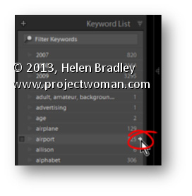
In the Library module in Lightroom the Keyword List panel tells you how many images are keyworded with a particular keyword. It can also find these images for you so, open the Keyword List panel, and click the arrow to the right of a keyword to view images that have that keyword associated with them.
These arrows appear only when you are hovering over a keyword in the list.
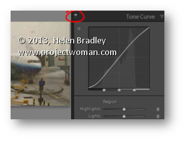
Switches in Lightroom appear in areas such as the Develop module where they can be used to enable or disable a setting such as the Tone Curve. You can use this switch to compare your image with or without the effect in place.
Set the switch to the up position to turn it on and to the down position to turn it off.
The benefit of doing this is you can turn the effect on and off in isolation to any other changes made to the rest of the image and you don’t have to wind back your history to see the change.
Learn to make lines thicker or thinner using a Filter in Photoshop. This is useful for adjusting scanned line art images, as well as, for thickening up lines on images which you have converted to a line drawing inside Photoshop.
Transcript:
Hello, I’m Helen Bradley. Welcome to this video tutorial. In this tutorial I’m going to show you how you can easily make lines thicker or thinner on line art images that you either scan into Photoshop or create in Photoshop yourself. In this video tutorial I’m going to show you a really quick technique for making lines a lot thinner or a lot thicker. And this is handy for images where you’ve actually converted it to line art or where you’ve got line art like this that we’ve actually scanned in.
To make the lines thicker choose Filter and then Other and then Minimum. And with Minimum you can then select the minimum radius which is going to make the image lines a lot thicker and you can test these out. Generally just one or two pixels is like all you need to do. And this is the original image and this is the thicker lined image. So let’s perhaps take this up to 4 and I’ll click Ok. And that has just thickened the line. So if that were all we wanted to do we could just save this and be off. But let’s have a look and see how we can make the lines thinner.
I’m going to choose Filter and this time, Other, and this time we’re looking at Maximum. And we’re just going to set the maximum line width. And so we want this down to something that gives us the lines that we’re looking for. So here I have it set to 5. This is what it was. This is what it is now. If I go a bit smaller the lines are going to get thicker. If I get bigger the lines are going to get thinner to the extent where they actually totally disappear. So you need to find this sweet spot here for your particular image. But if you do want to make the lines that are fairly thick right now to be a little bit finer then you can do that here with this tool. And these are again Filter, Other. Maximum allows you to set it so it’s smaller and minimum allows you to set the width so it’s larger.
I’m Helen Bradley. Thank you for joining me for this video tutorial. Look out for more tutorials on my YouTube channel. Please like and comment on this video if you do like it. And look out for more videos, tips, tricks and techniques on my website at projectwoman.com.
In the top left corner of the Library and Develop modules you’ll see the Navigator. Hover your mouse over an area of the image in the Navigator – it will look like a magnifying glass – click to view that portion of the image in the main preview.
In addition, whenever you see a rectangle in the Navigator you can drag on it to move the area of the image being viewed.