Helen Bradley - Photoshop and Lightroom tips and techniques
I'm Helen Bradley - I'm a photographer and Photoshop professional. In this Photoshop and Lightroom blog you will find powerful Photoshop and Lightroom tips, tricks and techniques that will help you get more out of both programs. You will also find step by step guides for working creatively with your photos in Lightroom and Photoshop and any other cool applications I know you will be interested in knowing more about.
Recover Detail with the Recovery Slider for Clipped Highlights
When you have clipped highlights you can recover detail from them in Lightroom 3 if you hold the Alt key (Option on the Mac) and drag on the Recovery slider.
As you do this you will see the clipped highlights in the image and they will disappear as you drag to the right. Do not adjust the Recovery slider any further than you need to to recover your clipped highlights.
In Lightroom 4 you can achieve the same effect if you hold Alt or Option as you drag on the Whites slider – the whites are the lightest portion of the image.
Learn how to check to see if you have any Clipped Highlights in your image
You can see the clipped highlights in the image by clicking on the white triangle in the top right corner of the histogram. Portions of the image that show red are clipped highlights.
Next time we’ll show you how to recover detail in these clipped highlights.
Exposure vs. Brightness vs. Whites Vs. Highlights – Understanding the differences
When you increase Exposure, you’re increasing the exposure across the image and the entire histogram will move to the right. When processing it is best to adjust Exposure until the histogram moves to the right but stop short of clipping the highlights. So make sure the right hand side of the histogram doesn’t hit the right wall of the chart.
Brightness in Lightroom 3 is a midtone lightening tool, which protects the highlights more so than Exposure does. So, if you can’t get the image bright enough without blowing out highlights using Exposure, adjust the Exposure but without blowing out the highlights and then use Brightness to lighten the image further.
In Lightroom 4 you can adjust the Whites slider to lighten the whites or the Highlights to lighten the next brightest areas of the image.
Transcript:
Hello, I’m Helen Bradley. Welcome to this video tutorial. In this tutorial I’m going to show you how you can actually make use of your reusable layout template that we made in an earlier video. In the previous video I showed you how to create this template.
It has a background color of white but that could be any color. It has space for two images. And then it has two copyright symbols here. One is black and one is white depending on which we want to use for any particular layout.
Now I’m going to show you how you can take this particular template and make it into this by adding images to it. I’m just going to hide this one away and we’ll focus on the one that we created.
I haven’t saved that yet but that doesn’t matter too much. Now I’m going to open some images that I want to use in it. So I’m going to go and select the images that I’d used previously. That’s winter7. And I want bird7 as well. So I’m just going to move these images into position. This is the main template and these are the individual images.
So to start off with I’m going to just drag and drop the background layers from each of these images into my main template. So this is this image first. I’m going to drag and drop it into position and I’m going to drag and drop this one in. Now you can see that the images that I’ve dragged and dropped in are way, way bigger than the template is. But that doesn’t matter because we know how to make them smaller. I’m going to click on the layer thumbnail, Ctrl T and then Ctrl Zero. You can see how much bigger these images are than the actual template itself. I’m going to size the image down quite small, click on this link here so I make sure that I don’t destroy its ratio of width and height, and I’m just going to move it roughly into position as to where it’s going to be in the final template. Now I’ll click the checkmark here and let’s go ahead and resize this one.
Click on the layer thumbnail, Ctrl T, Ctrl Zero. And now I’m going to scale it small, place it roughly in position, make sure that the width and height are scaled correctly in exactly the same proportion, finish off the positioning of it and then click the checkmark here. Now let’s zoom into the image. To make sure that this now works as we expect it to we need to bring back this line down here and we probably need to crop these images. Now the template has those crops already built into it.
The first thing I’m going to do is to drop this particular layer immediately above the layer that’s going to control its size. And then I’m going to drop this one immediately above the layer that’s going to control its size. And we’re going to use a simple feature called Clipping Path. With the topmost of this pair of layers selected, I’ll choose Layer and then Create Clipping Mask. And what that does is it clips this image to the exact size of the rectangle below. And now let’s do that with this one, click on the layer, Layer, Create Clipping Mask. And you can see that that’s clipped this particular image here to the exact size of the black box below.
The black has disappeared. It has nothing to do with it. These colors could be any color you like. But you can see that in doing so we’ve brought back the color from this layer here. And we can prove that that’s where the color is coming from. So I’m just going to select a blue color here and I’ll just fill this layer with blue. And you can see now that the space between those two images is the exact same blue as I just filled the background layer with. I’ll just undo that because I don’t really want blue.
To finish off I’m just going to decide which of these two copyright symbols is going to work better in this instance. Well I think the white one is. So I’m going to click its eyeball or its visibility icon and turn off the black one. So that’s how we would fill that template that we created in an earlier video.
Now your templates don’t have to be as simple as this one. They can be quite complex. And you may be aware that I have templates available on projectwoman.com. This is a free set of templates that you can download and use exactly as you’ve seen here. There are some triptychs and there are also some layouts with 9, 4 and 6 images in them.
I’m Helen Bradley. Thank you for joining me for this video tutorial. If you liked this tutorial place click the thumbs up to give it a like. Think about subscribing to my YouTube channel and visit my website at projectwoman.com for more tips, tricks and tutorials on Illustrator, Photoshop, Lightroom, Photoshop Elements, iPad and a whole lot more.
Learn to control and manage the White Balance tool and loupe in Lightroom
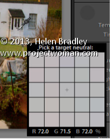
The White Balance Loupe shows you information about the color under the cursor. Across the bottom you will see the percent of Red, Green and Blue in the current selection. If the color is neutral then all values will be equal.
If you un-check the Auto Dismiss check-box at the foot of the preview, the Loupe will stay visible allowing you to click multiple times to find a good place to use to adjust the white balance. I think this setting should have been set to be not selected by default – it just makes white balance corrections so much easier because, let’s face it, none of us ever get it right first time every time!
Learn how to quickly and easily adjust an image’s White Balance
In the Lightroom Basic panel’s White Balance area is a White Balance Selector. You can get to it by pressing the letter W. Hold the White Balance Selector over an area of the image which should be a neutral color, such as gray, black or white – gray is the better choice.
You will see the Loupe appear (which is a grid of 25 cells showing the color under and around the cursor). Click once to set the white balance, using the center color as a reference. If the result isn’t what you want, click again to sample another area. Continue until you get a good fix for the image.
This technique shows a quick way to create even complex layouts using selections and layers in Photoshop. It is simple to achieve for any one with advanced beginner skills or better in Photoshop.
Transcript:
Hello, I’m Helen Bradley. Welcome to this video tutorial. In this tutorial I’m going to show you how you can use Photoshop to make a reusable layout template. In a later video I’ll show you how you can go ahead and reuse that template.
This is the type of template that I’m going to show you how to create in this video and in the next video I’m going to show you how to populate it. Basically the template is made up here of a background layer which can be any color you like and you can also change the color if you want to. And into the template we’re going to put two black boxes and these later on are going to be filled with images. Here’s one image and here’s another. And it’s going to be done in a way that’s going to be very easy for you to limit the size of these images to match these black boxes. And then you can add copyright symbol.
Now I’ve got two in this particular template because I’m not sure whether I’m going to need a black one or a white one. And that will pretty much depend on what the images are that I’m using. So into this template I’m going to put both of them so they’re both available. So in this particular video this is the point at which we’re going to have the template created. We’ll have a backing, the two boxes and then two alternate copyright symbols that we can use. So let’s get started.
The first thing to do is to choose File, New and then make a size for your template. I’m using one that could be used for a blog so it’s a mere 650 by 300 pixels in size, 72 pixels per inch because this is going to the web, RGB color mode, and because I want a white background I’m just going to select Background Contents White. But we could color that later on if we wanted to, and I’ll just click Ok. And here is my new document. It has just a background layer.
The next thing to do is to add a guide that I’m going to use to make it just a little bit easier to make those black boxes. I’m going to choose View and then New Guide and I want this one to be at 40 percent vertical. So that’s a little bit more than one-third of the way across this document. Now I’m going to add a new layer by clicking the Add New Layer icon here at the foot of the layer pallete. I’m going to target the Rectangular Marquee tool. And making sure that I’m pointed to this new layer I’m going to drag over to create a rectangle. Now I’m going to do that again so that you can see that I start my rectangle here outside the edge of the image to make sure that I get all the image up to this line. And because View is set to Snap I’m snapping to this guide so I’m making sure that I’m filling this exact area.
I have black selected here as my foreground color so I’m going to press Alt Backspace or Option Delete on the Mac to fill my rectangle with that black color. Now I’m going to add another new layer and this time I’m going to choose Select, Inverse because what that does is to select everything that I didn’t have selected before. Now I’m going to fill this with black again, Alt Backspace, Option Delete.
Now right now I’ve got two black boxes. And if I turn off these guides, I’m just going to clear the guides, you’ll see that these two boxes in fact butt onto each other so they’re creating an entire document. That’s not what I want. I want a marker between the two of them.
So I’m going to click on the topmost layer, click the Move tool and then just tap with the right arrow key and I’m just visually deciding how much space I want between these two boxes. And I think that’s a pretty good amount. So having done that I’m just going to select a different tool and that will turn this off. So here I’ve got my two layers and my background layer.
And all I need to do now is to add the copyrights so I’m just going to choose File, Open Recent because I recently opened my black and my white copyrights. So here they are. I’m going to just pull these images out of the way so that I can see my main image. And this is the white copyright here that is selected so this is its layer. So I’m just going to drag and drop it into my image. It’s way too big but we’ll worry about that in a minute. I’ll close it down. And now this is my black copyright image and I’m going to drag and drop its background layer into my image. And again, it’s way too big too. I’m now going to select the black copyright layer here and I’m going to press Ctrl and T and then Ctrl and zero. And what that does is it lets me see my sizing handles because this image this copyright image is really, really huge.
So I’m just going to size it down so it’s going to fit better in this area here. I’m going to make sure that I click this link here so that it’s sized in proportion. And now I’m going to just drag it back to approximately where I want it to be and click the checkmark. I can hide that now. And now let’s focus on the white layer exactly the same, click the layer thumbnail to select it, Ctrl and T and then Ctrl and zero. Now I’m going to drag in on the sizing handles to make my copyright small enough to position it in place on my image. I’m just going to click this link again just to make sure that this is scaled in proportion and click the checkmark.
So this is my template. It’s all done and now I can save it. So I can choose File and then Save as and I would give it a name such as 40, 60 something, like that to indicate to me that this is a template that I can now use to create other documents in future. In the next video I’ll show you exactly how to do that.
I’m Helen Bradley. Thank you for joining me for this video tutorial. If you liked the tutorial please click Like. Think about subscribing to my YouTube channel and look at my website at projectwoman.com for more tips, tricks and tutorials on Photoshop, Lightroom, Illustrator, iPad and a whole lot more.
Create the Orton Effect in Lightroom with the Clarity Slider
The Orton Effect is named after photographer Michael Orton. This process results in a somewhat surreal image which has a slightly out-of-focus look while retaining lots of edge detail.
You can quickly give an image a faux Orton look using the Clarity slider in Lightroom. All you need to do is drag the Clarity slider to the left close to -100 and then, increase the Blacks in the image to an higher than usual value.
Of course there is a lot more to the Orton effect than this but this gives you a good start and, for many images, may be all you really need.
How to solve the problem of Lightroom reporting a folder as missing
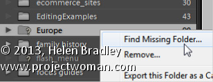
If a folder is missing, it will have a question mark beside its name in the Lightroom library.
You can sort out Lightroom’s problem by locating the missing folder – to do this, right click the folder name in Lightroom and choose Find Missing Folder.
Now navigate on your disk to find the folder that Lightroom can’t find. When you have done this all the contents from that folder will be added back into the Lightroom catalog automatically.
The reason that Lightroom can’t find your folder is because you have done something to it outside Lightroom. In future, move and rename folders from inside Lightroom and this problem won’t occur.
Learn to make realistic rivets in Photoshop. This tutorial makes use of the new photo filters in Photoshop CS6, but doesn’t require their use, so, you can make the rivets in any version of Photoshop. You will see how to add dimension with Bevel and Emboss and Contours, as well as with gradients and light. The tutorial is easy to follow and the process of making a rivet quite simple.
Transcript:
Hello, I’m Helen Bradley. Welcome to this video tutorial. In this tutorial I’m going to show you how you can create rivets quickly and easily in Photoshop. Before we get started making the rivets let’s have a look and see what it is that we’re creating. And this is the type of rivet that we’re going to create. This one’s a copper rivet, but we can make them in any colors that we like.
To start off I’m going to choose File and then New and I’m going to create a new image. This one’s going to be 500 by 500 pixels because I like my rivets to be able to be shrunk down so that they can look realistic in place. So I’m just going to click Ok. And the first thing I’m going to do is to fill this layer here with a gradient.
Now in Photoshop CS6 there are some new photo gradients that you can use. And I really like these for rivets, but in earlier versions of Photoshop you can go and do the same thing and you can create your own look in gradients. So you don’t have to have these gradients available, but you will find that they are kind of handy for creating rivets as well as of course coloring photos. So I’m just going to click Ok and I’m going to apply this as a linear gradient. So I’m going to make sure I have Linear Gradient selected here and I’m going to drag it across the image here. I’m holding Shift to constrain it to a straight line. Now I’m not totally convinced about this particular gradient so let’s go and get something.
I know this copper one is going to work. So I just want something that is a little less harsh. This one’s got a distinct dark area and I want something that transforms from light to dark a little bit more smoothly. So this is a pretty good gradient. Now if this is a bit dark you can add a new layer to your image. So I’m going to add a new layer and I’m going to fill it with the foreground color by pressing Alt and Backspace because my foreground color is white. That’s Option Delete on the Mac. I’m going to set this to Screen Blend mode and just adjust the opacity down so that I can use most of the color underneath. But I could make it lighter if I wanted to. And I’ll just merge those layers with Ctrl and E to merge the layers. But if your gradient isn’t too dark then you don’t need to do that step.
I’m then going to choose the Elliptical Marquee tool and I’m going to drag a circle onto my gradient. And if I hold the Shift key with it that will be a pure circle. And if I use the Spacebar I can move the circle right into the center of the image. So I’ve still got the Shift key selected, I’m going to let go of the left mouse button and then let go the Shift key so I’ve got a circle here.
Now I’m going to invert that with Select Inverse so I have selected everything but the circle and I’ll press Delete. So this is the first part here of my rivet and it’s actually this outside part here. I’m going to duplicate this layer by dragging and dropping it on the New Layer icon. Now I got a bit enthusiastic there and ended up with more layers than I needed. So I now have two identical layers. I’m going to deselect the current selection by pressing Ctrl D or I could choose Select, Deselect. Now this is going to be in my inner shape so I’m going to Ctrl click on it, choose the Move tool, and then I want to size it in smaller. Now the way I do that is to hold both the Shift and the Alt keys as I do this. The Shift key constrains my movement to a full circle so I’m always going to have a circle here and the Alt key sizes it from the middle so that it’s not being repositioned. This second circle is going to be right in the middle of the first circle. So when I get it in place, let go of the left mouse button and then and only then let go of the Alt and the Shift keys, I’m going to click the checkmark here.
Now I want to transform this. And I want to transform it through 180 degrees so I’ll press Ctrl and T to get my transform details up here and I’ll type 180. And that’s flipped it around. In fact I think it could be rotated a little bit more attractively, probably to about here. Now at this point you’re going to get a relatively flat looking rivet. And I actually prefer to at this stage actually go and reapply the gradient. So I’m going to select my gradient again, with this layer I’m going to lock the pixels on it so that I can drag my gradient in and it’s only going to affect the area marked out by the circle. I’m also going to select a radial gradient because what I want to do is for this part of the gradient here to be light and the outer edge to be dark, and I’m just going to find a good position for it. And I think this is a pretty good gradient. So you can just continue to drag until you get it into the right place. Let’s just unlock that now. We’re ready now to add a Bevel and Emboss.
So I’m going to click the bottom layer here, choose the Add Layer Style icon and I’ll choose Bevel and Emboss. Now in contour I want one of these contours, this one, this one or this one. They’re all going to work pretty well. And I’m going to just adjust the range so that I push it to the very edge of the shape. Let’s go back into Bevel and Emboss and now I’m going to reduce the depth quite a bit, reduce the size, just get it to what I want it to look like. Now we have a problem with the light now. At the moment from Photoshop’s point of view and for this Bevel and Emboss effect, Photoshop has the light coming from this direction. But you can see that the light is actually coming from this direction on the rivet itself. So we need to adjust the light here to match our rivet.
So I’m going to bring in a global light here that is hitting from this direction. And then I’m going to adjust my Screen and my Multiply so that I get the effect that I want. I don’t want a really, really harsh set of settings here. I just want the very smallest amount. And then I’m going to add a Drop Shadow so I’ll click Drop Shadow, select the Drop Shadow itself.
Now I think that these are badly named in Photoshop. Size in actual fact it’s more like a feather. So size will give you a softer or a harsher shadow and the actual physical size of the shadow is really controlled by the spread and the distance. So I’m going to bring my distance and my spread in quite small and adjust the size of it which gives me that sort of feathering effect and click Ok. And let’s just zoom out here and there we have our rivet. And this one’s a copper rivet but you’ll find that there’s plenty of things to choose from in this set of photo gradients. And you can create your own gradients to create your own look for your rivets.
I’m Helen Bradley. Thank you for joining me for this video tutorial. Look out for more video tutorials on this YouTube channel, subscribe to the channel, click Like if you liked this video and visit my website at projectwoman.com for more tips, tricks and tutorials on Illustrator, Photoshop, Lightroom and a whole lot more.
Give an image’s Midtones a Boost with the Clarity Slider
The Clarity slider helps you adjust the Midtones in the image so it adds Contrast to them which also results in them looking a little crisper and more saturated too.
It’s a great tool, but try not to overdo it. Typically, a Clarity adjustment of around 25 is a good choice for most images. In Lightroom 4 the adjustment has been tweaked a bit so you can add more Clarity in Lightroom 4 than you are perhaps used to doing in Lightroom 3.
Find Lost Details Hidden in Shadows and Darker Parts of an Image
When you have an image that has details lost in the shadows or darker areas of the image, the Fill Light slider in Lightroom 3 or the Shadows slider in Lightroom 4 can be used to recover this detail.
Don’t use either of these as a tool for lightening an image or to lighten shadows if there is nothing interesting in the shadows. Use them instead when you want to get some interesting detail out of the shadows.
The result of using the Fill Light and sometimes using the Shadow tool is that some contrast in the image will be lost – so you nay need to increase Contrast as a result of using the Fill Light slider in Lightroom 3 or apply a tone curve adjustment in Lightroom 4.
Learn how to create uneven lines that look hand drawn to use for cartography and other uses in Photoshop. Make use of Hue/Saturation adjustment to add vintage color, use brushes to create a pattern for the lines. Also, show how to render lines in black and white without any shades of grey and, lastly, how to distort them slightly. This video also shows how to add shadow around land mass and multiple lines of edging for a land mass.
Transcript:
Hello, I’m Helen Bradley. Welcome to this video tutorial. In this tutorial I’m going to show you some line drawing techniques for creating maps in Photoshop. In this video I’m going to show you how you can create the effect that we have here around the edge of this chart. We’re going to draw the edge. We’re going to add this shading and also create these lines so that we can see how this could be created. The pattern in the middle is just a very simple pattern fill. We won’t be covering that, but we’ll be covering everything else in this video tutorial.
So to get started I’m going to start with a new image. And I’m going to choose File and then New. And I’m going to create a very tall image. So it’s going to be 2,000 pixels tall, RGB color. Background contents of white is just fine, so I’ll just click Ok to create that image.
And what I want to do first of all is to create these lines. And we’re going to do that using a paintbrush. So I’m going to click on the paintbrush and let’s select a brush to use. And what I want is something relatively small so I’m going to start with something like this 4 pixel brush. And then I’m going to choose Window and then Brush to open this brushes panel here. And what I want to do is to set up the brush so it’s going to paint the lines for me. So first of all I’m going to adjust the spacing so that there’s increased spacing between the brush tips. And I’m going to leave the size at about 4 pixels. Then I’m going to shape dynamics because I want the size of the brush to vary.
So I’m going to increase this quite a bit so we start seeing that there’s some variety in the brush here. Minimum diameter I don’t want to change at all. And that’s pretty much all I need to do with the brush right now. And then I’m going to test it. So I’m going to make sure that I have black set as my background or foreground color, which it is here. And then I’m going to click with my brush here and I’m going to Shift click at the bottom because that will create a straight line of brush strokes. And let’s just have a look in here a bit closer at this.
You can see that we now have this sort of dotted line which is different varieties of line. Now if that’s not quite what I want I can just zoom out and we can start again. So I’m just going to undo the brush and perhaps we’ll go back and make the brush just a little bit bigger than it was. So let’s go to brush tip shape, increase the size just a little bit, and perhaps bring down the size jitter or up the minimum diameter so that we haven’t got quite so much variety in our brushes. I’m going to click here and then Shift click to finish my brush stroke.
Now what I want is a sampling of this. So I’m going to use this tool here which is the single column marquee tool, one of the few times you will ever find a need for this particular tool. I’m going to zoom in here so that I can see exactly what I’m selecting and I’m just going to click to select a single line through this image. Now that’s not the world’s best. So let’s just try again. My brush stroke is not completely vertical so that’s causing me some problems here. Let’s start this again. I’m going to click here, and again let’s Shift click to create a straight line. And let’s see if that’s a bit straighter. That will be when we click just to one side of it. So that’s going all the way through the dot.
So I’m just going to choose Edit and then Define Pattern because this is going to be a pattern. And it will be just this dashed line as our pattern so I’ll click Ok. I can now close this image because I don’t need it any longer. And let’s see how our pattern will work.
I’m going to create a new document, this time 2,000 by 2,000 pixels in size. And this time I’m going to fill it. So I’m going to choose Edit and then Fill. And I’m going to fill it with a pattern. So I’m going to select Pattern. And the very last pattern in this container here will be the pattern we’ve just created so I’ll click Ok. And there are our lines. And that’s a starter for our map.
Now with our lines we can make these bigger. So I’ve got a background layer here but I can click to make it into a regular layer. And we can just enlarge this. So if we want larger lines all we need to do is to just drag up and down on this to just make the lines a whole lot wider than they are. And because they’re lines we can just size everything like this.
If you want to make sure that that there are no gray areas to the lines, as you can see they’ve got slightly fuzzy sides here, just use Image and then Adjustments and then Threshold. And that just makes the lines black and white. They’re pure black and white now. And if you want a bit of variety, Edit, Transform and then Warp. And you can just adjust the lines with a little bit more of a curve or something through them so that they look a little less like they’re straight lines and perhaps a little bit more hand-drawn feel about them, Ok. Now let’s add our map part.
So I’m just going to grab the Lasso tool and for this exercise just draw a very wiggly sort of coastline that we’re going to use for our map. And white is my foreground color so I’m going to Alt Backspace, Option Delete on the Mac, to fill this with white. Now I want an edge around here so I’m going to choose Edit and then Stroke. And I’m going to stroke the edge with black. I’m just going to get all my tools over on this screen. So I’m going to select Black. And I’m going to make this a 6 pixel to begin with. And it’s going to be on the inside of this shape so I’ll just click Ok. And there’s our 6 pixel stroke.
Now I’m going to bring in this size. So I’m going to choose Select, Modify, Contract and I’m going to contract this by 10 pixels because I think that will be enough and then add another stroke. So again, Edit, Stroke. And this time I’m going to just use a 3 pixel stroke, but again on the inside. And then we’ll repeat that again, Select, Modify, Contract by 10 pixels and then repeat the stroke, Edit, Stroke and just click Ok. And then when I press Ctrl D you’ll see that we have the edges around here. But I’m actually just going to undo that Deselect right now because I have another piece to go in here.
What I want to do is to fill this shape with the grass so I have that as a pattern. So I’m going to choose Edit and then Fill, and again still pattern but here is my grass pattern here that I created earlier. And I’m just going to fill it with the grass pattern. Now we’re going to see how to create the shading around the edge. So I’m going to deselect the selection. I’m going to make sure I’m selected on the land, which is where the shading is to go, and I’m going to choose the Add Layer Style button here. And we’re going to choose an outer glow.
Now outer glow sounds like it should add some lightness around the edge but we can use it to add darkness. All we’re going to do is to select a dark color. Well we’ll stick with black right now. Now we can’t use screen as our blend mode. We’ll have to use something that will darken. So we’re going to choose multiply. And we’re going to set this if we want it to be full strength at 100 percent opacity. And we can adjust the size which is really the feathering around here. And the spread is how big it is. It would sound better to me if spread were really the feathering and size was the actual size. But that’s what you’re going to use.
So I’ll just click Ok. And now if we want to add this sort of sepia tone to the image, I’m going to make sure I have the image selected, and we’re going to do that with the hue/saturation adjustment layer, Layer, New Adjustment Layer, Hue/Saturation, click Ok. We’re going to select Colorized because we want to colorize this. And then we’re going to go and pick up our sort of brown color, increase the saturation and adjust the lightness. And you’re just looking for that sort of effect that is going to say vintage map to you. So I’m probably just going to select that for now.
And then I would finish off by cropping my image. We probably don’t need quite as much sea visible. In my image I have a one to one crop set here. That’s why it’s behaving a bit strangely. And there is our final result.
We’ve created lines using a brush in Photoshop. They’re all different size lines and we’ve created this sort of effect of an old-fashioned map. And actually if I just drag this adjustment layer up over the top of the fill we’ll really get that look of a vintage map.
I’m Helen Bradley. Thank you for joining me for this video tutorial. Look out for more of my Photoshop tutorials on this YouTube channel. Subscribe to the channel. If you enjoyed it please comment and like this video. You’ll find more videos, tips, tricks and tutorials at my website at projectwoman.com.
Learn how to create and use the Lightroom Target Collection feature
Lighroom’s target collection feature makes it easy for you to add images to a collection. If you make a collection the target collection you can add an image to that collection by simply pressing the letter B on the keyboard. But, be warned, once it is added if you press B again you will remove the image from the target collection.
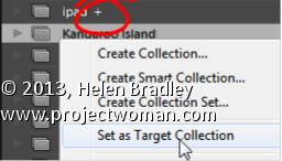
To make a Collection the Target Collection: right click it and choose Set as Target Collection.
Any Collection (except a Smart Collection) can be designated as the Target Collection but there can only be one Target Collection at the one time.
If you deselect the current Target Collection: by right clicking its name and disabling Set as Target Collection, then the Quick Collection becomes the Target Collection, by default.