Thursday, September 19th, 2013

Extract a shape from its background in Photoshop

How to cut an image from its background – this buckle has hard edges and you will see how to select around it and cut it out using shapes and a mask – you don’t have to learn how to use the pen tool to make the selection (although it would be the better tool to use). The idea  with this video is doing it without having to use the pen tool.

Transcript:

Hello, I’m Helen Bradley.

Welcome to this video tutorial. In this tutorial I’m going to show you a method of removing an object’s background when that object has some very distinct edges. Before we get started with this tutorial let’s have a look and see what we are going to do.

A client of mine sent me this image of a buckle. And what we want to do is to extract the buckle from its background so we can do things with it. And this is the finished project that I’ve already created and you can see that now I can create things such as a ribbon running behind the buckle. I’ve added a background to it and it has a slightly dimensional look to it. I’m going to show you how you can do this without even needing to use the Pen tool in Photoshop.

So let’s tuck this out of the way for the moment and let’s consider the image that we’re starting with. When faced with a project like this I’ll always start by duplicating the background layer so I’ll right click the layer, choose Duplicate Layer and click Ok. As a passing comment I would probably rescan this image before I started if I had the actual piece. The image is a little bit fluffy around the edges which is going to make selecting anything a little bit difficult.

And it’s a fairly low res image because this is already at 200 percent so a good scan is a good starting point. But let’s assume that we have a good scan and let’s see how we would get this image or this buckle extracted from its background. I’m going to start by selecting the Elliptical Marquee tool because I’ve really just had a look at this image and said to myself ok what sort of shapes have I got here that I can use to extract the image. And one of them is this curve.

I’ve got a curve here and a curve here and one on the inside and another one here on the inside. They look to me pretty much like circles. I have the Elliptical Marquee tool here and I’m going to start by dragging out an oval shape. And what I’m looking for is something that will be approximately the shape of this outside edge. Now I need to move this so before I let go of the mouse button I’m holding the spacebar and I’m just going to move the shape into position.

And it needs to be a little bit bigger still because what I want to do is to match the outside curve. I’m ignoring absolutely everything else and all I’m seeking to do at this stage is to line this up along this outside curve. Now I’ve got a reasonably good fit for that so I’m going to run with this. I’m also considering here that all the shape, all this buckle is inside this selection so I don’t need to make any adjustments to this selection right now.

All I need to do first off is to create a mask from this. So I’m going to click the Add Layer Mask icon. And what that does when I turn this background layer off is it starts to extract this shape from its background. Now to make it a little bit easier for us to see what we’re doing I’m actually going to put a filled layer in behind the image, it’s this sort of magenta color, so you can see how it’s looking. I’m going back to my image layer and this time I’m going to seek to find a shape for this side. So, again, I’m going to draw my large oval.

I’m going to hold the spacebar so I can move it into position, let go of the spacebar, reshape the circle and just keep going with the spacebar and moving it but without letting go of that mouse button until I have got the shape that I want for this long edge of the buckle. Now we do have a light problem here that we’ll need to adjust for because what I would typically do is to select Inverse so that now I have selected everything that was not selected earlier and then I would fill it because I would target the mask and fill it with black.

The problem is that I’m now cutting off this edge of the buckle. So I don’t want to do that. I’m going to do Edit, Undo Fill and I’m going to again invert that mask so that we’ve just got this circle shape. To make sure that I don’t remove part of the buckle that I already have extracted I’ve selected the Rectangular Marquee tool here and I’m going to select the Add to Selection icon here. And I’m just going to add back in anything that was on this side of the buckle so that now my shape is this curve and everything over here.

Now when I choose Select Inverse the only area that is selected is this edge down here, exactly what I want to mask. I’ll target my mask and press Alt Backspace to fill it with the current foreground color which is black. And you can see that we’re powering along here. We’ve got two sides of this shape pretty near extracted. I’m going back to the Elliptical Marquee tool because this looks like the side of an oval to me. Again, I’m going to create my oval shape and push it into position, maybe shrink it down a little bit to get it a little bit more curvy.

And when I have it in position I’m going to let go the mouse button and again here I’m going to need to add some extra bits of the image here because I don’t want to remove them. So, again, I’m going to target the Rectangular Marquee tool and add to this selection. So right now my selection is this shape. I’m going to invert it, select Inverse so that the only thing selected is across the top here, the area that we no longer want, target the mask and Alt Backspace to fill it with black. And I’m going to continue at the bottom here.

Again, Elliptical Marquee tool, a flat sort of oval shape, move it into position, size it. Any time I want to move it I’m just holding the spacebar so I can move it a little bit more accurately. When I’ve got it into position I’m going to select the Rectangular Marquee tool to add to the section so that we don’t lose the shape that we’ve already extracted, select Inverse and make sure I have my mask targeted, Alt Backspace to fill my mask with black.

At this point I might go back and reform these sides. I think I’ve got most of what I want out but I may want to perfect them a little bit more. I’m not going to bother doing that now, but you can see that you can continue to work on that side if you want to. I’m going to have a look at these inner areas. And the inner area again is just another curve. And I can make that curve using the Elliptical Marquee tool. Now I’ve let go of my shape so rather than discard it completely I’m going to choose Transform, Selection and just move it into position. And I can nudge it with my arrow keys.

When I’ve got it pretty much where I want it to be I’ll click the checkmark. Now I’m going to again select the Rectangular Marquee tool but this time I only want to select this inside bit so what I want to do is to drag over this and take the intersection of the two shapes. So I’m going to click this option here and then I’m going to be really careful about locating the bit I want to select and I’m just going to drag over it. And this is going to give me the intersection of these two edges.

Now I’ve got a little bit of a problem here so I’ll probably just take the Lasso tool, hit the minus key and just lasso into the corner to just round off that corner. If I’m happy with the shape I can now click on my mask and Alt Backspace, Option Delete on the Mac, to again take that piece out of the mask. Now there’s a good chance that this shape is the save as this shape just mirrored. So let’s choose Select, Transform Selection. This time I’m going to transform the selection’s width to minus 100 percent which will flip it over and then I’m going to move it into position.

When I have it in position I’m going to click the checkmark here, target the mask, Alt Backspace, Option Delete on the Mac, to create the filled mask object. Now that I’ve done this let’s assume that we have a good selection. I’ve been working pretty quickly here so I think I could probably have done an even better job had I been a little bit slower. I’m going to right click and duplicate this layer entirely so I have a second layer with its mask.

Now I’m going to trash that mask and I want to delete it. I don’t want this layer to have a mask at all. So I’m going to turn that off. I’m going back to this mask here. This is my good mask and I’m going to Alt click on the mask. And what that does is it shows me the mask itself. I’m now going to click on the Quick Select tool and I’m going to select the mask. I just want the white area selected. Now I’m going to turn off this layer and return to this top layer.

I’m going to turn everything else off. With the top layer selected I’m now going to use this tool that is new in Photoshop CS5, Select, Refine Edge. If you’re using an earlier version of Photoshop you’ll go into Modify and then you could expand or contract the border or add a little bit of a feather to it to soften it. In Refine Edge we get to refine the edge by looking at the background.

At the moment I have it against white so I can see what my edges are going to be like. I’ve seemed to have lost that so let’s go back and get Refine Edge. Here what I’m going to do is to smooth it out a little bit. I’m going to feather it a little bit and I can even shift the edge. So what I’m looking for is a good selection here. I’ve used my original mask that I created using the shape tools but I’m actually perfecting it now using this Refine Edge tool or we could perfect it with adding a slight feather to it or contracting or expanding it using the tools that were available in earlier versions of Photoshop.

Once you’ve perfected the edge I’m going to click Ok because I have its output to a selection. This is my new selection. I’m going to add a layer mask to this layer. So this is a little bit better selection than I had before. You can see that this new version is a little bit better than the last. Now to work on this image a little bit more I might want to add a little bit of a bevel to it so I’m going to add a layer style. I’m going to choose Bevel and Emboss. I don’t want to emboss it and I don’t want a shadow at this stage but what I might want is a little bit of a bevel just a slight rounding of the edges.

And you can fiddle here in this dialog to see exactly what you can achieve for the shape that you’re working on. But I might come in here and have a look at that as an option. I may also want to add a drop shadow to this shape in which case I’ll go to the Drop Shadow tool here and I can drag out and create a drop shadow for the object. You can also add a pattern overlay. Now it’s possible to add a pattern overlay in a number of different ways but since we’re already in this layer style dialog we’re going to use this as our pattern overlay.

I’m going to click here and go and select a pattern. Now I have a stripped pattern here that I created a long time ago. Now the pattern is sort of ok but I wanted lots of stripes not just a few of them so I’m going to scale it right down. And we can blend it in if we want to. So if you’ve got a shape that you want to start blending and using some of the detail or some of the shading on the layer below you can do that here using these blend modes. I’m not going to do that. I’m just going to add it in normal mode here and I’m just going to click Ok.

So there’s my shape and now I can do things like test it on a background to see if it is as I want it to look. And I can save it out now as a png file with some transparency. If you want to sharpen up these edges these edges would sharpen up a bit if this object were rescanned. But you can also sharpen edges by choosing Filter and then Sharpen and then Sharpen Edges. Now this filter just sharpens edges. There’s no settings for it but you can run it a couple of times if you need to so you could sharpen the edges just a little bit more. That might give you a slightly better effect.

So there is a handy way of extracting an object from its background when the object has some hard edges and where you can see visually that you’ve got some shapes on that object that you could use to make the extraction a whole lot easier.

I’m Helen Bradley.

Thank you for joining me for this video tutorial. Look out for more of my tutorials on this YouTube channel and please consider subscribing to the channel so you’ll be alerted when new videos are released. Visit my website at projectwoman.com for more tips, tricks and tutorials on Photoshop, Illustrator, Lightroom and a whole lot more.

Helen Bradley

Tuesday, September 17th, 2013

Go from Ho-Hum to WOW with this LAB fix in Photoshop

Learn a quick fix using lab color mode in Photoshop for adding a color boost to your images. It is simple, you can make it a preset so it is easy to use again in future and it packs a real punch!

Transcript:

Hello, I’m Helen Bradley.

Welcome to this video tutorial. In this tutorial I’m going to show you a simple photo fix using LAB mode that’s guaranteed to add punch to your photos. Before we get started let’s have a look and see what it is that we’re aiming for.

This is going to be are starter image and this is the effect that we’re going to get very quickly and easily with this image. Now this might not be my ending point traditionally in fixing this image but I want to show you how to get from here to here. And where you take it from there is up to you.

Now this fix that I’m going to show you uses the LAB color mode otherwise known as LAB color. And you can’t use it in other applications because it is not available. So for example this mode is not available in Photoshop Elements but you can use it in Photoshop. And it works particularly well when you have colors that are sort of all in the same palette.

You can see here that we’ve got some browns and sort of gray blues but there’s not a lot of differentiation between them. It also works pretty well with desert scenes, lots of greens in an image where there’s not a lot of definition between the greens. So the effect is very, very simple. I’m going to start with my layers palette visible and I’m going to choose Image > Mode > LAB Color.

I’m going into LAB color mode. And that’s just switched the image into LAB color. And then I’m going to duplicate the background layer. So I’m going to right click it and choose Duplicate Layer and click Ok. So now I have two versions of the image one on top of the other.

Now the adjustment that we’re going to use with this image is a curves adjustment. So I’m just going to put everything out of the way for a minute and let’s go and get our curves adjustment, Image > Adjustments > Curves.

Now I like to save this fix when I create it as a preset. So I have it here. It’s called three boxes. I’m not going to use it this time because I want to show you exactly how to do it but this is how you would do it. And you can actually then save it as a preset so you can use it over and over again.

Now the curves dialog is showing you at the moment the lightness, the L channel in LAB. The other two channels are A and B and we want to work on A and B. These are the two color channels. Now this is going to be a little bit confusing if you haven’t dealt with it before. I’m going to explain it to you but you don’t actually need to know anything about it.

I do want to make sure that I’m showing this smaller grid. So I’ve got  my options available here and I’m making sure I’ve got a smaller grid. The A channel is the green magenta channel. So this is magenta, this is green. So when I drag in here I’m going to drag in three boxes and you can see that I’ve added a lot of green to the image.

And it works best when you have an image that’s nicely white balanced. So if your image has got a colorcast I suggest you fix it before you come in here. So I’ve dragged in here three boxes on the bottom of the image, bottom of the curve, and now I’m going to drag in three boxes on the top of the curve.

And you come in the exact same number of boxes. You can do one, two or three. Three is just a really, really big effect. And I want to show you exactly how that works. The idea is for this line to go through the middle. So we’re not adding a colorcast to the image. We’re just boosting the colors. So that’s the A channel, magenta and green.

The B channel is yellow and blue. And this is blue and this is yellow. We’re going to do the exact same thing. We’re going to come in a certain number of boxes. Now we could come in two boxes in either direction in this channel. I’m actually going to do three. But you can come in a different number of boxes than you used for the A channel but you’ve got to do the same number of boxes in a particular channel.

So if we’re in a B channel then we’ve got to go three boxes, three boxes or two, two or one, one. But we can’t do different numbers because if we do the line here no longer goes through the middle and we’re throwing a colorcast on our image. That’s why you’ve got to come in the exact same number.

So A channel, magenta/green, boosted that, B channel, blue/yellow, boosted that. The L channel is lightness. So if you want to you could add some contrast in using this channel but you don’t have to. The fix is not about that. So I’m just going to remove it. We’re just going back in with the colors that we’ve boosted.

At this stage if you want to save this as a preset click this little icon here and do Save Preset. And I’m just going to save it for you so that you can see how it works. Again, let’s call it LAB fix and I’ll click Save. And here it is here and we can apply it at any time to our image by just clicking on it. So now that we’ve done this we’re headed back into RGB mode.

So I’m going to click Ok. Now I’m going to choose Image > Mode > RGB Color. Now I’m going to be prompted to flatten this or not flatten. Now I don’t want to flatten. I want these two layers separate so I’m going to choose Don’t Flatten.

However, if we had done curves as an adjustment layer we would be forced into flattening that adjustment layer because it won’t come back into RGB color. That’s why I used just a regular adjustment on a duplicate layer because an adjustment layer won’t work for this process. So I’m going to choose Don’t Flatten because I want my two layers.

And you can see here that we’re back in RGB. And now what I’m going to do is I’m going to select a blend mode to blend these two layers together and I’m going to use the overlay blend mode. And I use that because it’s a really nice contrasty blend mode. If it’s too much of an effect you can always dial down the opacity.

I’m taking it back to the original image and now I can walk it back up and stop wherever it is that I think I’m getting a good fix. So that’s an LAB color fix. I think you’re going to really like it. It’s one of my go to fixes. I use it a lot and particularly on images like this because as you can see the starter image is really, really blah but this image a whole lot better and I really love it.

I’m Helen Bradley.

Thank you for joining me for this video tutorial. Look out for more tutorials on this YouTube channel and please subscribe to my channel so you’ll be notified when new videos are released. And at the moment we’re releasing every Monday and Thursday.

Also visit my website at projectwoman.com for more tips, tricks and tutorials on Photoshop, Lightroom, Illustrator, Photoshop Elements and a whole lot more.


Helen Bradley

Sunday, September 15th, 2013

3 Photoshop Filter tips and tricks

Learn three things about using Filters in Photoshop – including how to control the colors used (and why sometimes the colors look horrible), how to combine and reorder filters and how to add them so you have maximum flexibility when using them.

Transcript:

Hello, I’m Helen Bradley.

Welcome to this video tutorial. In this tutorial we’re going to look at three things that you need to know about using filters in Photoshop. In this video I’m going to cover some of the important things that you need to know about filters.

And the first one is that what you have selected as the foreground and background color is critical when you’re using filters. Now I’m going to convert this layer into a Smart Object layer. So I’m going to choose Filter > Convert for Smart Filters and that makes this a Smart Object so that the filters will be editable.

If you’re using Photoshop CS4 or later you’ll want to do this. Now I’m going to choose Filter > Filter Gallery and notice that my foreground and background colors are sort of a lime green a bright pink. And they’re exactly the same colors that are being applied here with this halftone pattern filter.

Now you might come into this filter dialog and take one look at this result and say well this is not for me. Well the reason why it’s probably not for you is that you’ve got selected these foreground and background colors and if you weren’t using those colors then this halftone filter wouldn’t look like this.

Let’s just click Cancel to exit out of here and I’m going to press the D key which sets the default foreground and background color. Now let’s go back into the filter gallery and you can see that the halftone pattern looks very different this time.

It’s black and white. And it’s black and white because of this black and white here. Now again if I exit this dialog and if we switch black and white around and I go back into the filter gallery you’ll see that we’re getting this sort of negative look on our image. Because white is now the foreground color we’re getting the effect of a digital negative with a halftone on it.

So you can see how critical it is that you’re using these colors as black and white with the darker color in the foreground before you go into the filters if you want a sort of standard filter effect. So I’m just going to make this sort of a brown color so that I can use brown and white and I’m going into Filter and then Filter Gallery.

And now we’ve got a brown and white sort of color halftone effect. So that’s the first trick in Photoshop, always make sure that you have the correct foreground and background colors selected. And if things look funky in here then just exit the dialog and start again. Now this is not going to be the case for most of these effects.

The artistic effects for example do not generally rely on those colors the foreground and background color so you’ll probably find that most of these work just fine. For example sponge is working just fine. With brush strokes you might find that the colors are being used but you can always test this to make sure by choosing some really, really bright colors and see if you see these colors in the resulting filter.

If you do see the colors then you can say to yourself well yes these colors are being used by the filter and if I don’t like the effect then I’m going to need to exit this filter gallery and go and do something about it. You can see that the diffuse glow filter is using the background color, the pink that we have selected as a background color. Again, glass knot, ocean ripple knot, all the sketch filters, pretty much all of them use these foreground and background colors.

Chrome is an exception to that but all the others are using it. Water paper is different, again glowing edges will be different. The texture filters probably aren’t going to use these colors but certainly all of these sketch ones are. Now the other thing to be aware of here is that you can add multiple filters.

So for example I’m just going to set up this filter pretty much the way I want it to look on this image. I just probably want the size to be a bit smaller. But having done that to the image I can now click here on this New Effect Layer option and I can add a second effect. So for example I could go and put some sort of painterly effect over the top of this, for example accented edges. And this is accented edges over a halftone pattern filter.

But if I reverse these I may find that the result is quite different and it is in this combination. If I do the halftone first and accented edges second the entire result looks very different. So working these filters out the ones that you want to use and the order in which you want to use them is critical.

To turn a filter off deselect its eyeball here and that just turns its effect off in the image. You can add new effects layers, new filter layers by clicking New Effect Layer and if you to remove an effect layer just click it, for example accented edges, and click the Delete button and it’s now been removed. I’m just going to go back and put accented edges in and click Ok.

Now because of the way I set this up with Smart Filters there’s one option here for the filter gallery. When I open it I can then change both of these filters. It is also possible to create separate filters. So while this object has been created for Smart Filters I’m just going to trash my filters and let’s go back and put them in one at a time.

So first of all I’m going to go in and add my accented edges. So I’m going to remove the halftone filter. So I’m just going to click that and click Ok. And now I’m going to add a second filter. This one’s not going to be accented edges. This is going to be my halftone pattern. And then I’ll click Ok.

You’ll notice that what we’re seeing is pretty much the halftone filter. This is the halftone filter on top and this is the accented edges underneath. Now in this case these two filters can be dragged around inside the layer palette to reverse the order. So I get a bit more flexibility here if I add the filters separately because in this case I can drag to reorder them outside of the filter gallery.

I don’t have to go back into the filter gallery to edit them and I can also disable a filter if I want to by deselecting its eyeball here. So that’s another thing to consider when you’re applying filters to images inside Photoshop. Before we finish up let’s have a look at another reason why I like to add my filters one at a time and then reorder them as required.

At the moment we have green and pink selected as our foreground and background colors but I’m going to press the letter D to change these around so that they’re now the default colors. I have my image selected and I’m going back into the filter gallery. And this time I’m going to choose a different sort of filter effect.

I’m actually going to choose a sketch filter because I want to make use of the black and white. So I’m thinking graphic pen will probably be a good choice here so I’ll just click Ok. And now this is the filter that we’ve just applied and it’s been applied on top of the other filters. Now I can click here to change the blending on this filter and instead of normal I’m going to choose multiple so I get this darkening effect on the image.

But you’ll notice that this filter is using the black and white colors and these other two filters are using the original pink and green. And if I go in and try and edit this filter by double clicking on it you can see that we’re working with the pink and green filter. I’m working on accented edges. Although I’m seeing the halftone dots it’s the accented edges filter that I’m making changes to while I’m in here.

And I can change the edge brightness and the smoothness. I’ll click Ok. And now I want to have a look at the halftone filter and that’s this one here. I’m going to double click on it to open it. This time we’re looking at the halftone pattern filter and any changes that we’re making are to that pattern filter only.

So I’m going to make it a little bit larger size dots and click Ok. And you can see the result in the image. Halftone pattern filter, accented edges filter, both of these were they using a foreground and background color are using the original pink and green because that was the color combination when we applied those filters.

This filter is the brush strokes on the top and it’s black and white because when we applied this filter we were applying it using the then current black and white colors. So you can see that there’s really a lot more to filters in Photoshop than may first meet the eye.

I’m Helen Bradley.

Thank you for joining me for this YouTube video. Look out for more videos on this YouTube channel.

Subscribe to my channel and visit projectwoman.com for more tips, tricks and tutorials on Photoshop, Photoshop Elements, Lightroom, Illustrator and a whole lot more.

Helen Bradley

Friday, September 13th, 2013

Photoshop – Hold your own photo collage

Learn how to make a collage effect showing a hand holding a Polaroid photo over the top of your own original photo. The process can be done in practically any version of Photoshop. It uses some simple masks and selections.

Transcript:

Hello, I’m Helen Bradley.

Welcome to this video tutorial. In this tutorial I’m going to show you how you can create a collage image that shows you holding your own photo. Before we get started let’s have a look and see the effect that we’re looking for.

What I have here is a Polaroid frame and I’ve extracted a portion of the image underneath to place inside the frame. And we have a hand here looking as if the Polaroid image is being held over the top of a scene.

So this is the image that we start with. We’re going to add a hand to it and also a Polaroid frame which we’re then going to fill with our image. We’re going to finish off with just a little bit of shading to help the realism of the situation. So, if you’re ready let’s get started.

To create this effect you’re going to need three images. You’re going to need your main starting image, an image of a hand and an image of a Polaroid frame. Now this image I shot on the street front in front of my house. All I did was hold  my hand up as if I was holding something and then shot it with a macro setting on the camera because that allowed me to focus at that hand.

Now the Polaroid image is from a website. I got it from this Deviantart.com website.

There’s a person there who has a Polaroid image. You’ll just open the Polaroid image up, right click and choose Save Image as. And I’ve got the link for that in the description for this video. So once you’ve got all three images open you’re ready to go.

Now I’m going to start by just dragging and dropping the Polaroid image into my main image. So here’s my main image. I’m just taking the background layer and just dropping it in and then I can move it and resize it.

Now if I’m resizing it I want to do that with the Shift key held so it’s constrained in the correct proportions. I’m just going to place it loosely where it’s going to go. Now with the hand image I don’t want all of the detail because this is straight out of the camera. So I’m just going to crop it fairly tightly so the only bits that I’m going to work on are the actual bits that I need in my image.

So I’m just going to crop it there and then just drag and drop it into position. So once we’ve got the three images all in one we’ve got a lot less stuff hanging around on our desktop. So the first thing I’m going to do is deal with the hand. So I’m going to turn off the other layers, click on the hand layer and I’m going to use the Quick Selection tool.

It really, if it works for your job, it’s the best tool to use because it’s quick. And so I’ve just gone too far there and we’ve selected everything. But let’s just go and deselect the hand. If you select a bit more than you need you can Alt and drag with the Quick Selection tool to deselect an area. So now I have all this outside edge selected and I could either delete that or I could mask it.

And since I’m going to need a mask later on I may as well just mask it for now. So I’m just going to click the Mask icon. Now the mask has gone in the wrong way around but all I need to do is to tap on the mask layer and Ctrl I to invert it.

Now it looks like I’ve got a bit of extra here. So I’m just going to select the black color here and just paint out along this line to make sure that it’s all gone, ok, so I don’t have anything trailing and I’m just going to move my hand back into the very corner of the image where it’s going to go. Now we can go and focus our attention on the Polaroid frame. Again, I’m going to turn everything off, focus on the Polaroid frame layer and again I’m going to use the Quick Select tool just because it is so good.

So I’m just going to select around the edges of this Polaroid because it comes in with quite a bit of edge detail and we don’t want that. All we want is the white Polaroid frame itself. So I’m going to need to get rid of that edge and we’re also going to want to select everything in the middle here so that all that is left is the white frame. Now let’s learn from the last mask that we created.

The last mask we created when we selected the background and just clicked the Mask tool what we got was a mask that gave us the background, the selection and nothing else. So let’s just undo that and this time if we Alt Click on the layer mask we’ll get a layer mask that actually shows us the frame and not the excess.

Now again, we’ve got some trailing little bits around the edge which is a bit annoying. But with black as my paint color I’m going to click at one end of it, Shift Click at the other and there’s a bit of a strip down here too. I’m just going to get rid of those so that I have just the frame itself. And now we can go ahead and we can bring back in our hand and we can have a look at the frame over the top of the image. So you can see how everything is starting to go together.

The next thing to do is to position this frame pretty much where I want it to be.

Now I’m going to want to tilt it. Before I do that I want to grab a selection of the middle of the frame so I can then go and get the image of Sacre Coeur that I need. So I’m going back to my Quick Select tool. I’m going to make sure that the polaroid itself is selected, that layer, not the mask, just the polaroid and I’m going to click inside it with the Quick Select tool so I get a selection of the area that is the inside of the polaroid and turn everything back off again.

And you can see my selection is in place. Now if I just wanted exactly the same size I could go ahead and make a copy but I actually want my Sacre Coeur to be a slightly different size in the frame. So I need to transform this selection. So I’m going to Select and then Transform Selection because that allows me to make the selection bigger so the portion of Sacre Coeur that I’m going to take will be scaled down inside the Polaroid frame.

So I’ve not only scaled it by holding the Shift key as I’ve sized it up but I’ve also positioned the selection exactly where I want it and I’m going to click the Transform or the Commit tool here. Now I want this image but I also what my background so I sort of want my cake and eat it too. So then I’m going to make sure that I have the background selected and I’m going to do Layer > New Layer via Copy.

And what that gives me is not only my original background layer but also a layer that has just this image on it. And so now I want to size it and position it inside this frame. So I’m going to turn everything off except for the Polaroid frame and the image portion. I’m going to make sure that the image itself is selected and click the Move tool. And now I’m going to size it down. I want it just the right size for fitting inside this Polaroid frame.

So it can be a little bit larger than the inside of the frame because it’s in a layer behind the frame but I won’t want it so large that it’s falling over the edges. So we just need to get it in the right position. So having done that I’m going to select the Polaroid frame layer and the picture layer and just tilt it. And now when I turn everything back on we can see how it’s all fitting together. And you can see that it’s probably not in the ideal place still.

So I’m going to with those two layers selected – actually I think I’m going to move the hand. I think it’s the hand that’s the problem more than the image itself so I’m just going to move the hand back down. And now let’s go to the Polaroid and the image and we’ll just move them over a little bit and perhaps even square them up a little bit more.

So I want it where it is going to appear held in my hand. So now let’s go to the image itself and let’s make the image a little bit different so it’s obvious that it’s a Polaroid and not the image behind. I’m going to do this using an adjustment layer with Layer > New Adjustment Layer and I’m just going to choose a black and white adjustment because this allows me to convert the image into black and white.

In fact everything is going to black and white and I’m not worried about that. I’m only focusing on what’s happening inside the Polaroid because we’re going to limit this fix in a minute just to the Polaroid. So I’m going to darken the sky up and lighten up the building a bit. So let’s call that done. And now we’re going to create a clipping group of that which will limit this adjustment layer to only affect the layer below.

And to do that we select the adjustment layer and choose Layer > Create Clipping Mask. Now you can see that this is clipped to the layer below. Now I don’t want it to be black and white. I just want it to be a little less than full color. So I’m just going to drag down the opacity of this layer so that we get the distinct impression that this image inside the polaroid frame is a different image to the one that we’re actually seeing.

Now we just need to sort out the hand issue. And the problem with the hand is that the polaroid frame is behind the hand and we’re not getting that sense that the hand is actually even holding the frame. So we’re going to zoom in. So I’m going to click the Zoom tool with the letter Z and then just zoom into the image and move it around by holding the Spacebar. We already have our mask and the mask will be white where the image is showing and black where it’s not showing. So we want to start painting with black and I want a brush that is fairly hard.

So I’ve got a small, hard brush here and what I want to do is start painting on the mask layer in black to remove the finger where it shouldn’t be. Now it’s a little bit hard to see exactly where it shouldn’t be so I will generally paint out too much of it and then go back and fill it in again. And if I go too far I can just fine-tune that as I go.

And I may want to move even more closely into the image to do this. I certainly will want to size my brush down quite a bit. Now you’re going to do a better and more considered effect than I am because I’m just trying to do this for the sake of the video but you’ll be able to do a better job of this. You obviously – I’ve taken the wrong part of the finger out here.

Let’s just deal with my stupidity here. This is a much better idea. Let’s take the part of the finger that is in front of the Polaroid and then let’s get back the portion of the finger that is behind it. Hum, much better, ok. Now we’ve got some problems here.

Again, this time now I’m getting too much of the background in but I can just deal with that. And then I’m going to get in close here as well. And I would get a bit more of this skin because this is actually the second finger showing behind. We want to ease that off a little bit so we don’t get quite that effect. And part of this is the roadway too. Now having done that let’s just zoom out and see where we’re at.

We’re pretty near done on this. The only thing that concerns me is that there probably would be a bit of shadowing around here. So to put the shadowing in I’m going to add a new layer. I’ll just click the Add New Layer icon, I’m going to select a brush and then I’m going to select a sort of brown paint color. And you can sample this from the image if you want to. Just click on something that’s sort of brown. And then we’re going to paint in where we think that there would typically be a bit of a shadow. And there might be perhaps a bit of shadowing here as well and maybe even across the top of the Polaroid itself.

Now obviously the opacity is going to be reduced enormously. We’re going to take it right down. And we could use multiply if we wanted to just to blend it into the layer below. And then I would just get the Eraser in to just neaten up the edges so that you can take out the effect where you don’t want it to be.

This Eraser has got a reduced opacity which is not helping me here right now, just take out the effect where you don’t want it leaving it in where you do what it. And you fine-tune this. You can also go ahead and soften the edges of the brush so that you sort of peter out this effect so it’s not totally at 100 percent at the very edges. So you can soften the shadow effect a little bit and soften it under here.

But that shadow effect it might be very, very subtle but it will make a big difference in the final image. So let’s just zoom out again and here is our hand held photo. We’ve done this using a Polaroid frame that we downloaded from the web. We’ve copied a portion of the image and adjusted it within the frame so it looks as if it is a Polaroid image and then we’ve placed everything over the top of our underlying photo.

Now apart from a little bit of tidying up for example I can see I’ve still got a slight edge down here that I need to deal with, that’s pretty much the effect that we’re going for. I’m Helen Bradley. Thank you for joining me for this video tutorial. I encourage you to subscribe to my video channel so that you’ll be advised when new videos are release.

And visit my website at projectwoman.com for more tips, tricks and tutorials on Photoshop, Illustrator, Lightroom, Photoshop Elements and a whole lot more.


Helen Bradley

Monday, September 9th, 2013

Create bracket frames in Photoshop

Learn how to make bracket frames in Photoshop, how to save them as shapes and how to use them over and over again. This process is guaranteed to be fool proof! It is easy, repeatable and doesn’t need a wealth of Photoshop skills. The frames can be used for digi scrapping as well as for displaying photos – pretty much whatever you want to do with them, you can.

Transcript:

Hello, I’m Helen Bradley.

Welcome to this video tutorial.

In this tutorial I’m going to show you how you can make bracket frames very quickly and very easily in Photoshop.

Before we get started with this tutorial let’s have a look and see what it is that we’re aiming for and I’m going to show you how you can create this sort of bracket frame in Photoshop.

And I’m also going to show you then how you can fill it and add a background so you could get this kind of effect.

I’m going to tuck this one away for now and let’s start with a brand new image.

I’m choosing File, New and my image is going to be 1,200 pixels by 1,200.

I think if you start with an image this size you’re going to find that it’s a workable solution.

So I’ll click Ok.

Now we’re going to use some guides so I’m going to choose View and then New Guide.

And I need a number of guides and they need to be 200 pixels in from the edges.

So I want a horizontal one at 200 pixels.

I want another new guide at 1,300 pixels because that’s 200 in from the other edge.

Now I’m going to choose New Guide and do some verticals exactly the same values, one at 200 pixels and one at 1,000.

So this is going to help us align everything.

I’m now going to choose the Text tool and I’ve got a really large font size or I’m going to select a really large font size about 400 points which is really quite big.

I’m going to click here and I’m going to type a curly bracket and that’s just a curly bracket shape.

Now we can’t see it because it’s white on white so let’s just go and get a color for it right now.

Now this is an extremely unattractive for my purposes here curly bracket so let’s just select it and let’s find a nicer type.

So I’m just going to run through my typefaces until I find a curly bracket that I think is attractive.

I want it to have a fairly short start and something pointy or nice and curvy so that we can actually use it.

And it would be nice if it was sort of balanced.

I think this one might actually make quite a good frame so let’s settle for this one.

Having created it the next thing I’m going to do is this is the text layer, I’m going to right click it and I’m going to convert this to a shape.

So this character is now a shape.

And I’m going to select the Move tool and I’m going to hold the Shift key as I do because I want to constrain this so that it is created at a very large size and so it doesn’t lose its nice curviness.

And so I’m going to just make sure that it lines perfectly with these guides that I’ve created.

And because I’ve got smart guides turned on you can do this by choosing View and then Show and then Smart Guides you’ll see that you’ll see actually little red lines when everything is lined up.

So now that it’s lined up to the guides that I’ve created these two at the top and the bottom, now I’m going to drag it out and align it perfectly to this other guide here as well.

So I’m looking for nice little red lines to appear telling me that it’s lined up in this box here absolutely perfectly.

I’m not totally convinced right now.

Let’s just make sure that it is, okay.

So once it’s in position I’m going to hit the checkmark here.

You can see that it’s extending a bit beyond the edge of the image.

I’m not a slight bit worried about that.

All I need to do is to choose Image and then Reveal All and we can see its edge.

So now that we’ve got one in place the rest of it is really easy.

I’m going to drag this layer down onto the New Layer icon so I now have two.

I’m going to make sure that I target this layer and that I have the Move tool selected, I’m going to choose Edit and then Transform Path and I’m just going to flip this horizontally.

And what that does is create a mirror image of my shape.

Now provided I select the shape that I want to move and start moving it, if I hold the Shift key it will be constrained so it can only be moved in a horizontal direction.

So it’s going to line up perfectly to these guides here and all I need to worry about is that it lines up with this guide here that I’ve created.

And again, I’m just going to choose Image, Reveal All so that we can see both sides of this.

Now I’m going to select both these layers and I’m going to drag the selected layers onto the New Layer icon so that I’ve got another set of these braces.

And I’m going to link these.

I’m going to right click and choose Link Layers because I want these two to travel together.

And what I’m going to do with them is simply rotate them through 90 degrees.

So I’m going to make sure that I have them selected and that I have the Move tool selected and I’m just going to rotate these around 90 degrees and so they’re going to move exactly into position.

And I’m going to click the checkmark here to accept that and again, Image, Reveal All so that I can see the image.

Now I’m going to unlink these layers by clicking them and click Unlink Layers.

And the reason why I want to unlink them is that I want to now move each one of these layers independently of the other.

So I’m going to select this one first and I’m just going to use the arrow keys to nudge it in because I want to join up these gaps.

And I’m going to nudge it in and I’m going to count as I go.

Now I nudged that 20 times.

This one’s got a much bigger gap than I normally see so I’m going to have to do that 20 times for each of these.

And I’m going to continue all the way around.

And then I’m going to continue and do it again.

I’m moving the edge ones inwards and the top ones down.

Now you can see that some of these are coming in more quickly than others.

I’m not really worried about that because you’re not going to see it later on if it’s slightly off skew.

I’m just going to bring this one down a bit too.

I just want to join it up so that the edges are pretty even all the way around and some of them are going to join up in different ways.

It’s going to depend on the curly braces that you’re using.

I’m going to press Ctrl semicolon to turn off the guidelines now.

And this basically is my new curly bracket shape.

But of course I want to save it as a shape so that I can reuse it.

So I’m going to click on the topmost layer and then click on the bottommost of these four shape layers.

I’m going to right click and I’m going to choose Merge Shapes because what that does is it merges these into a single shape so they can be sized and moved and dealt with as a single shape.

And now so that I can use it later on as a shape I’m going to choose Edit and then Define Custom Shape.

And I’m going to call this bracket shape and click Ok.

And now of course we’ve created this bracket we can just discard that shape, that image.

We don’t need it any longer.

So I’m going to choose File, New and let’s create a brand new image.

Now we’re going to find this custom shape in our shapes collection so we’ll click here on the Custom Shape tool.

It shares a toolbar position with the Rectangle tool and a number of others.

But it’s the Custom Shape that we want.

And I’m going to go to the very bottom of my list because this very last one is the bracket shape that we just created.

You can see that I’ve created a few others using different fonts.

Now that I’ve got my shape I’m going to hold the Shift key as I draw it out on this image.

And you can see it’s coming in as a new shape layer because I had it designated as a shape.

In earlier versions of Photoshop you won’t have this dropdown list but you’ll be able to select the shape from the toolbar.

So now that I’ve got my shape let’s have a look and see how we would create some of the other effects that were around that original shape.

The first thing I’m going to do is add a background.

And I have already created a very simple pattern so I’m going to choose Edit, Fill and I have a pattern fill that I’m going to fill the background layer with.

And it’s just a little blue strip pattern.

But I don’t want it to be blue so I’m going to choose Image, Adjustments, Hue/Saturation and I’m going to adjust the layer so that it’s a color that works a little bit better with the shape color that I’m using.

So I’m just going to select that and click Ok.

Now I can of course go back to my shape and change the fill color for it.

So I might make it a little less obvious of a pink.

So I’ll select that.

I’m also going to add a stroke to it so I’m going to choose a white stroke or a creamy short of stroke and I’m going to make it a dot stroke.

So we can now see that we’ve got a dot stroke here.

Now I want the middle of this pattern to be a different color again.

And this is the important to see how you can actually create a fill for this shape so that it blocks out the background behind it.

To do that I’m going to take the shape layer and drop it on the New Layer icon so I have a duplicate.

And I’m going to right click and I’m going to rasterize this top layer.

So it’s now a raster layer.

Because it’s a raster layer I can now use the Magic Wand tool and I’ll click just outside the frame so that I select all the area around this shape.

And then I’m going to choose Select Inverse so that I’ve got the entire area of the shape selected.

And because I want to just miss the edge of this shape I’m going to bring this selection in 2 or 3 pixels.

So I’m going to choose Select, Modify, Contract.

I’m just going to bring it in a couple of pixels to make sure that I’m well clear of the border.

And now that I am clear of the border I’m going to select a color here, a sort of orangey yellow color and I’m going to fill my selection with this sort of yellowy orange.

But I don’t want to fill the layer that has the pink on it so I’m going to create a brand new layer and fill that.

So Alt, Backspace, Option, Delete and I’ll press Ctrl D to deselect the selection.

Now I’m going to get rid of the shape copy because I only needed that to create my fill and now I’m going to drag this below the frame and above the background.

And when I do we end up with the final effect that we saw in the original image.

So this was the original image that I created.

And the only real difference between these two is the style of bracket that I used to create the bracket edge.

So I’ve chosen a rather plain one here but in this case I chose a very fancy one.

But the process is identical to create these frames.

And once you get used to it you’ll be able to create these very quickly and very easily.

And this gives you the ability to create your own frames at any time to your own specifications.

I’m Helen Bradley.

Thank you for joining me for this video tutorial.

Look out for more tutorials on my website at projectwoman.com where you’ll find tutorials for Photoshop, Illustrator, Photoshop Elements, Lightroom and a whole lot more.
And please subscribe to my YouTube channel so that you’ll be notified when new videos are released.

Helen Bradley

Tuesday, September 3rd, 2013

Photoshop – Craft a custom Black & White Photo

Learn how to craft a custom black and white image in Photoshop using the Black and White adjustment layer and a curves adjustment. The process also includes adding a simple vignette effect.

Transcript:

Hello, I’m Helen Bradley.

Welcome to this video tutorial. In this tutorial I’m going to show you how you can create a custom black and white conversion for your images in Photoshop.

Before we get started with this process let’s have a look and see what it is that we’re aiming at. Here is just a standard conversion to black and white of an image and I just used the desaturated command to get this image. And here is a more crafted version.

Here I’ve been able to make choices about exactly how my black and white image looks. And I like this one a whole lot better and I’m going to show you how you can create this affect yourself. And what we do is use a black and white adjustment layer to do it. So first of all I’m going to take all these layers and just trash them.

And let’s get started with this image which of course was originally a color image. Now one thing I did do to this image is I cropped the beam across the top of the image out of the way because I didn’t think that helped it at all. And now instead of doing a desaturation which you might do by choosing Image > Adjustments > Desaturate, which gives you this sort of flat conversion into black and white, we’re just going to undo that and we’re going to choose Layer > New Adjustment Layer > Black and White.

Now this allows us to craft a black and white and what you get is a series of sliders. And you get a sort of standard black and white adjustment. But with these sliders you can determine how individual colors in the image are converted. Now right now I want you to look at this Konica Minolta sign here and it was originally blue.

Now you can see that if I take the blue slider towards the left it becomes very dark. If I take it towards the right we actually lose that sign completely. And this is the way that we craft our black and white image. All we need to do is to bring the sliders to where we want them to be to get the effect that we want on the image.

Now for me I wanted my greens to be a big lighter. So I’m going to take my greens to the lighter side of the slider and I’m testing each slider individually to see which gives me the effect that I’m looking for. And I’m looking for a bit of a moody image here.

So everything is going to be towards the darks for this image. But I might kick the occasional color up to light to that I get a little bit of variety in the image. And I’m just going to craft that until I get what I want and close the dialog.

Now the beauty of using an adjustment layer by choosing Layer > New Adjustment Layer is that this is now editable so I can double click on this adjustment layer at any time and I can redo the adjustment. I can tailor it again to my specific needs.

Having done this I wanted to really give this image a kick so I also added a couple of adjustments to it and these were curves adjustments. I chose Layer > New Adjustment Layer > Curves and I did this twice because I wanted to use standard curves adjustment. So from the presets the first thing I did was I chose a strong contrast because I really, really wanted a contrast here.

But then I realized that that was over darkening it so I added another adjustment layer and this time I went for a lightening curves adjustment layer. So I just went straight back into Curves and this time chose Lighter because that gave me a lighter but still very strong contrast image. And I finished off with a vignette.

Now with the vignette I added a new layer so Layer > New Layer. And then I chose the Rectangular Marquee tool here on this brand new layer and I just selected inside the image, sort of around I guess about half an inch inside the image. Then with that selection in place I chose Select > Inverse so that now I have this very edge of the image selected.

And you can see that I made a really poor job of this so let’s go back and I missed the top of the image. Let’s try that again, select Inverse. Now it looks pretty even all the way around. I have a sort of brown selected here but it could be black. It could be anything. I’m going to press Alt Backspace or Option Delete on the Mac just to fill the selection with that color and then I’m going to deselect the selection with Select > Deselect.

I’m going to blend it in using a multiply blend mode because the multiply blend mode darkens everything. And you can see the darkening effect around the edge of the image when I turn it on and off. Of course it’s not only way too much but it’s also a really hard edge. So with this layer selected I’m going to choose Filter > Blur > Gaussian Blur.

Gaussian Blur is my sort of go to blur because what it allows you to do is to really heavily blur the edges. Now I’m down at the very bottom of the image so that we can see the edge that we’ve got. This is it with a zero radius blur but as soon as I start increasing the blur you can see that it softens out nicely. So I’m just going to make it nice and soft and then bring down the opacity of it until I get what I want. So this is the original image and this is our new crafted black and white version.

And I think that for me is a lot more interesting than this particular version that I got by just choosing to desaturate the image. If you like this sort of dark, grungy sort of version or if you want to be able to craft your black and white images with a bit more control than just a one-step click select option then this is the tool you need to do it. Use the black and white adjustment layer and craft your own images.

I’m Helen Bradley.

Thank you for joining me for this video tutorial. Look out on this YouTube channel for more of my video tutorials.

And subscribe so that you’ll be advised when new tutorials are launched and also visit my website at projectwoman.com where you’ll find more tips, trick and tutorials on Photoshop, Photoshop Elements, Lightroom, Illustrator and a whole lot more.

Helen Bradley

Sunday, September 1st, 2013

Create ornate circles with shapes and color in Photoshop

See how to turn simple shapes in Photoshop into ornate circles. The process is simple and you can source the elements to use from the web as free shapes – I tell you where to get them from.

Transcript:

Hello, I’m Helen Bradley.

Welcome to this video tutorial.

In this tutorial I’m going to show you how you can make circular ornaments in Photoshop.

Before we get started with this tutorial let’s have a look and see what we’re aiming for.

This is one of the floral ornament shapes that I’ve created and I’m going to show you how you can create this quickly and easily in Photoshop.

And I’m using Photoshop CS6 for this technique.

If you’re using an earlier version you may need to adapt parts of the tutorial but you can still do it.

So let’s just close this down and let’s create a new document, File, New.

And it doesn’t really matter too much.

I’ve just got a 600 x 600 RGB document with a white background.

You can create pretty much anything.

Now before we actually start making our shapes we’re going to need to find some things to make them with and what I’ve done is I’ve located some places on the web that you can get these from.

So I’m going to this particular site here which is all-free-download.com.

It’s all-free-download.com.

And if you go searching for vector floral clipart you’ll be able to find this file here.

And this is the one that I’ve used so you just click it and then go ahead and download it.

And once you’ve downloaded it you can open it.

And I’ve got it open here now in Windows Explorer and I’ve actually gone ahead and extracted all the files.

And in this particular file there’s a floral clipart AI which is an Illustrator file and there’s also a CSH file.

And the CSH file is a Photoshop one so you can use that.

And what I did was I put the shapes in Photoshop’s shapes collection.

So I’m going to show you how you can do that now.

I’m just going to size the Photoshop screen down so that I can see the Photoshop screen as well as my Windows Explorer screen here.

And I’m going to grab the tools and I want the Shapes tool because I want the Shapes panel here.

So I’m going to open this up here and click this icon here which opens up the Shapes fly out menu.

And I’m going to choose Load Shapes because when I do that Photoshop takes me to the custom shapes location.

So this is where it expects the custom shapes to be.

So what I’m going to do is show here my Windows Explorer folder and I’m just going to drag and drop floral clipart into here.

In fact I’ve already done it.

You can see it’s here so I’m not going to drag it in a second time.

But you would drag the floral clipart CSH or the shapes file which is a Photoshop file into this custom shapes folder.

And when you do the custom shapes are now available inside Photoshop.

So you can close everything down.

I’ll just close this for now.

Okay, let’s go back to our document untitled2.

I’m going to make this screen, Photoshop screen, the full screen size.

So now we’re ready to go to our shapes.

I’m going to click here.

This is the Shapes collection.

Usually you’ll see the Rectangle tool but we’re actually going for the Custom Shape tool.

And because my image is 600 x 600 in size I’m going to put a couple of guides in here.

So I’m going to choose View, New Guide and I’m going to put a vertical one at 300 pixels, that’s 300 px, and click Ok.

And I’m going to go ahead and put a horizontal one in, click Horizontal, type 300 px and click Ok.

So now I have my center point marked and that’s just going to make things a whole lot easier in a minute.

So I’m going to create a new layer by just clicking the Create New layer icon here at the foot of the Layers palette because I want to work on an empty layer.

Now I used Kuler a little bit earlier to get my color scheme and I have a video on using Kuler in Photoshop that you may want to look at on this YouTube channel.

But basically what I did was I went to Window Extensions, Kuler and I launched Kuler.

Well, that’s just hidden it, hasn’t it.

So here’s Kuler and I went looking for flowers and I searched for flowers and I located a flower color scheme that I really like.

So I just clicked here and choose Add to Swatches Panel.

And here are the flower colors added to my Swatches panel so I thought we’d choose a different color flower this time.

So I can just tuck Kuler away because I don’t need it anymore.

I do need my Layers panel.

I do need my tools and I will like my swatches to be open.

So with the custom shape selected I’m going to go and first show you how you would add these shapes in because I’ve already done that.

But you’ll click the fly out menu and you should see your shapes in here.

They should be listed.

If they’re not then you can click Load Shapes and go and load the floral clipart shapes and click Load and then they’ll be loaded into your panel.

So they’ll be here.

Now I’ve got two sets of them but that doesn’t matter too much.

Now the first thing I’m going to do is choose one of these shapes to work with and the ones that I worked with were the fairly small ones, things like this or this that had sort of nice floral elements.

But they were fairly simple.

So I think we’re going to start with something a little bit more complex this time.

So let’s select this one.

I’m just going to click it.

And on the toolbar here I want to be working in shapes so I want this to be shape not path or pixels.

In earlier versions of Photoshop you will need to select an icon here.

It won’t be on a dropdown menu and you won’t have these features here for fill and stroke.

But you’ll be able to select the fill color and I don’t want a stroke on this at all.

But I do want a fill color and I’m going to select one of my floral colors that I used or grabbed from Kuler.

So now I’m going to make a blue shape with no stroke and I’m just going to draw it out here.

And I’m going to hold the Shift key so it’s constrained to its original proportions.

I’m just going to let go.

So you can see now I have this shape on a new layer and it’s just a blue shape.

I’m going to drag it into position.

Now I think in actual fact that I would like the bigger end on the outside so I’m going to drop it down here because that means that this bigger end is going to be on the outside of the circle as I work.

And now I’m going to press Ctrl or Command T because this gives me my Transform tools.

And what I want to do first of all is find this little marker that’s in the very, very center of the image.

And I’m going to drag it around and I’m going to pop it just right over the middle the image.

And then I’m going to set this option here this angle option to how many degrees I want to transform this image in.

And there is 360 degrees in a circle so we need something that will divide into 360 equally.

So for example if we want 10 shapes around it we could do 36 degrees.

Numbers like 30, 60, 45, 10 are good values.

I’m going to choose 30.

So I’m going to type in 30 here and you can see that the shape has started to rotate.

And I’m going to click the checkbox.

So it’s started its rotation and to complete the rotation all the way around the circle I’m going to hold Ctrl and Shift and Alt all at the same time.

So I’m going to press Ctrl, Shift, Alt on the Mac, that would be Command, Shift, Option and then the letter T for Transform.

And every time I press the letter T because I have Ctrl, Shift and Alt held down you can see that it’s adding another shape.

So all I have to do is to press the letter T enough times that my shapes creates an entire circle.

And here is my shape here.

Now you can leave it as a shape layer if you want to.

You can resize it if you want to by holding Shift and Alt as you drag in or out on the handles.

I’m going to drag mine out a little bit.

I think this is going to be the larger of the shapes and I’m going to click the checkmark to confirm it.

Now so that my computer doesn’t get stressed out with having such a large shape I’m going to rasterize this.

So I’m going to right click and just rasterize the layer.

But you could leave yours as shapes if you wanted to.

Now I’m just going to click Create a New Layer.

And we’re just going to repeat this over and over again.

So I’m going to choose my Shape tool, my Custom Shape tool.

I’m going to choose a different shape this time.

So I’m looking for something interesting that will complement the shape that I have here.

And last time I used this shape as my final shape so I think I’m going to do that again.

So we’ll wait for a minute before we use that.

But let’s go and get this one that’s sort of like a leaf shape.

I’ll click on it.

And now on a new layer I’m going to turn this layer off for a minute so that I can see what I’m doing here.

I’ve got no stroke.

I’m going to change my fill this time to a green color and I’m going to just drag out my leaf shape.

I’m going to hold the Shift key so it’s constrained to its original size and dimensions and I’m going to position it pretty much over the center of the image.

And I’m doing that by holding the Spacebar down as I drag it into position.

And now I’ve got my green shape.

I’m going to select the Move tool so I can now rotate it and press Ctrl or Command T.

I’m going to drag this little indicator into the very middle of the intersection where those two gridlines are.

So I’m going to rotate around that location and I’m going to select the amount of rotation.

And I’m going to use 30 degrees again so I’ll type 30 and then I’m going to press the checkmark here to accept that transformation.

Now I’ll press Ctrl, Alt, Shift T to repeat that transformation and copy that shape.

And I’m going to do that until I get all the way around the circle.

So this is my second shape and if I click to show my first shape I can see the two shapes as they’re interacting.

I think I want to change the size of my top shape so I’m going to select that layer and with Shift and Alt held down I’m going to size it so that it appears as a much smaller shape here.

And I many also want to rotate it for example because I initially set 30 degrees as my rotation.

If I rotate this through 15 degrees it’s going to be slightly offset.

And I think that will be a good choice here.

So now let’s go ahead and make a third shape, again creating a brand new layer, selecting the Custom Shape tool and this time I’m going to go for this sort of filler shape.

I think this one here is going to be a good choice although this leaf could be used as well.

I’m going to select it and select a different color to use.

This time I think I’m going to choose this very light green color.

I’m on a new layer.

I’m going to drag out my shape.

I’m going to hold the Spacebar to move it into position and perhaps even hold the Shift key so that it’s constrained to its original proportions the way it was drawn originally.

And then I’m going to let go the Mouse button and then let go the Shift key so that it is now drawn on this new layer.

Now this is really quite a big element so I’m not going to need to have too many of them.

I’m just going to use the Move tool to line it up very neatly here.

I’m going to press Ctrl or Command T to get into free transform mode.

I’m going to move its little indicator all the way down to the middle here so that it is going to rotate around the circle and this time I only want a small number.

So if I rotate it through 90 degrees I’m going to get four of these shapes on the screen.

And that will be plenty.

I’m going to press the checkmark here to confirm this transformation and then let’s go back and press Ctrl, Alt, Shift T to make the additional shapes.

I’m going to press that three times so that we get this finished shape.

Now I’m thinking this particular shape might look better with a border on it so I’m going back to the Shape tools and this time I’m going to select a stroke.

And I’m going to add a lighter green stroke around it.

I’m going to make it a single line stroke and I’m just going to make sure that the size of the stroke is correct or sufficient for my needs.

I’m thinking probably about a 2 point stroke will be nice.

And I’m going to again make this into a rasterized layer by right clicking and choose Rasterize Layer.

And so there’s my additional shape.

I’m now going to drag on my greenery layer and move it on top of the original layer and I can also resize this layer if I want to make it smaller or larger or even moving it behind everything else.

Now one of the things that you can do then is to make the background layer a different color such as black.

I’ve selected the background layer and I’m pressing Alt Backspace to fill it with black.

I can also add effects to these layers.

Let’s go to this greenery layer and let’s add an outer glow.

So I’m choosing the Add Layer Style icon here and I’m going to add an outer glow.

At the moment it’s a white glow.

So I’m just going to increase its spread a little bit.

You can see it’s some dimension and a little bit of a glowing effect here.

And then let’s go and get a green color from the underlying image and use that as our glow.

Now we may not want it to be quite as feathered and we may just want it to a more harsh sort of glow which is quite possible and just click Ok.

And then we can do the same for this shape here and we could add a glow to it, again, Outer Glow.

Again, I’m going to sample a color.

I’m actually going to sample this blue color and then use something in that sort of same color range perhaps a bluey green for my outer glow.

I’m going to increase the spread and also soften it up a little bit so it really looks like a glow.

Perhaps we could use a different blend mode such as lighten or we could play with overlay or color dodge.

Some of these will work and some of them may not.

But you can certainly experiment with how these interact with not only the black layer but also the green sort of colored layer below.

And I’ll click Ok and then I’m going to press Ctrl and the semicolon to turn off the gridlines.

Now this shape is very different from the shape we saw earlier.

It’s created in exactly the same way but you can see the color scheme and the actual elements that I used to create these shapes are quite different.

But I’ve got two very interesting shapes that I could now use as backgrounds or elements in a collage or for some other purpose.

It’s very easy to create these rotated shapes and lots of fun.

I’m Helen Bradley.

Thank you for joining me for this video tutorial.

Look out for more tutorials on this YouTube channel and follow me at projectwoman.com where my blogs include tips and tricks on Lightroom, Photoshop, Illustrator, Photoshop Elements and a whole lot more.

Helen Bradley

Helen Bradley

Thursday, August 29th, 2013

Lightroom Tip – Make your Images look as Good as they Did in Camera

Editing your Image: Make your Image look as it did in you Camera

You may find that the Lightroom previews look different to those you’re used to seeing when you view the image in your camera.

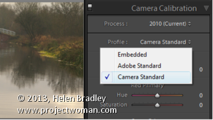
To make them closer to the camera version, select the Camera Calibration panel in the Develop module and from the Profile list choose Camera Standard – this better matches more closely the image you saw on the back of your camera.

These profiles are a starting point for further adjusting your image so choose the one which works best for you.

Helen Bradley

Tuesday, August 27th, 2013

Make an illustration in Photoshop using free fractal tree brushes

Learn how to download and install free fractal tree brushes and a texture and see how to use these to create your own Photoshop art.

Covers how to install brushes in Photoshop. How to add new layers, how to use masks and a gradient fill. Also shows how to add a drop shadow and an outer glow layer style. The land is created using a filled shape and made more organic using the Warp transform feature.

Transcript:

Hello, I’m Helen Bradley.

Welcome to this video tutorial.

In this tutorial I’m going to show you how you can download and install the fractal tree brushes from projectwoman.com and how you can use them to make art in Photoshop.

Before we get started with this project let’s look and see what we’re going to do.

We’re going to create an image that’s something like this.

It uses one of the fractal tree brushes and also uses part of the brush to create a sort of highlight effect that is the result of the sun going down.

So we’re going to add our tree and then we’re going to make this sort of background look with this blue fill background and we’re going to use the texture that we’ve downloaded.

So I’m going to show you how you can put it all together using the brushes and a texture file.

I’m just going to tuck this away for now and let’s have a look and see where we’re going to get the bits and pieces that we need.

Well first of all we’re going to flicker to some images that are offered by a gentleman called Skeletal Mess and we’re going to download this image.

And it’s in his 2009 texture of the day.

So here it is, texture of the day 2009, and this is the one that you want.

So just click on it, from Actions choose View All Sizes and then you can just go and download the largest size of this image or the original.

It doesn’t really matter too much.

I’m just going to work on the larger size one for now.

So I’m going to open the folder that it has been stored in and its here.

And I’m just going to open it in Photoshop so I’m going to right click and I’m going to open with Photoshop CS6.

Well it’s not in the list there so I’m just going to go and grab Photoshop and we’ll just drag and drop it in there.

Okay, so the image is now in Photoshop and now we need to get our brushes.

And they’re available on my website so that is at projectwoman.com.

So you’re going to projectworman.com and click here on the Free Photoshop Brushes option and just scroll down because the ones we’re looking for here are the rendered fractural tree brush set.

So click on that and then click here to download the brush set and that’s going to download to your Download folder.

And what you’ll do then is just double click on the file so that you can locate and expand the fractal tree brushes file.

And you need this in Photoshop so again I’m going to tuck this just out of the way for now and open Photoshop because there’s a quick and easy way of installing brushes in Photoshop that I want to show you.

So the way I install brushes in Photoshop is to first go and get the brushes option here.

So I click on Brushes and I’ll choose the brush dropdown list here and then click here and go to Save Brushes.

And what that does is it shows me the folder where Photoshop brushes are saved and you can see here that it’s a long string of folders that you need to go through.

But it’s easier if you just open this up in Photoshop and then what you’ll do is you’re go and get your file, your brushes file that you downloaded and then just drag and drop it.

Now my machine is playing games with me right now so I’m just going to make Photoshop a little bit smaller and bring up my brushes file at the same time which is hiding all the way around here.

So let’s just go and get the brushes again and we’re going to open this up.

I’m going to go to Save Brushes.

So I open this folder.

Here are my fractal tree brushes and I’m just going to drag and drop them in there.

So that’s done now.

The brushes are installed where Photoshop can find them.

So what I need to do now with my brushes palette is to go and open that set of fractal tree brushes.

So here are the fractal tree brushes and when Photoshop asks me if I want to replace the current brushes, cancel or append I’m just going to select append because that’s going to add them to the very end of my brushes collection.

Now, I’ve added them twice but they’re here now.

So we’re ready to get started and create the effect that we had on this image here.

So any time that we work with an image like this we’ll want to be working on a new layer to paint our tree so I’m going to add a new layer.

I’m going to go and get my tree.

I’m just going to choose a tree to use.

I think this one this time.

I’m going to size it up using the open square bracket key and I’m going to select black.

So I want to be looking at my swatches.

So I’m going to select black as my foreground color and let’s also go and get our tools so that we can see what we’re doing here.

So I’m going to paint with black on this layer and I’ll probably press it a couple of times in the same place so I make sure I get a really dark tree there.

Now what I’d like behind the tree is some sort of a sort of land mass if you like so I’m going to select the Rectangular Marquee tool here and on a brand new layer I’m just going to drag out a rectangle behind the tree.

I’ve add a new layer below.

And I’m going to select a sort of dark reddish color as my foreground color.

That’s a sort of maroon.

Let’s go a bit more for dark red.

And I’m going to fill that layer with this.

Since it’s my foreground color I can press Alt Backspace, Option Delete to fill that layer.

To blend it in I’m just going to use the multiply blend mode because that gives me a darker sort of effect.

Now this is probably not dark enough for me so I’m just going to open the color up and let’s select a much darker version and again Alt Backspace, Option Delete.

So now I’ve pressed Command D to deselect the selection.

Now the land mass is a little bit too regular for me so I’m going to Ctrl Click on this layer and choose Edit and then Transform and then Warp because warp allows me to create a sort of a bit more organic land mass.

So I’m just going to do that very, very simple, not very much happening there at all.

Now we need our setting sun so again a new layer.

I’m going to select a sort of lighter color.

Let’s go for a sort of lighter orange color.

I’m going to use the Elliptical Marquee tool and drag a circle by holding the Shift key to constrain the ellipse to a circle.

I want to move it into position so I’m going to hold the Spacebar as I move the circle down into position, let go of the Left Mouse button and then let go the Spacebar and the Shift key.

Again, this orange is my foreground color so Alt Backspace, Option Delete on the Mac will fill the shape with this orange color.

Again, I think it’s way too light so I’m just going to redo that with a darker color.

Now I want my sun to be behind my land mass so I’m just going to drag on the sun layer and move it behind the land mass layer.

Now I think I’ll blend my sun in a little bit so I’ll probably select multiply as the blend mode to darken it.

And I also want to add a slight glow around the edge so I’m going to select the Add Layer Style option.

I’m going to add an outer glow here.

The white is not the color I want.

I really just want to grab the color that I had for the sun and maybe just go a little bit lighter than that as my outer glow.

Size is really the sort of ambit of the glow.

It’s not really how many pixels it is.

It’s a bit more feather than anything.

And spread is a bit more pixels.

So I’m just going to add that glow in.

And I can also multiply it if I want to so I can get a sort of darker glow.

Now I’m trying to keep things pretty light right now because I don’t want to be working on a totally dark image.

But what I do want here is I really want the tree all over.

Again, I want a sort of drop shadow for the tree.

So, one of the ways that I can do this is by just adding a light drop shadow layer.

2,368So I’m going to add a layer style.

I’m going to choose drop shadow but instead of doing a darker drop shadow I’m going to do a lighter drop shadow.

In fact let’s just sample the color from the sun for this and maybe just go a little bit lighter than that.

Maybe a little bit more yellow still, okay.

And this is going to be a drop shadow.

And we want it to look as if it’s coming from the sun so it’s going to be out this direction.

But we’re going to screen this because we want it to be lighter and we also don’t want it to be both sides of the tree.

So we’re going to just play around with the spread and the size until we get the slightest suggestion of lightening on this side of the tree but not too much, probably about 4 pixels.

Something like that looks pretty good to me so I’m going to click Ok to select it.

Now what I want is to be able to work on this shadow independent of the tree itself so I really want to move the shadow to a new layer.

So I’m going to right click that and choose Create Layer.

And what that does is it creates the drop shadow as a new layer so I’m just going to click Ok.

So here’s my drop shadow on a new layer.

And because it’s on a new layer I can add a mask to it by clicking the drop shadow layer and click the Add Mask icon.

I’m going to select my brushes.

Let’s just go and grab a brush.

And this time I’m going to select a soft, round brush, something like this, make it a bit larger.

I want to be painting with black because I want to paint out this shadow area and make sure I have the mask targeted and on this side of the tree I’m just going to remove the shadow.

Now because this is a mask layer I can switch and paint with white and I can bring the shading, the highlighting back anywhere I want it.

So I can just paint it on or off as I wish.

I think too I’m going to soften this edge because I think it’s a bit harsh.

And again a mask will do that.

Just click on the layer, click on the layer mask, click on black paint.

This time I’m going to reduce my opacity way down and just gently tip over the edge here, press X to go back.

So I can make that as dark or as light as I want and I can just sort of blend that in to the background by just switching colors, painting with black on the mask to blend it, painting with white to bring it back again.

Now what I did on the original image that we haven’t done right now is to add a blue to white layer over the top of this background layer to just blend everything in so I’m going to that now.

I’m just going to add a new layer.

I’m going to select the Gradient tool and then I’m going to select a sort of darkest blue.

I’m thinking it needs to be a bit darker and a big grayer than that.

So that sort of color blue to white.

So I’m just going to select white here or a light blue.

It doesn’t really matter too much.

And then we’re going to use the gradient to apply that.

So let’s just have a look.

We’re on this foreground to background gradient.

We have linear gradient selected.

We have the layer here and I’m just going to drag to fill it with the gradient.

And I’m holding the Shift key down as I do so my gradient goes in nice and level.

Now it’s going in blue at the top, white at the bottom and I’m just going to blend it using the multiply blend mode.

You can see that my edge here is way too much but we can go back and fix that, again with brush and again, painting with white this time.

I’m just going to be painting on this mask and just bring back that edge a little bit and then we could fix the tree up.

So there you have a small project that you can do using the fractal tree brushes to create a sort of sunset landscape image in Photoshop.

You now know how to download and install the brushes.

And you can find this interesting texture online at Flickr to use and you can go and create your own art in Photoshop.

I’m Helen Bradley.

Thank you for joining me for this video tutorial.

Look out for more of my video tutorials on this YouTube channel.

And visit projectwoman.com for more tips, tricks and tutorials on Photoshop, Lightroom, Illustrator and a whole lot more.

Helen Bradley

Sunday, August 25th, 2013

Lightroom Tip – Add a Vignette Effect to an image

Learn how to darken the edges of an image using a Vignette in Lightroom

Vignettes are a darkening or lightening of the edges of an image – they can make an image look very attractive.

To add a vignette, open the Effects panel, set the Style to either Highlight Priority or Color Priority – Paint Overlay is the least attractive option. Drag to the left on the Amount slider to add a dark vignette and to the right to add a light one.

The Midpoint slider adjusts how the effect is applied to the edges of the image. Increase it to remove the vignette from the edges leaving it mainly in the corners.

Roundness controls the roundness of the vignette, drag to the left to make it more square, to the right to make it more circular. Feather controls the softness of the edges so use 0 for a hard-edge and 100 for a very soft edge.

Highlights applies when you use a negative Amount to create a darkened vignette. Zero gives no change and larger values preserve highlight contrast when you select Highlight Priority or Color Priority.

Helen Bradley

Thursday, August 22nd, 2013

Lightroom Tip – Sharpen only the edges in the image

How to use the Masking Slider to limit image sharpening to only the edges in the image

The Masking slider in the Lightroom Detail panel allows you to control the areas of the image that are sharpened and those that are not.

Hold Alt (Option on the Mac) as you drag on the Masking slider. As you do you will see a black and white overlay on the image. The areas that are black are not sharpened, those that are white are sharpened. The farther you drag to the right the more the sharpening is limited to just the edges in the image where you want it to be applied to.

Drag on the slider to control just how much of the image you want to have sharpened. When you’re done, adjust the Amount to a value that makes sense for the image.

Helen Bradley

Monday, August 19th, 2013

Lightroom Tip – How to manage halos when sharpening

Learn how to suppress halos with the Detail Slider when Sharpening in Lightroom

The Detail slider in the Detail panel in Lightroom lets you suppress the haloes you create with the Radius slider.

At zero position you will fully suppress any halos and at 100 you will have no halo suppression so you will see all the halos added using the Detail slider.

This means that a low value for the Detail sider sharpens only the largest edges in the image and a large value for Detail will tend towards sharpening everything.

Hold Alt (Option on the Mac) as you drag on the Detail slider to see the effect on the halos around the edges in the image.

Typically if you use a high Radius value then you will want to use a low value for Detail and vice versa.

Helen Bradley

Wednesday, August 14th, 2013

Lightroom Tip – Using Amount and Radius when Sharpening

Learn how to fine tune sharpening with the Amount and Radius Sliders

The Detail panel in Lightroom controls sharpening on the image. Use the Amount slider to manage the intensity of the sharpening – set this to a high value to begin.

The Radius slider adds halos around the edges in the image which is what gives the sharpening effect.

For an image with lots of fine lines and detail such as a building select a low radius. For a portrait or an image with softer detail, use a high radius value.

Hold the Alt key (Option on the Mac) as you drag on the Radius slider to see the halos.

Helen Bradley

Sunday, August 11th, 2013

Lightroom Tip – Preparing to Sharpen an Image

How to prepare your image for sharpening so you can make a good adjustment

To sharpen an image, first make sure that the main image is visible at a 1:1 ratio in size so you can see the resulting sharpening effect more clearly.

To control what appears in the Preview window, click the indicator in the top left of the Detail panel and click an area of the image to preview. Choose a good position on the image as a preview – something that needs to be good and sharp.

You can also click on the image in the Preview – click once to see the preview filled with the image and again to zoom into the image.

Drag the image in the Preview window to see different parts of it.

Helen Bradley

Thursday, August 8th, 2013

Lightroom Tip – Using a Split Tone effect on a Black and White Image

Split Toning a Black and White Image – learn how to make the Highlights and Shadows Different Colors

Split Toning applies one color to the highlights and another to the shadows in an image.

Good color choices when applying a split tone are colors that are opposite each other on the color wheel such as magenta and green, blue and yellow, or red and cyan – although you can choose any combination you like.

To apply the split tone effect, drag on the Hue slider or click the color picker to choose a color to use for the Highlights and then choose something else to use for the Shadows.

Adjust the Saturation of the colors as desired.

Balance allows you to fine tune how the colors are applied to the image – drag to the left to adjust the balance towards the shadow color and drag to the right to add more of the highlight color.

Helen Bradley