Helen Bradley - Photoshop and Lightroom tips and techniques
I'm Helen Bradley - I'm a photographer and Photoshop professional. In this Photoshop and Lightroom blog you will find powerful Photoshop and Lightroom tips, tricks and techniques that will help you get more out of both programs. You will also find step by step guides for working creatively with your photos in Lightroom and Photoshop and any other cool applications I know you will be interested in knowing more about.
Learn to add multiple strokes to a shape in Illustrator
One way I force myself to extend my knowledge of Illustrator is to take an existing illustration and to try to reproduce it. I don’t use these for anything but for learning and improving my skills. It’s a great tool because, when you try to copy someone else’s illustration you have to work out how to do things you may not typically do. You can’t just fluff yourself off and do the same old thing – if you don’t know how to achieve an effect you have to think about the problem and work it out using your existing skills or go research solutions.
Today I’ve been working on shapes that have neat edges and, in particular shapes with solid edges and dots – all in the one shape!
Start by drawing your shape – mine was a speech bubble but you can do it with anything. Then add a fill color and a stroke – this stroke is the thick band around the shape so make it the right size for the edge effect.
Now open the Appearance panel and add a second stroke by choosing the Add New Stroke icon. Make sure this is the top stroke – if not you can drag it up as if it were a layer. In the Appearance panel select a different color for this stroke and size it smaller than the previous one. You can now make it dots by setting up the panel so it looks like this – just note that your gap value should be the same or just larger than the stroke to make dots and that the cap shape is rounded – to get dots!
So, you know how to make a sunburst in Illustrator – here’s how to color it
Some time ago I wrote a post and created a YouTube video to show how to make a sunburst in Illustrator. This is one of my most popular posts and the video has been popular too – seems like it really hit a spot with a lot of readers.
Now, today I received an email from a reader asking how to make the sunburst multicolored. Turns out it isn’t as simple as selecting a ray and recoloring it – because when you select one ray you select them all. However, once you know how to break them up, it works just fine.
To do this, follow the instructions to create the circle, add the dashed line, expand it, select the inside anchors and choose Path > Average. This gets the sunburst made.
Now, to break the shape up, select it and choose Object > Live Paint > Make. Now you can use the Live Paint Bucket tool to color each piece of the sunburst – or not. You see the Live Paint > Make command breaks up the shape (in a way that Object > Expand does not) so you can now select each ray in turn and color it.
If you want to see the change happen, watch the Layers palette when you do the Live Paint > Make command – it turns the compound path into a set of individual vector objects – just what you need to have to be able to recolor them. The plus is that once the shape is broken up like this you can recolor it in the usual way by selecting each shape and color it or you can use Live Paint. You get to choose which works best for you.
Now, one side effect of this is that the spaces between the rays is filled with color – typically white. So you can’t put a solid color behind the rays and have it show through. There is a solution – open the Layers palette and locate the filled white circle shape at the bottom of the expanded sunburst shapes and delete it. Once it is deleted you can add your own background filed shape behind the sunburst.
It’s one of those things that is simple when you know how but not immediately obvious how you do it.
Curious or confused about where brushes go? Here’s the info you need and how to do it
It’s pretty easy to find the wrong place to install brushes on the PC and the Mac. The Adobe program file folders are more accessible than the user areas where you really should be installing your brushes. So, to help you out, here is where the brushes should go and a couple of tips for showing the hidden and hard to find folders on the PC and the Mac:
Photoshop CC
~/Library/Application Support/Adobe/Adobe Photoshop CC/Presets/Brushes
The tilde (~ ) indicates your hidden user library.
You can open it this way:
1 Launch Finder
2 Choose Go > Go to Folder
3 Type ~/Library and click Go
4 This opens the ~/Library folder and you can now navigate to the appropriate folder listed above.
On a Windows PC:
Follow these instructions to install the brushes where they can be found by both 32 and 64 bit versions of Photoshop (this is the prefered method of installing downloaded brushes):
Create fractal trees in your browser using this free download
I love Fractal Trees and I love finding new ways to make them. Today I found a handy download for creating some cool trees.
I’ll explain how to find and download it and then how to run and use it.
This program is browser based but you need to download the code for it. You will find that here at Github.com.
On the bottom right look out for a download Download Zip link – click it and download the zip file. Double click the download and extract the files into a folder.
When you do this, look for the Index.html file in the download. Double click it to open it in your browser. This launches the program which runs now in your browser.
All you need to do is to adjust the sliders and click Preview to preview your tree. You can use the color pickers to set the colors for the trunk, leaves and background.
Experiment with different settings – the Randomness setting will give you some randomness in the tree so each time you click Preview the tree will change even if no other settings are changed.
When you get a tree you like, click Make Image and the tree will open in a new window. You can click the tree, right click and then save it as a .png image – they aren’t transparent though.
Then you can use it anywhere you like – I use mine in collages in Photoshop. They are very small images but they scale up pretty well.
If you are interested in seeing Anna’s images head over to her website to see her page of fractal trees – here is a sampling of what you will find there – awesome!
Tidy up, rearrange and delete brushes in Photoshop
A reader just contacted me to ask how to delete a brush in Photoshop. It is an interesting question and one worthy of a post I think!
To do this, choose Edit > Presets > Preset Manager to open the Preset Manager dialog. From the Preset Type drop down list choose Brushes to view your brushes. Now you can click a brush to select it – it’s hard to see but it does get a narrow blue line around it. Click Delete to delete it.
Now, something else that is really handy about this dialog is that you can also move brushes! So drag a brush and you can move it to your chosen place in the panel. So, you can put those brushes you use most often at the top of the Brushes panel where they are nice and handy.
How to get the color picker to look the way you want it to look
or How to fix the Color Picker when it looks all funky
Sometimes when you open the color picker in Photoshop it looks one way and other times it looks a different way. It might even seem like there is no rhyme or reason to how it looks and that it changes without (what it may seem like) no input from you.
Of course, nothing could be further from the truth but knowing that won’t solve the problem of why it changes and how to change it back!
To change it, don’t go looking under Preferences for all the Color Picker choices. While some preferences can be found in the Preference area the secret changes are made inside the Color Picker itself.
To see them at work, click to open the Color Picker. What you see here depends on what is clicked in the right of the dialog (when you realize this everything becomes blindingly obvious).
Click H for Hue to see this:
And S for Saturation to see this:
And B for Brightness to see this:
Each of R, G and B make the picker look different:
As does choosing L or a or b:
And each looks different if you have the Only Web Colors dialog checked:
Now you know what affects how the Color Picker looks you can choose the one that makes the most sense to you.
Free Downloadable Illustrator Gradient Swatches for you to try
While Illustrator comes shipped with a range of gradient swatches you will probably find that there are never enough gradients for your needs. Luckily there are a few good quality freely downloadable gradient swatch sets that you can use to expand your Illustrator toolkit.
While there are a lot of gradient swatches you can download for Photoshop there are not a lot of free options for Illustrator. I’ve scoured the web to find you this collection – they all download and install correctly and they aren’t from spammy sites (some others not included here are from spurious sites – so beware!).
This selection of 48 vector gradients makes a good starter pack. There are some handy black and light colored gradients as well as a lot of green and blue ones too. If you’re looking for a simple collection of gradients to start off with this a good choice.
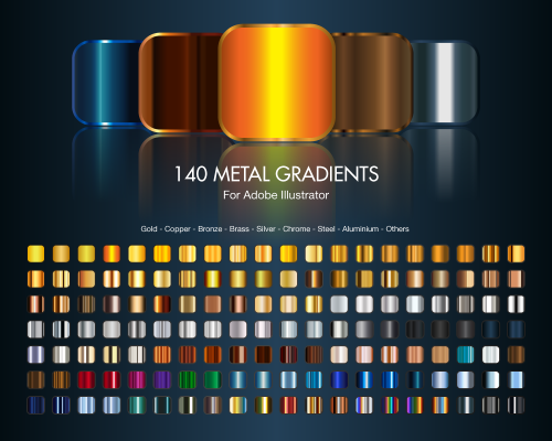
Deviant Art is always a great place to find handy downloadable things. Here we’ve located 140 metal gradients for Illustrator. There are a range of gold, metal gradients as well as copper, bronze, brass, silver, chrome, steel, aluminum and other metallic looks. This is a good starter collection of metallic gradients.
This group of gradients in files called (somewhat unimaginatively) 1.ai to 7.ai is a selection of handy gradients. While it would be nicer if these gradients were all in one pack that’s not the case so you may want to grab the lot and perhaps assemble them into a single swatch file of your own.
4. At Vectorportal.com you’ll find a series of six gradient packs totalling over 700 gradients. The images for these packs look a little on the small side but don’t let this fool you – each pack ranges in size from 75 – 160 gradients per pack. All six can be downloaded from this site.
From Faisaljasnak comes this set of gradients for Illustrator. These gradients range from subtle color shifts to gradients suitable for buttons and other web elements.
6. Adobe Exchange hosted gradients
This next group of downloadable gradients is accessible from Adobe’s own Exchange website.
Remove all the edits you’ve made to a raw or dng image in Adobe Camera Raw
No doubt you’ve encountered the situation where you have a raw file or a dng that you’ve worked on in Adobe Camera Raw or Lightroom and you one day look at it and think – “what was I thinking?”
You decide you want immediately to remove all the changes you’ve made to the image. Easy? Not really!
If you’re working with a raw image then you can locate the image on disk and alongside it will be its sidecar xmp. Shall I say that again, because to the uninitiated ‘sidecar xmp’ just sounds so cool doesn’t it. What it is is an .xmp file with the same name as the raw file and it contains the edits you made to your image. The sidecar xmp file is used because you cannot write data to a camera raw file so the edits have to go somewhere. They go in this little xmp file as a set of text entries – delete the file and you remove the edits, permanently – in fact just remove the xmp file to another folder where ACR can’t find it and you’re done.
In Lightroom you can wind back edits to an image from the Develop module in the History panel on the left of the screen. Open the panel and select the bottom-most entry to wind back the changes you made to the image.
Unfortunately this won’t work if you made changes in a program that wrote an .xmp file and it won’t work if the changes were made to a dng file, written to that file and then the file was imported into Lightroom.
In that case, go to the Library panel and open Quick Develop and click Reset All – that removes all the edits.
In ACR, go to the small menu in the top right of the edit pane and choose Reset Camera Raw Defaults. This removes the edits and returns the image to its out of camera state (see image at the top of this post)
This is also very handy for teachers who teach using a set of images – if you need to start over editing an image with a new class, this option will help you start over with a clean image.
Lightroom has a set of tools that you can use to adjust white balance in your images. To see these at work open an image in the Develop module. At the top of your Basic panel are the white balance adjustment tools.
White Balance Options
The dropdown list will show you some options for adjusting white balance – what is shown here will vary depending on how your images are captured. If you capture in raw then the white balance dropdown list will contain the same options as you have on your camera for setting white balance. If you’re capturing jpg images then there are fewer options – As Shot, Auto and Custom.
On the left are the options for a raw image and on the right those for a jpeg image.
The Temperature and Tint sliders also have different units of measure depending on whether you’re working with jpgs or raw images. For jpg images both the sliders range from +100 to -100. If you’re working on a raw image then the Temperature slider shows degrees Kelvin from 2000 – 50,000 and the Tint slider ranges between + 150 and – 150.
Kelvin is a measurement of the color of light – daylight is around 5,500 degrees Kelvin. Lights we consider to be warm or pink/orange in color including tungsten globes are around 3,000 degrees Kelvin and cool lights which are blue in color such as overcast daylight are around 7,000 degrees Kelvin and higher.
Adjust White Balance
To adjust the white balance in the selected image you can select an option from the White Balance dropdown list to use to fix the image or you can use it as a starting point and then fine tune the result.
You can also manually adjust the Temp slider to add warmth or remove it from the image. Drag the sider to the left to add a blue tint to the image (to cool it down), or to the right to add a yellow tint to it to warm the image.
Use the Tint slider to balance out any excess magenta or green in the image. Drag towards the right to add magenta to the image cancelling out any green tint and drag to the left to add a green tint cancelling out any unwanted magenta.
White Balance Selector
You can also use the White Balance Selector to adjust white balance. You can select the tool by clicking on it or press W.
From the White Balance toolbar under the image you can select options that make the White Balance tool easier to use. I suggest you deselect Auto Dismiss as you can then click on the image in various places to attempt to fix it. If you have Auto Dismiss enabled you’ll only be able to click once before the selector is dismissed so, if that fix isn’t perfect then you’ll need to select the tool again to attempt another fix. This is a cumbersome way to work so I prefer to disable Auto Dismiss and put the tool away only when I am done with it.
If you click the Show Loupe checkbox then you’ll see a 5 by 5 pixel grid beside the mouse cursor. The center point in the grid is the pixel that you are currently targeting and which will be used to adjust the image if you click. This grid makes it easier for you to pick the correct point in the image to adjust to. The scale itself can be increased or decreased using the Scale option on the toolbar.
At the bottom of the loupe itself are the RGB percentage values of the pixel under the cursor. These values tell you if the pixel is neutral or not. If it is neutral then the percentages of R, G and B will all be equal – if they are not equal then there is color in that pixel.
To balance the image using the White Balance selector, click on a pixel that should be neutral grey – not white or black. When you do so, Lightroom will adjust the image so that the selected pixel is a neutral grey and, as a result, all the color in the image will change. At the same time Lightroom adds an entry to the image History for that adjustment. This means that you can wind back the history to return to an earlier white balance fix, if desired.
You should be aware that adjusting image white balance is to an extent a subjective assessment – so there is no one value that is “correct”. There are, instead, a myriad of different results that can be achieved so look for one that is it pleasing to you. In most cases viewers prefer to see some warmth in photos as they are more pleasing to the eye if they are warmer rather than cool.
I find that a good approach to take is to experiment with the white balance selector to see the effect on the image by selecting different pixels to adjust to. Then choose the most aesthetically pleasing result.
Save Time in Lightroom when Resizing and Cropping Large Amounts of Output Images
If you’re working on a large shoot and need to output a lot of images at a fixed size then Lightroom can do the work for you. It isn’t obvious how you can crop all your images to a fixed size and output them at a certain set of pixel dimensions but it is easy to do when you know how. Here’s how to do it:
Step 1
First locate the folder with your images in it. I prefer to make virtual copies of my images and put them in a new collection but you can do whatever makes sense to you.
Step 2
Select all the images in Grid view in the Library module in Lightroom.
Open the Quick Develop panel on the right and, from the Crop Ratio dropdown list, select the crop ratio that you want to crop to. For example you can crop to fixed ratios such as 1 by 1 or printing sizes such as 5×7, 4×6 and so on.
Here I’ve selected 5×7 and when I do so all the selected images are automatically cropped to this 5 x 7 ratio.
Lightroom is smart enough to understand that some images are portrait orientation and others are landscape. Portrait images are cropped to 5 x 7 and landscape orientation images to 7 x 5.
Step 3 (optional)
If desired, you can now move to the Develop module and check the crop for all the images. By default, Lightroom will center the crop rectangle on the image and this may not be exactly what you want for some images. However, it is easy to go to the Develop module, click the first image and click on the Crop Overlay Tool so you see the crop marquee in position on the on the image.
Now from the filmstrip you can click on each image in succession to preview it in the crop window and you can easily identify if any of them need an adjustment to the crop rectangle. If they do simply drag on the crop rectangle to reposition it. When you’re done return to the Library view.
Step 4
As the images are now all cropped to size, press Ctrl + A to select them and then click Export. Choose a folder to export the images into or click New Folder to create a new folder.
You can now set your desired preferences in the Export dialog.
To control the output size – in pixels wide and tall – of the images easily because you already know the crop ratio. To do this, select the Resize to fit checkbox and choose Long Edge from the dropdown list. Then type a pixel dimension for the long edge. So, for example, to prepare 5 by 7 ratio images for printing at 300 dpi the longest edge will need to be 2,100 pixels (7 x 300) so type 2100 and set the resolution to 300.
Step 5
Click Export to export your images and they will be exported to a folder at the chosen size and resolution.
This process allows you to quickly and effectively prepare a batch of images for printing. It manages portrait and landscape images so that you don’t have to separately handle each type. It’s a simple workflow and a fast way to prepare images from a large shoot.
Ok.. so I am slow! A friend just sent me to the Amazon digital design bookstore. Now I love design books and finding them all in the one place is just awesome. So, thanks Marilyn and here for anyone else who hasn’t found it yet is the link to all things wonderful: Amazon Digital Design Bookstore.
Learn how to make a vector repeating pattern swatch from a pattern created using a MadPattern template.
The Madpattern Illustrator templates include instructions for saving swatches as bitmap files but most users will want to create vector swatches. How to do this is not either clear or intuitive. This video shows you how to make a vector pattern swatch and how to save and open it so you can use it again in future.
Video covers downloading and opening a MadPattern template. How to create a pattern and then how to save a vector repeating pattern swatch. It also shows how to save the swatch and how to load it to use it again in future. Also covered is how to recolor the pattern and resize it.
Transcript:
Hello, I’m Helen Bradley.
Welcome to this video tutorial.
In this tutorial I’m going to show you how you can create a vector pattern swatch using Mad Pattern templates for creating repeatable patters.
Before we get started making our vector pattern swatch let’s have a look and see what we’re aiming at.
This is a vector pattern swatch that I created earlier using the Mad Pattern templates and all I need to do is to open the swatches library they’re saved into and add it as a fill to a shape such as this one here.
It can be scaled and colored and we’ll see that again in a short period of time.
But for now we need to go and have a look and see where we’re going to get these Mad Pattern templates from.
You’ll find the Mad Pattern templates at madpattern.com.
They’re said to be compatible with Illustrator CS4 and 5.
They’re also compatible with 5.
Click here to download them.
On my website at projectwoman.com you’ll see that I have a link from my Home page to Mad Pattern template images.
These show you the series of templates that you’re being given and how they repeat.
It’s pretty critical once you get into this to know exactly which one you need to get the repeating style that you want.
We’re actually going to use P3M1 here in just a minute.
Now once you’ve downloaded and extracted the files you can open them in Illustrator.
You can choose File, New from Template but I’m actually just going to open the template itself and this is the P3M1 template.
Now when you open these templates the first thing you’ll want to do is to show your layers palette because that will show you what’s going on.
Every template will have a layer that has the exact same name as the template itself.
It will also have a small amount of information which you can turn off by clicking the Info icon here.
If you read the info it does tell you a little bit of what you need to do to actually start creating the illustration for the template and also it will tell you how you can save this for web and devices.
Now the swatch saved for web and devices is a raster swatch so it won’t be scalable to a really high degree.
It would of course be a document that you could use in Photoshop but if you want a vector swatch then that’s what I’m going to show you how to do.
So we’re going to turn off the Info and we’re going to turn off the template elements and we’re going to click in here in this clipped elements area because that’s where we’re going to create the pattern itself.
I’m just going to zoom in here, make this a lot larger to that we can see the area that we’re going to be working.
I’m going to create a simple heart for my pattern swatch so I’m just going to quickly with the Pen tool draw a heart shape.
I’m not worried too much about how it looks.
I’ve got my handles turned off so I’m just going to make sure I turn them on and let’s just call that good for my heart.
Now I am going to color it so I’m just going to get my color swatches.
I’m going to fill it with a pink color and around the edges I’m just going to make it a navy blue.
Now I’d like my stroke to be a little bit bigger so I’m just going to grab my Appearance panel because I often find that stroke and things are a little bit easier to manage in the Appearance panel.
So we’ll give it a nice wide stroke.
Now before we leave here we can also grab the Ellipse tool and we’ll drag out a couple of circles.
So I’m just going to click on the edge here of this triangle.
So I’m looking for the anchor point.
I’m going to hold Alt and Shift so I can grab and drag a circle.
I’ll just reverse the colors here.
I’ll choose my Move tool, click on the object, choose Edit, Copy and then Edit, Paste in Place.
So that gives me a duplicate of this which then I can move over the very edge of this end of the triangle.
I’m going to do the same thing with Edit, Copy, Edit, Paste in Place and this time I’ll put mine at the very bottom of the triangle.
So this is what we have so far as our pattern.
Oops, let’s just grab that there.
So this is our pattern.
And having created the pattern we’re now in a position where we can go and save it as a vector swatch.
Now to do this we need to understand a couple of things about these Mad Pattern templates and one is that this is the area in which we draw our shape.
But this is an art board and this art board is fairly critical because it tells us how big our pattern repeat is going to be.
So I’m going to click here on this Art Board tool here and I just want to click on Art Board too because I want to select it because I want to read off a little bit of information about it.
To do this I’m going to click Art Board Options and this opens this Art Board Options dialog.
And these are the two measurements I’m interested in.
I want to know the width and the height of this art board and I need to know it exactly.
So this .21 pixels, that’s critical too.
So it’s 300 x 173.21 pixels.
I’m just going to cancel out of here because I just need that information, nothing more.
Now I’m going to select and create a rectangle but I’m just going to click once on the background here because I want to type in those measurements that I just got, 300 x 173.21 pixels and click Ok.
Now this is my shape but as you can see it’s got a blue fill and a pink outline.
We just can’t see that because the shape is not in the area in which the repeat pattern is being created.
If I do move it into that area you can see that it does have that fill and that edge to it.
Now it’s critical that it doesn’t have any of those features so with it selected I’m going to turn off the stroke and I’m going to turn off the fill.
So this is now an empty rectangle.
If you’re familiar with working with repeating patterns in Illustrator CS5, 4 and earlier then you’ll know that you need this unfilled rectangle to actually select and create a repeating pattern.
Now I’ve just opened my clipped elements group here.
I’m just going to drag the path all the way down to behind the background.
I just want to tuck it away for now.
And now what I want to do is to expand this layer P3M1.
Now I can’t expand it right now with this clipping mask and also this dummy path that are here with lock icons on them so I need to go in and unlock these two icons.
And then I’m going to select P3M1, the layer that corresponds with the template name, and click on all of these layers here so that everything is selected.
Now I’ll choose Object, Expand Appearance.
If you don’t see Expand Appearance here, if it’s grayed out, then you’ve done something or left something unselected or selected when it shouldn’t be.
So just exit out of this menu and go back and check that these lock icons are deselected and that you have P3M1 or whatever the layer is that corresponds with the template name selected and that these are all selected here because you absolutely have to have Expand Appearance available.
So I’ve clicked Expand Appearance and now you can see that I’ve got this very interesting sort of pattern of things happening in the background.
That’s exactly as it should be because I did need to expand the appearance of all these shapes.
So now I’m going to go back and reselect here the rectangle shape and then I’m going to select all these other objects as well.
So I’ve got everything selected here that makes up the swatch that I want to save.
And having done that I’m going to go and grab my Move tool and drag from the middle of this rectangle so that I’m dragging and dropping it into the Swatches panel.
And this then becomes my swatch.
So to test it before we leave here I’m going to turn off all these layers.
I’m going to click the topmost layer and I’m going to add a brand new layer so that I can add a filled rectangle over the tops.
I’ve just dragged out a rectangle here.
Now we can’t see it.
But you can now see it has a border and we want to select Fill and we want to drop our pattern fill in there so that we can check to make sure that everything looks perfect.
And I suggest you go one step further and that you actually resize this pattern.
So again, making sure that we have this rectangle selected let’s go to Object, Transform Scale and let’s make sure that we’re not transforming the object ourselves but that we are transforming the pattern.
And now we’re reducing it to 25 percent and we can see that this is a perfect pattern.
It’s repeating exactly the way it should be.
It’s looking absolutely perfect.
And if it looks perfect then you’re right to go.
If it isn’t perfect then just turn off this layer, get rid of this layer and just step back and recreate your pattern.
But we’re ready to go.
Now the problem with this is if I get rid of this document as I’m tempted to do I’m going to lose this pattern swatch and it’s not coming back any time soon.
I would have to recreate it.
So I need to save it.
So I’m going to click the dropdown list here now and chose Save Swatch Library as an Eye.
This is the one you want, the one at the very bottom.
And I’m going to call this heart2 mad pattern because I’ve got a heart1 already there just so that we know that this is the pattern swatch we just created.
I’m going to click Save.
So having done that I can now get rid of this image.
I don’t need it any longer and while I might usually save it in case I want to come back and make alterations to it today I’m just going to trash it.
So I’m just going to close it.
And now let’s go and test our pattern swatch.
I’ll choose File and New because I’m going to create a brand new landscape orientation document.
I’m going to drag out a rectangle on that document and if we go to the swatches palette you’ll see that our swatch has gone.
And that is to be expected.
We have to go and grab it.
We have to go and load it.
So from the swatches palette I’m going to choose Open Swatch Library and we’re going to choose User Defined and then heart2 mad pattern because that’s the one that I just saved.
Here is my pattern swatch.
I’ve got fill selected so I’m just going to click here and the object is now filled with my pattern.
And again we can test this by choosing Object, Transform, Scale.
Now this pattern can be scaled as big or as small as you like because it is a vector pattern.
So I’m just going to scale it here.
Now not only can we scale it we can also recolor it.
So if all you wanted to know was how to create a vector pattern for a Mad Pattern template then you’re off and running now.
But if you want to know how to recolor this hang around and we’re going to have a look at this too.
So to recolor it I’m going back to my swatches here.
I’m going to grab my color swatches and I want to create this color scheme here as a new swatch.
So I’m going to click here for new color group and I want to use the selected artwork and I’ll click Ok.
And so now these are here as global colors.
I’m going to select over that and click here the Edit or Apply Color Group button and this opens this color dialog.
Now I can use this color dialog to make changes for example I can say I don’t like this blue for example and I want to make it a sort of aqua color.
And that will make it aqua.
But I can also click the Edit button here and individually change these colors by dragging on the slider.
So I can drag around and the two colors maintain the same distance from each other but I can make them less saturated or more saturated by just dragging in or out on either of these sliders.
Now I can also unlock the slider here so that they’re now independent of each other.
So I can select whatever colors I want for the fill and for the stroke color on the pattern that is being used to fill this rectangle.
So when I’m done I’ll click Ok and I do want to save the changes and so they’re now saved as a swatch.
So you have all sorts of options here using the Mad Pattern templates and there are some really, really good patterns there.
And we’ll have a look at some more things that you can do with these Mad Pattern templates in upcoming videos.
But for this video I just wanted to make sure that you were able to save your patterns as a vector swatch because that’s going to be critical in being able to resize these patterns to any size and particularly very, very large sizes without losing details in your patterns.
I’m Helen Bradley.
Thank you for joining me for this video tutorial.
Look out on this YouTube channel for more YouTube videos on Illustrator, Photoshop, Lightroom and a whole lot more.
Learn to make a silhouette in Photoshop and, from that, create an outline of the shape and a pattern fill for the shape. Tools used include the Quick Select tool, Refine Edge, Selection Smooth tool, Pattern Fill Layer, Stroke Layer Style and more.
Transcript:
Hello, I’m Helen Bradley.
Welcome to this video tutorial. In this tutorial I’m going to show you three options that you can use to create silhouettes in Photoshop and I’m using some old vintage clipart to show you how to do this. As usual before we get started let’s have a look and see what it is that we’re aiming to achieve.
I have this image of a red deer head which is an old scanned free image that I found from a public domain site and I wanted to look at some ways that I could use this image in my art but perhaps giving it a little bit of a different flavor. And this is one of the ways that I’m going to show you what we’re doing is making a selection or a silhouette of the deer head and filling it with a pattern or showing it filled as a pattern. This is another one of the options that I’m going to show you how you can create it as an edge effect. And finally we’ll look at creating it as a silhouette itself. So if you’re ready let’s get started working with our image. I have my deer head image here and this is the original scanned image that I downloaded from a public domain website.
The first thing we need to do is to make a selection of the deer head. It’s probably going to be easier to select the white area so I’m going to try with the Quick Select tool and just select over the white areas of the image leaving the deer itself intact and not selected. If I go too far I can hold the Alt key and drag out or I can add to the selection here. I might need to zoom in a little bit to make sure that I haven’t gone too far. This is looking pretty good to me. So I’m going to zoom a bit and let’s just test it by choosing Select and then Refine Edge and that will tell me if I’ve got it right. Well, I’ve got a few areas to tidy up. I’m just going to go back and select those and let’s continue once I’ve made those selections.
Now I’ve done a little bit more work on this image and I’m reasonably pleased with the result that I’ve got. This is what I’ve got so far. I would clean up a few of these areas if I were being a little bit more careful, had a bit more time. But basically that’s a pretty good selection for now. Now that I’ve got that selection I’m going to create a mask from it by just clicking the Layer Mask icon here. And because my mask has gone the wrong way I’m just going to click it and press Ctrl and I to turn it around the other way. We can test the mask by adding a color filled layer beneath the image. Now at the moment this image is a grayscale image so I’m going to convert it first into RGB color mode.
I’m not going to merge it so I’m just going to click Don’t merge. And now that it’s a color image I can add a color background behind this deer head which I’m going to do just so that we can check and see how it’s looking. At this point you could continue working on the image by painting on the mask using black and white so that you get a really, really good selection. But let’s assume that we’ve done that. For our first silhouette effect we’re just going to Ctrl and click on the mask because that will give us a selection of the deer head. I’m going to create a brand new layer and let’s just turn off the existing layer and let’s see what it looks like when it’s filled with black. I’ve pressed D to set the default foreground and background colors.
I’m going to press Alt Backspace to fill it with black and then Alt D to deselect the selection. Now ignoring the slight problem areas we’ve still got a fairly pixelated edge. So I’m going to trash that and go back and grab my mask selection, add a new layer and before I fill it this time let’s smooth it. I’ll choose Select and then Modify and then Smooth and I’ll smooth it by a couple of pixels. And now I’ll fill it. And you can see that this time we’ve got a much smoother edge. And we could smoother by even more pixels and we would get a much better result each time. So there’s one of the options that you have of creating a silhouette from an image. But let’s go one step further. Let’s turn this off and let’s go and get our selection again. I’m going to add a brand new layer.
This time let’s smooth it by three pixels and see if we get a slightly better result still. And I’m going to fill it with a color and it doesn’t matter what color I fill it with but let’s do black for argument sake. And I’m going to deselect my selection. This time I just want the white outline. So, on this fill layer I’m going to take the fill to zero so I’m effectively filling the layer with the deer shape but then turning that off. Now that might sound counterintuitive but look what happens when we select a layer style and add a stroke. I’m going to click on the stroke. You can see immediately we’re getting this stroked outline for this deer head. Now if I want it to be white I can just come in here and I’m just going to type the numbers for white which are 255, 255, 255 and click Ok. I can choose outside or center.
I could even do inside but I think that center is probably going to give me the best results here. And I can size my outline to whatever I want it to be and just click Ok. So that’s a filled layer with the fill turned off but with a white stroke to give us this outline shape. So, so far we’ve got two versions of our silhouette. One’s a black and white and one is an outline. And let’s create another one, a third one. I’m going to take this silhouette and I’m going to duplicate it. So let’s just move that up to the top here and turn the other layers off. Now what I want to do is to fill this area here with a pattern. So I’m going to choose Layer, New Fill Layer, Pattern and I’m going to choose this pattern this square pattern.
But its way, way too big so I’m going to scale it down to about 10 percent, maybe even 5 percent so it’s a nice small pattern. And I’ll click Ok. Now what I want to do is I want to make this pattern fill layer just the shape of the layer underneath and I can do that by creating a clipping mask. So I’ll select this pattern layer and choose Layer, Create Clipping Mask. And so I’ve clipped the pattern to the shape of the deer head. So there are a few options that you have for working with something like a clipart image, this clipart image of a deer head which I then extracted so I was able to do something with it. And what we did with it was to fill the selection with black to create a silhouette.
We can also fill it with black, or any color indeed, make the fill invisible and then stroke it to get a stroked outline. And the final feature allows us to fill the silhouette with a pattern. And if we wanted to we could even go and borrow the white outline from the layer below.
I’m Helen Bradley.
Thank you for joining me for this video tutorial. Look out for more of my tutorials on this YouTube channel. And visit my website at projectwoman.com for more tips, tricks and tutorials on Photoshop, Photoshop Elements, Illustrator, Lightroom and a whole lot more.
Learn to turn an image into one that looks like it is cut from paper and taped to a page. This effect uses the Quick Selection tool, Stroke Style, a filled layer and commercial brushes.
Transcript:
Hello, I’m Helen Bradley.
Welcome to this video tutorial. In this tutorial I’ll show you how you can create a hand cut image effect in Photoshop. Before we get started with this tutorial let’s have a look and see what it is that we’re aiming for.
I’m going to show you the original image I’m going to be starting with here. And what we’re going to do is isolate the image on its layer. We’re going to add a sort of white border around it so it could be used in various collage projects. And what I’m going to do here is actually show you it on a background here so I’ve got it dragged into a collage project. And so we’re going to see how we can create this sort of white edge look very easily for our images. So first of all let’s tuck this one away. I’m just going to delete those layers before we start and let’s just tuck that away and let’s go back and get our bird image.
Now the first thing that I would do with this particular image is to convert the background layer into a regular layer. So I’m just going to get everything back to what it was. And if this layer here that we’re seeing in front of us were the background layer I would just double click it to convert it into a regular layer. The next thing I’m going to do is to isolate this bird and the pieces that I want. Now I’m using the Quick Select tool because it’s quite a good tool for this and it’s going to make the job go pretty quickly.
So I’m just selecting over the areas of the bird that I want. And if the selection goes too far like it just did there I’m just going to hold the Alt key as I drag over the area that I want to remove from the selection. So I can select over the pieces if I want to add a bit to it. I’m just checking to make sure the bird looks pretty good but this could be edited later on. This effect is actually editable. So if you find that there’s a chunk of the bird missing or there’s a chunk of the background in it that you don’t want to include you can easily get rid of that later on.
So I’m just making a reasonable selection here and then I’m going to add a layer mask to this layer. So I’m just going to click here on the Add Layer Mask icon and that isolates the bird from its background. And you could brush this layer with black or white paint to make the edges smoother or whatever you want to do or you could add more of the bird or subtract it by just painting on this mask. But for now we’re going to assume that the mask is just fine. I’m going to add a new layer by clicking the Add New Layer icon here and I just want to fill it with this blue color.
So with the blue color as the foreground color I’m going to press Alt Backspace, Option Delete. You can see I could do a bit of tidying up in here. I’m going to leave you to do that yourself. With this particular layer selected I’m now going to add a stroke to it. So I’m going to click the Add Layer Style. I’m going to click Stroke. The color stroke I want is white or whatever you were opting as your sort of paper color because we want the idea that this bird has been cut out of a piece of paper.
So you could use an off white if you wanted to. I’m just using plain white. And I’m going to increase the size of this so it looks as if there’s a border edge around the bird and you can make that size whatever you want. It needs to be on the outside. If you put it on the inside you’re just shrinking your bird down and you’re losing detail here. It doesn’t want to be in the center either. You’ll have the same problem. It must be on the outside.
So having done that, I’m just going to click Ok. So essentially that’s my cut out bird and I could just drag and drop him into a collage if I wanted to. But I want to show you quickly how to do that tape effect. I’ve got this installed as a brush and all I did was look for tape as a brush and there are a lot of free commercial brushes that you can use. So here’s my tape brush. I’m just going to use this one. I’m going to make sure that I’m using red because I kind of like using red tape and I’m going to do it on a brand new layer.
So I’m going to size my brush down using the square bracket key and just press three or four times to get that tape effect. Now if I want to use the same piece of tape over and over again I’ve got this brush panel open so I can now rotate the brush so that the tape is where I want it to be. If I just open up the spacing we’ll be able to see what angle it’s going out at and that will allow me to then stick it onto the bird in the angle that I want it to appear at. And I could obviously have of course used a different piece of tape if I wanted to but I’m just doing this very simply and very quickly.
So now that we’ve got our tape let’s go back and get our background, this stripe background that I created, and we’re going to our bird image. I’m going to take the tape layer and the bird layer and just drag and drop them together into my collage. And now I can move it using the Move tool, size it if I want to and it’s now in position on the collage. So that’s how you create a sort of cut out taped on effect in Photoshop very easily using a stroke.
I’m Helen Bradley.
Thank you for joining me for this video tutorial. Look out for more of my tutorials on this YouTube channel. Please consider subscribing to my channel and visit my website at projectwoman.com for more tips, tricks and tutorials on Photoshop, Lightroom, Illustrator and a whole lot more.
Learn to add vignettes to your photos in Photoshop using three different methods. One uses a Inner Glow style, one a filled and blurred layer and the third the Lens Correction filter.
Transcript:
Hello, I’m Helen Bradley.
Welcome to this video tutorial. In this tutorial I’m going to show you how you can create vignettes in Photoshop in three different ways. Before we get started with this tutorial let’s have a look and see what a vignette is so that we can understand what it is that we’re aiming for.
This image has a vignette. It’s a darkening around the edges of the image. If I turn this layer off you can see the original image and now there is this darkening edge. And that’s the vignette that we’re going to create. And I’m going to tuck that image away for now and let’s go and get the original image and we’ll create that same vignette style. To do this, first of all I’m going to add a new layer to the image so I’ll click on the Add New Layer icon at the foot of the layers palette. I’m going to target the Rectangular Marquee tool and I’m going to drag in here to create a marquee just inside the edge of the image because this area is going to be my vignette.
Because I have selected the middle of the image I need to invert my selection with Select Inverse and that inverts the selection so just this edge is selected. I’ll now grab a color from my image. I’ve used the Eyedropper tool here and I’m just going to grab a brown color from my image as my foreground color. And now I’m going to fill the edge here with that color by pressing Alt Backspace on the PC or Option Delete on the Mac. Now I’m going to choose Select, Deselect because I’m about to blur the edges of this and I need to get rid of the selection before I do or else I won’t be able to blur it correctly.
With this layer selected I’ll choose Filter, Blur and I’m going to choose Gaussian Blur because that gives me a nice blurred edge. I’m going to wind up the blur until it’s nice and soft and so you can do this as much or as little as you like. I’ll click Ok. Now to get this effect on the image rather than being painted on like this to blend it in I’m going to set the blend mode to multiply. And that multiplies the edges. It darkens it all around the edges where the image is darker and it’s not quite so dark where the image is lighter. And now I’m just going to adjust the opacity until I get a pleasant darkening of the image.
Now if I wanted to I could go one step further with this and I could with this layer still selected choose Edit and then Transform and then Warp and this would allow me to warp this layer. So for example I could pull it away from the edges but leave it more definite in the corners. So you might want to try something like that if you’re using this particular effect. It can’t be done with all other effects. So there’s one of the vignette possibilities. Let’s go and get a second version of our image and we’ll try another vignette. This time I’m going to choose Filter and I’m going to choose the Lens Correction filter.
The Lens Correction filter has two panels. I’m going to click Custom because what I want to do is to add a vignette and I’m going to drag towards the darken side so that you can see that the edges of the image are being darkened. And when I have the vignette that I want here I’ll just click Ok. So now I’m going to wind this back so that you can see the effect. That’s the original and this is the vignetted version, before and after. For this final vignette we’re going to use a style. This layer has been converted from a background layer into a regular layer so I’m going to click the Effects or Style button and we’re going to add an inner glow to the image.
Now a glow can be something light but it can also be something very dark. So I’m going to click here and we’re going to choose a really dark color for our glow. So I’m looking for a sort of brown color here to use. Let’s click on that. Because I want it to be darker I need to use a different blend mode than screen because screen will always be lighter. So I’m going to use multiply and I’m going to increase the size of this quite a bit so it comes in around the edges of the image. And you can see it in place here.
And now I can adjust down the opacity if I don’t want it to be quite as dark and here I can work on the choke and I can also change the contour. So for example you can get different effects by choosing different contours here. You get a different effect again by choosing one of the ones that is looped inwards rather than bent outwards. And once I’ve got the vignette effect that I’m looking for I can just close this dialog. Now one of the things about a vignette done this way is that it’s able to be saved. For example we could save this and call it vignette and then in future we could add it to an image by adding that vignette style to it.
So I’ve just dropped the style off but let’s select this layer and now let’s choose Window and then Styles and this opens up the styles panel. This is our vignette style. We can just click to apply it to that image. So that is a very reusable vignette created using a style. So you can create vignettes using styles. You can create them using filled layers that are blurred or you can create them using the Lens Correction tool in Photoshop.
I’m Helen Bradley.
Thank you for joining me for this video tutorial. Look out for more of my tutorials on this YouTube channel. Please if you liked the video consider subscribing to this YouTube channel. And visit my website at projectwoman.com for more tips, tricks and tutorials on Photoshop, Lightroom, Illustrator and a whole lot more.


