Monday, July 16th, 2012

Why downsizing in Dreamweaver destroys images, and how to avoid this


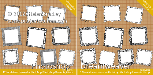
In the images above, you can see that the image on the right looks appalling in comparison with that on the left.

The two images are the same size but the one on the left was scaled down from a large size in Photoshop and the one on the right was scaled down by downsizing it in Dreamweaver.

The results are a great example of why you should never downsize an image in a web editor instead of a graphics program! The resized version on the right is downright nasty in comparison to the one on the left.

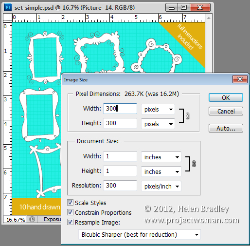
If you need to scale down your images – these were reduced from 2,376 x 2,376 pixels in size to 300 x 300 – then it’s vital that you use a proper tool to do so.

Photoshop has an image resize tool which you can get to by choosing Image > Image Size. Type the width and height of the finished image and then from the Resample image dropdown list select Bicubic Sharper (Best for Reduction). If you compare the results with different settings, you’ll see that the Bicubic Sharper typically gives the best result for downsizing images.


When you use this option the resulting images look as good downsized as they do on the screen in front of you.

Downsize them, save them and then import them into Dreamweaver and use them at that size. You will love your images a lot better when you do this.

Helen Bradley

Thursday, July 12th, 2012

Trevor’s Tip of the Week – Disappearing Ants

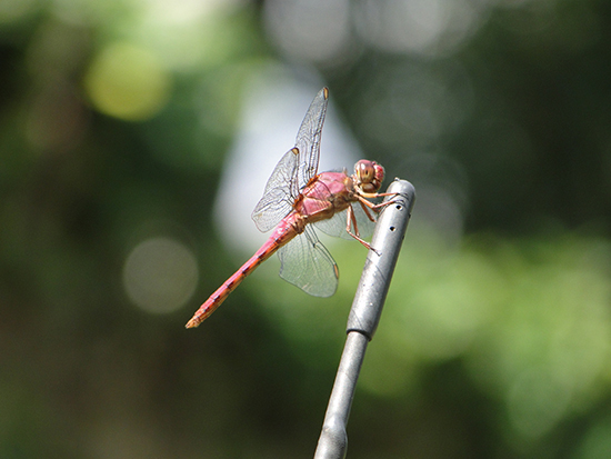
(photo by: Miwa via www.sxc.hu)

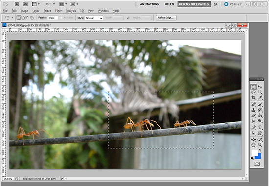
When those marching ants are too distracting on a selection you can make them disappear by pressing Ctr + H on a PC or Command + H on a Mac. Don’t forget to reverse it when you’re done by using the same commands.

Helen Bradley

Wednesday, July 11th, 2012

Using Adobe Camera Raw presets in Bridge


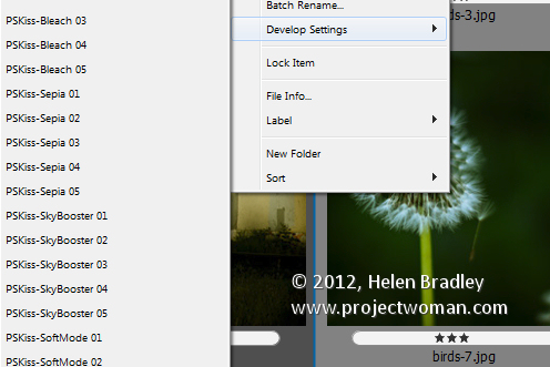
If you have a preset, for example a preset that applies an auto tone correction to an image in Adobe Camera Raw then you can apply this to an image in Bridge without needing to open Camera Raw.

Right click the image in Bridge, choose Develop Settings and then select the preset from the list.

Any preset can be applied automatically simply by selecting it. If you need to undo it, choose Develop Settings > Clear Settings. This will remove the settings from the image.

This strips out any ACR changes that you’ve made to the image.

A bonus of this feature is that the fix can be applied to jpg as well as raw images direct from Bridge.

Helen Bradley

Friday, July 6th, 2012

Editing JPG images in Camera Raw from Photoshop Elements


If you capture in jpg you may believe that you cannot take advantage of the Camera Raw processing features built into Photoshop Elements. This is because, by default, when you open a jpg image in Photoshop Elements it will open automatically in Elements bypassing the Camera Raw tool.

Only when you open a raw or dng file does will the Camera Raw tool appear allowing you to use its features to edit your image.

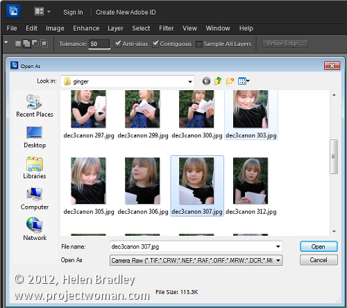
You can, however, get Photoshop Elements to open any image including a jpg image as a Camera Raw file. To do this, choose File > Open As and locate the jpg image to work with. From the Open As dropdown list, select Camera Raw as the option and click Open.


This treats the jpg image as a Camera Raw image so you have access to the superior processing tools available in Camera Raw for processing the image.

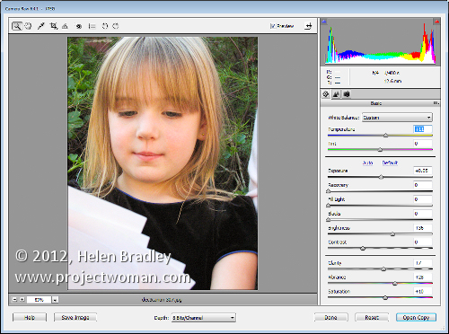
When you’ve finished with Camera Raw, click Open Image to move the image to Photoshop Elements with the Camera Raw adjustments in place. If you don’t want to go into Photoshop Elements then just click Done to save the fixed version of the image.

Helen Bradley

Thursday, July 5th, 2012

Trevor’s tip of the Week – One image, two Windows

(photo by: Belovodchenko Anton)

When doing detailed work, such as sharpening or color correction, on an image it’s important to see how your changes affect the whole image.  You can do this by having the same image appear in two separate windows.  All you need to do is select an image, go to Window > Arrange, and there will be a New Window for <image name> option at the bottom of the drop down menu.  Click to select it and you now have the same image in two windows that you can size and edit separately.

Helen Bradley

Tuesday, July 3rd, 2012

Illustrator – Trace & Color with Live Trace & Kuler

How to use Live Trace to trace an image and how to recolor it once traced and how to harness the power of Kuler to recolor it with a color scheme.

Check out the rest of or tutorials on our YouTube channel.

Helen Bradley

Tuesday, July 3rd, 2012

Clean up scanned line drawings in Photoshop


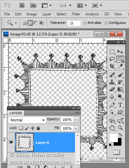
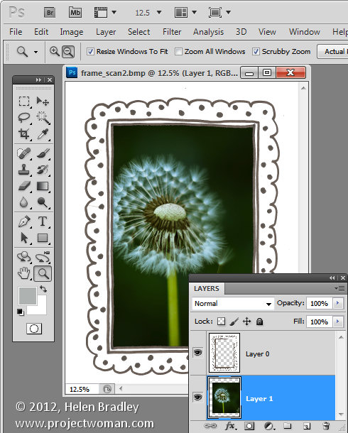
We hand draw a lot of images that you can buy and use as borders for your photos. These scanned sketches need to be cleaned up before selling them as there is often some residual mess from the scanning process.

Some of this might be dust on the scanner glass and occasionally we get small ink dots on the paper.

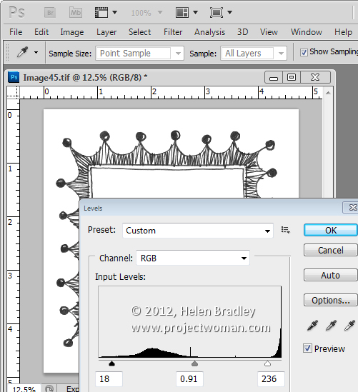
To remove these flaws from the scans once the scans have been made, we use Image > Adjustments > Levels and drag inwards at both ends of the slider to make the blacks blacker and the lights lighter. Sometimes a midtones adjustment is made to darken the blacks too. This fix gets rid of any small discolorations on the paper.


Then obvious problems can be fixed by painting over them with a white brush.

One other way to clean up when you got black line art on white paper is to make a selection of the white content. Start by making the background layer a regular layer by double clicking on it in the Layers palette. Set the Tolerance for the Magic Wand to ten or fifteen and click on the white areas to select all the white content. Then delete by pressing Delete.


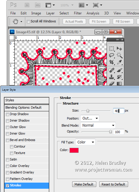
Now click the Add a Layer Style icon at the foot of the Layer palette. Choose Stroke and create a stroke that is red in color and quite big – just how big depends on the image – here mine is 40 pixels in size.


What this stroke does is to identify where the spots are on your image. Everywhere there’s a red dot on the image there is a stray tiny black or colored dot on the image itself – right in the middle of the red dot. It is this dot that is surrounded by your coloured stroke and the colour just makes it easier to find and fix it.

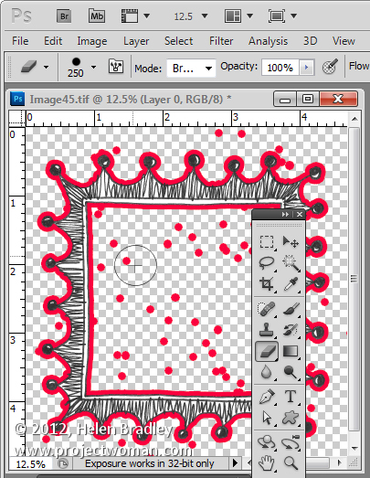
Grab a small hard edge eraser and start erasing the problem areas. All you need to do is to click in the middle of a dot and the problem will disappear. Make sure not to get too close to the lines if yours are uneven as there will be some natural bumps in hand-drawn images but you don’t want too much.


When you’re done and everything is nice and clean drag and drop the stroke layer into the trashcan.

Then you can put fill the areas you want to fill back with white by setting white as the foreground color and use the paint bucket to fill the empty spaces with white. Alternately add a white filled layer below your image and merge the two layers together.

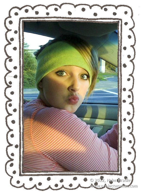
If you like this frame, it and others are for sale for less than a buck for 10 here.

Helen Bradley

Friday, June 29th, 2012

Anchor an Object with a Shadow in Photoshop


When you add an object to another scene you will typically want to anchor it using a shadow.

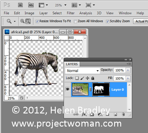
Here I have an image of a zebra that I want to incorporate in a larger image.


I masked out the zebra to add it to the image and included its own shadow with it.


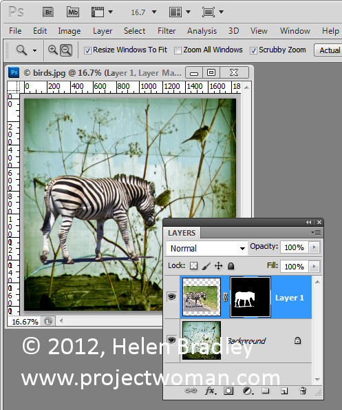
In place, the result is less than satisfactory.


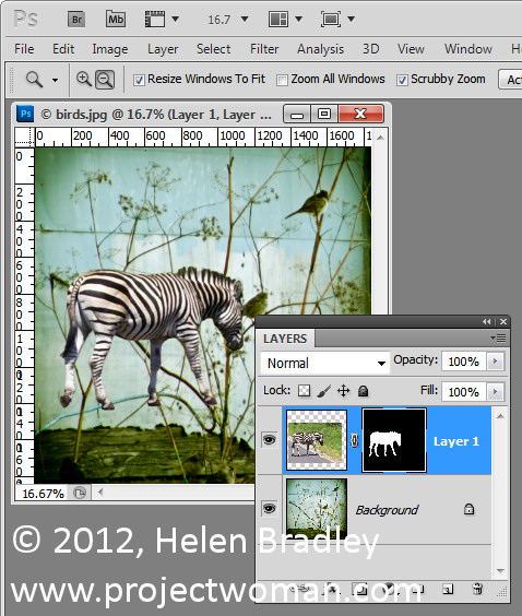
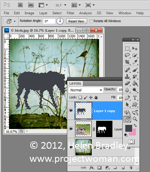
I would prefer to create my own shadow so the first thing to do is to remove the shadow that I brought in with the zebra which can be done by simply masking it out. With a mask you’ll paint on with white to reveal the layer it is attached to and in black to conceal it. In this case I want to paint in black to remove the shadow.


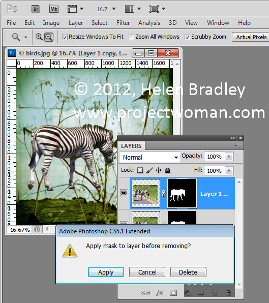
Once this is done I duplicated the zebra layer to create a second version of it and then dragged this layer’s mask into the trashcan. When you do this you’ll be asked if you want to apply the mask before removing it, and I clicked Apply to do this. This puts one version of the zebra by itself on a layer.


Now Ctrl + Click on the layer thumbnail for the zebra layer to select it. Press Delete to delete the zebra but to leave the selection intact. You’ll still see the zebra but you’re seeing the one from the layer below not the one you just isolated. Make sure that black or a dark gray is selected as the foreground color and press Alt + Backspace to fill the shape with the black color.


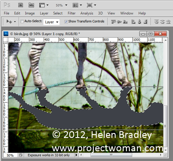
Target the Move tool and click on the shape. Choose Edit > Transform > Flip Vertical to turn the shadow upside down and then drag it into position. You will need it to line up correctly with the feet of the animal or with the base of the object that you’re trying to put into the image. In this case it didn’t line up exactly and needed to be rotated to the correct angle. Drag it into position and you can then shrink the shadow by dragging on the sizing handle to make it smaller.

You can also hold the Ctrl key as you drag on the corner handles to skew the shadow into shape. When you’re done, click to confirm the transformation. You can still continue to work on the shadow after this if necessary.


For example, you can also use Edit > Transform > Warp if you really need to bend the shadow into position. If the animal’s feet are on the ground the shadow should be attached to the bottom of the foot. Legs that are in the air like the rear leg of this zebra can be left floating.

Another tool that can be used is the Puppet Warp tool if you are using Photoshop CS5. You can also use the Liquify filter and use the Forward Warp tool to push the shadow around so that it matches the feet.

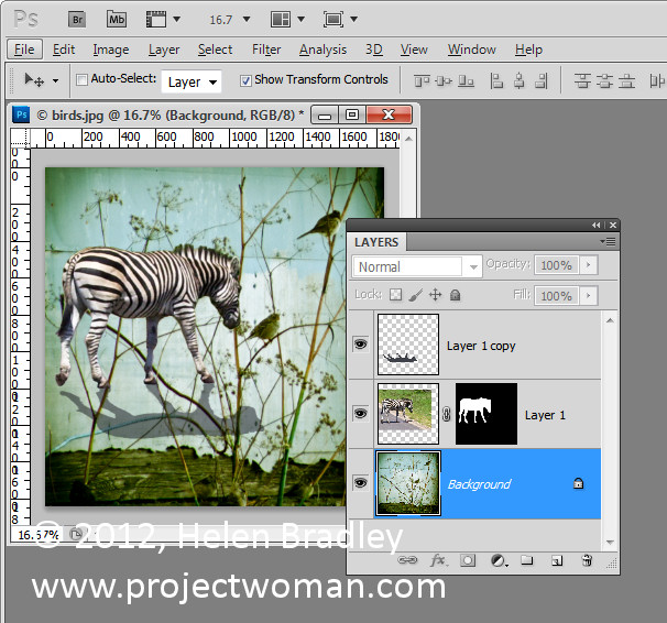
When you’re done blend the shadow into the underlying image using a blend mode. Modes such as Multiply and Overlay are good choices. Reduce the Opacity of the shadow layer until you get a blending of the shadow into the underlying image.

To move the shadow and the animal together make sure that you select both layers in the layer palette before moving them so that the two travel in unison.


For this image I finished off by cropping the image to remove the bottom part of it leaving just the zebra on the blue background.

Helen Bradley

Thursday, June 28th, 2012

Trevor’s tip of the Week – 100% zoom

(photo by: Luis Gustavo)

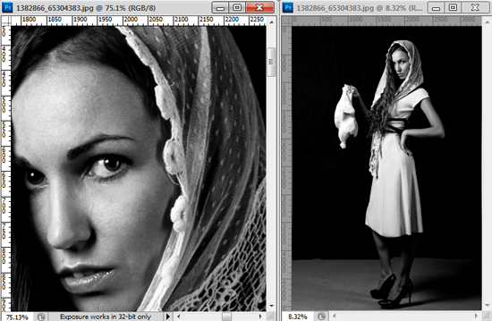
A quick tip for Photoshop that will save you some time.  To see an image at 100% size all you have to do is double click the zoom button in the tool bar.

Helen Bradley

Wednesday, June 27th, 2012

Create a Custom Frame in Photoshop

Check out our New YouTube channel for more great tutorials!

Helen Bradley

Monday, June 25th, 2012

Dreamweaver to Photoshop


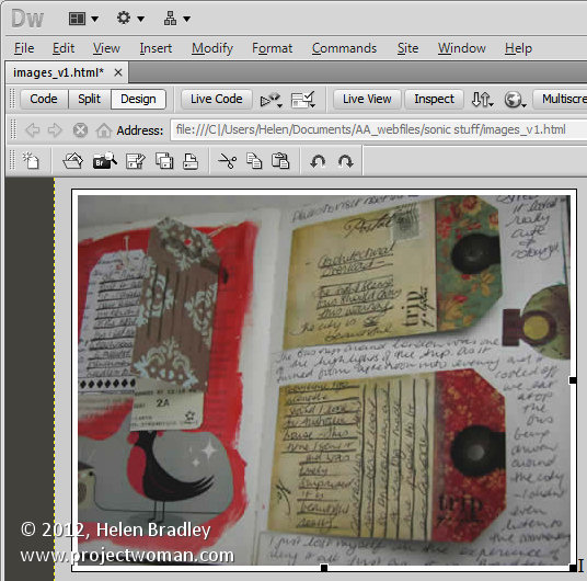
While Dreamweaver has some rudimentary tools for photo editing, if you want to do some real image editing, you’re better advised to take the image to a photo editor to do so.

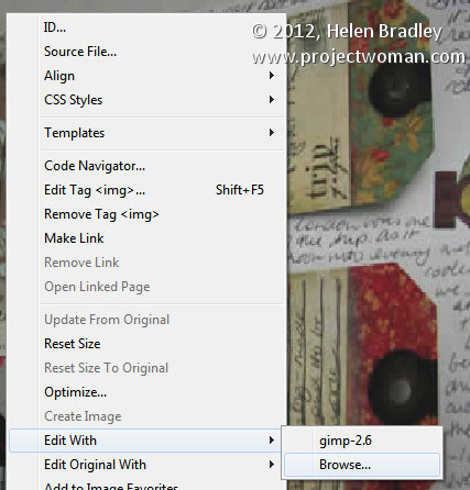
From Dreamweaver you can send an image to Photoshop by right clicking it and choosing Edit With > and choose the image editor to use from the list. If Photoshop is not in the list you can browse to find it, if desired.


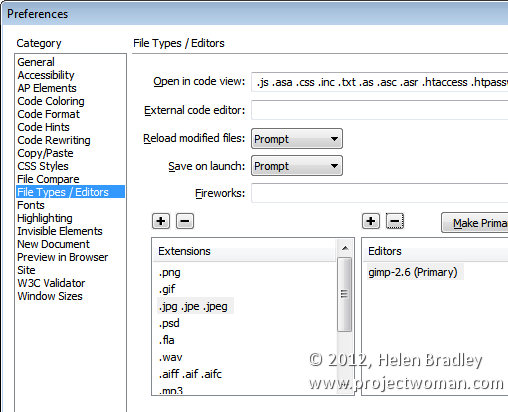
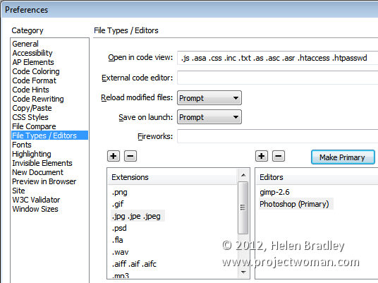
However, it’s better still to add Photoshop permanently to the list and to do this, choose Edit > Preferences > File Types/Editors and in the Extensions list, select the file extension to set the external editor for. In most cases you will be choosing .jpg .jpe .jpeg.


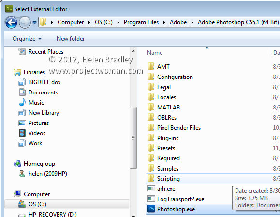
In the Editors box, click the plus (+) symbol above the box and browse to find the executable file for your version of Photoshop (or another program if desired). In most cases this will be in your C:\Program Files or C:\Program Files (x86) folder.


You can make an editor the primary one by selecting it in the list and choose Make Primary and then click Ok.


Next time you choose Edit With, you’ll be able to choose Photoshop and the image will be passed from Dreamweaver to Photoshop – if Photoshop isn’t open it will be opened automatically for you.

Helen Bradley

Thursday, June 21st, 2012

Resize Images in Dreamweaver


If you don’t pre-prepare your images before adding them to a page in Dreamweaver, you’ll need to resize them in the program.

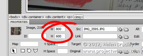
If you click an image and check the Properties panel, you’ll encounter your first problem. The selectors that let you adjust the Width and Height of the image do not do so proportionally so it’s perilously easy to skew your images out of alignment.


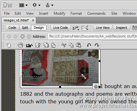
One alternative for resizing an image is to click the image and use the sizing handles to resize it. Hold the Shift key as you do this to scale the image in proportion.


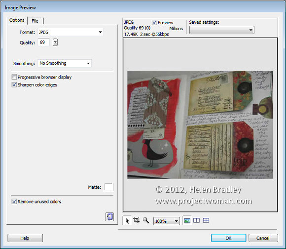
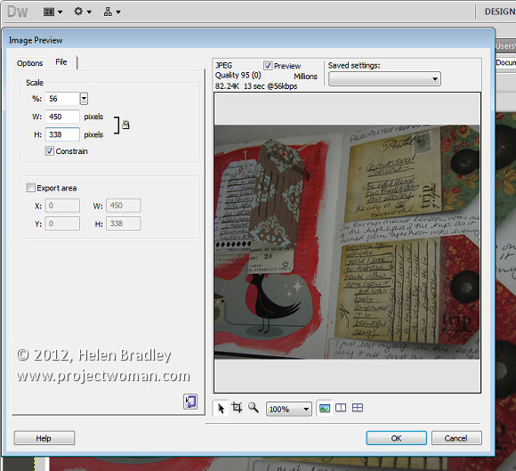
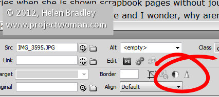
There is also another way and that is to click the image and choose Commands > Optimize Image. This is the same dialog as you get if you click the image and click the Edit Image settings button in the Properties tab (it’s just difficult to work out what button this is because it is so tiny). This opens the Image Preview window.


Click the File tab and you can scale the image to a fixed percentage or check the Constrain checkbox and adjust either the width or the height and both will be adjusted automatically in proportion.

Under the image are tools for moving around the image in the dialog, cropping it, zooming in and out of it and setting a magnification for viewing it in the dialog.

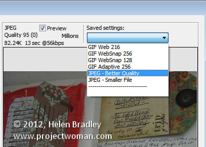
From the Saved Settings dropdown list you can select an optimization setting for your file, if you select JPEG – Smaller File the image will be saved as a low quality JPG. JPEG – Better Quality will result in a better quality but overall larger size file. For photos always select a JPG option and never GIF.


With the Preview enabled you can read off how long it will take to download the image at the currently selected quality at a 56kbps download rate.

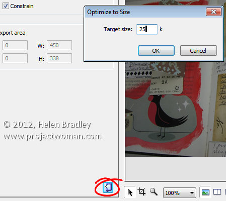
There is also a button in the bottom right of the left hand panel that allows you to optimize to a fixed size. Click it and you can set a target size for your image such as 20kb, click Ok and the image quality will be adjusted to give you file that is no larger than the size requested.


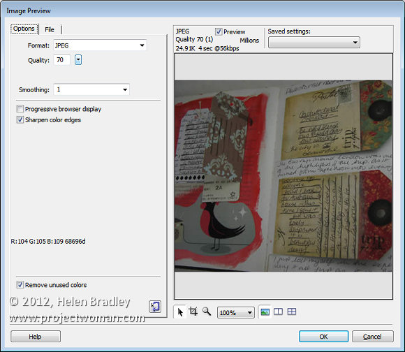
In the Options tab you can select to sharpen the color edges if desired. When you’re done, click Ok to configure the changes for your image.


Other image options include Brightness and Contrast and Sharpening both of which you can select by clicking the respective Brightness and Contrast, and Sharpen buttons in the Properties panel.


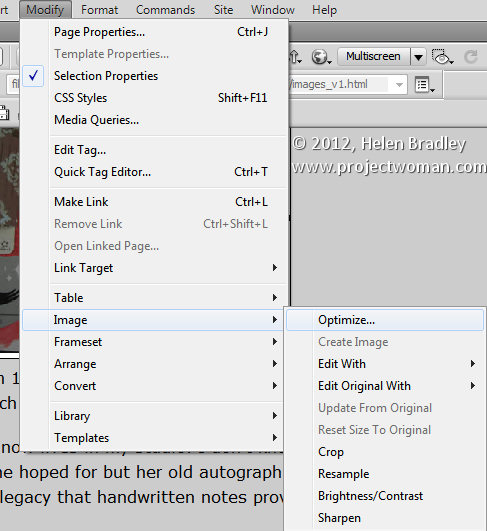
These options can also all be found by clicking Modify > Image. Here are options for optimizing the image, editing with an external editor, editing the original with an external editor, cropping, brightening, adjusting contrast, resampling and sharpening the image.


Helen Bradley

Tuesday, June 19th, 2012

Transparency and the Gimp


One of the most confusing things for Photoshop users will be the concept of a transparent layer in Gimp.

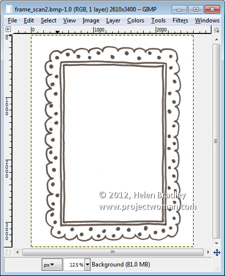
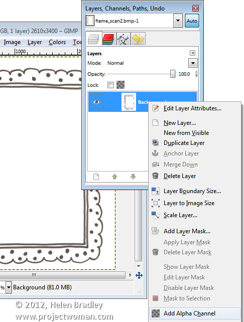
Consider the situation where you open an image such as this hand drawn frame here. The image is a BMP image and what I want to do is grab the middle out of the frame so that I can put something behind it.


If this were Photoshop, I would convert the background layer to a regular layer by double clicking on it and press Ok. Then I would target the Magic Wand tool and click in the middle of the frame to select the middle area then press Delete to make it transparent so I can drop an image in behind it.


If you try this process in Gimp, all you get is an extreme level of frustration as nothing seems to work. Select and delete does absolutely nothing !

Here’s the solution. With the layer with the image on it selected, right click and choose Add alpha channel. This then allows you to select an area on the image using the Fuzzy Select tool, and press the Delete button. Then choose Select none and you will have a transparent middle to your image. It’s an easy process once you understand what’s happening but an extremely frustration one until you do.


Helen Bradley

Saturday, June 16th, 2012

iPad style Apps come to Photoshop – At last!

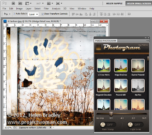
If you envy your friends their iPhone Instagram app and their iPad grunge photo editing apps then PSKiss has the solution. PSKiss recently released its PSKiss Photogram which is the first ever (at least as far as I’m aware) app like extension for Photoshop. It has all the coolness of an iPad app and it works on the desktop.

PSKiss Photogram is an extension so it installs like any extension and, when running, you see an iPad style interface with Instagram like features all running in a panel inside Photoshop.

You can download the extension from pskiss.com and right now the starter price is $9.90 which is comparable with many iPad apps. The extension is called Photogram and it has a distinctly retro look – it’s tag line is “Bringing the 70’s into Photoshop”.

Once you’ve downloaded the zip file, unzip it, fire up your Adobe Extension Manager and install the ZPG file. If you are using Windows 7 or Vista you may need to run the Extension Manager as an Administrator to install the extension in the correct location. To do this, right click the Adobe Extension Manager in your Start menu and choose Run as Administrator.

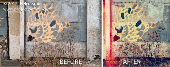
Once installed, close Photoshop if it’s open and then re-launch it. Start by opening an image that you want to work with. I grabbed an image of some graffiti I shot this morning  with a view to using it with this extension.

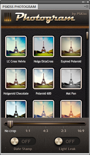
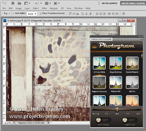
Run the extension by choosing Window > Extensions > PSKiss Photogram. The panel opens showing a series of image effects including Holga, Expired Polaroid, PolaroidPZ, Wrong Velvia and others. They are a mix of faux retro camera effects which are guaranteed to give your photos a very different look.

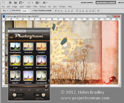
In addition to applying effects you can also crop your image to one of a number of crop ratios including No Crop, 1:1, 4:3, 2:3 and 16:9.

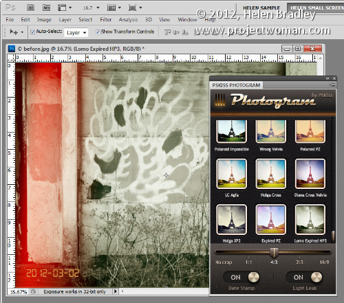
The app also lets you add light leaks by turning on the Light Leaks switch and add a date stamp which is set using the image metadata.

To apply an effect to an image, set the crop ratio, set the date stamp and light leaks switches then click an effect. You can wind back the processing using the History palette so click on Open in History to revert to the original image. If you choose a different effect it replaces the one you just applied and isn’t added to it so you don’t need to wind back your changes if you want to experiment with different effects.

The light leaks are random so they move around each time you click to add an effect.

If you want the same effect but a different crop, select a different crop and then reapply that same effect to it. You can tell which effect is in use as it has a glow around it and the title bar of the image indicates which effect is in use.

When you’re done, you can save the image as you would any regular image.

Helen Bradley

Sunday, June 3rd, 2012

Edit and Create on the go with Adobe Photoshop Touch

By Helen Bradley

On Monday, Adobe launched its Photoshop Touch application for the iPad. This long sought after app runs on the iPad 2, and not on the iPad 1, and it requires that you have iOS 5 installed. The app costs $9.99 which is at the high end of the price range for photo-editing apps in general but Photoshop Touch seems to have got the feature set about right so most people will probably consider it worth the money.

I use the iPad a lot for working with photos I’ve shot using a digital SLR camera in raw and which I’ve resized, converted to jpeg and downloaded to the iPad. Those images I have on the iPad are there because they are funky or because they lend themselves to some artistic play. So, I looked at Photoshop Touch in this light – I wanted to see if it would be part of my iPad image creative workflow. For heavy duty work, Photoshop and Lightroom will remain my tools of trade.

When you launch Photoshop Touch you get two options, viewing the tutorials or doing some work.
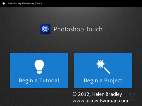
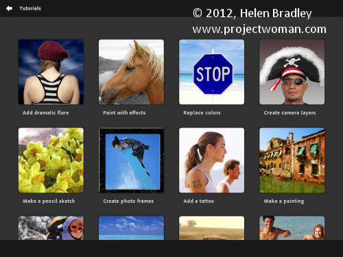
There are 10 tutorials that you can work through each of them is project based so you learn the program by learning a technique not by learning how individual tools work. These are text and image tutorials and not video ones, but they are interactive so you can learn as you go.
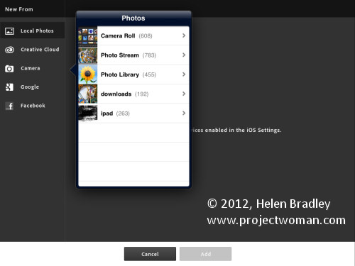
The second option is Begin a Project which is where I’ll start. You get the choice of adding an image from your iPad, the Adobe Creative Cloud, the Camera, Google or Facebook. I chose Local Photos then the Photo Library and an image from my iPad.
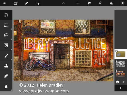
In the main editing area you’ll find the tools on the left, layers on the right and menus across the top. The program pays lip service only to Photoshop.  Some icons are familiar but others are more iPad than Photoshop so Photoshop users may find it a bit confusing where iPad artists will find it more familiar.
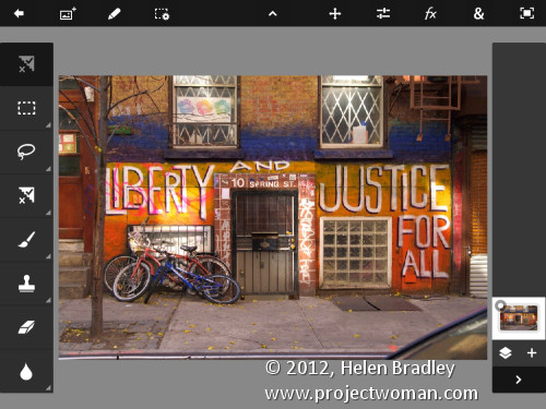
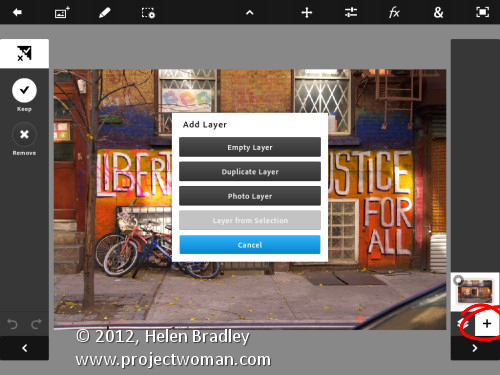
You can add multiple images and multiple layers. I wanted to texture this image so I clicked the Add Layer button and selected Photo Layer.
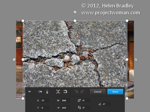
Once you select a second photo you get to size it as you import it – you can also rotate, flip or skew it too. Click Done to proceed to the editing area.
Now, with the layer selected, you can apply adjustments to it.
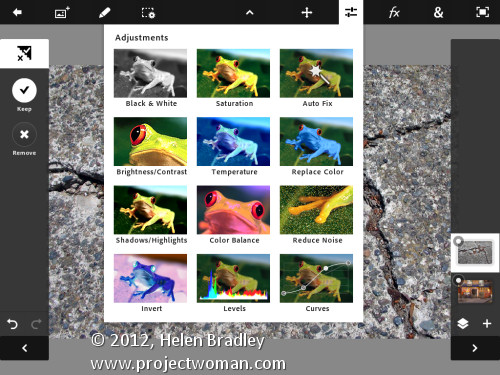
I chose Curves as this was a texture and I wanted more contrast. There are no adjustment layers so the Curves adjustment is being applied just to the targeted (top) layer. As you can see, you can adjust the RGB composite channel or the individual red, green and blue channels.
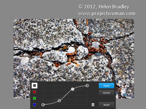
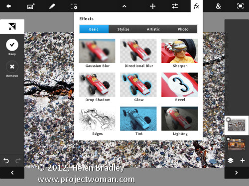
With the texture layer still targeted you can apply a filter to it by clicking the FX button. There is a range of filters including Basic, Stylize, Artistic and Photo. Some add things like drop shadows, blurs and glows and others are more artistic.
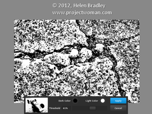
I chose Stylize > Old Photo, configured the settings and tapped Apply. Unlike Photoshop where the foreground and background colors need to be selected before you run a filter, here you can select the colors to use in the filter settings – this really is a feature that Photoshop should have.
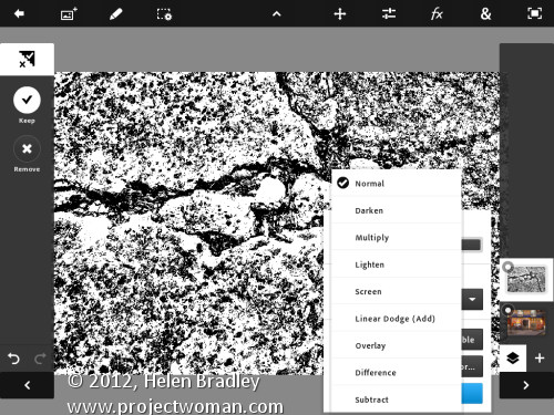
To blend the layers you click the Layer icon and you get a choice of blend modes and the chance to adjust the layer opacity.
There are no masks but you can use a gradient to fade the effect – when you do the gradient is applied to the layer and you can only undo it by tapping Undo – you can’t go back and edit it.
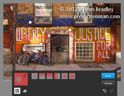
You can also add a new Empty Layer and fill it with a gradient.
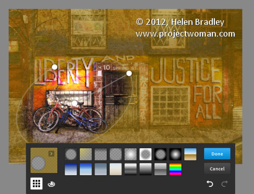
And then blend it using a layer blend mode as I have done here.
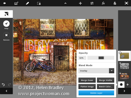
I finished by cropping the image and then saving it.
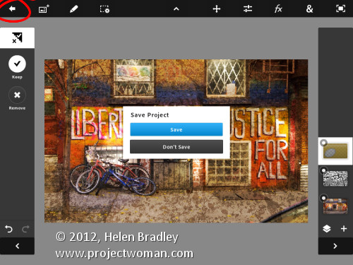
You can then email it or send it to the Camera Roll or upload the project to the Adobe Creative Cloud so you can access them from there.
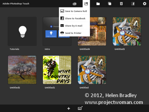
There are limits to Photoshop Touch and one is the 1600 x 1600 pixel image size limit. The text tools are rudimentary and, as a long time Photoshop user, I’d like to see editable masks and editable text. That said, for fixing photos and tinkering with creative projects this program is a welcome addition to the Adobe family.

This app will appeal to a range of users. There are plenty of basic tools that are easy to use but also some more advanced features for working with images. The Scribble Extract tool does a reasonable job of extracting a subject from a background and you can tinker with gradients and fades to get some interesting effects. You don’t need to know how to use Photoshop to use the app but your knowledge won’t go astray.

Helen Bradley