How to solve the problem of Lightroom reporting a folder as missing
If a folder is missing, it will have a question mark beside its name in the Lightroom library.
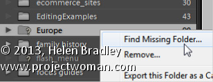
You can sort out Lightroom’s problem by locating the missing folder – to do this, right click the folder name in Lightroom and choose Find Missing Folder.
Now navigate on your disk to find the folder that Lightroom can’t find. When you have done this all the contents from that folder will be added back into the Lightroom catalog automatically.
The reason that Lightroom can’t find your folder is because you have done something to it outside Lightroom. In future, move and rename folders from inside Lightroom and this problem won’t occur.
Reflections make for great photos so here’s how to capture them
Reflections occur all around us. When you’re driving, the road behind you is reflected in the car rear vision mirror and your car will be reflected in the chrome on the car next to yours at the stop light.
Other reflections are more obvious and often constructed to be so, for example, the Reflecting Pool at the War Memorial in Canberra reflects the surrounding buildings and beautiful houses are often constructed with lakes in front of them to reflect their beauty.
Capturing these objects and their reflections can lead to some wonderful photos so here I’ll show you want to look out for and how to capture a great shot.
Axe the Polarizer
The first thing to do when shooting reflections is to remove the polarizing filter from your camera. This filter is designed to reduce reflections which, most of the time is a good thing, but not when it’s the reflections themselves you’re interested in.
If you leave the filter on and photograph something reflected in a window, chances are you’ll capture an image of what’s behind the window instead of what is reflected in it.
Ideas for reflections – sunglasses
While a beautiful building reflected in a lake makes for a great shot, there are reflections you’ll come across every day that will often be more interesting because they are not staged or expected.
For example, the lenses in sunglasses will reflect the scene around them. By positioning yourself so you can see something interesting reflected in the lens you can capture a mini scene within the glasses themselves.
Ideas for reflections – rear vision mirror
Car rear vision and side mirrors are great for capturing interesting reflections.
Hold the camera at an angle to the mirror so you don’t capture the camera in the shot (unless you actually want to) and frame the shot in the mirror. You’ll need to frame it very accurately because anything outside what shows in the mirror won’t be captured.
Ideas for reflections – city buildings
If you live in a city there will be reflection opportunities in the buildings around you. For example, capture a busy streetscape in the glass front window of a shop. Look out for an interesting shop to use for this purpose such as a fruiterer or bakery or some shop where what is in the window is as much of interest as what is reflected in it.
When you’re shooting reflections in shop windows, there’s a good chance the final shot will be a mix of reflection and what shows through the glass.
Tall buildings with mirror glass will reflect the buildings around them and the sky too. Look for opportunities where the sun is right and the reflected image an ideal one to compose and capture.
Learn to make realistic rivets in Photoshop. This tutorial makes use of the new photo filters in Photoshop CS6, but doesn’t require their use, so, you can make the rivets in any version of Photoshop. You will see how to add dimension with Bevel and Emboss and Contours, as well as with gradients and light. The tutorial is easy to follow and the process of making a rivet quite simple.
Transcript:
Hello, I’m Helen Bradley. Welcome to this video tutorial. In this tutorial I’m going to show you how you can create rivets quickly and easily in Photoshop. Before we get started making the rivets let’s have a look and see what it is that we’re creating. And this is the type of rivet that we’re going to create. This one’s a copper rivet, but we can make them in any colors that we like.
To start off I’m going to choose File and then New and I’m going to create a new image. This one’s going to be 500 by 500 pixels because I like my rivets to be able to be shrunk down so that they can look realistic in place. So I’m just going to click Ok. And the first thing I’m going to do is to fill this layer here with a gradient.
Now in Photoshop CS6 there are some new photo gradients that you can use. And I really like these for rivets, but in earlier versions of Photoshop you can go and do the same thing and you can create your own look in gradients. So you don’t have to have these gradients available, but you will find that they are kind of handy for creating rivets as well as of course coloring photos. So I’m just going to click Ok and I’m going to apply this as a linear gradient. So I’m going to make sure I have Linear Gradient selected here and I’m going to drag it across the image here. I’m holding Shift to constrain it to a straight line. Now I’m not totally convinced about this particular gradient so let’s go and get something.
I know this copper one is going to work. So I just want something that is a little less harsh. This one’s got a distinct dark area and I want something that transforms from light to dark a little bit more smoothly. So this is a pretty good gradient. Now if this is a bit dark you can add a new layer to your image. So I’m going to add a new layer and I’m going to fill it with the foreground color by pressing Alt and Backspace because my foreground color is white. That’s Option Delete on the Mac. I’m going to set this to Screen Blend mode and just adjust the opacity down so that I can use most of the color underneath. But I could make it lighter if I wanted to. And I’ll just merge those layers with Ctrl and E to merge the layers. But if your gradient isn’t too dark then you don’t need to do that step.
I’m then going to choose the Elliptical Marquee tool and I’m going to drag a circle onto my gradient. And if I hold the Shift key with it that will be a pure circle. And if I use the Spacebar I can move the circle right into the center of the image. So I’ve still got the Shift key selected, I’m going to let go of the left mouse button and then let go the Shift key so I’ve got a circle here.
Now I’m going to invert that with Select Inverse so I have selected everything but the circle and I’ll press Delete. So this is the first part here of my rivet and it’s actually this outside part here. I’m going to duplicate this layer by dragging and dropping it on the New Layer icon. Now I got a bit enthusiastic there and ended up with more layers than I needed. So I now have two identical layers. I’m going to deselect the current selection by pressing Ctrl D or I could choose Select, Deselect. Now this is going to be in my inner shape so I’m going to Ctrl click on it, choose the Move tool, and then I want to size it in smaller. Now the way I do that is to hold both the Shift and the Alt keys as I do this. The Shift key constrains my movement to a full circle so I’m always going to have a circle here and the Alt key sizes it from the middle so that it’s not being repositioned. This second circle is going to be right in the middle of the first circle. So when I get it in place, let go of the left mouse button and then and only then let go of the Alt and the Shift keys, I’m going to click the checkmark here.
Now I want to transform this. And I want to transform it through 180 degrees so I’ll press Ctrl and T to get my transform details up here and I’ll type 180. And that’s flipped it around. In fact I think it could be rotated a little bit more attractively, probably to about here. Now at this point you’re going to get a relatively flat looking rivet. And I actually prefer to at this stage actually go and reapply the gradient. So I’m going to select my gradient again, with this layer I’m going to lock the pixels on it so that I can drag my gradient in and it’s only going to affect the area marked out by the circle. I’m also going to select a radial gradient because what I want to do is for this part of the gradient here to be light and the outer edge to be dark, and I’m just going to find a good position for it. And I think this is a pretty good gradient. So you can just continue to drag until you get it into the right place. Let’s just unlock that now. We’re ready now to add a Bevel and Emboss.
So I’m going to click the bottom layer here, choose the Add Layer Style icon and I’ll choose Bevel and Emboss. Now in contour I want one of these contours, this one, this one or this one. They’re all going to work pretty well. And I’m going to just adjust the range so that I push it to the very edge of the shape. Let’s go back into Bevel and Emboss and now I’m going to reduce the depth quite a bit, reduce the size, just get it to what I want it to look like. Now we have a problem with the light now. At the moment from Photoshop’s point of view and for this Bevel and Emboss effect, Photoshop has the light coming from this direction. But you can see that the light is actually coming from this direction on the rivet itself. So we need to adjust the light here to match our rivet.
So I’m going to bring in a global light here that is hitting from this direction. And then I’m going to adjust my Screen and my Multiply so that I get the effect that I want. I don’t want a really, really harsh set of settings here. I just want the very smallest amount. And then I’m going to add a Drop Shadow so I’ll click Drop Shadow, select the Drop Shadow itself.
Now I think that these are badly named in Photoshop. Size in actual fact it’s more like a feather. So size will give you a softer or a harsher shadow and the actual physical size of the shadow is really controlled by the spread and the distance. So I’m going to bring my distance and my spread in quite small and adjust the size of it which gives me that sort of feathering effect and click Ok. And let’s just zoom out here and there we have our rivet. And this one’s a copper rivet but you’ll find that there’s plenty of things to choose from in this set of photo gradients. And you can create your own gradients to create your own look for your rivets.
I’m Helen Bradley. Thank you for joining me for this video tutorial. Look out for more video tutorials on this YouTube channel, subscribe to the channel, click Like if you liked this video and visit my website at projectwoman.com for more tips, tricks and tutorials on Illustrator, Photoshop, Lightroom and a whole lot more.
Learn to use ‘Save as type’ to format your document so users of older versions of Word can access them
You can easily exchange files with users of older versions of Word. This is because Word 2007, 2010, and 2013 essentially share the same file format. So it is pretty easy to open any Word document created using version 2007, 2010 or 2013 in any other of these three versions of Word. In addition, Word 2007, 2010, and 2013 will open files from any previous version of Word.
However, when you need to share a Word 2007, 2010, or 2013 file with someone using a much earlier version such as Word 2003 or a Mac version of Word, you must save the file using their particular Word file format. This is because the file formats are not the same and the older versions of Word cannot read the newer file formats.
To save using the appropriate format, select the File tab on the Ribbon, and click Save As. In the Save As dialog, click the Save as type: dropdown list and select the word processing format that matches the software that your other user is using such as Word 97-2003 Document (*.doc). Then click Save to save it in that format.
Give an image’s Midtones a Boost with the Clarity Slider
The Clarity slider helps you adjust the Midtones in the image so it adds Contrast to them which also results in them looking a little crisper and more saturated too.
It’s a great tool, but try not to overdo it. Typically, a Clarity adjustment of around 25 is a good choice for most images. In Lightroom 4 the adjustment has been tweaked a bit so you can add more Clarity in Lightroom 4 than you are perhaps used to doing in Lightroom 3.
Find Lost Details Hidden in Shadows and Darker Parts of an Image
When you have an image that has details lost in the shadows or darker areas of the image, the Fill Light slider in Lightroom 3 or the Shadows slider in Lightroom 4 can be used to recover this detail.
Don’t use either of these as a tool for lightening an image or to lighten shadows if there is nothing interesting in the shadows. Use them instead when you want to get some interesting detail out of the shadows.
The result of using the Fill Light and sometimes using the Shadow tool is that some contrast in the image will be lost – so you nay need to increase Contrast as a result of using the Fill Light slider in Lightroom 3 or apply a tone curve adjustment in Lightroom 4.
Learn how to create uneven lines that look hand drawn to use for cartography and other uses in Photoshop. Make use of Hue/Saturation adjustment to add vintage color, use brushes to create a pattern for the lines. Also, show how to render lines in black and white without any shades of grey and, lastly, how to distort them slightly. This video also shows how to add shadow around land mass and multiple lines of edging for a land mass.
Transcript:
Hello, I’m Helen Bradley. Welcome to this video tutorial. In this tutorial I’m going to show you some line drawing techniques for creating maps in Photoshop. In this video I’m going to show you how you can create the effect that we have here around the edge of this chart. We’re going to draw the edge. We’re going to add this shading and also create these lines so that we can see how this could be created. The pattern in the middle is just a very simple pattern fill. We won’t be covering that, but we’ll be covering everything else in this video tutorial.
So to get started I’m going to start with a new image. And I’m going to choose File and then New. And I’m going to create a very tall image. So it’s going to be 2,000 pixels tall, RGB color. Background contents of white is just fine, so I’ll just click Ok to create that image.
And what I want to do first of all is to create these lines. And we’re going to do that using a paintbrush. So I’m going to click on the paintbrush and let’s select a brush to use. And what I want is something relatively small so I’m going to start with something like this 4 pixel brush. And then I’m going to choose Window and then Brush to open this brushes panel here. And what I want to do is to set up the brush so it’s going to paint the lines for me. So first of all I’m going to adjust the spacing so that there’s increased spacing between the brush tips. And I’m going to leave the size at about 4 pixels. Then I’m going to shape dynamics because I want the size of the brush to vary.
So I’m going to increase this quite a bit so we start seeing that there’s some variety in the brush here. Minimum diameter I don’t want to change at all. And that’s pretty much all I need to do with the brush right now. And then I’m going to test it. So I’m going to make sure that I have black set as my background or foreground color, which it is here. And then I’m going to click with my brush here and I’m going to Shift click at the bottom because that will create a straight line of brush strokes. And let’s just have a look in here a bit closer at this.
You can see that we now have this sort of dotted line which is different varieties of line. Now if that’s not quite what I want I can just zoom out and we can start again. So I’m just going to undo the brush and perhaps we’ll go back and make the brush just a little bit bigger than it was. So let’s go to brush tip shape, increase the size just a little bit, and perhaps bring down the size jitter or up the minimum diameter so that we haven’t got quite so much variety in our brushes. I’m going to click here and then Shift click to finish my brush stroke.
Now what I want is a sampling of this. So I’m going to use this tool here which is the single column marquee tool, one of the few times you will ever find a need for this particular tool. I’m going to zoom in here so that I can see exactly what I’m selecting and I’m just going to click to select a single line through this image. Now that’s not the world’s best. So let’s just try again. My brush stroke is not completely vertical so that’s causing me some problems here. Let’s start this again. I’m going to click here, and again let’s Shift click to create a straight line. And let’s see if that’s a bit straighter. That will be when we click just to one side of it. So that’s going all the way through the dot.
So I’m just going to choose Edit and then Define Pattern because this is going to be a pattern. And it will be just this dashed line as our pattern so I’ll click Ok. I can now close this image because I don’t need it any longer. And let’s see how our pattern will work.
I’m going to create a new document, this time 2,000 by 2,000 pixels in size. And this time I’m going to fill it. So I’m going to choose Edit and then Fill. And I’m going to fill it with a pattern. So I’m going to select Pattern. And the very last pattern in this container here will be the pattern we’ve just created so I’ll click Ok. And there are our lines. And that’s a starter for our map.
Now with our lines we can make these bigger. So I’ve got a background layer here but I can click to make it into a regular layer. And we can just enlarge this. So if we want larger lines all we need to do is to just drag up and down on this to just make the lines a whole lot wider than they are. And because they’re lines we can just size everything like this.
If you want to make sure that that there are no gray areas to the lines, as you can see they’ve got slightly fuzzy sides here, just use Image and then Adjustments and then Threshold. And that just makes the lines black and white. They’re pure black and white now. And if you want a bit of variety, Edit, Transform and then Warp. And you can just adjust the lines with a little bit more of a curve or something through them so that they look a little less like they’re straight lines and perhaps a little bit more hand-drawn feel about them, Ok. Now let’s add our map part.
So I’m just going to grab the Lasso tool and for this exercise just draw a very wiggly sort of coastline that we’re going to use for our map. And white is my foreground color so I’m going to Alt Backspace, Option Delete on the Mac, to fill this with white. Now I want an edge around here so I’m going to choose Edit and then Stroke. And I’m going to stroke the edge with black. I’m just going to get all my tools over on this screen. So I’m going to select Black. And I’m going to make this a 6 pixel to begin with. And it’s going to be on the inside of this shape so I’ll just click Ok. And there’s our 6 pixel stroke.
Now I’m going to bring in this size. So I’m going to choose Select, Modify, Contract and I’m going to contract this by 10 pixels because I think that will be enough and then add another stroke. So again, Edit, Stroke. And this time I’m going to just use a 3 pixel stroke, but again on the inside. And then we’ll repeat that again, Select, Modify, Contract by 10 pixels and then repeat the stroke, Edit, Stroke and just click Ok. And then when I press Ctrl D you’ll see that we have the edges around here. But I’m actually just going to undo that Deselect right now because I have another piece to go in here.
What I want to do is to fill this shape with the grass so I have that as a pattern. So I’m going to choose Edit and then Fill, and again still pattern but here is my grass pattern here that I created earlier. And I’m just going to fill it with the grass pattern. Now we’re going to see how to create the shading around the edge. So I’m going to deselect the selection. I’m going to make sure I’m selected on the land, which is where the shading is to go, and I’m going to choose the Add Layer Style button here. And we’re going to choose an outer glow.
Now outer glow sounds like it should add some lightness around the edge but we can use it to add darkness. All we’re going to do is to select a dark color. Well we’ll stick with black right now. Now we can’t use screen as our blend mode. We’ll have to use something that will darken. So we’re going to choose multiply. And we’re going to set this if we want it to be full strength at 100 percent opacity. And we can adjust the size which is really the feathering around here. And the spread is how big it is. It would sound better to me if spread were really the feathering and size was the actual size. But that’s what you’re going to use.
So I’ll just click Ok. And now if we want to add this sort of sepia tone to the image, I’m going to make sure I have the image selected, and we’re going to do that with the hue/saturation adjustment layer, Layer, New Adjustment Layer, Hue/Saturation, click Ok. We’re going to select Colorized because we want to colorize this. And then we’re going to go and pick up our sort of brown color, increase the saturation and adjust the lightness. And you’re just looking for that sort of effect that is going to say vintage map to you. So I’m probably just going to select that for now.
And then I would finish off by cropping my image. We probably don’t need quite as much sea visible. In my image I have a one to one crop set here. That’s why it’s behaving a bit strangely. And there is our final result.
We’ve created lines using a brush in Photoshop. They’re all different size lines and we’ve created this sort of effect of an old-fashioned map. And actually if I just drag this adjustment layer up over the top of the fill we’ll really get that look of a vintage map.
I’m Helen Bradley. Thank you for joining me for this video tutorial. Look out for more of my Photoshop tutorials on this YouTube channel. Subscribe to the channel. If you enjoyed it please comment and like this video. You’ll find more videos, tips, tricks and tutorials at my website at projectwoman.com.
To automatically number rows in your table, select the column you wish to number (or the specific cells in the column you wish to number). Now, click the Numbering button on the Home tab on the Ribbon. After the rows are numbered, you can move the rows anywhere and the numbering will readjust automatically.
Learn how to create and use the Lightroom Target Collection feature
Lighroom’s target collection feature makes it easy for you to add images to a collection. If you make a collection the target collection you can add an image to that collection by simply pressing the letter B on the keyboard. But, be warned, once it is added if you press B again you will remove the image from the target collection.
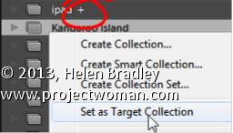
To make a Collection the Target Collection: right click it and choose Set as Target Collection.
Any Collection (except a Smart Collection) can be designated as the Target Collection but there can only be one Target Collection at the one time.
If you deselect the current Target Collection: by right clicking its name and disabling Set as Target Collection, then the Quick Collection becomes the Target Collection, by default.